 RSS Feed
 by Calculated Risk on 9/13/2010 07:15:00 PM
Showing posts with label House Prices. Show all posts
Showing posts with label House Prices. Show all posts
Monday, September 13, 2010
Capital One CEO: "Very cautious about the housing market"
From William Alden at HuffPo: Home Prices Set To Fall Further: Richard Fairbank, Capital One CEO
"I think we feel very cautious about the housing market," [Capital One CEO Richard Fairbank] said. "I think that even despite some of the recent months where home prices have gone up, I think it's a very plausible case for home prices to go back down again."I think house prices started falling again in July, but it might take some time before we see prices falling in the repeat sales index. CoreLogic will probably release their July HPI this week, and that might show declining prices - but that is a weighted average of May, June and July.
...
"We are managing to a view that home prices are more likely to be headed down rather than up."
Tuesday, August 31, 2010
On Case-Shiller House Prices: October is the "Witching Hour"
by Calculated Risk on 8/31/2010 12:54:00 PM
As we've discussed for some time, the Case-Shiller index is seriously lagged to real time data. The release today was for "June", but it is really an average of April, May and June.
Home sales were strong in April, May and June, and then collapsed in July. And prices have probably been falling for two months now - but that won't show up in Case-Shiller until the end of next month or even October (the Case-Shiller release at the end of October will be for June, July and August).
Note: The title for this post is from Rolfe Winkler at the WSJ's Heard on the Street (last week): Housing's Witching Hour
[T]he S&P/Case-Shiller home-price index ... could be set for another leg down. The index is computed using a three-month rolling average, meaning last month's weakness really should assert itself in late October.RadarLogic released a statement today: As Predicted, June S&P/Case-Shiller Home Price Indices Overstate Housing Market Strength
[T]he latest S&P/Case-Shiller home price indices show healthy improvement in home prices while other housing market indicators, including the RPX Composite price, show that housing markets are starting to weaken.The CoreLogic repeat sales index showed prices were flat from May to June (CoreLogic uses a weighted 3 month average and picks up the trend change a little quicker than Case-Shiller).
... We believe that these figures overstate the current strength of the U.S. housing markets. As we reported in this month’s RPX Monthly Housing Market Report, the RPX 25-MSA Composite Price declined 0.2% through the end of June on a year-over-year basis. ...
The conflict between the strength expressed in the S&P/Case-Shiller indices and the weakness apparent in other housing market indicators likely arises from the fact that the S&P/Case-Shiller indices are calculated using data from transactions that occur over a three-month period. As a result, the indices smooth over recent price movements and can take a number of months to reflect price fluctuations.
... Our concern is that, as we saw in spring 2009, the only effective stimulus of new housing demand will prove to be a precipitous decline in home prices. Our current analysis shows early signs that such a dynamic is approaching.
Case-Shiller: Home Price indices increase in June
by Calculated Risk on 8/31/2010 09:00:00 AM
IMPORTANT: These graphs are Seasonally Adjusted (SA). S&P has cautioned that the seasonal adjustment is probably being distorted by irregular factors. These distortions could include distressed sales and the various government programs.
S&P/Case-Shiller released the monthly Home Price Indices for June (actually a 3 month average of April, May and June).
This includes prices for 20 individual cities, and two composite indices (10 cities and 20 cities) and the quarterly national index.
From S&P: For the Past Year Home Prices Have Generally Moved Sideways
Data through June 2010, released today by Standard & Poor’s for its S&P/Case-Shiller Home Price Indices, the leading measure of U.S. home prices, show that the U.S. National Home Price Index rose 4.4% in the second quarter of 2010, after having fallen 2.8% in the first quarter. Nationally, home prices are 3.6% above their year-earlier levels. In June, 17 of the 20 MSAs covered by S&P/Case-Shiller Home Price Indices and both monthly composites were up; and the two composites and 15 MSAs showed year-over-year gains. Housing prices have rebounded from crisis lows, but other recent housing indicators point to more ominous signals as tax incentives have ended and foreclosures continue.
 Click on graph for larger image in new window.
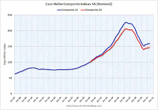
 The first graph shows the nominal seasonally adjusted Composite 10 and Composite 20 indices (the Composite 20 was started in January 2000).
The Composite 10 index is off 29.0% from the peak, and up 0.3% in June (SA).
The Composite 20 index is off 28.4% from the peak, and up 0.3% in June (SA).
 The second graph shows the Year over year change in both indices.
The Composite 10 is up 5.0% compared to June 2009.
The Composite 20 is up 4.2% compared to June 2009.
This is the fifth month with YoY price increases in a row.
The third graph shows the price declines from the peak for each city included in S&P/Case-Shiller indices.
 Prices increased (SA) in 9 of the 20 Case-Shiller cities in June seasonally adjusted.
Prices in Las Vegas are off 56.5% from the peak, and prices in Dallas only off 4.8% from the peak.
Prices are probably falling right now (starting in July), but this will not show up in the Case-Shiller index for a few months since this an average of three months.
Tuesday, August 17, 2010
Regional Reports: Home Sales fell sharply in July
by Calculated Risk on 8/17/2010 03:30:00 PM
From DataQuick:
A total of 18,946 new and resale homes were sold in Los Angeles, Riverside, San Diego, Ventura, San Bernardino and Orange counties in July. That was down 20.6 percent from 23,871 in June, and down 21.4 percent from 24,104 for July 2009, according to MDA DataQuick of San Diego.Other reports show similar declines as home sales fell sharply all across the country in July. We are now seeing double-digit months of supply nationwide - and we might even see the months of supply metric reach 1 year. The previous months-of-supply high for this downturn was 11.2 months in 2008.
This was the slowest July since 2007, when 17,867 homes were sold, and the second-slowest since July 1995, when 16,225 sold.
Housing economist Thomas Lawler's preliminary estimate for existing home sales in July is 3.95 million SAAR. If so, this would be fewest sales since 1996. Lawler's estimate for inventory in July was 4.04 million (although it is a bit of a mystery how the NAR calculates inventory). That would mean 12.3 months of supply!
A normal housing market usually has under 6 months of supply. The following graph shows the relationship between supply and house prices (using Case-Shiller).
 Click on graph for larger image in new window.
This graph show months of supply and the annualized change in the Case-Shiller Composite 20 house price index.
Below 6 months of supply (blue line) house prices are typically rising (black line).
Above 6 or 7 months of supply, house prices are usually falling. This isn't perfect - it is just a guideline. Over the last year, there have been many programs aimed at supporting house prices, and house prices increased slightly even with higher than normal supply. However those programs have mostly ended.
The dashed red line is the estimate for months of supply in July. Through the roof! And I expect we will see double-digit months-of-supply for a number of months.
This is a key reason why I expect house prices to fall further later this year as measured by the Case-Shiller and CoreLogic repeat sales house price indexes, although I don't expect huge declines like in 2008.
Monday, August 16, 2010
CoreLogic: House Prices flat in June
by Calculated Risk on 8/16/2010 12:13:00 PM
Note: CoreLogic reports the year-over-year change. The headline for this post is for the change from May 2010 to June 2010.
From CoreLogic (formerly First American LoanPerformance): CoreLogic® Home Price Index Increases Decelerate in June
According to the CoreLogic HPI, national home prices, including distressed sales, increased by 1.4 percent in June 2010 compared to June 2009 and increased by 3.7 percent [revised] in May 2010 compared to May 2009. The June 2.3 percentage point deceleration from May is very large by historical standards. The deceleration was most pronounced in more expensive and distressed segments of the market. Excluding distressed sales, year-over-year prices only increased by 0.2 percent in June and May’s non-distressed HPI increased by 0.5 percent.”
...
“Home price volatility and collateral risk remain very high. The stabilization phase and policy intervention since the spring of 2009 has run its course. Prices are expected to further moderately decline as the economy remains weak through the fall” said Mark Fleming, chief economist for CoreLogic.
 Click on graph for larger image in new window.
 This graph shows the national LoanPerformance data since 1976. January 2000 = 100.
The index is up 1.4% over the last year, and off 28% from the peak.
CoreLogic expects prices to "moderately decline" (more negative view than last month). I expect that we will see lower prices on this index later this year and into 2011.
 The second graph is an update on the price-to-rent ratio similar to the approach used by Fed economist John Krainer and researcher Chishen Wei in 2004: House Prices and Fundamental Value. Kainer and Wei presented a price-to-rent ratio using the OFHEO house price index and the Owners' Equivalent Rent (OER) from the BLS.
This graph shows the price to rent ratio using the CoreLogic data (January 2000 = 1.0).
This suggests that house prices are much closer to the bottom than the top, but that prices still have a ways to fall on a national basis.
This data is for June and was still impacted by the tax credit. I've been expecting this index to start showing price declines in July as sales collapsed.
Tuesday, July 27, 2010
Case-Shiller: House Price indexes increase in May
by Calculated Risk on 7/27/2010 09:00:00 AM
IMPORTANT: These graphs are Seasonally Adjusted (SA). S&P has cautioned that the seasonal adjustment is probably being distorted by irregular factors. These distortions could include distressed sales and the various government programs.
S&P/Case-Shiller released the monthly Home Price Indices for May (actually a 3 month average).
This includes prices for 20 individual cities, and two composite indices (10 cities and 20 cities).
From S&P: For the Past Year Home Prices Have Generally Moved Sideways
Data through May 2010, released today by Standard & Poor’s for its S&P/Case-Shiller1 Home Price Indices, the leading measure of U.S. home prices, show that the annual growth rates in 15 of the 20 MSAs and the 10- and 20-City Composites improved in May compared to those reported for April 2010. The 10-City Composite is up 5.4% and the 20-City Composite is up 4.6%from where they were in May 2009. While 19 MSAs and both Composites reported positive monthly changes in May over April, only 12 of the MSAs and the two Composites saw better month-over-month growth rates in May than those reported in April.
 Click on graph for larger image in new window.
 The first graph shows the nominal seasonally adjusted Composite 10 and Composite 20 indices (the Composite 20 was started in January 2000).
The Composite 10 index is off 29.3% from the peak, and up 1.0% in May (SA).
The Composite 20 index is off 28.7% from the peak, and up 1.1% in May (SA).
 The second graph shows the Year over year change in both indices.
The Composite 10 is up 5.4% compared to May 2009.
The Composite 20 is up 4.6% compared to May 2009.
This is the fourth month with YoY price increases in a row.
The third graph shows the price declines from the peak for each city included in S&P/Case-Shiller indices.
 Prices increased (SA) in 15 of the 20 Case-Shiller cities in May seasonally adjusted.
Prices in Las Vegas are off 56.1% from the peak, and prices in Dallas only off 4.8% from the peak.
Case Shiller is reporting on the NSA data (19 cities with increasing prices), and I'm using the SA data. I'm not sure why S&P calls a 5% increase "moving sideways". Prices are probably starting to fall right now, but this will not show up in the Case-Shiller index for a few months.
Monday, July 26, 2010
Survey shows house prices falling in June, but long wait for house price indexes
by Calculated Risk on 7/26/2010 02:20:00 PM
Campbell Surveys put out a press release this morning: Home Prices Tumble in Most Categories During June (no link)
A drop in homebuyer activity helped trigger a noticeable decline in home prices between May and June, according to the latest Campbell/Inside Mortgage Finance Monthly Survey of Real Estate Market Conditions.We already know existing home sales collapsed in July, however, as Popik notes, it will take some time for the impact on house prices to show up in the house price indexes.
...
Average prices tumbled by 6.8% for move-in ready foreclosed properties, 6.3% for short sales, and 4.6% for non-distressed properties.
...
“Prices are dropping…same house that had 2 showings a day in April with hopes of a closing by June at $139,000 now gets a showing of just one a week if we are lucky and at $129,000,” reported a real estate agent responding to the survey and located in Florida.
“Buyers just plan on deducting the $8,000 off what they are going to offer now. So, now prices are dropping to compensate for the credit not being available,” stated an agent located in Ohio.
...
“Contracts signed in June will be closing in July and August,” explained [Thomas Popik, research director for Campbell Surveys]. “That’s why we know prices for closed transactions will continue their decline. But this won’t be reflected in the publicly-released price indexes until October or November.”
The Case-Shiller index is a three month average and is released with a two month lag. The Case-Shiller house price index to be released tomorrow will be for a three month average ending in May.
The first Case-Shiller release with July prices will be released at the end of September - and that will include the months of May, June and July! And prices were probably up in May and June.
And prices don't fall overnight. Based on the timing of the above survey, prices fell from May to June - and those transactions will probably mostly closed in August. That is why Popik is saying the price declines will not show up in house price indexes until October of November.
The Corelogic data for July will also be released in September. There are other repeat sales measures (like from Radar Logic and Clear Capital), but in general it will be a long wait before reported house prices are falling.
Wednesday, July 21, 2010
Existing Homes: Months of Supply and House Prices
by Calculated Risk on 7/21/2010 12:08:00 PM
Earlier I mentioned that a normal housing market usually has under 6 months of supply. The NAR reported that months of supply was at 8.3 months in May, and the months of supply was probably be higher in June (to be reported tomorrow).
A quick estimate: If sales are 5.3 million (SAAR) in June, and inventory stays the same at 3.9 million units, the months of supply will rise to 8.8 months in June.
This is calculated as: 3.9 divided by 5.3 * 12 (months) = 8.8 months of supply.
For July, if sales fall to 4.5 million (it could be lower) and inventory is still at 3.9 million units, months of supply will rise to 10.4 months.
I think these estimates are conservative (actual will probably be higher). For reference, the all time record high was 11.2 months of supply in 2008.
This level of supply will put additional downward pressure on house prices. Click on graph for larger image in new window.
This graph show months of supply and the annualized change in the Case-Shiller Composite 20 house price index.
Below 6 months of supply (blue line) house prices are typically rising (black line).
Above 6 or 7 months of supply house prices are usually falling (although there were many programs to support house prices over the last year).
The dashed red line is the estimate for months of supply in June and July.
This is a key reason why I expect house prices to fall further later this year as measured by the Case-Shiller and CoreLogic repeat sales house price indexes.
Tuesday, July 13, 2010
CoreLogic: House Prices increase 0.9% in May
by Calculated Risk on 7/13/2010 01:10:00 PM
From CoreLogic (formerly First American LoanPerformance): CoreLogic® Home Price Index Shows Continued Increases in Home Prices for both Year-Over-Year and Month-Over-Month Figures In May
National home prices in the U.S. increased in May, the fourth-consecutive month showing a year-over-year increase. According to the CoreLogic HPI, national home prices, including distressed sales, increased by 2.9 percent in May 2010 compared to May 2009 and increased by 3.5 percent in April 2010 compared to April 2009. Excluding distressed sales, year-over-year prices only increased by 0.9 percent in May, and April’s non-distressed HPI increased by 0.4 percent.
On a month-over-month basis, May’s HPI was 0.9 percent higher than the April 2010 HPI, but the rate of increase was lower than the 1.3 percent gain from March 2010 to April 2010.
...
“Home price appreciation stabilized as homebuyer tax credit driven sales peaked in late spring,” said Mark Fleming, chief economist for CoreLogic. “But given that the labor market and income growth remain tepid we expect prices to moderate and possibly decline the rest of the year.”
 Click on graph for larger image in new window.
 This graph shows the national LoanPerformance data since 1976. January 2000 = 100.
The index is up 2.9% over the last year, and off 28.5% from the peak.
CoreLogic expects prices to "moderate and possibly decline". I expect that we will see lower prices on this index later this year.
 The second graph is an update on the price-to-rent ratio similar to the approach used by Fed economist John Krainer and researcher Chishen Wei in 2004: House Prices and Fundamental Value. Kainer and Wei presented a price-to-rent ratio using the OFHEO house price index and the Owners' Equivalent Rent (OER) from the BLS.
This graph shows the price to rent ratio using the CoreLogic data (January 2000 = 1.0).
This suggests that house prices are much closer to the bottom than the top, but that prices still have a ways to fall on a national basis.
I think this index will show a further price increase in June, as tax credit related existing home sales close. But I expect the index will show declines by the end of summer and into the fall.
Thursday, July 01, 2010
Housing: Timing for reported increase in Months-of-Supply and Decrease in House Prices
by Calculated Risk on 7/01/2010 07:10:00 PM
Some housing statistics are released with a long lag. Here is an overview ...
Earlier today, the NAR reported that the NAR's Pending Home Sales Index (PHSI) declined to a record low 77.6 in May. Although there is some variability, the PHSI usually leads existing home sales by about 45 to 60 days, so this suggests existing home sales will decline sharply in July. Of course we already knew this since tax credit buyers had to close by June 30th before the closing extension.
Note: The closing date for the tax credit was extended until Sept 30th, but that will only boost sales in July a little. (See from Reuters: US Congress Backs Home Tax Credit Extension)
In January 2009, the Pending Home Sales Index fell to a then record low 80.4. Two months later, existing home sales in March 2009 were at a 4.61 million rate. We can use that to estimate sales and months of supply in July.
If we assume sales fall a little little lower level in July 2010 than in March 2009 (because of the new record low PHSI), to say a 4.5 million sales rate, and that inventory stays about the same as in May 2010, say 3.9 million units for sale, the months-of-supply in July will be:
3.9 million units of inventory divided by 4.5 million existing sales (SAAR) times 12 months = 10.4 months of supply.
Maybe sales will be a little higher, or inventory a little lower, but the months-of-supply should be close to double digits in July.
Earlier I posted this graph showing the relationship between months-of-supply and the change in house prices (change in house prices plotted inverted to show the relationship):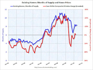 Click on graph for larger image in new window.
This graph shows months of supply from NAR, and the annualized change in the Case-Shiller Composite 20 house price index (inverted).
Below 6 months of supply (blue line) house prices are typically rising (red line, inverted).
Above 6 months of supply house prices are usually falling (although there were many programs to support house prices over the last year).
Since the months-of-supply will probably be close to 10 months this summer, house prices will probably be falling again. I don't expect dramatic price declines later this year because prices are much closer to normal now, based on price-to-rent and price-to-income measures, than in 2007 and 2008. But I do expect falling house prices.
However it will take some time for this to show up in the house price indexes. The Case-Shiller index is a three month average and is released with a two month lag (the release this week was for a three month average ending in April).
The first Case-Shiller release with July prices will be released at the end of September - and that will include the months of May, June and July! And prices will be up in May and June.
The Corelogic data for July will also be released in September. There are other repeat sales measures (like from Radar Logic and Clear Capital), but in general it will be a long wait before reported house prices are falling.
Tuesday, June 29, 2010
Case-Shiller: House Prices increased in April due to tax credit
by Calculated Risk on 6/29/2010 09:00:00 AM
IMPORTANT: These graphs are Seasonally Adjusted (SA). S&P has cautioned that the seasonal adjustment is probably being distorted by irregular factors. These distortions could include distressed sales and the various government programs.
S&P/Case-Shiller released the monthly Home Price Indices for April (actually a 3 month average).
This includes prices for 20 individual cities, and two composite indices (10 cities and 20 cities).
From S&P: While Most Markets Improved in April 2010, Home Prices Do Not Yet Show Signs of Sustained Recovery According to the S&P/Case-Shiller Home Price Indices
Data through April 2010, released today by Standard & Poor’s for its S&P/Case-Shiller1 Home Price Indices, the leading measure of U.S. home prices, show that annual growth rates of all 20 MSAs and the 10- and 20-City Composites improved in April compared to March 2010. The 10-City Composite is up 4.6% from where it was in April 2009, and the 20-City Composite is up 3.8% versus the same time last year. In addition, 18 of the 20 MSAs and both Composites saw improvement in prices as measured by April versus March monthly changes.
“Home price levels remain close to the April 2009 lows set by the S&P/Case Shiller 10- and 20-City Composite series. The April 2010 data for all 20 MSAs and the two Composites do show some improvement with higher annual increases than in March’s report. However, many of the gains are modest and somewhat concentrated in California. Moreover, nine of the 20 cities reached new lows at some time since the beginning of this year. The month-over-month figures were driven by the end of the Federal first-time home buyer tax credit program on April 30th. Eighteen cities saw month-to-month gains in April compared to six in the previous month. Miami and New York were the two that fared the worst in April compared to March. New York is the only MSA to have posted a new relative index low with April’s report.” says David M. Blitzer, Chairman of the Index Committee at Standard & Poor’s.
“Other housing data confirm the large impact, and likely near-future pullback, of the federal program. Recently released data for May 2010 show sharp declines in existing and new home sales and housing starts. Inventory data and foreclosure activity have not shown any signs of improvement. Consistent and sustained boosts to economic growth from housing may have to wait to next year. ”
 Click on graph for larger image in new window.
 The first graph shows the nominal not seasonally adjusted Composite 10 and Composite 20 indices (the Composite 20 was started in January 2000).
The Composite 10 index is off 29.7% from the peak, and up 0.3% in April (SA).
The Composite 20 index is off 29.0% from the peak, and up 0.4% in April (SA).
 The second graph shows the Year over year change in both indices.
The Composite 10 is up 4.6% compared to April 2009.
The Composite 20 is up 3.8% compared to April 2009.
This is the third month with YoY price increases in a row.
The third graph shows the price declines from the peak for each city included in S&P/Case-Shiller indices.
 Prices increased (SA) in 17 of the 20 Case-Shiller cities in April (SA).
 Prices in Las Vegas are off 55.9% from the peak, and prices in Dallas only off 5.2% from the peak.
Case Shiller is reporting on the NSA data (18 cities up), and I'm using the SA data. As S&P noted, there probably was a small boost to prices from tax credit related buying, but prices will probably fall later this year.
Tuesday, June 22, 2010
How high will Existing Home Months-of-Supply increase this summer?
by Calculated Risk on 6/22/2010 07:28:00 PM
Earlier I posted a graph showing the relationship of existing home months-of-supply to house prices. When months-of-supply is below 6 months, house prices are typically rising - and above 6 months-of-supply, house prices are usually falling (this isn't perfect, but it is a general guide).
So how high will months-of-supply rise this summer?
Here are some estimates of sales via James Haggerty at the WSJ: Outlook for Home Prices Grows Darker
Since April 30, new purchase contracts have plunged ... Lawrence Yun, chief economist for the Realtors, estimated that contracts signed in May were 10% to 15% below the weak level of a year earlier.Contracts signed in May and June lead to sales later in the summer (counted when escrow closes).
Ronald Peltier, chief executive officer of HomeServices of America Inc., which owns real estate brokers in 21 states, said new home-purchase contracts in May and June so far are down about 20% from a year earlier.
Sales in July 2009 were at a 5.14 million rate (SAAR). Usually inventory increases in July, but if we assume inventory is steady at 3.892 million, the following table shows the month-of-supply estimates based on three year-over-year declines sales in July 2009:
| Sales Decline from 2009 | July Sales Rate (millions) | Months-of-Supply |
|---|---|---|
| Off 10% | 4.63 | 10.1 |
| Off 15% | 4.37 | 10.7 |
| Off 20% | 4.11 | 11.4 |
The peak for months-of-supply was 11.2 months in 2008. And house prices? The Case-Shiller composite 20 index fell 17.2% in 2008.
We are much closer to the price bottom now than in 2008, and I don't expect that severe of a price decline. But I do expect house prices to fall in the 2nd half of 2010 and into 2011 - probably another 5% to 10% for the major house price indexes (Case-Shiller and CoreLogic).
Of course inventory could decline or sales increase a little ... and maybe months-of-supply will only be close to double digits.
Existing Homes: Months of Supply and House Prices
by Calculated Risk on 6/22/2010 02:34:00 PM
Earlier I mentioned that a normal housing market usually has under 6 months of supply. The current 8.3 months of supply is significantly above normal, and is especially concerning because the reported inventory is already historically very high.
After the tax credit related activity ends, the months of supply will probably increase, and the ratio could be close to double digits later this year. That level of supply will put additional downward pressure on house prices. Click on graph for larger image in new window.
This graph show months of supply and the annualized change in the Case-Shiller Composite 20 house price index (inverted).
Below 6 months of supply (blue line) house prices are typically rising (red line, inverted).
Above 6 months of supply house prices are usually falling (although there were many programs to support house prices over the last year).
Later this year the months of supply will probably increase, and I expect house prices to fall further as measured by the Case-Shiller and CoreLogic repeat sales house price indexes.
Monday, June 21, 2010
Obama Housing Metrics
by Calculated Risk on 6/21/2010 03:48:00 PM
The Obama administration has introduced a "monthly housing scorecard". Here is the website: www.hud.gov/scorecard
Some excerpts and a couple of graphs:
• Home price performance has improved. After 30 straight months of decline and an expectation of continued significant deterioration, home prices have leveled off in the past year and expectations have adjusted upward. Homeowners have benefitted from the stabilization, as owner equity has increased by over $1 trillion since the first quarter of 2009
 Click on graph for larger image in new window.
This graph from the Obama Administration "scorecard" shows the actual house prices, and future house prices. The light blue line was the projected house prices based on futures in January 2009 - before the Obama administration started supporting house prices with various programs to limit supply and boost demand.
Note: I don't know why they use washed out colors on the graphs.
I believe the overall goal of supporting house prices was a mistake. It wasn't horrible - because prices were much closer to the bottom than the top - but by keeping prices too high, the market hasn't cleared and there is still a huge overhang of existing home inventory.
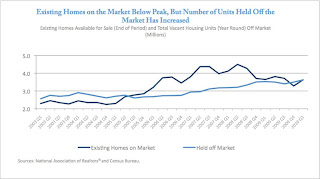 The second graph from the housing scorecard shows the Obama administration's estimate of the housing overhang.
 I'm not confident in the "held off market" category, but that is probably their method of estimating the shadow inventory (not all "held off market" is shadow, but some probably is). The existing home inventory - and shadow inventory - are still very high.
More from the report:
• More than 2.5 million first time homebuyers have purchased a home using the First-Time Homebuyer Tax credit, helping to stabilize home sales and prices and increase affordability.This is really sad news. This program was a disaster - most of these buyers would have bought anyway, and the others was just pulling forward future demand at a higher price. Now that the program is almost over (hopefully), demand and prices will probably fall again.
• Martgages are now more affordable. Due to historically low interest rates, more than 6 million homeowners have refinanced, saving an estimated $150 per month on overage and more than $11 billion in total.Note: the Obama administration needs a better spellchecker (what is a "martgage"?. And I think it is "benefited" with one "t")
• Servicers report that the number of homeowners receiving restructured mortgages since April 2009 has increased to 2.8 million. This includes more than 1.2 million homeowners who have started HAMP trial modifications and nearly 400,000 who have benefitted from FHA loss mitigation activities. Of those in the HAMP program, 346,000 have entered a permanent modification saving a median of more than $500 per month. In addition, HUD approved mortgage counselors have assisted 3.6 million families.
• Based on newly available survey data, nearly half of homeowners unable to enter a HAMP permanent modification enter an alternative modification with their servicer, and fewer than 10 percent of cancelled trials move to foreclosure sale.
This raises more questions: fewer than 10% of cancelled trials have moved to a foreclosure sale? What about short sales? Does that mean that the homeowners are curing the delinquency (getting caught up), or does that mean there are many more distressed sales to come?
There are many more graphs (and a list of sources) in the report and this report might not have much good news in the coming months ...
Friday, June 18, 2010
CoreLogic: House Prices increase 0.8% in April
by Calculated Risk on 6/18/2010 07:20:00 PM
From CoreLogic (formerly First American LoanPerformance): CoreLogic® Home Price Index Shows Year-Over-Year and Month-Over-Month Increase
National home prices increased in April, the second consecutive monthly increase. According to the CoreLogic HPI, national home prices, including distressed sales, increased by 2.6 percent in April 2010 compared to April 2009. This was an improvement over March’s yearover-year price increase of 2.3 percent. Excluding distressed sales, year-over-year prices increased in April by 2.2 percent; an improvement over the March non-distressed HPI which increased by 1.0 percent year-over-year.
On a month-over-month basis, the national average home price index increased by 0.8 percent in April 2010 compared to March 2010, which was stronger than the previous one-month increase of 0.1 percent from February to March.
...
“The monthly increase in the HPI shows the lingering effects of the homebuyer tax credit,” said Mark Fleming, chief economist for CoreLogic. “We expect that we will see home prices remain strong through early summer, but in the second half of the year we expect price growth to soften and possibly decline moderately.”
 Click on graph for larger image in new window.
 This graph shows the national LoanPerformance data since 1976. January 2000 = 100.
The index is up 2.6% over the last year, and off 29.5% from the peak.
House prices are off 3.5% from the recent peak in August 2009 (although some of the decline might be seasonal). The index bottomed in March 2009 ... and the index is up 3.1% since then.
CoreLogic expects prices to "soften and possibly decline moderately". I expect that we will see lower prices on this index later this year.
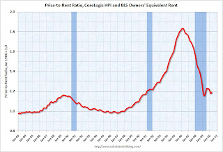 The second graph is an update on the price-to-rent ratio similar to the approach used by Fed economist John Krainer and researcher Chishen Wei in 2004: House Prices and Fundamental Value. Kainer and Wei presented a price-to-rent ratio using the OFHEO house price index and the Owners' Equivalent Rent (OER) from the BLS.
This graph shows the price to rent ratio using the CoreLogic data (January 2000 = 1.0).
This suggests that house prices are much closer to the bottom than the top, but that prices still have a ways to fall on a national basis.
Wednesday, May 26, 2010
New Home Prices: Median Lowest since 2003
by Calculated Risk on 5/26/2010 12:40:00 PM
As part of the new home sales report, the Census Bureau reported that the median price for new homes fell to the lowest level since 2003. Click on graph for larger image in new window.
This graph shows the median and average new home price. It appears the builders sold at a lower price point in April, and that helped boost sales.
This makes sense since many of the buyers were trying to take advantage of the housing tax credit (and probably using FHA insurance). Since the modification programs and the delays in foreclosure limited the number of distressed sales - many buyers at the low end found buying a new home easier than buying an existing home. The second graph shows the percent of new home sales by price.
Half of all home sales were under $200K in April - tying Jan 2009 as the highest level since 2003 (there was panic selling in Jan 2009).
And excluding Jan 2009, this is the highest percentage under $300K since May 2003 - and the highest under 400K since April 2003.
To summarize: the homebuilders sold 16,000 more units in April 2010 than in April 2009 - probably because of the tax credit, and at lower prices - and now sales will decline sharply in May probably close to the 34,000 units sold in May 2009.
Tuesday, May 25, 2010
Real Case-Shiller National House Prices
by Calculated Risk on 5/25/2010 11:40:00 AM
S&P/Case-Shiller also released the Q1 2010 National Index this morning.
By request, here is a graph that shows the national index in both nominal and real terms (adjusted with CPI less shelter). Click on graph for larger image in new window.
In nominal terms (blue), the National Index declined 1.3% in Q1, and is 2.1% off the recent bottom in Q1 2009.
Note: Case-Shiller reported the national index declined 3.2% in Q1 (Not Seasonally Adjusted, NSA) - however I'm using the SA data.
In real terms (red), the National Index declined 1.9% in Q1, and is now at the lowest level since Q4 2000.
Case-Shiller House Prices "Weakening"
by Calculated Risk on 5/25/2010 09:00:00 AM
IMPORTANT: These graphs are Seasonally Adjusted (SA). S&P has cautioned that the seasonal adjustment is probably being distorted by irregular factors. These distortions could include distressed sales and the various government programs.
S&P/Case-Shiller released the monthly Home Price Indices for March (actually a 3 month average), and the Q1 2010 National Index.
The monthly data includes prices for 20 individual cities, and two composite indices (10 cities and 20 cities).
From S&P: The First Quarter of 2010 Indicates Some Weakening in Home Prices
Data through March 2009, released today by Standard & Poor’s for its S&P/Case-Shiller Home Price Indices ... show that the U.S. National Home Price Index fell 3.2% in the first quarter of 2010, but remains above its year-earlier level. In March, 13 of the 20 MSAs covered by S&P/Case-Shiller Home Price Indices and both monthly composites were down although the two composites and 10 MSAs showed year-over-year gains.
Housing prices rebounded from crisis lows, but recently have seen renewed weakness as tax incentives are ending and foreclosures are climbing.
 Click on graph for larger image in new window.
 The first graph shows the nominal not seasonally adjusted Composite 10 and Composite 20 indices (the Composite 20 was started in January 2000).
The Composite 10 index is off 29.8% from the peak, and up slightly in March (SA).
The Composite 20 index is off 29.3% from the peak, and down slightly in March (SA).
 The second graph shows the Year over year change in both indices.
The Composite 10 is up 3.2% compared to March 2009.
The Composite 20 is up 2.4% compared to March 2009.
This is the second month with YoY price increases in a row.
The third graph shows the price declines from the peak for each city included in S&P/Case-Shiller indices.
 Prices decreased (SA) in 11 of the 20 Case-Shiller cities in March (SA).
 Prices in Las Vegas are off 56% from the peak, and prices in Dallas only off 5.8% from the peak.
Case Shiller is reporting on the NSA data (13 cities down), and I'm using the SA data. I'm not sure why Case-Shiller is saying prices are weakening because the tax incentive is ending. This is Q1 and March 2010 data - and the tax incentive pulled forward demand and probably supported prices. Just wait until later this year ...
Wednesday, May 19, 2010
First American CoreLogic: House Prices Decline 0.3% in March
by Calculated Risk on 5/19/2010 12:31:00 PM
From LoanPerformance: CoreLogic Home Price Index Shows Second Consecutive Annual Increase
National home prices, including distressed sales, increased by 1.7 percent in March 2010 compared to March 2009, according to CoreLogic and its Home Price Index (HPI). This was an improvement over February’s year-over-year price increase of 0.8 percent.* Excluding distressed sales, year-over-year prices increased in March by 1.9 percent; an improvement over the February non-distressed HPI which fell by 0.2 percent year-over-year.
On a month-over-month basis, the national average home price index fell by 0.3 percent in March 2010 compared to February 2010, which was more moderate than the previous one month decline of 1.7 percent from January to February.
...
“March’s year-over-year increase in the HPI shows that the housing market is continuing to exhibit signs of stability,” said Mark Fleming, chief economist for CoreLogic. “The differences between trends, including and excluding distressed sales, indicate the strong influence of distressed activity remains, but the surge in home sales in March is giving the market a boost this spring. As the influence of the tail end of the tax credit and spring buying season fade, price growth will fade with it as we go into summer.”
 Click on graph for larger image in new window.
 This graph shows the national LoanPerformance data since 1976. January 2000 = 100.
The index is up 1.7% over the last year, and off 30.5% from the peak.
House prices are off 4.8% from the recent peak in August 2009 (although some of the decline is seasonal). The index bottomed last March ... so the index is also up 1.7% from the recent low.
With all the distressed sales and government programs, it is hard to separate the seasonal factors from other distortions. However I expect that we will see lower prices on this index later this year.
Note: This is the house price index the Fed now uses for the Flow of Funds report.
Sunday, May 02, 2010
Update to Fed Rent-to-House Price Graph
by Calculated Risk on 5/02/2010 06:00:00 PM
Last night I posted some excerpts from the just released 2004 FOMC transcripts showing there was some concern about a housing bubble in June 2004. A key graph, presented by Fed associate research director Stephen Oliner, showed the rent-to-price ratio through Q1 2004. Oliner used the OFHEO (now FHFA) house price index. Usually the invert is presented (price-to-rent).
Here is an update to that graph through Q4 2009. Click on graph for larger image in new window.
The arrow shows the rent-to-price ratio when Oliner warned that "even after you account for the fundamentals, there’s a part of the increase [in house prices] that is hard to explain".
Clearly the ratio was even more out of line with fundamentals in 2005.
But the OFHEO (now FHFA) price index is GSE mortgages only, and by far the worst loans were part of the Wall Street originate-to-distribute machine. Using the OFHEO house prices missed the worst loans. However the Case-Shiller index included these non-GSE transactions, so I added the blue line showing the rent-to-price ratio using the quarterly Case-Shiller National House Price index.
If the Fed had been paying attention to all house prices, the graph presented at the 2004 meeting would have been even more alarming. It was scary enough ...


