by Calculated Risk on 11/05/2012 10:00:00 AM
Monday, November 05, 2012
ISM Non-Manufacturing Index decreases in October
The October ISM Non-manufacturing index was at 54.2%, down from 55.1% in September. The employment index increased in October to 54.9%, up from 51.1% in September. Note: Above 50 indicates expansion, below 50 contraction.
From the Institute for Supply Management: October 2012 Non-Manufacturing ISM Report On Business®
Economic activity in the non-manufacturing sector grew in October for the 34th consecutive month, say the nation's purchasing and supply executives in the latest Non-Manufacturing ISM Report On Business®.
The report was issued today by Anthony Nieves, C.P.M., CFPM, chair of the Institute for Supply Management™ Non-Manufacturing Business Survey Committee. "The NMI™ registered 54.2 percent in October, 0.9 percentage point lower than the 55.1 percent registered in September. This indicates continued growth this month at a slightly slower rate in the non-manufacturing sector. The Non-Manufacturing Business Activity Index registered 55.4 percent, which is 4.5 percentage points lower than the 59.9 percent reported in September, reflecting growth for the 39th consecutive month. The New Orders Index decreased by 2.9 percentage points to 54.8 percent. The Employment Index increased by 3.8 percentage points to 54.9 percent, indicating growth in employment for the third consecutive month. The Prices Index decreased 2.5 percentage points to 65.6 percent, indicating prices increased at a slower rate in October when compared to September. According to the NMI™, 13 non-manufacturing industries reported growth in October. The majority of the respondents' comments reflect a positive but guarded outlook on business conditions and the economy."
 Click on graph for larger image.
This graph shows the ISM non-manufacturing index (started in January 2008) and the ISM non-manufacturing employment diffusion index.
This was below the consensus forecast of 54.9% and indicates slower expansion in October than in September. The internals were mixed with the employment index up, but new orders down.
Gasoline Prices down 30 cents over last month
by Calculated Risk on 11/05/2012 08:29:00 AM
From the SacBee: Gas prices decline sharply in October, trend may continue through end of the year
"Gas prices at the end of October were dropping at the fastest speeds in nearly four years," said Beth Mosher, director of public affairs for AAA Chicago. "If this trend continues, motorists could be paying less than last year to fill up their cars."Gasoline prices in California have fallen sharply following the recent spike due to refinery issues, and most areas are now under $4 per gallon.
Assuming a smooth restart to production following Hurricane Sandy, AAA predicts that gas prices will continue to drop through the end of the year. ... The Northeast is a significant gasoline consumer and not a major producer, so it is expected that the decline in demand from people not driving will outweigh any disruption in gasoline production.
Brent crude is now down to $105.33 per barrel. Using the calculator from Professor Hamilton, and the current price of Brent crude oil, the national average should be around $3.47 per gallon. That is about 3 cents below the current level according to Gasbuddy.com.
Notes: Add a California city to the graph - like Los Angeles or San Francisco - and you will see the recent sharp increase and decrease. If you click on "show crude oil prices", the graph displays oil prices for WTI, not Brent; gasoline prices in most of the U.S. are impacted more by Brent prices.
| Orange County Historical Gas Price Charts Provided by GasBuddy.com |
Sunday, November 04, 2012
Monday: ISM Service Index
by Calculated Risk on 11/04/2012 08:40:00 PM
A couple of earlier posts that might interest some readers:
• Retail: Seasonal Hiring vs. Retail Sales
• Update: Further Discussion on Labor Force Participation Rate
A few scary articles on Europe:
• From the WSJ: Europe's Bank Reviews Collateral
The European Central Bank is looking into whether it is treating Spanish government Treasury bills too generously when commercial banks present them as collateral for loans, potentially reviving concerns over the safety of the central bank's €3 trillion ($3.85 trillion) balance sheet.• From the WSJ: Greece's Siren Call
An ECB spokeswoman confirmed the collateral examination Sunday after Germany's Welt am Sonntag newspaper reported, based on its own research, that the ECB hasn't followed its own rules when banks presented some Spanish government securities.
Voting in the Greek parliament on the passage of €13.5 billion ($17.33 billion) of austerity measures, labor reforms and the 2013 budget will also be a focus for financial markets. ... The immediate risk is that Greece fails to approve the new austerity measures. ... The next vote is needed to unlock €31.5 billion of bailout funding, much of which will go to recapitalize Greece's banks. Again, PASOK's behavior will be key.• From the Telegraph: Angela Merkel: eurozone crisis will last at least another five years
If Greece jumps that hurdle, it still needs an extension of two years from the rest of Europe on its budget targets, as its economy has suffered far more than forecast.
“We need a long breath of five years and more,” [Merkel] told a conference in Sternberg, GermanyFive more years?
Monday:
• At 10:00 AM ET, the ISM non-Manufacturing Index for October will be released. The consensus is for a decrease to 54.9 from 55.1 in September. Note: Above 50 indicates expansion, below 50 contraction.
• Also at 10:00 AM, the Trulia Price Rent Monitors for October will be released. This is the new index from Trulia that uses asking prices adjusted both for the mix of homes listed for sale and for seasonal factors and seems like a decent leading indicator for house prices.
The Asian markets are mostly red tonight, with the Nikkei down 0.3%.
From CNBC: Pre-Market Data and Bloomberg futures: the S&P futures are down 2 and DOW futures are down 8.
Oil prices are falling with WTI futures at $84.78 per barrel and Brent down to $105.44 per barrel. This is the lowest level since July. And gasoline prices are falling too!
Weekend:
• Summary for Week Ending Nov 2nd
• Schedule for Week of Nov 4th
Two more questions this week for the November economic prediction contest and four question for the November contest (Note: You can now use Facebook, Twitter, or OpenID to log in).
Update: Further Discussion on Labor Force Participation Rate
by Calculated Risk on 11/04/2012 02:31:00 PM
Last month I wrote Understanding the Decline in the Participation Rate. As a follow on, I wrote: Further Discussion on Labor Force Participation Rate. Here is a repeat with some added data, graphs and commentary.
Definitions from the BLS:
Civilian noninstitutional population: "consists of persons 16 years of age and older residing in the 50 States and the District of Columbia who are not inmates of institutions (for example, penal and mental facilities and homes for the aged) and who are not on active duty in the Armed Forces". If you look at the first graph below, the total of the Blue, Red, and light brown areas is the Civilian noninstitutional population.
"The civilian labor force consists of all persons classified as employed or unemployed". This is Blue and Red combined on the first graph.
"The labor force participation rate represents the proportion of the civilian noninstitutional population that is in the labor force." So this is Blue and Red, divided by all areas combined.
"The employment-population ratio represents the proportion of the civilian noninstitutional population that is employed." This is Blue divided by the total area.
"The unemployment rate is the number of unemployed as a percent of the civilian labor force." This is Red divided by Red and Blue combined. This is the REAL unemployment rate (some claim U-6 is the "real rate", but that is nonsense - although U-6 is an alternative measure of underemployment, it includes many people working part time).
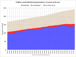 Click on graph for larger image.
There are some bumps in the total area - usually when there is a decennial census. These are due to changes in population controls.
Note that the Blue area collapsed in 2008 and early 2009, and started increasing in 2010. This shows the increase in employment over the last few years. Over the last few years, the red area (unemployment) has been decreasing.
However the combined area, the civilian labor force, has not increased much - even though the civilian noninstitutional population has been increasing. Some people argue that this evidence of a large number of people who left the labor force because of the weak labor market - and that the actual unemployment rate should be much higher than 7.9%.
However, as I noted last month, some decrease in the labor force participation rate was expected, and it appears most of the decline in the participation rate can be explained by demographic shifts.
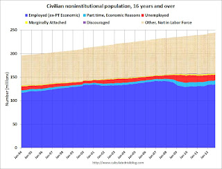 The second graph is similar to the first graph, but breaks the data down by a few more categories. Some of this data is only available since January 1994.
The light blue area is part time for economic reasons. "These individuals were working part time because their hours had been cut back or because they were unable to find a full-time job." Some of the dark blue workers are working part time too, but that is by choice. The dark blue and light blue add to dark blue in the previous graph.
The yellow area is marginally attached workers. "These individuals were not in the labor force, wanted and were available for work, and had looked for a job sometime in the prior 12 months. They were not counted as unemployed because they had not searched for work in the 4 weeks preceding the survey."
The purple area is discouraged workers. "Discouraged workers are persons not currently looking for work because they believe no jobs are available for them."
Part time for economic reasons, marginally attached workers, and discouraged workers are all included in U-6, an alternate measure of labor underutilization.
 The third graph shows the number of people in the US by age group from both the 2000 and 2010 decennial Census, and a recent Census Bureau projection for 2020.
This graph shows two key shifts. First, baby boomers are now moving into lower participation rate age groups. Look at the increase in the 55-to-59 and 60-to-64 groups from 2000 (blue) to 2010 (red).
A second key demographic is the significant increase in people in the 15-to-19 and 20-to-24 age groups. These groups have lower participation rates usually because of school enrollment - and enrollment has been increasing.
Taken together, it is clear why the labor force hasn't increase as quickly as the civilian noninstitutional population, and therefore, why a decline in the labor force participation rate was expected.
Also - in 2010, the group with the highest population was in the '45 to 49 age group, followed by the '50 to 54 age group. By 2020, the seven groups with the highest projected population will all be under 35! Sure, some geezers will hang around, and that will push down the overall participation rate - but there is a new engine of growth coming.
Retail: Seasonal Hiring vs. Retail Sales
by Calculated Risk on 11/04/2012 08:32:00 AM
On Friday I noted that retailers hired seasonal workers at slightly above the 2011 pace in October. At the bottom of this post is a graph showing the correlation between seasonal hiring and retail sales.
First, here is the NRF forecast for this year: NRF, Shop.org Expect Solid Growth This Holiday Season
Tempered by political and fiscal uncertainties but supported by signs of improvement in consumer confidence, holiday sales this year will increase 4.1 percent to $586.1 billion. NRF’s 2012 holiday forecast is higher than the 10-year average holiday sales increase of 3.5 percent. Actual holiday sales in 2011 grew 5.6 percent.Note: NRF defines retail sales as including discounters, department stores, grocery stores, and specialty stores, and exclude sales at automotive dealers, gas stations, and restaurants.
“This is the most optimistic forecast NRF has released since the recession. In spite of the uncertainties that exist in our economy and among consumers, we believe we’ll see solid holiday sales growth this year,” said NRF President and CEO Matthew Shay. “Variables including an upcoming presidential election, confusion surrounding the ‘fiscal cliff’ and concern relating to future economic growth could all combine to affect consumers’ spending plans, but overall we are optimistic that retailers promotions will hit the right chord with holiday shoppers.”
Last year the NRF forecast sales to increase 2.8%. At the beginning of November 2011, I posted that that forecast seemed way too low based on seasonal hiring (the NRF related their forecast at the beginning of October). In fact retail sales increased 5.6% last year in November and December.
This is an old idea: Watch what they do, not what they say. And once again the retailers are hiring seasonal workers at a solid pace. Here is a repeat of the graph of retail hiring based on the BLS employment report:
 Click on graph for larger image.
This graph shows the historical net retail jobs added for October, November and December by year.
Retailers hired 130.1 thousand workers (NSA) net in October. This is slightly below the numbers in 2003 through 2006 and about the same as in 2011. Note: this is NSA (Not Seasonally Adjusted).
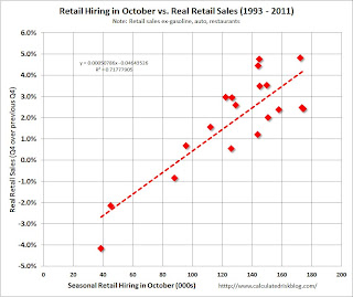 The scatter graph is for the years 1993 through 2011 and compares October retail hiring with the real increase (inflation adjusted) for retail sales (Q4 over previous Q4).
In general October hiring is a pretty good indicator of seasonal sales. R-square is 0.72 for this small sample. Note: This uses retail sales in Q4, and excludes autos, gasoline and restaurants.
With 130 thousand seasonal hires, this suggests a real gain of around 2.0% in Q4 (plus inflation), very close to the NRF forecast of 4.1% nominal (that includes inflation).
Saturday, November 03, 2012
Unofficial Problem Bank list declines to 861 Institutions
by Calculated Risk on 11/03/2012 08:17:00 PM
This is an unofficial list of Problem Banks compiled only from public sources.
Here is the unofficial problem bank list for Nov 2, 2012. (table is sortable by assets, state, etc.)
Changes and comments from surferdude808:
Failures and unassisted mergers led to several changes to the Unofficial Problem Bank List this week. In all, there were four removals and one addition, which leave the list at 861 institutions with assets of $328.4 billion. A year ago, the list held 983 institutions with assets of $406.3 billion.Earlier:
The failures were Citizens First National Bank, Princeton, IL ($958 million Ticker: PNBC); and Heritage Bank of Florida, Lutz, FL ($234 million). Beacon Federal, East Syracuse, NY ($998 million Ticker: BFED); and 1st Commonwealth Bank of Virginia, Arlington, VA ($57 million) found merger partners.
The addition this week was The Patapsco Bank, Baltimore, MD ($254 million Ticker: PATD). Next week, most changes will likely result from failure or unassisted mergers.
• Summary for Week Ending Nov 2nd
• Schedule for Week of Nov 4th
Yesterday on employment report:
• October Employment Report: 171,000 Jobs, 7.9% Unemployment Rate
• Employment: An encouraging report (also more graphs)
• Solid Seasonal Retail Hiring, Graphs for Duration of Unemployment, Unemployment by Education and Diffusion Indexes
• Employment graph gallery
Summary for Week Ending Nov 2nd
by Calculated Risk on 11/03/2012 12:22:00 PM
Best wishes to everyone in the Northeast. I hope you are recovering from Hurricane Sandy.
This was a busy week, and the fifth week in a row with somewhat better than expected data. The big story was the encouraging October employment report (see first section below).
As usual housing was a bright spot: residential construction spending increased, and house prices were up 2.0% year-over-year in August (as reported by Case-Shiller). On the other hand, manufacturing was weak, although the ISM manufacturing survey was slightly better than most forecasts.
Auto sales were down, apparently because of lost sales at the end of the month in the northeast due to Hurricane Sandy. The hurricane would negatively impact several reports over the next couple of months, but the economy should bounce back quickly.
Overall this suggests some pickup in economic activity.
Here is a summary of last week in graphs:
• October Employment Report: 171,000 Jobs, 7.9% Unemployment Rate
 Click on graph for larger image.
With 171,000 payroll jobs added, and the upward revisions to the August and September reports, this was a solid report. And that doesn't include the annual benchmark revision to be released early next year that will also show more jobs.
This was above expectations of 125,000 payroll jobs added.
The second graph shows the unemployment rate. The unemployment rate increased slightly to 7.9%.
 The unemployment rate is from the household report, and that report showed another month of strong job growth. The unemployment rate increased because of the significant increase in the labor force (and the increase in the labor force participation rate).
The third graph shows the job losses from the start of the employment recession, in percentage terms, compared to previous post WWII recessions. The dotted line is ex-Census hiring.
 This shows the depth of the recent employment recession - worse than any other post-war recession - and the relatively slow recovery due to the lingering effects of the housing bust and financial crisis.
The economy has only added 1.55 million private sector payroll jobs over the first nine months of the year. At this pace, the economy would only add 1.9 million private sector jobs in 2012; less than the 2.1 million added in 2011.
Overall this employment report was an improvement over recent reports, especially with the upward revisions.
Here are the earlier employment posts (with graphs):
October Employment Report: 171,000 Jobs, 7.9% Unemployment Rate
Employment: An encouraging report (also more graphs)
Solid Seasonal Retail Hiring, Graphs for Duration of Unemployment, Unemployment by Education and Diffusion Indexes
• ISM Manufacturing index increased slightly in October to 51.7
 The ISM manufacturing index indicated expansion in October. PMI was at 51.7% in October, up from 51.5% in September. The employment index was at 52.1%, down from 54.7%, and the new orders index was at 54.2%, up from 52.3%.
Here is a long term graph of the ISM manufacturing index.
This was slightly above expectations of 51.0% and suggests manufacturing expanded in October.
• U.S. Light Vehicle Sales at 14.3 million annual rate in October
 Based on an estimate from Autodata Corp, light vehicle sales were at a 14.29 million SAAR in October. That is up 8% from October 2011, and down 4% from the sales rate last month.
This was below the consensus forecast of 14.9 million SAAR (seasonally adjusted annual rate), however sales were impacted by Hurricane Sandy at the end of October, and sales will probably bounce back quickly.
Note: dashed line is current estimated sales rate.
This shows the huge collapse in sales in the 2007 recession.
Most (or all) of the month-to-month decline was related to Hurricane Sandy.
• Construction Spending increased in September
 This graph shows private residential and nonresidential construction spending, and public spending, since 1993. Note: nominal dollars, not inflation adjusted.
Private residential spending is 58% below the peak in early 2006, and up 29% from the post-bubble low. Non-residential spending is 29% below the peak in January 2008, and up about 29% from the recent low.
Public construction spending is now 17% below the peak in March 2009 and at the post-bubble low.
The second graph shows the year-over-year change in construction spending.
 On a year-over-year basis, private residential construction spending is now up 21%. Non-residential spending is also up 9% year-over-year mostly due to energy spending (power and electric). Public spending is down 4% year-over-year.
Three key construction spending themes:
• Private residential construction spending is still very low, but increasing. Residential construction declined sharply for four years following the peak of the housing bubble, and then move mostly sideways for another three years.
• Private non-residential construction spending picked up last year mostly due to energy spending (power and electric), but spending on office buildings, hotels and malls is still very low.
• Public construction spending is down 4% year-over-year and has been declining for several years.
• Case-Shiller: House Prices increased 2.0% year-over-year in August
 S&P/Case-Shiller released the monthly Home Price Indices for July (a 3 month average of June, July and August).
The first graph shows the nominal seasonally adjusted Composite 10 and Composite 20 indices (the Composite 20 was started in January 2000).
The Composite 10 index is off 31.5% from the peak, and up 0.4% in August (SA). The Composite 10 is up 4.0% from the post bubble low set in March (SA).
The Composite 20 index is off 30.92% from the peak, and up 0.5% (SA) in August. The Composite 20 is up 4.4% from the post-bubble low set in March (SA).
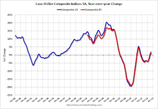 The second graph shows the Year over year change in both indices.
The Composite 10 SA is up 1.3% compared to August 2011.
The Composite 20 SA is up 2.0% compared to August 2011. This was the third consecutive month with a year-over-year gain since 2010 (when the tax credit boosted prices temporarily).
The third graph shows the price declines from the peak for each city included in S&P/Case-Shiller indices.
 Prices increased (SA) in 19 of the 20 Case-Shiller cities in August seasonally adjusted (also 19 of 20 cities increased NSA). Prices in Las Vegas are off 59.5% from the peak, and prices in Dallas only off 5.8% from the peak. Note that the red column (cumulative decline through August 2012) is above previous declines for all cities.
This was about at the consensus forecast and the recent change to a year-over-year increase is a significant story.
• Real House Prices, Price-to-Rent Ratio
 Case-Shiller, CoreLogic and others report nominal house prices, and it is also useful to look at house prices in real terms (adjusted for inflation) and as a price-to-rent ratio. Real prices, and the price-to-rent ratio, are back to late 1999 to 2000 levels depending on the index.
The first graph shows the quarterly Case-Shiller National Index SA (through Q2 2012), and the monthly Case-Shiller Composite 20 SA and CoreLogic House Price Indexes (through August) in nominal terms as reported.
In nominal terms, the Case-Shiller National index (SA) is back to Q1 2003 levels (and also back up to Q4 2010), and the Case-Shiller Composite 20 Index (SA) is back to August 2003 levels, and the CoreLogic index (NSA) is back to December 2003.
 The second graph shows the same three indexes in real terms (adjusted for inflation using CPI less Shelter). Note: some people use other inflation measures to adjust for real prices.
In real terms, the National index is back to mid-1999 levels, the Composite 20 index is back to June 2000, and the CoreLogic index back to February 2001.
In real terms, most of the appreciation early in the last decade is gone.
In October 2004, Fed economist John Krainer and researcher Chishen Wei wrote a Fed letter on price to rent ratios: House Prices and Fundamental Value. Kainer and Wei presented a price-to-rent ratio using the OFHEO house price index and the Owners' Equivalent Rent (OER) from the BLS.
 Here is a similar graph using the Case-Shiller National, Composite 20 and CoreLogic House Price Indexes.
This graph shows the price to rent ratio (January 1998 = 1.0).
On a price-to-rent basis, the Case-Shiller National index is back to Q3 1999 levels, the Composite 20 index is back to June 2000 levels, and the CoreLogic index is back to February 2001.
In real terms - and as a price-to-rent ratio - prices are mostly back to 1999 or early 2000 levels.
• NMHC Apartment Survey: Market Conditions Tighten, Growth Rate Moderates
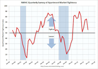 From the National Multi Housing Council (NMHC): Apartment Market Expansion Continues as Growth Rate Moderates
This graph shows the quarterly Apartment Tightness Index. Any reading above 50 indicates tightening from the previous quarter. The index has indicated tighter market conditions for the last eleven quarters and suggests falling vacancy rates and or rising rents.
This fits with the recent Reis data showing apartment vacancy rates fell in Q3 2012 to 4.6%, down from 4.7% in Q2 2012, and down from 8.0% at the end of 2009. This was the lowest vacancy rate in the Reis survey in over 10 years.
Even though multifamily starts have been increasing, completions lag starts by about a year - so the builders are still trying to catch up. There will be many more completions in 2012 than in 2011, increasing the supply.
As I've mentioned before, this index helped me call the bottom for effective rents (and the top for the vacancy rate) early in 2010 - and will probably be useful in indicating when the vacancy rate will stop falling.
Schedule for Week of Nov 4th
by Calculated Risk on 11/03/2012 07:53:00 AM
Note: I'll post the weekly summary soon.
The most anticipated event this week will be the US election on Tuesday.
The key US report for this week will be the September trade balance report on Thursday.
Note: We might see some impact from Hurricane Sandy on weekly unemployment claims on Thursday.
10:00 AM: Trulia Price Rent Monitors for October. This is the new index from Trulia that uses asking prices adjusted both for the mix of homes listed for sale and for seasonal factors.
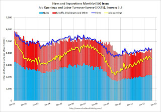 10:00 AM: Job Openings and Labor Turnover Survey for September from the BLS.
 This graph shows job openings (yellow line), hires (purple), Layoff, Discharges and other (red column), and Quits (light blue column) from the JOLTS.
Jobs openings decreased in August to 3.561 million, down slightly from 3.593 million in July. The number of job openings (yellow) has generally been trending up, and openings are up about 13% year-over-year compared to August 2011.
3:00 PM: Consumer Credit for September. The consensus is for credit to increase $10.2 billion.
8:30 AM: The initial weekly unemployment claims report will be released. The consensus is for claims to increase to 370 thousand from 363 thousand.
 8:30 AM: Trade Balance report for September from the Census Bureau.
 This graph is through August. Both exports and imports decreased in August. It appears that the global economic weakness is impacting both exports and imports.
The consensus is for the U.S. trade deficit to increase to $45.4 billion in August, up from from $44.2 billion in August. Export activity to Europe will be closely watched due to economic weakness.
9:55 AM: Reuter's/University of Michigan's Consumer sentiment index (preliminary for November). The consensus is for sentiment to increase slightly to 83.3.
10:00 AM: Monthly Wholesale Trade: Sales and Inventories for September. The consensus is for a 0.3% increase in inventories.
Friday, November 02, 2012
Bank Failures #48 and 49 in 2012
by Calculated Risk on 11/02/2012 06:32:00 PM
Our citizens heritage:
Unquenchable debt
by Soylent Green is People
From the FDIC: Centennial Bank, Conway, Arkansas, Assumes All of the Deposits of Heritage Bank of Florida, Lutz, Florida
As of September 30, 2012, Heritage Bank of Florida had approximately $225.5 million in total assets and $223.3 million in total deposits. ... The FDIC estimates that the cost to the Deposit Insurance Fund (DIF) will be $65.5 million. ... Heritage Bank of Florida is the 48th FDIC-insured institution to fail in the nation this year, and the eighth in Florida.And from the FDIC: Heartland Bank and Trust Company, Bloomington, Illinois, Assumes All of the Deposits of Citizens First National Bank, Princeton, Illinois
As of September 30, 2012, Citizens First National Bank had approximately $924.0 million in total assets and $869.4 million in total deposits. ... The FDIC estimates that the cost to the Deposit Insurance Fund (DIF) will be $45.2 million. ... Citizens First National Bank is the 49th FDIC-insured institution to fail in the nation this year, and the eighth in Illinois.It is Friday, Friday!
Here are the earlier employment posts (with graphs):
• October Employment Report: 171,000 Jobs, 7.9% Unemployment Rate
• Employment: An encouraging report (also more graphs)
• Solid Seasonal Retail Hiring, Graphs for Duration of Unemployment, Unemployment by Education and Diffusion Indexes
• Employment graph gallery
Solid Seasonal Retail Hiring, Graphs for Duration of Unemployment, Unemployment by Education and Diffusion Indexes
by Calculated Risk on 11/02/2012 01:51:00 PM
Here are the earlier employment posts (with graphs):
• October Employment Report: 171,000 Jobs, 7.9% Unemployment Rate
• Employment: An encouraging report (also more graphs)
• Employment graph gallery
And a few more graphs ...
According to the BLS employment report, retailers hired seasonal workers at about the same level as last year.
 Click on graph for larger image.
Typically retail companies start hiring for the holiday season in October, and really increase hiring in November. Here is a graph that shows the historical net retail jobs added for October, November and December by year.
This really shows the collapse in retail hiring in 2008. Since then seasonal hiring has increased back close to more normal levels. Note: I expect the long term trend will be down with more and more internet holiday shopping.
Retailers hired 130.1 thousand workers (NSA) net in October. This is slightly below the numbers in 2003 through 2006 and about the same as in 2011. Note: this is NSA (Not Seasonally Adjusted).
This suggests retailers are somewhat optimistic about the holiday season. There is a decent correlation between retail hiring and retail sales, see: Retail: Seasonal Hiring vs. Retail Sales
 This graph shows the duration of unemployment as a percent of the civilian labor force. The graph shows the number of unemployed in four categories: less than 5 week, 6 to 14 weeks, 15 to 26 weeks, and 27 weeks or more.
The general trend is down for all categories, but only the less than 5 weeks is back to normal levels.
The the long term unemployed is at 3.2% of the labor force - and the number (and percent) of long term unemployed remains a serious problem.
 This graph shows the unemployment rate by four levels of education (all groups are 25 years and older).
Unfortunately this data only goes back to 1992 and only includes one previous recession (the stock / tech bust in 2001). Clearly education matters with regards to the unemployment rate - and it appears all four groups are generally trending down.
Although education matters for the unemployment rate, it doesn't appear to matter as far as finding new employment (all four categories are only gradually declining).
Note: This says nothing about the quality of jobs - as an example, a college graduate working at minimum wage would be considered "employed".
 This is a little more technical. The BLS diffusion index for total private employment was at 60.7 in October, up from 56.4 in September. For manufacturing, the diffusion index increased to 56.8, up from 46.3 in September.
 Think of this as a measure of how widespread job gains are across industries. The further from 50 (above or below), the more widespread the job losses or gains reported by the BLS. From the BLS:
Figures are the percent of industries with employment increasing plus one-half of the industries with unchanged employment, where 50 percent indicates an equal balance between industries with increasing and decreasing employment.We'd like to see the diffusion indexes consistently above 60 - and even in the 70s like in the '1990s. It appears job growth was spread across more industries in October, and that is good news.


