by Calculated Risk on 11/04/2012 02:31:00 PM
Sunday, November 04, 2012
Update: Further Discussion on Labor Force Participation Rate
Last month I wrote Understanding the Decline in the Participation Rate. As a follow on, I wrote: Further Discussion on Labor Force Participation Rate. Here is a repeat with some added data, graphs and commentary.
Definitions from the BLS:
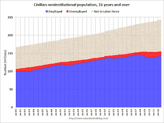
Civilian noninstitutional population: "consists of persons 16 years of age and older residing in the 50 States and the District of Columbia who are not inmates of institutions (for example, penal and mental facilities and homes for the aged) and who are not on active duty in the Armed Forces". If you look at the first graph below, the total of the Blue, Red, and light brown areas is the Civilian noninstitutional population.
"The civilian labor force consists of all persons classified as employed or unemployed". This is Blue and Red combined on the first graph.
"The labor force participation rate represents the proportion of the civilian noninstitutional population that is in the labor force." So this is Blue and Red, divided by all areas combined.
"The employment-population ratio represents the proportion of the civilian noninstitutional population that is employed." This is Blue divided by the total area.
"The unemployment rate is the number of unemployed as a percent of the civilian labor force." This is Red divided by Red and Blue combined. This is the REAL unemployment rate (some claim U-6 is the "real rate", but that is nonsense - although U-6 is an alternative measure of underemployment, it includes many people working part time).
 Click on graph for larger image.
There are some bumps in the total area - usually when there is a decennial census. These are due to changes in population controls.
Note that the Blue area collapsed in 2008 and early 2009, and started increasing in 2010. This shows the increase in employment over the last few years. Over the last few years, the red area (unemployment) has been decreasing.
However the combined area, the civilian labor force, has not increased much - even though the civilian noninstitutional population has been increasing. Some people argue that this evidence of a large number of people who left the labor force because of the weak labor market - and that the actual unemployment rate should be much higher than 7.9%.
However, as I noted last month, some decrease in the labor force participation rate was expected, and it appears most of the decline in the participation rate can be explained by demographic shifts.
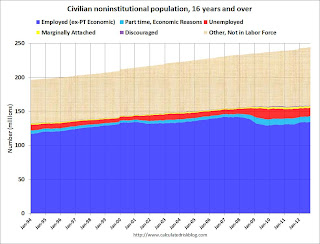
 The second graph is similar to the first graph, but breaks the data down by a few more categories. Some of this data is only available since January 1994.
The light blue area is part time for economic reasons. "These individuals were working part time because their hours had been cut back or because they were unable to find a full-time job." Some of the dark blue workers are working part time too, but that is by choice. The dark blue and light blue add to dark blue in the previous graph.
The yellow area is marginally attached workers. "These individuals were not in the labor force, wanted and were available for work, and had looked for a job sometime in the prior 12 months. They were not counted as unemployed because they had not searched for work in the 4 weeks preceding the survey."
The purple area is discouraged workers. "Discouraged workers are persons not currently looking for work because they believe no jobs are available for them."
Part time for economic reasons, marginally attached workers, and discouraged workers are all included in U-6, an alternate measure of labor underutilization.
 The third graph shows the number of people in the US by age group from both the 2000 and 2010 decennial Census, and a recent Census Bureau projection for 2020.
This graph shows two key shifts. First, baby boomers are now moving into lower participation rate age groups. Look at the increase in the 55-to-59 and 60-to-64 groups from 2000 (blue) to 2010 (red).
A second key demographic is the significant increase in people in the 15-to-19 and 20-to-24 age groups. These groups have lower participation rates usually because of school enrollment - and enrollment has been increasing.
Taken together, it is clear why the labor force hasn't increase as quickly as the civilian noninstitutional population, and therefore, why a decline in the labor force participation rate was expected.
Also - in 2010, the group with the highest population was in the '45 to 49 age group, followed by the '50 to 54 age group. By 2020, the seven groups with the highest projected population will all be under 35! Sure, some geezers will hang around, and that will push down the overall participation rate - but there is a new engine of growth coming.


