by Calculated Risk on 11/03/2012 12:22:00 PM
Saturday, November 03, 2012
Summary for Week Ending Nov 2nd
Best wishes to everyone in the Northeast. I hope you are recovering from Hurricane Sandy.
This was a busy week, and the fifth week in a row with somewhat better than expected data. The big story was the encouraging October employment report (see first section below).
As usual housing was a bright spot: residential construction spending increased, and house prices were up 2.0% year-over-year in August (as reported by Case-Shiller). On the other hand, manufacturing was weak, although the ISM manufacturing survey was slightly better than most forecasts.
Auto sales were down, apparently because of lost sales at the end of the month in the northeast due to Hurricane Sandy. The hurricane would negatively impact several reports over the next couple of months, but the economy should bounce back quickly.
Overall this suggests some pickup in economic activity.
Here is a summary of last week in graphs:
• October Employment Report: 171,000 Jobs, 7.9% Unemployment Rate
 Click on graph for larger image.
With 171,000 payroll jobs added, and the upward revisions to the August and September reports, this was a solid report. And that doesn't include the annual benchmark revision to be released early next year that will also show more jobs.
This was above expectations of 125,000 payroll jobs added.
The second graph shows the unemployment rate. The unemployment rate increased slightly to 7.9%.
 The unemployment rate is from the household report, and that report showed another month of strong job growth. The unemployment rate increased because of the significant increase in the labor force (and the increase in the labor force participation rate).
The third graph shows the job losses from the start of the employment recession, in percentage terms, compared to previous post WWII recessions. The dotted line is ex-Census hiring.
 This shows the depth of the recent employment recession - worse than any other post-war recession - and the relatively slow recovery due to the lingering effects of the housing bust and financial crisis.
The economy has only added 1.55 million private sector payroll jobs over the first nine months of the year. At this pace, the economy would only add 1.9 million private sector jobs in 2012; less than the 2.1 million added in 2011.
Overall this employment report was an improvement over recent reports, especially with the upward revisions.
Here are the earlier employment posts (with graphs):
October Employment Report: 171,000 Jobs, 7.9% Unemployment Rate
Employment: An encouraging report (also more graphs)
Solid Seasonal Retail Hiring, Graphs for Duration of Unemployment, Unemployment by Education and Diffusion Indexes
• ISM Manufacturing index increased slightly in October to 51.7
 The ISM manufacturing index indicated expansion in October. PMI was at 51.7% in October, up from 51.5% in September. The employment index was at 52.1%, down from 54.7%, and the new orders index was at 54.2%, up from 52.3%.
Here is a long term graph of the ISM manufacturing index.
This was slightly above expectations of 51.0% and suggests manufacturing expanded in October.
• U.S. Light Vehicle Sales at 14.3 million annual rate in October
 Based on an estimate from Autodata Corp, light vehicle sales were at a 14.29 million SAAR in October. That is up 8% from October 2011, and down 4% from the sales rate last month.
This was below the consensus forecast of 14.9 million SAAR (seasonally adjusted annual rate), however sales were impacted by Hurricane Sandy at the end of October, and sales will probably bounce back quickly.
Note: dashed line is current estimated sales rate.
This shows the huge collapse in sales in the 2007 recession.
Most (or all) of the month-to-month decline was related to Hurricane Sandy.
• Construction Spending increased in September
 This graph shows private residential and nonresidential construction spending, and public spending, since 1993. Note: nominal dollars, not inflation adjusted.
Private residential spending is 58% below the peak in early 2006, and up 29% from the post-bubble low. Non-residential spending is 29% below the peak in January 2008, and up about 29% from the recent low.
Public construction spending is now 17% below the peak in March 2009 and at the post-bubble low.
The second graph shows the year-over-year change in construction spending.
 On a year-over-year basis, private residential construction spending is now up 21%. Non-residential spending is also up 9% year-over-year mostly due to energy spending (power and electric). Public spending is down 4% year-over-year.
Three key construction spending themes:
• Private residential construction spending is still very low, but increasing. Residential construction declined sharply for four years following the peak of the housing bubble, and then move mostly sideways for another three years.
• Private non-residential construction spending picked up last year mostly due to energy spending (power and electric), but spending on office buildings, hotels and malls is still very low.
• Public construction spending is down 4% year-over-year and has been declining for several years.
• Case-Shiller: House Prices increased 2.0% year-over-year in August
 S&P/Case-Shiller released the monthly Home Price Indices for July (a 3 month average of June, July and August).
The first graph shows the nominal seasonally adjusted Composite 10 and Composite 20 indices (the Composite 20 was started in January 2000).
The Composite 10 index is off 31.5% from the peak, and up 0.4% in August (SA). The Composite 10 is up 4.0% from the post bubble low set in March (SA).
The Composite 20 index is off 30.92% from the peak, and up 0.5% (SA) in August. The Composite 20 is up 4.4% from the post-bubble low set in March (SA).
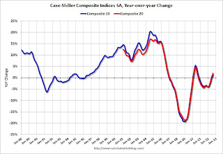
 The second graph shows the Year over year change in both indices.
The Composite 10 SA is up 1.3% compared to August 2011.
The Composite 20 SA is up 2.0% compared to August 2011. This was the third consecutive month with a year-over-year gain since 2010 (when the tax credit boosted prices temporarily).
The third graph shows the price declines from the peak for each city included in S&P/Case-Shiller indices.
 Prices increased (SA) in 19 of the 20 Case-Shiller cities in August seasonally adjusted (also 19 of 20 cities increased NSA). Prices in Las Vegas are off 59.5% from the peak, and prices in Dallas only off 5.8% from the peak. Note that the red column (cumulative decline through August 2012) is above previous declines for all cities.
This was about at the consensus forecast and the recent change to a year-over-year increase is a significant story.
• Real House Prices, Price-to-Rent Ratio
 Case-Shiller, CoreLogic and others report nominal house prices, and it is also useful to look at house prices in real terms (adjusted for inflation) and as a price-to-rent ratio. Real prices, and the price-to-rent ratio, are back to late 1999 to 2000 levels depending on the index.
The first graph shows the quarterly Case-Shiller National Index SA (through Q2 2012), and the monthly Case-Shiller Composite 20 SA and CoreLogic House Price Indexes (through August) in nominal terms as reported.
In nominal terms, the Case-Shiller National index (SA) is back to Q1 2003 levels (and also back up to Q4 2010), and the Case-Shiller Composite 20 Index (SA) is back to August 2003 levels, and the CoreLogic index (NSA) is back to December 2003.
 The second graph shows the same three indexes in real terms (adjusted for inflation using CPI less Shelter). Note: some people use other inflation measures to adjust for real prices.
In real terms, the National index is back to mid-1999 levels, the Composite 20 index is back to June 2000, and the CoreLogic index back to February 2001.
In real terms, most of the appreciation early in the last decade is gone.
In October 2004, Fed economist John Krainer and researcher Chishen Wei wrote a Fed letter on price to rent ratios: House Prices and Fundamental Value. Kainer and Wei presented a price-to-rent ratio using the OFHEO house price index and the Owners' Equivalent Rent (OER) from the BLS.
 Here is a similar graph using the Case-Shiller National, Composite 20 and CoreLogic House Price Indexes.
This graph shows the price to rent ratio (January 1998 = 1.0).
On a price-to-rent basis, the Case-Shiller National index is back to Q3 1999 levels, the Composite 20 index is back to June 2000 levels, and the CoreLogic index is back to February 2001.
In real terms - and as a price-to-rent ratio - prices are mostly back to 1999 or early 2000 levels.
• NMHC Apartment Survey: Market Conditions Tighten, Growth Rate Moderates
 From the National Multi Housing Council (NMHC): Apartment Market Expansion Continues as Growth Rate Moderates
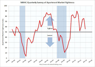
This graph shows the quarterly Apartment Tightness Index. Any reading above 50 indicates tightening from the previous quarter. The index has indicated tighter market conditions for the last eleven quarters and suggests falling vacancy rates and or rising rents.
This fits with the recent Reis data showing apartment vacancy rates fell in Q3 2012 to 4.6%, down from 4.7% in Q2 2012, and down from 8.0% at the end of 2009. This was the lowest vacancy rate in the Reis survey in over 10 years.
Even though multifamily starts have been increasing, completions lag starts by about a year - so the builders are still trying to catch up. There will be many more completions in 2012 than in 2011, increasing the supply.
As I've mentioned before, this index helped me call the bottom for effective rents (and the top for the vacancy rate) early in 2010 - and will probably be useful in indicating when the vacancy rate will stop falling.


