by Calculated Risk on 9/03/2011 08:01:00 PM
Saturday, September 03, 2011
Update: Labor Force Participation Rate by Age
Note: I've updated the percent job losses in recession graphs. With an earlier BLS revision, the peak of employment moved to January 2008 instead of December 2007. This matters if we are counting the number of months below the previous peak. (ht Scott)
By request, here is an update to several participation rate graphs. Here is a look at some the long term trends (updated graphs through August 2011).
The following graph shows the changes in the participation rates for men and women since 1960 (in the 25 to 54 age group - the prime working years).
 Click on graph for larger image in graph gallery.
The participation rate for women increased significantly from the mid 30s to the mid 70s and has mostly flattened out this year - the rate increased slightly in August to 74.7%. The participation rate for men has decreased from the high 90s a few decades ago, to 88.7% in August 2011. (up slightly from July).
There will probably be some "bounce back" for both men and women (some of the recent decline is probably cyclical), but the long term trend for men is down.
The next graph shows that participation rates for several key age groups.
 There are a few key long term trends:
• The participation rate for the '16 to 19' age group has been falling for some time (red). This was at 34.5% in August.
• The participation rate for the 'over 55' age group has been rising since the mid '90s (purple), although this has stalled out a little recently (perhaps cyclical). This was at 40.2% in August.
• The participation rate for the '20 to 24' age group fell recently too (perhaps more people are focusing on eduction before joining the labor force). This appears to have stabilized - although it was down to 70.5% in August, from 71.5% in August 2010, and I expect the participation rate to increase for this cohort as the job market improves.
 The third graph shows the participation rate for several over 55 age groups. The red line is the '55 and over' total seasonally adjusted. All of the other age groups are Not Seasonally Adjusted (NSA).
The participation rate is generally trending up for all older age groups.
Eventually the 'over 55' participation rate will start to decline as the oldest baby boomers move into even older age groups.
I've been expecting some small bounce back in the overall participation rate, but I don't think the bounce back will be huge - and we haven't seen it yet. The overall participation rate increased slightly in August to 64.0% from 63.9% in July (the lowest rate in almost 30 years).
Earlier:
• Summary for Week ending September 2nd (with plenty of graphs)
• Schedule for Week of September 4th
Yesterday:
• August Employment Report: 0 Jobs (unchanged), 9.1% Unemployment Rate
• Employment Summary, Part Time Workers, and Unemployed over 26 Weeks
• Duration of Unemployment, Unemployment by Education and Diffusion Indexes
• Employment graph gallery
Schedule for Week of September 4th
by Calculated Risk on 9/03/2011 02:31:00 PM
Earlier:
• Summary for Week ending September 2nd (with plenty of graphs)
The key economic releases this week are the July trade balance report on Thursday, and the August ISM non-manufacturing index on Tuesday.
On Thursday, President Obama will address a joint session of Congress regarding the economy and jobs. Also on Thursday, Fed Chairman Ben Bernanke will speak on the economic outlook. The Fed's Beige Book, to be released on Wednesday, should provide some discussion of the recent economic weakness.
Labor Day: All US markets will be closed in observance of the Labor Day holiday.
 10:00 AM: ISM non-Manufacturing Index for July. The consensus is for a decrease to 50.5 in August from 52.7 in July.
 This graph shows the ISM non-manufacturing index (started in January 2008) and the ISM non-manufacturing employment diffusion index. The July ISM Non-manufacturing index was at 52.7% and the employment index decreased to 52.5% in July.
1:10 PM: Minneapolis Federal Reserve Bank President Narayana Kocherlakota speaks at the University of Minnesota
7:00 AM: The Mortgage Bankers Association (MBA) will release the mortgage purchase applications index. This index has been very weak over the last several months and the four average was at the lowest level since 1995 last week.
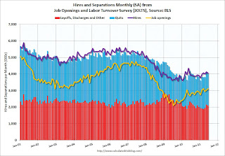 10:00 AM: Job Openings and Labor Turnover Survey for July from the BLS.
 This graph shows job openings (yellow line), hires (purple), Layoff, Discharges and other (red column), and Quits (light blue column) from the JOLTS.
In general job openings (yellow) has been trending up - and job openings increased slightly again in June - and were up about 16% year-over-year compared to June 2010.
2:00 PM: Fed's Beige Book. This is an informal review by the Federal Reserve Banks of current economic conditions.
4:00 PM: San Francisco Fed President John Williams speaks to the Seattle Rotary Club on the economic outlook.
8:30 AM: The initial weekly unemployment claims report will be released. The consensus is for an increase to 410,000 from 409,000 last week.
 8:30 AM: Trade Balance report for July from the Census Bureau.
 This graph shows the monthly U.S. exports and imports in dollars through June 2011.
The consensus is for the U.S. trade deficit to delcine to $51.0 billion, down from $53.1 billion in June.
1:30 PM: Fed Chairman Ben Bernanke speaks on "The U.S. Economic Outlook", At the Economic Club of Minnesota Luncheon, Minneapolis, Minnesota
3:00 PM: Consumer Credit for July. The consensus is for a $6.0 billion increase in consumer credit.
7:00 PM: President Obama will address a joint session of Congress regarding the economy and jobs.
10:00 AM: Monthly Wholesale Trade: Sales and Inventories for July. The consensus is for a 0.8% increase.
11:30 AM: San Francisco Fed President John Williams speaks at Asian Banking Symposium.
Summary for Week Ending September 2nd
by Calculated Risk on 9/03/2011 08:11:00 AM
This was a busy week for economic data, but the key story of the week was the August employment report - and the report was dismal. There were no jobs added in August (zero total non-farm and 17,000 private sector jobs added). Also the BLS revised down payrolls for June and July.
The unemployment rate was unchanged at 9.1%, but U-6, an alternate measure of labor underutilization that includes part time workers and marginally attached workers, increased to 16.2%; this is at the high for the year. The average workweek declined slightly to 34.2 hours, and average hourly earnings decreased.
There were special factors in August - the debt ceiling shock to the economy and the Verizon strike - but overall this was another very weak report. The good news is August is over.
The other economic data was weak, but for the most part better than expected. The ISM manufacturing index and the regional data (Chicago PMI and Texas Manufacturing survey) were weak, but showed expansion.
Consumer spending in July was solid, but will probably be weaker in August due to the confidence shattering debt ceiling debate. Auto sales in August were down slightly from July - not too bad considering the debt ceiling shock and that Hurricane Irene hit during the last weekend of the month.
The house price indexes, Case-Shiller and CoreLogic, showed seasonal increases in prices in June and July respectively.
There was a theme: Data sampled in early August, like the employment report, tended to be especially weak, but data sampled later in the month, while still very weak, was not as quite as grim. This suggests that the debt ceiling debate, and possibly the European debt crisis, impacted consumer and business confidence early in August.
Unfortunately the European crisis is once again in the news with more negotiations about the next Greece bailout. Also bond yields for Italy and Spain are starting to increase again (although Ireland is doing better). This will be something to watch over the next few weeks.
Here is a summary in graphs:
• August Employment Report: 0 Jobs (unchanged), 9.1% Unemployment Rate
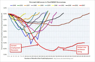 Click on graph for larger image in graph gallery.
This graph shows the job losses from the start of the employment recession, in percentage terms aligned at the start of the recession.
In this post, the graph shows the job losses aligned at maximum job losses.
The red line is moving sideways - and I'll need to expand the graph soon.
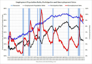 This graph shows the employment population ratio, the participation rate, and the unemployment rate. The unemployment rate was unchanged at 9.1% (red line).
The Labor Force Participation Rate increased to 64.0% in August (blue line). This is the percentage of the working age population in the labor force.
The Employment-Population ratio increased to 58.2% in August (black line).
 The number of workers only able to find part time jobs (or have had their hours cut for economic reasons) increased to 8.826 million in August from 8.396 million in July.
These workers are included in the alternate measure of labor underutilization (U-6) that increased to 16.2% in August from 16.1% in July. This is at the high for the year.
The next graph shows the duration of unemployment as a percent of the civilian labor force.
 The graph shows the number of unemployed in four categories: less than 5 week, 6 to 14 weeks, 15 to 26 weeks, and 27 weeks or more.
Two categories declined in August: The 27 weeks and more (the long term unemployed) declined slightly to 6.0 million workers, or just under 4.0% of the labor force, and the '5 to 14 weeks' category edged down slightly.
The other two categories increased, especially the '15 to 26 weeks' group that increased to 2.24 million or almost 1.5% of the labor force - the highest level since January.
Here are the employment posts from yesterday:
1) August Employment Report: 0 Jobs (unchanged), 9.1% Unemployment Rate
2) Employment Summary, Part Time Workers, and Unemployed over 26 Weeks
3) Duration of Unemployment, Unemployment by Education and Diffusion Indexes
4) Employment graph gallery
• Personal Income increased 0.3% in July, Spending increased 0.8%
The BEA released the Personal Income and Outlays report for July:
 This graph shows real Personal Consumption Expenditures (PCE) through July (2005 dollars).
PCE increased 0.8 in July, and real PCE increased 0.5% as the price index for PCE increased 0.4 percent in July.
Real PCE was revised up a little for Q2 too. This was a solid increase in spending and above the consensus of 0.5% - however I expect August to be weaker due to the confidence shattering debt ceiling debate.
• Case Shiller: Home Prices increased in June
From S&P: Nationally, Home Prices Went Up in the Second Quarter of 2011 According to the S&P/Case-Shiller Home Price Indices
 This graph shows the nominal seasonally adjusted Composite 10 and Composite 20 indices (the Composite 20 was started in January 2000).
The Composite 10 index is off 31.9% from the peak, and up slightly in June (SA). The Composite 10 is 1.5% above the June 2009 post-bubble bottom (Seasonally adjusted).
The Composite 20 index is off 31.9% from the peak, and down slightly in June (SA). The Composite 20 is slightly above the March 2011 post-bubble bottom seasonally adjusted.
 Here are the price declines from the peak for each city included in S&P/Case-Shiller indices.
Prices increased (SA) in 8 of the 20 Case-Shiller cities in June seasonally adjusted. Prices in Las Vegas are off 59.2% from the peak, and prices in Dallas only off 9.7% from the peak.
This increase was mostly seasonal and prices will probably decline later this year.
• ISM Manufacturing index declines slightly to 50.6
From the Institute for Supply Management: August 2011 Manufacturing ISM Report On Business®
 PMI was at 50.6% in August, down from 50.9% in July. The employment index was at 51.8%, down from 53.5%, and new orders increased to 49.6%, up from 49.2%.
Here is a long term graph of the ISM manufacturing index.
This was above expectations of 48.5% and suggests manufacturing expanded - slowly - in August.
• U.S. Light Vehicle Sales at 12.12 million SAAR in August
 Based on an estimate from Autodata Corp, light vehicle sales were at a 12.12 million SAAR in August. That is up 5.3% from August 2010, and down less than 1% from the sales rate last month (12.2 million SAAR in July 2011).
This was right at the consensus forecast of 12.1 million SAAR.
Note: dashed line is current estimated sales rate.
Growth in auto sales should make a positive contribution to Q3 GDP as sales bounce back from the May and June lows. However, so far, sales in Q3 have average 12.16 million, only slightly above the Q2 rate - May and June were very weak, but April was above 13 million SAAR.
• Construction Spending declined in July
The Census Bureau reported that overall construction spending declined in July.
 This graph shows private residential and nonresidential construction spending, and public spending, since 1993. Note: nominal dollars, not inflation adjusted.
Private residential spending is 63% below the peak in early 2006, and non-residential spending is 36% below the peak in January 2008.
Private construction spending is mostly moving sideways, and it is public construction spending that is now declining. Note: Residential construction spending for May and June were revised up significantly.
• LPS: Average Loan in Foreclosure Is Delinquent for Record 599 Days
From LPS: LPS' Mortgage Monitor Report Shows Average Loan in Foreclosure Is Delinquent for Record 599 Days; First-Time Foreclosure Starts Near Three-Year Lows
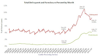 According to LPS, 8.34% of mortgages were delinquent in July, up from 8.15% in June, and down from 9.31% in July 2010.
LPS reports that 4.11% of mortgages were in the foreclosure process, down slightly from 4.12% in June, and up from 3.74% in July 2010. This gives a total of 12.45% delinquent or in foreclosure.
This graph shows the total delinquent and in-foreclosure rates since 1995.
The total delinquent rate has increased recently (part of the increase is seasonal), but the rate has fallen to 8.34% from the peak in January 2010 of 10.97%. A normal rate is probably in the 4% to 5% range, so there is a long long ways to go.
However the in-foreclosure rate at 4.11% is barely below the peak rate of 4.21% in March 2011. There are still a large number of loans in this category (about 2.16 million) - and the average loan in foreclosure has been delinquent for a record 599 days!
• Weekly Initial Unemployment Claims decline to 409,000
 The following graph shows the 4-week moving average of weekly claims since January 2000 (longer term graph in graph gallery).
The dashed line on the graph is the current 4-week average. The four-week average of weekly unemployment claims increased this week to 410,250.
Weekly claims declined slightly, but the 4-week average is still elevated. Next week claims will probably increase due to Hurricane Irene.
• Other Economic Stories ...
• FOMC Minutes: Discussed Options for additional monetary accommodation
• CoreLogic: Home Price Index increased 0.8% in July
• From the NAR: Pending Home Sales Slip in July but Up Strongly From One Year Ago
• From the Dallas Fed: Texas Manufacturing Activity Flat
• From the Chicago PMI Chicago Business Barometer™ Slipped
• Recession Measures: an update to four key indicators used by the NBER for business cycle dating: GDP, Employment, Industrial production and real personal income less transfer payments.
• From the National Restaurant Association: Restaurant Industry Outlook Softened in July as Restaurant Performance Index Slipped to Its Lowest Level in 11 Months
• Fannie Mae and Freddie Mac Serious Delinquency Rates mostly unchanged in July
• From the FHFA: FHFA Sues 17 Firms to Recover Losses to Fannie Mae and Freddie Mac
• ADP: Private Employment increased 91,000 in August
Have a great weekend.
Friday, September 02, 2011
Unofficial Problem Bank list declines to 987 Institutions
by Calculated Risk on 9/02/2011 10:15:00 PM
Note: this is an unofficial list of Problem Banks compiled only from public sources.
Here is the unofficial problem bank list for Sept 2, 2011.
Changes and comments from surferdude808:
There were only minor changes to the Unofficial Problem Bank List this week with two removals and one addition resulting in 987 institutions still on the list. Assets dropped by only $48 million so they are unchanged on a rounded basis at $403 billion. For comparison purposes, the list had 845 institutions with assets of $412.0 billion a year ago and 421 institutions with assets of $267.8 billion two years ago.Here are the earlier employment posts (with graphs):
The removals include Golden Security Bank, Rosemead, CA ($132 million), which merged on an unassisted basis; and the failed Creekside Bank, Woodstock, GA ($102 million). It is hard to understand how the other failure this week -- Patriot Bank of Georgia, Cumming, GA -- was not under any disclosed formal enforcement action prior to its failure. Given that we are more than three years into the crisis, it seems that all problem banks should be identified by this time.
The addition this week is Pacific Commerce Bank, Los Angeles, CA ($186 million Ticker: PFCI). We do not anticipate many additions next week and most changes will likely come from failures or unassisted mergers.
• August Employment Report: 0 Jobs (unchanged), 9.1% Unemployment Rate
• Employment Summary, Part Time Workers, and Unemployed over 26 Weeks
• Duration of Unemployment, Unemployment by Education and Diffusion Indexes
• Employment graph gallery
Bank Failures #69 & 70: Two more Georgia Banks
by Calculated Risk on 9/02/2011 06:15:00 PM
Past war cry once often heard
Now gone with the wind.
by Soylent Green is People
From the FDIC: Georgia Commerce Bank, Atlanta, Georgia, Acquires All the Deposits of Two Georgia Banks
As of June 30, 2011, Patriot Bank of Georgia had approximately $150.8 million in total assets and $111.2 million in total deposits; and CreekSide Bank had total assets of $102.3 million and total deposits of $96.6 million.
...
The FDIC estimates that the cost to the Deposit Insurance Fund (DIF) for Patriot Bank of Georgia will be $44.4 million and for CreekSide Bank, $27.3 million. Compared to other alternatives, Georgia Commerce Bank's acquisition of the two institutions was the least costly resolution for the FDIC's DIF.
The closings are the 69th and 70th FDIC-insured institutions to fail in the nation so far this year and the eighteenth and nineteenth in Georgia.
FHFA Sues 17 Firms to Recover Losses to Fannie Mae and Freddie Mac
by Calculated Risk on 9/02/2011 05:05:00 PM
From the FHFA: FHFA Sues 17 Firms to Recover Losses to Fannie Mae and Freddie Mac
The Federal Housing Finance Agency (FHFA), as conservator for Fannie Mae and Freddie Mac (the Enterprises), today filed lawsuits against 17 financial institutions, certain of their officers and various unaffiliated lead underwriters. The suits allege violations of federal securities laws and common law in the sale of residential private-label mortgage-backed securities (PLS) to the Enterprises.Here are the links to the legal filings for each bank.
An excerpt from the filing against BofA:
This action arises out of Defendants’ actionable conduct in connection with the offer and sale of certain residential mortgage-backed securities to Fannie Mae and Freddie Mac (collectively, the “Government Sponsored Enterprises” or “GSEs”). These securities were sold pursuant to registration statements, including prospectuses and prospectus supplements that formed part of those registration statements, which contained materially false or misleading statements and omissions. Defendants falsely represented that the underlying mortgage loans complied with certain underwriting guidelines and standards, including representations that significantly overstated the ability of the borrowers to repay their mortgage loans.
...
Between September 30, 2005 and November 5, 2007, Fannie Mae and Freddie Mac purchased over $6 billion in residential mortgage-backed securities (the “GSE Certificates”) issued in connection with 23 BOA-sponsored and/or BOA-underwritten securitizations.
Europe Update: Greek Bond Yields move Sharply Higher
by Calculated Risk on 9/02/2011 04:22:00 PM
From the NY Times: Sovereign Debt Worries Flare Again in Europe
Concerns about the euro zone’s ability to cohesively respond to its debt crisis resurfaced Friday after talks between Greece and its foreign creditors were interrupted and the head of the European Central Bank warned Italy to stick to its austerity program.From the WSJ: Greek Bonds Plunge on Aid Deal Worries
A Greek official had said earlier Friday that a visiting troika of international inspectors has been suspended amid a dispute over the country's ability to meet its deficit targets,The Greek 2 year yield is at 47.2% and the 10 year yield increased to 18.3% today.
The delegation of European Union, International Monetary Fund and European Central Bank officials is expected to return in about 10 days after the Greek government has prepared the draft outlines of its 2012 budget, the official added.
Here is a graph of the 10 year spread (Italy to Germany) from Bloomberg. And for Spain to Germany. The Italian spread is up to 327 and the Spanish spread is at 311. Both up sharply.
The Portuguese 2 year yield is up a little to 12.8%. And the Irish 2 year yield is up slightly to 8.1%.
Duration of Unemployment, Unemployment by Education and Diffusion Indexes
by Calculated Risk on 9/02/2011 01:15:00 PM
Here are the earlier employment posts (with graphs):
• August Employment Report: 0 Jobs (unchanged), 9.1% Unemployment Rate
• Employment Summary, Part Time Workers, and Unemployed over 26 Weeks
• Employment graph gallery
And a few more graphs based on the employment report:
 This graph shows the duration of unemployment as a percent of the civilian labor force. The graph shows the number of unemployed in four categories: less than 5 week, 6 to 14 weeks, 15 to 26 weeks, and 27 weeks or more.
Two categories declined in August: The 27 weeks and more (the long term unemployed) declined slightly to 6.0 million workers, or just under 4.0% of the labor force, and the '5 to 14 weeks' category edged down slightly.
The other two categories increased, especially the '15 to 26 weeks' group that increased to 2.24 million or almost 1.5% of the labor force - the highest level since January.
 This graph shows the unemployment rate by four levels of education (all groups are 25 years and older).
Unfortunately this data only goes back to 1992 and only includes one previous recession (the stock / tech bust in 2001). Clearly education matters with regards to the unemployment rate - and it appears all four groups are generally trending down.
Although education matters for the unemployment rate, it doesn't appear to matter as far as finding new employment (all four categories are only gradually declining).
Note: This says nothing about the quality of job - many college graduates are underemployed.
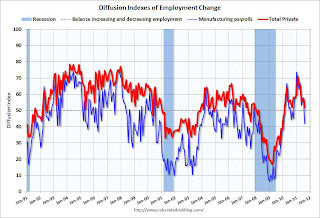 This is a little more technical. The BLS diffusion index for total private employment was at 52.2 in August, down from 57.7 in July, and for manufacturing, the diffusion index decreased sharply to 42.0.
 Think of this as a measure of how widespread job gains are across industries. The further from 50 (above or below), the more widespread the job losses or gains reported by the BLS. From the BLS:
Figures are the percent of industries with employment increasing plus one-half of the industries with unchanged employment, where 50 percent indicates an equal balance between industries with increasing and decreasing employment.This was the lowest diffusion index for total private employment since last September, and the lowest for manufacturing since January 2010.
Employment Summary, Part Time Workers, and Unemployed over 26 Weeks
by Calculated Risk on 9/02/2011 10:21:00 AM
This was a very weak report, so let's start with a few positives:
• August is over. Just like in June, when employment was impacted by the tsunami in Japan, employment in August was impacted by the debt ceiling debate in August. As I noted yesterday, the BLS survey reference week includes the 12th of the month, and that was just after the economy froze up due to the D.C. debate, and also after the European crisis flared up again.
• The Verizon labor dispute subtracted 45,000 payroll jobs. This dispute is over and these jobs will be added back in the September report. From the BLS: "45,000 workers in the telecommunications industry were on strike and thus off company payrolls during the survey reference period."
• The household survey showed an increase of (edit) 331,000 jobs in August. This increase in the household survey kept the unemployment rate from rising, even as more people participated in the workforce. The unemployment rate was unchanged at 9.1%, and the participation rate increased to 64.0%. The employment population ratio also increased slightly to 58.2%.
But overall this was a very weak report. There were no jobs added in August (0 total and 17,000 private sector).
U-6, an alternate measure of labor underutilization that includes part time workers and marginally attached workers, increased to 16.2%; this is at the high for the year.
The BLS revised down the June and July payrolls. "The change in total nonfarm payroll employment for June was revised from +46,000 to +20,000, and the change for July was revised from +117,000 to +85,000."
The average workweek declined slightly to 34.2 hours, and average hourly earnings decreased. "In August, average hourly earnings for all employees on private nonfarm payrolls decreased by 3 cents, or 0.1 percent, to $23.09. This decline followed an 11-cent gain in July. Over the past 12 months, average hourly earnings have increased by 1.9 percent."
Through the first eight months of 2011, the economy has added 872,000 total non-farm jobs or just 109 thousand per month. This is a better pace of payroll job creation than last year, but the economy still has 6.9 million fewer payroll jobs than at the beginning of the 2007 recession. The economy has added 1,162,000 private sector jobs this year, or about 145 thousand per month.
There are a total of 13.967 million Americans unemployed and 6.0 million have been unemployed for more than 6 months. Very grim.
Although there were special factors - the debt ceiling shock to the economy and the Verizon strike - overall this was another very weak report. The economy has only added 158 thousand jobs over the last four months.
Percent Job Losses During Recessions
 Click on graph for larger image in graph gallery.
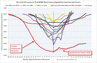
This graph shows the job losses from the start of the employment recession, in percentage terms - this time aligned at maximum job losses.
In the previous post, the graph showed the job losses aligned at the start of the employment recession.
In terms of lost payroll jobs, the 2007 recession was by far the worst since WWII.
Part Time for Economic Reasons
 From the BLS report:
The number of persons employed part time for economic reasons (sometimes referred to as involuntary part-time workers) rose from 8.4 million to 8.8 million in August. These individuals were working part time because their hours had been cut back or because they were unable to find a full-time job.The number of workers only able to find part time jobs (or have had their hours cut for economic reasons) increased to 8.826 million in August from 8.396 million in July.
These workers are included in the alternate measure of labor underutilization (U-6) that increased to 16.2% in August from 16.1% in July.
Unemployed over 26 Weeks
 This graph shows the number of workers unemployed for 27 weeks or more.
 According to the BLS, there are 6.034 million workers who have been unemployed for more than 26 weeks and still want a job. This was down from 6.185 million in July. This is very high, and long term unemployment is one of the defining features of this employment recession.
• Earlier Employment post: August Employment Report: 0 Jobs (unchanged), 9.1% Unemployment Rate
August Employment Report: 0 Jobs (unchanged), 9.1% Unemployment Rate
by Calculated Risk on 9/02/2011 08:30:00 AM
From the BLS:
Nonfarm payroll employment was unchanged (0) in August, and the unemployment rate held at 9.1 percent, the U.S. Bureau of Labor Statistics reported today. Employment in most major industries changed little over the month. Health care continued to add jobs, and a decline in information employment reflected a strike. Government employment continued to trend down, despite the return of workers from a partial government shutdown in Minnesota.The following graph shows the employment population ratio, the participation rate, and the unemployment rate.
...
The change in total nonfarm payroll employment for June was revised from
+46,000 to +20,000, and the change for July was revised from +117,000 to +85,000.
 Click on graph for larger image in graph gallery.
The unemployment rate was unchanged at 9.1% (red line).
The Labor Force Participation Rate increased to 64.0% in August (blue line). This is the percentage of the working age population in the labor force. The participation rate is well below the 66% to 67% rate that was normal over the last 20 years, although some of the decline is due to the aging population.
The Employment-Population ratio increased to 58.2% in August (black line).
Note: the household survey showed a strong gain in jobs, and that is why the unemployment rate could hold steady with no payroll jobs added - and the participation rate increase.
 The second graph shows the job losses from the start of the employment recession, in percentage terms. The dotted line is ex-Census hiring.
 The red line is moving sideways - and I'll need to expand the graph soon.
The current employment recession is by far the worst recession since WWII in percentage terms, and 2nd worst in terms of the unemployment rate (only the early '80s recession with a peak of 10.8 percent was worse).
This was very weak and well below expectations for payroll jobs. I'll have much more soon ...


