 RSS Feed
 by Calculated Risk on 5/01/2010 08:53:00 PM
Showing posts with label House Prices. Show all posts
Showing posts with label House Prices. Show all posts
Saturday, May 01, 2010
Fed Discussed Possible Housing Bubble in 2004
The Fed released the transcripts for the 2004 FOMC meeting this week. There definitely was some mention of a possible housing bubble, but little discussion.
From June 30, 2004: 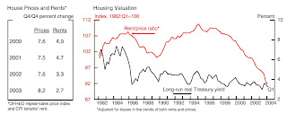 Click on graph for larger image in new window.
This graph shows the Fed estimate of the rent-to-price ratio in June 2004. Usually this is drawn inverted (Price-to-rent). And this was after the Fed made some technical adjustments - otherwise, in the words of a Fed researcher, the graph would "have looked more alarming".
MR. FERGUSON [Roger Ferguson, Fed Vice Chairman in 2004]: The other question I have deals with chart 3, on housing prices. My question is about the footnote, which says that the rent–price ratio is adjusted for biases in the trends of both rents and prices. Is that where you pick up demographics and lifecycle factors? What are these biases in the trends, and how does one think about changing demographics and the relative attractiveness of owning a home versus renting? Give me some sense of whether or not the shape of the curve that you show here is likely to reverse, as you imply, or likely to stay relatively low.
MR. OLINER [Stephen Oliner, Fed associate research director]: The biases referred to in that footnote were really technical biases in the construction of the two measures shown here, the rent measure and the price measure. Had we not adjusted for them, the rent-to-price ratio would have been much lower at the end point. So it would have looked more alarming. In part we think the published data have some technical problems that need to be taken care of before this analysis can be done in a way that is meaningful. With regard to the question of owning versus renting, it depends to some extent on what is happening to interest rates because that changes that calculation at the margin. So it’s really important to plot any kind of valuation measure relative to an opportunity cost. Just showing the rent-to-price ratio I think would have been somewhat misleading; it’s really that gap that we think is the meaningful measure of valuation. And it looks somewhat rich, taking account of the fact that interest rates are relatively low and income growth has been relatively strong. I don’t want to leave the impression that we think there’s a huge housing bubble. We believe a lot of the rise in house prices is rooted in fundamentals. But even after you account for the fundamentals, there’s a part of the increase that is hard to explain.
And a couple of comments from the March 2004 meeting:
MR. GUYNN [Atlanta Fed President]: We keep looking to our directors and other contacts for indications of imbalances and pricing pressures that they might see developing, and we’ve begun to get hints of both. A number of folks are expressing growing concern about potential overbuilding and worrisome speculation in the real estate markets, especially in Florida. Entire condo projects and upscale residential lots are being pre-sold before any construction, with buyers freely admitting that they have no intention of occupying the units or building on the land but rather are counting on “flipping” the properties—selling them quickly at higher prices.
...
MR. KOHN [Fed Governor]: House prices are elevated relative to rents—and will look even more so when rates begin to rise—but are more likely to correct by rising less rapidly than by crashing. Eggs will get broken when rates begin to rise, but the capital in most intermediaries is high, and the system is resilient.
CR: Rampant speculation, an "alarming" price-to-rent chart, prices rising faster than explained by fundamentals, "eggs will be broken" - and this was in 2004. And Kohn was wrong - the system wasn't "resilient".
Tuesday, April 27, 2010
Real House Prices and the Unemployment Rate
by Calculated Risk on 4/27/2010 01:24:00 PM
Earlier today S&P released the Case-Shiller house price indexes for February, see: Case-Shiller House Prices "mixed" in February
Below is a comparison of real house prices and the unemployment rate using the First American Corelogic LoanPerformance national house price index (starts in 1976) and Case-Shiller Composite 10 index (starts in 1987). Both indexes are adjusted by CPI less shelter. This is an update to a post from almost a year ago. 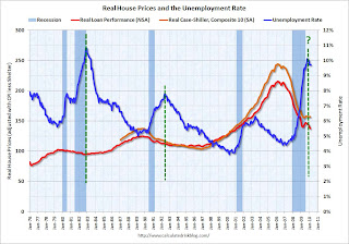 Click on image for larger graph in new window.
The two previous national declines in real house prices are evident on the graph (early '80s and early '90s). The dashed green lines are drawn at the peak of the unemployment rate following the peak in house prices.
The unemployment rate peak in 2009 is likely, but not certain.
In the early '80s, real house prices declined until the unemployment rate peaked, and then increased sluggishly for a few years. Following the late 1980s housing bubble, real house prices declined for several years after the unemployment rate peaked.
Although there are periods when there is no relationship between the unemployment rate and house prices - like during the bursting of the stock market bubble - this graph suggested to me that house prices would not bottom in real terms until the unemployment rate had peaked - and probably later (the recent housing bubble dwarfed the previous housing bubbles, and the bust will probably take some time).
Real prices, as measure by LoanPerformance, hit new lows in February, although real Case-Shiller prices are still fractionally above the lows of last year. I expect further declines in both indexes later this year, and this graph suggests that real house prices are probably still 10% or more too high on a national basis.
Real prices can decline because of falling nominal house prices (likely in my view) or from inflation (or a combination of both).
Note: earlier I mentioned that S&P has expressed concern about the Case-Shiller seasonal adjustment - here is the announcement from S&P.
Case-Shiller House Prices "mixed" in February
by Calculated Risk on 4/27/2010 09:00:00 AM
IMPORTANT: These graphs are Seasonally Adjusted (SA). S&P has cautioned that the seasonal adjustment is probably being distorted by irregular factors. These distortions could include distressed sales and the various government programs.
S&P/Case-Shiller released the monthly Home Price Indices for February (actually a 3 month average).
The monthly data includes prices for 20 individual cities, and two composite indices (10 cities and 20 cities).
From S&P: Home Prices Mixed in February 2010
Data through February 2010, released today by Standard & Poor’s for its S&P/Case-Shiller Home Price Indices, the leading measure of U.S. home prices, show that the annual rates of decline of the 10-City and 20-City Composites improved in February compared to January 2010. For the first time since December 2006, the annual rates of change for the two Composites are positive. The 10-City Composite is up 1.4% from where it was in February 2009, and the 20-City Composite is up 0.6% versus the same time last year. However, 11 of 20 cities saw year-over-year declines.
 Click on graph for larger image in new window.
 The first graph shows the nominal not seasonally adjusted Composite 10 and Composite 20 indices (the Composite 20 was started in January 2000).
The Composite 10 index is off 30.0% from the peak, and up slightly in February (SA).
The Composite 20 index is off 29.3% from the peak, and down slightly in February (SA).
 The second graph shows the Year over year change in both indices.
The Composite 10 is up 1.4% compared to February 2009.
The Composite 20 is up 0.6% compared to February 2009.
These are the first YoY price increases since 2006.
The third graph shows the price declines from the peak for each city included in S&P/Case-Shiller indices.
 Prices decreased (SA) in 15 of the 20 Case-Shiller cities in February.
 Prices in Las Vegas are off 55.7% from the peak, and prices in Dallas only off 6.0% from the peak.
Note: Congratulations to S&P: the new release format is excellent.
Monday, April 26, 2010
First American CoreLogic: House Prices Decline 2.0% in February
by Calculated Risk on 4/26/2010 10:48:00 AM
The Fed's favorite house price indicator from First American CoreLogic’s LoanPerformance ...
From LoanPerformance: Home Price Index Shows First Annual Increase in Over Three Years, But Shadow Inventory and End of Tax Credit Program May Result in Further Declines
National home prices, including distressed sales, increased by 0.3 percent in February 2010 compared to February 2009, according to First American CoreLogic and its LoanPerformance Home Price Index (HPI). This was an improvement over January’s year-over-year price decline of 0.5 percent. Excluding distressed sales, year-over-year prices increased in February by 0.6 percent; an improvement over the January non-distressed HPI which fell by 1.1 percent year-over-year.
On a month-over-month basis, the national average home price index fell by 2.0 percent in February 2010 compared to January 2010, which was steeper than the previous one-month decline of 1.6 percent from December to January. Prices are typically weak in the winter months, so seasonal effects may be driving this one-month change.
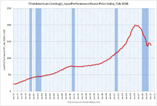 Click on graph for larger image in new window.
 This graph shows the national LoanPerformance data since 1976. January 2000 = 100.
The index is up 0.3% over the last year, and off 30.6% from the peak.
House prices are off 4.9% from the recent peak in August 2009 (although some of the decline is seasonal).
With all the distressed sales and government programs, it is hard to separate the seasonal factors from other distortions. However I expect that we will see lower prices on this index later this year - as does CoreLogic (from the press release):
After a modest increase this spring and summer, the national single-family combined index is projected to decline by 3.4 percent from February 2010 to February 2011 assuming the expiration of current Federal Housing Stimulus programs.
Thursday, April 22, 2010
FHFA House Price Index Declines in February
by Calculated Risk on 4/22/2010 03:57:00 PM
The two house price indexes I usually use are from S&P Case-Shiller and First American Corelogic LoanPerformance (the one the Fed uses). The FHFA index is also a repeat sales index, but only includes GSE loans - and it has other issues too.
The LoanPerformance and Case-Shiller indexes for February will be released soon, but here is the FHFA index (and a graph of all three).
From Federal Housing Finance Agency (FHFA): U.S. Monthly House Price Index Declines 0.2 Percent from January to February
U.S. house prices fell 0.2 percent on a seasonally adjusted basis from January to February, according to the Federal Housing Finance Agency’s monthly House Price Index. The previously reported 0.6 percent decline in January was unchanged. For the 12 months ending in February, U.S. prices fell 3.4 percent. The U.S. index is 13.3 percent below its April 2007 peak.
The FHFA monthly index is calculated using purchase prices of houses backing mortgages that have been sold to or guaranteed by Fannie Mae or Freddie Mac.
 Click on graph for larger image in new window.
This graph shows the three indexes (note that LoanPeformance is NSA, Case-Shiller and FHFA are seasonally adjusted). FHFA is set to 100 in Jan 2000. The insert shows the movement of the three indexes since Jan 2008.
The FHFA index didn't match what we were seeing during the housing bubble, and I just wanted to point out why I focus on the other indexes now.
Saturday, April 10, 2010
Shiller: "Don’t Bet the Farm on the Housing Recovery"
by Calculated Risk on 4/10/2010 10:46:00 PM
From Robert Shiller in the NY Times: Don’t Bet the Farm on the Housing Recovery
MUCH hope has been pinned on the recovery in home prices that began about a year ago. A long-lasting housing recovery might provide a balm to households, mortgage lenders and the entire United States economy. But will the recovery be sustained?Momentum only goes so far. And I think it is likely that prices will fall further in many bubble areas later this year as more distressed properties hit the market.
Alas, the evidence is equivocal at best.
The most obvious reason for hope is that, unlike stock prices, home prices tend to show a great deal of momentum.
Shiller also argues prices might fall:
Consider some leading indicators. The National Association of Home Builders index of traffic of prospective home buyers measures the number of people who are just starting to think about buying. In the past, it has predicted market turning points: the index peaked in June 2005, 10 months before the 2006 peak in home prices, and bottomed in November 2008, six months before the 2009 bottom in prices.Usually I graph the total NAHB Housing Market Index. Here is a graph of the NAHB traffic of prospective buyers and two home prices indexes: the Case-Shiller Composite 10 (seasonally adjusted) and First American Corelogic's LoanPerformance HPI (NSA).
The index’s current signals are negative. After peaking again in September 2009, it has been falling steadily, suggesting that home prices may have reached another downward turning point.
 Click on graph for larger image in new window.
Although Shiller is correct about traffic index peaking in 2005 and declining sharply in 2006 (when prices started to fall), I think this isn't a reliable indicator of future house price movements. I think a better indicator that prices were about to decline in 2006 was the rapid rise in inventories in the 2nd half of 2005 and into 2006 - and I think we should watch inventory levels again this year.
I think the NAHB does provide hints about housing starts.
 This second graph compares the NAHB HMI (left scale) with single family housing starts (right scale). This includes the March release for the HMI and the February data for starts.
This shows that the HMI and single family starts mostly move generally in the same direction - although there is plenty of noise month-to-month.
For house prices, I think we need to watch inventory levels - especially distressed inventory.
Shiller concludes:
Recent polls show that economic forecasters are largely bullish about the housing market for the next year or two. But one wonders about the basis for such a positive forecast.
Momentum may be on the forecasts’ side. But until there is evidence that the fundamental thinking about housing has shifted in an optimistic direction, we cannot trust that momentum to continue.
Tuesday, March 30, 2010
Case-Shiller House Price Graphs for January
by Calculated Risk on 3/30/2010 10:44:00 AM
Finally. Every month the S&P website crashes when the Case-Shiller data is released.
IMPORTANT: These graphs are Not Seasonally Adjusted (NSA). Unfortunately this month only the NSA data is currently available. Usually I report the SA data, but that isn't available.
S&P/Case-Shiller released the monthly Home Price Indices for January (actually a 3 month average).
The monthly data includes prices for 20 individual cities, and two composite indices (10 cities and 20 cities). Click on graph for larger image in new window.
The first graph shows the nominal not seasonally adjusted Composite 10 and Composite 20 indices (the Composite 20 was started in January 2000).
The Composite 10 index is off 30.2% from the peak, and down about 0.2% in January (media reports are an increase seasonally adjusted - but that data isn't available).
The Composite 20 index is off 29.6% from the peak, and down about 0.4% in January (NSA). The second graph shows the Year over year change in both indices.
The Composite 10 is essentially flat compared to January 2009.
The Composite 20 is off 0.7% from January 2009.
The third graph shows the price declines from the peak for each city included in S&P/Case-Shiller indices. Prices decreased (NSA) in 18 of the 20 Case-Shiller cities in January NSA.
On a SA basis from the NY Times: U.S. Home Prices Prices Inch Up, but Troubles Remain
Twelve of the cities in the index went up in January from December. Los Angeles was the biggest gainer, up 1.7 percent. Chicago was the biggest loser, dropping 0.8 percent.NOTE: Usually I report the Seasonally Adjusted data (see NY Times article), but that data wasn't available. So remember these graphs are NSA.
Case-Shiller House Prices increase in January
by Calculated Risk on 3/30/2010 09:04:00 AM
From Bloomberg: Home Prices in 20 U.S. Cities Increased 0.3% in January
The S&P/Case-Shiller home-price index climbed 0.3 percent from the prior month on a seasonally adjusted basis after a similar gain in December, the group said today in New York. The gauge was down 0.7 percent from January 2009, the smallest year- over-year decrease in two years.Graphs soon (S&P site always crashes when this data is released).
...
“While we continue to see improvements in the year-over- year data for all 20 cities, the rebound in housing prices seen last fall is fading,” David Blitzer, chairman of the index committee at S&P, said in a statement.
Thursday, March 18, 2010
First American CoreLogic: House Prices Decline 1.9% in January
by Calculated Risk on 3/18/2010 10:46:00 AM
The Fed's favorite house price indicator from First American CoreLogic’s LoanPerformance ...
From LoanPerformance: January Home Price Index Shows Narrowing Annual Decline
National home prices, including distressed sales, declined by 0.7 percent in January 2010 compared to January 2009, according to First American CoreLogic and its LoanPerformance Home Price Index (HPI). This was a significant improvement over December’s year-over-year price decline of 3.4 percent. Excluding distressed sales, year-over-year prices declined in January by 0.4 percent; while in December the non-distressed HPI fell by 3.3 percent year-over-year. Compared to a year ago, the month-to-month rate of decline is lessening – in January 2009, the HPI showed the largest one month decline in its more than 30-year history. On a month-over-month basis, the national average home price index decline accelerated, falling by 1.9 percent in January 2010 compared to 0.8 percent in December 2009, indicating the housing market still remains weak.
 Click on graph for larger image in new window.
 This graph shows the national LoanPerformance data since 1976. January 2000 = 100.
The index is off 0.7% over the last year, and off 29% from the peak.
The index has declined for five consecutive months.
Tuesday, February 23, 2010
Case Shiller House Price Graphs for December
by Calculated Risk on 2/23/2010 02:42:00 PM
Finally. The S&P website has been down all morning.
S&P/Case-Shiller released the monthly Home Price Indices for December (actually a 3 month average).
The monthly data includes prices for 20 individual cities, and two composite indices (10 cities and 20 cities). This is the Seasonally Adjusted monthly data - some sites report the NSA data.  Click on graph for larger image in new window.
The first graph shows the nominal seasonally adjusted Composite 10 and Composite 20 indices (the Composite 20 was started in January 2000).
The Composite 10 index is off 30.3% from the peak, and up about 0.3% in December.
The Composite 20 index is off 29.4% from the peak, and up 0.3% in December.
The impact of the massive government effort to support house prices is obvious on the Composite graph. The question is what happens to prices as these programs end over the next few months?  The second graph shows the Year over year change in both indices.
The Composite 10 is off 2.4% from December 2008.
The Composite 20 is off 3.1% from December 2008.
The third graph shows the price declines from the peak for each city included in S&P/Case-Shiller indices. Prices decreased (SA) in 6 of the 20 Case-Shiller cities in December.
In Las Vegas, house prices have declined 55.9% from the peak. At the other end of the spectrum, prices in Dallas are only off about 3.1% from the peak. Several cities are showing price increases in 2009 - San Diego, San Francisco, Boston, Washington D.C., Denver and Dallas.
Case-Shiller House Prices increase in December
by Calculated Risk on 2/23/2010 09:37:00 AM
Note: as usual, the S&P website crashes when they release the monthly house price data. I'll post some graphs when the data is available.
The WSJ reports:
[The composite 10 and 20] indexes dropped 0.2% from the previous month, although adjusted for seasonal factors, they increased 0.3%.More from Reuters: Home Prices Fall 2.5% as Market Recovery Still Weak (note: Reuters is reporting the NSA data).
...
Month-to-month gainers were led by Los Angeles, which rose 1%. Chicago again fared worst, falling 1.6%.
Thursday, February 18, 2010
First American CoreLogic: House Prices Decline in December
by Calculated Risk on 2/18/2010 11:43:00 AM
The Fed's favorite house price indicator from First American CoreLogic’s LoanPerformance ...
From LoanPerformance: Home Prices Exhibit “Improving Declines”
On a month-over-month basis the national average of home prices declined moderately, falling by 1.0 percent in December 2009 compared to November 2009, indicating seasonal slowing in a fledging housing recovery.
...
Including distressed transactions, the peak-to-current change in the national HPI (from April 2006 to December 2009) is -28.2 percent. Excluding distressed properties, the peak-to-current change in the HPI is -21.5 percent.
...
"The housing market, after experiencing stabilization in many, but not all, markets in the spring and summer of 2009 is going through the typical seasonal winter malaise," said Mark Fleming, chief economist for First American CoreLogic. "The big unknown for the 2010 spring selling season continues to be the future of the federal home buyer tax credit."
...
First American CoreLogic’s forecast continues to project declining house prices into the spring months. The national HPI is projected to fall an average of 4.4 percent through April 2010, as high levels of unemployment, housing inventories and foreclosures continue to exert downward pressure on prices.
 Click on graph for larger image in new window.
 This graph shows the national LoanPerformance data since 1976. January 2000 = 100.
The index is off 3.7% over the last year, and off 28.2% from the peak.
The index has declined for four consecutive months.
Tuesday, January 26, 2010
Case Shiller House Prices Increase Slightly in November
by Calculated Risk on 1/26/2010 09:00:00 AM
S&P/Case-Shiller released their monthly Home Price Indices for November this morning.
This monthly data includes prices for 20 individual cities, and two composite indices (10 cities and 20 cities). This is the Seasonally Adjusted data - some sites report the NSA data.  Click on graph for larger image in new window.
The first graph shows the nominal seasonally adjusted Composite 10 and Composite 20 indices (the Composite 20 was started in January 2000).
The Composite 10 index is off 30.4% from the peak, and up about 0.2% in November.
The Composite 20 index is off 29.5% from the peak, and up 0.2% in November.
NOTE: S&P reported this as "down", but they were using the NSA data. The second graph shows the Year over year change in both indices.
The Composite 10 is off 4.5% from November 2008.
The Composite 20 is off 5.3% from November 2008.
The third graph shows the price declines from the peak for each city included in S&P/Case-Shiller indices. Prices decreased (SA) in 6 of the 20 Case-Shiller cities in October.
In Las Vegas, house prices have declined 56.2% from the peak. At the other end of the spectrum, prices in Dallas are only off about 4.6% from the peak. Several cities are showing price increases in 2009 including San Diego, San Francisco, Denver and Dallar. Prices have declined by double digits from the peak in 18 of the 20 Case-Shiller cities.
The impact of the massive government effort to support house prices led to small increases in prices over the Summer, and the question is what happens to prices as these programs end over the next 6 months. I expect further price declines in many cities.
Friday, January 22, 2010
Real House Prices, Price-to-Rent Ratio
by Calculated Risk on 1/22/2010 04:00:00 PM
Earlier First American CoreLogic reported that house prices declined in November. This is the Fed's favorite house price index. This post looks at real prices and the price-to-rent ratio, but first a look at the market ...
This graph is from Doug Short of dshort.com (financial planner): "Four Bad Bears".
Note that the Great Depression crash is based on the DOW; the three others are for the S&P 500.
The second graph shows the First American CoreLogic LoanPerformance house price index through November (with and without foreclosures) and the Case-Shiller Composite 20 index through October in real terms (all adjusted with CPI less Shelter). It is interesting to look at the sharp decline in the index with foreclosures at the end of 2008 - this was what housing economist Tom Lawler described as "destickification" in the high foreclosure areas.
Notice the LoanPerformance price index without foreclosures (in red) is now at the lowest level since July 2002 in real terms (inflation adjusted).
This isn't like 2005 when prices were way out of the normal range by most measures - and it is possible that total national prices bottomed in 2009 (although I think prices will fall further), but prices ex-foreclosures probably still have a ways to go, even with all the government programs aimed at supporting house prices.
Price-to-Rent
In October 2004, Fed economist John Krainer and researcher Chishen Wei wrote a Fed letter on price to rent ratios: House Prices and Fundamental Value. Kainer and Wei presented a price-to-rent ratio using the OFHEO house price index and the Owners' Equivalent Rent (OER) from the BLS.
Here is a similar graph through November 2009 using the First American CoreLogic LoanPerformance House Price Index: This graph shows the price to rent ratio (January 2000 = 1.0).
This suggests that house prices are still a little too high on a national basis. Also rents are still falling and the OER index tends to lag market rents by a few months. And that will push up the price-to-rent ratio, putting more pressure on house prices.
First American CoreLogic: House Prices Decline in November
by Calculated Risk on 1/22/2010 02:26:00 PM
The Fed's favorite house price indicator from First American CoreLogic’s LoanPerformance ...
From LoanPerformance: Home Prices Continue to Depreciate
On a month-over-month basis ... national home prices declined by 0.2 percent in November 2009 compared to October 2009.
...
Including distressed transactions, the HPI has fallen 30.0 percent nationally through November from its peak in April 2006. Excluding distressed properties, the national HPI has fallen 21.8 percent from the same peak.
...
"On average, we are expecting home prices to turn around next spring," said Mark Fleming, chief economist for First American CoreLogic. "While the share of REO sales are down, allowing price declines to moderate, there is concern moving forward with the levels of shadow inventory, negative equity, and the ability of modification programs to mitigate this risk."
 Click on graph for larger image in new window.
 This graph shows the national LoanPerformance data since 1976. January 2000 = 100.
The index is off 5.7% over the last year, and off 30.0% from the peak.
The index has declined for three consecutive months. I'll have some comparisons to Case-Shiller later, but according to First American CoreLogic, prices are now falling again. It might take another month for this to show up in the Case-Shiller index because it is an average over three months.
Wednesday, December 30, 2009
House Prices and the Unemployment Rate
by Calculated Risk on 12/30/2009 12:35:00 PM
Here is a comparison of real house prices and the unemployment rate using the LoanPerformance national house price data (starts in 1976) and Case-Shiller Composite 10 index (starts in 1987). Both indexes are adjusted by CPI less shelter. This is an update to a post earlier this year. Click on image for larger graph in new window.
The two previous national declines in real house prices are evident on the graph (early '80s and early '90s). The dashed green lines are drawn at the peak of the unemployment rate following the peak in house prices.
In the early '80s, real house prices declined until the unemployment rate peaked, and then increased sluggishly for a few years. Following the late 1980s housing bubble, real house prices declined for several years after the unemployment rate peaked.
Although there are periods when there is no relationship between the unemployment rate and house prices, this graph suggests that house prices will not bottom (in real terms) until the unemployment rate peaks (or later, especially since the current bubble dwarfs those previous housing bubbles). This also suggests that real house prices are probably 10% or more too high on a national basis.
Tuesday, December 29, 2009
House Prices: Stress Test, Price-to-Rent, and More
by Calculated Risk on 12/29/2009 11:46:00 AM
This following graph compares the Case-Shiller Composite 10 SA index with the Stress Test scenarios from the Treasury (stress test data is estimated from quarterly forecasts). Click on graph for larger image in new window.
The Stress Test scenarios use the Composite 10 index and start in December. Here are the numbers:
Case-Shiller Composite 10 Index (SA), October: 157.56
Stress Test Baseline Scenario, October: 142.3
Stress Test More Adverse Scenario, October: 130.6
House prices are 10.7% higher than the baseline scenario, and 20.6% higher than the more adverse scenario.
There were three key economic stress test parameters: house prices, GDP and unemployment. Both house prices and GDP are performing better than the baseline scenario, and unemployment is performing worse than both stress test scenarios.
Price-to-Rent
In October 2004, Fed economist John Krainer and researcher Chishen Wei wrote a Fed letter on price to rent ratios: House Prices and Fundamental Value. Kainer and Wei presented a price-to-rent ratio using the OFHEO house price index and the Owners' Equivalent Rent (OER) from the BLS.
Here is a similar graph through October 2009 using the Case-Shiller Composite Indices (SA): This graph shows the price to rent ratio (January 2000 = 1.0) for the Case-Shiller composite indices. For rents, the national Owners' Equivalent Rent from the BLS is used.
At the peak of the housing bubble it was obvious that prices were out of line with fundamentals such as price-to-rent, price-to-income and real prices. Now most of the adjustment in the price-to-rent ratio is behind us.
It appears the ratio is still a little high, and the recent increase was a combination of falling rents and rising house prices (probably due to the massive government intervention). I expect some further decline in prices, although it isn't as obvious as in 2005.
Comparison to LoanPerformance And finally, here is a graph of the LoanPerformance index (with and without foreclosures) and the Case-Shiller Composite 20 index. Earlier LoanPerformance announced that house prices fell 0.7% in October.
This graph shows the three indices with January 2000 = 100.
The indices mostly move together over time. Notice how the total LoanPerformance index fell further than the index excluding foreclosures - and also rebounded more.
The seasonally adjusted Case-Shiller index increased slightly in October and the LoanPerformance index showed a decline. However Case-Shiller is an average of three months, so there might be a decline next month.
Case-Shiller House Price Graphs for October
by Calculated Risk on 12/29/2009 09:30:00 AM
S&P/Case-Shiller released their monthly Home Price Indices for October this morning.
This monthly data includes prices for 20 individual cities, and two composite indices (10 cities and 20 cities). This is the Seasonally Adjusted data - some sites report the NSA data.  Click on graph for larger image in new window.
The first graph shows the nominal seasonally adjusted Composite 10 and Composite 20 indices (the Composite 20 was started in January 2000).
The Composite 10 index is off 30.5% from the peak, and up about 0.4% in October.
The Composite 20 index is off 29.5% from the peak, and up 0.4% in October.
NOTE: S&P reported this as "flat", but they were using the NSA data. The second graph shows the Year over year change in both indices.
The Composite 10 is off 6.4% from October 2008.
The Composite 20 is off 7.3% from October 2008.
This is still a significant YoY decline in prices.
The third graph shows the price declines from the peak for each city included in S&P/Case-Shiller indices. Prices decreased (SA) in 9 of the 20 Case-Shiller cities in October.
In Las Vegas, house prices have declined 56.3% from the peak. At the other end of the spectrum, prices in Dallas are only off about 5.4% from the peak - and up slightly in 2009. Prices have declined by double digits from the peak in 18 of the 20 Case-Shiller cities.
The impact of the massive government effort to support house prices led to small increases in prices over the Summer, and the question is what happens to prices as these programs end over the next 6 months. I expect further price declines in many cities. I'll have more ...
Case-Shiller House Prices Flat in October
by Calculated Risk on 12/29/2009 09:05:00 AM
Still waiting for the data ...
From S&P:
“The turn-around in home prices seen in the Spring and Summer has faded with only seven of the 20 cities seeing month-to-month gains, although all 20 continue to show improvements on a year-over-year basis. All in all, this report should be described as flat.” says David M. Blitzer, Chairman of the Index Committee at Standard & Poor’s.Prices declined in 12 of the 20 Case-Shiller cities, and were flat in New York.
...
As of October 2009, average home prices across the United States are at similar levels to where they were in the autumn of 2003. From the peak in the second quarter of 2006 through the trough in April 2009, the 10-City Composite is down 33.5% and the 20-City Composite is down 32.6%. With the relative improvement of the past few months, the peak-to-date figures through October 2009 are -29.8% and -29.0%, respectively.
Tuesday, December 22, 2009
More on Falling House Prices
by Calculated Risk on 12/22/2009 02:16:00 PM
Yesterday I mentioned that the Fed's favorite house price index showed prices fell in October.
However most people follow the Case-Shiller index, and the October Case-Shiller house price index will not be released until next Tuesday. Although Case-Shiller is an average of three months, I think that index will probably show a price decline too.
The following graph shows the LoanPerformance index (with and without foreclosures) and the Case-Shiller Composite 20 index in real terms (all adjusted with CPI less Shelter). Click on graph for larger image in new window.
It is interesting to look at the sharp decline in the index with foreclosures at the end of 2008 - this was what housing economist Tom Lawler described as "destickification" in the high foreclosure areas.
Notice the LoanPerformance price index without foreclosures (in red) is now at the lowest level since September 2002 in real terms (inflation adjusted).
This isn't like 2005 when prices were way out of the normal range by most measures - and it is possible that total prices have bottomed (although I think prices will fall further), but prices ex-foreclosures probably still have a ways to go - even with all the government programs aimed at supporting house prices.


