by Calculated Risk on 12/21/2009 10:51:00 PM
Monday, December 21, 2009
House Price Indices: Case-Shiller and LoanPerformance
Earlier today I mentioned that the Fed started using First American CoreLogic's LoanPerformance House Price Index last year for the Flow of Funds report.
And also that LoanPerformance announced today that house prices fell 0.7% in October.
Since most people have been following Case-Shiller, here is a graph of the LoanPerformance index (with and without foreclosures) and the Case-Shiller Composite 20 index. Click on graph for larger image in new window.
This graph shows the three indices with January 2000 = 100.
The indices mostly move together over time. Notice how the total LoanPerformance index fell further than the index excluding foreclosures - and also rebounded more.
The Case-Shiller index will probably show a decline in October - although Case-Shiller is an average of three months, so it might be a small decrease. The question is how much further will prices fall?
LoanPerformance: House Prices Fall 0.7% in October
by Calculated Risk on 12/21/2009 04:53:00 PM
The Fed's favorite house price indicator from First American CoreLogic’s LoanPerformance ...
From LoanPerformance: Annual Home Prices Continue to Depreciate
On a month-over-month basis ... national home prices declined by -0.7 percent in October 2009 compared to September 2009.Prices are now falling again. It might take a month or two for this to show up in the Case-Shiller index because it is an average over three months.
...
"We are continuing to see improvements in the year-over-year home price change as prices have remained relatively stable since April," said Mark Fleming, chief economist for First American CoreLogic. "The crutches of government support for the housing market have stimulated demand and restricted supply in 2009. How these government supports are removed in 2010 will be critical to the continued stability of the housing market."
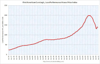 Click on graph for larger image in new window.
 This graph shows the national LoanPerformance data since 1976. January 2000 = 100.
The index is off 7.9% over the last year, and off 30.1% from the peak.
The index has declined for two consecutive months (-0.16% in September and -0.68% in October). I'll have some comparisons to Case-Shiller later, but it appears house prices are now falling again.
Tuesday, November 24, 2009
House Prices: Real Prices, Price-to-Rent, and Price-to-Income
by Calculated Risk on 11/24/2009 12:10:00 PM
Here are three key measures of house prices: Price-to-Rent, Price-to-Income and real prices based on the Case-Shiller quarterly national home price index.
Price-to-Rent
In October 2004, Fed economist John Krainer and researcher Chishen Wei wrote a Fed letter on price to rent ratios: House Prices and Fundamental Value. Kainer and Wei presented a price-to-rent ratio using the OFHEO house price index and the Owners' Equivalent Rent (OER) from the BLS.
Here is a similar graph through Q3 2009 using the Case-Shiller National Home Price Index (SA): Click on image for larger graph in new window.
This graph shows the price to rent ratio (Q1 1987 = 1.0) for the Case-Shiller national Home Price Index. For rents, the national Owners' Equivalent Rent from the BLS is used.
Looking at the price-to-rent ratio based on the Case-Shiller index, the adjustment in the price-to-rent ratio is mostly behind us as of Q3 2009 on a national basis. However this ratio could easily decline another 5% to 10% or so, and with rents now falling, prices could fall even more.
Notice the price-to-rent ratio is currently almost as high as during the late '80s housing bubble.
Price-to-Income:
The second graph shows the price-to-income ratio: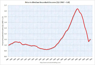 This graph is based off the Case-Shiller national index, and the Census Bureau's median income tables, and flat for 2009.
Using national median income and house prices provides a gross overview of price-to-income (it would be better to do this analysis on a local area). However this does shows that the price-to-income is still too high, and that this ratio needs to fall another 10% or so. A further decline in this ratio could be a combination of falling house prices and/or rising nominal incomes.
Real Prices This graph shows the real and nominal house prices based on the Case-Shiller national index. (Q1 2000 = 100 for nominal index)
Nominal prices are adjusted using CPI less Shelter.
The Case-Shiller real prices are still above prices in the '90s and perhaps real prices will decline another 10% or so. Prices can and do increase in real terms - especially in areas with land constraints. Also newer homes are larger than older homes - so the real prices are higher.
Summary
These measures are useful, but somewhat flawed. These measures give a general idea about house prices, but in the short run there are more important factors like inventory levels and credit issues. All of this data is on a national basis and it would be better to use local area price-to-rent, price-to-income and real prices.
It appears that house prices - in general - are still too high. However prices depend on the local supply and demand factors. In many lower priced bubble areas supply has declined sharply (because of the loan modification efforts and local moratoria), and demand was very strong in Q3 from the first-time home buyer frenzy and cash flow investors. This has pushed up prices at the low end, and suggests price might fall some again at the low end - although probably not to new lows.
However in the mid-to-high end of the bubble areas - with significant supply and little demand - prices are still too high. And I expect further declines in those areas and probably nationwide (although this isn't as obvious as it was in 2005 since most of the price declines are over).
Case Shiller Home Price Graphs
by Calculated Risk on 11/24/2009 09:56:00 AM
S&P/Case-Shiller released their monthly Home Price Indices for September this morning.
This monthly data includes prices for 20 individual cities, and two composite indices (10 cities and 20 cities). NOTE: This is the Not Seasonally Adjusted data - the link is broken for the SA data.  Click on graph for larger image in new window.
The first graph shows the nominal seasonally adjusted Composite 10 and Composite 20 indices (the Composite 20 was started in January 2000).
The Composite 10 index is off 29.9% from the peak, and up about 0.4% in September.
The Composite 20 index is off 29.1% from the peak, and up 0.3% in September. The second graph shows the Year over year change in both indices.
The Composite 10 is off 8.5% from September 2008.
The Composite 20 is off 9.4% from September 2008.
This is still a very significant YoY decline in prices.
The third graph shows the price declines from the peak for each city included in S&P/Case-Shiller indices. Prices decreased (SA) in 11 of the 20 Case-Shiller cities in September (NSA).
In Las Vegas, house prices have declined 55.4% from the peak. At the other end of the spectrum, prices in Dallas are only off about 4.7% from the peak - and up in 2009. Prices have declined by double digits from the peak in 18 of the 20 Case-Shiller cities.
I'll have more on prices (compare to stress, price-to-rent) later.
Case-Shiller House Prices Increase in September
by Calculated Risk on 11/24/2009 09:12:00 AM
Note: I will have graphs as soon as S&P releases the data online.
S&P reports the Composite 10 index increased 0.3% in September, and the Composite 20 index increased 0.3% (both SA). Eleven cities posted increases, nine showed price declines.
From S&P:
“We have seen broad improvement in home prices for most of the past six months,” says David M. Blitzer, Chairman of the Index Committee at Standard & Poor’s. “However, the gains in the most recent month are more modest than during the seasonally strong summer months. Fewer cities saw month to month improvements in September than in August in both seasonally adjusted and unadjusted figures. Nationally, the U.S. National Composite rose by 3.1% in both the 2nd and 3rd quarters of 2009. Both the 10-City and 20-City Composites posted their fifth consecutive monthly increase with September’s report."
Tuesday, October 27, 2009
Case-Shiller Home Price Index Increases in August
by Calculated Risk on 10/27/2009 09:15:00 AM
S&P/Case-Shiller released their monthly Home Price Indices for August this morning.
This monthly data includes prices for 20 individual cities, and two composite indices (10 cities and 20 cities). This is the Seasonally Adjusted data - some sites report the NSA data.  Click on graph for larger image in new window.
The first graph shows the nominal seasonally adjusted Composite 10 and Composite 20 indices (the Composite 20 was started in January 2000).
The Composite 10 index is off 32.5% from the peak, and up about 1.0% in August.
The Composite 20 index is off 31.3% from the peak, and up 1.0% in August. The second graph shows the Year over year change in both indices.
The Composite 10 is off 10.7% from August 2008.
The Composite 20 is off 11.4% from August 2008.
This is still a very significant YoY decline in prices.
The third graph shows the price declines from the peak for each city included in S&P/Case-Shiller indices. Prices increased (SA) in 16 of the 20 Case-Shiller cities in August.
In Las Vegas, house prices have declined 55.6% from the peak. At the other end of the spectrum, prices in Dallas are only off about 4.8% from the peak - and up in 2009. Prices have declined by double digits from the peak in 18 of the 20 Case-Shiller cities.
The debate continues - is the price increase because of the seasonal mix (distressed sales vs. non-distressed sales), the impact of the first-time home buyer frenzy on prices, less supply because of modifications and the general slowdown in the foreclosure process, or have prices actually bottomed? My guess is we will see further house price declines in many areas.
I'll compare house prices to the stress test scenarios soon.
Tuesday, September 29, 2009
Case-Shiller House Prices increase in July
by Calculated Risk on 9/29/2009 09:00:00 AM
S&P/Case-Shiller released their monthly Home Price Indices for July this morning.
This monthly data includes prices for 20 individual cities, and two composite indices (10 cities and 20 cities). This is the Seasonally Adjusted data - others report the NSA data. 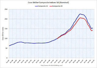 Click on graph for larger image in new window.
The first graph shows the nominal seasonally adjusted Composite 10 and Composite 20 indices (the Composite 20 was started in January 2000).
The Composite 10 index is off 31.6% from the peak, and up about 1.3% in July.
The Composite 20 index is off 30.6% from the peak, and up 1.2% in July. The second graph shows the Year over year change in both indices.
The Composite 10 is off 12.8% from July 2008.
The Composite 20 is off 11.5% from last year.
This is still a very strong YoY decline.
The third graph shows the price declines from the peak for each city included in S&P/Case-Shiller indices. Prices increased (SA) in 17 of the 20 Case-Shiller cities in July.
In Las Vegas, house prices have declined 55.2% from the peak. At the other end of the spectrum, prices in Dallas are only off about 4.9% from the peak - and up in 2009. Prices have declined by double digits almost everywhere.
The debate continues - is the price increase because of the seasonal mix (distressed sales vs. non-distressed sales), the impact of the first-time home buyer frenzy on prices, and the slowdown in the foreclosure process (with a huge shadow inventory), or have prices actually bottomed? I think we will see further house price declines in many areas.
I'll compare house prices to the stress test scenarios soon.
Tuesday, August 25, 2009
Case-Shiller House Prices and Stress Test Scenarios
by Calculated Risk on 8/25/2009 02:25:00 PM
This following graph compares the Case-Shiller Composite 10 SA index with the Stress Test scenarios from the Treasury (stress test data is estimated from quarterly forecasts).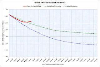 The Stress Test scenarios use the Composite 10 index and start in December. Here are the numbers:
Case-Shiller Composite 10 Index, June: 152.55
Stress Test Baseline Scenario, June: 148.82
Stress Test More Adverse Scenario, June: 140.71
Unlike with the unemployment rate (worse than both scenarios), house prices are performing better (from the perspective of the banks) than the the stress test scenarios. I believe there will be further price declines later this year, because I think the Case-Shiller seasonal adjustment is insufficient, and because I expect the first-time home buyer frenzy to slow just as more distressed supply comes on the market - even if an extension to the tax credit is passed.
House Prices: Real Prices, Price-to-Rent, and Price-to-Income
by Calculated Risk on 8/25/2009 10:01:00 AM
Here are three key measures of house prices: Price-to-Rent, Price-to-Income and real prices based on the Case-Shiller quarterly national home price index.
Price-to-Rent
In October 2004, Fed economist John Krainer and researcher Chishen Wei wrote a Fed letter on price to rent ratios: House Prices and Fundamental Value. Kainer and Wei presented a price-to-rent ratio using the OFHEO house price index and the Owners' Equivalent Rent (OER) from the BLS.
Here is a similar graph through Q2 2009 using the Case-Shiller National Home Price Index (SA): Click on image for larger graph in new window.
This graph shows the price to rent ratio (Q1 1997 = 1.0) for the Case-Shiller national Home Price Index. For rents, the national Owners' Equivalent Rent from the BLS is used.
Looking at the price-to-rent ratio based on the Case-Shiller index, the adjustment in the price-to-rent ratio is mostly behind us as of Q2 2009 on a national basis. However this ratio could easily decline another 10% or so.
It is important to note that rents are now falling and this has not shown up in the OER measure yet. The OER lags REIT rents, and I expect OER to declines later this year. And declining rents will impact the price-to-rent ratio.
Price-to-Income:
The second graph shows the price-to-income ratio: This graph is based off the Case-Shiller national index, and the Census Bureau's median income Historical Income Tables - Households (and an estimate of 2% increase in household median income for 2008 and flat for 2009).
Using national median income and house prices provides a gross overview of price-to-income (it would be better to do this analysis on a local area). However this does shows that the price-to-income is still too high, and that this ratio needs to fall another 10% or so. A further decline in this ratio could be a combination of falling house prices and/or rising nominal incomes.
Real Prices This graph shows the real and nominal house prices based on the Case-Shiller national index. (Q1 2000 = 100 for nominal index)
Nominal prices are adjusted using CPI less Shelter.
The Case-Shiller real prices are still significantly above prices in the '90s and perhaps real prices will decline another 10% to 20%.
Summary
These measures are useful, but somewhat flawed. These measures give a general idea about house prices, but there are other important factors like inventory levels and credit issues. All of this data is on a national basis and it would be better to use local area price-to-rent, price-to-income and real prices.
It appears that house prices - in general - are still too high. However prices depend on the local supply and demand factors. In many lower priced bubble areas supply has declined sharply (as banks are currently slow to foreclose), and demand is very strong (first-time home buyer frenzy, and cash flow investors). This is pushing up low end prices.
However in the mid-to-high end of the bubble areas - with significant supply and little demand - prices are probably still too high.
Case-Shiller House Price Index Increases in June
by Calculated Risk on 8/25/2009 09:00:00 AM
S&P/Case-Shiller released their monthly Home Price Indices for June this morning.
This monthly data includes prices for 20 individual cities, and two composite indices (10 cities and 20 cities). This is the Seasonally Adjusted data - others report the NSA data. Note: I have more on the quarterly national index soon.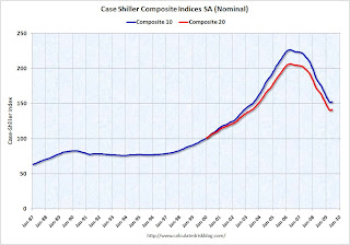 Click on graph for larger image in new window.
The first graph shows the nominal seasonally adjusted Composite 10 and Composite 20 indices (the Composite 20 was started in January 2000).
The Composite 10 index is off 32.6% from the peak, and up about 9% (annualized) in June.
The Composite 20 index is off 31.4% from the peak, and up in June.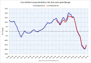 The second graph shows the Year over year change in both indices.
The Composite 10 is off 15.1% over the last year.
The Composite 20 is off 15.4% over the last year.
This is still a very strong YoY decline.
The third graph shows the price declines from the peak for each city included in S&P/Case-Shiller indices.
NOTE: updated 3rd graph. Two cities have price increases for 2009, and hopefully this graph shows the change better.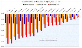 Prices increased (SA
 NSA) in 15 of the 20 Case-Shiller cities in June. In Las Vegas, house prices have declined 54.6% from the peak. At the other end of the spectrum, prices in Dallas are only off about 5.6% from the peak - and up in 2009. Prices have declined by double digits almost everywhere.
Let the debate begin - seasonal issues of mix (distressed sales vs. non-distressed sales), the impact of the first-time home buyer frenzy on prices, etc. - but this does show a price increase in June.
I'll compare house prices to the stress test scenarios soon.
Monday, August 03, 2009
Jim the Realtor: Prices falling at the high end
by Calculated Risk on 8/03/2009 10:30:00 PM
Prices are falling at the high end ...
"Poof, another notch down practically overnight ..."
Jim the Realtor: E-Ranch Balloon
Barclays Analysts: House Prices Still Falling
by Calculated Risk on 8/03/2009 01:17:00 PM
From Bloomberg: Mortgage-Bond Rally May End on Housing Reality, Barclays Says (ht James)
While an S&P/Case-Shiller index for May showed the first month-over-month price increase since 2006 and a 2 percent seasonally adjusted annualized drop, a more-accurate reading probably would have been an annualized decline of 10 percent to 15 percent, [Barclays' analysts Ajay Rajadhyaksha and Glenn Boyd] wrote.This is similar to the argument Mark Hanson made last week (See: Housing Bottom? No, the Mother of All Head Fakes). I think we will see further price declines in the mid-to-high end bubble areas where the prices have still been sticky.
... seasonally adjusted home-price data has been skewed higher during the spring months of this year and last year by an “amplified” version of typical patterns, according to the analysts. More homeowners sell their properties during those months, cutting the share of foreclosed homes being offloaded at distressed prices, as new buyers focus on “desirable neighborhoods” where values hold up better, they said.
...
Data reflecting a reversal of the seasonal benefit, as well as “a tide of new foreclosure sales” as a moratorium on the seizing of homes put in place by banks subsides, will lead to “renewed weakness” in the fall, they said.
...
They project that U.S. home prices will fall an additional 11 percent on average before bottoming next year, bringing the total decline to 40 percent from their peak.
Saturday, August 01, 2009
Tiered House Prices for Several Cities
by Calculated Risk on 8/01/2009 06:30:00 PM
The big question of the week was: "Are house prices near the bottom?"
My feeling has been that house prices are probably close to the bottom in the lower priced bubble areas with heavy foreclosure activity (Lawler's "de-stickification"). Inventories are very low in many of these areas, and activity has been fairly high as first time buyers and investors buy distressed properties.
However it appears there are more foreclosures coming, and the level of inventory will be the key to future price declines.
My view is that mid-to-high priced bubble areas - with far fewer distressed sales than the low-to-mid priced areas, and much higher inventory-to-sales levels, and few move-up buyers - will see continued real price declines, although the pace of price declines will probably slow.
That still seems reasonable, and it depends on location. Here is a look as tiered house price indices from Case-Shiller to see if the lower priced areas have fallen further than the high priced areas.
All graphs use the seasonally adjusted indices and nominal prices (not inflation adjusted).
The second graph is for Miami. Here is appears that all tiers are now at about the same level. |  |
This graph is for Washington, D.C. |  |
 | This graph is for Boston. The pattern is slightly different - the low end is still above the mid and high tiers. |
Next up is San Diego. Although the low end tier has fallen the furthest, the high end tier pricing is pretty low for San Diego because of the mix. |  |
 | The last graph is for San Francisco and show the the low end has increased more than the mid-to-high tiers, and has also fallen further. |
This was an interesting exercise (at least for me!), but I'm not completely comfortable with the tiered pricing because the buckets are impacted by the mix of homes sold.
Tuesday, July 28, 2009
Case-Shiller House Price Seasonal Adjustment and Comparison to Stress Tests
by Calculated Risk on 7/28/2009 10:48:00 AM
Case-Shiller released the May house price index this morning, and most news reports focused on the small increase, not seasonally adjusted (NSA), from April to May. As I noted earlier, the seasonally adjusted (SA) data showed a small price decline from April to May.
Case-Shiller reported that prices fell at a 2.5% annual rate in May (SA).
However I think the seasonal factor might be insufficient during the current period.
The following graph shows the month-to-month change of the Case-Shiller index for both the NSA and SA data (annualized). Note that Case-Shiller uses a three-month moving average to smooth the data. Click on graph for larger image in new window.
The Blue line is the NSA data. There is a clear seasonal pattern for house prices.
The red dashed line is the SA data as provided by Case-Shiller.
The seasonal adjustment appears pretty good in the '90s, but it appears insufficient now. I expect that the index will show steeper declines, especially starting in October and November.
The second graph compares the Case-Shiller Composite 10 SA index with the Stress Test scenarios from the Treasury (stress test data is estimated from quarterly forecasts).
NOTE: I'm now using the Seasonally Adjusted (SA) composite 10 series.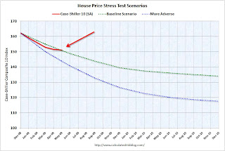 The Stress Test scenarios use the Composite 10 index and start in December. Here are the numbers:
Edit correction: All data for May.
Case-Shiller Composite 10 Index, May: 151.13
Stress Test Baseline Scenario, May: 150.85
Stress Test More Adverse Scenario, May: 143.81
So far house prices are tracking the baseline scenario, but I believe the seasonal adjustment is insufficient and prices will decline faster in the Fall.
Case-Shiller Prices Fall in May Seasonally Adjusted
by Calculated Risk on 7/28/2009 09:41:00 AM
Just a note to the previous post.
Case-Shiller has released the Seasonally Adjusted house price index.
Prices fell slightly in May (compared to April) for the Composite 10 and Composite 20 indexes.
Seasonally adjusted, prices fell in 12 of the 20 Case Shiller cities.
There is a strong seasonal pattern to house prices, and it is important to use the SA data. Unfortunately Case-Shiller did not release the SA data earlier this morning. This has lead to numerous incorrect headlines about prices increasing from April to May. That is correct, if they mention the data is Not Seasonally Adjusted.
Case-Shiller House Prices for May
by Calculated Risk on 7/28/2009 09:00:00 AM
Important Note: Case-Shiller hasn't released the Seasonally Adjusted data yet for May. There is a strong seasonal pattern for prices and this is the NSA data.
S&P/Case-Shiller released their monthly Home Price Indices for May this morning.
This monthly data includes prices for 20 individual cities, and two composite indices (10 cities and 20 cities). Note: This is not the quarterly national index. Click on graph for larger image in new window.
The first graph shows the nominal seasonally adjusted Composite 10 and Composite 20 indices (the Composite 20 was started in January 2000).
The Composite 10 index is off 33.3% from the peak, and up slightly in May.
The Composite 20 index is off 32.3% from the peak, and up slightly in May.
NOTE: This is the NSA data, prices probably fell using the SA data.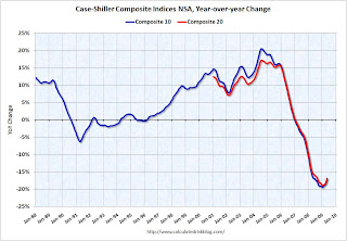 The second graph shows the Year over year change in both indices.
The Composite 10 is off 16.8% over the last year.
The Composite 20 is off 17.1% over the last year.
This is still a very strong YoY decline.
The third graph shows the price declines from the peak for each city included in S&P/Case-Shiller indices. Prices increased (NSA) in 14 of the 20 Case-Shiller cities in May. In Phoenix, house prices have declined 54.5% from the peak. At the other end of the spectrum, prices in Dallas are only off about 8% from the peak. Prices have declined by double digits almost everywhere.
I'll compare house prices to the stress test scenarios soon.
Wednesday, July 22, 2009
Lawler on Sticky House Prices
by Calculated Risk on 7/22/2009 11:59:00 PM
Note: Thomas Lawler is a former Fannie Mae and Wall Street economist who now writes a newsletter. He did an excellent job calling the housing bubble and bust, and I've quoted him a few times over the years.
From James Hagerty at the WSJ: As Housing Loses its Stickiness, Prices Reach Bottom Quicker
Tom Lawler has a new concept. He calls it the “de-stickification” of house prices.Once again house prices were sticky. Even in the low priced areas with significant foreclosure activity, prices have fallen for several years. The question is how sticky?
Though Mr. Lawler was among the more bearish of housing economists when the market was still bubbling, he recently has been arguing that prices for low- and mid-range homes are stabilizing in many parts of the country ...
Part of the bear case involves the historical observation that it takes many years for house prices to bottom out because they are “sticky,” or slow to adjust downward even when supply surges and demand evaporates. In the past, home prices adjusted slowly in such circumstances because homeowners are stubborn and often don’t need to sell immediately. When Los Angeles had a housing slump in the early 1990s, caused in part by a plunge in aerospace-related employment, the Case-Shiller price index for the city started falling gradually in early 1990 and didn’t hit bottom until 1996.
This time around, Mr. Lawler argues, things are happening a lot faster. That’s partly because banks are dealing with a foreclosure rate not seen at least since the Great Depression. ...
That has forced prices down much more quickly than would have been expected in some of the milder down cycles of the past, Mr. Lawler says. ...
Not that Mr. Lawler sees another housing boom around the corner.
What Lawler is apparently suggesting is that significant foreclosure activity makes prices less sticky in for "low- and mid-range" priced homes - I agree - and I've argued before that some low priced areas could be near the price bottom.
The dynamics will probably be different in the mid-to-high priced areas. With few move-up buyers, I expect prices to fall for some time in the mid-to-high priced range bubble areas (especially in real terms). Of course foreclosure activity is picking up in the high priced areas - see DataQuick's report today - but I think it will still take some time for prices to fall to the market clearing price.
Thursday, July 16, 2009
Housing: Sticky Prices
by Calculated Risk on 7/16/2009 09:41:00 PM
Earlier today, DataQuick reported that home sales increased in the California Bay Area. The report mentioned "a perception among potential buyers that prices have bottomed out."
First, a little history: When the housing bubble was inflating, the demand for housing surged with the widespread use of non-traditional mortgage products. Looking at a supply-demand diagram, this surge in demand pushed the curve to the right.
At the same time speculators were buying up properties, reducing the supply with the intention of selling later at a higher price. This activity shifted the supply curve to the left (this activity was classic storage).
So with the surge in demand, combined with speculators removing supply from the market, prices skyrocketed.
This is exactly what I described in April 2005: Housing: Speculation is the Key
Of course, once the bubble burst, the supply curve shifted back to the right with speculators unloading properties and all the distressed sales. At the same time, demand declined sharply as speculators disappeared and lenders tightened standards.
If housing was a perfect market, prices would have fallen rapidly to the market clearing price. However housing prices are sticky downward - as I described in 2005 post: "[R]eal estate prices display strong persistence and are sticky downward. Sellers tend to want a price close to recent sales in their neighborhood, and buyers, sensing prices are declining, will wait for even lower prices.
This means real estate markets do not clear immediately, and what we usually observe is a drop in transaction volumes."
This doesn't mean prices are stuck - just sticky. Prices have been falling in most areas for three years, and will probably fall further.
And this brings us back to the DataQuick article. Just because demand is picking up a little, doesn't mean prices have bottomed. Note: Ignore the median price in the article - that is rising because of the change in mix.
Assume the following diagram shows the current housing market supply and demand. With the current supply and demand curves, and a perfect market, prices would be at P0 and quantity Q0. However prices were actually at P1.
Note that demand doesn't fall to zero just because the price is above the market clearing price.
Now prices have fallen from P1 to P2. Click on graph for larger image in new window.
This has increased the demand from Q1 to Q2.
I've drawn the diagram to show P2 is still above P0 (typo fixed). Naturally the current buyers think "prices have bottomed out", but they haven't for the market shown.
There are clues in the DataQuick report that prices are still too high. The volume of sales is still below normal, foreclosure resales are 37.3 percent of the resale market (a very high percentage) - and foreclosure activity "remains near record levels". And the foreclosure resale statistic don't include short sales, and the recent data from Sacramento suggest short sale activity is fairly strong.
There are other reasons to believe prices will fall further, but I just want to point out that the small pickup in demand doesn't suggest a price bottom.
Monday, July 13, 2009
Shiller on Housing
by Calculated Risk on 7/13/2009 10:19:00 AM
"One thing is true about housing, it is a very inefficient market - and it shows momentum. And in fact, when the rate of decline slows that is evidence that the rate of decline will continue to slow because there has been a second derivative effect that is actually in the data historically."UPDATE: Ignore the Tech Ticker story title - Shiller said he felt an echo bubble was unlikely.
Robert Shiller, July 13, 2009
An interview with Robert Shiller at Tech Ticker: “Another Bubble” In Housing? It Could Happen, Says Yale’s Robert Shiller (ht Dirk van Dijk)
The slowing rate of decline in home prices is likely to continue but the housing market is "still in an abysmal situation," says Robert Shiller, a professor of economics at Yale. ... [Shiller] says the housing market could "languish for many years," due to the "huge inventory" of unsold holds, "shadow inventory" of homes kept off the market by banks and other potential sellers, and "a lot of financial problems."Housing markets are very inefficient - and that is why it takes several years for prices to fall to a market clearing price. Even if the rate of price declines has slowed, there will probably be a long tail of real price declines in many areas.
[Shiller] believes "there could be another bubble" in housing, once the excess inventory is worked off. "This is not my more probable scenario [but] people have gotten very speculative in their attitudes toward housing," he says.
"My more probable scenario is languishing of the housing market for years."
Robert Shiller
Tuesday, June 30, 2009
House Prices: The Long Tail
by Calculated Risk on 6/30/2009 02:14:00 PM
First a couple of quotes:
From Bloomberg: Shiller Sees ‘Improvement’ in Rate of Home-Price Drop
Home prices saw a “striking improvement in the rate of decline” in April and trading in funds launched today indicates investors believe the U.S. housing slump is nearing a bottom, said Yale University economist Robert Shiller.From the WSJ: Home Prices Drop at Slower Pace
“At this point, people are thinking the fall is over,” Shiller, co-founder of the home price index that bears his name, said in a Bloomberg Radio interview today. “The market is predicting the declines are over.”
...
“My guess would be that home prices are going to level off -- they’re not going to keep falling,” Shiller said in a separate interview with Bloomberg Television. Still, it’s “hard to predict” a speculative market, and “I am not optimistic that we’re going to see any sharp rebound.”
Home prices in 20 major cities fell an average 0.6% in April, an improvement over the 2.2% decline the prior month, according to the Case-Shiller index produced by Standard & Poor's and released Tuesday.First, the 0.6% decline in the Composite 20 index (mentioned in the WSJ) is the Not Seasonally Adjusted (NSA) index. The NSA index was at 139.97 in March, and 139.18 in April.
...
David Blitzer, chairman of S&P's index committee, said in a statement that while "some stabilization may be appearing in some markets," the spring buying season usually helps buoy housing-market activity. "It will take some time to determine if a recovery is really here," he said.
The Composite 20 Seasonally Adjusted (SA) index was at 141.36 in March and 140.1 in April - a decline of 0.9% or 10.2% annualized.
So house prices were falling at about a 10% annualized rate in April - and that apparently feels like "stabilization"!
By most measure like price-to-income, price-to-rent and real prices, a large portion of the probable price declines are behind us. See: House Prices: Real Prices, Price-to-Rent, and Price-to-Income Note: that post is based on the quarterly Case-Shiller National price index.
But in many previous housing busts, there was a long tail of smaller price declines (especially in real terms).
 Click on graph for larger image in new window.
This graph shows the annualized rate of change, monthly, for the Case-Shiller Composite 10 SA index.
Note: The Composite 20 index mentioned in the WSJ only goes back to January 2000.
Notice that during the early '90s housing bust, prices fell on and off for a few years after the worst of the price declines were over.
 The second graph shows this long tail of price declines in real terms (the composite 20 index adjusted with CPI less Shelter).
 I'm not sure we've reached the "long tail" portion of this housing bust yet, but I think that prices will follow a similar pattern as previous busts, with prices falling in real terms for a few years after the worst of the price declines are over.
With record delinquencies, record foreclosures, few move-up buyers (impacting the mid-to-high end), a huge overhang of inventory, I believe prices will continue to fall in many areas.


