by Calculated Risk on 5/21/2011 08:15:00 AM
Saturday, May 21, 2011
Summary for Week Ending May 20th
The economic data was soft last week. The Empire State and Philly Fed manufacturing surveys showed much slower growth in May. And industrial production from the Fed (for April) showed no change, although this was probably related to supply chain issues and the earthquake in Japan.
For housing, the data was weak as usual. The NAHB survey showed builders are still depressed and the Census Bureau reported housing starts declined in April. Existing home sales also declined in April, although inventory declined year-over-year (for anyone looking for a small silver lining). But there is still 9.2 months of supply on the market - and that doesn't include the shadow inventory.
The MBA reported the percentage of delinquent first lien loans, including loans in the foreclosure process, was unchanged at the end of Q1 on a seasonally adjusted basis. This was disappointing because other indicators suggested a decline in overall delinquencies.
There was a little good news for the U.S. economy - gasoline prices are now down about 10 cents per gallon nationally from the recent peak, and initial weekly unemployment claims declined last week.
Below is a summary of economic data last week mostly in graphs:
• April Existing Home Sales: 5.05 million SAAR, 9.2 months of supply
The NAR reported: April Existing-Home Sales Ease
 Click on graph for larger image in graph gallery.
This graph shows existing home sales, on a Seasonally Adjusted Annual Rate (SAAR) basis since 1993.
Sales in April 2011 (5.05 million SAAR) were 0.8% lower than last month, and were 12.9% lower than in April 2010. According to the NAR, inventory increased to 3.87 million in April from 3.52 million in March.
Inventory is not seasonally adjusted and there is a clear seasonal pattern with inventory peaking in the summer and declining in the fall and winter. The next graph shows the year-over-year (YoY) change in reported existing home inventory and months-of-supply. Note: Months-of-supply is based on the seasonally adjusted sales and not seasonally adjusted inventory - so the increase in months-of-supply during the Spring is expected.
 Although inventory increased from March to April (as usual), inventory decreased 3.9% year-over-year in April from April 2010. This is the third consecutive month with a YoY decrease in inventory.
Inventory should increase over the next few months and peak in the summer (the normal seasonal pattern), and the YoY change is something to watch closely this year.
• Housing Starts declined in April
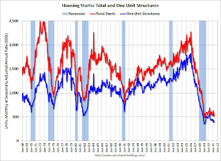 Total housing starts were at 523 thousand (SAAR) in April, down 10.6% from the revised March rate of 585 thousand. Single-family starts decreased 5.1% to 394 thousand in April.
This graph shows total and single unit starts since 1968. This shows the huge collapse following the housing bubble, and that housing starts have mostly been moving sideways for over two years - with slight ups and downs due to the home buyer tax credit. This was well below expectations of 570 thousand starts in April.
• MBA: Total Delinquencies essentially unchanged in Q1 Seasonally Adjusted
The MBA reported that 12.84 percent of mortgage loans were either one payment delinquent or in the foreclosure process in Q1 2011 (seasonally adjusted). This is essentially the same as in Q4. There was a significant decline in Not Seasonally Adjusted (NSA) delinquencies, but that is the usual seasonal pattern.
The following graph shows the percent of loans delinquent by days past due.
 Loans 30 days delinquent increased to 3.35% from 3.26% in Q4. This is below the average levels of the last 2 years, but still higher than normal.
Delinquent loans in the 60 day bucket were unchanged at 1.35%; this is the lowest since Q2 2008. There was a slight increase in the 90+ day delinquent bucket. This increased from 3.62% in Q4 to 3.65% in Q1 2011.
The percent of loans in the foreclosure process decreased to 4.52%.
The following graph is for each state and includes all delinquent loans (sorted by percent seriously delinquent).
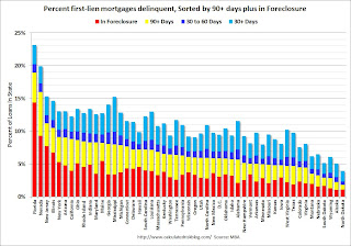 Florida and Nevada have the highest percentage of serious delinquent loans, followed by New Jersey, Illinois, New York, Arizona and California.
And the next graph shows the change in the percent delinquent based on Q1 2007, Q1 2010 (the peak of the crisis nationally), and Q1 2011. These are the 10 worst states sorted by the current percent seriously delinquent.
 For each state there are 3 columns (Q1 2007, 2010, and 2011). In Ohio and Indiana, delinquency rates were already elevated by Q1 2007.
Some states have made progress: Arizona, Nevada and California. For other states like New Jersey and New York, serious delinquencies were higher in Q1 2011 than in Q1 2010.
But even though there has been some progress, there is a long way to go to get back to the 2007 rates.
Here is a post for the remaining 40 states.
• Industrial Production unchanged in April, Capacity Utilization declines slightly
From the Fed: Industrial production and Capacity Utilization
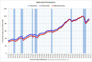 The next graph shows industrial production since 1967.
Industrial production was unchanged in April at 93.1; previous months were revised down, so this is a decline from the previously reported level in March.
Production is still 7.6% below the pre-recession levels at the end of 2007.
The consensus was for a 0.4% increase in Industrial Production in April, and an increase to 77.6% for Capacity Utilization. So this was well below expectations - partly because of the earthquake in Japan.
• AIA: Architecture Billings Index indicates declining demand in April
Note: This index is a leading indicator for new Commercial Real Estate (CRE) investment.
From Reuters: US architecture billings index falls in April-AIA
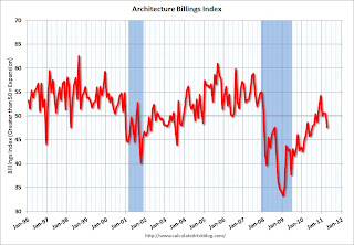 This graph shows the Architecture Billings Index since 1996. The index showed billings decreased in April (index at 47.6, anything below 50 indicates a decrease in billings).
Note: Nonresidential construction includes commercial and industrial facilities like hotels and office buildings, as well as schools, hospitals and other institutions.
According to the AIA, there is an "approximate nine to twelve month lag time between architecture billings and construction spending" on non-residential construction.
• Other Economic Stories ...
• Empire State Manufacturing Survey indicates slower growth in May
• Philly Fed Survey shows "regional manufacturing activity grew slightly in May"
• Residential Remodeling Index increases in March
• NAHB Builder Confidence index unchanged at low level in May
Best wishes to all!
Saturday, May 14, 2011
Summary for Week Ending May 13th
by Calculated Risk on 5/14/2011 08:36:00 AM
This was a light week for economic data. As expected, house prices continued to decline in March, the trade deficit increased in March due to higher oil prices, and inflation picked up a little, mostly due to - what else? - higher oil prices in April.
The good news is oil prices have fallen in May, and (WTI futures) are now under $100 per barrel (WTI futures were close to $114 per barrel at the end of April). Meanwhile the ten year Treasury yield has fallen to 3.19%, and mortgage rates are at the low for the year (the 30 year conforming is at 4.63%).
Below is a summary of economic data last week mostly in graphs:
• CoreLogic: House Prices declined 1.5% in March, Prices now 4.6% below 2009 Lows
Notes: Case-Shiller is the most followed house price index, but CoreLogic is used by the Federal Reserve and is followed by many analysts.
From CoreLogic: CoreLogic® Home Price Index Shows Year-Over-Year Decline for 8th Straight Month
 Click on graph for larger image in graph gallery.
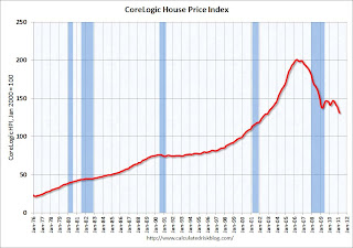
This graph shows the national CoreLogic HPI data since 1976. January 2000 = 100.
The index is down 7.5% over the last year, and off 34.8% from the peak.
This was the eight straight month of year-over-year declines, and the ninth straight month of month-to-month declines. The index is now 4.6% below the previous post-bubble low set in March 2009, and I expect to see further new post-bubble lows for this index over the next few months.
 The second graph shows the quarterly Case-Shiller National Index (through Q4 2010), and the monthly Case-Shiller Composite 20 (through February release) and CoreLogic House Price Indexes (through March release) in real terms (adjusted for inflation using CPI less Shelter).
In real terms, the National index is back to Q1 2000 levels, the Composite 20 index is back to December 2000, and the CoreLogic index back to December 1999.
 The third graph is a price-to-rent ratio using the Case-Shiller Composite 20 (through February) and CoreLogic House Price Index (through March) (January 1998 = 1.0).
On a price-to-rent basis, the Composite 20 index is just above the May 2009 levels (and about at November 2000 levels), and the CoreLogic index is back to December 1999.
• Trade Deficit increased to $48.2 billion in March
 The first graph shows the monthly U.S. exports and imports in dollars through March 2011.
Both imports and exports increased in March (seasonally adjusted). Exports are well above the pre-recession peak, but imports are now increasing at a faster rate - mostly because of oil prices.
The second graph shows the U.S. trade deficit, with and without petroleum, through March.
 The blue line is the total deficit, and the black line is the petroleum deficit, and the red line is the trade deficit ex-petroleum products.
The petroleum deficit increased sharply in March as both the quantity and price increased - prices averaged $93.76 per barrel in March, up from $87.17 in February. Prices will be even higher in April.
The trade deficit was larger than the expected $47 billion.
• BLS: CPI increased 0.4% in April
 This graph shows three measure of underlying inflation on a year-over-year basis. Over the last 12 months, core CPI has increased 1.3%, median CPI has increased 1.4%, and trimmed-mean CPI increased 1.7%.
Although the year-over-year increases are below the Fed's inflation target, the annualized rates were above the target in April. Core CPI increased at an annualized rate of 2.2%, median CPI 2.8% annualized, and trimmed-mean CPI increased 3.3% annualized.
However, with the slack in the system, I expect the year-over-year core measures to stay below 2% this year.
• BLS: Job Openings increased in March, Highest since 2008
 This graph shows job openings (yellow line), hires (purple), Layoff, Discharges and other (red column), and Quits (light blue column) from the JOLTS.
Notice that hires (purple) and total separations (red and blue columns stacked) are pretty close each month. When the purple line is above the two stacked columns, the economy is adding net jobs - when it is below the columns, the economy is losing jobs.
In general job openings (yellow) has been trending up - and are up 16% from March 2010. However the overall turnover remains low.
• NFIB: Small Business Optimism Index decreases in April
 This graph shows the small business optimism index since 1986. The index decreased to 91.2 in April from 91.9 in March.
This has been trending up, although optimism has declined for two consecutive months now.
Note: Small businesses have a larger percentage of real estate and retail related companies than the overall economy.
The recovery continues to be sluggish for this index, probably partially because of the high concentration of real estate related companies.
• Consumer Sentiment increases in May
 The preliminary May Reuters / University of Michigan consumer sentiment index increased to 72.4 from 69.8 in April.
This was slightly above the consensus forecast of 70.0.
In general consumer sentiment is a coincident indicator and is usually impacted by employment (and the unemployment rate) and gasoline prices.
This is still a low reading, but sentiment will probably improve later this month if gasoline prices fall.
• Other Economic Stories ...
• NY Fed Q1 Report on Household Debt and Credit
• Zillow on Negative Equity: 28.4% of all single-family homes with mortgages are "underwater"
• AAR: Rail Traffic "mixed" in April
• Ceridian-UCLA: Diesel Fuel index declines in April
• Unofficial Problem Bank list at 983 Institutions
Best wishes to all!
Saturday, April 16, 2011
Summary for Week ending April 15th
by Calculated Risk on 4/16/2011 11:15:00 AM
It now appears that Q1 real GDP growth will be less than 2%, but recent data suggests a pickup in March and into April. We will see.
Overall the U.S. story remains the same: manufacturing is the leading the recovery with the NY Fed index (for April) and the Industrial Production report (for March) both showing solid expansion. For more downbeat news, we will hear from housing next week (housing starts and existing home sales). Headline inflation has picked up, although core inflation remains below the Fed’s target. Oil prices are still high, with WTI crude futures near $110 per barrel, and gasoline near $4 per gallon, and these prices are impacting retail sales and are a drag on U.S. and global growth.
Unfortunately there are also several international headwinds. Officials are now talking openly about Greece defaulting, Ireland debt was downgraded, Portugal is negotiating a bailout ... Japan is still struggling, the middle-east and North Africa unrest continues, and China is overheating again. Interesting times.
Below is a summary of economic data last week mostly in graphs:
• Retail Sales increased 0.4% in March
 Click on graph for larger image in graph gallery.
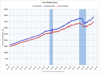
On a monthly basis, retail sales increased 0.4% from February to March (seasonally adjusted, after revisions), and sales were up 7.1% from March 2010.
This graph shows retail sales since 1992. This is monthly retail sales, seasonally adjusted (total and ex-gasoline).
Retail sales are up 16.0% from the bottom, and now 2.5% above the pre-recession peak.
 The second graph shows the year-over-year change in retail sales (ex-gasoline) since 1993.
Retail sales ex-gasoline increased by 5.8% on a YoY basis (7.1% for all retail sales).
This was below expectations for a 0.5% increase. Retail sales ex-autos were up 0.8%; slightly above expectations of a 0.7% increase. Retail sales ex-gasoline were only up 0.1% in March - and this shows the impact of higher gasoline prices.
• Trade Deficit decreased in February to $45.8 billion
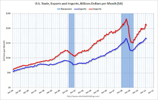 "February exports were $2.4 billion less than January exports of $167.5 billion. February imports were $3.6 billion less than January imports of $214.5 billion."
This graph shows the monthly U.S. exports and imports in dollars through January 2011.
Both imports and exports declined slightly in February (seasonally adjusted). Still exports are now above the pre-recession peak.
The next graph shows the U.S. trade deficit, with and without petroleum, through February.
 "[T]otal February exports of $165.1 billion and imports of $210.9 billion resulted in a goods and services deficit of $45.8 billion, down from $47.0 billion in January, revised."
The blue line is the total deficit, and the black line is the petroleum deficit, and the red line is the trade deficit ex-petroleum products.
The petroleum deficit decreased in February as the quantity declined even as import prices continued to rise - averaging $87.17 in February. Prices will be even higher in March and April. The trade deficit was larger than the expected $44 billion.
• Industrial Production, Capacity Utilization increased in March
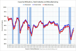 This graph shows Capacity Utilization. This series is up 10 percentage points from the record low set in June 2009 (the series starts in 1967).
Capacity utilization at 77.4% is still "3.0 percentage points below its average from 1972 to 2010" - and below the pre-recession levels of 81.2% in November 2007.
 The next graph shows industrial production since 1967.
Industrial production increased in March to 93.6, however February was revised down from 93.0 to 92.8. So the increase was reported at 0.8% but would have been 0.6% without the downward revision.
Production is still 7.0% below the pre-recession levels at the end of 2007.
The consensus was for a 0.5% increase in Industrial Production in March, and an increase to 77.4% (from 76.3%) for Capacity Utilization. So this was close to expectations.
• NFIB: Small Business Optimism Index decreases in March
From National Federation of Independent Business (NFIB): Hiring Up, But Optimism Down in March
Note: Small businesses have a larger percentage of real estate and retail related companies than the overall economy.
 From NFIB: "The Index of Small Business Optimism gave up 2.6 points in March, falling to 91.9. Four components rose or were unchanged, while six lost ground. The “hard” components of the Index (job creation, job openings, capital spending plans and inventory plans) added two points while the “soft” components (the other six in the table above) gave up 31 points".
This graph shows the small business optimism index since 1986. The index decreased to 91.9 in March from 94.5 in February.
This has been trending up, although the level is still very low.
• BLS: Job Openings increase in February, Highest since 2008
The following graph shows job openings (yellow line), hires (purple), Layoff, Discharges and other (red column), and Quits (light blue column) from the Job Openings and Labor Turnover Summary
 Notice that hires (purple) and total separations (red and blue columns stacked) are pretty close each month. When the purple line is above the two stacked columns, the economy is adding net jobs - when it is below the columns, the economy is losing jobs.
In general job openings (yellow) has been trending up - and are up 23% from February 2010. However the overall turnover remains low.
• Consumer Sentiment increases slightly in April
 The preliminary April Reuters / University of Michigan consumer sentiment index increased to 69.6 in April from 67.5 in March.
This was slightly above the consensus forecast of 69.0.
In general consumer sentiment is a coincident indicator and is usually impacted by employment (and the unemployment rate) and gasoline prices.
This low reading is probably due to $4 per gallon gasoline prices.
• Core Measures show low inflation in March
The Cleveland Fed released the median CPI and the trimmed-mean CPI: Over the last 12 months, core CPI has increased 1.2%, median CPI has increased 1.2%, and trimmed-mean CPI increased 1.5%.
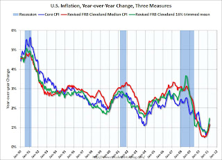 This graph shows these three measure of inflation on a year-over-year basis.
These measures all show that year-over-year inflation is still low, but increasing lately.
A little good news: Core CPI increased at an annualized rate of 1.6% (down from 2.4% in February), median CPI 1.6% annualized in March, and trimmed-mean CPI increased 3.0% annualized (high, but down from 3.8% annualized last month).
• Other Economic Stories ...
• From Reuters: Fed's Yellen says too soon to start reversing policy
• From Bloomberg: Dudley Says Fed Shouldn’t Rush to Tighten Policy ‘Too Early’
• From Fed Vice Chair Janet Yellen: Commodity Prices, the Economic Outlook, and Monetary Policy
• Press Release: Pulse of Commerce Index Jumps 2.7% in March
• Beige Book: Fed sees economic improvement
• From the Empire State Manufacturing Survey indicates faster growth in April
• From Bloomberg: Greece May Need Debt Restructuring, Schaeuble Tells Die Welt
• Unofficial Problem Bank list at 978 Institutions
Best wishes to all!
Saturday, March 26, 2011
Summary for Week ending March 25th
by Calculated Risk on 3/26/2011 11:31:00 AM
World events once again dominated the headlines last week, with the Japanese nuclear issues, Libya, the Middle-East (especially Syria) and also the European financial crisis (Portugal, Ireland, Greece - even Spain and more) all on the front page.
In the U.S., the economic data was weaker, mostly because the major economic releases were housing related. New home sales were at a record low, and existing home sales fell sharply. But also durable goods orders were weaker than expected and consumer sentiment declined sharply from February (probably due to high gasoline prices and world events).
On the positive side, initial weekly unemployment claims continued to decline and the Richmond Fed manufacturing survey indicated continued expansion in March.
Below is a summary of economic data last week mostly in graphs:
• New Home Sales Fall to Record Low in February
 Click on graph for larger image in graph gallery.
The Census Bureau reported New Home Sales in February were at a seasonally adjusted annual rate (SAAR) of 250 thousand. This was down from a revised 301 thousand in January.
The first graph shows New Home Sales vs. recessions since 1963. The dashed line is the current sales rate. This was a new record low sales rate and well below the consensus forecast of 290 thousand homes sold (SAAR).
 The 2nd graph shows "months of supply". Months of supply increased to 8.9 in February from 7.4 months in January. The all time record was 12.1 months of supply in January 2009. This is very high (less than 6 months supply is normal).
The third graph shows sales NSA (monthly sales, not seasonally adjusted annual rate).
 In February 2010 (red column), 19 thousand new homes were sold (NSA). This is a new record low for the month of February.
The previous record low for February was 27 thousand in 2010. The high was 109 thousand in 2005.
This was a very weak report ...
• February Existing Home Sales: 4.88 million SAAR, 8.6 months of supply
The NAR reported: February Existing-Home Sales Decline
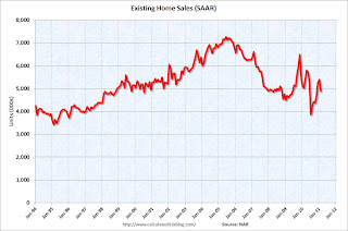 This graph shows existing home sales, on a Seasonally Adjusted Annual Rate (SAAR) basis since 1993.
Sales in February 2011 (4.88 million SAAR) were 9.6% lower than last month, and were 2.8% lower than February 2010.
The next graph shows the year-over-year (YoY) change in reported existing home inventory and months-of-supply. Inventory is not seasonally adjusted, so it really helps to look at the YoY change.
 Although inventory increased from January to February (as usual), inventory decreased 1.2% YoY in February. This is a small YoY decrease and follows six consecutive month of year-over-year increases in inventory.
Inventory should increase over the next few months (the normal seasonal pattern), and the YoY change is something to watch closely this year. Inventory and "months of supply" are already very high, and further YoY increases in inventory would put more downward pressure on house prices.
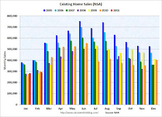 This graph shows existing home sales Not Seasonally Adjusted (NSA).
The red columns in January and February are for 2011.
Sales NSA were about the same level as the last three years. February is usually the second weakest month of the year for existing home sales (close to January). The real key is what happens in the spring and summer - and March sales and inventory will give a clearer picture of existing home sales activity.
• AIA: Architecture Billings Index increased slightly in February
From the American Institute of Architects: Architecture Firm Billings Increase Slightly in February. Note: This index is a leading indicator for new Commercial Real Estate (CRE) investment.
 This graph shows the Architecture Billings Index since 1996. The index showed billings were slightly higher in February (at 50.6).
According to the AIA, there is an "approximate nine to twelve month lag time between architecture billings and construction spending" on non-residential construction. So this indicator suggests the drag from CRE investment will end mid-year 2011 or so - but there won't be a strong increase in investment.
• Consumer Sentiment declines in March
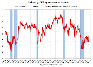 The final March Reuters / University of Michigan consumer sentiment index declined to 67.5 from the preliminary March reading of 68.2 - and down from 77.5 in February. This is the lowest level since November 2009 and was below the consensus forecast of 68.0.
In general consumer sentiment is a coincident indicator and is usually impacted by employment (and the unemployment rate) and gasoline prices.
With higher gasoline prices and the scary world news, a low reading isn't that surprising.
• Other Economic Stories ...
• From the Chicago Fed: Economic Growth Near Average in February
• From the Richmond Fed: Manufacturing Activity Continues to Advance in March; Expectations Remain Upbeat
• ATA Truck Tonnage Index declined in February
• Moody's: Commercial Real Estate Prices declined 1.2% in January
• DOT: Vehicle Miles Driven increased slightly in January
• Q4 Real GDP Growth revised up to 3.1%
• Unofficial Problem Bank list increases to 985 Institutions
Best wishes to all!
Saturday, February 26, 2011
Summary for Week ending February 25th
by Calculated Risk on 2/26/2011 02:36:00 PM
With the exception of housing, most of the U.S. economic data last week was fairly positive. We were also reminded of several potential downside risks to the U.S. economy, as falling house prices, higher oil prices, the European financial crisis, and state and local government cutbacks, were all in the news.
The focus last week was once again on the Middle East and North Africa, and especially on the historic and tragic events in Libya. These events have pushed U.S. oil prices to around $100 per barrel and have raised questions about the possible drag of higher oil prices on the U.S. economy.
The European financial crisis has been on the back burner, but yields are still elevated and there are key Euro Zone meetings scheduled in March. I expect this to be front page news again soon.
And a downward revision to state and local government spending contributed to the downward revision in the Q4 real GDP growth estimate, revised down to 2.8% from 3.2%. And several state budgets were in the news, especially the Wisconsin political battles.
The Case-Shiller house price index showed house prices are still falling – for the sixth consecutive month – and more house price declines are expected with the high levels of inventory and a high percentage of distressed sales. Eleven of the twenty Case-Shiller cities are now at new post-bubble lows: Atlanta, Charlotte, Chicago, Detroit, Las Vegas, Miami, New York, Phoenix, Portland (OR), Seattle and Tampa, and more will probably follow. Also new home sales remained weak in January.
These are all risks to 2011 economic growth.
But other economic news was more positive. On employment, all of the preliminary indicators suggested an increase in hiring. The four week average of initial weekly unemployment claims fell to the lowest level since 2008. The regional manufacturing surveys all suggest an increase in employment. The Reuters / University of Michigan consumer sentiment index was at the highest level in three years.
And growth in manufacturing continues to be strong. The Richmond Fed reported Manufacturing Activity Advanced at a Healthy Pace in February, and the the Kansas City Fed reported Manufacturing activity matched an all-time survey high in February. This suggests a strong ISM manufacturing report on March 1st.
Below is a summary of economic data last week mostly in graphs:
• Case-Shiller: National Home Prices Are Close to the 2009Q1 Trough
S&P/Case-Shiller reported that home prices are close to a post-bubble low.
 Click on graph for larger image in graph gallery.
This graph shows the nominal seasonally adjusted Composite 10 and Composite 20 indices (the Composite 20 was started in January 2000).
The Composite 10 index is off 31.2% from the peak and still 2.4% above the May 2009 post-bubble bottom.
The Composite 20 index is also off 31.2% from the and only 0.8% above the May 2009 post-bubble bottom and will probably be at a new post-bubble low in January.
The next graph shows the price declines from the peak for each city included in S&P/Case-Shiller indices.
 From S&P:
Eleven MSAs posted new index level lows in December 2010, since their 2006/2007 peaks. These cities are Atlanta, Charlotte, Chicago, Detroit, Las Vegas, Miami, New York, Phoenix, Portland (OR), Seattle and Tampa.Prices are now falling just about everywhere, and more cities are hitting new post-bubble lows. Both composite indices are still slightly above the post-bubble low, but the indexes will probably be at new lows in early 2011.
• New Home Sales decreased in January
 The Census Bureau reports New Home Sales in January were at a seasonally adjusted annual rate (SAAR) of 284 thousand. This is down from a revised 325 thousand in December.
This graph shows New Home Sales vs. recessions since 1963. The dashed line is the current sales rate. New home sales have averaged 293 thousand per month (annual rate) over the last nine months - all below the previous record low.
 The last graph shows sales NSA (monthly sales, not seasonally adjusted annual rate).
In January 2010 (red column), 19 thousand new homes were sold (NSA). This is a new record low for the month of January.
The previous record low for January was 24 thousand in 2009 and 2010.
 Starting in 1973 the Census Bureau broke down inventory into three categories: Not Started, Under Construction, and Completed.
The inventory of completed homes for sale fell to 78,000 units in January. And the combined total of completed and under construction is at the lowest level since this series started.
• January Existing Home Sales: 5.36 million SAAR, 7.6 months of supply
 This graph shows existing home sales, on a Seasonally Adjusted Annual Rate (SAAR) basis since 1993.
 Sales in January 2010 (5.36 million SAAR) were 2.7% higher than last month, and were 5.3% higher than January 2010.
The next graph shows the year-over-year (YoY) change in reported existing home inventory and months-of-supply. Inventory is not seasonally adjusted, so it really helps to look at the YoY change. According to the NAR, inventory decreased to 3.38 million in January from 3.56 million in December.
 Although inventory decreased from December to January, inventory increased 3.1% YoY in January. This is the sixth consecutive month of year-over-year increases in inventory, although the increase in January was lower than the previous months. But any increase is bad news with the high level of inventory.
Inventory should increase in February and March, and this is something to watch closely over the next few months.
 This graph shows existing home sales Not Seasonally Adjusted (NSA).
The red column in January is for 2011. Sales NSA were about the same level as the last three years. January is usually the weakest month of the year for existing home sales (followed by February). The real key is what happens in the spring and summer.
The bottom line: Sales increased slightly in January (using the old method to estimate sales), apparently due to an increase in investor purchases of distressed properties at the low end. Inventory remains very high, and the year-over-year increase in inventory is very concerning.
Special Note: Back in January, I noted that it appeared the NAR had overestimated sales by 5% or so in 2007, and that the errors had increased since then (perhaps 10% to 15% or more in 2009 and 2010). The numbers released this week will probably be revised down significantly this summer.
• AIA: Architecture Billings Index shows no change in January
From the American Institute of Architects: Billings at Architecture Firms Hold Steady in January
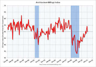 This graph shows the Architecture Billings Index since 1996. The index showed billings were at the same level in January as in December (at 50).
Note: Nonresidential construction includes commercial and industrial facilities like hotels and office buildings, as well as schools, hospitals and other institutions.
According to the AIA, there is an "approximate nine to twelve month lag time between architecture billings and construction spending" on non-residential construction. So this indicator suggests the drag from CRE investment will end mid-year 2011 or so.
• Consumer Sentiment increases in February
 The final February Reuters / University of Michigan consumer sentiment index increased to 77.5, the highest level in three years.
This was above the consensus forecast of 75.4.
In general consumer sentiment is a coincident indicator. This is still fairly low, but improving.
• Total REO decreased slightly in Q4
 This graph from economist Tom Lawler shows an estimate of all the REO inventory. Lawler writes:
 Based on the FDIC’s QBP report, as well as preliminary data on REO for private-label securities (using Barclay’s Capital data, as I don’t have data from my other source yet), REO inventory at “the F’s,” FDIC-insured institutions, and PLS would look as follows [see graph]From CR: REO inventory is still below the levels in 2008 - but not much - and that was when prices were falling quickly. I think the various lenders are a little more careful disposing of REOs now, but the level of REOs suggest downward house price pressure.
• Other Economic Stories ...
• Q4 real GDP growth revised down to 2.8% annualized rate
• From Nick Timiraos: Home Sales Data Doubted
• From David Streitfeld at the NY Times: Shiller says house prices could fall 15% to 25%
• From MarketWatch: Consumer confidence jumps in February
• From the American Trucking Association: ATA Truck Tonnage Index Surged 3.8 Percent in January
• Unofficial Problem Bank list increases to 960 Institutions
Best wishes to all!
Sunday, February 13, 2011
Summary for Week ending February 12th
by Calculated Risk on 2/13/2011 09:00:00 AM
Here is the busy economic schedule for the coming week.
• Egpyt
From the NY Times: Military Offers Assurances to Egypt and Neighbors
From the WSJ: Egypt's Military Moves to Clear Tahrir Square
From the Financial Times: Egyptian youth groups seek army talks
Below is a summary of the previous week, mostly in graphs.
• Trade Deficit increased in December
 Click on graphs for larger image in graph gallery.
The first graph shows the monthly U.S. exports and imports in dollars through December 2010.
December exports were $163.0 billion, up from $160.1 billion in November. December imports were $203.5 billion, up from $198.5 billion in November.
Imports had been mostly flat since May, but increased again in December. Exports have started increasing again after the mid-year slowdown.
The second graph shows the U.S. trade deficit, with and without petroleum, through December.
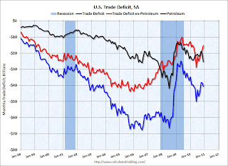 The blue line is the total deficit, and the black line is the petroleum deficit, and the red line is the trade deficit ex-petroleum products. The trade deficit was $40.6 billion, up from $38.3 billion in November.
The petroleum deficit increased in December as both quantity and import prices continued to rise - averaging $79.78 in December. Prices will be even higher in January. Once again oil and China deficits are essentially the entire trade deficit (or even more).
• CoreLogic: House Prices declined 1.8% in December
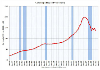 This graph shows the national CoreLogic HPI data since 1976. January 2000 = 100.
The index is down 5.46% over the last year, and off 31.6% from the peak.
This is the fifth straight month of year-over-year declines, and the sixth straight month of month-to-month declines. The index is only 0.07% above the low set in March 2009 (essentially at the low), and I expect to see a new post-bubble low for this index with the January release.
• NFIB: Small Business Optimism Index increases in January
 From National Federation of Independent Business (NFIB): "The National Federation of Independent Business Index of Small Business Optimism rose 1.5 points in January, a modest increase, opening the new year with a reading of 94.1."
This graph shows the small business optimism index since 1986. The index increased to 94.1 in January from 92.6 in December.
Although still fairly low, this is the highest level for the index since December 2007.
 This graph shows the net hiring plans over the next three months.
Hiring plans decreased slightly in January but are still positive.
The recovery is sluggish for the small business optimism index (probably because of the high concentration of real estate related companies), but this is the highest level for the optimism index since December 2007.
• Consumer Sentiment increases slightly in February
 The preliminary Reuters / University of Michigan consumer sentiment index increased to 75.1 in February from 74.2 in January.
This was at the consensus forecast of 75.0.
Sentiment is still at levels usually associated with a recession - and sentiment is well below the pre-recession levels.
• Other Economic Stories ...
• From Treasury: Proposed plan for Fannie and Freddie press release and here is the report
• AAR: Rail Traffic increases in January
• Ceridian-UCLA: Diesel Fuel index decreases slightly in January
• Bernanke Testimony: The Economic Outlook and Monetary and Fiscal Policy
• From NY Fed Vice President Brian Sack: Implementing the Federal Reserve’s Asset Purchase Program
• CoStar: Commercial Real Estate prices increased slightly in December
• From RealtyTrac: Foreclosure Activity Increases 1 Percent in January
• Unofficial Problem Bank list at 944 Institutions
Best wishes to all!


