 RSS Feed
 by Calculated Risk on 10/31/2010 09:22:00 PM
Sunday, October 31, 2010
Two Extremes: Paying on Underwater Mortgages, and Living in Default
Earlier posts:
The following articles illustrate two extremes we've discussed before. The first is about borrowers with significant negative equity who are still paying their mortgage. They can't refinance. They can't sell. And it is difficult to move for new employment. This is probably a drag on economic growth.
And at the other extreme are borrowers staying in their homes for extended periods without paying their mortgage or property taxes. This might be providing some "stealth stimulus" for the economy. Note: Some people call this the "squatter stimulus", but I think that term is demeaning since many of these people are facing serious financial problems and living with uncertainty.
From Don Lee at the LA Times: Millions of homeowners keep paying on underwater mortgages
Of the estimated 15 million homeowners underwater, about 7.8 million owed at least 25% more than their properties were worth in the first quarter of this year ... More than 4 million borrowers ... were underwater more than 50%.The borrowers with negative equity are still receiving the same housing service, and making the same payment, as a few years ago. In that sense it isn't a drag on the economy. However they can't take advantage of low rates to refinance, they can't sell, it is difficult to move, and they are frequently reluctant to invest in home improvements - and they might even forgo needed repairs. And there is probably a negative wealth effect impacting their overall consumption.
... They still have jobs and can afford to make the payments. ... But they can't refinance because they owe too much.
And from Mark Whitehouse at the WSJ: The Stealth Stimulus of Defaulters Living for Free
Defaulters living in their homes are getting a subsidy worth about $2.6 billion a month, according to a Wall Street Journal analysis based on mortgage data from LPS Applied Analytics and rent data from the Commerce Department.For the borrowers in default, many are probably unemployed or facing other serious financial issues. If they weren’t living “rent free”, they’d probably move in with friends or relatives, or even live in their cars or worse. So the "free" housing service they are currently receiving will probably be replaced with another low cost housing alternative. And if even if they move into an apartment, they will probably still be spending the same amount (just on different items). So for many people in this situation, I don't think there is really much "stealth stimulus".
Music: Quantitative Easin'
by Calculated Risk on 10/31/2010 05:45:00 PM
Earlier posts:
For your enjoyment, from singer Curtis Threadneedle (in the style of Barry White), a song co-written by Curtis Threadneedle and Merle Hazard, and produced by Merle Hazard.
Schedule for Week of Oct 31st
by Calculated Risk on 10/31/2010 01:14:00 PM
The previous post is the Summary for Week ending Oct 30th.
The highly anticipated second round of Federal Reserve quantitative easing (QE2) will be announced on Wednesday at 2:15 PM (when the FOMC statement is released). The key economic release this week is the October employment report on Friday.
8:30 AM: Personal Income and Outlays for September. The consensus is for a 0.3% increase in personal income and a 0.4% increase in personal spending, and for the Core PCE price index to increase 0.1%.
10:00 AM: ISM Manufacturing Index for October. The consensus is for 54.5 or about the same as the 54.4 in September.
10:00 AM: Construction Spending for September. The consensus is for a 0.5% decline in construction spending.
10:00 AM: Q3 Housing Vacancies and Homeownership from the Census Bureau. In Q2 2010, this report indicated that the homeownership rate fell to the lowest level since 1999 (66.9% in Q2 2010). The homeowner and rental vacancy rates provide a hint at the number of excess housing units (Note: this data is based on limited surveys and an estimate of the housing inventory).
Expected: October Personal Bankruptcy Filings
7:00 AM: The Mortgage Bankers Association (MBA) will release the mortgage purchase applications index.
8:15 AM: The ADP Employment Report for October. This report is for private payrolls only (no government). The consensus is for +20,000 payroll jobs in October - still weak, but an improvement over the 39,000 jobs reported lost in September.
All day: Light vehicle sales for October. Light vehicle sales are expected to increase in October to around 12.0 million (Seasonally Adjusted Annual Rate), from 11.76 million in September. If correct, this will be highest sales rate in 2 years (excluding Cash-for-clunkers in August 2009).
10:00 AM: Manufacturers' Shipments, Inventories and Orders for September. The consensus is for a 1.8% increase in orders. Also important will be the growth in inventories, and the inventory-to-sales ratio.
10:00 AM: ISM non-Manufacturing Index for October. The consensus is for an increase to 54.0 from 53.2 in September.
2:15 PM: FOMC statement released. The key will be how the FOMC will implement the 2nd round of quantitative easing.
8:30 AM: The initial weekly unemployment claims report will be released. Consensus is for about an increase to 445,000 from 434,000 last week.
8:30 AM: Productivity and Costs for Q3 (Preliminary). The consensus is for a 0.2% increase in unit labor costs.
8:30 AM: Employment Report for October. The consensus is an increase of 60,000 payroll jobs in October, and for the unemployment rate to stay steady at 9.6%.
10:00 AM: Pending Home Sales Index for September. The consensus is for a 3% increase in contracts signed. It usually takes 45 to 60 days to close, so this will provide an early indication of closings in November.
3:00 PM: Consumer Credit for September. The consensus is for another $3 billion decline in consumer credit.
After 4:00 PM: The FDIC will probably have another busy Friday afternoon ...
Note: The Atlanta Fed will host a conference at Jekyll Island, Georgia on November 5th and 6th: The Origins, History, and Future of the Federal Reserve. On Saturday there will be a discussion of "the overvaluation of assets such as land" and the "appropriate policy responses". Also Fed Chairman Ben Bernanke and previous Fed Chairman Alan Greenspan are scheduled to participate on a panel "on the purpose, structure, and functions of the Federal Reserve System".
Summary for Week ending Oct 30th
by Calculated Risk on 10/31/2010 08:30:00 AM
A summary of last week - mostly in graphs. The key reports last week were the Q3 Advance GDP report, and several housing reports (New home sales, existing home sales, and house prices).
The the National Association of Realtors:
 Click on graph for larger image in new window.
This graph shows existing home sales, on a Seasonally Adjusted Annual Rate (SAAR) basis since 1993.
Sales in September 2010 (4.53 million SAAR) were 10% higher than last month, and were 19.1% lower than September 2009 (5.6 million SAAR).
The next graph shows the year-over-year (YoY) change in reported existing home inventory and months-of-supply. Inventory is not seasonally adjusted, so it really helps to look at the YoY change.
 Although inventory decreased slightly from August 2010 to September 2010, inventory increased 8.9% YoY in September. This is the largest YoY increase in inventory since early 2008.
The year-over-year increase in inventory is very bad news because the reported inventory is already historically very high (around 4 million), and the 10.7 months of supply in September is far above normal.
The bottom line: Sales were weak in September - almost exactly at the levels I expected - and will continue to be weak for some time. Inventory is very high - and the significant year-over-year increase in inventory is very concerning. The high level of inventory and months-of-supply will put downward pressure on house prices.
 The Census Bureau reported New Home Sales in September were at a seasonally adjusted annual rate (SAAR) of 307 thousand. This is slightly higher than in August (288 thousand SAAR).
This graph shows New Home Sales vs. recessions for the last 47 years. The dashed line is the current sales rate.
And another long term graph - this one for New Home Months of Supply.
 Months of supply decreased to 8.0 in September from 8.6 in August. The all time record was 12.4 months of supply in January 2009. This is still high (less than 6 months supply is normal).
The 307 thousand annual sales rate for September is just above the all time record low in May (282 thousand). This was the weakest September on record.
New home sales are important for the economy and jobs - and this indicated that residential investment would be a sharp drag on GDP in Q3 (subtracted 0.8 percentage points in Q3).
S&P/Case-Shiller released the monthly Home Price Indices for August (actually a 3 month average of June, July and August).
This includes prices for 20 individual cities, and two composite indices (10 cities and 20 cities).
 This graph shows the nominal seasonally adjusted Composite 10 and Composite 20 indices (the Composite 20 was started in January 2000).
The Composite 10 index is off 29.2% from the peak, and down 0.2% in August(SA).
The Composite 20 index is off 28.8% from the peak, and down 0.3% in August (SA).
The next graph shows the price declines from the peak for each city included in S&P/Case-Shiller indices.
 Prices increased (SA) in only 1 of the 20 Case-Shiller cities in August seasonally adjusted. Only New York saw a price increase (SA) in August, and that was very small.
 Prices in Las Vegas are off 57.5% from the peak, and prices in Dallas only off 6.9% from the peak.
Prices are now falling - and falling just about everywhere. And it appears there are more price declines coming (based on inventory levels and anecdotal reports).
The CoreLogic HPI is a three month weighted average of June, July and August, and is not seasonally adjusted (NSA).
 This graph shows the national CoreLogic HPI data since 1976. January 2000 = 100.
The index is down 1.5% over the last year, and off 28.2% from the peak.
The index is 5.4% above the low set in March 2009, and I expect to see a new post-bubble low for this index later this year or early in 2011. Prices are falling in most areas now (unusually for the summer months).
From the BEA:
Real gross domestic product -- the output of goods and services produced by labor and property located in the United States -- increased at an annual rate of 2.0 percent in the third quarter of 2010, (that is, from the second quarter to the third quarter), according to the "advance" estimate released by the Bureau of Economic Analysis.
 This graph shows the quarterly GDP growth (at an annual rate) for the last 30 years. The dashed line is the median growth rate of 3.05%. The current recovery is very weak as the 2nd half slowdown continues.
A key number:
Without the boost in inventories, GDP would have been barely positive in Q3.
Overall this was a weak report and will not derail QE2 next wednesday (further easing from the Fed).
The following graph compares the regional Fed surveys with the ISM manufacturing survey, including the Kansas City survey released this morning:
 For this graph I averaged the New York and Philly Fed surveys (dashed green, through October), and averaged five Fed surveys (blue) including New York, Philly, Richmond, Dallas and Kansas City.
 The Institute for Supply Management (ISM) PMI (red) is through September (right axis).
Although the internals were mixed in the regional Fed surveys, this graph suggests the ISM index will still show expansion in October. The ISM Manufacturing index will be released on Monday November 1st.
Best wishes to all.
Saturday, October 30, 2010
Unofficial Problem Bank list increases to 894 Institutions
by Calculated Risk on 10/30/2010 08:37:00 PM
Note: this is an unofficial list of Problem Banks compiled only from public sources.
Here is the unofficial problem bank list for Oct 29, 2010.
Changes and comments from surferdude808:
As anticipated, the FDIC released its enforcement actions for September this week contributing to many changes to the Unofficial Problem Bank List. This week there were 26 additions and three removals, which results in the list having 894 institutions with $410.7 billion of assets, up from 871 institutions and $402.1 billion of assets last week.
The three removals are for action termination and include First Carolina State Bank, Rocky Mount, NC ($113 million); State Bank of Burnettsville, Burnettsville, IL ($39 million); and The Citizens Bank of Weir, Weir, KS ($6 million).
Among the additions are CNLBank, Orlando, FL ($1.5 billion); Colorado Capital Bank, Castle Rock, CO ($870 million); Malvern Federal Savings Bank, Paoli, PA ($691 million); The Delaware County Bank and Trust Company, Lewis Center, OH ($644 million Ticker: DCBF); County Bank, Rehoboth, DE ($400 million Ticker: CBFD); Bank of Alameda, Alameda, CA ($245 million Ticker: NCLC); Old Harbor Bank, Clearwater, FL ($232 million Ticker: OHBK); and Charter Oak Bank, Napa, CA ($139 million Ticker: CHOB). The FDIC also issued a Prompt Corrective Action order against Charter Oak Bank.
Other changes include Prompt Corrective Actions orders against four institutions already on the list including Firstier Bank, Louisville, KY ($809 million); Nevada Commerce Bank, Las Vegas, NV ($194 million); Valley Community Bank, St. Charles, IL ($142 million); and First Vietnamese American Bank, Westminster, CA ($52 million). Strangely, the FDIC just published the action against Firstier Bank although it is dated April 21, 2010.
Residential Investment declines to new low as Percent of GDP
by Calculated Risk on 10/30/2010 04:45:00 PM
A couple more graphs ...
 Click on graph for larger image in new window.
I'll break down Residential Investment (RI) into components after the GDP details are released this coming week. Note: Residential investment (RI) includes new single family structures, multifamily structures, home improvement, broker's commissions, and a few minor categories.
It is interesting to note that RI as a percent of GDP has declined to a post war low of 2.22%. Some people have asked how could a sector that only accounts for 2.2% of GDP be so important? The answer is that usually RI accounts for a large percentage of the employment and GDP growth in the first year or so of a recovery. Not this time.
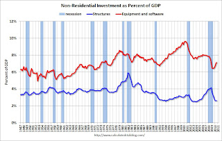 The second graph shows non-residential investment in structures and equipment and software.
Equipment and software investment has been booming, and non-residential investment in structures is near a record low.
Investment Contribution to GDP: Leading and Lagging Sectors
by Calculated Risk on 10/30/2010 12:30:00 PM
By request, the following graph is an update to: The Investment Slump in Q2 2009
The following graph shows the rolling 4 quarter contribution to GDP from residential investment, equipment and software, and nonresidential structures. This is important to follow because residential investment tends to lead the economy, equipment and software is generally coincident, and nonresidential structure investment trails the economy.
For the following graph, red is residential, green is equipment and software, and blue is investment in non-residential structures. The usual pattern - both into and out of recessions is - red, green, blue.
 Click on graph for larger image in new window.
Residential Investment (RI) made a negative contribution to GDP in Q3 2010, and the four quarter rolling average is negative again.
RI was negatively impacted by the slowdown in new home construction, and also because the number of existing home sold fell sharply (real estate commissions are included in RI).
Equipment and software investment has made a significant positive contribution to GDP for five straight quarters (it is coincident).
The contribution from nonresidential investment in structures was slightly positive in Q3. The details will be released next week, but I expect that oil and gas investment made a positive contribution, and hotels, malls and office investment were negative again. As usual nonresidential investment in structures is the last sector to recover.
The key leading sector - residential investment - has lagged this recovery because of the huge overhang of existing inventory. Usually RI is a strong contributor to GDP growth and employment in the early stages of a recovery, but not this time - and this is a key reason why the recovery has been sluggish so far.
Restaurant Index shows expansion in September
by Calculated Risk on 10/30/2010 08:45:00 AM
This is one of several industry specific indexes I track each month.
 Click on graph for larger image in new window.
Unfortunately the data for this index only goes back to 2002.
Note: Any reading above 100 shows expansion for this index.
From the National Restaurant Association (NRA): Restaurant Industry Outlook Improved in September as Restaurant Performance Index Rose Above 100 for First Time in Five Months
Driven by improving same-store sales and customer traffic levels, as well as growing optimism among restaurant operators, the outlook for the restaurant industry improved in September. The National Restaurant Association’s Restaurant Performance Index (RPI) – a monthly composite index that tracks the health of and outlook for the U.S. restaurant industry – stood at 100.3 in September, up a solid 0.8 percent from its August level. In addition, the RPI rose above 100 for the first time in five months, which signifies expansion in the index of key industry indicators.Restraurants are a discretionary expense, and this slight expansion is a little bit of good news.
“The RPI’s solid gain in September was the result of broad-based improvements among both the current situation and forward-looking indicators,” said Hudson Riehle, senior vice president of the Research and Knowledge Group for the National Restaurant Association. “Restaurant operators reported positive same-store sales and customer traffic levels for the first time in six months, which propelled the RPI’s Current Situation Index to its highest level in nearly three years.”
...
Restaurant operators reported a net increase in same-store sales for the first time in six months in September. ... Restaurant operators also reported a slight uptick in customer traffic levels in September.emphasis added
Friday, October 29, 2010
Commercial Real Estate: "Normal market conditions years away"
by Calculated Risk on 10/29/2010 10:03:00 PM
From Buck Wargo at the Las Vegas Sun: Commercial real estate’s slide likely at an end
The commercial real estate market led by the office sector appears to have halted its slide ... analysts said.It is possible the office vacancy rate has peaked - or is near the peak as the the Reis vacancy data suggests - but it will take a long time to absorb all the excess office space. And that means non-residential investment in office buildings will be low for some time.
...
With little construction and the demand for space outpacing those who are giving it up, it appears the office market isn’t going to worsen, [Jake Joyce, a project manager with Applied Analysis] said.
“While it’s easy to latch on to even the smallest bright spot, the return to more normal market conditions is years away, but must start somewhere,” Joyce said.
But you do have to start somewhere ...
Real GDP Growth and the Unemployment Rate
by Calculated Risk on 10/29/2010 04:36:00 PM
Here is an excerpt from a previous post earlier this month and his probably worth repeating after the GDP report this morning. This relationship suggests the unemployment will rise with only 2% real GDP growth:
 Click on graph for larger image.
Here is an update on a version of Okun's Law. This graph shows the annual change in real GDP (x-axis) vs. the annual change in the unemployment rate (y-axis).
Note: For this graph I used a rolling four quarter change - so all the data points are not independent. However - remember - this "law" is really just a guide.
The following table summarizes several scenarios over the next year (starting from the current 9.6% unemployment rate):
| Real GDP Growth | Unemployment Rate in One Year |
|---|---|
| 0.0% | 11.0% |
| 1.0% | 10.5% |
| 2.0% | 10.0% |
| 3.0% | 9.6% |
| 4.0% | 9.1% |
| 5.0% | 8.7% |
I expected a sluggish recovery in 2010, so I thought the unemployment rate would stay elevated throughout 2010 (that was correct).
Going forward, I think the recovery will stay sluggish and choppy for some time and I'd guess the unemployment rate will tick up in the short term and still be above 9% later next year. You can see why those expecting 1% to 2% growth next year (like Goldman Sachs) are expecting the unemployment rate to be close to 10%.
In general, the U.S. economy needs to grow faster than a 3% real rate to reduce the unemployment - and there is no evidence yet of a pickup in growth.
Real GDP: Still 0.8% below pre-recession levels
by Calculated Risk on 10/29/2010 01:06:00 PM
Real GDP is 0.8% below the pre-recession peak, so real GDP would have to grow at a 3.1% annualized pace in Q4 for the economy to be back at the pre-recession peak.
That is unlikely since growth in personal consumption expenditures (PCE) will probably slow in Q4, and the contribution from the change in private inventories will likely be much smaller or negative in Q4.
Probably the earliest the economy will be back to pre-recession levels for GDP would be in Q1 2011 and that requires a 1.6% annualized growth rate over the next two quarters. It might even take until Q2 2011 (my current forecast).
Note: The following graphs are all constructed as a percent of the peak in each indicator. This shows when the indicator has bottomed - and when the indicator has returned to the level of the previous peak. If the indicator is at a new peak, the value is 100%.
 Click on graph for larger image in new window.
This graph is for real GDP through Q3 2010.
Real GDP is still 0.8% below the pre-recession peak.
Based on the June FOMC forecasts, real GDP would be close or above the pre-recession peak by now. So clearly those forecasts will be revised down next week.
And GDP has performed better than other indictors.
 The second graph is for real personal income less transfer payments (also released today for Q3 as part of the GDP report).
Real personal income less transfer payments is still 5.5% below the pre-recession peak. Much of the growth in PCE over the last year has come from transfer payments - this includes people taking Social Security early, extended unemployment benefits, and other assistance programs - and it will be some time before this indicator returns to pre-recession levels.
And two more graphs to show two key monthly indicators:
 This graph is for industrial production through Septmember.
Industrial production has been one of the stronger performing sectors because of inventory restocking and some growth in exports. However industrial production is still 7.5% below the pre-recession peak, and it appears export growth has slowed, and the inventory cycle is almost over.
One of the surprises in the GDP report today was the strong contribution from changes in private inventories. That will probably slow over the next few quarters - and may even turn negative. So it will probably be some time before industrial production returns to pre-recession levels.
 The final graph is for employment. This is similar to the graph I post every month comparing percent payroll jobs lost in several recessions.
Payroll employment is still 5.6% below the pre-recession peak. And with below trend GDP growth, payroll employment growth will likely remain sluggish.
Chicago PMI increases, Consumer Sentiment weak
by Calculated Risk on 10/29/2010 09:55:00 AM
Two stories ...
From the Institute for Supply Management – Chicago: The overall index increased to 60.6 vs 60.4. Note: any number above 50 shows expansion. Employment index increased to 54.6 from 53.4 in September. The new orders index increased to 65.0 from 61.4.
Overall this was a positive report. The national ISM manufacturing index will be released on Monday.
From MarketWatch: Consumer sentiment falls in October to 67.7
 Click on graph for larger image in new window.
This was a big story in July when consumer sentiment collapsed. Sentiment in October was slightly below the level in July - and this is the lowest level since late 2009.
Consumer sentiment is a coincident indicator and reflects the weak economy.
Q3 Advance Report: Real Annualized GDP Grew at 2.0%
by Calculated Risk on 10/29/2010 08:30:00 AM
Real gross domestic product -- the output of goods and services produced by labor and property located in the United States -- increased at an annual rate of 2.0 percent in the third quarter of 2010, (that is, from the second quarter to the third quarter), according to the "advance" estimate released by the Bureau of Economic Analysis.
Click on graph for larger image in new window.This graph shows the quarterly GDP growth (at an annual rate) for the last 30 years. The dashed line is the median growth rate of 3.05%. The current recovery is very weak - the 2nd half slowdown continues.
A few key numbers:
Without the boost in inventories, GDP would have been barely positive in Q3.
This was a little stronger than expected, and PCE will probably slow over the next couple of quarters.
As expected, residential investment declined sharply after the Q2 tax credit boost.
Overall this was a weak report and will not derail QE2 next wednesday (further easing from the Fed).
Thursday, October 28, 2010
Foreclosure-Gate: Title Insurers Drop Demands
by Calculated Risk on 10/28/2010 09:49:00 PM
From Elizabeth Razzi at the WaPo: Title insurers drop demands on mortgage lenders in foreclosure cases
Three major title insurance companies - First American Financial, Old Republic International and Stewart Information Services - told Wall Street analysts in conference calls Thursday that they had decided not to demand written indemnifications from lenders re-selling foreclosed homes. Combined, the three companies account for 52 percent of the title insurance market.This is means that the buyers of REO (lender Real Estate Owned) will be able to obtain title insurance, and that the new owner can sell the property. There was some concern that buyers would shy away from REOs.
House Prices have corrected to what year?
by Calculated Risk on 10/28/2010 05:45:00 PM
Housing consultant John Burns presented this slide as part of the UCLA Anderson Forecast this week:
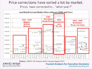 Click on graph for larger image in new window.
John Burns used median prices for this slide. It shows that the "biggest bubble markets" are back to 2000 to 2002 median prices, whereas some areas are still at 2006 prices.
And here is a timeline for the 20 Case-Shiller cities:
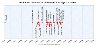 There is no y-axis because this is based on a price index (not median prices).
Detroit is back to 1995 prices, and some cities like Dallas, Portland and Seattle are only back to 2005 or 2006 prices (the bubble arrived later in the Northwest).
Housing Bust impacting Manager Mobility
by Calculated Risk on 10/28/2010 02:31:00 PM
From Challenger, Gray & Christmas: Job Seeker Relocation Drops to Record Low
The percentage of unemployed managers and executives relocating for a new position fell to a record low in the third quarter of 2010, as a slightly improved job market and greatly depreciated home values combined to eliminate this option for most job seekers.
Just 6.9 percent of job seekers who found employment in the third quarter relocated for the new position. That was down from a relocation rate of 13.4 percent in the same quarter a year ago ...
“Continued weakness in the housing market is undoubtedly the biggest factor suppressing relocation. Job seekers who own a home – even if they are open to relocating for a new job – are basically stuck where they are if they are unable or unwilling to sell their homes without incurring a significant loss,” said John A. Challenger, chief executive officer of Challenger, Gray & Christmas.
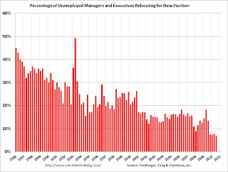 Click on graph for larger image in new window.
Here is the quarterly data from Challenger, Gray. Mobility has been trending down for some time, but really declined over the last year.
It is tough to move when you can't sell your home. Sometimes the new employer will pick up the short fall for key executives and managers, but it is probably too expensive in many cases now.
This is no surprise. Here is what I wrote in 2007:
Less worker mobility [due to negative equity] is kind of like arteriosclerosis of the economy. It lowers the overall growth potential.One of the strengths of the U.S. labor market has been the flexibility associated with labor mobility at all levels of employment - households could easily move from one region to another for better employment. The sharp decline in house prices, leaving homeowners with significant negative equity, appears to be limiting this flexibility.
Perhaps as many as 15 to 20 million households will be saddled with negative equity by 2009. Even if most of these homeowners don't "walk away", there might still be a negative impact on the economy due to less worker mobility.
Update: PIMCO's Bill Gross has called end of bond rally before
by Calculated Risk on 10/28/2010 01:42:00 PM
Yesterday I mentioned that Bill Gross was calling the end "of a great 30-year bull market in bonds". I thought he was changing his view, but this isn't the first time (ht Erik):
From Bloomberg on March 27, 2010: Pimco’s Bill Gross Says Bonds Have Seen Best Days
“Bonds have seen their best days,” Gross said in a Bloomberg Radio interview ... Yields on two-year U.S. Treasury notes are likely to rise to 1.25 percent to 1.5 percent from 1.08 percent in the next year as the economy strengthens and the Federal Reserve begins to increase interest rates, Gross said.On March 26, 2010 the Ten Year Treasury yield was 3.86% (now 2.65%)
And from Reuters in June 2007: Pimco's Gross says he's now a "bear market manager"
Gross forecast that benchmark Treasury yields will range higher than previously thought, prompting him to acknowledge he is now a "bear market manager" after a quarter of a century as the global bond market's most powerful bull.On June 7, 2007, the ten year Treasury yield was 5.1%.
So Gross has called the end of the bond rally before. Nevermind.
The end of the "bull market in bonds" really depends on if the economy strengthens, and I don't see a pickup in economic growth any time soon.
Regional Fed Manufacturing Surveys still show "moderate" expansion in October
by Calculated Risk on 10/28/2010 11:00:00 AM
The Kansas City Fed released their October manufacturing survey this morning:
Tenth District manufacturing activity continued to expand moderately in October, and producers were increasingly optimistic about future activity.This was the last of the regional Fed surveys for October.
...
The net percentage of firms reporting month-over-month increases in production in October was 10, down from 14 in September ... the new orders index jumped from 9 to 16, its highest level since early 2007, and the employment index also edged higher [to -1].
The following graph compares the regional Fed surveys with the ISM manufacturing survey, including the Kansas City survey released this morning:
Click on graph for larger image in new window.For this graph I averaged the New York and Philly Fed surveys (dashed green, through October), and averaged five Fed surveys (blue) including New York, Philly, Richmond, Dallas and Kansas City.
The Institute for Supply Management (ISM) PMI (red) is through September (right axis).
Although the internals were mixed in the regional Fed surveys, this graph suggests the ISM index will still show expansion in October. The ISM Manufacturing index will be released on Monday November 1st.
Weekly Initial Unemployment Claims decrease
by Calculated Risk on 10/28/2010 08:30:00 AM
The DOL reports on weekly unemployment insurance claims:
In the week ending Oct. 23, the advance figure for seasonally adjusted initial claims was 434,000, a decrease of 21,000 from the previous week's revised figure of 455,000. The 4-week moving average was 453,250, a decrease of 5,500 from the previous week's revised average of 458,750.
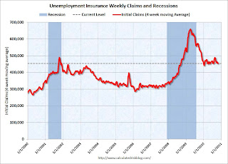 Click on graph for larger image in new window.
This graph shows the 4-week moving average of weekly claims since January 2000.
The dashed line on the graph is the current 4-week average. The four-week average of weekly unemployment claims decreased this week by 5,500 to 453,250.
This is the lowest level for weekly claims and the 4-week average since July, however the 4-week moving average has been moving sideways at an elevated level for almost a year - and that suggests a weak job market.
Wednesday, October 27, 2010
Report: Greece Falling Short of Rescue Package Deficit Goal
by Calculated Risk on 10/27/2010 10:28:00 PM
From Landon Thomas at the NY Times: Greece Said to Be Falling Short of Deficit-Cutting Goals
With economic conditions weaker than expected, tax revenue is coming up short of projections in parts of Europe.According to Bloomberg, the yield on the Greece 10-year bond jumped to 10.39% from 9.36% on Tuesday, and the yield on the Ireland 10-year bond increased to a new crisis closing high of 6.77%.
...
Greece ... looks as if it will run a budget deficit for 2010 greater than the 8.1 percent of gross domestic product it agreed to as part of a rescue package from the International Monetary Fund and the European Union ...
In Ireland, which is expecting its third consecutive year of economic contraction this year, the government says it will need an additional 15 billion euros in budget cuts to reduce its deficit from 32 percent of gross domestic product to 3 percent by 2014.
PIMCO's Gross: 30-year Bull Market in Bonds is Over
by Calculated Risk on 10/27/2010 06:46:00 PM
From PIMCO's Bill Gross: Run Turkey, Run
[W]hile next Wednesday’s [FOMC] announcement will carry our qualified endorsement, I must admit it may be similar to a Turkey looking forward to a Thanksgiving Day celebration.Gross has been a bond bull for as long as I can remember - I think even last year when many others were calling the end of the bond bull market.
...
Anyone for 1.10% 5-year Treasuries? Well, the Fed will buy them, but then what, and how will PIMCO tell the 500 billion investor dollars in the Total Return strategy and our equally valued 750 billion dollars of other assets that the Thanksgiving Day axe has finally arrived?
...
Ben Bernanke ... [y]ou are doing what you have to do, and it may or may not work. But either way it will likely signify the end of a great 30-year bull market in bonds ...
Freddie Mac: 90+ Day Delinquency Rate Declines Slightly in September
by Calculated Risk on 10/27/2010 03:59:00 PM
The following graph shows the Freddie Mac serious delinquency rate (loans that are "three monthly payments or more past due or in foreclosure"):
 Click on graph for larger image in new window.
Freddie Mac reports that the serious delinquency rate declined to 3.80% in September, from 3.83% in August.
Some of the rapid increase last year was probably because of foreclosure moratoriums, and distortions from modification programs because loans in trial mods were considered delinquent until the modifications were made permanent.
As modifications have become permanent, they are no longer counted as delinquent. Also, both Fannie Mae and Freddie Mac started foreclosing again (they have a record number of REOs) - and REO (real estate owned) is not counted in the delinquency rate.
The delinquency rate will probably start increasing again in October because of more foreclosure moratoriums, and possibly from falling house prices.
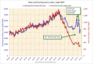
Home Sales: Distressing Gap Sept 2010
by Calculated Risk on 10/27/2010 12:24:00 PM
By request, here is an update - this graph shows existing home sales (left axis) and new home sales (right axis) through September. This graph starts in 1994, but the relationship has been fairly steady back to the '60s. Then along came the housing bubble and bust, and the "distressing gap" appeared (due partially to distressed sales).
Note: it is important to note that existing home sales are counted when transactions are closed, and new home sales are counted when contracts are signed. So the timing of sales is different.
 Click on graph for larger image in new window.
Initially the gap was caused by the flood of distressed sales. This kept existing home sales elevated, and depressed new home sales since builders couldn't compete with the low prices of all the foreclosed properties.
The two spikes in existing home sales were due primarily to the homebuyer tax credits (the initial credit last year, followed by the 2nd credit this year). There were also two smaller bumps for new home sales related to the tax credits.
Now, once again, the gap is mostly because of the continuing flood of distressed sales (both foreclosures and short sales). I expect that eventually this gap will be closed, however that will only happen after the huge overhang of existing inventory (especially distressed inventory) is significantly reduced.
New Home Sales increased slightly in September, still near record low
by Calculated Risk on 10/27/2010 10:00:00 AM
The Census Bureau reports New Home Sales in September were at a seasonally adjusted annual rate (SAAR) of 307 thousand. This is slightly higher than in August (288 thousand SAAR).
 Click on graph for larger image in new window.
The first graph shows monthly new home sales (NSA - Not Seasonally Adjusted or annualized).
Note the Red columns for 2010. In September 2010, 24 thousand new homes were sold (NSA). This is a new record low for September.
The previous record low for the month of September was 28 thousand in 1981; the record high was 95 thousand in September 2005.
The second graph shows New Home Sales vs. recessions for the last 47 years. The dashed line is the current sales rate.
Sales of new single-family houses in September 2010 were at a seasonally adjusted annual rate of 307,000, according to estimates released jointly today by the U.S. Census Bureau and the Department of Housing and Urban Development. This is 6.6 percent (±16.9%)* above the revised August rate of 288,000, but is 21.5 percent (±13.3%) below the September 2009 estimate of 391,000.And another long term graph - this one for New Home Months of Supply.
Months of supply decreased to 8.0 in September from 8.6 in August. The all time record was 12.4 months of supply in January 2009. This is still high (less than 6 months supply is normal).The seasonally adjusted estimate of new houses for sale at the end of September was 204,000. This represents a supply of 8.0 months at the current sales rate.
 The final graph shows new home inventory.
 The 307 thousand annual sales rate for September is just above the all time record low in May (282 thousand). This was the weakest September on record.
New home sales are important for the economy and jobs - and this indicates that residential investment will be a sharp drag on GDP in Q3.
MBA: Mortgage Purchase Activity increases slightly
by Calculated Risk on 10/27/2010 07:57:00 AM
The MBA reports: Mortgage Applications Increase in Latest MBA Weekly Survey
The Refinance Index increased 3.0 percent from the previous week. The seasonally adjusted Purchase Index increased 3.9 percent from one week earlier.
...
The average contract interest rate for 30-year fixed-rate mortgages decreased to 4.25 percent from 4.34 percent, with points increasing to 1.0 from 0.81 (including the origination fee) for 80 percent loan-to-value (LTV) ratio loans. The 30-year contract rate matches the rate from the week ending October 1, 2010, which was the second lowest ever observed in this survey.
 Click on graph for larger image in new window.
This graph shows the MBA Purchase Index and four week moving average since 1990.
The four-week moving average of the purchase index is still 30% below the levels of April 2010, and is about at the levels of 1996. This suggests existing home sales will remain weak through the end of the year.
Tuesday, October 26, 2010
Report: Fed will probably use gradual approach for QE2
by Calculated Risk on 10/26/2010 11:21:00 PM
QE2 is coming. The only question is if the Fed will announce a fairly large amount of purchases on November 3rd (like $500 billion), or a somewhat smaller amount and revisit the purchases at each FOMC meeting. It sounds like the Fed might take the 2nd approach ...
From Jon Hilsenrath and Jonathan Cheng at the WSJ: Fed Gears Up for Stimulus
The central bank is likely to unveil a program of U.S. Treasury bond purchases worth a few hundred billion dollars over several months, a measured approach in contrast to purchases of nearly $2 trillion it unveiled during the financial crisis.This is the approach the NY Fed's EVP Brian Sack described earlier this month: Managing the Federal Reserve’s Balance Sheet
It is hard to call "a few hundred billion dollars" a gradual approach, but this is less than current expectations for the Nov 3rd FOMC announcement.
DataQuick: California Mortgage Defaults Rise in Third Quarter
by Calculated Risk on 10/26/2010 07:44:00 PM
 Click on graph for larger image in new window.
This graph shows the Notices of Default (NOD) by year through 2009, and for the first three quarters of 2010, in California from DataQuick.
Although the pace of filings has slowed from the previous two years, it is still very high by historical standards.
From DataQuick: California Mortgage Defaults Rise in Third Quarter
The number of foreclosure proceedings initiated by lenders between July and September edged higher on a quarter-to-quarter basis for the first time since early last year. But the number of home owners who went all the way through that process to foreclosure dipped from the previous quarter and a year ago, a real estate information service reported.As prices fall later this year, we might see another increase in NODs. Although NODs will decline in 2010 from 2009, the number will still be very high and 2010 will be the third highest on record (only behind 2009 and 2008).
A total of 83,261 Notices of Default ("NODs") were recorded at county recorder offices during the July-through-September period. That was up 18.9 percent from 70,051 in the prior quarter, and down 25.5 percent from 111,689 in third-quarter 2009, according to San Diego-based MDA DataQuick.
...
"Over the past year, with some minor ups and downs, financial institutions and their servicers have been processing a fairly steady number of defaults each quarter. That probably has more to do with their capacity to process defaults, than with higher or lower levels of incoming distress," said John Walsh, DataQuick president.
...
The number of Trustees Deeds ("TDs") recorded, which reflects the number of houses and condos foreclosed on, totaled 45,377 during the third quarter. That was down 4.8 percent from 47,669 for the prior quarter, and down 9.3 percent from 50,013 for third-quarter 2009. The all-time peak for TDs was 79,511 in third-quarter 2008.
There are many details in the press release - the median origination month was August 2006, Countrywide made the most bad loans (no surprise), and the top beneficiaries were Bank of America (15,992), Wells Fargo (10,069), MERS (5,292), and JP Morgan Chase (5,172).
It will be interesting to see what happens in Q4. Since this is the first stage of the foreclosure process, and almost all foreclosures in California are non-judicial, I'd expect little or no impact from "foreclosure-gate".
Philly Fed September State Coincident Indexes
by Calculated Risk on 10/26/2010 04:00:00 PM
Earlier posts on Case-Shiller house prices:
 Click on map for larger image.
Here is a map of the three month change in the Philly Fed state coincident indicators. Thirty one states are showing increasing three month activity. The index decreased in 12 states, and was unchanged in 7.
Based on the one month data, this three month activity map be turning even more red next month.
Here is the Philadelphia Fed state coincident index release for September.
In the past month, the indexes increased in 24 states, decreased in 14, and remained unchanged in 12 for a one-month diffusion index of 20. Over the past three months, the indexes increased in 31 states, decreased in 12, and remained unchanged in seven for a three-month diffusion index of 38.
 The second graph is of the monthly Philly Fed data for the number of states with one month increasing activity.
 The indexes increased in 24 states, decreased in 14, and remained unchanged in 12. Note: this graph includes states with minor increases (the Philly Fed lists as unchanged).
A number of states are showing declining activity - and this "recovery" looks very similar to the sluggish recovery following the 2001 recession. No wonder consumer confidence remains very low.
ATA: Truck Tonnage Index increases in September: "Economy barely growing"
by Calculated Risk on 10/26/2010 02:27:00 PM
From the American Trucking Association: ATA Truck Tonnage Index Rose 1.7 Percent in September
The American Trucking Associations’ advance seasonally adjusted (SA) For-Hire Truck Tonnage Index increased 1.7 percent in September after falling a revised 2.8 percent in August. The latest gain put the SA index at 108.7 (2000=100) in September from 106.9 in August.
...
Compared with September 2009, SA tonnage climbed 5.1 percent, which was well above August’s 2.9 percent year-over-year gain. Year-to-date, tonnage is up 6.1 percent compared with the same period in 2009.
ATA Chief Economist Bob Costello said that truck tonnage over the last few months fits with an economy that is growing very slowly. “While I am glad to report that tonnage grew in September, the fact remains that truck freight volumes leveled off over the summer and early autumn. This is a reflection of an economy that is barely growing.”
 Click on map for larger image.
This graph from the ATA shows the Truck Tonnage Index since Jan 2006.
The lines are added to show the index has mostly "leveled off".
Real House Prices, Price-to-Rent Ratio
by Calculated Risk on 10/26/2010 11:45:00 AM
Yesterday CoreLogic reported that house prices declined 1.2% in August, and this morning S&P Case-Shiller reported widespread price declines in August (really an average of June, July and August).
 Click on graph for larger image in new window.
This post looks at real prices and the price-to-rent ratio, but first here is a graph of the two Case-Shiller composite indexes, and the CoreLogic HPI (NSA).
All three indexes are above the lows of early 2009, but it appears that prices are now falling - and I expect all three indexes to show new lows later this year or in early 2011.
Price-to-Rent
In October 2004, Fed economist John Krainer and researcher Chishen Wei wrote a Fed letter on price to rent ratios: House Prices and Fundamental Value. Kainer and Wei presented a price-to-rent ratio using the OFHEO house price index and the Owners' Equivalent Rent (OER) from the BLS.
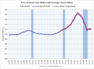 Here is a similar graph through August 2010 using the Case-Shiller Composite 20 and CoreLogic House Price Index.
This graph shows the price to rent ratio (January 1998 = 1.0).
Recent reports suggest rents might have bottomed, but this suggests that house prices are still a little too high on a national basis.
Real House Prices
 The third graph shows the CoreLogic house price index and the Case-Shiller Composite 20 index through August 2010 in real terms (adjusted with CPI less Shelter).
These indexes are still above the 2009 lows in real terms, but it is getting close, and I expect new real price lows sometime in the next few months.
This isn't like in 2005 when prices were way out of the normal range by these measures, but it does appear prices are still a little too high. And with high levels of inventory, prices will probably fall some more.
Case-Shiller: Home Price declines widespread in August
by Calculated Risk on 10/26/2010 09:00:00 AM
S&P/Case-Shiller released the monthly Home Price Indices for August (actually a 3 month average of June, July and August).
This includes prices for 20 individual cities, and two composite indices (10 cities and 20 cities).
Note: Case-Shiller reports NSA, I use the SA data.
From S&P: Home Prices Increases Slow Down in August
Data through August 2010, released today by Standard & Poor’s for its S&P/Case-Shiller1 Home Price Indices, the leading measure of U.S. home prices, show a deceleration in the annual growth rates in 17 of the 20 MSAs and the 10- and 20-City Composites in August compared to what was reported for July 2010. The 10-City Composite was up 2.6% and the 20-City Composite was up 1.7% from their levels in August 2009. Home prices decreased in 15 of the 20 MSAs and both Composites in August from their July levels.
Click on graph for larger image in new window. The first graph shows the nominal seasonally adjusted Composite 10 and Composite 20 indices (the Composite 20 was started in January 2000).
The Composite 10 index is off 29.2% from the peak, and down 0.2% in August(SA).
The Composite 20 index is off 28.8% from the peak, and down 0.3% in August (SA).
 The second graph shows the Year over year change in both indices.
The Composite 10 is up 2.5% compared to August 2009.
The Composite 20 is up 1.7% compared to August 2009.
The year-over-year increases are slowing and will probably be negative later this year.
The third graph shows the price declines from the peak for each city included in S&P/Case-Shiller indices.
Prices increased (SA) in only 1 of the 20 Case-Shiller cities in August seasonally adjusted. Only New York saw a price increase (SA) in August, and that was very small. Prices in Las Vegas are off 57.5% from the peak, and prices in Dallas only off 6.9% from the peak.
Prices are now falling - and falling just about everywhere. And it appears there are more price declines coming (based on inventory levels and anecdotal reports).
Mervyn King Quote: “Banking” and “Crises” are natural bedfellows
by Calculated Risk on 10/26/2010 08:40:00 AM
A quick quote from Bank of England's Mervyn King: “Banking: From Bagehot to Basel, and Back Again”
The words “banking” and “crises” are natural bedfellows. If love and marriage go together like a horse and carriage, then banking and crisis go together like Oxford and the Isis, intertwined for as long as anyone can remember.From the press release:
[T]he Governor of the Bank of England, Mervyn King, outlines the challenges of managing the financial system and suggests a framework for assessing proposals designed to reduce the riskiness inherent in banking and solve the “Too Important to Fail” problem.He discusses several options including the imposition of a permanent tax on banks, higher capital requirements and limits on leverage.
“Change is, I believe, inevitable. The question is only whether we can think our way through to a better outcome before the next generation is damaged by a future and bigger crisis. This crisis has already left a legacy of debt to the next generation. We must not leave them the legacy of a fragile banking system too.”
Monday, October 25, 2010
WSJ Survey: Housing Inventories up in 19 of 28 Markets Year-over-Year
by Calculated Risk on 10/25/2010 08:16:00 PM
From Nick Timiraos at the WSJ: Housing Gloom Deepens
The growing pessimism is attributed partly to rising inventory in many markets ... The Wall Street Journal's latest quarterly survey ... in 28 major metropolitan areas found inventories of unsold homes were up in 19 markets ... compared with a year ago ...I highlighted the 8.9% year-over-year inventory increase in the NAR report - a strong indicator of more house price declines to come, especially with the already high level of supply.
"We'll see some additional price declines," said David Berson, chief economist at PMI Group Inc ... "The gains we've seen can't be sustained given the current supply situation."
This survey from the WSJ shows that the inventory increases are fairly widespread. And that suggests that price declines will probably be widespread too. This morning CoreLogic noted that house prices declined in 78 out of the largest 100 metropolitan areas in their August report.
Tomorrow Case-Shiller will report on August house prices, and the expectations are for a slight decline in prices - and it will be interesting to see how many of the 20 Case-Shiller cities are showing price declines.
Misc: Expectations, Dallas Fed Manufacturing, HAMP and Foreclosure-Gate
by Calculated Risk on 10/25/2010 03:57:00 PM
Earlier posts on Existing Home sales:
Texas factory activity increased in October, according to business executives responding to the Texas Manufacturing Outlook Survey. The production index, a key measure of state manufacturing conditions, was positive for the second consecutive month and slightly higher than its September reading.So the headline number improved slightly, but the internals were weak.
Despite the rise in output, several other manufacturing activity indicators fell again. The new orders and shipments indexes were negative for the fifth consecutive month. The capacity utilization index dipped below zero, with more than one-quarter of respondents reporting a decrease.
...
Labor market indicators worsened slightly in October. Hours worked fell for the fourth consecutive month, and the employment index dipped back into negative territory ...
This means that for the median borrower, about 80% of the borrower's income went to servicing debt. And the median is 63.3% after the modification. So I expect the redefault rate to be high. Although Treasury is arguing the modifications are performing "well":
At nine months, nearly 90% of homeowners remain in a permanent modification, with 11% defaulted. Fewer than 16% of permanent modifications are 60+ days delinquent.With a median back end DTI after modification of 63.3%, I expect the redefault rate will move higher. Also here the October Housing Scorecard.
Before I address the specific topics of this conference, I would like to note that we have been concerned about reported irregularities in foreclosure practices at a number of large financial institutions. The federal banking agencies are working together to complete an in-depth review of practices at the largest mortgage servicing operations. We are looking intensively at the firms' policies, procedures, and internal controls related to foreclosures and seeking to determine whether systematic weaknesses are leading to improper foreclosures. We take violations of proper procedures seriously. We anticipate preliminary results of the review next month. In addition, Federal Reserve staff members and their counterparts at other federal agencies are evaluating the potential effects of these problems on the real estate market and financial institutions.
Bank of America... confirmed that it had discovered errors, including incorrect data and misspelled names, in the paperwork it has reviewed.
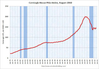
CoreLogic: House Prices Declined 1.2% in August
by Calculated Risk on 10/25/2010 01:41:00 PM
Notes: CoreLogic reports the year-over-year change. The headline for this post is for the change from July 2010 to August 2010. The CoreLogic HPI is a three month weighted average of June, July and August, and is not seasonally adjusted (NSA).
From CoreLogic: August Home Prices Declined 1.5 Percent Year Over Year
CoreLogic ... today released its Home Price Index (HPI) which shows that home prices in the U.S. declined for the first time this year. According to the CoreLogic HPI, national home prices, including distressed sales, declined 1.5 percent in August 2010 compared to August 2009 and increased by 0.6 percent in July 2010 compared to July 2009. Excluding distressed sales, year-over-year prices declined 0.4 percent in August 2010. ...
“Price declines are geographically expanding as 78 out of the largest 100 metropolitan areas are experiencing declines, up from 58 just one month ago” said Mark Fleming, chief economist for CoreLogic.
Click on graph for larger image in new window. This graph shows the national CoreLogic HPI data since 1976. January 2000 = 100.
The index is down 1.5% over the last year, and off 28.2% from the peak.
The index is 5.4% above the low set in March 2009, and I expect to see a new post-bubble low for this index later this year or early in 2011. As Fleming noted, prices are falling in most areas now (unusually for the summer months).
Earlier posts on Existing Home sales:


