 RSS Feed
 by Calculated Risk on 10/31/2010 08:30:00 AM
Sunday, October 31, 2010
Summary for Week ending Oct 30th
A summary of last week - mostly in graphs. The key reports last week were the Q3 Advance GDP report, and several housing reports (New home sales, existing home sales, and house prices).
The the National Association of Realtors:
 Click on graph for larger image in new window.
This graph shows existing home sales, on a Seasonally Adjusted Annual Rate (SAAR) basis since 1993.
Sales in September 2010 (4.53 million SAAR) were 10% higher than last month, and were 19.1% lower than September 2009 (5.6 million SAAR).
The next graph shows the year-over-year (YoY) change in reported existing home inventory and months-of-supply. Inventory is not seasonally adjusted, so it really helps to look at the YoY change.
 Although inventory decreased slightly from August 2010 to September 2010, inventory increased 8.9% YoY in September. This is the largest YoY increase in inventory since early 2008.
The year-over-year increase in inventory is very bad news because the reported inventory is already historically very high (around 4 million), and the 10.7 months of supply in September is far above normal.
The bottom line: Sales were weak in September - almost exactly at the levels I expected - and will continue to be weak for some time. Inventory is very high - and the significant year-over-year increase in inventory is very concerning. The high level of inventory and months-of-supply will put downward pressure on house prices.
 The Census Bureau reported New Home Sales in September were at a seasonally adjusted annual rate (SAAR) of 307 thousand. This is slightly higher than in August (288 thousand SAAR).
This graph shows New Home Sales vs. recessions for the last 47 years. The dashed line is the current sales rate.
And another long term graph - this one for New Home Months of Supply.
 Months of supply decreased to 8.0 in September from 8.6 in August. The all time record was 12.4 months of supply in January 2009. This is still high (less than 6 months supply is normal).
The 307 thousand annual sales rate for September is just above the all time record low in May (282 thousand). This was the weakest September on record.
New home sales are important for the economy and jobs - and this indicated that residential investment would be a sharp drag on GDP in Q3 (subtracted 0.8 percentage points in Q3).
S&P/Case-Shiller released the monthly Home Price Indices for August (actually a 3 month average of June, July and August).
This includes prices for 20 individual cities, and two composite indices (10 cities and 20 cities).
 This graph shows the nominal seasonally adjusted Composite 10 and Composite 20 indices (the Composite 20 was started in January 2000).
The Composite 10 index is off 29.2% from the peak, and down 0.2% in August(SA).
The Composite 20 index is off 28.8% from the peak, and down 0.3% in August (SA).
The next graph shows the price declines from the peak for each city included in S&P/Case-Shiller indices.
 Prices increased (SA) in only 1 of the 20 Case-Shiller cities in August seasonally adjusted. Only New York saw a price increase (SA) in August, and that was very small.
 Prices in Las Vegas are off 57.5% from the peak, and prices in Dallas only off 6.9% from the peak.
Prices are now falling - and falling just about everywhere. And it appears there are more price declines coming (based on inventory levels and anecdotal reports).
The CoreLogic HPI is a three month weighted average of June, July and August, and is not seasonally adjusted (NSA).
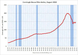 This graph shows the national CoreLogic HPI data since 1976. January 2000 = 100.
The index is down 1.5% over the last year, and off 28.2% from the peak.
The index is 5.4% above the low set in March 2009, and I expect to see a new post-bubble low for this index later this year or early in 2011. Prices are falling in most areas now (unusually for the summer months).
From the BEA:
Real gross domestic product -- the output of goods and services produced by labor and property located in the United States -- increased at an annual rate of 2.0 percent in the third quarter of 2010, (that is, from the second quarter to the third quarter), according to the "advance" estimate released by the Bureau of Economic Analysis.
 This graph shows the quarterly GDP growth (at an annual rate) for the last 30 years. The dashed line is the median growth rate of 3.05%. The current recovery is very weak as the 2nd half slowdown continues.
A key number:
Without the boost in inventories, GDP would have been barely positive in Q3.
Overall this was a weak report and will not derail QE2 next wednesday (further easing from the Fed).
The following graph compares the regional Fed surveys with the ISM manufacturing survey, including the Kansas City survey released this morning:
 For this graph I averaged the New York and Philly Fed surveys (dashed green, through October), and averaged five Fed surveys (blue) including New York, Philly, Richmond, Dallas and Kansas City.
 The Institute for Supply Management (ISM) PMI (red) is through September (right axis).
Although the internals were mixed in the regional Fed surveys, this graph suggests the ISM index will still show expansion in October. The ISM Manufacturing index will be released on Monday November 1st.
Best wishes to all.


