by Calculated Risk on 12/10/2015 07:05:00 PM
Thursday, December 10, 2015
Sacramento Housing in November: Sales up 11.5%, Inventory down 28% YoY
Thursday:
• At 8:30 AM ET, the Producer Price Index for November from the BLS. The consensus is for no changed in prices, and a 0.1% increase in core PPI.
• Also at 8:30 AM, Retail sales for November will be released. The consensus is for retail sales to increase 0.3% in November, and to increase 0.3% ex-autos.
• At 10:00 AM, Manufacturing and Trade: Inventories and Sales (business inventories) report for October. The consensus is for a 0.1% increase in inventories.
• Also at 10:00 AM, University of Michigan's Consumer sentiment index (preliminary for December). The consensus is for a reading of 92.0, up from 91.3 in November.
Sacramento: During the recession, I started following the Sacramento market to look for changes in the mix of houses sold (equity, REOs, and short sales). For a few years, not much changed. But in 2012 and 2013, we saw some significant changes with a dramatic shift from distressed sales to more normal equity sales.
This data suggests healing in the Sacramento market and other distressed markets are showing similar improvement. Note: The Sacramento Association of REALTORS® started breaking out REOs in May 2008, and short sales in June 2009.
In November, total sales were up 11.5% from November 2014, and conventional equity sales were up 13.9% compared to the same month last year.
In November, 8.3% of all resales were distressed sales. This was up from 7.0% last month, and down from 11.5% in November 2014. Distressed sales happen all year, but equity sales have a seasonal pattern - so this pushed up the percent of distressed sales in the Winter.
The percentage of REOs was at 3.7% in October, and the percentage of short sales was 4.6%.
Here are the statistics.

This graph shows the percent of REO sales, short sales and conventional sales. Distressed sales are so small, the font doesn't fit.
There has been a sharp increase in conventional (equity) sales that started in 2012 (blue) as the percentage of distressed sales declined sharply.
Active Listing Inventory for single family homes decreased 28.4% year-over-year (YoY) in October. This was the seventh consecutive monthly YoY decrease in inventory in Sacramento (a big recent change).
Cash buyers accounted for 20.2% of all sales (frequently investors).
Summary: This data suggests a more normal market with fewer distressed sales, more equity sales, and less investor buying.
Fed's Flow of Funds: Household Net Worth Declined in Q3
by Calculated Risk on 12/10/2015 01:23:00 PM
The Federal Reserve released the Q3 2015 Flow of Funds report today: Flow of Funds.
According to the Fed, household net worth decreased in Q3 compared to Q2:
The net worth of households and nonprofits fell to $85.2 trillion during the third quarter of 2015. The value of directly and indirectly held corporate equities decreased $2.3 trillion and the value of real estate rose $482 billion.Household net worth was at $85.2 trillion in Q3 2015, down from $86.4 trillion in Q2. The decline was due to the decline in the stock market in Q3.
The Fed estimated that the value of household real estate increased to $21.8 trillion in Q3 2015. The value of household real estate is still $0.7 trillion below the peak in early 2006 (not adjusted for inflation).
 Click on graph for larger image.
The first graph shows Households and Nonprofit net worth as a percent of GDP. Household net worth, as a percent of GDP, is higher than the peak in 2006 (housing bubble), and above the stock bubble peak.
This includes real estate and financial assets (stocks, bonds, pension reserves, deposits, etc) net of liabilities (mostly mortgages). Note that this does NOT include public debt obligations.
This ratio was increasing gradually since the mid-70s, and then we saw the stock market and housing bubbles.
 This graph shows homeowner percent equity since 1952.
 Household percent equity (as measured by the Fed) collapsed when house prices fell sharply in 2007 and 2008.
In Q3 2015, household percent equity (of household real estate) was at 56.7% - up from Q2, and the highest since Q2 2006. This was because of an increase in house prices in Q3 (the Fed uses CoreLogic).
Note: about 30.3% of owner occupied households had no mortgage debt as of April 2010. So the approximately 50+ million households with mortgages have far less than 56.7% equity - and several million still have negative equity.
 The third graph shows household real estate assets and mortgage debt as a percent of GDP.
 Mortgage debt increased by $48 billion in Q3.
Mortgage debt has declined by $1.27 trillion from the peak. Studies suggest most of the decline in debt has been because of foreclosures (or short sales), but some of the decline is from homeowners paying down debt (sometimes so they can refinance at better rates).
The value of real estate, as a percent of GDP, was up in Q3, and is somewhat above the average of the last 30 years (excluding bubble).
Weekly Initial Unemployment Claims increase to 282,000
by Calculated Risk on 12/10/2015 08:37:00 AM
The DOL reported:
In the week ending December 5, the advance figure for seasonally adjusted initial claims was 282,000, an increase of 13,000 from the previous week's unrevised level of 269,000. The 4-week moving average was 270,750, an increase of 1,500 from the previous week's unrevised average of 269,250.The previous week was unrevised at 269,000.
There were no special factors impacting this week's initial claims.
The following graph shows the 4-week moving average of weekly claims since 1971.
 Click on graph for larger image.
The dashed line on the graph is the current 4-week average. The four-week average of weekly unemployment claims increased to 270,750.
This was above the consensus forecast of 270,000, and the low level of the 4-week average suggests few layoffs.
Wednesday, December 09, 2015
Thursday: Unemployment Claims, Q3 Quarterly Services, Q3 Flow of Funds
by Calculated Risk on 12/09/2015 05:51:00 PM
Thursday:
• At 8:30 AM ET, the initial weekly unemployment claims report will be released. The consensus is for 270 thousand initial claims, up from 269 thousand the previous week.
• At 10:00 AM, the Q3 Quarterly Services Report from the Census Bureau.
• At 12:00 PM, the Q3 Flow of Funds Accounts of the United States from the Federal Reserve.
• At 2:00 PM, the Monthly Treasury Budget Statement for November.
From Matthew Graham at Mortgage News Daily: Mortgage Rates Break Even After Bumpy Start
Mortgage rates held steady for a second straight day, but only when considering the end-of-day rate sheets. The morning hours were similar on each of the past two days, with underlying bond markets weakening in concert with rising oil prices. The afternoon hours were quite different. Today saw bonds bounce back with a relatively strong move inspired by falling oil prices and a well-received 10yr Treasury Note Auction. Stronger bond markets imply downward pressure on mortgage rates.Here is a table from Mortgage News Daily:
Indeed several lenders recalled rate sheets early this afternoon for a mid-day improvement. This was enough to bring the average conventional 30yr fixed rate quote back in line with yesterday's latest levels. Even then, the only differences between the two days had been to the closing costs associated with the prevailing rate of 4.0%.
emphasis added
Hilsenrath: "Fed Plans to Signal Gradual, Cautious Path on Rate Hikes"
by Calculated Risk on 12/09/2015 01:42:00 PM
The Fed will raise rates next week, and now the attention will shift to the path of future rate hikes.
From Jon Hilsenrath at the WSJ: Fed Plans to Signal Gradual, Cautious Path on Rate Hikes. A few excerpts:
Fed officials want to signal they expect to proceed slowly and cautiously before raising rates again. Ms. Yellen has emphasized in recent speeches that the economy won’t be able to bear very high interest rates in the years ahead.Right now I expect 3 or 4 rate increases next year, but it could be less.
...
The median forecast among 17 officials in September showed they expected the rate to reach 1.375% in December 2016 and 2.625% in late 2017. That would put them on track to raise rates four times next year and five times in 2017.
Futures markets point to a shallower trajectory. For instance, futures contracts indicate traders expect a 0.85% rate by December 2016.
Update: Framing Lumber Prices down Sharply Year-over-year
by Calculated Risk on 12/09/2015 09:48:00 AM
Here is another graph on framing lumber prices. Early in 2013 lumber prices came close to the housing bubble highs.
The price increases in early 2013 were due to a surge in demand (more housing starts) and supply constraints (framing lumber suppliers were working to bring more capacity online).
Prices didn't increase as much early in 2014 (more supply, smaller "surge" in demand).
In 2015, even with the pickup in U.S. housing starts, prices are down year-over-year. Note: Multifamily starts do not use as much lumber as single family starts, and there was a surge in multi-family starts.
Overall the decline in prices is probably due to more supply, and less demand from China.

This graph shows two measures of lumber prices: 1) Framing Lumber from Random Lengths through November 2015 (via NAHB), and 2) CME framing futures.
Right now Random Lengths prices are down about 15% from a year ago, and CME futures are down around 26% year-over-year.
MBA: Mortgage Applications Increase in Latest MBA Weekly Survey, Purchase Applications up 29% YoY
by Calculated Risk on 12/09/2015 07:01:00 AM
From the MBA: Mortgage Applications Increase in Latest MBA Weekly Survey
Mortgage applications increased 1.2 percent from one week earlier, according to data from the Mortgage Bankers Association’s (MBA) Weekly Mortgage Applications Survey for the week ending December 4, 2015. The previous week’s results included an adjustment for the Thanksgiving holiday.
...
The Refinance Index increased 4 percent from the previous week. The seasonally adjusted Purchase Index increased 0.04 percent from one week earlier. The unadjusted Purchase Index increased 36 percent compared with the previous week and was 29 percent higher than the same week one year ago.
The average contract interest rate for 30-year fixed-rate mortgages with conforming loan balances ($417,000 or less) increased to 4.14 percent from 4.12 percent, with points decreasing to 0.43 from 0.50 (including the origination fee) for 80 percent loan-to-value ratio (LTV) loans.
emphasis added
 Click on graph for larger image.
The first graph shows the refinance index.
Refinance activity remains low.
2014 was the lowest year for refinance activity since year 2000, and refinance activity will probably stay low for the rest of 2015.
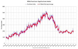 The second graph shows the MBA mortgage purchase index.
 According to the MBA, the unadjusted purchase index is 29% higher than a year ago.
Tuesday, December 08, 2015
EIA: Gasoline Prices expected to average $2.36/gal in 2016
by Calculated Risk on 12/08/2015 08:58:00 PM
Wednesday:
• At 7:00 AM ET, the Mortgage Bankers Association (MBA) will release the results for the mortgage purchase applications index.
• At 10:00 AM, the Monthly Wholesale Trade: Sales and Inventories for October. The consensus is for a 0.2% increase in inventories.
Oil prices have fallen sharply, with Brent at $40.83 per barrel, and WTI at $38.17.
Currently the EIA expects gasoline prices to average $2.36/gal in 2016 according to the Short Term Energy Outlook released today:
• EIA forecasts that Brent crude oil prices will average $53/b in 2015 and $56/b in 2016. Forecast West Texas Intermediate (WTI) crude oil prices average $4/b lower than the Brent price in 2015 and $5/b lower in 2016. The current values of futures and options contracts for March 2016 delivery (Market Prices and Uncertainty Report) suggest the market expects WTI prices to range from $30/b to $63/b (at the 95% confidence interval). ...Right now gasoline prices are down to around $2.02 per gallon nationally according to the Gasbuddy.com.
• The monthly average price of U.S. regular retail gasoline was $2.16/gallon (gal) in November, a decrease of 13 cents/gal from October and 75 cents/gal lower than in November 2014. EIA forecasts U.S. regular gasoline retail prices to average $2.04/gal in December 2015 and $2.36/gal for 2016.
emphasis added
The Future's so Bright ...
by Calculated Risk on 12/08/2015 01:11:00 PM
Almost three years ago I wrote The Future's so Bright .... In that post I outlined why I was becoming more optimistic. Last year, 2014, was the best year for employment since the '90s, and 2015 will be the 2nd or 3rd best year since the '90s. It time for another update!
For new readers: I was very bearish on the economy when I started this blog in 2005 - back then I wrote mostly about housing (see: LA Times article and more here for comments about the blog). I started looking for the sun in early 2009, and recently I've been more optimistic.
Here are some updates to the graphs I posted three years ago. Several of these graphs have changed direction since I wrote that post. As example, state and local government employment is now increasing, and household deleveraging is over (as predicted).

This graph shows total and single family housing starts. Even though starts have more than doubled from the bottom, starts are still way below the average level of 1.5 million per year from 1959 through 2000.
Demographics and household formation suggests starts will increase to around 1.5 million over the next few years. That means starts will probably increase another 40% or so from the October 2015 level of 1.06 million starts (SAAR).
Residential investment and housing starts are usually the best leading indicator for the economy, so this suggests the economy will continue to grow in 2016.
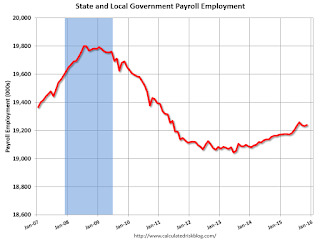
In 2013, state and local government employment increased slightly, and in 2014, state and local government employment increased by 85,000.
This year, through November 2015, state and local employment is up 70,000. So, in the aggregate, state and local government layoffs are over - and the economic drag on the economy is over. However state and local government employment is still 561,000 below the pre-recession peak.
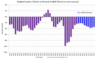
As we've been discussing, the US deficit as a percent of GDP has been declining, and will probably remain under 3% for several years.
Here are a couple of graph on household debt (and debt service):

From the NY Fed: Just Released: New and Improved Charts and Data on Auto Loans
the New York Fed announced that household debt increased by a robust $212 billion in the third quarter of 2015. Both mortgage and auto loan originations increased, as auto originations reached a ten-year high and new mortgage lending appears to have finally recovered from the very low levels seen in the past year.There will be some more deleveraging ahead for certain households (mostly from foreclosures and distressed sales), but in the aggregate, household deleveraging ended more than 2 years ago.
emphasis added
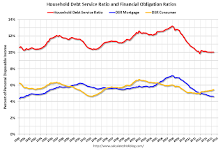 This graph is from the Fed's Q2 Household Debt Service and Financial Obligations Ratios. These ratios show the percent of disposable personal income (DPI) dedicated to debt service (DSR) and financial obligations (FOR) for households.
The overall Debt Service Ratio has been moving sideways and is near the record low. Note: The financial obligation ratio (FOR) is also near a record low (not shown)
Also the DSR for mortgages (blue) are near the low for the last 30 years. This ratio increased rapidly during the housing bubble, and continued to increase until 2007. With falling interest rates, and less mortgage debt (mostly due to foreclosures), the mortgage ratio has declined significantly.
This data suggests household cash flow is in much better shape than several years ago.
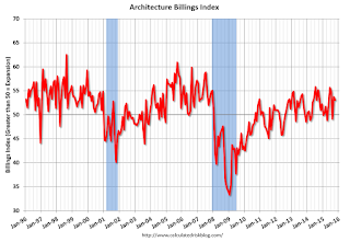 And for commercial real estate, here is the AIA Architecture Billings Index. This is usually a leading indicator for commercial real estate, and the readings over the last year suggest more increases in CRE investment in 2016 (except oil and power with the recent decline in oil prices).
Overall it appears the economy is poised for more growth.
And in the longer term I remain very optimistic.
Last year, I posted some demographic data for the U.S., see: Census Bureau: Largest 5-year Population Cohort is now the "20 to 24" Age Group and The Future is still Bright!
I pointed out that "even without the financial crisis we would have expected some slowdown in growth this decade (just based on demographics). The good news is that will change soon."
Changes in demographics are an important determinant of economic growth, and although most people focus on the aging of the "baby boomer" generation, the movement of younger cohorts into the prime working age is another key story in coming years. Here is a graph of the prime working age population (this is population, not the labor force) from 1948 through October 2015.
 There was a huge surge in the prime working age population in the '70s, '80s and '90s - and the prime age population has been mostly flat recently (even declined a little).
The prime working age population peaked in 2007, and appears to have bottomed at the end of 2012. The good news is the prime working age group has started to grow again, and should be growing solidly by 2020 - and this should boost economic activity in the years ahead.
These young workers are well educated and tech savvy. And they will have babies and buy homes soon. For more, see from Joe Weisenthal: The Analyst Who Nailed The Housing Crash Is Quietly Revealing The Next Big Thing
Three years ago I said that looking forward I was the most optimistic since the '90s. And things are only getting better. The future's so bright, I gotta wear shades.
Yes, the song was about nuclear holocaust ... but it was originally intended the way I'm using it.
BLS: Jobs Openings "little changed" in October
by Calculated Risk on 12/08/2015 10:15:00 AM
From the BLS: Job Openings and Labor Turnover Summary
The number of job openings was little changed at 5.4 million on the last business day of October, the U.S. Bureau of Labor Statistics reported today. Hires and separations were little changed at 5.1 million and 4.9 million, respectively. Within separations, the quits rate was 1.9 percent for the seventh consecutive month, and the layoffs and discharges rate was 1.2 percent. ...The following graph shows job openings (yellow line), hires (dark blue), Layoff, Discharges and other (red column), and Quits (light blue column) from the JOLTS.
...
Quits are generally voluntary separations initiated by the employee. Therefore, the quits rate can serve as a measure of workers’ willingness or ability to leave jobs. ... There were 2.8 million quits in October, little changed from September. The number of quits has held between 2.7 million and 2.8 million for the past 14 months. The quits rate remained unchanged in October, measuring 1.9 percent for the seventh consecutive month
emphasis added
This series started in December 2000.
Note: The difference between JOLTS hires and separations is similar to the CES (payroll survey) net jobs headline numbers. This report is for October, the most recent employment report was for November.
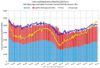 Click on graph for larger image.
Note that hires (dark blue) and total separations (red and light blue columns stacked) are pretty close each month. This is a measure of labor market turnover. When the blue line is above the two stacked columns, the economy is adding net jobs - when it is below the columns, the economy is losing jobs.
Jobs openings decreased in October to 5.383 million from 5.534 million in September.
The number of job openings (yellow) are up 11% year-over-year compared to October 2014.
Quits are up slightly year-over-year. These are voluntary separations. (see light blue columns at bottom of graph for trend for "quits").
This is a solid report. Job openings are close to the record high set in July, although Quits have leveled off.


