 RSS Feed
 by Calculated Risk on 1/27/2012 05:13:00 PM
Friday, January 27, 2012
Bank Failures #4 and 5 in 2012: Florida and Tennessee
Sack Panther and Titan banks
A Patriots chore
by Soylent Green is People
From the FDIC: CenterState Bank of Florida, National Association, Winter Haven, Florida, Assumes All of the Deposits of First Guaranty Bank and Trust Company of Jacksonville, Jacksonville, Florida
As of September 30, 2011, First Guaranty Bank and Trust Company of Jacksonville had approximately $377.9 million in total assets and $349.5 million in total deposits. ... The FDIC estimates that the cost to the Deposit Insurance Fund (DIF) will be $82.0 million. ... First Guaranty Bank and Trust Company of Jacksonville is the fourth FDIC-insured institution to fail in the nation this year, and the second in Florida. The last FDIC-insured institution closed in the state was Central Florida State Bank, Belleview, on January 20, 2012.From the FDIC: Republic Bank & Trust Company, Louisville, Kentucky, Assumes All of the Deposits of Tennessee Commerce Bank, Franklin, Tennessee
As of September 30, 2011, Tennessee Commerce Bank had approximately $1.185 billion in total assets and $1.156 billion in total deposits. ... The FDIC estimates that the cost to the Deposit Insurance Fund (DIF) will be $416.8 million. ... Tennessee Commerce Bank is the fifth FDIC-insured institution to fail in the nation this year, and the first in Tennessee. The last FDIC-insured institution closed in the state was Bank of Alamo, Alamo, on November 8, 2002.Hey, Tennessee is on the board. Another failure in Florida? No surprise.
LPS: 2010, 2011 Mortgage Originations have record low default rates
by Calculated Risk on 1/27/2012 02:46:00 PM
From LPS Applied Analytics: LPS' Mortgage Monitor Shows 2010, 2011 Originations Among Best Quality on Record
The December Mortgage Monitor report released by Lender Processing Services shows mortgage originations continued their decline from 2011’s September peak, down 10.1 percent from the month before. At the same time, those loans originated over the last two years have proven to be some of the best quality originations on record.According to LPS, 8.15% of mortgages were delinquent in December, unchanged from November, and down from 8.83% in December 2010.
...
Looking at judicial vs. non-judicial foreclosure states, LPS found that half of all loans in foreclosure in judicial states have not made a payment in more than two years. Foreclosure sale rates in non-judicial states stood at approximately four times that of judicial foreclosure states in December. Still, on average, pipeline ratios (the time it would take to clear through the inventory of loans either seriously delinquent or in foreclosure at the current rate of foreclosure sales) have declined significantly from earlier this year.
LPS reports that 4.11% of mortgages were in the foreclosure process, down from 4.16% in November, and down slightly from 4.15% in December 2010.
This gives a total of 12.26% delinquent or in foreclosure. It breaks down as:
• 2.31 million loans less than 90 days delinquent.
• 1.79 million loans 90+ days delinquent.
• 2.07 million loans in foreclosure process.
For a total of 6.17 million loans delinquent or in foreclosure in December.
 Click on graph for larger image.
This graph shows the total delinquent and in-foreclosure rates since 1995.
The total delinquent rate has fallen to 8.15% from the peak in January 2010 of 10.97%, but the decline has "halted". A normal rate is probably in the 4% to 5% range, so there is a long ways to go.
The in-foreclosure rate was at 4.11%, down from the record high in October 2011 of 4.29%. There are still a large number of loans in this category (about 2.07 million). LPS reported that foreclosure starts were down nearly 40% in December, probably due to process issues.
 This graph provided by LPS Applied Analytics shows foreclosure inventories by process.
 As LPS noted earlier: "Judicial vs. non-judicial foreclosure processes remain a significant factor in the reduction of foreclosure pipelines from state to state, with non-judicial foreclosure inventory percentages less than half that of judicial states. This is largely a result of the fact that foreclosure sale rates in non-judicial states have been proceeding at four to five times that of judicial. Non-judicial foreclosure states made up the entirety of the top 10 states with the largest year-over-year decline in non-current loans percentages."
 The third graph shows the 90+ day default rate by vintage.
LPS noted "2010 and 2011 originations are among the best on record".
And this isn't just because of tighter lending standards, LPS also noted (see report) that there were vintage improvements for high risk cohorts too (high risk defined as "Credit Score less than 660 and LTV greater than 80").
Notice the early payment default for the bubble years. The jump in payment 3 means the buyer missed the first three payments!
Overall this means newer loans are performing very well, but that there are a large number of delinquent loans stuck in the pipeline - especially in the judicial states.
Q4 GDP: Residential Investment now making a positive contribution
by Calculated Risk on 1/27/2012 11:19:00 AM
The following graph shows the contribution to GDP from residential investment, equipment and software, and nonresidential structures (3 quarter centered average). This is important to follow because residential investment tends to lead the economy, equipment and software is generally coincident, and nonresidential structure investment trails the economy.
For the following graph, red is residential, green is equipment and software, and blue is investment in non-residential structures. So the usual pattern - both into and out of recessions is - red, green, blue.
The dashed gray line is the contribution from the change in private inventories.
 Click on graph for larger image.
Residential Investment (RI) made a positive contribution to GDP in Q4 for the third consecutive quarter. Usually residential investment leads the economy, but not this time because of the huge overhang of existing inventory.
The contribution from RI will probably continue to be sluggish compared to previous recoveries. Still the positive contribution is a significant story.
Equipment and software investment has made a significant positive contribution to GDP for ten straight quarters (it is coincident). However the contribution from equipment and software investment in Q4 was the weakest since the recovery started.
The contribution from nonresidential investment in structures was negative in Q4. Nonresidential investment in structures typically lags the recovery, however investment in energy and power has masked the ongoing weakness in office, mall and hotel investment (the underlying details will be released next week).
 Residential Investment as a percent of GDP increased slightly in Q4.
Most of the increase was probably due to multifamily and home improvement investment. I'll break down Residential Investment (RI) into components after the GDP details are released this coming week. Note: Residential investment (RI) includes new single family structures, multifamily structures, home improvement, broker's commissions, and a few minor categories.
Residential investment will increase further in 2012, and I expect investment in single family structures will also add to growth this year.
 The last graph shows non-residential investment in structures and equipment and software.
Equipment and software investment had been increasing sharply, however the growth slowed in Q4.
Non-residential investment in structures decreased in Q4 and is still near record lows as a percent of GDP. The recent small increase has come from investment in energy and power. I'll add details for investment in offices, malls and hotels next week.
The key story is that residential investment is starting to increase. This trend will probably continue in 2012 - although the recovery in RI will be sluggish.
Earlier ...
• Real GDP increased 2.8% annual rate in Q4
Consumer Sentiment increases in January
by Calculated Risk on 1/27/2012 09:55:00 AM

Click on graph for larger image.
The final January Reuters / University of Michigan consumer sentiment index increased to 75.0, up from the preliminary reading of 74.0, and up from the December reading of 69.9.
Sentiment is still fairly weak, although above the consensus forecast of 74.0.
Real GDP increased 2.8% annual rate in Q4
by Calculated Risk on 1/27/2012 08:30:00 AM
Real gross domestic product -- the output of goods and services produced by labor and property located in the United States -- increased at an annual rate of 2.8 percent in the fourth quarter of 2011 (that is, from the third quarter to the fourth quarter), according to the "advance" estimate released by the Bureau of Economic Analysis.The following graph shows the quarterly GDP growth (at an annual rate) for the last 30 years. The dashed line is the current growth rate. Growth in Q4 at 2.8% annualized was below trend growth (around 3%) - and very weak for a recovery - but the best since Q2 2010.
The acceleration in real GDP in the fourth quarter primarily reflected an upturn in private inventory investment and accelerations in PCE and in residential fixed investment that were partly offset by a deceleration in nonresidential fixed investment, a downturn in federal government spending, an acceleration in imports, and a larger decrease in state and local government spending.

Click on graph for larger image.
A few key numbers:
• Real personal consumption expenditures increased 2.0 percent in the second quarter, compared with an increase of 1.7 percent in the third.
• Change in private inventories added 1.94 percentage point. This was partially ffset by a decline in government spending (subtracted 0.93 percentage points).
• Investment growth slowed, except residential investment: "Real nonresidential fixed investment increased 1.7 percent in the fourth quarter, compared with an increase of 15.7 percent in the third. Nonresidential structures decreased 7.2 percent, in contrast to an increase of 14.4 percent. Equipment and software increased 5.2 percent, compared with an increase of 16.2 percent. Real residential fixed investment increased 10.9 percent, compared with an increase of 1.3 percent."
I'll have more on GDP later ...
Thursday, January 26, 2012
GDP Report expected to show 3% annualized growth
by Calculated Risk on 1/26/2012 10:05:00 PM
On December New Home Sales:
• New Home Sales decline in December to 307,000 Annual Rate
• 2011: Record Low New Home Sales and 'Distressing Gap'
• New Home Sales graphs
Last week on Existing Home sales:
• Existing Home Sales in December: 4.61 million SAAR, 6.2 months of supply
• Existing Home Sales: Inventory and NSA Sales Graph
• Existing Home Sales graphs
 The BEA will release the Q4 advance GDP report Friday morning. The consensus is that real GDP increased 3.0% annualized in Q4.
This graph shows the quarterly GDP growth (at an annual rate) for the last 30 years. The Red column is the forecast for Q4 GDP.
At 3% this would be the fastest growth rate since Q2 2010, however PCE growth will probably still be weak and will probably be closer to 2% annualized.
Case Shiller House Price Forecasts: New Post-bubble lows Seasonally Adjusted
by Calculated Risk on 1/26/2012 05:07:00 PM
The Case Shiller house price indexes for November will be released next Tuesday. Here are a couple of forecasts:
• Zillow Forecast: November Case-Shiller Composite-20 Expected to Show 3.2% Decline from One Year Ago
Zillow predicts that the 20-City Composite Home Price Index (non-seasonally adjusted, NSA) will decline by 3.2 percent on a year-over-year basis, while the 10-City Composite Home Price Index (NSA) will show a year-over-year decline of 2.7 percent. The seasonally adjusted (SA) month-over-month change from October to November will be -0.2 percent and -0.1 percent for the 20 and 10-City Composite Home Price Index (SA), respectively.• From RadarLogic: Home Prices Declined at an Accelerating Rate in November as Sales Increased
The S&P/Case-Shiller Composite Home Price Indices for November 2011 will decline again on a month-over-month basis.Below is a summary table. Case-Shiller will probably report house prices are at a new post-bubble low seasonally adjusted, but still above the NSA (Not Seasonally Adjusted) levels of March 2011.
...
This month, we expect the November 2011 10-City composite index to be about 152 and the 20-City index to be roughly 138.
| Case Shiller Composite 10 | Case Shiller Composite 20 | ||||
|---|---|---|---|---|---|
| NSA | SA | NSA | SA | ||
| Case Shiller (actual) | Nov-10 | 157.5 | 156.44 | 143.77 | 142.77 |
| Oct-11 | 154.1 | 152.24 | 140.3 | 138.56 | |
| Zillow Forecast | YoY | -2.7% | -2.7% | -3.2% | -3.2% |
| MoM | -0.6% | -0.1% | -0.8% | -0.2% | |
| Zillow Forecasts1 | 153.2 | 152.2 | 139.2 | 138.2 | |
| RadarLogic Forecast | 152 | 138 | |||
| Post Bubble Lows2 | 150.44 | 152.24 | 137.64 | 138.56 | |
| 1Estimate based on Year-over-year and Month-over-month Zillow forecasts2NSA lows were in March 2011, SA lows were last month. | |||||
Misc: Tenth District manufacturing increases, Chicago Fed National Activity Index, State Coincident indexes
by Calculated Risk on 1/26/2012 02:31:00 PM
Catching up ...
• Kansas City Fed: Tenth District Manufacturing Activity Rebounded in January
The month-over-month composite index was 7 in January, up from revised totals of -2 in December and 4 in November. The composite index is an average of the production, new orders, employment, supplier delivery time, and raw materials inventory indexes. ... The production and shipments indexes jumped to their highest levels since June, and the new orders index climbed from -2 to 8.All of the regional manufacturing surveys have indicated stronger expansion in January (Empire state, Philly, Richmond and Kansas City). The Dallas Fed survey is scheduled to be released on Monday.
• The Chicago Fed released the national activity index (a composite index of other indicators): Index shows economic activity improved in December
Led by improvements in production- and employment-related indicators, the Chicago Fed National Activity Index increased to +0.17 in December from –0.46 in November. ...This graph shows the Chicago Fed National Activity Index (three month moving average) since 1967.
The index’s three-month moving average, CFNAI-MA3, increased from –0.19 in November to –0.08 in December—its highest value since March 2011. December’s CFNAI-MA3 suggests that growth in national economic activity was slightly below its historical trend. The economic slack reflected in this level of the CFNAI-MA3 suggests limited inflationary pressure from economic activity over the coming year.
 Click on graph for larger image.
According to the Chicago Fed:
A zero value for the index indicates that the national economy is expanding at its historical trend rate of growth; negative values indicate below-average growth; and positive values indicate above-average growth.• From the Philly Fed:
The Federal Reserve Bank of Philadelphia has released the coincident indexes for the 50 states for December 2011. In the past month, the indexes increased in 39 states, decreased in seven, and remained unchanged in four (Arizona, Nebraska, New York, and Wyoming) for a one-month diffusion index of 64.
 This is a graph is of the number of states with one month increasing activity according to the Philly Fed. This graph includes states with minor increases (the Philly Fed lists as unchanged).
In December, 42 states had increasing activity, down from 44 in November.
Note: These are coincident indexes constructed from state employment data. From the Philly Fed:
The coincident indexes combine four state-level indicators to summarize current economic conditions in a single statistic. The four state-level variables in each coincident index are nonfarm payroll employment, average hours worked in manufacturing, the unemployment rate, and wage and salary disbursements deflated by the consumer price index (U.S. city average). The trend for each state’s index is set to the trend of its gross domestic product (GDP), so long-term growth in the state’s index matches long-term growth in its GDP.
 Here is a map of the three month change in the Philly Fed state coincident indicators. This map was all red during the worst of the recession, and all green in early 2011 - but this is an improvement from last summer.
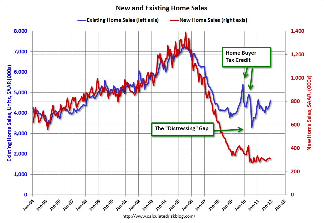
2011: Record Low New Home Sales and 'Distressing Gap'
by Calculated Risk on 1/26/2012 12:04:00 PM
2011 was the worst year for new home sales since the Census Bureau started tracking sales in 1963. The three worst years were 2011, 2010, and 2009 - and 2008 is also on the worst ten list. Although sales will probably increase in 2012, this year will probably be high in the list too.
See list at bottom.
The following graph shows existing home sales (left axis) and new home sales (right axis) through December. This graph starts in 1994, but the relationship has been fairly steady back to the '60s.
Following the housing bubble and bust, the "distressing gap" appeared mostly because of distressed sales. The flood of distressed sales has kept existing home sales elevated, and depressed new home sales since builders can't compete with the low prices of all the foreclosed properties.
 Click on graph for larger image.
I expect this gap to eventually close once the number of distressed sales starts to decline.
Note: Existing home sales are counted when transactions are closed, and new home sales are counted when contracts are signed. So the timing of sales is different.
On December New Home Sales:
• New Home Sales decline in December to 307,000 Annual Rate
• New Home Sales graphs
Last week on Existing Home sales:
• Existing Home Sales in December: 4.61 million SAAR, 6.2 months of supply
• Existing Home Sales: Inventory and NSA Sales Graph
• Existing Home Sales graphs
| Ten Worst Years for New Home Sales since 1963 | |
|---|---|
| Year | Sales (000s) |
| 2011 | 302 |
| 2010 | 323 |
| 2009 | 375 |
| 1982 | 412 |
| 1981 | 436 |
| 1969 | 448 |
| 1966 | 461 |
| 1970 | 485 |
| 2008 | 485 |
| 1967 | 487 |
New Home Sales decline in December to 307,000 Annual Rate
by Calculated Risk on 1/26/2012 10:00:00 AM
The Census Bureau reports New Home Sales in December were at a seasonally adjusted annual rate (SAAR) of 307 thousand. This was down from a revised 314 thousand in November (revised down from 315 thousand).
The first graph shows New Home Sales vs. recessions since 1963. The dashed line is the current sales rate.
Sales of new single-family houses in December 2011 were at a seasonally adjusted annual rate of 307,000 ... This is 2.2 percent (±13.2%) below the revised November rate of 314,000 and is 7.3 percent (±16.6%) below the December 2010 estimate of 331,000.
 Click on graph for larger image in graph gallery.
The second graph shows New Home Months of Supply.
Months of supply increased to 6.1 in December.
The all time record was 12.1 months of supply in January 2009.
 This is now close to normal (less than 6 months supply is normal).
The seasonally adjusted estimate of new houses for sale at the end of December was 157,000. This represents a supply of 6.1 months at the current sales rate.On inventory, according to the Census Bureau:
"A house is considered for sale when a permit to build has been issued in permit-issuing places or work has begun on the footings or foundation in nonpermit areas and a sales contract has not been signed nor a deposit accepted."Starting in 1973 the Census Bureau broke this down into three categories: Not Started, Under Construction, and Completed.
 This graph shows the three categories of inventory starting in 1973.
The inventory of completed homes for sale was at 61,000 units in December. The combined total of completed and under construction is at the lowest level since this series started.
The last graph shows sales NSA (monthly sales, not seasonally adjusted annual rate).
In December 2011 (red column), 21 thousand new homes were sold (NSA). This was the weakest December since this data has been tracked, and was below the previous record low for December of 23 thousand set in 1966 and tied in 2010. The high for December was 87 thousand in 2005.
 This was below the consensus forecast of 320 thousand, and was a new record low for the month of December (NSA).
 New home sales have averaged only 300 thousand SAAR over the 20 months since the expiration of the tax credit ... mostly moving sideways at a very low level.


