 RSS Feed
 by Calculated Risk on 9/30/2016 06:20:00 PM
Friday, September 30, 2016
Mortgage Rates "Near All Time Lows"
From Matthew Graham at Mortgage News Daily: Mortgage Rates Mixed, But Closer to Recent Lows
Mortgage Rates were mixed today, with some lenders in slightly weaker territory while others offered modest improvements versus yesterday. The dichotomy has to do with the timing of yesterday's market movements. Bond market began the day in weak territory yesterday but improved noticeably by the end of the day. Some lenders sent out updated (better) rate sheets while others stood pat. Lenders whose rates increased today tended to come from the group that offered improvements yesterday afternoon. Long story short, there was a brief window of the week's best rates for some lenders yesterday with everyone getting mostly back on the same page today.Here is a table from Mortgage News Daily:
Fortunately, that page is still a good one. While rates aren't quite as low as they were earlier this week, they're still much lower than they were earlier this month. 3.375% is still the most prevalent conventional 30yr fixed quotes on top tier scenarios. That's the lowest stably-held rate of all time (there have been lower rates, but only for a few days here and there), even though the upfront costs are slightly higher than they were in early August. That's splitting hairs though! The point is that, unless you're examining day-to-day rate movement under a microscope, rates have been holding steady near all-time lows.
emphasis added
Restaurant Performance Index decreased in August
by Calculated Risk on 9/30/2016 01:47:00 PM
Here is a minor indicator I follow from the National Restaurant Association: RPI drops into contraction territory
Due in large part to declines in both same-store sales and customer traffic, the National Restaurant Association’s Restaurant Performance Index (RPI) fell below 100 in August. The RPI stood at 99.6, down 1.0 percent from a level of 100.6 in July.
“Broad-based declines in the current situation indicators caused the RPI to fall below 100 for the first time in eight months,” said Hudson Riehle, senior vice president of research for the National Restaurant Association. “Restaurant operators reported soft sales and traffic in August, along with corresponding dips in the labor indicators. While the Expectations component of the index remains in expansion territory, it too has trended downward in the past several months.”
emphasis added
 Click on graph for larger image.
The index decreased to 99.6 in August, down from 100.6 in July. (below 100 indicates contraction).
Restaurant spending is discretionary, so even though this is "D-list" data, I like to check it every month.
Chicago PMI increase in September, Final Sept Consumer Sentiment at 91.2
by Calculated Risk on 9/30/2016 11:18:00 AM
Chicago PMI: September Chicago Business Barometer Up 2.7 Points to 54.2
The MNI Chicago Business Barometer increased 2.7 points to 54.2 in September from 51.5 in August, recovering most of lost ground experienced in the previous month.This was above the consensus forecast of 52.0.
...
In response to September’s special question, 79% of Chicago panellists said the run-up to November Presidential Elections is having a negligible impact on business.
...
“Economic growth in the US appears to have picked up a little at the end of the third quarter and although the Employment component fell, this was on the back of a relatively strong showing in the previous month. Note Employment usually lags changes in orders and output, so it was not that surprising to see this component weakening in September,” said Lorena Castellanos, senior economist at MNI Indicators
emphasis added

Click on graph for larger image.
The final consumer sentiment reading was 91.2 in September, up from 89.8 in August.
"Confidence edged upward in September due to gains among higher income households, while the Sentiment Index among households with incomes under $75,000 has remained at exactly the same level for the third consecutive month. Importantly, the data provide no evidence of an upward trend as the average level of the Sentiment Index since the start of 2016 is nearly identical with the September level (91.4 versus 91.2). "This was above the consensus forecast.
emphasis added
Personal Income increased 0.2% in August, Spending increased less than 0.1%
by Calculated Risk on 9/30/2016 08:38:00 AM
The BEA released the Personal Income and Outlays report for August:
Personal income increased $39.3 billion (0.2 percent) in August according to estimates released today by the Bureau of Economic Analysis. ... personal consumption expenditures (PCE) increased $6.2 billion (less than 0.1 percent).The August PCE price index increased 1.0 percent year-over-year and the August PCE price index, excluding food and energy, increased 1.7 percent year-over-year.
...
Real PCE decreased 0.1 percent. The PCE price index increased 0.1 percent. Excluding food and energy, the PCE price index increased 0.2 percent.
The following graph shows real Personal Consumption Expenditures (PCE) through August 2016 (2009 dollars). Note that the y-axis doesn't start at zero to better show the change.
 Click on graph for larger image.
The dashed red lines are the quarterly levels for real PCE.
The increase in personal income was at consensus expectations. And the increase in PCE was below the 0.2% increase consensus.
Using the two-month method to estimate Q3 PCE growth, PCE was increasing at a 3.1% annual rate in Q3 2016. (using the mid-month method, PCE was increasing 2.6%). This suggests decent PCE growth in Q3, even with the weak August report.
Thursday, September 29, 2016
Friday: Personal Income, Chicago PMI, Consumer Sentiment
by Calculated Risk on 9/29/2016 08:21:00 PM
From Merrill Lynch: Elections: what keeps us up at night?
The US elections are quickly approaching and, in our view, have become one of the most significant near-term risks for the economy and markets. The facts are changing quickly, both in terms of the policies that each candidate supports but also in terms of expectations over the outcome of the election. According to the Iowa Electronic Markets (IEM) and PredictWise, Clinton currently has about a 70-75% chance of winning the election. FiveThirtyEight, a political aggregator, is expecting a closer race with Clinton’s chances at only about 60%. According to IEM and PredictWise, the probability of Republicans retaining control of the House is running at 70%-90%, and the probability of Democrats taking control of the Senate is about 40%-60%.CR Note: All key analysts are assuming Ms. Clinton will be the next President (my forecasts also assume a Clinton presidency). The alternative is too grim to contemplate.
Although the race has narrowed, the markets and political aggregators are suggesting the most likely outcome is split government, with Hillary Clinton in the White House and the Republicans in control of the House. This would imply that the gridlock in Washington continues and that policy changes would not be significant – which is assumed in our baseline economic forecasts. However, we cannot rule out the possibility of a Republican sweep. As our strategists have noted, the initial reaction to a potential Trump victory would likely be a risk-off event in the markets, which we think could end up delaying the Fed from hiking in December.
emphasis added
Friday:
• At 8:30 AM ET, Personal Income and Outlays for August. The consensus is for a 0.2% increase in personal income, and for a 0.2% increase in personal spending. And for the Core PCE price index to increase 0.2%.
• At 9:45 AM, Chicago Purchasing Managers Index for September. The consensus is for a reading of 52.0, up from 51.5 in August.
• At 10:00 AM, University of Michigan's Consumer sentiment index (final for September). The consensus is for a reading of 90.1, up from the preliminary reading 89.8.
Fannie Mae: Mortgage Serious Delinquency rate declined in August, Lowest since April 2008
by Calculated Risk on 9/29/2016 05:09:00 PM
Fannie Mae reported today that the Single-Family Serious Delinquency rate declined in August to 1.24%, down from 1.30% in July. The serious delinquency rate is down from 1.62% in August 2015.
These are mortgage loans that are "three monthly payments or more past due or in foreclosure".
This is the lowest rate since April 2008.
The Fannie Mae serious delinquency rate peaked in February 2010 at 5.59%.
 Click on graph for larger image
Although the rate is generally declining, the "normal" serious delinquency rate is under 1%.
The Fannie Mae serious delinquency rate has fallen 0.38 percentage points over the last year, and at that rate of improvement, the serious delinquency rate will not be below 1% for about 8 more months.
Note: Freddie Mac reported yesterday.
Zillow Forecast: Expect Similar YoY Growth in August for the Case-Shiller Indexes
by Calculated Risk on 9/29/2016 01:37:00 PM
The Case-Shiller house price indexes for July were released Tuesday. Zillow forecasts Case-Shiller a month early, and I like to check the Zillow forecasts since they have been pretty close.
From Zillow: August Case-Shiller Forecast: New Home Price Peaks Within Sight
According to Zillow’s August Case-Shiller forecast, the national index and both smaller 10 and 20-city indices look set to keep growing at a very similar rate as they have been for the past few months. After two full years of steady growth around 5 percent annually, the U.S. National Case-Shiller home price index is within striking distance of reaching its July 2006 peak levels, just 0.6 percent off those levels, according to today’s data.The year-over-year change for the 20-city index will probably be slightly lower in the August report than in the July report. The change for the National index will probably be slightly higher.
The August Case-Shiller National Index is expected to grow 5.2 percent year-over-year and 0.5 percent month-to-month (seasonally adjusted). We expect the 10-City Index to grow 4.1 percent year-over-year and to stay flat (SA) from July. The 20-City Index is expected to grow 4.9 percent between August 2015 and August 2016, and rise 0.1 percent (SA) from July.
Zillow’s August Case-Shiller forecast is shown in the table below. These forecasts are based on today’s July Case-Shiller data release and the August 2016 Zillow Home Value Index (ZHVI). The August S&P CoreLogic Case-Shiller Indices will not be officially released until Tuesday, October 25.

NAR: Pending Home Sales Index decreased 2.4% in August, down 0.2% year-over-year
by Calculated Risk on 9/29/2016 10:03:00 AM
From the NAR: Pending Home Sales Retreat in August
After bouncing back in July, pending home sales cooled in August for the third time in four months and to their lowest level since January, according to the National Association of Realtors®.This was well below expectations of a 0.5% increase for this index. Note: Contract signings usually lead sales by about 45 to 60 days, so this would usually be for closed sales in September and October.
The Pending Home Sales Index, a forward-looking indicator based on contract signings, declined 2.4 percent to 108.5 in August from a downwardly revised 111.2 in July and is now slightly lower (0.2 percent) than August 2015 (108.7). With last month's decline, the index is now at its second lowest reading this year after January (105.4).
...
The PHSI in the Northeast rose 1.3 percent to 98.1 in August, and is now 5.9 percent above a year ago. In the Midwest the index decreased 0.9 percent to 104.7 in August, and is now 1.7 percent lower than August 2015.
Pending home sales in the South declined 3.2 percent to an index of 119.8 in August and are now 1.5 percent lower than last August. The index in the West fell 5.3 percent in August to 102.8, and is now 0.6 percent lower than a year ago.
emphasis added
Weekly Initial Unemployment Claims at 254,000
by Calculated Risk on 9/29/2016 08:38:00 AM
The DOL reported:
In the week ending September 24, the advance figure for seasonally adjusted initial claims was 254,000, an increase of 3,000 from the previous week's revised level. The previous week's level was revised down by 1,000 from 252,000 to 251,000. The 4-week moving average was 256,000, a decrease of 2,250 from the previous week's revised average. The previous week's average was revised down by 250 from 258,500 to 258,250.The previous week was revised down.
There were no special factors impacting this week's initial claims. This marks 82 consecutive weeks of initial claims below 300,000, the longest streak since 1970.
The following graph shows the 4-week moving average of weekly claims since 1971.
 Click on graph for larger image.
The dashed line on the graph is the current 4-week average. The four-week average of weekly unemployment claims decreased to 256,000.
This was lower than the consensus forecast of 260,000. The low level of claims suggests relatively few layoffs.
Q2 GDP Revised Up to 1.4% Annual Rate
by Calculated Risk on 9/29/2016 08:34:00 AM
From the BEA: Gross Domestic Product: Second Quarter 2016 (Third Estimate)
Real gross domestic product increased at an annual rate of 1.4 percent in the second quarter of 2016 (table 1), according to the "third" estimate released by the Bureau of Economic Analysis. In the first quarter, real GDP increased 0.8 percent.Here is a Comparison of Second and Advance Estimates. PCE growth was revised down from 4.4% to 4.3%. (Solid PCE). Non-Residential investment was revised up from -0.9% to +1.0%. This was close to the consensus forecast.
The GDP estimate released today is based on more complete source data than were available for the "second" estimate issued last month. In the second estimate, the increase in real GDP was 1.1 percent. With the third estimate for the second quarter, the general picture of economic growth remains the same. The most notable change from the second to third estimate is that nonresidential fixed investment increased in the second quarter; in the previous estimate, nonresidential fixed investment decreased ...
emphasis added
Wednesday, September 28, 2016
Thursday: GDP, Unemployment Claims, Pending Home Sales
by Calculated Risk on 9/28/2016 08:06:00 PM
The GDP release will be for Q2. Here are two looks at Q3 ...
Atlanta Fed GDP Now:
The GDPNow model forecast for real GDP growth (seasonally adjusted annual rate) in the third quarter of 2016 is 2.8 percent on September 28, down from 2.9 percent on September 20.New York Fed Nowcasting:
The FRBNY Staff Nowcast stands at 2.3% and 1.2% for 2016:Q3 and 2016:Q4, respectively.Thursday:
• At 8:30 AM ET, The initial weekly unemployment claims report will be released. The consensus is for 260 thousand initial claims, up from 252 thousand the previous week.
• Also at 8:30 AM, Gross Domestic Product, 2nd quarter 2016 (Third estimate). The consensus is that real GDP increased 1.3% annualized in Q2, up from 1.1% in the second estimate.
• At 10:00 AM, Pending Home Sales Index for August. The consensus is for a 0.5% increase in the index.
• At 5:10 PM, Speech by Fed Chair Janet Yellen, Conversation with conference participants, At the Banking and the Economy: A Forum for Minority Bankers, Federal Reserve Bank of Kansas City, Kansas City, Missouri
Freddie Mac: Mortgage Serious Delinquency rate declined in August, Lowest since July 2008
by Calculated Risk on 9/28/2016 04:40:00 PM
Freddie Mac reported that the Single-Family serious delinquency rate declined in August to 1.03%, down from 1.08% in July. Freddie's rate is down from 1.45% in August 2015.
This is the lowest rate since July 2008.
Freddie's serious delinquency rate peaked in February 2010 at 4.20%.
These are mortgage loans that are "three monthly payments or more past due or in foreclosure".
 Click on graph for larger image
Although the rate is generally declining, the "normal" serious delinquency rate is under 1%.
The Freddie Mac serious delinquency rate has fallen 0.42 percentage points over the last year, and at that rate of improvement, the serious delinquency rate could be below 1% in next month (September).
Note: Fannie Mae will report in the next few days.
OPEC Agrees to Cut Oil Output
by Calculated Risk on 9/28/2016 03:34:00 PM
From Bloomberg: OPEC Agrees to First Oil Output Cut in Eight Years
In two days of round-the-clock talks in Algiers, the group agreed to drop production to 32.5 million barrels a day, the delegate said, asking not to be named because the decision isn’t yet public. That’s nearly 750,000 barrels a day less than it pumped in August.
...
As OPEC agreed to limit its output, Russia smashed a post-Soviet oil-supply record, pumping 11.1 million barrels a day in September, up 400,000 from August, according to preliminary estimates. Russia participated in the Algiers talks, but it’s not party to the OPEC deal.
 Click on graph for larger image
This graph shows the year-over-year change in WTI based on data from the EIA.
Five times since 1987, oil prices have increased 100% or more YoY. And several times prices have almost fallen in half YoY.
Brent and WTI oil prices are now up about 5% year-over-year.
 The second graph shows WTI and Brent spot oil prices from the EIA. (Prices today added).
 According to Bloomberg, WTI is at $46.83 per barrel today, and Brent is at $48.41.
Prices really collapsed at the end of 2014 - and then rebounded a little - and then collapsed again at the end of 2015 and in early 2016.
Who knows if this agreement will hold, but it seems likely that oil prices - and eventually gasoline prices - will be up year-over-year at the end of 2016 and no longer a drag on CPI.
Update on "Peak Renter"
by Calculated Risk on 9/28/2016 12:52:00 PM
From economist Josh Lehner at Oregon Office of Economic Analysis Peak Renter In Real Life
A year ago our office asked “Is 2015 Peak Renter?” We laid out a straightforward case examining the three main underlying drivers for the shift into rentership over the past decade: household finances, demographics, and preferences and tastes. We know the pendulum has swung all the way toward rentership. The question is not whether or not it will swing back toward ownership, it will. The question is when will this happen. Our office’s position was that it would happen probably sooner than the conventional wisdom suggested. The reason was household finances and demographics are now working in favor of ownership.CR Note: there is much more in the post. When Lehner sent me his post last year, I added some comments here - including the following graph.
...
Well, the 2015 ACS data was just released and we got an update on the question of ownership vs rentership. As Jed Kolko notes in his great summary of the ACS data, rentership ticked up 0.1 percentage points nationwide last year. So not yet peak renter across the entire U.S. and the HVC data differ from the ACS data as well. That said, the U.S. changes were minimal, suggesting the shift into rentership has slowed considerably; possibly an indication that peak renter is near.
Locally, however, peak renter is already here. Statewide the homeownership rate ticked up from 60.7% in 2014 to 61.1% in 2015. In the Portland metro region the increase was even bigger at 1.6 percentage points.
 Click on graph for larger image.
This graph shows the long term trend for two key age groups: 20 to 29, and 30 to 39.
This graph is from 1990 to 2060 (all data from BLS: current to 2060 is projected).
We can see the surge in the 20 to 29 age group (red). Once this group exceeded the peak in earlier periods, there was an increase in apartment construction. This age group will peak in 2018 (until the 2030s).
Note: I used a similar graph six years ago to argue there would be a surge in rentals from both demographics, and also from people losing their homes to foreclosure.
For buying, the 30 to 39 age group (blue) is important (note: see Demographics and Behavior for some reasons for changing behavior). The population in this age group is increasing, and will increase significantly over the next 10+ years.
This demographics is positive for home buying, and this is a key reason I expect single family housing starts to continue to increase in coming years.
ATA Trucking Index increased Sharply in August
by Calculated Risk on 9/28/2016 09:46:00 AM
This was released last week by the ATA: ATA Truck Tonnage Index Jumped 5.7% in August
American Trucking Associations’ advanced seasonally adjusted (SA) For-Hire Truck Tonnage Index increased 5.7% in August, following a 2.1% decline during July. In August, the index equaled 141.8 (2000=100), up from 134.2 in July. The all-time high was 144 in February.
Compared with August 2015, the SA index rose 5.9%, the largest year-over-year gain since May also 5.9%. In July, the year-over-year increase was 0.2%. Year-to-date, compared with the same period in 2015, tonnage was up 3.5%.
...
“Volatility continues to reign in 2016. This month’s tonnage reading highlights this fact and underscores the difficulty in determining any real or clear trend in truck tonnage,” said ATA Chief Economist Bob Costello. “What is clear to me is that normal seasonal patterns are not holding in 2016.”
...
“Despite a difficult to read August, I expect the truck freight environment to be softer than normal as well as continued choppiness until the inventory correction is complete. With moderate economic growth forecasted, truck freight will improve as progress is made with the inventory overhang,” he said.
emphasis added
 Click on graph for larger image.
Here is a long term graph that shows ATA's For-Hire Truck Tonnage index.
The dashed line is the current level of the index.
The index is now up 5.9% year-over-year.
MBA: "Mortgage Applications Decrease in Latest Weekly Survey"
by Calculated Risk on 9/28/2016 07:00:00 AM
From the MBA: Mortgage Applications Decrease in Latest MBA Weekly Survey
Mortgage applications decreased 0.7 percent from one week earlier, according to data from the Mortgage Bankers Association’s (MBA) Weekly Mortgage Applications Survey for the week ending September 23, 2016.
... The Refinance Index decreased 2 percent from the previous week. The seasonally adjusted Purchase Index increased 1 percent from one week earlier. The unadjusted Purchase Index remained unchanged from the previous week and was 10 percent higher than the same week one year ago.
...
The average contract interest rate for 30-year fixed-rate mortgages with conforming loan balances ($417,000 or less) decreased to 3.66 percent from 3.70 percent, with points decreasing to 0.33 from 0.38 (including the origination fee) for 80 percent loan-to-value ratio (LTV) loans.
emphasis added
 Click on graph for larger image.
The first graph shows the refinance index since 1990.
Refinance activity has increased this year since rates have declined.
 The second graph shows the MBA mortgage purchase index.
 The purchase index was "10 percent higher than the same week one year ago".
Tuesday, September 27, 2016
Lawler: Renter Share of Single-Family Market Declined Slightly in 2015
by Calculated Risk on 9/27/2016 05:12:00 PM
From housing economist Tom Lawler:
Data from the 2015 American Community Survey suggest thatFor the first time since 2006, the number of single-family housing units occupied by renters declined slightly last year. The share of occupied single-family (detached and attached) housing units occupied by renters, which went up from 14.8% in 2006 to 18.9% in 2014, declined very slightly to 18.8% in 2015.
| Occupied Single Family Detached and Attached Homes, American Community Survey | |||
|---|---|---|---|
| 2015 | 2014 | Change | |
| Total | 80,881,173 | 80,426,594 | 454,579 |
| Owner | 65,703,475 | 65,231,767 | 471,708 |
| 15-34 year olds | 6,165,488 | 6,153,328 | 12,160 |
| 35-64 year olds | 39,953,123 | 40,044,935 | -91,812 |
| 65+ year olds | 19,584,864 | 19,033,504 | 551,360 |
| Renter | 15,177,698 | 15,194,827 | -17,129 |
| 15-34 year olds | 4,676,567 | 4,735,281 | -58,714 |
| 35-64 year olds | 8,800,400 | 8,819,476 | -19,076 |
| 65+ year olds | 1,700,731 | 1,640,070 | 60,661 |
| Renter Share | 18.8% | 18.9% | -0.1% |
 Click on graph for larger image.
ACS estimates suggest that the number of owner-occupied single-family homes declined by about 260,000 from 2006 to 2014, while the number of renter-occupied single-family homes increased by almost 3.9 million.
On the owner-occupied single-family front, from 2010 to 2015 the share of owned homes occupied by households 65 years or older rose from 25.5% to 29.8%.
Some analysts believe that the combination of a high renter-share and a high “old-folks” share of the single-family market is at least partly responsible for the relatively low level of single-family homes for sale.
CR Note: My view is these are two of the key reasons existing home inventory is low: 1) As Lawler notes, a large number of single family home and condos were converted to rental units. Most of these rental conversions were at the lower end, and that is limiting the supply for first time buyers. and 2) Baby boomers are aging in place (people tend to downsize when they are 75 or 80, in another 10 to 20 years for the boomers).
Chemical Activity Barometer indicated "Solid Growth in September"
by Calculated Risk on 9/27/2016 03:25:00 PM
Here is an indicator that I'm following that appears to be a leading indicator for industrial production.
From the American Chemistry Council: Chemical Activity Barometer Continues Solid Growth in September
The Chemical Activity Barometer (CAB), a leading economic indicator created by the American Chemistry Council (ACC), expanded 0.4 percent in September following a 0.4 percent gain in August and a 0.7 percent gain in July and June. Accounting for adjustments, the CAB is up 3.7 percent over this time last year, an improvement over prior months. All data is measured on a three-month moving average (3MMA). On an unadjusted basis the CAB climbed 0.2 percent in September, following a 0.4 percent gain in August.
...
Applying the CAB back to 1912, it has been shown to provide a lead of two to fourteen months, with an average lead of eight months at cycle peaks as determined by the National Bureau of Economic Research. The median lead was also eight months. At business cycle troughs, the CAB leads by one to seven months, with an average lead of four months. The median lead was three months. The CAB is rebased to the average lead (in months) of an average 100 in the base year (the year 2012 was used) of a reference time series. The latter is the Federal Reserve’s Industrial Production Index.
emphasis added
 Click on graph for larger image.
This graph shows the year-over-year change in the 3-month moving average for the Chemical Activity Barometer compared to Industrial Production. It does appear that CAB (red) generally leads Industrial Production (blue).
Currently CAB has increased solidly over the last several months, and this suggests an increase in Industrial Production over the next year.
Real Prices and Price-to-Rent Ratio in July
by Calculated Risk on 9/27/2016 12:21:00 PM
Here is the earlier post on Case-Shiller: Case-Shiller: National House Price Index increased 5.1% year-over-year in July
The year-over-year increase in prices is mostly moving sideways now around 5%. In July, the index was up 5.1% YoY.
In the earlier post, I graphed nominal house prices, but it is also important to look at prices in real terms (inflation adjusted). Case-Shiller, CoreLogic and others report nominal house prices. As an example, if a house price was $200,000 in January 2000, the price would be close to $275,000 today adjusted for inflation (37%). That is why the second graph below is important - this shows "real" prices (adjusted for inflation).
It has been almost ten years since the bubble peak. In the Case-Shiller release this morning, the National Index was reported as being 2.2% below the bubble peak (seasonally adjusted). However, in real terms, the National index is still about 16.6% below the bubble peak.
Nominal House Prices
 The first graph shows the monthly Case-Shiller National Index SA, the monthly Case-Shiller Composite 20 SA, and the CoreLogic House Price Indexes (through June) in nominal terms as reported.
In nominal terms, the Case-Shiller National index (SA) is back to December 2005 levels, and the Case-Shiller Composite 20 Index (SA) is back to June 2005 levels, and the CoreLogic index (NSA) is back to July 2005.
Real House Prices
 The second graph shows the same three indexes in real terms (adjusted for inflation using CPI less Shelter). Note: some people use other inflation measures to adjust for real prices.
CPI less Shelter has declined over the last two years pushing up real house prices.
In real terms, the National index is back to January 2004 levels, the Composite 20 index is back to October 2003, and the CoreLogic index back to November 2003.
In real terms, house prices are back to late 2003 levels.
Price-to-Rent
In October 2004, Fed economist John Krainer and researcher Chishen Wei wrote a Fed letter on price to rent ratios: House Prices and Fundamental Value. Kainer and Wei presented a price-to-rent ratio using the OFHEO house price index and the Owners' Equivalent Rent (OER) from the BLS.
 Here is a similar graph using the Case-Shiller National, Composite 20 and CoreLogic House Price Indexes.
This graph shows the price to rent ratio (January 1998 = 1.0).
On a price-to-rent basis, the Case-Shiller National index is back to July 2003 levels, the Composite 20 index is back to April 2003 levels, and the CoreLogic index is back to June 2003.
In real terms, and as a price-to-rent ratio, prices are back to late 2003 - and the price-to-rent ratio maybe moving a little more sideways now.
Richmond Fed: Regional Manufacturing Activity "Still Soft" in September
by Calculated Risk on 9/27/2016 10:16:00 AM
From the Richmond Fed: Manufacturing Sector Activity Still Soft in September; Employment Index at 36-Month Low
Manufacturing activity in the Fifth District continued to soften in September, but somewhat less so than in August, according to the Richmond Fed's latest survey. ...This was the last of the regional Fed surveys for September.
Overall manufacturing activity, as measured by the composite index, gained three points but continued to indicate some contraction, with a reading of −8 following last month’s reading of −11.
...
Hiring activity at District manufacturing firms weakened in September. The manufacturing employment indicator lost 20 points to end at a reading of −7, while the average workweek index improved from a reading of −4 in August to 1 in September. The wage index lost eight points to end at a reading of 13 for the month. ...
emphasis added
Here is a graph comparing the regional Fed surveys and the ISM manufacturing index:
 Click on graph for larger image.
The New York and Philly Fed surveys are averaged together (yellow, through September), and five Fed surveys are averaged (blue, through September) including New York, Philly, Richmond, Dallas and Kansas City. The Institute for Supply Management (ISM) PMI (red) is through August (right axis).
It seems likely the ISM manufacturing index will show expansion in September.
Case-Shiller: National House Price Index increased 5.1% year-over-year in July
by Calculated Risk on 9/27/2016 09:13:00 AM
S&P/Case-Shiller released the monthly Home Price Indices for July ("July" is a 3 month average of May, June and July prices).
This release includes prices for 20 individual cities, two composite indices (for 10 cities and 20 cities) and the monthly National index.
Note: Case-Shiller reports Not Seasonally Adjusted (NSA), I use the SA data for the graphs.
From S&P: Home Price Gains in July Slow According to the S&P CoreLogic Case-Shiller Indices
The S&P CoreLogic Case-Shiller U.S. National Home Price NSA Index, covering all nine U.S. census divisions, reported a 5.1% annual gain in July, up from 5.0% last month. The 10-City Composite posted a 4.2% annual increase, down from 4.3% the previous month. The 20-City Composite reported a year-over-year gain of 5.0%, down from 5.1% in June.
...
Before seasonal adjustment, the National Index posted a month-over-month gain of 0.7% in July. The 10-City Composite recorded a 0.5% month-over-month increase while the 20-City Composite posted a 0.6% increase in July. After seasonal adjustment, the National Index recorded a 0.4% month-overmonth increase, the 10-City Composite posted a 0.1% decrease, and the 20-City Composite remains unchanged. After seasonal adjustment, 12 cities saw prices rise, two cities were unchanged, and six cities experienced negative monthly prices changes.
emphasis added
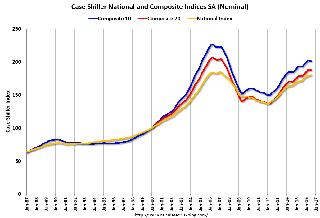 Click on graph for larger image.
 The first graph shows the nominal seasonally adjusted Composite 10, Composite 20 and National indices (the Composite 20 was started in January 2000).
The Composite 10 index is off 11.1% from the peak, and down slightly in July (SA).
The Composite 20 index is off 9.2% from the peak, and down slightly (SA) in July.
The National index is off 2.2% from the peak (SA), and up 0.4% (SA) in July. The National index is up 32.1% from the post-bubble low set in December 2011 (SA).
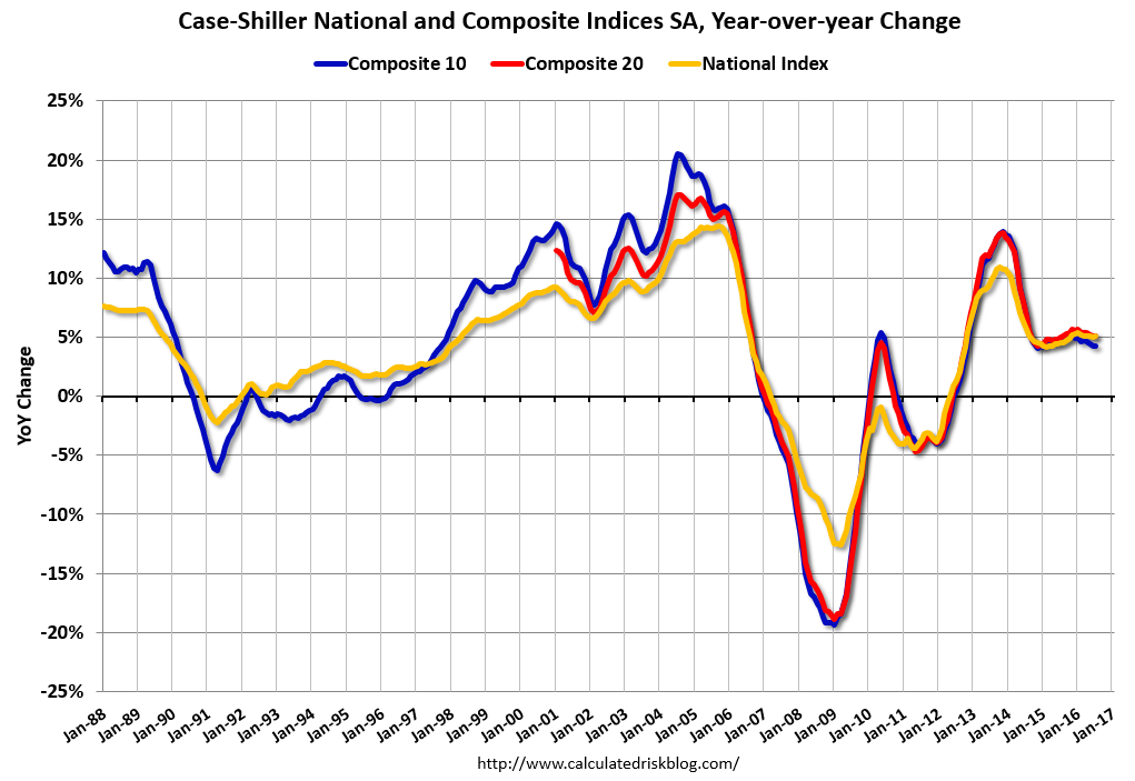 The second graph shows the Year over year change in all three indices.
The Composite 10 SA is up 4.2% compared to July 2015.
The Composite 20 SA is up 5.1% year-over-year.
The National index SA is up 5.1% year-over-year.
Note: According to the data, prices increased in 12 of 20 cities month-over-month seasonally adjusted.
I'll have more later.
Monday, September 26, 2016
Tuesday: Case-Shiller House Prices
by Calculated Risk on 9/26/2016 07:14:00 PM
Monday Night from 9:00 to 10:30 PM: the First Presidential Debate at Hofstra University in New York.
From Politifact Live fact-checking the first Trump, Clinton presidential debate
From the NY Times: How The New York Times Will Fact-Check the Debate
Tuesday:
• At 9:00 AM ET, S&P/Case-Shiller House Price Index for July. Although this is the July report, it is really a 3 month average of May, June and July prices. The consensus is for a 5.2% year-over-year increase in the Comp 20 index for July. The Zillow forecast is for the National Index to increase 5.0% year-over-year in July.
• At 10:00 AM, Richmond Fed Survey of Manufacturing Activity for September. This is the last of the regional Fed surveys for September.
Duy on the Fed: "December Looking Good. But ..."
by Calculated Risk on 9/26/2016 02:49:00 PM
From Tim Duy: December Looking Good. But ...
FOMC doves squeezed out another victory at last week’s meeting. But can they do it again in December?CR Note: A rate hike in December seems likely right now.
As was widely expected, the Fed held rates steady at the September FOMC meeting. That said, the meeting was clearly divisive, with three dissents, all from regional bank presidents. And the accompanying statement leaned in a hawkish direction – the committee noted that near-term risks were “balanced” and that the case for a rate hike had “strengthened.” Moreover, only three of the participants did not expect a rate hike before year end.
And if that was not enough, during her press conference, Federal Reserve Chair Janet Yellen suggested the bar to a December rate hike was low:
... most participants do expect that one increase in the federal funds rate will be appropriate this year and I would expect to see that if we continue on the current course of labor market improvement and there are no major new risks that develop and we simply stay on the current course.Sounds like December is a go. But markets are not entirely convinced, with participants pricing in a roughly 60% chance of a rate hike. Perhaps this pricing reflects post-election economic risk. Or perhaps it reflects the possibility that the doves can stare down the hawks one more time before the composition of the Board changes next year.
...
Bottom Line: Doves on the Board continue to delay the preemptive strike on inflation. Stalling gains on unemployment and underemployment gave them the ammunition to stand their ground. If those gains resume, doves will fall prey to the hawks at the next meeting. But they will have an easier time maintaining a shallow path of policy next year, and hopefully are better set to communicate that path.
A few Comments on August New Home Sales
by Calculated Risk on 9/26/2016 11:23:00 AM
The new home sales report for August was strong at 609,000 on a seasonally adjusted annual rate basis (SAAR) - the highest for the month of August since 2007 - and the second highest sales rate since January 2008 (only last month was higher). However combined sales for May, June and July were revised down slightly.
Sales were up 20.6% year-over-year (YoY) compared to August 2015. And sales are up 13.3% year-to-date compared to the same period in 2015.
This is very solid year-over-year growth. And new home sales are much more important for jobs and the economy than existing home sales. Since existing sales are existing stock, the only direct contribution to GDP is the broker's commission. There is usually some additional spending with an existing home purchase - new furniture, etc - but overall the economic impact is small compared to a new home sale.
Earlier: New Home Sales decreased to 609,000 Annual Rate in August.
 Click on graph for larger image.
This graph shows new home sales for 2015 and 2016 by month (Seasonally Adjusted Annual Rate). Sales to date are up 13.3% year-over-year, because of very strong year-over-year growth over the last five months.
Overall I expected lower growth this year, in the 4% to 8% range. Slower growth seemed likely this year because Houston (and other oil producing areas) will have a problem this year. It looks like I was too pessimistic on new home sales this year.
And here is another update to the "distressing gap" graph that I first started posting a number of years ago to show the emerging gap caused by distressed sales. Now I'm looking for the gap to close over the next several years.
 The "distressing gap" graph shows existing home sales (left axis) and new home sales (right axis) through August 2016. This graph starts in 1994, but the relationship had been fairly steady back to the '60s.
Following the housing bubble and bust, the "distressing gap" appeared mostly because of distressed sales.
I expect existing home sales to move more sideways, and I expect this gap to slowly close, mostly from an increase in new home sales.
However, this assumes that the builders will offer some smaller, less expensive homes. If not, then the gap will persist.
 Another way to look at this is a ratio of existing to new home sales.
This ratio was fairly stable from 1994 through 2006, and then the flood of distressed sales kept the number of existing home sales elevated and depressed new home sales. (Note: This ratio was fairly stable back to the early '70s, but I only have annual data for the earlier years).
In general the ratio has been trending down, and this ratio will probably continue to trend down over the next several years.
Note: Existing home sales are counted when transactions are closed, and new home sales are counted when contracts are signed. So the timing of sales is different.
New Home Sales decreased to 609,000 Annual Rate in August
by Calculated Risk on 9/26/2016 10:13:00 AM
The Census Bureau reports New Home Sales in August were at a seasonally adjusted annual rate (SAAR) of 609 thousand.
The previous three months were revised down by a total of 4 thousand (SAAR).
"Sales of new single-family houses in August 2016 were at a seasonally adjusted annual rate of 609,000, according to estimates released jointly today by the U.S. Census Bureau and the Department of Housing and Urban Development. This is 7.6 percent below the revised July rate of 659,000, but is 20.6 percent above the August 2015 estimate of 505,000."
emphasis added
 Click on graph for larger image.
The first graph shows New Home Sales vs. recessions since 1963. The dashed line is the current sales rate.
Even with the increase in sales since the bottom, new home sales are still fairly low historically.
The second graph shows New Home Months of Supply.
 The months of supply increased in August to 4.6 months.
 The all time record was 12.1 months of supply in January 2009.
This is now in the normal range (less than 6 months supply is normal).
"The seasonally adjusted estimate of new houses for sale at the end of August was 235,000. This represents a supply of 4.6 months at the current sales rate."
 On inventory, according to the Census Bureau:
 "A house is considered for sale when a permit to build has been issued in permit-issuing places or work has begun on the footings or foundation in nonpermit areas and a sales contract has not been signed nor a deposit accepted."Starting in 1973 the Census Bureau broke this down into three categories: Not Started, Under Construction, and Completed.
The third graph shows the three categories of inventory starting in 1973.
The inventory of completed homes for sale is still low, and the combined total of completed and under construction is also low.
 The last graph shows sales NSA (monthly sales, not seasonally adjusted annual rate).
In August 2016 (red column), 50 thousand new homes were sold (NSA). Last year 41 thousand homes were sold in August.
The all time high for August was 110 thousand in 2005, and the all time low for August was 23 thousand in August 2010.
This was above expectations of 598,000 sales SAAR in August. A solid report. I'll have more later today.
Black Knight: House Price Index up 0.4% in July, Up 5.3% year-over-year
by Calculated Risk on 9/26/2016 08:12:00 AM
Note: I follow several house price indexes (Case-Shiller, CoreLogic, Black Knight, Zillow, FHFA, FNC and more). Note: Black Knight uses the current month closings only (not a three month average like Case-Shiller or a weighted average like CoreLogic), excludes short sales and REOs, and is not seasonally adjusted.
From Black Knight: Black Knight Home Price Index Report: July 2016 Transactions, U.S. Home Prices Up 0.4 Percent for the Month; Up 5.3 Percent Year-Over-Year
• U.S. home prices were up 0.4 percent for the month, and have gained 5.3 percent from one year agoThe year-over-year increase in this index has been about the same for the last year.
• At $266K, the U.S. HPI has risen over 33 percent from the market’s bottom and is now within just 0.8 percent of a new national peak
• Home prices in nine of the nation’s 20 largest states and 14 of the 40 largest metros hit new peaks in July
Note that house prices are close to the bubble peak in nominal terms, but not adjusted for inflation.
Sunday, September 25, 2016
Monday: New Home Sales, Presidential Debate
by Calculated Risk on 9/25/2016 07:44:00 PM
I mentioned this on twitter earlier today:
I spoke to a local infill spec builder yesterday who has been asking me for advice for several years (and happy with my advice!). The builder brought up the election ... The spec builder told me he was thinking of voting for Trump because his tax rate would be lower. I asked him "How is business?"
The spec builder told me 2016 was his best year ever, and the last few years have been the best of his career.
So I asked what he thought would happen if Trump was elected?
We discussed The Wall, more deportations, trade disputes and more. He asked for my advice if Trump is elected: I explained that it is not possible to predict exactly what will happen because Trump's proposals all over the place ... and Congress would probably block some of Trump’s proposals.
But in general, my advice would be to scale back on his spec building.
I also told him that all key forecasters are assuming Ms. Clinton will win, so forecasts will be revised (probably down) ... And if Trump is elected, the changing forecasts would mean the markets will be volatile. He noted that his sales always slow when the markets are volatile.
My conclusion was that voting for a lower tax rate – and probably worse business conditions – seems penny-wise and pound foolish.
Weekend:
• Schedule for Week of Sept 25, 2016
Monday:
• At 10:00 AM ET, New Home Sales for August from the Census Bureau. The consensus is for an decrease in sales to 598 thousand Seasonally Adjusted Annual Rate (SAAR) in August from 654 thousand in July.
• At 10:00 AM, Dallas Fed Survey of Manufacturing Activity for September.
• From 9:00 to 10:30 PM ET: the First Presidential Debate at Hofstra University in New York.
From CNBC: Pre-Market Data and Bloomberg futures: S&P futures are up 1 and DOW futures are up 20 (fair value).
Oil prices were up over the last week with WTI futures at $44.85 per barrel and Brent at $46.26 per barrel. A year ago, WTI was at $45, and Brent was at $47 - so prices are down slightly year-over-year.
Here is a graph from Gasbuddy.com for nationwide gasoline prices. Nationally prices are at $2.20 per gallon (down less than $0.10 per gallon from a year ago).
Vehicle Sales Forecast: Sales to Rebound in September
by Calculated Risk on 9/25/2016 11:22:00 AM
The automakers will report September vehicle sales on Monday, October 3rd.
Note: There were 25 selling days in September, the same as in September 2015.
From WardsAuto: Forecast: U.S. SAAR to Rebound in September
The forecast 17.6 million SAAR is greater than 16.9 million from prior-month and the 17.2 million over the first eight months of the year.This graph shows light vehicle sales since the BEA started keeping data in 1967.
emphasis added
 The dashed line is the August sales rate.
Sales for 2016 - through the first eight months - were up slightly from the comparable period last year.
After increasing significantly for several years following the financial crisis, auto sales are now mostly moving sideways.
Saturday, September 24, 2016
Schedule for Week of Sept 25, 2016
by Calculated Risk on 9/24/2016 08:11:00 AM
The key economic report this week is August New Home Sales. Other key indicators include Personal Income and Outlays for August, and the Case-Shiller House Price Index for July.
Also the third estimate of Q2 GDP will be released.
For manufacturing, the September Richmond and Dallas manufacturing surveys will be released this week.
A key focus will be on the first Presidential debate on Monday.
 10:00 AM ET: New Home Sales for August from the Census Bureau.
 This graph shows New Home Sales since 1963. The dashed line is the July sales rate.
The consensus is for an decrease in sales to 598 thousand Seasonally Adjusted Annual Rate (SAAR) in August from 654 thousand in July.
10:30 AM: Dallas Fed Survey of Manufacturing Activity for September.
From 9:00 to 10:30 PM: the First Presidential Debate at Hofstra University in New York.
 9:00 AM ET: S&P/Case-Shiller House Price Index for July. Although this is the July report, it is really a 3 month average of May, June and July prices.
This graph shows the nominal seasonally adjusted National Index, Composite 10 and Composite 20 indexes through the June 2016 report (the Composite 20 was started in January 2000).
The consensus is for a 5.2% year-over-year increase in the Comp 20 index for July. The Zillow forecast is for the National Index to increase 5.0% year-over-year in July.
10:00 AM: Richmond Fed Survey of Manufacturing Activity for September. This is the last of the regional Fed surveys for September.
7:00 AM ET: The Mortgage Bankers Association (MBA) will release the results for the mortgage purchase applications index.
8:30 AM: Durable Goods Orders for August from the Census Bureau. The consensus is for a 1.9% decrease in durable goods orders.
10:00 AM: Testimony by Fed Chair Janet Yellen, Supervision and Regulation, Before the Committee on Financial Services, U.S. House of Representatives
8:30 AM ET: The initial weekly unemployment claims report will be released. The consensus is for 260 thousand initial claims, up from 252 thousand the previous week.
8:30 AM: Gross Domestic Product, 2nd quarter 2016 (Third estimate). The consensus is that real GDP increased 1.3% annualized in Q2, up from 1.1% in the second estimate.
10:00 AM: Pending Home Sales Index for August. The consensus is for a 0.5% increase in the index.
5:10 PM: Speech by Fed Chair Janet Yellen, Conversation with conference participants, At the Banking and the Economy: A Forum for Minority Bankers, Federal Reserve Bank of Kansas City, Kansas City, Missouri
8:30 AM ET: Personal Income and Outlays for August. The consensus is for a 0.2% increase in personal income, and for a 0.2% increase in personal spending. And for the Core PCE price index to increase 0.2%.
9:45 AM: Chicago Purchasing Managers Index for September. The consensus is for a reading of 52.0, up from 51.5 in August.
10:00 AM: University of Michigan's Consumer sentiment index (final for September). The consensus is for a reading of 90.1, up from the preliminary reading 89.8.
Friday, September 23, 2016
FDIC Closes Bank in Arkansas; Fifth Failed Bank of 2016
by Calculated Risk on 9/23/2016 06:33:00 PM
From the FDIC: Today's Bank, Huntsville, Arkansas, Assumes All of the Deposits of Allied Bank Mulberry, Arkansas
Allied Bank, Mulberry, Arkansas, was closed today by the Arkansas State Banking Department, which appointed the Federal Deposit Insurance Corporation (FDIC) as receiver. To protect the depositors, the FDIC entered into a purchase and assumption agreement with Today's Bank, Huntsville, Arkansas, to assume all of the deposits of Allied Bank.The FDIC closed 8 banks last year, and is on pace for 6 or 7 in 2016. The number of failures this year will probably be the lowest since 2007 (3 failures).
...
As of June 30, 2016, Allied Bank had approximately $66.3 million in total assets and $64.7 million in total deposits. ... The FDIC estimates that the cost to the Deposit Insurance Fund (DIF) will be $6.9 million. ... Allied Bank is the fifth FDIC-insured institution to fail in the nation this year and the first in Arkansas. The last FDIC-insured institution closed in the state was First Southern Bank, Batesville, Arkansas, on December 17, 2010.
Philly Fed: State Coincident Indexes increased in 39 states in August
by Calculated Risk on 9/23/2016 02:11:00 PM
From the Philly Fed:
The Federal Reserve Bank of Philadelphia has released the coincident indexes for the 50 states for August 2016. In the past month, the indexes increased in 39 states, decreased in nine, and remained stable in two, for a one-month diffusion index of 60. Over the past three months, the indexes increased in 41 states, decreased in eight, and remained stable in one, for a three month diffusion index of 66.Note: These are coincident indexes constructed from state employment data. An explanation from the Philly Fed:
The coincident indexes combine four state-level indicators to summarize current economic conditions in a single statistic. The four state-level variables in each coincident index are nonfarm payroll employment, average hours worked in manufacturing, the unemployment rate, and wage and salary disbursements deflated by the consumer price index (U.S. city average). The trend for each state’s index is set to the trend of its gross domestic product (GDP), so long-term growth in the state’s index matches long-term growth in its GDP.
 Click on graph for larger image.
This is a graph is of the number of states with one month increasing activity according to the Philly Fed. This graph includes states with minor increases (the Philly Fed lists as unchanged).
In August, 39 states had increasing activity.
Six states have seen declines over the last 6 months, in order they are Wyoming (worst), Louisiana, Montana, Kansas, Alaska and Oklahoma - mostly due to the decline in oil prices.
 Here is a map of the three month change in the Philly Fed state coincident indicators. This map was all red during the worst of the recession, and is mostly green now.
Source: Philly Fed. Note: Complaints about red / green issues can be sent to the Philly Fed.
Unemployment and Wages: "A Dirty Little Secret"
by Calculated Risk on 9/23/2016 10:50:00 AM
I'm reminded of a post I wrote in May 2011: Employment: A dirty little secret
[I]t really isn't much of a secret that Wall Street and corporate America like the unemployment rate to be a little high. But it is "dirty" in the sense that it is unspoken. Higher unemployment keeps wage growth down, and helps with margins and earnings - and higher unemployment also keeps the Fed on the sidelines. Yes, corporations like to see job growth, so people have enough confidence to spend (and they can have a few more customers). And they definitely don't want to see Depression era unemployment - but a slowly declining unemployment rate (even at 9%) with some job growth is considered OK.And from others, like Kash Mansori, also in 2011: Why a Bad Job Market is Good News for Some
[T]his opens up an interesting line of reasoning, one that is certainly not new but which this data reminds us of. If a bad labor market means that workers get a smaller share of the productivity they bring to their employers, then the owners of companies will have a strong preference for a weak labor market. Firms don't like recessions, of course -- it's hard to make money when your sales are falling. But companies do enjoy the way that a very slow recovery in the job market can allow them to keep wages down, and thus keep a larger share of the output of their workers for themselves.And from Paul Krugman in 2013: The Plight of the Employed
And may I suggest that employers, although they’ll never say so in public, like this situation? That is, there’s a significant upside to them from the still-weak economy. I don’t think I’d go so far as to say that there’s a deliberate effort to keep the economy weak; but corporate America certainly isn’t feeling much pain, and the plight of workers is actually a plus from their point of view.The good news is that the unemployment rate has finally declined enough that are seeing a pickup in wage growth.
This graph is from the Atlanta Fed Wage Growth Tracker and shows year-over-year wage growth for job switchers and job stayers:
The Atlanta Fed's Wage Growth Tracker is a measure of the wage growth of individuals. It is constructed using microdata from the Current Population Survey (CPS), and is the median percent change in the hourly wage of individuals observed 12 months apart.This measure is indicating a pickup in wages - especially over the last year or two - and especially for job switchers.
Different policies (more infrastructure spending in 2011, no immediate pivot to austerity) would have boosted employment, and wages would have increased sooner.
Lawler: Table of Distressed Sales and All Cash Sales for Selected Cities in August
by Calculated Risk on 9/23/2016 08:21:00 AM
Economist Tom Lawler sent me the table below of short sales, foreclosures and all cash sales for selected cities in August.
On distressed: Total "distressed" share is down year-over-year in all of these markets.
Short sales and foreclosures are down in all of these areas (except a minor increase in Springfield).
The All Cash Share (last two columns) is mostly declining year-over-year. As investors continue to pull back, the share of all cash buyers continues to decline.
| Short Sales Share | Foreclosure Sales Share | Total "Distressed" Share | All Cash Share | |||||
|---|---|---|---|---|---|---|---|---|
| Aug- 2016 | Aug- 2015 | Aug- 2016 | Aug- 2015 | Aug- 2016 | Aug- 2015 | Aug- 2016 | Aug- 2015 | |
| Las Vegas | 4.1% | 6.2% | 5.5% | 7.0% | 9.6% | 13.2% | 25.8% | 28.2% |
| Phoenix | 2.1% | 2.7% | 2.3% | 3.4% | 4.4% | 6.1% | 20.3% | 22.6% |
| Sacramento | 2.9% | 4.3% | 2.9% | 3.8% | 5.8% | 8.0% | 15.3% | 18.8% |
| Minneapolis | 1.1% | 1.7% | 3.8% | 6.1% | 4.9% | 7.8% | 12.1% | 11.7% |
| Mid-Atlantic | 2.8% | 3.2% | 8.6% | 10.5% | 11.4% | 13.7% | 16.7% | 16.5% |
| Florida SF | 2.1% | 3.5% | 8.0% | 16.6% | 10.1% | 20.2% | 27.3% | 33.6% |
| Florida C/TH | 1.4% | 2.3% | 7.3% | 15.3% | 8.6% | 17.6% | 55.0% | 59.7% |
| Miami MSA SF | 2.9% | 5.9% | 9.5% | 17.9% | 12.4% | 23.8% | 26.5% | 32.0% |
| Miami MSA C/TH | 1.7% | 3.0% | 10.0% | 19.2% | 11.7% | 22.2% | 56.1% | 62.9% |
| Chicago (city) | 12.4% | 15.0% | ||||||
| Northeast Florida | 14.2% | 25.8% | ||||||
| Rhode Island | 8.0% | 10.1% | ||||||
| Spokane | 6.1% | 10.0% | ||||||
| Toledo | 24.9% | 30.3% | ||||||
| Tucson | 20.9% | 25.8% | ||||||
| Knoxville | 22.5% | 23.4% | ||||||
| Peoria | 20.2% | 17.2% | ||||||
| Georgia*** | 19.8% | 21.9% | ||||||
| Omaha | 15.2% | 16.9% | ||||||
| Pensacola | 24.3% | 30.6% | ||||||
| Richmond VA | 6.9% | 9.3% | 16.0% | 16.0% | ||||
| Memphis | 8.6% | 12.2% | ||||||
| Springfield IL** | 6.8% | 6.6% | ||||||
| *share of existing home sales, based on property records **Single Family Only ***GAMLS | ||||||||
Thursday, September 22, 2016
Lawler on August Existing Home Sales
by Calculated Risk on 9/22/2016 06:49:00 PM
From housing economist Tom Lawler:
In a report released this morning, the National Association of Realtors estimated that US existing home sales ran a seasonally adjusted annual rate of 5.33 million, down 0.9% from July’s downwardly revised (to 5.38 million from 5.39 million) pace and up 0.8% from last August’s seasonally adjusted pace. The NAR’s estimate was well below my above-consensus projection from last week (5.49 million) based on then-available local realtor/MLS reports.
My unusually large “miss” was partly attributable to an under-estimate of the “gap” between the growth in unadjusted home sales compared to seasonally adjusted sales. According to NAR estimates, the YOY growth in unadjusted home sales last month was7.3%, or 6.5 percentage points higher than the YOY increase in seasonally adjusted sales. I had assumed a “gap” of 4.7 percentage points. (This August had two more business days than last August).
In addition, local realtor/MLS reports released since last week (including quite a few released today) showed somewhat lower home sales than I had been assuming for those areas. And finally, even after incorporating local realtor/MLS reports released through today, my “tracking” suggests somewhat faster YOY growth in home sales than that shown by the NAR.
I apologize for my miss this month.
On the inventory front, the NAR estimated that the inventory of existing homes for sale at the end of August totaled 2.04 million, down 3.3% from July and down 10.1% from last August.
Finally, the NAR estimated that the median existing SF home sales price last month was $242.200, up 5.3% from last August.
| YOY % Change, Existing Home Sales (NAR Estimate) | ||
|---|---|---|
| Not Seasonally Adjusted | Seasonally Adjusted | |
| July | -6.9% | -1.8% |
| Aug | 7.3% | 0.8% |
| July-August Average | -0.1% | -0.6% |
FHFA: House Price Index Up 0.5 Percent in July
by Calculated Risk on 9/22/2016 03:56:00 PM
Earlier from the FHFA: FHFA House Price Index Up 0.5 Percent in July 2016
U.S. house prices rose in July, up 0.5 percent on a seasonally adjusted basis from the previous month, according to the Federal Housing Finance Agency (FHFA) monthly House Price Index (HPI). The previously reported 0.2 percent increase in June was revised upward to reflect a 0.3 percent increase.Most of the other indexes are also showing mid-single digit year-over-year gains.
The FHFA monthly HPI is calculated using home sales price information from mortgages sold to, or guaranteed by, Fannie Mae and Freddie Mac. From July 2015 to July 2016, house prices were up 5.8 percent.
emphasis added
Kansas City Fed: Regional Manufacturing Activity "Rebounded Moderately" in September
by Calculated Risk on 9/22/2016 02:15:00 PM
From the Kansas City Fed: Tenth District Manufacturing Activity Rebounded Moderately
The Federal Reserve Bank of Kansas City released the September Manufacturing Survey today. According to Chad Wilkerson, vice president and economist at the Federal Reserve Bank of Kansas City, the survey revealed that Tenth District manufacturing activity increased moderately.The Kansas City region was hit hard by the decline in oil prices, and activity may now be stabilizing.
“For the second time in four months we had a positive reading on our composite index,” said Wilkerson. “This followed 15 straight months of contraction and suggests regional factory activity may be stabilizing.”
...
The month-over-month composite index was 6 in September, up from -4 in August and -6 in July ... The production, shipments, and capital spending indexes were moderately higher, while the employment and order backlog indexes were unchanged. ...
emphasis added
A Few Comments on August Existing Home Sales
by Calculated Risk on 9/22/2016 11:15:00 AM
Earlier: Existing Home Sales decreased in August to 5.33 million SAAR
Inventory remains a key issue. Here is repeat of two paragraphs I wrote about inventory a few months ago:
I expected some increase in inventory last year, but that didn't happened. Inventory is still very low and falling year-over-year (down 10.1% year-over-year in August). More inventory would probably mean smaller price increases and slightly higher sales, and less inventory means lower sales and somewhat larger price increases.
Two of the key reasons inventory is low: 1) A large number of single family home and condos were converted to rental units. Last year, housing economist Tom Lawler estimated there were 17.5 million renter occupied single family homes in the U.S., up from 10.7 million in 2000. Many of these houses were purchased by investors, and rents have increased substantially, and the investors are not selling (even though prices have increased too). Most of these rental conversions were at the lower end, and that is limiting the supply for first time buyers. 2) Baby boomers are aging in place (people tend to downsize when they are 75 or 80, in another 10 to 20 years for the boomers). Instead we are seeing a surge in home improvement spending, and this is also limiting supply.
Of course low inventory keeps potential move-up buyers from selling too. If someone looks around for another home, and inventory is lean, they may decide to just stay and upgrade.
A key point: Some areas are seeing more inventory. For example, there is more inventory in some coastal areas of California, in New York city and for high rise condos in Miami.
Another key point: I'd consider any existing home sales rate in the 5 to 5.5 million range solid based on the normal historical turnover of the existing stock. As always, it is important to remember that new home sales are more important for jobs and the economy than existing home sales. Since existing sales are existing stock, the only direct contribution to GDP is the broker's commission. There is usually some additional spending with an existing home purchase - new furniture, etc - but overall the economic impact is small compared to a new home sale.
The following graph shows existing home sales Not Seasonally Adjusted (NSA).
 Click on graph for larger image.
Sales NSA in August (red column) were the highest for August since 2006 (NSA).
Note that sales NSA were strong in August (up 7.3% from August 2015, and up 5.5% from last month), but there were more selling days this year - so the seasonally adjusted number was lower than last month.


