by Calculated Risk on 9/20/2012 12:00:00 PM
Thursday, September 20, 2012
Fed's Q2 Flow of Funds: Household Mortgage Debt down $1 Trillion from Peak
The Federal Reserve released the Q2 2012 Flow of Funds report today: Flow of Funds.
According to the Fed, household net worth declined slightly in Q2 compared to Q1 2011. Net worth peaked at $67.4 trillion in Q3 2007, and then net worth fell to $51.2 trillion in Q1 2009 (a loss of $16.2 trillion). Household net worth was at $62.7 trillion in Q2 2012 (up $11.5 trillion from the trough, but still down $4.7 trillion from the peak).
The Fed estimated that the value of household real estate increased $353 billion to $16.9 trillion in Q2 2012. The value of household real estate is still $5.9 trillion below the peak.
 Click on graph for larger image.
This is the Households and Nonprofit net worth as a percent of GDP.
This includes real estate and financial assets (stocks, bonds, pension reserves, deposits, etc) net of liabilities (mostly mortgages). Note that this does NOT include public debt obligations.
This ratio was relatively stable for almost 50 years, and then we saw the stock market and housing bubbles. The ratio decreased a little in Q2.
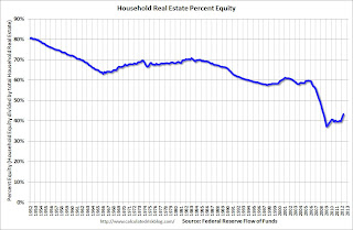
 This graph shows homeowner percent equity since 1952.
Household percent equity (as measured by the Fed) collapsed when house prices fell sharply in 2007 and 2008.
In Q2 2012, household percent equity (of household real estate) was at 43.1% - up from Q1, and the highest since Q2 2008. This was because of a small increase in house prices in Q2 (the Fed uses CoreLogic) and a reduction in mortgage debt.
Note: about 30.3% of owner occupied households had no mortgage debt as of April 2010. So the approximately 52+ million households with mortgages have far less than 43.1% equity - and over 10 million have negative equity.
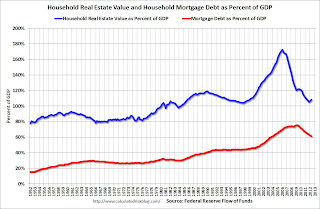
 The third graph shows household real estate assets and mortgage debt as a percent of GDP.
Mortgage debt declined by $51 billion in Q2. Mortgage debt has now declined by $1.05 trillion from the peak. Studies suggest most of the decline in debt has been because of foreclosures (or short sales), but some of the decline is from homeowners paying down debt (sometimes so they can refinance at better rates).
The value of real estate, as a percent of GDP, was up slightly in Q2 (as house prices increased), but is still near the lows of the last 30 years. However household mortgage debt, as a percent of GDP, is still historically very high, suggesting more deleveraging ahead for households.
Philly Fed "Region’s manufacturing sector has steadied"
by Calculated Risk on 9/20/2012 10:00:00 AM
The Philly Fed manufacturing index showed slight contraction in September. From the Philly Fed: September Manufacturing Survey
Firms responding to the September Business Outlook Survey reported nearly flat business activity this month. The survey’s indicators for general activity and new orders both improved from last month but recorded levels near zero. Firms reported continuing declines in shipments, employment, and hours worked. Indicators for the firms’ expectations over the next six months, however, improved notably this month, although the same firms forecast continued deceleration in production growth in the fourth quarter.
The survey’s broadest measure of manufacturing conditions, the diffusion index of current activity, increased 5 points, to a reading of ‐1.9. Although this marks the fifth consecutive negative reading for the index, the index has been edging nearer to zero over the last three months.
Labor market conditions at the reporting firms remained weak this month. The current employment index, at ‐7.3, was little changed from its reading in July and August.
 Click on graph for larger image.
Here is a graph comparing the regional Fed surveys and the ISM manufacturing index. The dashed green line is an average of the NY Fed (Empire State) and Philly Fed surveys through September. The ISM and total Fed surveys are through August.
The average of the Empire State and Philly Fed surveys increased slightly in September, and has remained negative for four consecutive months. This suggests another weak reading for the ISM manufacturing index.
Weekly Initial Unemployment Claims at 382,000
by Calculated Risk on 9/20/2012 08:30:00 AM
The DOL reports:
In the week ending September 15, the advance figure for seasonally adjusted initial claims was 382,000, a decrease of 3,000 from the previous week's revised figure of 385,000. The 4-week moving average was 377,750, an increase of 2,000 from the previous week's revised average of 375,750.The previous week was revised up from 382,000.
The following graph shows the 4-week moving average of weekly claims since January 2000.

Click on graph for larger image.
The dashed line on the graph is the current 4-week average. The four-week average of weekly unemployment claims increased to 377,750.
This was above the consensus forecast of 373,000.

And here is a long term graph of weekly claims:
Mostly moving sideways this year, but moving up recently.
Wednesday, September 19, 2012
Thursday: Weekly Unemployment Claims, Philly Fed Mfg Survey
by Calculated Risk on 9/19/2012 08:46:00 PM
From Jim Hamilton at Econbrowser: Thresholds in the economic effects of oil prices
As U.S. retail gasoline prices once again near $4.00 a gallon, does this pose a threat to the economy and President Obama's prospects for re-election? My answer is no.See Professor Hamilton's piece for supporting data and graphs.
...
This is now the fourth time we've been near the $4 threshold. It first happened in June 2008, again in May 2011, and again in April of this year. In fact, on each of those previous 3 occasions the average U.S. retail price of gasoline was higher than it is today.
...
There is quite a bit of empirical support for the claim that the second or third time oil prices move back near a previous high, the economic disruption is significantly less than the first time; see for example the evidence and literature reviewed in my 2003 Journal of Econometrics paper (ungated version here) and two recent surveys [1], [2].
$4/gallon? Been there, done that.
The good news is oil prices have fallen sharply over the last few days, with Brent down to $108.96 per barrel. Brent closed at $117.48 last Friday. The peak for the year was $128.14 back in March, and the closing low was $88.69 in June.
Thursday:
• At 8:30 AM ET, the initial weekly unemployment claims report will be released. The consensus is for claims to decrease to 373 thousand from 382 thousand.
• At 9:00 AM, the Markit US PMI Manufacturing Index Flash will be released. This is a new release and might provide hints about the ISM PMI for September. The consensus is for a reading of 51.5, down from 51.9 in August.
• At 10:00 AM, the Philly Fed Manufacturing Survey for September will be released. The consensus is for a reading of minus 4.0, up from minus 7.1 last month (below zero indicates contraction).
• Also at 10:00 AM, the Conference Board Leading Indicators for September. The consensus is for no change in this index.
• At 12:00 PM, the Q2 Flow of Funds Accounts from the Federal Reserve will be released.
• Note: On Thursday, the Census Bureau will release the 2011 American Community Survey estimates.
One more question for the September economic prediction contest (Note: You can now use Facebook, Twitter, or OpenID to log in).
Starts and Completions: Multi-family and Single Family
by Calculated Risk on 9/19/2012 06:02:00 PM
Two-thirds of the way through 2012, single family starts are on pace for 515 thousand this year, and total starts are on pace for about 740 thousand. That is an increase of about 20% from 2011, and is above the forecasts for most analysts (however Lawler was very close).
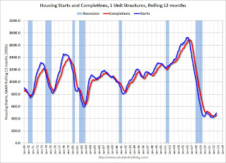
Here is an update to the graph comparing multi-family starts and completions. Since it usually takes over a year on average to complete a multi-family project, there is a lag between multi-family starts and completions. Completions are important because that is new supply added to the market, and starts are important because that is future new supply (units under construction is also important for employment).
These graphs use a 12 month rolling total for NSA starts and completions.
 Click on graph for larger image.
The blue line is for multifamily starts and the red line is for multifamily completions.
The rolling 12 month total for starts (blue line) has been increasing steadily, and completions (red line) is lagging behind - but completions will follow starts up over the course of the year (completions lag starts by about 12 months).
This means there will be an increase in multi-family deliveries next year.
 The second graph shows single family starts and completions. It usually only takes about 6 months between starting a single family home and completion - so the lines are much closer. The blue line is for single family starts and the red line is for single family completions. Starts are moving up, but the increase in completions has just started (wait a few months!).
For the seventh consecutive month, the rolling 12 month total for starts has been above completions - that usually only happens after housing has bottomed.
Earlier:
• Housing Starts increased to 750 thousand in August
• Existing Home Sales in August: 4.82 million SAAR, 6.1 months of supply
• Existing Home Sales: Inventory and NSA Sales Graph
• Existing Home Sales graphs
AIA: Architecture Billings Index shows slight expansion in August
by Calculated Risk on 9/19/2012 02:54:00 PM
Note: This index is a leading indicator primarily for new Commercial Real Estate (CRE) investment.
From AIA: Architecture Billings Index Inches Back into Positive Territory
On the heels of a nearly three-point increase, the Architecture Billings Index (ABI) climbed into positive terrain for the first time in five months. As a leading economic indicator of construction activity, the ABI reflects the approximate nine to twelve month lag time between architecture billings and construction spending. The American Institute of Architects (AIA) reported the August ABI score was 50.2, up from the mark of 48.7 in July. This score reflects an increase in demand for design services (any score above 50 indicates an increase in billings). The new projects inquiry index was 57.2, up from mark of 56.3 the previous month.
“Until the economy is on firmer ground, there aren’t likely to be strong increases in demand for design services,” said AIA Chief Economist, Kermit Baker, PhD, Hon. AIA. “In the meantime, we can expect to see design activity alternate between modest growth and modest decline.”
 Click on graph for larger image.
This graph shows the Architecture Billings Index since 1996. The index was at 50.2 in August, up from 48.7 in July. Anything above 50 indicates expansion in demand for architects' services.
Note: This includes commercial and industrial facilities like hotels and office buildings, multi-family residential, as well as schools, hospitals and other institutions.
According to the AIA, there is an "approximate nine to twelve month lag time between architecture billings and construction spending" on non-residential construction. This suggests further weakness in CRE investment later this year and into next year (it will be some time before investment in offices and malls increases).
Earlier:
• Housing Starts increased to 750 thousand in August
• Existing Home Sales in August: 4.82 million SAAR, 6.1 months of supply
• Existing Home Sales: Inventory and NSA Sales Graph
• Existing Home Sales graphs
Existing Home Sales: Inventory and NSA Sales Graph
by Calculated Risk on 9/19/2012 12:48:00 PM
A few comments on existing home sales and inventory ...
This was a decent report, not because sales increased, but because of the level of inventory. Based on historical turnover rates, I think "normal" sales would be in the 4.5 to 5.0 million range. So existing home sales at 4.82 million are in the normal range. However, a "normal" market would have very few distressed sales, so there is still a long ways to go. As I've noted before, no one should expect existing home sales to go back to 6 or 7 million per year. Instead the key to returning to "normal" is more conventional sales and fewer distressed sales.
And it appears the shift from distressed to conventional is ongoing, from the NAR this morning:
Distressed homes - foreclosures and short sales sold at deep discounts - accounted for 22 percent of August sales (12 percent were foreclosures and 10 percent were short sales), down from 24 percent in July and 31 percent in August 2011.I'm not confident in the NAR measurement, but other sources suggest distressed sales have fallen in many areas.
Of course what matters the most in the NAR's existing home sales report is inventory. It is active inventory that impacts prices (although the "shadow" inventory will keep prices from rising). For existing home sales, look at inventory first and then at the percent of conventional sales.
The NAR reported inventory increased to 2.47 million units in August, up from 2.40 million in July. This is down 18.2% from August 2011, and down 13% from the inventory level in August 2005 (mid-2005 was when inventory started increasing sharply). This is about the same level for inventory as in August 2004.
I expect that the largest year-over-year declines in inventory are now behind us. It is very likely that each reported price increase will be met with more supply from sellers "waiting for a better market". I don't expect prices to fall to new lows in most areas, but this new inventory will probably limit any price increases.
Important: The NAR reports active listings, and although there is some variability across the country in what is considered active, most "contingent short sales" are not included. "Contingent short sales" are strange listings since the listings were frequently NEVER on the market (they were listed as contingent), and they hang around for a long time - they are probably more closely related to shadow inventory than active inventory. However when we compare inventory to 2005, we need to remember there were no "short sale contingent" listings in 2005. In the areas I track, the number of "short sale contingent" listings is also down sharply year-over-year.
 Click on graph for larger image.
The following graph shows inventory by month since 2004. In 2005 (dark blue columns), inventory kept rising all year - and that was a clear sign that the housing bubble was ending.
This year (dark red for 2012) inventory is at the lowest level for the month of August since 2003, and inventory is below the level in August 2005 (not counting contingent sales). However inventory is still slightly elevated using months-of-supply, but I expect months-of-supply to be below 6 later this year.
The following graph shows existing home sales Not Seasonally Adjusted (NSA).
 Sales NSA in August (red column) are above the sales for 2008 through 2011. Sales are well below the bubble years of 2005 and 2006, and also below 2007.
Earlier:
• Housing Starts increased to 750 thousand in August
• Existing Home Sales in August: 4.82 million SAAR, 6.1 months of supply
• Existing Home Sales graphs
Existing Home Sales in August: 4.82 million SAAR, 6.1 months of supply
by Calculated Risk on 9/19/2012 10:00:00 AM
The NAR reports: August Existing-Home Sales and Prices Rise
Total existing-home sales, which are completed transactions that include single-family homes, townhomes, condominiums and co-ops, rose 7.8 percent to a seasonally adjusted annual rate of 4.82 million in August from 4.47 million in July, and are 9.3 percent higher than the 4.41 million-unit level in August 2011.
...
Total housing inventory at the end August rose 2.9 percent to 2.47 million existing homes available for sale, which represents a 6.1-month supply at the current sales pace, down from a 6.4-month supply in July. Listed inventory is 18.2 percent below a year ago when there was an 8.2-month supply.
 Click on graph for larger image.
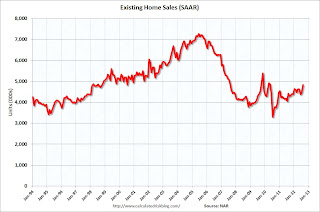
This graph shows existing home sales, on a Seasonally Adjusted Annual Rate (SAAR) basis since 1993.
Sales in August 2012 (4.82 million SAAR) were 7.8% higher than last month, and were 9.3% above the August 2011 rate.
The second graph shows nationwide inventory for existing homes.
 According to the NAR, inventory increased to 2.47 million in August up from 2.40 million in July. Inventory is not seasonally adjusted, and usually inventory increases from the seasonal lows in December and January to the seasonal high in mid-summer.
The last graph shows the year-over-year (YoY) change in reported existing home inventory and months-of-supply. Since inventory is not seasonally adjusted, it really helps to look at the YoY change. Note: Months-of-supply is based on the seasonally adjusted sales and not seasonally adjusted inventory.
 Inventory decreased 18.2% year-over-year in August from August 2011. This is the eighteenth consecutive month with a YoY decrease in inventory.
Months of supply declined to 6.1 months in August.
This was above expectations of sales of 4.55 million. For existing home sales, the key number is inventory - and the sharp year-over-year decline in inventory is a positive for housing. I'll have more later ...
Housing Starts increased to 750 thousand in August
by Calculated Risk on 9/19/2012 08:30:00 AM
From the Census Bureau: Permits, Starts and Completions
Housing Starts:
Privately-owned housing starts in August were at a seasonally adjusted annual rate of 750,000. This is 2.3 percent above the revised July estimate of 733,000 and is 29.1 percent above the August 2011 rate of 581,000.
Single-family housing starts in August were at a rate of 535,000; this is 5.5 percent above the revised July figure of 507,000.
Building Permits:
Privately-owned housing units authorized by building permits in August were at a seasonally adjusted annual rate of 803,000. This is 1.0 percent below the revised July rate of 811,000, but is 24.5 percent (±1.7%) above the August 2011 estimate of 645,000.
Single-family authorizations in August were at a rate of 512,000; this is 0.2 percent above the revised July figure of 511,000.
 Click on graph for larger image.
The first graph shows single and multi-family housing starts for the last several years. Starts are slowing increasing.
Total housing starts were at 750 thousand (SAAR) in August, up 2.3% from the revised July rate of 733 thousand (SAAR). Note that July was revised from 746 thousand.
Single-family starts increased 5.5% to 535 thousand in August.
The second graph shows total and single unit starts since 1968.
 This shows the huge collapse following the housing bubble, and that total housing starts have been increasing lately after moving sideways for about two years and a half years.
 Total starts are up 57% from the bottom start rate, and single family starts are up 51% from the low.
This was below expectations of 768 thousand starts in August - mostly because of the volatile multi-family sector - but the key is starts are up solidly from last year. Right now starts are on pace to be up about 25% from 2011. Also note that total permits are up sharply from last year.
MBA: Mortgage Applications decrease, Mortgage Rates decline to Survey Lows
by Calculated Risk on 9/19/2012 07:03:00 AM
From the MBA: Mortgage Rates Drop to New Survey Lows
The Refinance Index increased 1 percent from the previous week. The HARP 2.0 share of refinance applications was 22 percent this past week. The seasonally adjusted Purchase Index decreased 4 percent from one week earlier.
The average contract interest rate for 30-year fixed-rate mortgages with conforming loan balances ($417,500 or less) decreased to 3.72 percent, the lowest rate in the history of the survey, from 3.75 percent, with points increasing to 0.45 from 0.44 (including the origination fee) for 80 percent loan-to-value ratio (LTV) loans. The effective rate decreased from last week.
 Click on graph for larger image.
This graph shows the MBA mortgage purchase index.
The purchase index has been mostly moving sideways over the last two years.
It looks like refinance activity is picking up again as mortgage rates decline.


