 RSS Feed
 by Calculated Risk on 7/04/2010 08:55:00 AM
Sunday, July 04, 2010
Cancellations along the Gulf: Real Estate Closings and Fireworks Displays
From Tom Bayles at the HeraldTribune: Home closings mired in crude. (ht Wayne in Elizabeth City) This is mostly anecdotes about canceled closings:
Coldwell Banker Residential Real Estate says that six of its 22 sales that failed to close in late May and early June were on waterfront homes and the direct result of buyer qualms about the spill.And from Bob Drogin at the LA Times: Oil spill takes boom out of holiday weekend
...
BP has received about 1,350 claims from Realtors and others who profit from the sale of real estate. Of the 583 claims from Florida, only two had been paid as of Tuesday ...
Alyssa M. Nohren, a real estate attorney with Sarasota's Icard Merrill firm, had a sale fall through this month on a home listed for about $350,000 on Sarasota Bay.
"It was an out-of-state buyer who just freaked out about the oil and was convinced the oil is coming this way and will further reduce property values," Noreen said. "I was devastated as a real estate lawyer because we were finally getting back on our feet, but what could I say? It is not going to come here? I can't say that."
Gulf beaches are bare and businesses are empty on what is usually one of the busiest weekends of the year. Alabama's Dauphin Island and Bayou La Batre have canceled fireworks displays.A tough holiday weekend.
Saturday, July 03, 2010
Condos: Post Tax Credit Price Cuts
by Calculated Risk on 7/03/2010 10:48:00 PM
From the Chicago Tribune: Price cuts mount as condos linger
A trio of condo developments — one small, one medium and one large — announced price cuts recently as the market readjusts in a post-tax credit market ...The $100,000 price decrease at Wabansia Row was from $800,000 to $700,000 (12.5%). And the other 40 unsold condos at "The Columbian"? Those prices will be reassessed next year.
Among the developments with recent price cuts is Parkside of Old Town, where prices were cut by up to 30 percent on 75 condos and up to 40 percent on 27 town homes ...
In Bucktown, Wabansia Row has dropped the price by up to $100,000 on 11 new town homes. At The Columbian, a 46-story condo tower that overlooks Grant Park and was taken over earlier this year by Fidelity Investments, prices on 20 of the remaining 60 unsold condos have been cut by an average of 25 percent.
"Price reduced" is a common sign where I live ...
Recession Dating and a "Double Dip"
by Calculated Risk on 7/03/2010 06:18:00 PM
My forecast is for U.S. economic growth to slow in the 2nd half (a sluggish and choppy recovery), but not slide into recession. However a recession is a possibility, and the following describes how NBER differentiates between a "double dip" and a new recession.
The National Bureau of Economic Research (NBER) Business Cycle Dating Committee is the recognized group for dating recessions in the U.S. It is always difficult to tell when a recession has ended, especially with a sluggish recovery. If the economy slides back into recession - a possibility right now - the NBER has to decide if it is a continuation of the previous recession, or if the new period of economic decline is a new separate recession.
This is just a technical question: for those impacted by the recession it makes no difference if it is called a "double dip" or a new recession.
Yesterday an AP story quoted Robert Hall, the current Chairman of NBER on a "double dip": So what exactly is a 'double-dip' recession?
"The idea -- hypothetical because it has yet to happen -- is that activity might rise for a period, but not far enough to complete a cycle, then fall again, and finally rise above its original level, only then completing the cycle."The closest we've seen to a "double dip" was in the early 1980s - and the NBER dated those as two separate recessions. We can use the NBER memos from that period to look for clues. From July 8, 1981 announcing the end of the 1980 recession: Business Cycle Trough Last July
The period following July 1980 will appear in the NBER chronology as an expansion. An important factor influencing that decision is that most major indicators, including real GNP, are already close to or above their previous highs.And from the January 1982 announcing the beginning of the 1981-1982 recession: Current Recession Began in July
The committee also reviewed its earlier decision that a peak of economic activity occurred in January 1980 and a trough in July 1980 and reaffirmed that decision. Although not all economic indicators had regained their 1979-80 peaks by the summer of 1981, the committee agreed that the resurgence of economic activity in the previous year clearly constituted a business cycle recovery.And from The NBER's Recession Dating Procedure
In choosing the dates of business-cycle turning points, the committee follows standard procedures to assure continuity in the chronology. Because a recession influences the economy broadly and is not confined to one sector, the committee emphasizes economy-wide measures of economic activity. The committee views real GDP as the single best measure of aggregate economic activity. ...GDP is the key measure, and the NBER actually uses two measures of GDP: 1) real GDP, and 2) real Gross Domestic Income (GDI). For a discussion on GDI, see from Fed economist Jeremy Nalewaik, “Income and Product Side Estimates of US Output Growth,” Brookings Papers on Economic Activity.
The committee places particular emphasis on two monthly measures of activity across the entire economy: (1) personal income less transfer payments, in real terms and (2) employment. In addition, the committee refers to two indicators with coverage primarily of manufacturing and goods: (3) industrial production and (4) the volume of sales of the manufacturing and wholesale-retail sectors adjusted for price changes.
Below is a look at four of the measures mentioned: real GDP (and real GDI), industrial production, employment and real personal income excluding transfer payments.
Note: The following graphs are all constructed as a percent of the peak in each indicator. This shows when the indicator has bottomed - and when the indicator has returned to the level of the previous peak. If the indicator is at a new peak, the value is 100%. On all graphs the recent recession is marked as ending in July 2009 or Q3 2009 - this is preliminary and NOT an NBER determination. GDP is quarterly, the other data is monthly.
 Click on graph for larger image in new window.
The first graph is for GDP through Q1 2010.
This is the key measure and real GDP is only 1.3% below the pre-recession peak - and real GDI 2.0% below the previous peak. GDP probably increased in Q2 too (probably at close to a 3% annualized rate), and at the end of Q2 both of these measures will be even closer to the previous peak, but not there yet.
If you look at the period between the two early '80s recessions, both real GDP and real GDI returned to pre-recession levels before declining again.
 The second graph is for monthly industrial production based on data from the Federal Reserve through May.
Industrial production is still 8.1% below the pre-recession peak -and now it appears that growth is slowing in the manufacturing sector (although still expanding). Even if growth continues, it will take some time before industrial production is back to pre-recession levels.
Between the early '80s recessions, industrial production didn't quite return to pre-recession levels - but it was only about 0.5% below the previous peak.
 The third graph is for employment through June.
Between the two recession in the early '80s, employment returned to the pre-recession peak.
This time employment is barely off the bottom.
 And the last graph is for real personal income excluding transfer payments through May. This bottomed in Sept 2009, but has only increased slightly since then and is still 6% below the pre-recession peak.
 Once again - looking back - this measure returned to the pre-recession peak between the 1980 and 1981/1982 recessions.
Based on these graphs and the NBER memos, it would seem pretty easy to date two recessions in the early '80s. However, if another recession starts this year, it will almost certainly be dated as a continuation of the "great recession" that started in 2007. If so, I'll need more blue ink to shade all my graphs ...
Duration of Unemployment
by Calculated Risk on 7/03/2010 01:25:00 PM
An update by request ... Click on graph for larger image.
This graph shows the duration of unemployment as a percent of the civilian labor force. The graph shows the number of unemployed in four categories: less than 5 week, 6 to 14 weeks, 15 to 26 weeks, and 27 weeks or more.
Note: The BLS reports 15+ weeks, so the 15 to 26 weeks number was calculated.
In June 2010, the number of unemployed for 27 weeks or more declined slightly to 6.751 million (seasonally adjusted) from a record 6.763 million in May. Because the civilian labor force declined sharply, the percent of long term unemployed set a new record in June (4.39% of civilian labor force).
It is possible that the number of long term unemployed might has peaked, but it is still very difficult for these people to find a job - and this is a very serious employment issue.
All categories of unemployment duration increased in June as a percent of civilian unemployment.
Note: Even though these numbers are all seasonally adjusted, they can't be added together to calculate the unemployment rate.
Double Dip Search Trends
by Calculated Risk on 7/03/2010 08:53:00 AM
From Google Trends, search trend on "double dip"...
 |
It appears the 2nd half slowdown is here, but I think the U.S. will avoid a technical "double-dip" recession. As I noted last week, for the unemployed and marginally employed, and for many other Americans suffering with too much debt or stagnant real incomes, there is little difference between slower growth and a double-dip recession.
And a repeat of a couple graphs from yesterday ...
 Click on graph for larger image.
This graph shows the job losses from the start of the employment recession in percentage terms.
The dotted line shows the impact of Census hiring. In May, there were 339,000 temporary 2010 Census workers on the payroll. The number of Census workers will continue to decline - and the gap between the solid and dashed red lines will be mostly closed in three or four months.
 This graph shows the employment-population ratio; this is the ratio of employed Americans to the adult population.
The Employment-Population ratio decreased to 58.5% in June from 58.7% in May. This had been increasing after plunging since the start of the recession, and the recovery in the Employment-Population ratio was considered a good sign - but the ratio has now decreased for two consecutive months.
Note: the graph doesn't start at zero to better show the change.
Employment posts yesterday:
Friday, July 02, 2010
Illinois and California: State Basket Cases
by Calculated Risk on 7/02/2010 11:25:00 PM
A couple of stories ...
From the NY Times: Illinois Stops Paying Its Bills, but Can’t Stop Digging Hole
For the last few years, California stood more or less unchallenged as a symbol of the fiscal collapse of states during the recession. Now Illinois has shouldered to the fore, as its dysfunctional political class refuses to pay the state’s bills and refuses to take the painful steps — cuts and tax increases — to close a deficit of at least $12 billion, equal to nearly half the state’s budget.From the LA Times PolitiCal: Appeals court affirms Schwarzenegger's order to cut state workers' pay
Then there is the spectacularly mismanaged pension system, which is at least 50 percent underfunded and, analysts warn, could push Illinois into insolvency if the economy fails to pick up.
A state appeals court ruled Friday that Gov. Arnold Schwarzenegger can reduce state workers' pay to the federal minimum wage when the state budget is late.The state problems will be a drag on the economy for some time.
The ruling comes a day after the governor ordered the pay of nearly 200,000 state employees to be reduced to $7.25 an hour until a budget is passed ...
Employment posts today:
Unofficial Problem Bank List at 798 Institutions
by Calculated Risk on 7/02/2010 08:45:00 PM
Note: this is an unofficial list of Problem Banks compiled only from public sources.
Here is the unofficial problem bank list for July 2, 2010.
Changes and comments from surferdude808:
The Unofficial Problem Bank List underwent minor changes after a flurry of activity last week. It looks like the FDIC is taking the holiday weekend off.
The only changes were the addition of two institutions -- United Western Bank, Denver, CO ($2.6 billion Ticker: UWBK); and Cecil Bank, Elkton, MD ($513 million Ticker: CECB); and one removal from a voluntary liquidation -- American Trust & Savings Bank, Whiting, IN ($119 million). At mid-year 2010, the list stands at 798 institutions with aggregate assets of $412.6 billion.
With the passage of another quarter, we thought it was time to update the transition matrix. The Unofficial Problem Bank List debuted on August 7, 2009 with 389 institutions with assets of $276.3 billion (see table). Over the past ten months, 119 institutions have been removed with 87 due to failure, 22 due to action termination, and 10 due to unassisted merger. Thus, 73 percent of the removals are from failure. Moreover, 22.4 percent of the 389 institutions on the original list have failed, which is substantially higher than the 12 percent figure usually cited by the media as the failure rate for institutions on the FDIC Problem Bank List.
More distressing, however, is that failed institutions represented 55 percent or $152.9 billion of the $276.3 billion assets on the original list. Notable failures include Colonial Bank ($26.4 billion); Westernbank Puerto Rico ($15.1 billion); AmTrust Bank ($14.4 billion); Guaranty Bank ($14.3 billion); Corus Bank (7.6 billion); First Federal Bank of California ($6.8 billion); California National Bank ($6.5 billion); and Amcore Bank ($5.2 billion).
Other changes to the original list include the addition of 602 institutions. However, only 528 of those 602 additions are on the current list as 74 institutions have been removed in the interim. Of the 74 interim removals, 62 were due to failure, 10 were due to unassisted merger, and one each from action termination and voluntary liquidation. Again, failure represents a disproportionate 83.7 percent of the reason for removal. 872 institutions have made an appearance on the Unofficial Problem Bank List and 149 or 17 percent have failed. The average asset size of removals because of failure is $623 million. Currently, the average asset size of institutions is $517 million versus $710 million on the original list. Thus, the average asset size of future failures will likely be lower, which is the only positive in the data.
| Unofficial Problem Bank List | |||
|---|---|---|---|
| Change Summary | |||
| Number of Institutions | Assets ($Thousands) | ||
| Start (8/7/2009) | 389 | 276,313,429 | |
| Subtractions | |||
| Action Terminated | 22 | (3,272,910) | |
| Unassisted Merger | 10 | (1,317,634) | |
| Failures | 87 | (152,932,468) | |
| Asset Change | (9,337,980) | ||
| Still on List at 7/02/2010 | 270 | 109,452,437 | |
| Additions | 528 | 303,142,129 | |
| End (4/02/2010) | 798 | 412,594,566 | |
| Interperiod Deletions1 | |||
| Action Terminated | 1 | 37,695 | |
| Unassisted Merger | 10 | 1,769,600 | |
| Voluntary Liquidation | 1 | 119,082 | |
| Failures | 62 | 60,103,942 | |
| Total | 74 | 62,030,319 | |
| 1Institution not on 8/7/2009 or 7/02/2010 list but appeared on a list between these dates. | |||
Fewest Teen Jobs added in June since 1951
by Calculated Risk on 7/02/2010 04:18:00 PM
According to the BLS, only 497,000 teens (ages 16 to 19) found jobs in June 2010 NSA (June is the key months for summer employment). This is the fewest teen jobs added in June since 1951. Click on graph for larger image in new window.
This graph shows the number of teens looking for work (lowest since 1954) and the number of teens found jobs in June (data is not seasonally adjusted).
This partially explains the large drop in participation rate in June - an extremely low number of teenagers joined the workforce, and this resulted in 256,000 teens leaving the workforce on a seasonally adjusted basis - of the total 652,000 total people leaving the workforce (seasonally adjusted).
Teens not looking for jobs - because the job market is so bad - actually helped push down the unemployment rate!
Earlier employment posts today:
Personal Bankruptcy Filings up 14% in first 6 months of 2010
by Calculated Risk on 7/02/2010 01:45:00 PM
From the American Bankruptcy Institute: Consumer Bankruptcy Filings up 14 percent through First Half of 2010
U.S. consumer bankruptcy filings totaled 770,117 nationwide during the first six months of 2010 (Jan. 1-June 30), a 14 percent increase over the 675,351 total consumer filings during the same period a year ago, according to the American Bankruptcy Institute (ABI), relying on data from the National Bankruptcy Research Center (NBKRC). The consumer filings for the first half of 2010 represent the highest total since 2005, when Congress enacted the Bankruptcy Abuse Prevention and Consumer Protection Act to try and stem the tide of filings, although the number of monthly consumer filings has been steadily decreasing since March.
"Years of rising consumer debt and low savings rates, combined with the housing and unemployment crises, are causing bankruptcy levels not seen since the 2005 amendments to the Bankruptcy Code," said ABI Executive Director Samuel J. Gerdano. "We expect that there will be more than 1.6 million new bankruptcy filings by year end."
The overall June consumer filing total of 126,270 was 8.5 percent more than the 116,365 consumer filings recorded in June 2009.
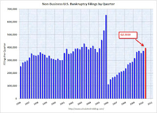 Click on graph for larger image in new window.
This graph shows the non-business bankruptcy filings by quarter using monthly data from the ABI and previous quarterly data from USCourts.gov.
Excluding 2005, when the so-called "Bankruptcy Abuse Prevention and Consumer Protection Act of 2005" was enacted (really a pro-lender act), the record year was in 2003 when 1.62 million personal bankruptcies were filed. This year will be close to that level.
Employment Report: Temporary Help and Diffusion Index
by Calculated Risk on 7/02/2010 11:47:00 AM
This post is a little more technical ...
Temporary Help
From the BLS report:
Within professional and business services, employment continued to increase in temporary help services (+21,000). Employment in temporary help has risen by 379,000 since a recent low in September 2009.The following graph was used early this year as the basis for some optimistic employment forecasts.
 This graph is a little complicated. The red line is the three month average change in temporary help services (left axis). This is shifted four months into the future.
The blue line (right axis) is the three month average change in total employment (excluding temporary help services).
Unfortunately the data on temporary help services only goes back to 1990, but it does appear that temporary help leads employment by about four months.
The thinking is that before companies hire permanent employees following a recession, employers will first increase the hours worked of current employees (hours worked decreased slightly in June) and also hire temporary employees. After the number of temporary workers increased sharply late last year, some people thought this might be signaling the beginning of a strong employment recovery.
I was skeptical and joked that "We're all temporary now!" - and now temporary hiring is growing at a slower pace and it appears the hoped for surge in overall hiring didn't happen.
Note that the temporary hiring for the Census is excluded from this graph.
Diffusion Index
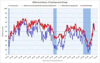 The BLS diffusion index for total private employment decreased to 52.2 from 54.8 in May. For manufacturing, the diffusion index is at 52.4; down sharply from 62.2 in May.
Think of this as a measure of how widespread job gains are across industries. The further from 50 (above or below), the more widespread the job losses or gains reported by the BLS. From the BLS:
Figures are the percent of industries with employment increasing plus one-half of the industries with unchanged employment, where 50 percent indicates an equal balance between industries with increasing and decreasing employment.The increase in the diffusion index earlier this year was one of the clear positives in the monthly employment reports. The decrease in the diffusion index in June (almost falling to 50%), is disappointing.
Earlier employment posts today:


