 RSS Feed
 by Calculated Risk on 5/15/2011 02:41:00 PM
Sunday, May 15, 2011
The upward slope of Real House Prices
On Friday, Dave Altig asked Just how out of line are house prices?. Dr. Altig's post featured both a price-to-rent graph and the following real house price graph based on Professor Robert Shiller's work (credits: the graph is from Barry Ritholtz's The Big Picture blog and is an update of a New York Times graphic with a possible projection by Steve Barry).
 Click on graph for larger image in new window.
For the underlying data for the NY Times graphic, please see Professor Shiller's Irrational Exuberance website.
This graph has suggested to many observers that house prices track inflation (i.e. that house price adjusted for inflation are stable - except for bubbles).
I've disagreed with the assertion of stable real prices, and I've argued that "In many areas - if the population is increasing - house prices increase slightly faster than inflation over time, so there is an upward slope for real prices."
 The second graph shows the Professor Shiller real prices and the CoreLogic HPI real prices (adjusted for CPI just like Shiller).
It is important to realize that Professor Shiller used the quarterly Case-Shiller National index starting in 1987. From 1975 through 1986 he used what is now called the FHFA index. He used other price indexes in earlier periods.
The FHFA index was based on a small percentage of transactions back in the '70s. If we look at the CoreLogic index instead, there is a clear upward slope to real house prices.
If Professor Shiller had used the Freddie Mac quarterly index back to 1970 (instead of the PHCPI), there would be more of an upward slope to his graph too. So it is important to understand that for earlier periods the data is probably less accurate.
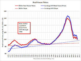 The third graph shows the upward slope for both real price indexes. Even the Shiller Irrational Exuberance real price index has an upward slope - and the CoreLogic upward slope is steeper.
Sure - house prices could overshoot to the downside. But the projection on the first graph of close to 25% in further real price declines is probably excessive. Right now the real CoreLogic HPI is less than 5% above the trend line (it could overshoot), and the Case-Shiller national index will probably decline sharply in Q1 too and not be far above the trend line.
So - back to Dr. Altig's post - I don't think we have to choose between real prices and price-to-rent graphs to ask "how far out of line are house prices?" I think they are both showing that prices are not far above the historical lows. Prices might overshoot to the downside because of supply and demand issues; there is a large overhang of vacant housing units and many distressed properties still coming on the market, plus demand is soft with weak employment, fairly tight financing, negative home buying sentiment and some usual buyers excluded because of credit issues. But I don't think national real prices are that far out of line.
Note: usually near the end of a housing bust - after nominal prices stop falling - real prices decline slowly for a couple more years, and we will probably see that this time too. Of course, right now, nominal prices are still falling.
Earlier:
• Summary for Week Ending May 13th
• Schedule for Week of May 15th
Schedule for Week of May 15th
by Calculated Risk on 5/15/2011 09:01:00 AM
Earlier:
• Summary for Week Ending May 13th
Three key housing reports will be released this week: May homebuilder confidence on Monday, April housing starts on Tuesday, and April existing home sales on Wednesday.
There will also be three manufacturing reports released: the NY and Philly Fed manufacturing surveys for May, and Industrial Production and Capacity Utilization for April. Last month there was some concern that growth in manufacturing was slowing, and these surveys will provide an early hint for activity in May.
8:30 AM ET: NY Fed Empire Manufacturing Survey for May. The consensus is for a reading of 20.0, down slightly from 21.7 in April.
9:00 AM: Speech, Fed Chairman Ben Bernanke, "Innovation, Research, and Development: The Government's Role", At the Conference on "New Building Blocks for Jobs and Economic Growth", Washington, D.C.
10 AM: The May NAHB homebuilder survey. The consensus is for a reading of 17, up slightly from 16 in April. Any number below 50 indicates that more builders view sales conditions as poor than good. This index has been below 25 for forty six consecutive months (almost 4 years).
8:30 AM: Housing Starts for April. After collapsing following the housing bubble, housing starts have mostly moved sideways at a very depressed level for over two years.
 Click on graph for larger image in graph gallery.
This graph shows total and single unit starts since 1968.
Total housing starts were at 549 thousand (SAAR) in March, up 7.2% from the revised February rate of 512 thousand (revised up from 479 thousand). Single-family starts increased 7.7% to 422 thousand in March (February was revised up to 392 thousand from 375 thousand).
The consensus is for an increase to 570,000 (SAAR) in April.
9:15 AM ET: The Fed will release Industrial Production and Capacity Utilization for April.
 This graph shows industrial production since 1967. Industrial production increased in March to 93.6, however February was revised down from 93.0 to 92.8. Production is still 7.0% below the pre-recession levels at the end of 2007.
 The consensus is for a 0.4% increase in Industrial Production in April, and an increase to 77.6% (from 77.4%) for Capacity Utilization.
Early: The AIA's Architecture Billings Index for April (a leading indicator for commercial real estate).
 This graph shows the Architecture Billings Index since 1996. The index showed billings increased slightly in March (index at 50.5, anything above indicates an increase in billings).
This index usually leads investment in non-residential structures (hotels, malls, office) by 9 to 12 months.
7:00 AM: The Mortgage Bankers Association (MBA) will release the mortgage purchase applications index. This index has been very weak over the last couple months suggesting weak home sales through mid-year (not counting all cash purchases).
2:00 PM: FOMC Minutes, Meeting of April 26-27, 2011. The minutes were overshadowed by Fed Chairman Bernanke’s press conference and the previous release of the updated forecasts.
8:30 AM: The initial weekly unemployment claims report will be released. The number of claims has increased over the last few weeks. The consensus is for a decrease to 420,000 from 434,000 last week.
8:30 NY Fed President William Dudley speaks, “The US Economic Outlook — Where Are We Headed”, New Paltz, NY
10:00 AM: Mortgage Bankers Association (MBA) 1st Quarter 2011 National Delinquency Survey (NDS)
10:00 AM: Philly Fed Survey for May. The consensus is for an increase to 20.0, up from the 18.5 last month.
10:00 AM: Conference Board Leading Indicators for April. The consensus is for a 0.1% increase for this index.
10:00 AM: Existing Home Sales for April from the National Association of Realtors (NAR). The consensus is for sales of 5.2 million at a Seasonally Adjusted Annual Rate (SAAR) in April, up about 2% from the 5.10 million SAAR in March.
 This graph shows existing home sales, on a Seasonally Adjusted Annual Rate (SAAR) basis since 1993. Sales in March 2011 (5.10 million SAAR) were 3.7% higher than in February, and were 6.3% lower than March 2010.
 In addition to sales, the level of inventory and months-of-supply will be very important (since months-of-supply impacts prices).
10:00 AM: Regional and State Employment and Unemployment for April 2011
Best wishes to All!
Saturday, May 14, 2011
Another Mortgage Refinance Wave?
by Calculated Risk on 5/14/2011 10:16:00 PM
Freddie Mac reported this week: 30-Year Fixed-Rate Mortgage Drops to 4.63 Percent
Freddie Mac today released the results of its Primary Mortgage Market Survey® (PMMS®), which shows mortgage rates at their lowest level for 2011 after declining for the fourth consecutive week. The 30-year fixed-rate averaged 4.63 percent, and the 15-year fixed averaged 3.82 percent.Will this lead to another wave of mortgage refinancing?
Here is a graph of refinance activity and mortgage rates:
 Click on graph for larger image in graph gallery.
This graph shows the MBA's refinance index (monthly average) and the the 30 year fixed rate mortgage interest rate from the Freddie Mac Primary Mortgage Market Survey®.
Although mortgage rates are at the lowest level this year, it takes lower and lower rates to get people to refi (at least lower than recent purchase rates).
With 30 year mortgage rates still about 0.4 percentage points above the lows of last October, mortgage refinance activity will probably only pickup a little.
Earlier:
• Summary for Week Ending May 13th
Final Portugal bailout terms expected Monday, maybe Greece update too
by Calculated Risk on 5/14/2011 08:36:00 PM
From the Telegraph: EU to unveil Greece and Portugal bail-outs
Brussels is expected this week to unveil the details of its €78bn (£69bn) rescue for Portugal as it attempts to hammer out a second emergency package for Greece.This might impact the timing, from the NY Times: I.M.F. Head Is Arrested and Accused of Sexual Attack
...
Final terms of the Portuguese deal will be unveiled after the meeting of eurogroup finance ministers on Monday. Portugal is expected to be charged an average loan rate of about 5.5pc – cheaper than Ireland's 5.8pc but more expensive than the Greek level of just over 4pc.
Earlier:
• Summary for Week Ending May 13th
More on Debt Ceiling Charade
by Calculated Risk on 5/14/2011 03:43:00 PM
From the WSJ: Geithner Issues Warning on Debt Ceiling
Treasury Secretary Timothy Geithner warned in a letter to Congress that failure to raise the $14.294 trillion debt ceiling would drive up interest rates, push down household wealth, put more pressure on federal entitlement programs and cause a double-dip recession.First, even though the U.S. will hit the debt ceiling on Monday, there are games that Treasury can play - so Congress has until August 2nd. And there might even be some more tricks that can delay the date further - like promising to pay defense contractors sometime in the future. But some day in the not too distant future Congress will have to raise the debt ceiling - or suffer the consequences that Geithner describes.
...
The U.S. government debt is projected to hit the ceiling Monday. Treasury officials say they have until Aug. 2 before the country could begin defaulting on its debt.
...
"This would be an unprecedented event in American history," he wrote. "A default would inflict catastrophic, far-reaching damage on our Nation's economy, significantly reducing growth, and increasing unemployment."
Second, Congress will probably push this to the brink, but they will raise the debt ceiling before the country defaults. The first rule for most politicians is to get re-elected, and the easiest way to guarantee losing in 2012 is to throw the country back into recession. If that happened, I believe the voters would correctly blame the leaders of Congress, and I think Congress knows that too. Therefore it won't happen. I'm not worried and neither are investors.
Earlier:
• Summary for Week Ending May 13th
Summary for Week Ending May 13th
by Calculated Risk on 5/14/2011 08:36:00 AM
This was a light week for economic data. As expected, house prices continued to decline in March, the trade deficit increased in March due to higher oil prices, and inflation picked up a little, mostly due to - what else? - higher oil prices in April.
The good news is oil prices have fallen in May, and (WTI futures) are now under $100 per barrel (WTI futures were close to $114 per barrel at the end of April). Meanwhile the ten year Treasury yield has fallen to 3.19%, and mortgage rates are at the low for the year (the 30 year conforming is at 4.63%).
Below is a summary of economic data last week mostly in graphs:
• CoreLogic: House Prices declined 1.5% in March, Prices now 4.6% below 2009 Lows
Notes: Case-Shiller is the most followed house price index, but CoreLogic is used by the Federal Reserve and is followed by many analysts.
From CoreLogic: CoreLogic® Home Price Index Shows Year-Over-Year Decline for 8th Straight Month
 Click on graph for larger image in graph gallery.
This graph shows the national CoreLogic HPI data since 1976. January 2000 = 100.
The index is down 7.5% over the last year, and off 34.8% from the peak.
This was the eight straight month of year-over-year declines, and the ninth straight month of month-to-month declines. The index is now 4.6% below the previous post-bubble low set in March 2009, and I expect to see further new post-bubble lows for this index over the next few months.
 The second graph shows the quarterly Case-Shiller National Index (through Q4 2010), and the monthly Case-Shiller Composite 20 (through February release) and CoreLogic House Price Indexes (through March release) in real terms (adjusted for inflation using CPI less Shelter).
In real terms, the National index is back to Q1 2000 levels, the Composite 20 index is back to December 2000, and the CoreLogic index back to December 1999.
 The third graph is a price-to-rent ratio using the Case-Shiller Composite 20 (through February) and CoreLogic House Price Index (through March) (January 1998 = 1.0).
On a price-to-rent basis, the Composite 20 index is just above the May 2009 levels (and about at November 2000 levels), and the CoreLogic index is back to December 1999.
• Trade Deficit increased to $48.2 billion in March
 The first graph shows the monthly U.S. exports and imports in dollars through March 2011.
Both imports and exports increased in March (seasonally adjusted). Exports are well above the pre-recession peak, but imports are now increasing at a faster rate - mostly because of oil prices.
The second graph shows the U.S. trade deficit, with and without petroleum, through March.
 The blue line is the total deficit, and the black line is the petroleum deficit, and the red line is the trade deficit ex-petroleum products.
The petroleum deficit increased sharply in March as both the quantity and price increased - prices averaged $93.76 per barrel in March, up from $87.17 in February. Prices will be even higher in April.
The trade deficit was larger than the expected $47 billion.
• BLS: CPI increased 0.4% in April
 This graph shows three measure of underlying inflation on a year-over-year basis. Over the last 12 months, core CPI has increased 1.3%, median CPI has increased 1.4%, and trimmed-mean CPI increased 1.7%.
Although the year-over-year increases are below the Fed's inflation target, the annualized rates were above the target in April. Core CPI increased at an annualized rate of 2.2%, median CPI 2.8% annualized, and trimmed-mean CPI increased 3.3% annualized.
However, with the slack in the system, I expect the year-over-year core measures to stay below 2% this year.
• BLS: Job Openings increased in March, Highest since 2008
 This graph shows job openings (yellow line), hires (purple), Layoff, Discharges and other (red column), and Quits (light blue column) from the JOLTS.
Notice that hires (purple) and total separations (red and blue columns stacked) are pretty close each month. When the purple line is above the two stacked columns, the economy is adding net jobs - when it is below the columns, the economy is losing jobs.
In general job openings (yellow) has been trending up - and are up 16% from March 2010. However the overall turnover remains low.
• NFIB: Small Business Optimism Index decreases in April
 This graph shows the small business optimism index since 1986. The index decreased to 91.2 in April from 91.9 in March.
This has been trending up, although optimism has declined for two consecutive months now.
Note: Small businesses have a larger percentage of real estate and retail related companies than the overall economy.
The recovery continues to be sluggish for this index, probably partially because of the high concentration of real estate related companies.
• Consumer Sentiment increases in May
 The preliminary May Reuters / University of Michigan consumer sentiment index increased to 72.4 from 69.8 in April.
This was slightly above the consensus forecast of 70.0.
In general consumer sentiment is a coincident indicator and is usually impacted by employment (and the unemployment rate) and gasoline prices.
This is still a low reading, but sentiment will probably improve later this month if gasoline prices fall.
• Other Economic Stories ...
• NY Fed Q1 Report on Household Debt and Credit
• Zillow on Negative Equity: 28.4% of all single-family homes with mortgages are "underwater"
• AAR: Rail Traffic "mixed" in April
• Ceridian-UCLA: Diesel Fuel index declines in April
• Unofficial Problem Bank list at 983 Institutions
Best wishes to all!


