 RSS Feed
 by Calculated Risk on 1/07/2013 04:24:00 PM
Monday, January 07, 2013
Question #8 for 2013: Will Housing inventory bottom in 2013?
Earlier I posted some questions for this year: Ten Economic Questions for 2013. I'll try to add some thoughts, and maybe some predictions for each question.
Note: Here is a review of my 2012 Forecasts
8) Housing Inventory: Over the last few years, we've seen a dramatic plunge in existing home inventory. Will inventory bottom in 2013?
This is an interesting question and the lack of supply is one of the reasons house prices were up about 6% in 2012. Economist Jed Kolko at Trulia wrote about inventory last month:
The key question in 2013, though, is whether prices will rise enough so that for-sale inventory–which has fallen 43% nationally since the summer of 2010–will hit bottom and start expanding again. ... Rising prices should lead to more inventory, for two reasons: (1) rising prices encourage new construction, and (2) rising prices encourage some homeowners to sell.This graph shows nationwide inventory for existing homes through November.
 Click on graph for larger image.
According to the NAR, inventory declined to 2.03 million in November down from 2.11 million in October. This is the lowest level of inventory since December 2001. Inventory is not seasonally adjusted, and usually inventory decreases from the seasonal high in mid-summer to the seasonal lows in December and January as sellers take their homes off the market for the holidays.
If we see the usually seasonal decline in December (not reported yet) and January, then NAR reported inventory will probably fall to the 1.80 to 1.85 million range. That would be the lowest level since January 2001.
Important: The NAR reports active listings, and although there is some variability across the country in what is considered active, most "contingent short sales" are not included. When we compare inventory to earlier periods, we need to remember there were essentially no "short sale contingent" listings prior to 2006.
 The second graph shows the year-over-year (YoY) change in reported existing home inventory and months-of-supply. Since inventory is not seasonally adjusted, it really helps to look at the YoY change. Note: Months-of-supply is based on the seasonally adjusted sales and not seasonally adjusted inventory.
Inventory decreased 22.5% year-over-year in November from November 2011. This was the 21st consecutive month with a YoY decrease in inventory.
Months of supply declined to 4.8 months in November. This is the lowest level based on months-of-supply since September 2005.
Whenever I talk with real estate agents, I ask why they think inventory is so low. A common answer is that people don't want to sell at the bottom. In a market with falling prices, sellers rush to list their homes, and inventory increases. But if sellers think prices have bottomed, then they believe they can be patient, and inventory declines. Another reason is that many homeowners are "underwater" on their mortgage and can't sell.
Note: the Mortgage Debt Relief Act of 2007 was extended for another year. This means homeowners can sell their homes "short" (for less than they owe if the lender approves) and they don't have to pay taxes on the debt forgiveness. This will keep the short sale market active in 2013.
If prices increase enough then some of the potential sellers will come off the fence, and some of these underwater homeowners will be able to sell. It might be enough for inventory to bottom in 2013.
Right now my guess is active inventory will bottom in 2013, probably in January. At the least, the rate of year-over-year inventory decline will slow sharply. It will be very interesting to see how much inventory comes on the market during the spring selling season!
Here are the ten questions for 2013 and a few predictions:
• Question #1 for 2013: US Fiscal Policy
• Question #2 for 2013: Will the U.S. economy grow in 2013?
• Question #3 for 2013: How many payroll jobs will be added in 2013?
• Question #4 for 2013: What will the unemployment rate be in December 2013?
• Question #5 for 2013: Will the inflation rate rise or fall in 2013?
• Question #6 for 2013: What will happen with Monetary Policy and QE3?
• Question #7 for 2013: What will happen with house prices in 2013?
• Question #8 for 2013: Will Housing inventory bottom in 2013?
• Question #9 for 2013: How much will Residential Investment increase?
• Question #10 for 2013: Europe and the Euro
Thoughts on the Budget Deficit
by Calculated Risk on 1/07/2013 01:57:00 PM
Note: The US government is on a fiscal year that runs from October 1st through September 30th of the following year. Fiscal year 2012 ended on September 30th of 2012, and fiscal year 2013 started on October 1, 2012. The graphs below use fiscal year GDP.
A few points on "short term" vs. "long term" issues, and cyclical vs. structural deficits. None of this should be controversial (or political).
1. The "fiscal cliff" was about reducing the deficit too quickly in the short term. This was concerning because a rapid reduction in the deficit (aka "austerity") would probably have taken the economy back into recession. The fiscal agreement reduces the deficit this year compared to fiscal 2012 - the payroll tax hike alone adds almost $120 billion in revenue this year. Those saying "nothing was accomplished" are possibly confusing the short term with the long term.
2. There is a long term budget problem mostly related to spending for health care. I'll have more on this in a future post, but I think it helps to focus on the short term right now.
3. There is a significant difference between a "structural" budget deficit, and a "cyclical" deficit. A cyclical deficit happens when the economy goes into recession because tax revenues decline, and spending on safety net programs like unemployment insurance and food stamps increases. A cyclical deficit is expected during recessions, and the Federal government is (and should be) counter-cyclical. (this should not be controversial).
4. A structural deficit is a mismatch between tax revenue and outlays even during good times. A structural deficit is much worse for the economy than a cyclical deficit since a cyclical deficit will decline as the economy recovers, but a structural deficit is ongoing.
Here are a couple of graphs.
 Click on graph for larger image.
The first graph shows revenue and outlays as a percent of GDP. Clearly, in fiscal 2012, the government had BOTH a revenue and spending problem. Both revenue and spending have been impacted by the great recession, and are slowly recovering.
There was also a structural deficit starting in fiscal 2002, and even during the housing boom, revenue was below outlays. So the recent low level revenue was due to both cyclical and structural reasons.
In fiscal 2013, revenue will increase due to the payroll tax increase, an increase in the tax rate on high income earners, and an improving economy. Spending will probably decrease as a percent of GDP due to some defense spending cuts and an improving economy.
Here are the data sources for these graphs. CBO: Historical Budget Data and An Update to the Budget and Economic Outlook: Fiscal Years 2012 to 2022, BEA: GDP Tables
 The second graph shows the budget deficit each year as a percent of GDP. As David Wessel at the WSJ recently noted: Putting the Brakes on Cutting the Deficit
In the depths of the most recent recession, the fiscal year that ended Sept. 30, 2009, the deficit was 10.1% of gross domestic product, the value of all the goods and services produced. Since then, the deficit has declined to 9% of GDP in 2010, 8.7% in 2011 and 7.0% in fiscal 2012. Private analysts predict the deficit will be between 5.5% and 6.0% of GDP in fiscal 2013 ...My guess is the deficit will decline to around 5.5% of GDP this year. If there is no change in policy, I expect the deficit to continue to decline over the next few years.
However, later this decade, the deficit will probably start to increase again, mostly due to rising health care expenditures. This is the long term issue, and health care spending needs to be addressed to put the debt on a sustainable path long term.
The key points are: the cyclical deficit will slowly decline, and there is a long term issue, mostly related to health care costs that we need to start to address in the next few years.
We'd be in better shape without the structural deficit and if we had avoided the great recession (I did my best to alert policymakers in 2005). But that is water over the dam. The bottom line is this is all very solvable.
Office Vacancy Rate and Office Investment
by Calculated Risk on 1/07/2013 10:26:00 AM
Earlier this morning I noted that Reis reported the office vacancy rate declined slightly to 17.1% in Q4 from 17.2% in Q3.
A key question is when will new office investment increase. The answer depends on how quickly the vacancy rate falls. The following graph shows the office vacancy rate and office investment as a percent of GDP. Note: Office investment also includes improvements - and as Reis Senior Economist Ryan Severino noted this morning, there is very little new construction.
Here is Reis Senior Economist Ryan Severino's office forecast for 2013:
"The outlook for 2013 is slightly better than what we experienced in 2012. Although some of the uncertainty over the potential “fiscal cliff” has been resolved, spending decisions still remain and the debt situation in Europe, which oscillates in and out of panic, is still uncertain. Moreover, higher payroll and income taxes are likely to reduce consumption and the government is expected to implement some spending cuts, if not outright sequestration. Nonetheless, job growth is expected to accelerate slightly during 2013 while the unemployment rate is expected to tick marginally lower. Reflecting this moderate improvement, we expect an acceleration in both rent growth and vacancy compression next year, but it is important to keep expectations aligned with reality. And the reality for 2013 is another year of languorous recovery."
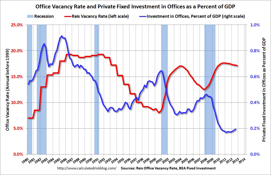 Click on graph for larger image.
This graph shows the office vacancy rate starting in 1980 (prior to 1999 the data is annual). Back in the early '80s, there was overbuilding in the office sector even as the vacancy rate was rising. This was due to the very loose lending that led to the S&L crisis.
In the '90s, office investment picked up as the vacancy rate fell. Following the bursting of the stock bubble, the vacancy rate increased sharply and office investment declined.
During the housing bubble, office investment started to increase even before the vacancy rate had fallen below 14%. This was due to loose lending - again. Investment essentially stopped following the financial crisis.
Like Reis, I expect the office vacancy rate to slowly decline, and I don't expect a significant pickup in new investment until the vacancy rate is close to 14%.
Office vacancy data courtesy of Reis.
Reis: Office Vacancy Rate declines slightly in Q4 to 17.1%
by Calculated Risk on 1/07/2013 08:15:00 AM
Reis released their Q4 Office Vacancy survey this morning. Reis reported that the office vacancy rate declined slightly to 17.1% from 17.2% in Q3.
On absorption from Reis Senior Economist Ryan Severino:
During the fourth quarter 3.691 million square feet were absorbed. This represents a decrease versus the 4.819 million square feet that were absorbed during the third quarter and the 4.842 million square feet that were absorbed during the fourth quarter of 2011. However, this is the eighth consecutive quarter of positive net absorption.On new construction:
3.170 million square feet were delivered during the fourth quarter, versus 3.821 million square feet during the third quarter. This is also a slowdown compared to the 3.653 million square feet of office space that were delivered during the fourth quarter of 2011. For calendar year 2012, 12.025 million square feet were completed. This is a decline from the 15.164 million square feet that were completed during 2011.On rents:
Asking and effective rents both grew by 0.8% during the fourth quarter. This exceeded the third quarter performance when asking and effective rents both grew 0.2%. This was the ninth consecutive quarter that asking and effective rents have increased. This was the strongest performance of both measures since mid‐2008 before the downturn in the office market.
 Click on graph for larger image.
This graph shows the office vacancy rate starting in 1980 (prior to 1999 the data is annual).
Reis is reporting the vacancy rate declined in Q4 to 17.1%, down slightly from 17.2% in Q3, and down from 17.4% in Q4 2011. The vacancy rate peaked in this cycle at 17.6% in Q3 and Q4 2010, and Q1 2011.
As Severino noted, net absorption was still positive, even though demand for office space was low - because there is so little new construction. This remains a sluggish recovery for office space, and new construction will stay low until the vacancy rate falls much further.
Sunday, January 06, 2013
Sunday Night Futures
by Calculated Risk on 1/06/2013 09:18:00 PM
From the NY Times: Deal in Foreclosure Case Is Imminent, Officials Say
A $10 billion settlement to resolve claims of foreclosure abuses by 14 major lenders is expected to be announced as early as Monday, several people with knowledge of the discussions said on Sunday.This agreement ends the foreclosure review process that was apparently not effective. This is an addition to the settlement last year.
The settlement comes after weeks of negotiations between federal regulators and the banks, and covers abuses like flawed paperwork and botched loan modifications ...
An estimated $3.75 billion of the $10 billion is to be distributed in cash relief to Americans who went through foreclosure in 2009 and 2010, these people said. An additional $6 billion is to be directed toward homeowners in danger of losing their homes after falling behind on their monthly payments.
Monday economic release:
• Reis Q4 2012 Office survey of rents and vacancy rates. In Q3 Reis reported the office vacancy rate declined to 17.1%, from 17.2% in Q2. The vacancy rate peaked in this cycle at 17.6% in Q3 and Q4 2010.
Weekend:
• Summary for Week Ending Jan 4th
• Schedule for Week of Jan 6th
• Question #9 for 2013: How much will Residential Investment increase?
• Question #10 for 2013: Europe and the Euro
The Asian markets are mixed tonight; the Shanghai Composite index is up slightly, and the Nikkei is down 0.4%.
From CNBC: Pre-Market Data and Bloomberg futures: the S&P futures are down 2 and DOW futures are down 20.
Oil prices have moved up a recently with WTI futures at $92.97 per barrel and Brent at $111.32 per barrel. Gasoline prices have also increased a little recently.
Question #9 for 2013: How much will Residential Investment increase?
by Calculated Risk on 1/06/2013 06:26:00 PM
Earlier I posted some questions for next year: Ten Economic Questions for 2013. I'll try to add some thoughts, and maybe some predictions for each question.
Note: Here is a review of my 2012 Forecasts
9) Residential Investment: Residential investment (RI) picked up in 2012, with new home sales and housing starts increasing 20% or so. Note: RI is mostly investment in new single family structures, multifamily structures, home improvement and commissions on existing home sales. This still leaves RI at a historical low level. How much will RI increase in 2013?
First a graph of RI as a percent of Gross Domestic Product (GDP) through Q3 2012.
 Click on graph for larger image.
Usually residential investment is a strong contributor to GDP growth and employment in the early stages of a recovery, but not this time - and that weakness was a key reason why the recovery was sluggish so far. Residential investment finally turned positive during 2011 and made a positive contribution to GDP in 2012.
Residential investment as a percent of GDP is just above the record low, and it seems likely that residential investment as a percent of GDP will increase further in 2013.
 The second graph shows total and single family housing starts through November 2012.
Housing starts are on pace to increase about 25% in 2012. And even after the sharp increase last year, the approximately 770 thousand housing starts in 2012 will still be the 4th lowest on an annual basis since the Census Bureau started tracking starts in 1959 (the three lowest years were 2009 through 2011).
Here is a table showing housing starts over the last few years. No one should expect an increase to 2005 levels, however demographics and household formation suggest starts will return to close to the 1.5 million per year average from 1959 through 2000. That means starts will come close to doubling over the next few years from the 2012 level.
| Housing Starts (000s) | ||||
|---|---|---|---|---|
| Total | Change | Single Family | Change | |
| 2005 | 2,068.3 | --- | 1,715.8 | --- |
| 2006 | 1,800.9 | -12.9% | 1,465.4 | -14.6% |
| 2007 | 1,355.0 | -24.8% | 1,046.0 | -28.6% |
| 2008 | 905.5 | -33.2% | 622.0 | -40.5% |
| 2009 | 554.0 | -38.8% | 445.1 | -28.4% |
| 2010 | 586.9 | 5.9% | 471.2 | 5.9% |
| 2011 | 608.8 | 3.7% | 430.6 | -8.6% |
| 20121 | 770.0 | 26% | 535.0 | 24% |
| 12012 estimated | ||||
 The third graph shows New Home Sales since 1963 through November 2012. The dashed line is the current sales rate.
Just like for RI as a percent of GDP, and housing starts, new home sales were up in 2012, but are still near the low historically.
New home sales will still be competing with distressed sales (short sales and foreclosures) in many areas in 2013 - and probably even more foreclosures in some judicial states. Also I've heard some builders might be land constrained in 2013 (not enough finished lots in the pipeline). Both of these factors could slow the growth of residential investment, but I expect another solid year of growth.
Here are some recent forecasts for housing in 2013. I expect growth for new home sales and housing starts in the 20% to 25% range in 2013 compared to 2012. That would still make 2013 the sixth weakest year on record for housing starts (behind 2008 through 2012), and the seventh or eight weakest for new home sales. So I expect further growth in 2014 too.
Here are the ten questions for 2013 and a few predictions:
• Question #1 for 2013: US Fiscal Policy
• Question #2 for 2013: Will the U.S. economy grow in 2013?
• Question #3 for 2013: How many payroll jobs will be added in 2013?
• Question #4 for 2013: What will the unemployment rate be in December 2013?
• Question #5 for 2013: Will the inflation rate rise or fall in 2013?
• Question #6 for 2013: What will happen with Monetary Policy and QE3?
• Question #7 for 2013: What will happen with house prices in 2013?
• Question #8 for 2013: Will Housing inventory bottom in 2013?
• Question #9 for 2013: How much will Residential Investment increase?
• Question #10 for 2013: Europe and the Euro
Question #10 for 2013: Europe and the Euro
by Calculated Risk on 1/06/2013 02:44:00 PM
Earlier I posted some questions for next year: Ten Economic Questions for 2013. I'll try to add some thoughts, and maybe some predictions for each question.
Mostly I focus on the US, but like everyone I've been watching Europe a little more closely over the last few years. Unfortunately the situation in Europe remains grim, with high unemployment - especially in Greece and Spain - and most of the eurozone in recession.
However the crisis has eased a bit. There are several reasons - one key is the the ECB's longer-term refinancing operations (LTROs) that was offered in December 2011. These have a 36 month maturity, and the LTROs have helped lower borrowing costs in Europe.
 Click on graph for larger image in graph gallery.
This graph, from the Atlanta Fed, shows the 10-year bond spreads for a few European countries (this is the difference between the 10-year bond of each country to the 10-year of Germany).
By this measure, the financial crisis has eased recently (the recent agreements with Greece have helped too).
With a Greek deal in place, and Germany's Merkel motivated by the election later this year to keep the eurozone together, and a strong commitment by other policymakers to the euro, I think there is a good chance that the eurozone and the euro will make it through 2013 intact.
Even though I've been pessimistic on Europe (In 2011, I argued that the eurozone was heading into recession), I was less pessimistic than many others. Each of the last two years, I argued the eurozone would stay together (2011: Europe and the Euro and 2012: Europe and the Euro). My guess is the eurozone makes it through another year without losing any countries or a serious collapse. Obviously several countries are near the edge, and the key will be to return to expansion soon.
Note: unless the eurozone "implodes", I don't think Europe poses a large downside risk to the US. If there is a breakup of the euro (something I do not expect in 2013), then the impact on the US could be significant due to financial tightening.
Here are the ten questions for 2013 and a few predictions:
• Question #1 for 2013: US Fiscal Policy
• Question #2 for 2013: Will the U.S. economy grow in 2013?
• Question #3 for 2013: How many payroll jobs will be added in 2013?
• Question #4 for 2013: What will the unemployment rate be in December 2013?
• Question #5 for 2013: Will the inflation rate rise or fall in 2013?
• Question #6 for 2013: What will happen with Monetary Policy and QE3?
• Question #7 for 2013: What will happen with house prices in 2013?
• Question #8 for 2013: Will Housing inventory bottom in 2013?
• Question #9 for 2013: How much will Residential Investment increase?
• Question #10 for 2013: Europe and the Euro
Labor Force Participation Rate Update
by Calculated Risk on 1/06/2013 10:22:00 AM
I've written extensively about the participation rate, see: Understanding the Decline in the Participation Rate and Further Discussion on Labor Force Participation Rate.
In trying to forecast the change in the unemployment rate for 2013, it is important to forecast what will happen to the participation rate this year. The participation rate is the percentage of the working age population in the labor force. If more people join the workforce, then more jobs will be needed to push down the unemployment rate. However, if the participation rate stays flat in 2013 - or even declines further - then fewer jobs are needed to push down the unemployment rate.
 Click on graph for larger image in graph gallery.
Here is a repeat of a graph from the December employment report. The Labor Force Participation Rate was unchanged at 63.6% in December (blue line).
A key point: The recent decline in the participation rate was expected, and a large portion of the decline in the participation rate was due to changing demographics, as opposed to economic weakness.
 The second graph shows the changes in the participation rates for men and women since 1960 (in the 25 to 54 age group - the prime working years).
The participation rate for prime working age women increased significantly from the mid 30s to the mid 70s and has mostly flattened out since then. The participation rate for women increased slightly in December to 74.5% and might increase a little in 2013.
The participation rate for prime working age men has been decreasing for decades - from the high 90s in the 1950s to just over 90% in 2005. In December, the participation rate for men increased slightly to 88.4% .
I still expect a little bounce back for both prime working age men and women - but not much.
There are other key demographic trends - younger people have been staying in school, so the participation rate for those under 25 has been falling - and older people have been staying in the work force longer, so the participation rate for older workers has been increasing.
Overall I've been expecting some small bounce back in the participation rate, but I don't think any bounce back will be huge - and that means it will take fewer jobs than some expect to lower the unemployment rate in 2013. This remains a key number to watch.
Saturday, January 05, 2013
Default Ceiling: Bluffing into the Nuts
by Calculated Risk on 1/05/2013 08:49:00 PM
I wrote several posts about the "debt ceiling" debate in 2011. The debate clearly scared many Americans and impacted the economy. Hopefully this time the "debt ceiling" will be raised well in advance of the deadline.
I prefer "default ceiling" because "debt ceiling" sounds like some sort of virtuous limit, when, in reality, the vote is about whether or not to the pay the bills - and voting for default is reckless and irresponsible.
Note: Several financial articles recently have used poker terms - and the title of this post is my contribution to this sad trend. "The Nuts" is the best possible poker hand in a given situation. Bluffing into the nuts is a losing play - and that is what the Congress is trying to do with the "debt ceiling". The sooner they fold, the better for the economy and the Congress.
From the WaPo: GOP dissension over debt-ceiling strategy
House Speaker John A. Boehner (R-Ohio) likewise insisted that Republicans hold the line, telling his members they must demand that every dollar they raise the debt limit be paired with commensurate spending cuts.It is a bluff. As Republican Senator Mitch McConnell noted in 2011, if the debt ceiling isn't raised the "Republican brand" would become toxic and synonymous with fiscal irresponsibility.
But other Republicans counseled caution, warning that pressure from the business community and the public to raise the $16.4 trillion federal borrowing limit renders untenable any threats not to do so and will weaken the GOP’s hand if their stance is perceived to be a bluff.
Part of the problem is some congressmen don't understand economics. Look at this quote from the WaPo article:
“It may be necessary to partially shut down the government in order to secure the long-term fiscal well being of our country, rather than plod along the path of Greece, Italy and Spain,” [Senate Minority Whip John Cornyn (R-Tex.)] wrote.First, hitting the default ceiling will not just "shut down the government", it will force the government to stop paying some bills (most of the bills are for Defense, Medicare, Social Security and interest payments on the debt).
Second, the US is not plodding along "the path of Greece, Italy and Spain". Geesh.
I reread some of my posts from 2011, as an example Debt Ceiling Charade: The Smart Options.
Option #1: Eliminate the debt ceiling. The debt ceiling is a joke. It serves no purpose except political posturing. It is not about the deficit - it is about paying the bills, and the U.S. will pay the bills.I still prefer Option #1, but one thing is clear, the Congress will fold and the debt ceiling will be raised. There might be some agreement with the "sequester" that gives Congress some cover, and if that is the approach, then Congress should look to settle this early.
...
Option #2: Pass a "clean" bill raising the debt ceiling enough to get through the next election (so the politicians don't have to embarrass themselves again). Congress could do this at any time. That is why voters would blame the party controlling the House if the debt ceiling is not raised.
In 2011, I started writing about the debt ceiling when it became clear the threat of default was impacting the economy. A couple of old posts: Debt Ceiling Charade impacting Short-Term Credit Markets and Random Thoughts. From July 30, 2011:
"I remain confident that Congress will raise the debt ceiling; however the circus in D.C. is clearly impacting the economy. This morning I spoke to a business owner who is negotiating a new lease to expand. His lawyer told him not to sign the lease until the debt ceiling issue is resolved. I believe similar caution has gripped business owners and consumers in many places - and impacting consumer and business confidence."This time I'm going to start criticizing Congress earlier in the process; 2011 was ridiculous and reckless.
Summary for Week Ending January 4th
by Calculated Risk on 1/05/2013 01:27:00 PM
Happy New Year to all!
The key story of the week was the fiscal agreement. Unfortunately the media did an excellent job of confusing most people.
Remember - the "fiscal cliff" was about too much austerity too quickly (about reducing the deficit too quickly). The "fiscal cliff" included expiring tax cuts (income, payroll), expiring spending (unemployment insurance, etc.) and the "sequester" (a combination of defense and other spending cuts). The sequester has been delayed for two months, so we don't know the size of the cuts yet, but it appears the amount of austerity will not be large enough to drag the economy into a new recession. Still, austerity will be a drag in 2013 and that probably means another year of sluggish growth.
I would have argued for a different mix of policies, but reducing the amount of austerity was achieved - and this was a key goal for the fiscal agreement. Long term debt sustainability is still an issue (not part of the "fiscal cliff"), but the deficit is declining right now, and will decline further in 2013. This agreement contained some short term deficit reduction (just the end of the payroll tax cut will reduce the deficit by around $120 billion in 2013 compared to 2012).
The economic data was mixed. The employment report indicated sluggish payroll growth with the unemployment rate still very high at 7.8%. Auto sales were down from November, but still solid. Construction spending was down in November, but residential construction spending was up (non-residential and public spending was down). And the ISM manufacturing and service indexes increased in December, suggesting some improvement.
It appears 2012 ended with sluggish growth. There are reasons for optimism for 2013, but the austerity at the Federal level will be a significant drag all year.
Here is a summary of last week in graphs:
• December Employment Report: 155,000 Jobs, 7.8% Unemployment Rate
From the BLS:
Nonfarm payroll employment rose by 155,000 in December, and the unemployment rate was unchanged at 7.8 percent, the U.S. Bureau of Labor Statistics reported today.
...
The change in total nonfarm payroll employment for October was revised from +138,000 to +137,000, and the change for November was revised from +146,000 to +161,000.
 Click on graph for larger image.
The headline number was at expectations of 157,000. Employment for October was revised down slightly, and November payroll growth was revised up.
The second graph shows the unemployment rate.
The unemployment rate was unchanged at 7.8% (The November unemployment rate was revised up from 7.7% as part of the annual household report revision).
 The unemployment rate is from the household report and the household report showed only a small increase in employment.
The third graph shows the employment population ratio and the participation rate.
The Labor Force Participation Rate was unchanged at 63.6% in December (blue line. This is the percentage of the working age population in the labor force.
The participation rate is well below the 66% to 67% rate that was normal over the last 20 years, although a significant portion of the recent decline is due to demographics.The Employment-Population ratio decreased to 58.6% in December (black line). I'll post the 25 to 54 age group employment-population ratio graph later.
 The fourth graph shows the job losses from the start of the employment recession, in percentage terms, compared to previous post WWII recessions. The dotted line is ex-Census hiring.
This shows the depth of the recent employment recession - worse than any other post-war recession - and the relatively slow recovery due to the lingering effects of the housing bust and financial crisis.
Here is a table of the change in payroll employment on an annual basis (before benchmark revisions - the revision through March 2012 will be released next month and will show more jobs added based on the preliminary estimate):
| Annual Change Payroll Employment (000s) | |||
|---|---|---|---|
| Private | Public | Total | |
| 2006 | 1,859 | 209 | 2,068 |
| 2007 | 812 | 288 | 1,100 |
| 2008 | -3,782 | 179 | -3,603 |
| 2009 | -4,984 | -76 | -5,060 |
| 2010 | 1,248 | -221 | 1,027 |
| 2011 | 2,105 | -265 | 1,840 |
| 2012 | 1,903 | -68 | 1,835 |
Employment growth in 2012 was mostly in line with expectations. A little good news - it appears we are near the end of the state and local government layoffs, but the Federal government layoffs are ongoing. Look at the table - four consecutive years of public sector job losses is unprecedented since the Depression.
• U.S. Light Vehicle Sales at 15.3 million annual rate in December
 Based on an estimate from WardsAuto, light vehicle sales were at a 15.31 million SAAR in December. That is up 13% from December 2011, and down 1% from the sales rate last month.
This was above the consensus forecast of 15.1 million SAAR (seasonally adjusted annual rate). Note: Some of the increase in November was a bounce back from Hurricane Sandy that negatively impacted sales at the end of October, and sales might have been boosted slightly in December from some storm related bounce back.
Sales were up over 13% in 2012, and auto sales have been a key contributor to the economy over the last three years. Sales will probably increase in 2013, but not at a double digit rate.
• ISM Manufacturing index increased in December to 50.7
 The ISM manufacturing index indicated expansion in December. PMI was at 50.7% in December, up from 49.5% in November. The employment index was at 52.7%, up from 48.4%, and the new orders index was at 50.3%, unchanged from November.
Here is a long term graph of the ISM manufacturing index.
This was slightly above expectations of 50.5% and suggests manufacturing expanded in December.
• ISM Non-Manufacturing Index increases in December
 The December ISM Non-manufacturing index was at 56.1%, up from 54.7% in November. The employment index increased in December to 56.3%, up sharply from 50.3% in November. Note: Above 50 indicates expansion, below 50 contraction.
 This graph shows the ISM non-manufacturing (Service) index (started in January 2008) and the ISM non-manufacturing employment diffusion index.
This was above the consensus forecast of 54.5% and indicates faster expansion in December than in November. The internals were strong with both the employment index and new order index up.
• Construction Spending declined in November
The Census Bureau reported that overall construction spending decreased in November:
The U.S. Census Bureau of the Department of Commerce announced today that construction spending during November 2012 was estimated at a seasonally adjusted annual rate of $866.0 billion, 0.3 percent below the revised October estimate of $868.2 billion. The November figure is 7.7 percent above the November 2011 estimate of $804.0 billion.
 In November 2012, private residential construction spending was the largest category for the first time since 2007 - but spending is still very low (at 1998 levels not adjusted for inflation). Note: Residential construction is usually the largest category for construction spending, but there was a huge collapse in spending following the housing bubble (as expected).
 This graph shows private residential and nonresidential construction spending, and public spending, since 1993. Note: nominal dollars, not inflation adjusted.
 Private residential spending is 56% below the peak in early 2006, and up 33% from the post-bubble low. Non-residential spending is 29% below the peak in January 2008, and up about 30% from the recent low.
Public construction spending is now 15% below the peak in March 2009 and just above the post-bubble low.
The second graph shows the year-over-year change in construction spending.
On a year-over-year basis, private residential construction spending is now up 19%. Non-residential spending is up 8% year-over-year mostly due to energy spending (power and electric). Public spending is down 3% year-over-year.
• Weekly Initial Unemployment Claims increase to 372,000
 The DOL reports:
In the week ending December 29, the advance figure for seasonally adjusted initial claims was 372,000, an increase of 10,000 from the previous week's revised figure of 362,000.Weekly claims were above the 363,000 consensus forecast.
The dashed line on the graph is the current 4-week average. The four-week average of weekly unemployment claims increased to 360,000.
Weekly claims are very volatile during the holiday season, but the 4-week average finished 2012 near the low for the year.
Schedule for Week of Jan 6th
by Calculated Risk on 1/05/2013 08:06:00 AM
Note: I'll post a summary for last week later today.
This will be a light week for economic data. The key report for this week will be the November trade balance report on Friday.
Also Reis will release their Q4 Office, Mall and Apartment vacancy rate surveys this week. Last quarter Reis reported falling vacancy rates for apartments, malls, and offices.
Early: Reis Q4 2012 Office survey of rents and vacancy rates.
Early: Reis Q4 2012 Apartment survey of rents and vacancy rates.
7:30 AM ET: NFIB Small Business Optimism Index for December. The consensus is for an increase to 87.9 from 87.5 in November.
3:00 PM: Consumer Credit for November from the Federal Reserve. The consensus is for credit to increase $13.2 billion in November.
Early: Reis Q4 2012 Mall Survey of rents and vacancy rates.
7:00 AM: The Mortgage Bankers Association (MBA) will release the results for the mortgage purchase applications index.
8:30 AM: The initial weekly unemployment claims report will be released. The consensus is for claims to decrease to 362 thousand from 372 thousand last week.
 10:00 AM: Job Openings and Labor Turnover Survey for November from the BLS.
 This graph shows job openings (yellow line), hires (purple), Layoff, Discharges and other (red column), and Quits (light blue column) from the JOLTS.
Jobs openings increased in October to 3.675 million, up from 3.547 million in September. The number of job openings (yellow) has generally been trending up, and openings are up about 8% year-over-year compared to October 2011.
10:00 AM: Monthly Wholesale Trade: Sales and Inventories for November. The consensus is for a 0.3% increase in inventories.
 8:30 AM: Trade Balance report for November from the Census Bureau.
 Both exports and imports decreased in October. US trade has slowed recently.
The consensus is for the U.S. trade deficit to decrease to $41.1 billion in November from $42.2 billion in October. Export activity to Europe will be closely watched due to economic weakness. Note: the strike at the ports of Long Beach and Los Angeles started in late November and impacted this report.
8:30 AM: Import and Export Prices for December. The consensus is a 0.1% increase in import prices.
Friday, January 04, 2013
Unofficial Problem Bank list declines to 834 Institutions
by Calculated Risk on 1/04/2013 09:22:00 PM
Note: The first unofficial problem bank list was published in August 2009 with 389 institutions. The number of unofficial problem banks grew steadily and peaked at 1,002 institutions on June 10, 2011. The list has been declining since then.
This is an unofficial list of Problem Banks compiled only from public sources.
Here is the unofficial problem bank list for Jan 4, 2012.
Changes and comments from surferdude808:
Quiet start to the new year for the Unofficial Problem Bank List as there were only four removals this week. The removals push the list count down to 834 institutions with assets of $311.6 billion. A year ago, the list held 970 institutions with assets of $391.2 billion.Earlier on employment:
Actions were terminated against CommerceWest Bank, N.A., Irvine, CA ($340 million) and Farmers State Bank, Victor, MT ($315 million). The Savannah Bank, National Association, Savannah, GA ($672 million) and Bryan Bank & Trust, Richmond Hill, GA merged into SCBT, Columbia, SC during December 2012. Next week will likely be as quiet; however, the FDIC may have a pent-up closing or two that have been on ice through the holidays they need to get done.
• December Employment Report: 155,000 Jobs, 7.8% Unemployment Rate
• Employment Report Comments and more Graphs
• Graphs for Duration of Unemployment, Unemployment by Education and Diffusion Indexes
• Employment graph gallery
AAR: Rail Traffic "mixed" in December
by Calculated Risk on 1/04/2013 06:20:00 PM
From the Association of American Railroads (AAR): AAR Reports Mixed Annual and Monthly Traffic for December
The Association of American Railroads (AAR) today reported mixed 2012 rail traffic compared with 2011. U.S. rail intermodal volume totaled 12.3 million containers and trailers in 2012, up 3.2 percent or 374,918 units, over 2011. Carloads totaled 14.7 million in 2012, down 3.1 percent or 476,322 carloads, from 2011. Intermodal volume in 2012 was the second highest on record, down 0.1 percent or 14,885 containers and trailers, from the record high totals of 2006.
...
“Coal and grain typically account for around half of U.S. rail carloads, so when they’re down, chances are good that overall rail carloads are down too, as we saw in 2012,” said AAR Senior Vice President John T. Gray. “That said, a number of key rail carload categories showed solid improvement in 2012, including categories like autos and lumber that are most highly correlated with economic growth. Meanwhile, intermodal just missed setting a new volume record in 2012.”
emphasis added
 Click on graph for larger image.
This graph shows U.S. average weekly rail carloads (NSA).
U.S. railroads originated 1,086,990 carloads in December 2012, down 4.2% (48,071 carloads) from December 2011 and an average of 271,748 carloads per week. Except for a tiny increase in January, year-over-year total U.S. rail carloads fell each month in 2012 compared with the same month in 2011 ...Note that building related commodities were up.
In December 2012, as in every prior month in 2012, year-over-year U.S. rail carloads would have increased if not for a decline in coal carloadings. Coal carloads totaled 446,233 in December 2012, down 13.3% (68,372 carloads) from December 2011.
Grain carloads totaled 72,422 in December 2012, down 13.9% (11,708 carloads) from December 2011. December 2012’s average weekly grain carloads of 18,106 were the lowest for any December on record.
...
Other commodities showing carload increases on U.S. railroads in December 2012 compared with December 2011 include motor vehicles and parts (up 7,252 carloads, or 13.9%) and crushed stone, gravel, and sand (up 5,419 carloads, or 9.1%. Carloads of stone, clay and glass products were up 1,902, or 7.8%, in December 2012, while carloads of lumber and wood products were 1,673, or 16.3%, higher for the month.
The second graph is for intermodal traffic (using intermodal or shipping containers):
 Graphs reprinted with permission.
Intermodal traffic is near peak levels (black line).
U.S. rail intermodal traffic totaled 888,002 containers and trailers in December 2012, up 1.7% (14,690 intermodal units) over December 2011 and an average of 222,001 per week ... For all of 2012, U.S. rail intermodal volume totaled 12,267,336 containers and trailers, up 3.2% (374,918 units) over 2011 and just 0.1% (14,885 units) off 2006’s record. A new record almost certainly would have been set in 2012 if not for the strike by harbor clerks at the Ports of Los Angeles and Long Beach beginning in late November, and/or Hurricane Sandy, which severely disrupted rail and port operations on the East Coast beginning in late October.Intermodal will probably set a new record in 2013.
Earlier on employment:
• December Employment Report: 155,000 Jobs, 7.8% Unemployment Rate
• Employment Report Comments and more Graphs
• Graphs for Duration of Unemployment, Unemployment by Education and Diffusion Indexes
• Employment graph gallery
Graphs for Duration of Unemployment, Unemployment by Education and Diffusion Indexes
by Calculated Risk on 1/04/2013 02:31:00 PM
Here are the earlier employment posts (with graphs):
• December Employment Report: 155,000 Jobs, 7.8% Unemployment Rate
• Employment Report Comments and more Graphs
• Employment graph gallery
And a few more graphs ...
 This graph shows the duration of unemployment as a percent of the civilian labor force. The graph shows the number of unemployed in four categories: less than 5 week, 6 to 14 weeks, 15 to 26 weeks, and 27 weeks or more.
The general trend is down for all categories, but only the less than 5 weeks is back to normal levels.
The the long term unemployed is at 3.1% of the labor force - and the number (and percent) of long term unemployed remains a serious problem.
 This graph shows the unemployment rate by four levels of education (all groups are 25 years and older).
Unfortunately this data only goes back to 1992 and only includes one previous recession (the stock / tech bust in 2001). Clearly education matters with regards to the unemployment rate - and it appears all four groups are generally trending down.
Although education matters for the unemployment rate, it doesn't appear to matter as far as finding new employment (all four categories are only gradually declining).
Note: This says nothing about the quality of jobs - as an example, a college graduate working at minimum wage would be considered "employed".
 This is a little more technical. The BLS diffusion index for total private employment was at 63.2 in December, up from 56.6 in November. For manufacturing, the diffusion index increased to 59.3, up from 51.2 in November.
 Think of this as a measure of how widespread job gains are across industries. The further from 50 (above or below), the more widespread the job losses or gains reported by the BLS. From the BLS:
Figures are the percent of industries with employment increasing plus one-half of the industries with unchanged employment, where 50 percent indicates an equal balance between industries with increasing and decreasing employment.Even though the headline number was similar for November and December, it appears job growth was spread across more industries in December, and that is good news.
Employment Report Comments and more Graphs
by Calculated Risk on 1/04/2013 11:52:00 AM
Here is a table of the change in payroll employment on an annual basis (before benchmark revisions - the revision through March 2012 will be released next month and will show more jobs added based on the preliminary estimate):
| Annual Change Payroll Employment (000s)
| |||
|---|---|---|---|
| Private | Public | Total | |
| 2006 | 1,859 | 209 | 2,068 |
| 2007 | 812 | 288 | 1,100 |
| 2008 | -3,782 | 179 | -3,603 |
| 2009 | -4,984 | -76 | -5,060 |
| 2010 | 1,248 | -221 | 1,027 |
| 2011 | 2,105 | -265 | 1,840 |
| 2012 | 1,903 | -68 | 1,835 |
Employment growth in 2012 was mostly in line with expectations. A little good news - it appears we are near the end of the state and local government layoffs (see last graph), but the Federal government layoffs are ongoing. Look at the table - four consecutive years of public sector job losses is unprecedented since the Depression.
The first graph below shows the employment-population ratio for the 25 to 54 age group. This has been moving sideways lately, and that shows the labor market is still weak. Also seasonal retail hiring slowed sharply in December (3rd graph) - but overall seasonal hiring suggests a decent holiday retail season.
Hopefully employment growth will pick up some in 2013, although austerity probably means another year of sluggish growth. Here are a several more graphs...
Employment-Population Ratio, 25 to 54 years old
 Click on graph for larger image.
Since the participation rate has declined recently due to cyclical (recession) and demographic (aging population) reasons, an important graph is the employment-population ratio for the key working age group: 25 to 54 years old.
In the earlier period the employment-population ratio for this group was trending up as women joined the labor force. The ratio has been mostly moving sideways since the early '90s, with ups and downs related to the business cycle.
This ratio should probably move close to 80% as the economy recovers. The ratio increased in December to 75.9% from 75.7% in November. This has generally been trending up - although the improvement stalled in 2012 - and the ratio is still very low.
Percent Job Losses During Recessions

This graph shows the job losses from the start of the employment recession, in percentage terms - this time aligned at maximum job losses.
In the earlier post, the graph showed the job losses aligned at the start of the employment recession.
This financial crisis recession was much deeper than other post WWII recessions, and the recovery has been slower (the recovery from the 2001 recession was slow too). However, if we compare to other financial crisis recoveries, this recovery has actually been better than most.
Seasonal Retail Hiring
According to the BLS employment report, retailers hired seasonal workers at a slow pace in December.
 Typically retail companies start hiring for the holiday season in October, and really increase hiring in November. Here is a graph that shows the historical net retail jobs added for October, November and December by year.
This really shows the collapse in retail hiring in 2008. Since then seasonal hiring has increased back close to more normal levels. Note: I expect the long term trend will be down with more and more internet holiday shopping.
Retailers hired 88.3 thousand workers (NSA) net in December. The combined level for October, November is the highest since 2006. Note: this is NSA (Not Seasonally Adjusted).
This suggests retailers were initially optimistic about the holiday season, but sales might have slowed in December. There is a decent correlation between retail hiring and retail sales, see: Retail: Seasonal Hiring vs. Retail Sales, and the retail season was probably decent.
Part Time for Economic Reasons
 From the BLS report:
The number of persons employed part time for economic reasons (sometimes referred to as involuntary part-time workers), at 7.9 million, changed little in December. These individuals were working part time because their hours had been cut back or because they were unable to find a full-time job.The number of part time workers declined in December to 7.92 million from 8.14 million in November.
These workers are included in the alternate measure of labor underutilization (U-6) that was unchanged at 14.4% in December.
Unemployed over 26 Weeks
 This graph shows the number of workers unemployed for 27 weeks or more.
 According to the BLS, there are 4.77 million workers who have been unemployed for more than 26 weeks and still want a job. This was down slightly from 4.78 million in November, and is at the lowest level since June 2009. This is generally trending down, but is still very high. Long term unemployment remains one of the key labor problems in the US.
State and Local Government
 This graph shows total state and government payroll employment since January 2007. State and local governments lost 129,000 jobs in 2009, 262,000 in 2010, and 230,000 in 2011. In 2012, state and local government employment declined by 26,000 jobs.
Note: The dashed line shows an estimate including the benchmark revision.
It appears most of the state and local government layoffs are over, however the Federal government layoffs are ongoing. Overall government employment has seen an unprecedented decline over the last 3+ years (not seen since the Depression).
ISM Non-Manufacturing Index increases in December
by Calculated Risk on 1/04/2013 10:00:00 AM
Note: I'll have more on the employment report soon.
The December ISM Non-manufacturing index was at 56.1%, up from 54.7% in November. The employment index increased in December to 56.3%, up sharply from 50.3% in November. Note: Above 50 indicates expansion, below 50 contraction.
From the Institute for Supply Management: December 2012 Non-Manufacturing ISM Report On Business®
Economic activity in the non-manufacturing sector grew in December for the 36th consecutive month, say the nation's purchasing and supply executives in the latest Non-Manufacturing ISM Report On Business®.
The report was issued today by Anthony Nieves, C.P.M., CFPM, chair of the Institute for Supply Management™ Non-Manufacturing Business Survey Committee. "The NMI™ registered 56.1 percent in December, 1.4 percentage points higher than the 54.7 percent registered in November. This indicates continued growth at a slightly faster rate in the non-manufacturing sector. The Non-Manufacturing Business Activity Index registered 60.3 percent, which is 0.9 percentage point lower than the 61.2 percent reported in November, reflecting growth for the 41st consecutive month. The New Orders Index increased by 1.2 percentage points to 59.3 percent. The Employment Index increased by 6 percentage points to 56.3 percent, indicating growth in employment for the fifth consecutive month at a significantly faster rate. The Prices Index decreased 0.4 percentage point to 56.6 percent, indicating prices increased at a slightly slower rate in December when compared to November. According to the NMI™, 13 non-manufacturing industries reported growth in December. Respondents' comments remain mixed and are mostly positive about business conditions and the economy."
emphasis added
Click on graph for larger image.This graph shows the ISM non-manufacturing index (started in January 2008) and the ISM non-manufacturing employment diffusion index.
This was above the consensus forecast of 54.5% and indicates faster expansion in December than in November. The internals were strong with the employment index and new order up.
December Employment Report: 155,000 Jobs, 7.8% Unemployment Rate
by Calculated Risk on 1/04/2013 08:30:00 AM
From the BLS:
Nonfarm payroll employment rose by 155,000 in December, and the unemployment rate was unchanged at 7.8 percent, the U.S. Bureau of Labor Statistics reported today.
...
The change in total nonfarm payroll employment for October was revised from +138,000 to +137,000, and the change for November was revised from +146,000 to +161,000.
Click on graph for larger image.The headline number was at expectations of 157,000. Employment for October was revised down slightly, and November payroll growth was revised up.
The second graph shows the unemployment rate.
The unemployment rate was unchanged at 7.8% (The November unemployment rate was revised up from 7.7% as part of the annual household report revision).
The unemployment rate is from the household report and the household report showed only a small increase in employment.The third graph shows the employment population ratio and the participation rate.
The Labor Force Participation Rate was unchanged at 63.6% in December (blue line. This is the percentage of the working age population in the labor force.
The participation rate is well below the 66% to 67% rate that was normal over the last 20 years, although a significant portion of the recent decline is due to demographics.The Employment-Population ratio decreased to 58.6% in December (black line). I'll post the 25 to 54 age group employment-population ratio graph later.
The fourth graph shows the job losses from the start of the employment recession, in percentage terms, compared to previous post WWII recessions. The dotted line is ex-Census hiring.This shows the depth of the recent employment recession - worse than any other post-war recession - and the relatively slow recovery due to the lingering effects of the housing bust and financial crisis.
This was another sluggish growth employment report. I'll have much more later ...
Thursday, January 03, 2013
Friday: Employment Report
by Calculated Risk on 1/03/2013 09:20:00 PM
The key report of the week will be released Friday morning: the December Employment Report. The consensus (see below) increased today based on the better than expected ADP employment report. Here is a summary of recent data:
• The ADP employment report showed an increase of 215,000 private sector payroll jobs in December. This was above expectations. Historically the ADP report hasn't been very useful in predicting the BLS report for any one month, although the methodology changed three months ago and may be more useful in predicting the BLS report. In general this suggests employment growth was above expectations.
• The ISM manufacturing employment index increased in December to 52.7%, up from 48.4% in November.
• Initial weekly unemployment claims averaged about 362,000 in December. This was the low for the year. A positive for employment.
For the BLS reference week (includes the 12th of the month), initial claims were at 362,000; the lowest for a reference week this year.
• The small business index from Intuit showed 15,000 payroll jobs added, down from 25,000 in November.
• And on the unemployment rate from Gallup:
Gallup's seasonally unadjusted unemployment rate for the U.S. workforce was 7.7% for the month of December, statistically unchanged from 7.8% at the end of November. Gallup's seasonally adjusted unemployment rate is 7.9%, a 0.4-point decline over November.Note: Gallup only recently has been providing a seasonally adjusted estimate for the unemployment rate, so use with caution. So far the Gallup numbers haven't been very useful in predicting the BLS unemployment rate, but this does suggest little change in December from 7.7% in November.
This data suggests a stronger employment report for December than for November, and perhaps over 200 thousand jobs added.
Friday economic releases:
• At 8:30 AM, the Employment Report for December will be released. The consensus is for an increase of 157,000 non-farm payroll jobs in December; there were 146,000 jobs added in November. The consensus is for the unemployment rate to increase to 7.8% in December, up from 7.7% in November.
• At 10:00 AM, ISM non-Manufacturing Index for December. The consensus is for a decrease to 54.5 from 54.7 in November. Note: Above 50 indicates expansion, below 50 contraction.
• Also at 10:00 AM, Manufacturers' Shipments, Inventories and Orders (Factory Orders) for November. The consensus is for a 0.3% increase in orders.
• At 3:00 PM, Speech by Fed Vice Chair Janet Yellen, "Systemic Risk", At the American Economic Association/American Finance Association Joint Luncheon, San Diego, California


