 RSS Feed
 by Calculated Risk on 6/23/2010 12:16:00 PM
Wednesday, June 23, 2010
Estimate of June Decennial Census impact on payroll employment: minus 243,000
The Census Bureau released the weekly payroll data for the week ending June 12th this morning (ht Bob_in_MA). If we subtract the number of temporary 2010 Census workers in the week containing the 12th of the month, from the same week for the previous month - this provides a close estimate for the impact of the Census hiring on payroll employment.
The Census Bureau releases the actual number with the employment report. 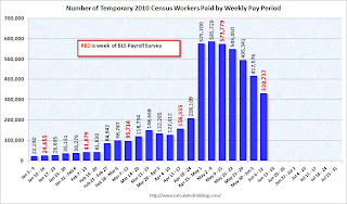 Click on graph for larger image in new window.
This graph shows the number of Census workers paid each week. The red labels are the weeks of the BLS payroll survey.
The Census payroll decreased from 573,779 for the week ending May 15th to 330,737 for the week ending June 12th.
So my estimate for the impact of the Census on June payroll employment is minus 243 thousand (this will be close). The employment report will be released on July 2nd, and the headline number for June - including Census numbers - will almost certainly be negative. But a key number will be the hiring ex-Census (so we will add back the Census workers this month).
New Home Sales collapse to Record Low in May
by Calculated Risk on 6/23/2010 10:00:00 AM
The Census Bureau reports New Home Sales in May were at a seasonally adjusted annual rate (SAAR) of 300 thousand. This is a sharp decrease from the revised rate of 446 thousand in April (revised from 504 thousand). Click on graph for larger image in new window.
The first graph shows monthly new home sales (NSA - Not Seasonally Adjusted).
Note the Red columns for 2010. In May 2010, 28 thousand new homes were sold (NSA). This is a new record low.
The previous record low for the month of May was 34 thousand in 2009; the record high was 120 thousand in May 2005. The second graph shows New Home Sales vs. recessions for the last 45 years.
Sales of new single-family houses in May 2010 were at a seasonally adjusted annual rate of 300,000 ... This is 32.7 percent (±9.9%) below the revised April rate of 446,000 and is 18.3 percent (±13.0%) below the May 2009 estimate of 367,000.And another long term graph - this one for New Home Months of Supply.
 Months of supply increased to 8.5 in May from 5.8 April. The all time record was 12.4 months of supply in January 2009. Since the sales rate declined sharply, the months of supply increased - this is still very high (less than 6 months supply is normal).
 The seasonally adjusted estimate of new houses for sale at the end of May was 213,000. This represents a supply of 8.5 months at the current sales rate.
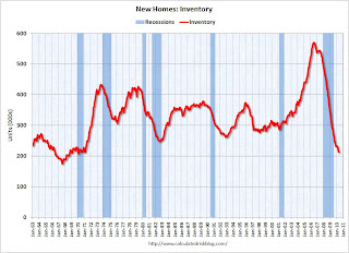 The final graph shows new home inventory.
 New home sales are counted when the contract is signed, so the tax credit related pickup in sales activity happened in April. This pulled demand forward, and April was probably the peak for new home sales this year.
The 300 thousand annual sales rate is a new all time record low. The previous record low annual sales rate was 338 thousand in September 1981.
MBA: Mortgage Purchase Applications Decrease in Weekly Survey
by Calculated Risk on 6/23/2010 07:55:00 AM
The MBA reports: Mortgage Applications Decrease in Latest MBA Weekly Survey
The Refinance Index decreased 7.3 percent from the previous week and the seasonally adjusted Purchase Index decreased 1.2 percent from one week earlier.
...
The average contract interest rate for 30-year fixed-rate mortgages decreased to 4.75 percent from 4.82 percent, with points increasing to 1.07 from 0.89 (including the origination fee) for 80 percent loan-to-value (LTV) ratio loans. This is the lowest 30-year contract rate observed in the survey since the week ending May 15, 2009.
 Click on graph for larger image in new window.
This graph shows the MBA Purchase Index and four week moving average since 1990.
The purchase index has collapsed following the expiration of the tax credit suggesting home sales will fall sharply too. This is the lowest level for 4-week average of the purchase index since February 1997.
Tuesday, June 22, 2010
AIA: Architecture Billings Index declines in May
by Calculated Risk on 6/22/2010 11:59:00 PM
Note: This index is a leading indicator for Commercial Real Estate (CRE) investment.
Reuters reports that the American Institute of Architects’ Architecture Billings Index declined to 45.8 in May from 48.5 in April. Any reading below 50 indicates contraction.
The ABI press release is not online yet. Click on graph for larger image in new window.
This graph shows the Architecture Billings Index since 1996. The index has remained below 50, indicating falling demand, since January 2008.
Note: Nonresidential construction includes commercial and industrial facilities like hotels and office buildings, as well as schools, hospitals and other institutions.
This suggests the slump for commercial real estate design is ongoing. According to the AIA, there is an "approximate nine to twelve month lag time between architecture billings and construction spending" on non-residential construction. So there will probably be further declines in CRE investment through all of 2010, and probably well into 2011.
How high will Existing Home Months-of-Supply increase this summer?
by Calculated Risk on 6/22/2010 07:28:00 PM
Earlier I posted a graph showing the relationship of existing home months-of-supply to house prices. When months-of-supply is below 6 months, house prices are typically rising - and above 6 months-of-supply, house prices are usually falling (this isn't perfect, but it is a general guide).
So how high will months-of-supply rise this summer?
Here are some estimates of sales via James Haggerty at the WSJ: Outlook for Home Prices Grows Darker
Since April 30, new purchase contracts have plunged ... Lawrence Yun, chief economist for the Realtors, estimated that contracts signed in May were 10% to 15% below the weak level of a year earlier.Contracts signed in May and June lead to sales later in the summer (counted when escrow closes).
Ronald Peltier, chief executive officer of HomeServices of America Inc., which owns real estate brokers in 21 states, said new home-purchase contracts in May and June so far are down about 20% from a year earlier.
Sales in July 2009 were at a 5.14 million rate (SAAR). Usually inventory increases in July, but if we assume inventory is steady at 3.892 million, the following table shows the month-of-supply estimates based on three year-over-year declines sales in July 2009:
| Sales Decline from 2009 | July Sales Rate (millions) | Months-of-Supply |
|---|---|---|
| Off 10% | 4.63 | 10.1 |
| Off 15% | 4.37 | 10.7 |
| Off 20% | 4.11 | 11.4 |
The peak for months-of-supply was 11.2 months in 2008. And house prices? The Case-Shiller composite 20 index fell 17.2% in 2008.
We are much closer to the price bottom now than in 2008, and I don't expect that severe of a price decline. But I do expect house prices to fall in the 2nd half of 2010 and into 2011 - probably another 5% to 10% for the major house price indexes (Case-Shiller and CoreLogic).
Of course inventory could decline or sales increase a little ... and maybe months-of-supply will only be close to double digits.
Market Update, Fed Meeting Preview and more
by Calculated Risk on 6/22/2010 04:03:00 PM

Click on graph for interactive version in new window.
The graph has tabs to look at the different bear markets - "now" shows the current market - and there is also a tab for the "four bears".
Tomorrow the Census Bureau will release New Home sales for May (consensus is for around 400,000) and the FOMC statement will be released.
Tom Lawler called the existing home sales number correctly today (he constructed an estimate from local data), and he is taking the under on new home sales too. See: Lawler: Home Sales in May: A Look at the Data.
On Sunday I posted a preview of the FOMC statement: Look Ahead to FOMC Statement on Wednesday. The statement will be a little less upbeat.
And on existing home sales today (with graphs):
Existing Homes: Months of Supply and House Prices
by Calculated Risk on 6/22/2010 02:34:00 PM
Earlier I mentioned that a normal housing market usually has under 6 months of supply. The current 8.3 months of supply is significantly above normal, and is especially concerning because the reported inventory is already historically very high.
After the tax credit related activity ends, the months of supply will probably increase, and the ratio could be close to double digits later this year. That level of supply will put additional downward pressure on house prices.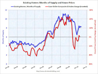 Click on graph for larger image in new window.
This graph show months of supply and the annualized change in the Case-Shiller Composite 20 house price index (inverted).
Below 6 months of supply (blue line) house prices are typically rising (red line, inverted).
Above 6 months of supply house prices are usually falling (although there were many programs to support house prices over the last year).
Later this year the months of supply will probably increase, and I expect house prices to fall further as measured by the Case-Shiller and CoreLogic repeat sales house price indexes.
Existing Home Sales: Inventory increases Year-over-Year
by Calculated Risk on 6/22/2010 11:28:00 AM
Earlier the NAR released the existing home sales data for May; here are a couple more graphs ...
The first graph shows the year-over-year (YoY) change in reported existing home inventory and months-of-supply. Inventory is not seasonally adjusted, so it really helps to look at the YoY change.  Click on graph for larger image in new window.
Inventory increased 1.1% YoY in May. This is the second consecutive month of a year-over-year increases in inventory. Although the YoY increase is small, I expect it will be higher later this year.
This increase in inventory is especially concerning because the reported inventory is already historically very high, and the 8.3 months of supply in May is well above normal. The months of supply will probably stay near this level in June, because of more tax credit related sales (reported at closing), but the months-of-supply could be close to double digits later this year.
And a double digit months-of-supply would be a really bad sign for house prices ... The second graph shows NSA monthly existing home sales for 2005 through 2010 (see Red columns for 2010).
Sales (NSA) in May 2010 were 17.7% higher than in May 2009, and also higher than in May 2008.
We will probably see sales at around this level in June because of the tax credit, however I expect to see existing home sales below last year in the 2nd half of this year.
This was definitely a weak report. Sales were up year-over-year because of the tax credit pulling sales forward, but that does very little for the economy. The key is the inventory and months-of-supply, and if these two measures increase later this year as I expect, then there will be additional downward pressure on house prices.
Existing Home Sales decline in May
by Calculated Risk on 6/22/2010 10:00:00 AM
The NAR reports: May Shows a Continued Strong Pace for Existing-Home Sales
Existing-home sales, which are completed transactions that include single-family, townhomes, condominiums and co-ops, were at a seasonally adjusted annual rate of 5.66 million units in May, down 2.2 percent from an upwardly revised surge of 5.79 million units in April. May closings are 19.2 percent above the 4.75 million-unit level in May 2009; April sales were revised to show an 8.0 percent monthly gain.
...
Total housing inventory at the end of May fell 3.4 percent to 3.89 million existing homes available for sale, which represents an 8.3-month supply at the current sales pace, compared with an 8.4-month supply in April. Raw unsold inventory is 1.1 percent above a year ago, but is still 14.9 percent below the record of 4.58 million in July 2008.
 Click on graph for larger image in new window.
This graph shows existing home sales, on a Seasonally Adjusted Annual Rate (SAAR) basis since 1993.
Sales in May 2010 (5.66 million SAAR) were 2.2% lower than last month, and were 19.2% higher than May 2009 (4.75 million SAAR).
 The second graph shows nationwide inventory for existing homes.
According to the NAR, inventory decreased to 3.89 million in May from 4.04 million in April. The all time record high was 4.58 million homes for sale in July 2008.
Inventory is not seasonally adjusted and there is a clear seasonal pattern with inventory increasing in the spring and into the summer. The increase in April 2010 was partially related to sellers hoping to take advantage of the housing tax credit, and a decline in May was expected (I'll have more on inventory later).
 The last graph shows the 'months of supply' metric.
Months of supply decreased slightly to 8.3 months in May. A normal market has under 6 months of supply, so this is high - and probably excludes some substantial shadow inventory. And the months of supply will probably increase sharply this summer as sales fade.
This was a very weak report - as anticpated by Tom Lawler yesterday (see Lawler: Home Sales in May: A Look at the Data ). I'll have more ...
Moody's: Commercial Real Estate Prices increase 1.7% in April
by Calculated Risk on 6/22/2010 08:36:00 AM
Moody's reported today that the Moody’s/REAL All Property Type Aggregate Index increased 1.7% in April, after declining for the previous two months. This is a repeat sales measure of commercial real estate prices.
Below is a comparison of the Moodys/REAL Commercial Property Price Index (CPPI) and the Case-Shiller composite 20 index.
Notes: Beware of the "Real" in the title - this index is not inflation adjusted. Moody's CRE price index is a repeat sales index like Case-Shiller - but there are far fewer commercial sales - and that can impact prices.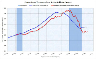 Click on graph for larger image in new window.
CRE prices only go back to December 2000.
The Case-Shiller Composite 20 residential index is in blue (with Dec 2000 set to 1.0 to line up the indexes).
It is possible that commercial real prices have bottomed - in general - but it is hard to tell because the number of transactions are very low and there are a number of distressed sales. Prices have been choppy and mostly moving sideways.
Commercial real estate values are now down 16% over the last year, and down 41% from the peak in late 2007.
Monday, June 21, 2010
Update on California bill to extend anti-deficiency rules to some Refinanced Mortgages
by Calculated Risk on 6/21/2010 10:32:00 PM
Last week I mentioned the potential law change in California: Under California law, purchase money loans are non-recourse. However once a homeowner refinances, the entire mortgage is recourse ... that is probably going to change ...
Note: This bill, if passed, will take effect June 1, 2011. Here is the proposed bill (ht pastafarian)
From David Streitfeld at the NY Times: Battles in California Over Mortgages
Lenders in California rarely chase foreclosed borrowers for deficiency judgments. Pursuing such cases in court can be an arduous process, and few of those in foreclosure have the assets or incomes to make it worthwhile.There is much more in the article. Of course the bankers are fighting to make this apply only to new loans after June 2011. The realtors are fighting to make it apply to current loans ...
But the threat of such action can come in handy for lenders, servicers and collection agencies. By raising the possibility of a court fight, they can negotiate favorable terms when agreeing to loan modifications and workouts, surrenders of deeds and sales for less than the full amount owed, also known as short sales.
“Using the threat of a deficiency, full-recourse lenders often prevail upon distressed borrowers to sign new, unsecured obligations in exchange for their assent to a proposed short sale or surrender of a deed,” said William A. Markham, a lawyer with Maldonado & Markham in San Diego. “This practice will nearly vanish overnight if the new measure becomes law.”
Lawler: Home Sales in May: A Look at the Data
by Calculated Risk on 6/21/2010 07:15:00 PM
CR Note: As mentioned in the Look Ahead post, the consensus for existing home sales (to be announced Tuesday) is for an increase to 6.2 million sales in May (SAAR), from 5.77 million in April (SAAR). For new home sales, the consensus is for a sharp decrease in sales to around 400K (SAAR), down from 504K in April.
Housing economist Tom Lawler is taking the under. The following is from Tom:
While most (though by no means all) of the country appears to have experienced a sharp gain in existing home sales (closed) this May vs. a year ago, the nationwide increase does not appear to have been as high as the surge in pending sales (related to the expiring tax credit) in March and April would have suggested. Last year’s “comp,” of course, was pretty low: the NAR estimates that existing home sales last May ran at a seasonally adjusted annual rate of 4.75 million, and unadjusted sales were estimated at 447,000. While this May’s “seasonal factor” should be lower than last May’s (meaning flat unadjusted sales would produce a seasonally adjusted increase), I estimate that unadjusted sales this May vs. last May would have to be up about 19.2% for seasonally adjusted sales to be flat to April. Obviously sales in many areas of the country were up a lot more than that, but in some large states sales showed much smaller gains, and a few saw declines.
Dataquick estimates that new and resale home sales in California were up 4.9%, with the “small” gain mainly resulting from a decline in foreclosure sales. While this stat is based on deeds recorded and includes new sales, MLS data I’ve seen aren’t too far off. The Michigan Association of Realtors reported a YOY decline in sales in May, with the drop coming many in foreclosure sales in very distressed areas. Sales in both Las Vegas and Phoenix were also down from a year ago, with both areas seeing sizable declines in foreclosure sales.
Many other states saw YOY sales gains that were decent, but hardly explosive. Based on realtor data from North Texas, Houston, San Antonio, Austin, Lubbock, and Wichita Falls, it appears as if Texas sales increased about 19.2%. Other states with “so-so” YOY sales gains include Iowa (20.8% statewide), Colorado (18% for Denver and Colorado Springs combined), Birmingham (16.8%), Indiana (14% Indianapolis and Fort Wayne combined), Minneapolis-St-Paul (10.7%), Greater Northern Virginia (6.2%), and quite a few (but not all) Florida markets showed very modest gains.
To be sure, many areas of the country saw sizable increases, but interestingly the vast bulk of these areas saw smaller YOY sales gains in May than in April.
When I add everything I have up, and make estimates for areas where I couldn’t find any reliable data, I come up with an estimated seasonally adjusted annual rate for existing home sales that is much smaller than I would have expected a few weeks ago – something in the range of 5.83 to 5.84 million, which would translate into an unadjusted YOY sales gain of around 20.5 to 20.6%, and would be a boatload under consensus.
Of course, my regional tracking – which until the last few months has easily produced a better-than-consensus estimate, of late has been low to the downside. More troubling (to me, at least), I’ve had trouble “reconciling” to the NAR data even after getting state/local realtor sales data not available until the day of the existing home sales report (or later in some cases!).
Nevertheless, the “raw” data I’ve seen so far suggests that existing home sales in May will come in well under “consensus” – for reasons that are unclear, and until recently to my surprise.
On the new home sales front (to be reported by the Census Bureau), anecdotal reports from a wide range of builders, as well as from some local realtors, suggest that new home sales as defined by the CD probably ran a bit lower than last May, when sales (based on contracts signed/deposits taken) ran at a SAAR of 367 k. I’m “guessing” that the preliminary number for May will be somewhere around 330 k, which would be a monthly decline from April of 34.5% (which is probably close to the monthly decline we’ll see in the pending home sale index scheduled to be release by the NAR on July 1.
CR Note: This was from housing economist Tom Lawler. Note the caveats, but clearly the data suggests a downside surprise.
Obama Housing Metrics
by Calculated Risk on 6/21/2010 03:48:00 PM
The Obama administration has introduced a "monthly housing scorecard". Here is the website: www.hud.gov/scorecard
Some excerpts and a couple of graphs:
• Home price performance has improved. After 30 straight months of decline and an expectation of continued significant deterioration, home prices have leveled off in the past year and expectations have adjusted upward. Homeowners have benefitted from the stabilization, as owner equity has increased by over $1 trillion since the first quarter of 2009
 Click on graph for larger image in new window.
This graph from the Obama Administration "scorecard" shows the actual house prices, and future house prices. The light blue line was the projected house prices based on futures in January 2009 - before the Obama administration started supporting house prices with various programs to limit supply and boost demand.
Note: I don't know why they use washed out colors on the graphs.
I believe the overall goal of supporting house prices was a mistake. It wasn't horrible - because prices were much closer to the bottom than the top - but by keeping prices too high, the market hasn't cleared and there is still a huge overhang of existing home inventory.
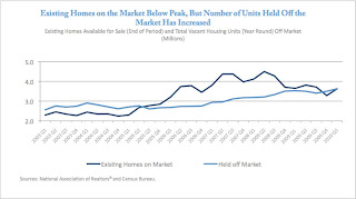 The second graph from the housing scorecard shows the Obama administration's estimate of the housing overhang.
 I'm not confident in the "held off market" category, but that is probably their method of estimating the shadow inventory (not all "held off market" is shadow, but some probably is). The existing home inventory - and shadow inventory - are still very high.
More from the report:
• More than 2.5 million first time homebuyers have purchased a home using the First-Time Homebuyer Tax credit, helping to stabilize home sales and prices and increase affordability.This is really sad news. This program was a disaster - most of these buyers would have bought anyway, and the others was just pulling forward future demand at a higher price. Now that the program is almost over (hopefully), demand and prices will probably fall again.
• Martgages are now more affordable. Due to historically low interest rates, more than 6 million homeowners have refinanced, saving an estimated $150 per month on overage and more than $11 billion in total.Note: the Obama administration needs a better spellchecker (what is a "martgage"?. And I think it is "benefited" with one "t")
• Servicers report that the number of homeowners receiving restructured mortgages since April 2009 has increased to 2.8 million. This includes more than 1.2 million homeowners who have started HAMP trial modifications and nearly 400,000 who have benefitted from FHA loss mitigation activities. Of those in the HAMP program, 346,000 have entered a permanent modification saving a median of more than $500 per month. In addition, HUD approved mortgage counselors have assisted 3.6 million families.
• Based on newly available survey data, nearly half of homeowners unable to enter a HAMP permanent modification enter an alternative modification with their servicer, and fewer than 10 percent of cancelled trials move to foreclosure sale.
This raises more questions: fewer than 10% of cancelled trials have moved to a foreclosure sale? What about short sales? Does that mean that the homeowners are curing the delinquency (getting caught up), or does that mean there are many more distressed sales to come?
There are many more graphs (and a list of sources) in the report and this report might not have much good news in the coming months ...
HAMP data shows over 150 Thousand Trials Cancelled in May
by Calculated Risk on 6/21/2010 01:35:00 PM
From Treasury: HAMP Servicer Performance Report Through May 2010 Click on table for larger image in new window.
About 347 thousand modifications are now "permanent" - up from 299 thousand last month - and 430 thousand trial modifications have been cancelled - up sharply from 277 thousand last month.
According to HAMP, there are 467,672 "active trials", down from 637,353 last month. However if we add the trials started since December (5 months!), there should only be 300,000 thousand borrowers in trial programs. That means there is still a huge number of borrowers in limbo, but with all the cancellations, the number is declining.  The second graph shows the cumulative HAMP trial programs started.
Notice that the pace of new trial modifications has slowed sharply from over 150,000 in September to just over 30,000 in May (down from 47,160 in April 2010). This is the slowest pace since the program started, probably because of two factors: 1) servicers are now pre-qualifying borrowers, and 2) servicers are running out of eligible borrowers. The program continues to slow down ...
Debt-to-income ratios worsen
If we look at the HAMP program stats (see page 5), the median front end DTI (debt to income) before modification was 44.8% - about the same as last month. And the back end DTI was an astounding 79.8 (down slightly from 80.2% last month).
Think about that for a second: for the median borrower, about 80% of the borrower's income went to servicing debt. And it is almost 64% after the modification.
And that is the median - and just imagine the characteristics of the borrowers who can't be converted!
Summary:
Housing Tax Credit Extension Update
by Calculated Risk on 6/21/2010 11:30:00 AM
David Rosenberg, chief economist at Gluskin Sheff + Associates, wrote this morning:
"We heard from Ivy Zelman (top-rated real estate research) on Friday that the bill that included an extension for the closing date of the homebuyer tax credit fell two votes short of passing in the Senate. This virtually assures that it will not become law prior to the June 30th deadline. Ivy says that while it is difficult to quantify the impact, the fact that as of yet there is no extension, which was widely expected in this bailout nation, it could trigger a jump in cancellations beginning in July if a sizeable number of sales are not closed in time."Rosenberg is referring to H.R.4213 the "American Jobs and Closing Tax Loopholes Act of 2010".
The amendment (S.AMDT.4344) to extend the closing date for the tax credit passed last week on a vote of 60 to 37.
The Senate is still debating the other tax extenders, and was unable to obtain cloture (this is what Zelman was referring to). This bill also includes the extension of the date (not duration) of unemployment benefits and other provisions. One of the sticking points is the extension of the COBRA benefit.
China's Yuan Rises against Dollar
by Calculated Risk on 6/21/2010 08:38:00 AM
From Reuters: China's Yuan Jumps After Flexibility Pledge
The yuan closed at 6.7976 against the dollar, up 0.42 percent from Friday's close ...The yuan has been essentially pegged at 6.83 since July 2008.
On Saturday China announced more exchange rate flexibility ... here are some excerpts from the statement (via WSJ):
In view of the recent economic situation and financial market developments at home and abroad, and the balance of payments (BOP) situation in China, the People´s Bank of China has decided to proceed further with reform of the RMB exchange rate regime and to enhance the RMB exchange rate flexibility.
...
The global economy is gradually recovering. The recovery and upturn of the Chinese economy has become more solid with the enhanced economic stability. It is desirable to proceed further with reform of the RMB exchange rate regime and increase the RMB exchange rate flexibility.
Sunday, June 20, 2010
Apartment owner on rental market: "Worst ever", Charge-offs triple
by Calculated Risk on 6/20/2010 09:42:00 PM
Some landlords think rents have bottomed ... other are not so optimistic ...
From Jon Lansner at the O.C. Register: ‘Worst ever’ market hits O.C. landlords
Veteran Orange County apartment owner and manager Ray Maggi says this the current rental market “is the worst I’ve ever seen” for landlords.
...
Last year, landlords usually offered free months of rent as lures for new tenants. This year, Maggi says, more landlords have simply slashed rents to meet tight-fisted renters who have plenty of choice.
Making matters worse for property owners is that a growing number of tenants aren’t keeping up with payments. Charge-offs have roughly tripled to nearly 3 percent of rents due.
Look Ahead to FOMC Statement on Wednesday
by Calculated Risk on 6/20/2010 05:17:00 PM
The previous post was the Weekly Summary and a Look Ahead.
The FOMC statement to be released on Wednesday will be interesting. This is the first scheduled FOMC meeting since the EU / ECB rescue package was announced on May 9th. In addition, some of the economic data since the last FOMC meeting has been somewhat disappointing.
Two things are nearly certain: 1) the FOMC will not increase the Fed Funds rate at this meeting, and 2) the key language about "exceptionally low levels of the federal funds rate for an extended period" will remain.
Here are a few excerpts from the last FOMC statement to see some possible changes:
Information received since the Federal Open Market Committee met in March suggests that economic activity has continued to strengthen and that the labor market is beginning to improve. Growth in household spending has picked up recently ...Since the April meeting, growth appears to have slowed, the labor market has stumbled, and retail spending was weak. The first sentence will be less positive this meeting.
Housing starts have edged up but remain at a depressed level.Housing starts plummeted in May.
With substantial resource slack continuing to restrain cost pressures and longer-term inflation expectations stable, inflation is likely to be subdued for some time.It is possible that the Fed will mention the downside risk to prices (deflation). The Fed might also mention the European situation.
Last week, Jon Hilsenrath at the WSJ wrote "Federal Reserve officials are beginning to debate quietly what steps they might take if the recovery surprisingly falters or if the inflation rate falls much more". These discussions are probably part of the agenda, but I doubt there will be any mention in the FOMC statement.
Weekly Summary and a Look Ahead
by Calculated Risk on 6/20/2010 11:59:00 AM
Two key housing reports will be released this week: existing home sales on Tuesday, and new home sales on Wednesday.
On Tuesday at 10 AM, the National Association for Realtors (NAR) will release the May existing home sales report. The consensus is for an increase to 6.2 million sales in May, at a seasonally adjusted annual rate (SAAR), from 5.77 million in April (SAAR). I'll take the under because I think there will be a larger than normal fallout from pending home sales. A key number in the release will be existing home inventory. Inventory surged in April, to over 4 million homes for sale, as sellers tried to take advantage of the homebuyer tax credit. I expect inventory to decline in May.
Also on Tuesday, the FHFA house price index, and the Richmond Fed survey will be released.
On Wednesday at 10 AM, the Census Bureau will release the May New Home sales report. The consensus is for a sharp decrease in sales to around 400K (SAAR), down from 504K in April. Since new home sales are reported when a contract is signed, April was the last month that reported sales will be positively impacted by the tax credit. The May AIA's Architecture Billings Index will also be released on Wednesday (a leading indicator for commercial real estate).
Also on Wednesday, the FOMC statement will be released at 2:15 PM ET (conclusion of 2 day meeting).
On Thursday, the May Durable Goods Orders will be released at 8:30 AM. The consensus is for a 1.2% decrease. Also on Thursday, the closely watched initial weekly unemployment claims will be released. Consensus is for a decline to 465K from 472K last week.
On Friday, the third estimate of the Q1 GDP report will be released at 8:30 AM. The consensus is for no significant change (3.0% annualized growth rate). And of course the FDIC will probably have another busy Friday afternoon ...
Note: Other reports that will probably be released this week include the Moodys/REAL Commercial Property Price Index (for April) and the HAMP May report.
And a summary of last week:
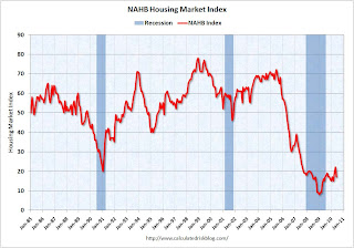 Click on graph for larger image in new window.
This graph shows the builder confidence index from the National Association of Home Builders (NAHB).
The housing market index (HMI) was at 17 in June. This was a sharp decline from 22 in May.
Note: any number under 50 indicates that more builders view sales conditions as poor than good.
 Total housing starts were at 593 thousand (SAAR) in May, down 10% from the revised April rate of 659,000 (revised down from 672 thousand), and up 24% from the all time record low in April 2009 of 477 thousand (the lowest level since the Census Bureau began tracking housing starts in 1959).
 Single-family starts collapsed 17.2% to 468,000 in May. This is 30% above the record low in January 2009 (360 thousand).
This was way below expectations (I took the under!), and is good news for the housing market longer term (there are too many housing units already), but bad news for the economy and employment short term.
From the Fed: Industrial production and Capacity Utilization
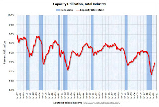 This graph shows Capacity Utilization. This series is up 9.4% from the record low set in June 2009 (the series starts in 1967).
 Capacity utilization at 73.7% is still far below normal - and 7.2% below the the pre-recession levels of 80.5% in November 2007.
Note: y-axis doesn't start at zero to better show the change.
Here is the Philadelphia Fed Index released this week: Business Outlook Survey.
 This graph shows the Philly index for the last 40 years.
The index has been positive for ten months now, but turned down "notably" in June.
This might suggest that growth in the manufacturing sector is slowing. Especially concerning is the slightly negative employment index.
 From the NAHB, framing lumber prices have collapsed since the end of April.
This graph shows two measures of lumber prices: 1) from Random Lengths (via NAHB), and 2) CME futures.
With so many mills shut down during the bust, the supply of lumber was way down - and prices surged early this year with a slight increase in construction activity. Now that construction has slowed - at the same time mills were coming back online (more supply) - prices have collapsed.
Note: the oil gusher continues ...
Best wishes to all.
On Fannie and Freddie REO Inventory
by Calculated Risk on 6/20/2010 08:36:00 AM
Binyamin Appelbaum writes in the New York Times: Cost of Seizing Fannie and Freddie Surges for Taxpayers
Fannie Mae and Freddie Mac took over a foreclosed home roughly every 90 seconds during the first three months of the year. They owned 163,828 houses at the end of March, a virtual city with more houses than Seattle. The mortgage finance companies, created by Congress to help Americans buy homes, have become two of the nation’s largest landlords.The REO inventory of Fannie and Freddie (and the FHA) are increasing rapidly, but this is only a portion of the total REO inventory. The worst loans were made outside of Fannie and Freddie.
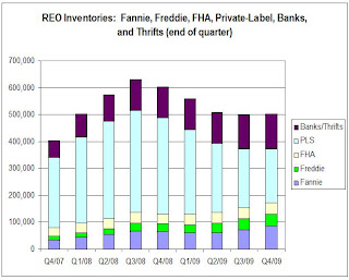
This graph shows the increase in Fannie, Freddie and FHA REOs through Q1 2010.
 Click on graph for larger image in new window.
Even with all the delays in foreclosure, the REO inventory has increased sharply over the last three quarters, from 135,868 at the end of Q2 2009, to 153,007 in Q3 2009, 172,357 at the end of Q4 2009 and now 209,500 at the end of Q4 2010.
These are new records for all three agencies.
However private label securities and banks and thrifts hold an even larger number of REOs. For more, see Tom Lawler's earlier post: REO: Agencies vs. Private Label and from James Hagerty at the WSJ in March writing about a Barclays Capital report: Supply of Foreclosed Homes on the Rise Again.
Here is the graph Tom Lawler constructed for REOs at the end of Q4 2009:
 Tom wrote:
 Putting the Fannie, Freddie, FHA, and private-label data (with the latter “grossed up” assuming LP covers 85% of the market) together; making a crude assumption of units of REO at banks and thrifts (and grossing the total up to reflect non-FDIC institutions), here is a crude look at the path of REO inventories by quarter from the end of 2007 through the end of 2009. These estimates would NOT be the full market, of course, but the general pattern would probably reflect the overall market.Although this graph is only through Q4 2009, notice that the Fannie, Freddie and FHA REO are just a small part of the total!
The major problem were the loans outside of Fannie and Freddie. From Tanta in 2008:
I think we can give Fannie and Freddie their due share of responsibility for the mess we're in, while acknowledging that they were nowhere near the biggest culprits in the recent credit bubble. They may finance most of the home loans in America, but most of the home loans in America aren't the problem; the problem is that very substantial slice of home loans that went outside the Fannie and Freddie box.Of course now Fannie, Freddie and FHA are almost the entire market, and unfortunately most of the bad loans being made today are insured by the FHA - but that is a different story.


