 RSS Feed
 by Calculated Risk on 4/15/2010 08:54:00 AM
Thursday, April 15, 2010
RealtyTrac: March Foreclosure Activity Highest on Record
From RealtyTrac: Foreclosure Activity Increases 7 Percent in First Quarter
RealtyTrac® ... today released its U.S. Foreclosure Market Report™ for Q1 2010, which shows that foreclosure filings — default notices, scheduled auctions and bank repossessions — were reported on 932,234 properties in the first quarter, a 7 percent increase from the previous quarter and a 16 percent increase from the first quarter of 2009. One in every 138 U.S. housing units received a foreclosure filing during the quarter.This is the highest monthly total - and highest quarterly total - since RealtyTrac started tracking foreclosures in 2005 (and that probably means this is the highest ever). Note that the initial stage filings (Notice of Default and Lis Pendens depending on the state) were flat with Q1 2009, but that later stage filings (of Trustee Sale and Notice of Foreclosure Sale and repossessions) surged:
Foreclosure filings were reported on 367,056 properties in March, an increase of nearly 19 percent from the previous month, an increase of nearly 8 percent from March 2009 and the highest monthly total since RealtyTrac began issuing its report in January 2005.
“Foreclosure activity in the first quarter of 2010 followed a very similar pattern to what we saw in the first quarter of 2009: a shallow trough in January and February followed by a substantial spike in March,” said James J. Saccacio, chief executive officer of RealtyTrac. “One difference, however, is that the increases were more tilted toward the final stage of foreclosure, with REOs increasing 9 percent on a quarterly basis in the first quarter of 2010 compared to a 13 percent quarterly decrease in REOs in the first quarter of 2009.
“This subtle shift in the numbers pushed REOs to the highest quarterly total we’ve ever seen in our report and may be further evidence that lenders are starting to make a dent in the backlog of distressed inventory that has built up over the last year as foreclosure prevention programs and processing delays slowed down the normal foreclosure timeline.”
Foreclosure auctions were scheduled for the first time on a total of 369,491 properties during the quarter, the highest quarterly total for scheduled auctions in the history of the report. Scheduled auctions increased 12 percent from the previous quarter and were up 21 percent from the first quarter of 2009.It appears that the banks are starting to clear out the foreclosure backlog.
Bank repossessions (REOs) also hit a record high for the report in the first quarter, with a total of 257,944 properties repossessed by the lender during the quarter — an increase of 9 percent from the previous quarter and an increase of 35 percent from the first quarter of 2009.
Weekly Initial Unemployment Claims Increase to 484,000
by Calculated Risk on 4/15/2010 08:34:00 AM
The DOL reports on weekly unemployment insurance claims:
In the week ending April 10, the advance figure for seasonally adjusted initial claims was 484,000, an increase of 24,000 from the previous week's unrevised figure of 460,000. The 4-week moving average was 457,750, an increase of 7,500 from the previous week's unrevised average of 450,250.
...
The advance number for seasonally adjusted insured unemployment during the week ending April 3 was 4,639,000, an increase of 73,000 from the preceding week's revised level of 4,566,000.
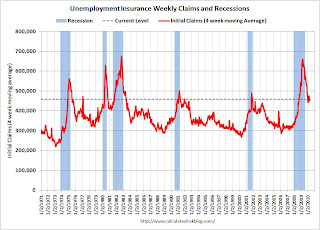 Click on graph for larger image in new window.
This graph shows the 4-week moving average of weekly claims since 1971.
The four-week average of weekly unemployment claims increased this week by 7,500 to 457,750.
The dashed line on the graph is the current 4-week average. The current level of 484,000 (and 4-week average of 457,750) is still high, and suggests continuing weakness in the jobs market. This is much worse than expected.
Wednesday, April 14, 2010
Lawler: BoA and Chase on Second Mortgages
by Calculated Risk on 4/14/2010 11:06:00 PM
The following report is from housing economist Tom Lawler:
In a House Financial Services Committee meeting today on “Second Liens and Other Barriers to Principal Reduction as an Effective Foreclosure Mitigation Program, spokespersons from BoA, Citi, JPMorgan Chase, and Wells Fargo explained the potential dangers of broad principal reductions, as well as tried to dismiss the silly claim that many second mortgages have “virtually no value” because so many borrowers with seconds have total mortgage balances at or exceeding the value of the home collateralizing those mortgages. Below are some observations on BoA’s and Chase’s testimony.
BoA provided a few interesting stats: of the 10.4 million first lien mortgages that it services, 15% of second mortgages owned by BoA, while 16% have second mortgages with other lenders. (Thus, 31% have second liens!).
BoA also said that about 90% of BoA’s owned second-lien mortgage portfolio is made up of “standalone originations used to finance a specific customer need, such as education expenses or home improvements, with “(t)he remainder consists of piggy back (combo) loans originated with the home purchase.” BoA made this point to highlight that the vast bulk of its second mortgage lending was collateralized consumer credit lending, where the borrower’s ability to pay was a major factor behind extending the credit.
Here is what BoA said about their second mortgage portfolio:
“Most of our second loans continue to have collateral value, and of those where the second loan is underwater, a significant number are still performing. Indeed, out of 2.2 million second liens in Bank of America’s held for investment portfolio – only 91,000 seconds – about four percent – are (i) delinquent, (ii) behind a delinquent first mortgage and (iii) not supported by any equity.”
BoA’s spokesperson vexed a number of investors in first-lien mortgages (or securities backed by such mortgages) by saying that in cases where the first and second are held by different investors, the “logic of 2MP” (the administrations second mortgage program) where “the holder of the second lien is required to forebear a similar percentage as the first lien holder” seems “equitable” to BoA – despite the subordinate nature of the second, and despite the fact that the 2MP program does not require second mortgage holders to forgive principal, even when the first mortgage holder does!
Here is what Chase said about its Home Equity (second) mortgage portfolio:
Chase owns about $131 billion in Home Equity loans and lines as of February 28, 2010.
• Approximately $25 billion are home equity loans and $106 billion are home equity lines of credit.And on the issue of broad-based principal reduction programs, as well as the “subordinate” nature of second mortgages, here is what Chase had to say:
• Approximately $33 billion are in first lien position and $98 billion in second lien position.
• 5% of Chase’s home equity portfolio is 30 days or more delinquent. Total home equity line, home equity loan, first lien and second lien delinquency rates are within two percentage points of the overall total.
• About 50% of the total Chase second lien portfolio is underwater, and 95% of this portfolio is performing (less than 60 days past due). 30% of second lien mortgages have combined loan-to-value ratios over 125% and 94% of this portfolio is performing.
• For $40 billion of Chase-owned second lien mortgages, Chase also services a first lien mortgage:• 92% of these first lien mortgages are performing.• About 10% of Chase’s total serviced portfolio of first lien mortgage loans has a Chase-owned second lien.
• 28% of these first lien mortgages are by themselves underwater (loan- to-value ratio of over 100%).
• 45% of first lien mortgages have a combined loan- to-value ratio of over 100%.
• Our best estimate is that about 20% of Chase serviced first lien mortgages may have a second lien from another lender and about 70% do not have a second lien.
“We do think that large scale, broad–based principal reduction programs raise serious policy concerns, for both first and second lien mortgage loans, and particularly for current borrowers with an ability to repay their obligations. In Chase’s view, such programs could be potentially very harmful to consumers, investors and future mortgage market conditions – and should not be undertaken without first attempting other solutions, including more targeted modification efforts.
“Like all loans, mortgage contracts are based on a promise to repay money borrowed. Importantly, there is no provision in the mortgage contract, express or implied, that the lender will restore equity or reduce the repayment amount if the value of the collateral – be it a home, a car or a stock market investment – depreciates. If we re-write the mortgage contract retroactively to restore equity to any mortgage borrower because the value of his or her home declined, what responsible lender will take the equity risk of financing mortgages in the future? What responsible regulator would want lenders to take such risk?
“We are also concerned that broad-based principal reduction could result in reduced access to credit and higher costs for consumers if market risk to lenders and investors materially increases. Borrowers likely will be required to increase their down payments, credit criteria will be further tightened and risk premiums for mortgage credit will increase and get passed on to consumers. Less affluent borrowers would likely be harmed disproportionately.
“The benefits of a broad-based principal reduction program are to a large degree unknown and in Chase’s view, outweighed by the risks and the facts that we do know.”
And here is Chase on why many second loan portfolios are performing better than firsts, as well as the risks involved in broad-based principal reduction plans:
“Many borrowers remain current on their home equity loans because they want to honor their obligations and protect their credit. Our data show that 97% of borrowers in Chase’s $98 billion second lien portfolio are performing on their loans (less than 60 days past due). For second liens that have a cumulative loan-to-value ratio greater than 100%, 95% of borrowers are performing. Regardless of loan-to-value, as long as borrowers continue to do the right thing and fulfill their contractual obligations, second liens that are current and producing cash flow to investors have value."
“Additionally, a broad-based second-lien principal reduction plan would be forgiving past consumption by borrowers rather than housing investment. According to both internal Chase and Federal Reserve data, over 50% of borrowers used home equity loan proceeds for repayment of debt or personal consumption. No more than 15-20% used home equity proceeds to purchase a home. A broad-based program of principal reduction would be very expensive. To bring underwater borrowers “even” to a loan to value ratio of 100%, we estimate:
• It would have an industry-wide cost of $700 billion to $900 billion.And on the issue of LIEN priority, here is what Chase had to say:
• The cost to Fannie Mae, Freddie Mac and FHA alone would be in the neighborhood of $150 billion.
• The Federal Reserve and Department of Treasury would have additional exposure through their ownership interests and risk guarantees of AIG, GMAC, and other institutions.
• Mortgage lenders would incur a significant reduction in capital now, potentially impairing their ability to extend future credit – mortgage or otherwise.
• And if house prices decline further, the costs would be even higher, representing the implicit “put” at 100% CLTV. “
“It is important not to confuse payment priority with lien priority. In almost all scenarios, second lien holders have rights equal to a first lien holder with respect to a borrower’s cash flow. The same is true with respect to other secured or unsecured debt, such as credit cards or car loans. Generally, consumers can decide how they want to manage their monthly payments. In fact, almost 64% of borrowers who are 30-59 days delinquent on a first lien serviced by Chase are current on their second lien. It is only at liquidation or property disposition that first lien investors have priority.”
The banks’ testimony, of course, was in response to a letter from Barney Frank, who has been heavily lobbied (and influenced) by the Mortgage Investors Coalition to get second mortgage holders to write down their loans. In that letter Congressman Frank incorrectly argued that because many borrowers with second mortgages have total mortgage indebtedness that exceeds the value of their homes, these second mortgages “have no real economic value,” and he urged banks “in the strongest possible terms to take immediate steps to write down these second mortgages.”
Here, by the way, are some residential mortgage servicing statistics as of the end of last year for the top four mortgage servicers:
| 12/31/2009 | Delinquency Stats: Q4/09 | |||||
|---|---|---|---|---|---|---|
| Company Name | Number of Loans Serviced1 | 30-day | 60-day | 90+-day | In Foreclosure | Total Past Due |
| Bank of America | 14,011,029 | 3.4% | 1.7% | 6.5% | 3.3% | 14.8% |
| Wells Fargo | 12,168,836 | 2.4% | 1.2% | 3.5% | 1.9% | 9.0% |
| Chase | 9,689,312 | 3.0% | 1.4% | 4.6% | 3.2% | 12.2% |
| CitiMortgage, Inc. | 5,118,563 | 2.3% | 1.4% | 4.9% | 1.7% | 10.4% |
1 includes first liens and subordinate liens
These “mega” servicers were, through the economies of scale in processing payments, able to charge a pretty small fee to service loans and still make what appeared to be a decent amount of money. However, as problem loans mounted it became clear that the companies were woefully understaffed to deal with these problem loans effectively, leading to extremely poor loss mitigation efforts, poorly designed foreclosure prevention/modification programs.
All of these companies finally began materially increasing the size of their staffs devoted to troubled loan management, and the administration’s HAMP effort helped prompt them to do so by providing hefty premiums to servicers. However, it took companies quite a while to get staff and board and train them, as was clearly evidence in last year’s overall servicing performance.
NOTE: This was from housing economist Tom Lawler.
Iceland Bank "Black Report"
by Calculated Risk on 4/14/2010 08:16:00 PM
The English version of the Black Report on the Iceland bank failures was released today. It has it all - regulatory capture, oblivious politicians, shadow banking, loans to shareholders to buy shares and more. (ht Steinn)
Here is the website with the English version.
The following graph is from Chapter 21: Causes of the Collapse of the Icelandic Banks - Responsibility, Mistakes and Negligence Click on graph for larger image in new window
Here is an excerpt from the long report:
[This figure] shows the lending of the three big banks’ parent companies, classified by type of borrowers. The lending by the parent companies amounted usually to 50-60% of all lending by the banking groups from mid-2004. ... the largest and steadiest increase in lending was to holding companies on the one hand and to foreign parties on the other. The increase in lending to foreign parties was notably larger. The increase was especially big during the latter part of 2007. During the first part of 2007 the Icelandic banks increased their lending to foreign parties by 800 million EUR, to 8.3 billion EUR. During the latter part of that year, i.e. after the beginning of the international liquidity crisis in mid-summer 2007, the lending to foreign parties increased however by 11.4 billion EUR, to 20.7 billion EUR. Thereby, lending by the banks’ parent companies to foreign parties increased by more than 120% in just six months. As stated in Chapter 8, this increase was seen in all three banks, an increase of 5 billion in Kaupthing and 3 billion each in Landsbanki and Glitnir. The [Special Investigation Commission] (SIC) notes that this increased lending started at about the same time as the liquidity crisis in the international financial markets began. The increase was so substantial that it can be assumed that many of the new customers had turned to the Icelandic banks after other banks had made arrangements to reduce their lending and that these customers had therefore been refused service by other banks.It sounds like the Icelandic banks were making bad loans right at the wrong time.
One of the key problems identified in the report is "weak equity". Although some of these arrangment were complicated, basically the bank would loan money to an owner who would buy shares in the bank - and use those shares as collateral for the loan. This boosted the apparent capital, and allowed the bank to lend more money. Amazing.
The largest owners of all the big banks had abnormally easy access to credit at the banks they owned, apparently in their capacity as owners.Geesh - that reminds me of Enron.
...
The banks had invested their funds in their own shares. Share capital, financed by the company itself, is not the protection against loss it is intended to be. Here this is referred to as “weak equity”. Weak equity in the three banks amounted to about ISK 300 billion by mid year 2008. At the same time, the capital base of the banks was about ISK 1,186 billion in total. Weak equity, therefore, represented more than 25% of the banks’ capital base. If only the core component of the capital base is examined, i.e. shareholders’ equity, according to the annual accounts, less intangible assets, the weak equity of the three banks amounted to more than 50% of the core component in mid year 2008.
Here is the executive summary for a quick read.
HAMP March Data
by Calculated Risk on 4/14/2010 05:45:00 PM
From Treasury: Administration Releases March Loan Modification Report
 |
About 228,000 modifications are now "permanent", and 155,000 trial modification cancelled. There is still a huge number of borrowers in limbo. If we add the 228,000 permanent mods, plus 155,000 cancelled, and the 108,000 pending permanent mods that is only 491,000 borrowers - there were 825,000 borrowers in the program as of last November. So there are another 334,000 borrowers in modification limbo.
Here is the report. See here for a list of reports.
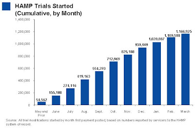 |
The second graph shows the cumulative HAMP trial programs started.
Notice that the pace of new trial modifications has slowed sharply from over 150,000 in September to around 57,000 in March 2010. This is slowest pace since May 2009 and is probably because of two factors: 1) servicers are now pre-qualifying borrowers, and 2) servicers are running out of eligible borrowers.
Debt-to-income ratios worsen
If we look at the HAMP program stats (see page 6), the median front end DTI (debt to income) before modification was 44.8% - down slightly from 45% last month. And the back end DTI was an astounding 77.5% (up from 76.4% last month).
Just imagine the characteristics of the borrowers who can't be converted!
No wonder the re-default rate is high ... from David Streitfeld at the NY Times: Defaults Rise in Loan Modification Program
The number of homeowners who secured cheaper mortgages through the government’s modification program only to default again nearly doubled in March, continuing a worrisome trend that threatens to undermine the entire program.In summary: 1) the program is slowing, 2) the borrowers DTI characteristics are poor - and getting worse, and 3) the re-default rate is rising. Oh, and 4) there are a large number of borrowers in modification limbo.
Treasury Department data released Wednesday showed that 2,879 loans that were permanently modified have defaulted since the program’s inception in the fall, up from 1,499 in February and 1,005 in January.
Rail Traffic increases in March
by Calculated Risk on 4/14/2010 03:28:00 PM
From the Association of American Railroads: Rail Time Indicators. The AAR reports traffic in March 2010 was up 7.5% compared to March 2009 - the first year-over-year increase since July 2008 - although traffic was still 11.5% lower than in March 2008.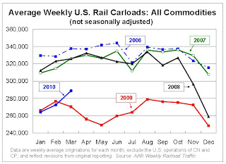 Click on graph for larger image in new window.
This graph shows U.S. average weekly rail carloads. Traffic increased in 16 of the 19 major commodity categories YoY.
From AAR:
• On a non-seasonally adjusted basis, U.S. freight railroads originated 1,443,967 carloads in March 2010, up 7.5% (100,624 carloads) from March2009 and the first year-over-year increase since July 2008(see chart)The graph above shows that rail traffic collapsed in November 2008, and now nine months into the recovery, traffic hasn't even recovered half way. This is clearly not a "V-shaped" recovery - this is far more moderate and sluggish (although the pickup in March traffic was sharp).
• On a seasonally adjusted basis, U.S. carloads in March 2010 were up 3.9% from February 2010.
• Note, though, that carloads in March 2010 were still 11.5% lower than they were in March 2008, and in all 19 commodity categories carloads were lower in March 2010 than they were in March 2008. Railroads need many more monthly increases to get back to where they were prior to the downturn.
excerpts with permission
 The second graph from the AAR report shows lumber rail traffic compared to U.S. housing starts.
From the AAR:
Seasonally-adjusted housing starts fell 5.9% in February 2010 to an annualized 575,000 from a revised 611,000 in January 2010. February 2010’s housing starts were almost the same as they were in February 2009. The bottom line is that the housing recession that’s now more than four years old shows no sign of ending.Residential investment is moving sideways with no recovery in sight.
Fed's Beige Book: Economic activity increased "somewhat"
by Calculated Risk on 4/14/2010 01:59:00 PM
From the Federal Reserve: Beige book
Overall economic activity increased somewhat since the last report across all Federal Reserve Districts except St. Louis, which reported "softened" economic conditions. Districts generally reported increases in retail sales and vehicle sales.On Real Estate:
Residential real estate activity increased, albeit from low levels, in most Districts, with the exceptions of St. Louis, where it was mixed, and San Francisco, where it was flat. Contacts in Philadelphia, Cleveland and Kansas City expressed concern about whether sales would continue to grow after the expiration of the first-time home buyer tax credit. New York, Kansas City, Dallas and San Francisco noted sluggish sales for high-end homes. Home prices were stable across most Districts, but decreased in parts of the New York and Atlanta Districts. Residential construction activity increased slightly in New York, Atlanta, St. Louis, Minneapolis and Dallas, but remained weak in Cleveland, Chicago and San Francisco.
Commercial real estate activity was slow across the nation. Notable exceptions were Richmond, which saw an uptick in commercial leasing, and Dallas, where the sector was mixed and might be nearing bottom. In Boston, leasing activity consists largely of renewals, with many renewing tenants leasing less space. Manhattan Class A office rents were down 20 percent to 25 percent year over year. Contacts in Philadelphia, Richmond, Kansas City and Dallas expressed concern that lease concessions from landlords were putting downward pressure on rents. Commercial construction continued to be weak in most Districts. Cleveland saw some development in the energy and industrial segments.
San Diego: A "Surge" in Foreclosures
by Calculated Risk on 4/14/2010 11:39:00 AM
From Eric Wolff at the North County Times: Major lender signals surge in local foreclosures
Bank of America ... ramped up its foreclosure activity in March, sending hundreds of letters warning delinquent borrowers in the region that it could sell their homes at auction in as little as three weeks ... The bank said the increased activity was a natural consequence of borrowers running out of options.This fits with what Irvine Renter reported last month on the Irvine Housing Blog.
Analysts and real estate agents said the moves ... could signal a final reckoning for homeowners who have been protected by government programs for months or even years.
...
The notices went to 230 homeowners in North San Diego County, a 69 percent increase from February, and to 391 owners in Southwest Riverside County, up 67 percent from February.
By comparison, in March 2009, ReconTrust sent a total of 31 such letters to both regions combined
...
"We have reported recently that we anticipate a rise in foreclosure activity through the coming months as homeowners are unable to qualify for loan modifications, fall out of modification programs or go into delinquency due to the ongoing stress in the economy," [Richard Simon, a Bank of America spokesman] said.
Retail Sales increase sharply in March
by Calculated Risk on 4/14/2010 08:44:00 AM
On a monthly basis, retail sales increased 1.6% from February to March (seasonally adjusted, after revisions), and sales were up 7.6% from March 2009 (easy comparison).  Click on graph for larger image in new window.
This graph shows retail sales since 1992. This is monthly retail sales, seasonally adjusted (total and ex-gasoline).
The red line shows retail sales ex-gasoline and shows the increase in final demand ex-gasoline has been sluggish.
Retail sales are up 8.3% from the bottom, but still off 4.4% from the peak. The second graph shows the year-over-year change in retail sales (ex-gasoline) since 1993.
Retail sales ex-gasoline increased by 5.3% on a YoY basis (7.6% for all retail sales). The year-over-year comparisons are easy now since retail sales collapsed in late 2008. Retail sales bottomed in December 2008.
Here is the Census Bureau report:
The U.S. Census Bureau announced today that advance estimates of U.S. retail and food services sales for March, adjusted for seasonal variation and holiday and trading-day differences, but not for price changes, were $363.2 billion, an increase of 1.6 percent (±0.5%) from the previous month and 7.6 percent (±0.5%) above March 2009. Total sales for the January through March 2010 period were up 5.5 percent (±0.3%) from the same period a year ago. The January to February 2010 percent change was revised from +0.3 percent (±0.5%)* to +0.5 percent (±0.3%).This is a strong retail sales report.
MBA: Mortgage Applications Decrease as FHA Insurance Rates Increase
by Calculated Risk on 4/14/2010 07:51:00 AM
The MBA reports: Mortgage Applications Decrease in Latest MBA Weekly Survey
The Market Composite Index, a measure of mortgage loan application volume, decreased 9.6 percent on a seasonally adjusted basis from one week earlier. ...
"Applications for government mortgages dropped substantially last week, following the implementation of an increase in FHA mortgage insurance premiums," said Mike Fratantoni, MBA's Vice President of Research and Economics. "Applications for conventional mortgages also dropped last week, with refinance application volume continuing to drop following last week's jump in rates.”
The Refinance Index decreased 9.0 percent from the previous week, marking the index’s fifth consecutive decline. The seasonally adjusted Purchase Index decreased 10.5 percent from one week earlier. ...
The refinance share of mortgage activity increased to 58.9 percent of total applications from 58.7 percent the previous week. ...
The average contract interest rate for 30-year fixed-rate mortgages decreased to 5.17 percent from 5.31 percent, with points increasing to 0.91 from 0.64 (including the origination fee) for 80 percent loan-to-value (LTV) ratio loans.
 Click on graph for larger image in new window.
This graph shows the MBA Purchase Index and four week moving average since 1990.
If there is any increase in activity because of the expiration of the tax credit, it will probably be this month. I expect any increase this year to be less than the increase last year ...
Tuesday, April 13, 2010
Household Debt as a Percent of GDP
by Calculated Risk on 4/13/2010 07:37:00 PM
From Neil Irwin at the WaPo: Economic data don't point to boom times just yet
"There have always been Wall Street economists wanting to cheerlead the recovery, and quick to jump on any piece of news showing a great boom is around the corner," said Kenneth Rogoff, a Harvard economist. "The data so far are more consistent with a very moderate recovery."
There are a number of reasons that would be the case. American households are trying to reduce debt to stabilize finances. But they are doing so slowly, with total household debt at 94 percent of gross domestic product in the fourth quarter down just slightly from 96 percent when the recession began in late 2007.
...
"When you have a recession that's amplified by a deep financial crisis, the recovery is slower and more painful, much akin to recovering from a heart attack," said Rogoff ... "It just takes time. If you look at a typical recovery, we would be growing at 7 or 8 percent by now given the depth of our fall."
 Click on graph for larger image.
This graph, based on the Federal Reserve Flow of Funds data, shows household debt as a percent of GDP through Q4 2009 (note: I removed a few non-profit categories).
Note that the household debt problem is mostly a mortgage debt problem. Mortgage debt as a percent of GDP started really picking up in 2001 and 2002 and continued to increase sharply through 2006.
There was also a sharp increase in mortgage debt in the late '80s. That was partially associated with Tax Reform Act of 1986 that only allowed mortgage debt to be tax deductible, and excluded interest on all personal loans including credit card debt. There was also a smaller housing bubble in the late '80s that was associated with the increase in mortgage debt.
 The second graph shows the annual change in the percent of household mortgage debt.
 There was some increase in the late '90s associated with the booming economy and stock bubble wealth effect. But the real boom in mortgage debt started in the 2nd half of 2001 - and continued through 2006. This rapid increase in mortgage debt should have been a red flag for regulators.
Finally, on Rogoff's comment about "Wall Street economists wanting to cheerlead the recovery", there is an old saying on Wall Street for analysts: Bearish equals unemployed. Of course they are cheerleading!
DataQuick: SoCal house sales increase in March, "propped up" with FHA-insured loans
by Calculated Risk on 4/13/2010 03:06:00 PM
From DataQuick: More Incremental Gains for Southland Real Estate Market
A total of 20,476 new and resale homes sold in Los Angeles, Riverside, San Diego, Ventura, San Bernardino and Orange counties last month. That was up 33.3 percent from 15,359 in February, and up 5.0 percent from 19,506 in March 2009, according to MDA DataQuick of San Diego.The SoCal market is mostly first time homebuyers using FHA-insured loans, and investors paying cash. Note that foreclosure resales don't include short sales - so the 38.4% foreclosures is not all of the distressed sales (probably over 50% in SoCal).
...
“It’s a reflection of just how grim things got, that we’ve now had almost two years of sales gains and we’re still 18 percent below the sales average. ...” said John Walsh, MDA DataQuick president.
...
Foreclosure resales accounted for 38.4 percent of the resale market last month, down from 42.3 percent in February, and down from 54.8 percent a year ago. The all-time high was in February 2009 at 56.7 percent.
...
Meanwhile, Uncle Sam continues to prop up lending for many low-to mid-priced homes. Government-insured FHA loans, a popular choice among first-time buyers, accounted for 38.6 percent of all mortgages used to purchase Southland homes in March.
Absentee buyers – mostly investors and some second-home purchasers – bought 21.3 percent of the homes sold in March.
Buyers who appeared to have paid all cash – meaning there was no indication that a corresponding purchase loan was recorded – accounted for 27.1 percent of March sales. In February it was a revised 30.0 percent – an all-time high. The 22-year monthly average for Southland homes purchased with cash is 13.8 percent.
Kirsten Grind Blogging the WaMu Hearing
by Calculated Risk on 4/13/2010 01:06:00 PM
Kirsten Grind at the Puget Sound Business Journal is blogging from the WaMu hearing. How about this quote?
"My opinion is the OTS examiner in charge during the period of time I was there did an excellent job of finding and raising issues. Likewise, I found good performance from the FDIC examiner in charge. What I can't explain is why the superior in the agencies didn't take a tougher tone with banks, given the degree of negative findings. My experience with the OTS and OCC (Office of Comptroller of the Currency, another federal bank regulator) was completely different, so there seemed to be a tolerance there or political influence of senior management of those agencies that prevented them from taking more active stances — I mean, putting banks under letters of agreement and forcing change."We have seen this over and over. Every time the inspector general's office issues a report on a failed bank, the field examiners had correctly identified the problems - usually going back to 2003 or so - but no further action was taken.
James Vanasek, who was the former chief risk and credit officer of WaMu from 1999 to 2005
Vanasek is arguing this was possibly because of "political influence of senior management of those agencies" - the political appointees in charge. I've heard the same thing from examiners.
Ceridian-UCLA: Diesel fuel consumption increases in March
by Calculated Risk on 4/13/2010 11:43:00 AM
This is the new UCLA Anderson Forecast and Ceridian Corporation index using real-time diesel fuel consumption data: Pulse of Commerce IndexTM
Press Release: March PCI Increase Indicates U.S. Economy on 4 Percent Growth Track
Ceridian-UCLA Pulse of Commerce Index™ (PCI) by UCLA Anderson School of Management staged a healthy comeback in March, with the PCI growing by 1 percent, making up for February’s snowstorm-induced decline of 0.7 percent. The adjusted index grew from 107.4 to 108.5, continuing its climb from a recessionary low of 100.7 in June 2009. ... [T]he March PCI shows growth over the prior year period for the fourth consecutive month. This follows twenty-two consecutive months of year-over-year declines experienced prior to December 2009.
...
“The good news in March is that the economy is still recovering at a pace that should support job growth, although unfortunately not at a pace that will drive rapid improvement in the unemployment rate. GDP needs to grow at a 5 to 6 percent rate to drive meaningful change in unemployment,” said Ed Leamer, chief economist for the PCI.
For the first quarter of 2010, the PCI grew at an annualized rate of 9.7 percent, a solid gain but not enough to offset the declines of 14 percent and 16 percent suffered in the fourth quarter of 2008 and the first quarter of 2009. “In other words, we fell into the recession much more rapidly than we are climbing out of it,” Leamer said.
 Click on graph for larger image in new window.
This graph shows the index since January 1999 (monthly and 3 month average). There is significant variability month to month.
Note: This index appears to lead Industrial Production (IP), but there is a significant amount of monthly noise.
This is a new index and might be interesting to follow along with the Trucking and Railroad data.
Trade Deficit increases in February
by Calculated Risk on 4/13/2010 08:54:00 AM
The Census Bureau reports:
[T]otal February exports of $143.2 billion and imports of $182.9 billion resulted in a goods and services deficit of $39.7 billion, up from $37.0 billion in January, revised.
 Click on graph for larger image.
The first graph shows the monthly U.S. exports and imports in dollars through February 2010.
On a year-over-year basis, exports are up 14% and imports are up 20%. This is an easy comparison because of the collapse in trade at the end of 2008 and into early 2009. This is the first time since late 2008 that imports are up a greater percentage than imports on a YoY basis as export growth appears to have slowed.
The second graph shows the U.S. trade deficit, with and without petroleum, through February.
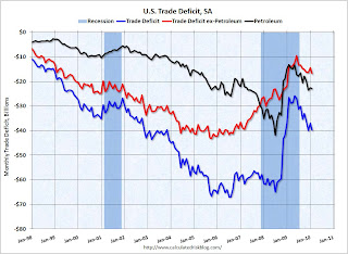 The blue line is the total deficit, and the black line is the petroleum deficit, and the red line is the trade deficit ex-petroleum products.
Import oil prices decreased slightly to $72.92 in February - but are up 86% from the low of one year ago in February 2009 (at $39.22). Oil import volumes declined in February.
In general trade has been increasing, although both imports and exports are still below the pre-financial crisis levels. Exports boosted the economy over the last year, however it now appears that export growth has slowed. Imports are still increasing even with the lower oil deficit in February.
Small Business Index Declines in March
by Calculated Risk on 4/13/2010 08:18:00 AM
From the National Federation of Independent Business: Small Business Optimism Declines in March
The National Federation of Independent Business Index of Small Business Optimism lost 1.2 points in March, falling to 86.8. The persistence of index readings below 90 is unprecedented in survey history.
“The March reading is very low and headed in the wrong direction,” said Bill Dunkelberg, NFIB chief economist. “Something isn’t sitting well with small business owners. Poor sales and uncertainty continue to overwhelm any other good news about the economy.”
...
After a devastating period of employment reductions, employment change per firm hit the “zero line” in March. .... While actual job reductions may have halted, plans to create new jobs remain weak. ... Only nine percent (seasonally adjusted) reported unfilled job openings, down two points and historically low, showing little hope for a lower unemployment rate.
Monday, April 12, 2010
Report: Commuting Costs offset Lower House Prices
by Calculated Risk on 4/12/2010 11:15:00 PM
Something a little different ...
From the Boston Globe: Travel swells cost of housing
People who move to an outlying Boston suburb to find affordable housing or to get more house for their money often sacrifice the savings to higher transportation costs, according to a study to be released today by a national planning and land-use organization.Here is the report on Boston:
The report, by the Urban Land Institute, is the first to quantify by community not only commuting costs, but the price of daily transportation around often-sprawling suburbs.
This report analyzes the combined costs of housing and transportation for neighborhoods, cities, and towns throughout a Boston regional study area that extends south to Providence, Rhode Island; west to Worcester, Massachusetts; and northeast to Dover, New Hampshire.When gasoline prices rose to over $4 per gallon in 2008, it really crushed some exurban areas that were already hard hit by the housing bust. The old saying "Drive to you qualify" doesn't really make sense if the transportation costs offset the lower house prices.
Our analysis finds that the typical household in the study area spends upwards of $22,000 annually on housing, which represents roughly 35 percent of the median household income ($68,036). With transportation costs for the typical household reaching nearly $12,000 annually, the combined costs of housing and transportation account for roughly 54 percent of the typical household’s income.
Similar studies conducted for the San Francisco Bay Area and the Washington, D.C., region have found average housing and transportation cost burdens of 59 percent and 47 percent, respectively.
WaMu Hearings Start Tomorrow
by Calculated Risk on 4/12/2010 05:50:00 PM
Jim Puzzanghera at the LA Times has a preview: Washington Mutual created 'mortgage time bomb,' Senate panel finds
Before Washington Mutual collapsed ... its executives knowingly created "a mortgage time bomb" by steering borrowers to subprime mortgages and turning the loans into securities the company knew were likely to go bad, one of the most extensive investigations into the causes of the financial crisis has found.More from the WSJ: Senate Probe Finds Washington Mutual Ignored Warnings
...
"At times, WaMu selected and securitized loans that it had identified as likely to go delinquent" or securitized loans in which the company had discovered fraudulent activity, such as misstated income, without disclosing the information to investors, the committee found. The company's pay practices exacerbated the problem by rewarding loan officers and processors based on how many mortgages they could churn out.
The documents to be disclosed on Tuesday also reflect that employees routinely fabricated lending documents. "One Sales Associate admitted that during that crunch time some of the Associates would 'manufacture' asset statements …and submit them to the" loan processing center, according to one document. "She said the pressure was tremendous ... since the loan had already [been] funded."The Inspectors General's report on WaMu will be issued on Friday - Sewell Chan at the NY Times reported Saturday: U.S. Faults Regulators Over a Bank
Regulators failed for years to properly supervise the giant savings and loan Washington Mutual, even as the company wobbled ... a federal investigation has concluded.A huge bank out of control and regulators ignoring the problem ... this is quite a story. And no surprise at all.
...
The report, prepared by the inspectors general for the Treasury Department and the Federal Deposit Insurance Corporation, is expected to be released Friday. A draft was obtained by The New York Times.
PIMCO's Simon on a Post-Fed MBS Market
by Calculated Risk on 4/12/2010 02:34:00 PM
Scott Simon, Managing Director at PIMCO Discusses a Post-Fed Mortgage-Backed Securities Market. A few excerpts:
We are unlikely to see a significant market disruption in the Agency market stemming from the Fed’s retreat. ... if and when we see mortgages cheapen, we expect to see private institutions stepping in to buy. Even a 15 basis point move could spark a flurry of buying. Therefore, we don’t expect a major widening of mortgage spreads ...And some Q&A:
Q: Could you elaborate more on who will fill the purchasing gap left by the Fed’s exit?And finally on housing:
Simon: Money managers and other institutions have been sitting on the sidelines for quite a while, but cash yields are essentially zero, making it very tempting to move out the risk and duration spectrum. This is exactly what the Fed has meant to do with a fed funds rate near zero – make it so that investors can’t stand to be in cash any more. For banks, it makes the spread between cash and Agency mortgages look more attractive, and for investors, it makes risk-adjusted yields on Agencies look competitive.
...
Q: Do you think it’s at all likely the Federal Reserve will reboot its MBS purchase program later this year or in 2011?
Simon: Probably not. Barring a major double dip in the economy or housing, private balance sheets have plenty of room to add Agency MBS (unlike in late 2008, when the Fed program began).
Q: Finally, let’s discuss housing more directly. When might we see a recovery?My comments: In the low price / high foreclosure bubble areas, I think house prices bottomed over a year ago because of the flood of foreclosure sales (Tom Lawler's "destickification"), however I think there will be further price declines in the mid-to-high end bubbles areas. This is where many of the next wave of distressed sales will be concentrated. My guess is this will push the national price indexes (Case-Shiller, LoanPerformance) to new lows later this year and probably into 2011. And then any recovery in prices will be very slow because distressed sales will remain elevated for some time.
Simon: We continue to believe that lower-priced homes bottomed last year. Higher-priced homes should bottom later this year. If one labels recovery as prices rising dramatically, we do not foresee that anytime soon.
Q: Do you think the government is done tinkering with housing sales and foreclosures?
Simon: The three issues that need addressing are: 1) negative equity, 2) unemployment and 3) second liens hindering loan modifications. Obama’s plan addresses these issues, but the devil is in the details. ...
And 2nd liens remain a huge stumbling block. Dakin Campbell and David Henry at Bloomberg had a story on 2nd liens and banks this morning: Bank Profits Dimmed by Prospect of Home-Equity Losses (ht Brian, Mike in Long Island, Clip)
Bank of America Corp., JPMorgan Chase & Co. and Wells Fargo & Co. may have to set aside an additional $30 billion to cover possible losses on home-equity loans, an amount almost equal to analysts’ estimates of profit at the three banks this year.Although the article is focused on write-downs for the banks, this also has implications for the housing market.
The cost of these reserves was calculated by CreditSights Inc., a New York-based research firm whose prediction almost four years ago proved prescient after banks reported unprecedented mortgage-related writedowns. Recognizing the home- equity loan losses is unfinished business from the housing bubble ...
The four biggest U.S. banks by assets -- Bank of America, JPMorgan, Citigroup Inc. and Wells Fargo -- hold about 42 percent, or $442 billion of the $1.1 trillion in second-lien mortgage loans, according to Amherst Securities Group LP, an Austin, Texas-based firm that analyzes home-loan assets.
Recession Measures
by Calculated Risk on 4/12/2010 11:59:00 AM
Calling the beginning or end of a recession takes time. The National Bureau of Economic Research (NBER) waits until the data is revised, and if the recovery is sluggish, this process can take from 18 months to two years or longer.
In addition, if the economy slides into recession again, the committee will only consider it a new recession if most major indicators were close to or above their previous highs. Otherwise it will just be considered a continuation of the previous recession.
A good example of the NBER calling two separate recessions was in the early '80s, from the NBER memo:
"The period following July 1980 will appear in the NBER chronology as an expansion. An important factor influencing that decision is that most major indicators, including real GNP, are already close to or above their previous highs."It will take some time for most major indicators to be above their previous high after the "great recession" because of the severe contraction as the graphs below show.
emphasis added
GDP is the key measure, as the NBER committee notes in their business cycle dating procedure:
The committee views real GDP as the single best measure of aggregate economic activity.This is actually two measures: 1) real GDP, and 2) real Gross Domestic Income (GDI). For a discussion on GDI, see from Fed economist Jeremy Nalewaik, “Income and Product Side Estimates of US Output Growth,” Brookings Papers on Economic Activity. An excerpt:
The U.S. produces two conceptually identical official measures of its economic output, currently called Gross Domestic Product (GDP) and Gross Domestic Income (GDI). These two measures have shown markedly different business cycle fluctuations over the past twenty five years, with GDI showing a more-pronounced cycle than GDP. These differences have become particularly glaring over the latest cyclical downturn, which appears considerably worse along several dimensions when looking at GDI. ...The NBER uses both real GDP and real GDI.
In discussing the information content of these two sets of estimates, the confusion often starts with the nomenclature. GDP can mean either the true output variable of interest, or an estimate of that output variable based on the expenditure approach. Since these are two very different things, using “GDP” for both is confusing. Furthermore, since GDI has a different name than GDP, it may not be initially clear that GDI measures the same concept as GDP, using the equally valid income approach.
Note: The following graphs are all constructed as a percent of the peak in each indicator. This shows when the indicator has bottomed - and when the indicator has returned to the level of the previous peak. If the indicator is at a new peak, the value is 100%. On all graphs the recent recession is marked as ending in July 2009 or Q3 2009 - this is preliminary and NOT an NBER determination. GDP is quarterly, the other data is monthly.
The first graph is for GDP and GDI:
 Click on graph for larger image in new window.
It appears that GDP bottomed in Q2 2009 and GDI in Q3 2009. This is the key measure, and the NBER will probably use GDP and GDI to determine the trough of the recession. Real GDP is only 2.0% below the pre-recession peak - and real GDP 2.7% below the previous peak - so both could be at new highs later this year or early in 2011, even with a sluggish recovery.
 The second graph is for monthly industrial production based on data from the Federal Reserve.
Industrial production bottomed in June 2009. The NBER will consider this measure when trying to identify the month the recession ended. Note that industrial production is still substantially below the pre-recession levels - so it might be some time before this measure is at or above earlier levels.
Now for some less optimistic measures the NBER uses ...
 The third graph is for employment. It appears the employment recession might have bottomed in February, but it will take a long time before this measure is at pre-recession levels.
 Historically employment was a coincident indicator for the end of recessions, but that hasn't been true for the previous two recessions (1990-1991 and 2001) and also will not be true for the "great recession" if the NBER determines an end date in July 2009.
If the NBER waits for employment to return to pre-recession levels, we might be waiting for an annoucement for a long time.
 And the last graph is for real personal income excluding transfer payments. This bottomed in Sept 2009, but has moved sideways since then. This shows the effect of the stimulus programs that boosted GDP and income - but not income less transfer payments.
This will be a key measure of a sustainable recovery, and once again it will take a long time to return to pre-recession levels.
These graphs are useful in trying to identify peaks and troughs in economic activity. My guess is the economy bottomed by most measure in Q3 2009 (probably July), but I don't expect an announcement from the NBER until the end of 2010 at the earliest - and perhaps well into 2011 or beyond.


