 RSS Feed
 by Calculated Risk on 1/04/2021 07:09:00 PM
Monday, January 04, 2021
January 4 COVID-19 Test Results; Record Hospitalizations
Note: It will take a week or so for the data to adjust for lack of reporting during the holidays. The week-over-week growth in positive cases slowed prior to the holidays. Hopefully that continues after the holidays.
The US is now averaging close to 2 million tests per day. Based on the experience of other countries, for adequate test-and-trace (and isolation) to reduce infections, the percent positive needs to be under 5% (probably close to 1%), so the US has far too many daily cases - and percent positive - to do effective test-and-trace.
There were 1,638,829 test results reported over the last 24 hours.
There were 177,669 positive tests.
Almost 8,000 US deaths have been reported so far in January. See the graph on US Daily Deaths here.
 Click on graph for larger image.
This data is from the COVID Tracking Project.
The percent positive over the last 24 hours was 10.8% (red line is 7 day average). The percent positive is calculated by dividing positive results by total tests (including pending).
And check out COVID Act Now to see how each state is doing. (updated link to new site)
 The second graph shows the 7 day average of positive tests reported and daily hospitalizations.
• Record Hospitalizations
Housing Inventory: Starting the Year at Record Lows
by Calculated Risk on 1/04/2021 04:57:00 PM
One of the key questions for 2021 is: Will inventory increase as the pandemic subsides, or will inventory decrease further in 2021?
Tracking inventory will be very important this year, and I'll be using some weekly sources.
 Click on graph for larger image in graph gallery.
This inventory graph is courtesy of Altos Research.
According to inventory is at 420 thousand (7 day average), compared to 764 thousand the same week a year ago.
Mike Simonsen discusses this data every Monday on Youtube. Mike focuses on inventory this week, and also discussed how many houses are being rented.
Mike Simonsen discusses this data every Monday on Youtube. Mike focuses on inventory this week, and also discussed how many houses are being rented.
Update: Framing Lumber Prices More Than Double Year-over-year
by Calculated Risk on 1/04/2021 12:07:00 PM
Here is another monthly update on framing lumber prices.
This graph shows CME framing futures through Jan 4th.
 Click on graph for larger image in graph gallery.
This is up 115% year-over-year - more than double.
There is a seasonal pattern for lumber prices, and usually prices will increase in the Spring, and peak around May, and then bottom around October or November - although there is quite a bit of seasonal variability.
Clearly there is another surge in demand for lumber.
Construction Spending Increased 0.9% in November
by Calculated Risk on 1/04/2021 10:13:00 AM
From the Census Bureau reported that overall construction spending increased:
Construction spending during November 2020 was estimated at a seasonally adjusted annual rate of $1,459.4 billion, 0.9 percent above the revised October estimate of $1,446.9 billion. The November figure is 3.8 percent above the November 2019 estimate of $1,405.5 billion.Private spending increased and public spending decreased:
emphasis added
Spending on private construction was at a seasonally adjusted annual rate of $1,111.8 billion, 1.2 percent above the revised October estimate of $1,098.6 billion. ...
In November, the estimated seasonally adjusted annual rate of public construction spending was $347.6 billion, 0.2 percent below the revised October estimate of $348.3 billion.
 Click on graph for larger image.
This graph shows private residential and nonresidential construction spending, and public spending, since 1993. Note: nominal dollars, not inflation adjusted.
Residential spending is 3% below the previous peak.
Non-residential spending is 9% above the previous peak in January 2008 (nominal dollars), but has been weak recently.
Public construction spending is 7% above the previous peak in March 2009, and 33% above the austerity low in February 2014.
 The second graph shows the year-over-year change in construction spending.
On a year-over-year basis, private residential construction spending is up 16.1%. Non-residential spending is down 9.5% year-over-year. Public spending is up 3.1% year-over-year.
Construction was considered an essential service in most areas and did not decline sharply like many other sectors, but it seems likely that non-residential, and public spending (depending on disaster relief), will be under pressure. For example, lodging is down 27% YoY, multi-retail down 21% YoY, and office down 7 YoY.
This was at consensus expectations of a 0.9% increase in spending, and construction spending for the previous two months was revised up slightly.
Seven High Frequency Indicators for the Economy
by Calculated Risk on 1/04/2021 08:43:00 AM
These indicators are mostly for travel and entertainment. It will interesting to watch these sectors recover as the vaccine is distributed.
IMPORTANT: Be safe now - if all goes well, we could all be vaccinated by Q2 2021.
----- Airlines: Transportation Security Administration -----
The TSA is providing daily travel numbers.
 Click on graph for larger image.
This data shows the seven day average of daily total traveler throughput from the TSA for 2019 (Blue) and 2020 (Red).
The dashed line is the percent of last year for the seven day average.
This data is as of January 3rd.
The seven day average is down 53.0% from last year (47.0% of last year). (Dashed line)
There has been a slow increase from the bottom, with ups and downs due to the Thanksgiving and Christmas holidays.
----- Restaurants: OpenTable -----
The second graph shows the 7 day average of the year-over-year change in diners as tabulated by OpenTable for the US and several selected cities.
 Thanks to OpenTable for providing this restaurant data:
This data is updated through January 2, 2020.
This data is "a sample of restaurants on the OpenTable network across all channels: online reservations, phone reservations, and walk-ins. For year-over-year comparisons by day, we compare to the same day of the week from the same week in the previous year."
Note that this data is for "only the restaurants that have chosen to reopen in a given market". Since some restaurants have not reopened, the actual year-over-year decline is worse than shown.
Dining picked up during the holidays. Note that dining is generally lower in the northern states - Illinois, Pennsylvania, and New York. Note that California dining is off sharply with the orders to close.
----- Movie Tickets: Box Office Mojo -----
 This data shows domestic box office for each week (red) and the maximum and minimum for the previous four years. Data is from BoxOfficeMojo through December 31st.
Note that the data is usually noisy week-to-week and depends on when blockbusters are released.
Movie ticket sales have picked up slightly over the last couple of months, and were at $28 million last week due to Wonder Woman 1984 (compared to usually around $400 million per week at this time of year).
----- Hotel Occupancy: STR -----
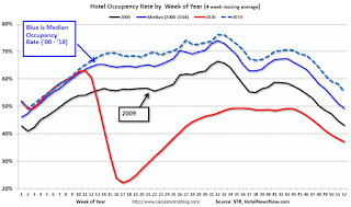 This graph shows the seasonal pattern for the hotel occupancy rate using the four week average.
The red line is for 2020, dash light blue is 2019, blue is the median, and black is for 2009 (the worst year since the Great Depression for hotels - prior to 2020).
This data is through December 26th. Hotel occupancy is currently down 33.0% year-over-year.
Notes: Y-axis doesn't start at zero to better show the seasonal change.
----- Gasoline Supplied: Energy Information Administration -----
 This graph, based on weekly data from the U.S. Energy Information Administration (EIA), shows gasoline supplied compared to the same week last year of .
At one point, gasoline supplied was off almost 50% YoY.
As of December 25th, gasoline supplied was off about 9.3% YoY (about 90.7% of last year).
Note: People driving instead of flying might have boosted gasoline consumption over the summer.
----- Transit: Apple Mobility -----
This graph is from Apple mobility. From Apple: "This data is generated by counting the number of requests made to Apple Maps for directions in select countries/regions, sub-regions, and cities." This is just a general guide - people that regularly commute probably don't ask for directions.
There is also some great data on mobility from the Dallas Fed Mobility and Engagement Index. However the index is set "relative to its weekday-specific average over January–February", and is not seasonally adjusted, so we can't tell if an increase in mobility is due to recovery or just the normal increase in the Spring and Summer.
 This data is through January 1st for the United States and several selected cities.
The graph is the running 7 day average to remove the impact of weekends.
IMPORTANT: All data is relative to January 13, 2020. This data is NOT Seasonally Adjusted. People walk and drive more when the weather is nice, so I'm just using the transit data.
According to the Apple data directions requests, public transit in the 7 day average for the US is at 43% of the January level. It is at 30% in Chicago, and 49% in Houston - and mostly trending down over the last few months (with dips on holidays like Thanksgiving and Christmas).
----- New York City Subway Usage -----
Here is some interesting data on New York subway usage (HT BR).
 This graph is from Todd W Schneider. This is weekly data for the last several years.
This data is through Friday, January 1st.
Schneider has graphs for each borough, and links to all the data sources.
He notes: "Data updates weekly from the MTA’s public turnstile data, usually on Saturday mornings".
The TSA is providing daily travel numbers.
 Click on graph for larger image.
This data shows the seven day average of daily total traveler throughput from the TSA for 2019 (Blue) and 2020 (Red).
The dashed line is the percent of last year for the seven day average.
This data is as of January 3rd.
The seven day average is down 53.0% from last year (47.0% of last year). (Dashed line)
There has been a slow increase from the bottom, with ups and downs due to the Thanksgiving and Christmas holidays.
The second graph shows the 7 day average of the year-over-year change in diners as tabulated by OpenTable for the US and several selected cities.
 Thanks to OpenTable for providing this restaurant data:
This data is updated through January 2, 2020.
This data is "a sample of restaurants on the OpenTable network across all channels: online reservations, phone reservations, and walk-ins. For year-over-year comparisons by day, we compare to the same day of the week from the same week in the previous year."
Note that this data is for "only the restaurants that have chosen to reopen in a given market". Since some restaurants have not reopened, the actual year-over-year decline is worse than shown.
Dining picked up during the holidays. Note that dining is generally lower in the northern states - Illinois, Pennsylvania, and New York. Note that California dining is off sharply with the orders to close.
 This data shows domestic box office for each week (red) and the maximum and minimum for the previous four years. Data is from BoxOfficeMojo through December 31st.
Note that the data is usually noisy week-to-week and depends on when blockbusters are released.
Movie ticket sales have picked up slightly over the last couple of months, and were at $28 million last week due to Wonder Woman 1984 (compared to usually around $400 million per week at this time of year).
 This graph shows the seasonal pattern for the hotel occupancy rate using the four week average.
 The red line is for 2020, dash light blue is 2019, blue is the median, and black is for 2009 (the worst year since the Great Depression for hotels - prior to 2020).
This data is through December 26th. Hotel occupancy is currently down 33.0% year-over-year.
Notes: Y-axis doesn't start at zero to better show the seasonal change.
 This graph, based on weekly data from the U.S. Energy Information Administration (EIA), shows gasoline supplied compared to the same week last year of .
At one point, gasoline supplied was off almost 50% YoY.
As of December 25th, gasoline supplied was off about 9.3% YoY (about 90.7% of last year).
Note: People driving instead of flying might have boosted gasoline consumption over the summer.
This graph is from Apple mobility. From Apple: "This data is generated by counting the number of requests made to Apple Maps for directions in select countries/regions, sub-regions, and cities." This is just a general guide - people that regularly commute probably don't ask for directions.
There is also some great data on mobility from the Dallas Fed Mobility and Engagement Index. However the index is set "relative to its weekday-specific average over January–February", and is not seasonally adjusted, so we can't tell if an increase in mobility is due to recovery or just the normal increase in the Spring and Summer.
 This data is through January 1st for the United States and several selected cities.
The graph is the running 7 day average to remove the impact of weekends.
IMPORTANT: All data is relative to January 13, 2020. This data is NOT Seasonally Adjusted. People walk and drive more when the weather is nice, so I'm just using the transit data.
According to the Apple data directions requests, public transit in the 7 day average for the US is at 43% of the January level. It is at 30% in Chicago, and 49% in Houston - and mostly trending down over the last few months (with dips on holidays like Thanksgiving and Christmas).
Here is some interesting data on New York subway usage (HT BR).
 This graph is from Todd W Schneider. This is weekly data for the last several years.
This data is through Friday, January 1st.
Schneider has graphs for each borough, and links to all the data sources.
He notes: "Data updates weekly from the MTA’s public turnstile data, usually on Saturday mornings".
Sunday, January 03, 2021
Sunday Night Futures
by Calculated Risk on 1/03/2021 07:22:00 PM
Weekend:
• Schedule for Week of January 3, 2021
• Question #1 for 2021: How much will the economy grow in 2021?
• Question #2 for 2021: Will all the jobs lost in 2020 return in 2021, or will job growth be sluggish?
• Question #3 for 2021: What will the unemployment rate be in December 2021?
• Question #4 for 2021: Will the overall participation rate increase to pre-pandemic levels (63.4% in February 2020) , or will it will only partially recover in 2021?
• Question #5 for 2021: Will the core inflation rate increase in 2021? Will too much inflation be a concern in 2021?
• Question #6 for 2021: Will the Fed raise rates in 2021? What about the asset purchase program?
• Question #7 for 2021: How much will RI increase in 2021? How about housing starts and new home sales in 2021?
• Question #8 for 2021: What will happen with house prices in 2021?
• Question #9 for 2021: Will inventory increase as the pandemic subsides, or will inventory decrease further in 2021?
• Question #10 for 2021: How much damage did the pandemic do to certain sectors?
Monday:
• At 10:00 AM: Construction Spending for November. The consensus is for a 0.9% increase in construction spending.
• All day: Light vehicle sales for December. Sales were at 15.55 million in November (Seasonally Adjusted Annual Rate).
From CNBC: Pre-Market Data and Bloomberg futures S&P 500 and DOW futures are down slightly (fair value).
Oil prices were up over the last week with WTI futures at $48.42 per barrel and Brent at $51.73 barrel. A year ago, WTI was at $63, and Brent was at $69 - so WTI oil prices are down over 20% year-over-year.
Here is a graph from Gasbuddy.com for nationwide gasoline prices. Nationally prices are at $2.25 per gallon. A year ago prices were at $2.57 per gallon, so gasoline prices are down $0.32 per gallon year-over-year.
January 3 COVID-19 Test Results; Record Hospitalizations
by Calculated Risk on 1/03/2021 07:08:00 PM
Note: It will take a week or so for the data to adjust for lack of reporting during the holidays. Several states didn't report today. The week-over-week growth in positive cases slowed prior to the holidays. Hopefully that continues after the holidays.
The US is now averaging close to 2 million tests per day. Based on the experience of other countries, for adequate test-and-trace (and isolation) to reduce infections, the percent positive needs to be under 5% (probably close to 1%), so the US has far too many daily cases - and percent positive - to do effective test-and-trace.
There were 1,424,180 test results reported over the last 24 hours.
There were 204,805 positive tests.
Over 6,000 US deaths have been reported so far in January. See the graph on US Daily Deaths here.
 Click on graph for larger image.
This data is from the COVID Tracking Project.
The percent positive over the last 24 hours was 14.4% (red line is 7 day average). The percent positive is calculated by dividing positive results by total tests (including pending).
And check out COVID Act Now to see how each state is doing. (updated link to new site)
 The second graph shows the 7 day average of positive tests reported and daily hospitalizations.
• Record Hospitalizations
Four Bank Failures in 2020
by Calculated Risk on 1/03/2021 12:43:00 PM
There were four bank failures in 2020. This was the same number as in 2019. The median number of failures since the FDIC was established in 1933 was 7 - so 4 failures in 2020 was below the median.
The great recession / housing bust / financial crisis related failures have been behind us for several years.
The first graph shows the number of bank failures per year since the FDIC was founded in 1933.
 Click on graph for larger image.
Typically about 7 banks fail per year.
Note: There were a large number of failures in the '80s and early '90s. Many of these failures were related to loose lending, especially for commercial real estate. Also, a large number of the failures in the '80s and '90s were in Texas with loose regulation.
Even though there were more failures in the '80s and early '90s than during the financial crisis, the financial crisis was much worse (larger banks failed and were bailed out).
 The second graph includes pre-FDIC failures. In a typical year - before the Depression - 500 banks would fail and the depositors would lose a large portion of their savings.
Then, during the Depression, thousands of banks failed. Note that the S&L crisis and recent financial crisis look small on this graph.
Q4 2020 Update: Unofficial Problem Bank list Increased to 65 Institutions
by Calculated Risk on 1/03/2021 10:16:00 AM
The FDIC's official problem bank list is comprised of banks with a CAMELS rating of 4 or 5, and the list is not made public (just the number of banks and assets every quarter). Note: Bank CAMELS ratings are also not made public.
CAMELS is the FDIC rating system, and stands for Capital adequacy, Asset quality, Management, Earnings, Liquidity and Sensitivity to market risk. The scale is from 1 to 5, with 1 being the strongest.
As a substitute for the CAMELS ratings, surferdude808 is using publicly announced formal enforcement actions, and also media reports and company announcements that suggest to us an enforcement action is likely, to compile a list of possible problem banks in the public interest.
DISCLAIMER: This is an unofficial list, the information is from public sources only, and while deemed to be reliable is not guaranteed. No warranty or representation, expressed or implied, is made as to the accuracy of the information contained herein and same is subject to errors and omissions. This is not intended as investment advice. Please contact CR with any errors.
Here is the unofficial problem bank list for Q4 2020.
Here are the monthly changes and a few comments from surferdude808:
Update on the Unofficial Problem Bank List through December 31, 2020. Since the last update at the end of October 2020, the list increased by one to 65 institutions after one addition. Assets increased by $1.5 billion to $58.2 billion, with $1.3 billion of the increase from updated asset figures through September 30, 2020. A year ago, the list held 67 institutions with assets of $51.1 billion. Added this month was the Business Bank of Texas, N.A., Austin, TX ($115 million). On December 1, 2020, the FDIC released third quarter results and an update on the Official Problem Bank List. In that release, the FDIC said there were 56 institutions with assets of $53.9 billion on the official list, up from 52 institutions with assets of $48.1 billion at the second quarter of 2020.
With the conclusion of the fourth quarter, we bring an updated transition matrix to detail how banks are transitioning off the Unofficial Problem Bank List. Since we first published the Unofficial Problem Bank List on August 7, 2009 with 389 institutions, 1,768 institutions have appeared on a weekly or monthly list since then. Only 3.7 percent of the banks that have appeared on a list remain today as 1,703 institutions have transitioned through the list. Departure methods include 1,003 action terminations, 411 failures, 270 mergers, and 19 voluntary liquidations. Of the 389 institutions on the first published list, only 3 or less than 1.0 percent, still have a troubled designation more than ten years later. The 411 failures represent 23.2 percent of the 1,768 institutions that have made an appearance on the list. This failure rate is well above the 10-12 percent rate frequently cited in media reports on the failure rate of banks on the FDIC's official list.
Saturday, January 02, 2021
January 2 COVID-19 Test Results
by Calculated Risk on 1/02/2021 07:35:00 PM
Note: It will take a week or so for the data to adjust for lack of reporting during the holidays. The week-over-week growth in positive cases slowed prior to the holidays. Hopefully that continues after the holidays.
The US is now averaging close to 2 million tests per day. Based on the experience of other countries, for adequate test-and-trace (and isolation) to reduce infections, the percent positive needs to be under 5% (probably close to 1%), so the US has far too many daily cases - and percent positive - to do effective test-and-trace.
There were 2,062,082 test results reported over the last 24 hours.
There were 275,897 positive tests.
Almost 5,000 US deaths have been reported so far in January. See the graph on US Daily Deaths here.
 Click on graph for larger image.
This data is from the COVID Tracking Project.
The percent positive over the last 24 hours was 13.4% (red line is 7 day average). The percent positive is calculated by dividing positive results by total tests (including pending).
And check out COVID Act Now to see how each state is doing. (updated link to new site)
 The second graph shows the 7 day average of positive tests reported and daily hospitalizations.


