by Calculated Risk on 6/06/2014 10:10:00 AM
Friday, June 06, 2014
Comment: U.S. Employment at All Time High
First, I promised the headline for this post last week!
Second, this means I'll be retiring the graph many called the "scariest jobs chart ever" (first graph in previous post).
Earlier: May Employment Report: 217,000 Jobs, 6.3% Unemployment Rate
Now some numbers: Through the first five months of 2014, the economy has added 1,068,000 payroll jobs - slightly better than during the same period in 2013 even with the severe weather early this year. (For comparison, there were 1,020,000 payroll jobs added during the first five months of 2013). My expectation at the beginning of the year was the economy would add between 2.4 and 2.7 million payroll jobs this year, and that still looks about right.
Here is a table of the annual change in total nonfarm and private sector payrolls jobs since 1999. The last three years have been near the best since 1999 (2005 was the best year for total nonfarm, and 2011 the best for private jobs).
It is possible that 2014 will be the best year since 1999 for both total nonfarm and private sector employment.
| Change in Payroll Jobs per Year (000s) | ||
|---|---|---|
| Total, Nonfarm | Private | |
| 1999 | 3,177 | 2,716 |
| 2000 | 1,946 | 1,682 |
| 2001 | -1,735 | -2,286 |
| 2002 | -508 | -741 |
| 2003 | 105 | 147 |
| 2004 | 2,033 | 1,886 |
| 2005 | 2,506 | 2,320 |
| 2006 | 2,085 | 1,876 |
| 2007 | 1,140 | 852 |
| 2008 | -3,576 | -3,756 |
| 2009 | -5,087 | -5,013 |
| 2010 | 1,058 | 1,277 |
| 2011 | 2,083 | 2,400 |
| 2012 | 2,236 | 2,294 |
| 2013 | 2,331 | 2,365 |
| 20141 | 2,563 | 2,527 |
| 1 2014 is current pace annualized (through May). | ||
Also employment has reached another milestone: total employment is now 98,000 above the previous peak, and and at a new all time high in May. Of course the labor force has continued to increase over the last 6+ years, and there are still millions of workers unemployed - so the economy still has a long way to go.
Note: Private payroll employment increased 216,000 in May and private employment is now 617,000 above the previous peak (the unprecedented large number of government layoffs has held back total employment).
Overall this was another solid employment report.
Employment-Population Ratio, 25 to 54 years old
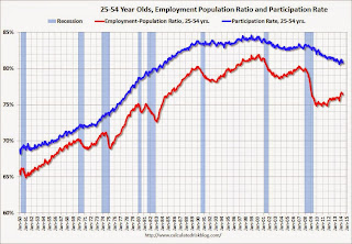 Since the overall participation rate declined recently due to cyclical (recession) and demographic (aging population, younger people staying in school) reasons, an important graph is the employment-population ratio for the key working age group: 25 to 54 years old.
In the earlier period the participation rate for this group was trending up as women joined the labor force. Since the early '90s, the participation rate has mostly moved sideways (with a downward drift started around '00) - and with ups and downs related to the business cycle.
The 25 to 54 participation rate was unchanged in May at 80.8%, and the 25 to 54 employment population ratio decreased to 76.4% from 76.5%. As the recovery continues, I expect the participation rate for this group to increase.
Percent Job Losses During Recessions

This graph shows the job losses from the start of the employment recession, in percentage terms - this time aligned at maximum job losses. Employment is now back above pre-recession levels and this graph will be retired until the next recession (Of course this doesn't include population growth).
In the earlier post, the graph showed the job losses aligned at the start of the employment recession.
Part Time for Economic Reasons
 From the BLS report:
The number of persons employed part time for economic reasons (sometimes referred to as involuntary part-time workers), at 7.3 million, changed little in May. These individuals were working part time because their hours had been cut back or because they were unable to find a full-time job.The number of persons working part time for economic reasons declined in May to 7.269 million from 7.465 million in April. This suggests significantly slack still in the labor market. These workers are included in the alternate measure of labor underutilization (U-6) that decreased to 12.2% in May from 12.3% in April. This is the lowest level for U-6 since October 2008.
Unemployed over 26 Weeks
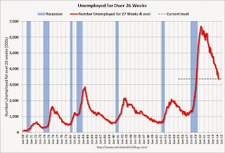 This graph shows the number of workers unemployed for 27 weeks or more.
 According to the BLS, there are 3.374 million workers who have been unemployed for more than 26 weeks and still want a job. This was down from 3.452 in April. This is trending down, but is still very high. This is the lowest level for long term unemployed since March 2009.
Long term unemployment remains one of the key labor problems in the US.
State and Local Government
 This graph shows total state and government payroll employment since January 2007. State and local governments lost jobs for four straight years. (Note: Scale doesn't start at zero to better show the change.)
 In May 2014, state and local governments added 6,000 jobs. State and local government employment is now up 107,000 from the bottom, but still 637,000 below the peak.
It appears state and local employment employment is now increasing. Of course Federal government layoffs are ongoing (another 5,000 jobs lost in May).
May Employment Report: 217,000 Jobs, 6.3% Unemployment Rate
by Calculated Risk on 6/06/2014 08:30:00 AM
From the BLS:
Total nonfarm payroll employment rose by 217,000 in May, and the unemployment rate was unchanged at 6.3 percent, the U.S. Bureau of Labor Statistics reported today.
...
After revision, the change in total nonfarm employment for March remained +203,000, and the change for April was revised from +288,000 to +282,000. With these revisions, employment gains in March and April were 6,000 lower than previously reported.
 Click on graph for larger image.
The headline number was at expectations of 213,000 payroll jobs added.
The first graph shows the job losses from the start of the employment recession, in percentage terms, compared to previous post WWII recessions. The dotted line is ex-Census hiring.
This shows the depth of the recent employment recession - worse than any other post-war recession - and the relatively slow recovery due to the lingering effects of the housing bust and financial crisis.

Total employment is now 98 thousand above the pre-recession peak and at an all time high. It is probably time to retire this graph - until the next recession.
NOTE: The second graph is the change in payroll jobs ex-Census - meaning the impact of the decennial Census temporary hires and layoffs is removed to show the underlying payroll changes.
The third graph shows the employment population ratio and the participation rate.
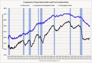 The Labor Force Participation Rate was unchanged in May at 62.8%. This is the percentage of the working age population in the labor force. A large portion of the recent decline in the participation rate is due to demographics.
The Employment-Population ratio was unchanged in May at 58.9% (black line).
I'll post the 25 to 54 age group employment-population ratio graph later.
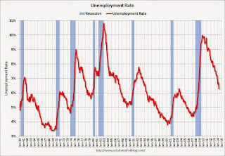 The fourth graph shows the unemployment rate.
 The unemployment rate was unchanged in May at 6.3%.
This was a solid employment report, and total non-farm employment is now at a new all time high.
I'll have much more later ...
Thursday, June 05, 2014
Friday: Jobs, Jobs, Jobs
by Calculated Risk on 6/05/2014 09:47:00 PM
Some great graphs from Nick Timiraos at the WSJ: Mortgage Rates Are Falling, So Where Are the Home Buyers?
True, mortgage rates are low—as low as they’ve been in almost 12 months. But in the same way that shoppers may not be lured by “low prices” at a department store that is always advertising a sale, mortgage rates at 4.1% may not be seen as a steal by buyers who lived with rates that were even lower for all of 2012 and the first half of 2013—especially considering that prices have moved higher.Check out the graphs!
Friday:
• At 8:30 AM ET, the Employment Report for May. The consensus is for an increase of 213,000 non-farm payroll jobs in May, down from the 288,000 non-farm payroll jobs added in April. The consensus is for the unemployment rate to increase to 6.4% in May. There are 406 thousand more private sector jobs now than when the recession started in 2007, but total employment is still 113 thousand below the pre-recession peak.
• At 3:00 PM, Consumer Credit for April from the Federal Reserve. The consensus is for credit to increase $15.5 billion.
Mortgage Equity Withdrawal Still Negative in Q1 2014
by Calculated Risk on 6/05/2014 06:55:00 PM
Note: This is not Mortgage Equity Withdrawal (MEW) data from the Fed. The last MEW data from Fed economist Dr. Kennedy was for Q4 2008.
The following data is calculated from the Fed's Flow of Funds data (released this morning) and the BEA supplement data on single family structure investment. This is an aggregate number, and is a combination of homeowners extracting equity - hence the name "MEW", but there is little MEW right now - and normal principal payments and debt cancellation.
For Q1 2014, the Net Equity Extraction was minus $74 billion, or a negative 2.3% of Disposable Personal Income (DPI).
 Click on graph for larger image.
This graph shows the net equity extraction, or mortgage equity withdrawal (MEW), results, using the Flow of Funds (and BEA data) compared to the Kennedy-Greenspan method.
There are smaller seasonal swings right now, perhaps because there is a little actual MEW (this is heavily impacted by debt cancellation right now).
The Fed's Flow of Funds report showed that the amount of mortgage debt outstanding decreased by $37 billion in Q1. Compared to recent years, this was a small decrease in mortgage debt.
The Flow of Funds report also showed that Mortgage debt has declined by almost $1.3 trillion since the peak. This decline is mostly because of debt cancellation per foreclosures and short sales, and some from modifications. There has also been some reduction in mortgage debt as homeowners paid down their mortgages so they could refinance. With residential investment increasing, and a slower rate of debt cancellation, it is possible that MEW will turn positive again soon.
For reference:
Dr. James Kennedy also has a simple method for calculating equity extraction: "A Simple Method for Estimating Gross Equity Extracted from Housing Wealth". Here is a companion spread sheet (the above uses my simple method).
For those interested in the last Kennedy data included in the graph, the spreadsheet from the Fed is available here.
Employment Report Preview for May
by Calculated Risk on 6/05/2014 03:17:00 PM
Friday at 8:30 AM ET, the BLS will release the employment report for May. The consensus, according to Bloomberg, is for an increase of 213,000 non-farm payroll jobs in May (range of estimates between 110,000 and 240,000), and for the unemployment rate to increase to 6.4% (a slight bounce back following the sharp decline in April).
Note: The BLS reported 288,000 payroll jobs added in April with the unemployment rate at 6.3%.
Here is a summary of recent data:
• The ADP employment report showed an increase of 179,000 private sector payroll jobs in May. This was below expectations of 210,000 private sector payroll jobs added. The ADP report hasn't been very useful in predicting the BLS report for any one month, but in general, this suggests employment growth below expectations.
• The ISM manufacturing employment index decreased in May to 52.8%. A historical correlation between the ISM manufacturing employment index and the BLS employment report for manufacturing, suggests that private sector BLS manufacturing payroll jobs decreased about 5,000 in May. The ADP report indicated a 10,000 increase for manufacturing jobs in May.
The ISM non-manufacturing employment index increased in May to 52.4%. A historical correlation between the ISM non-manufacturing employment index and the BLS employment report for non-manufacturing, suggests that private sector BLS non-manufacturing payroll jobs increased about 135,000 in May.
Combined, the ISM surveys suggest about 130,000 payroll jobs added in May (note that the ISM diffusion indexes are based on number of firms, not employees - and the timing is different).
• Initial weekly unemployment claims averaged close to 310,000 in May, the lowest level since 2007. However for the BLS reference week (includes the 12th of the month), initial claims were at 327,000; this was up from 305,000 during the reference week in April.
The higher reference week reading suggests some downside to the consensus forecast.
• The final May Reuters / University of Michigan consumer sentiment index decreased to 81.9 from the March reading of 84.1. This is frequently coincident with changes in the labor market, but there are other factors too.
• On small business hiring: The small business index from Intuit showed a 35,000 increase in small business employment in May - the largest gain in more than a year. From Intuit:
"This month's employment increase is the largest we've seen in more than a year. In addition to the impressive increase of jobs this month, the hiring rate is also at the highest level we've seen since early 2009," said Susan Woodward, the economist who works with Intuit to create the indexes.And from NFIB: NFIB Jobs Statement: Employment Improves a Bit, Raises New Hopes?
“NFIB owners increased employment by an average of 0.11 workers per firm in May (seasonally adjusted), the eighth positive month in a row and the best string of gains since 2006. ... Job creation plans continued to strengthen ..."• Conclusion: Most of the data was on the downside with the exception of small business hiring. The ADP report was lower in May than in April, and below forecasts. Weekly unemployment claims were higher during the reference period, and the ISM indexes suggest lower hiring. However the Intuit small business index showed the most hiring in a year.
Also - any bounce back from the severe winter weather probably happened in March and April.
There is always some randomness to the employment report, but the I'll take the under on the consensus forecast of 213,000 nonfarm payrolls jobs added in May.
Final note: A key number will be 113,000 jobs added (including all revisions). This will put employment above the pre-recession peak.
Trulia: Asking House Prices up 8.0% year-over-year in May, "slowest rate in 13 months"
by Calculated Risk on 6/05/2014 01:31:00 PM
From Trulia chief economist Jed Kolko: Home Price Gains Finally More Balanced, Sustainable, and Widespread
Asking home prices rose at their slowest rate in 13 months, rising just 8.0% year-over-year (7.2% excluding foreclosures). Although this year-over-year increase is slower than in previous months, an 8.0% increase is still far above the long-term historical norm for home-price appreciation. Furthermore, prices continue to climb in the most recent quarter: the 2.4% quarter-over-quarter increase in May 2014 is equivalent to 9.9% on an annualized basis. Finally, price gains continue to be widespread, with 93 of the 100 largest metros clocking quarter-over-quarter price increases, seasonally adjusted.Here is the slowdown: In November 2013, year-over-year asking prices were up 12.2%. In December, the year-over-year increase slowed slightly to 11.9%. In January 11.4%, in February 10.4%, in March 10.0%, April 9.0% and now in May 8.0%.
Nationally, asking home prices are rising slower than in previous months, but the real change has been the price slowdown in the hyper-rebounding markets of the West. In May 2014, none of the 100 largest metros had a year-over-year price gain of more than 20%; the steepest increase was 18.8%, in Riverside-San Bernardino. Among the markets with the biggest price gains today, three – Las Vegas, Sacramento, and Oakland – have had significant slowdowns in year-over-year gains, from around 30% in May 2013 to around 15% in May 2014. In contrast, price gains accelerated dramatically in Chicago, up 13.5% year-over-year in May 2014 versus just 3.6% in May 2013. Overall, half of the top 10 markets with the largest price gains are outside the West, another big change from last year when almost all of the biggest price increases were in the West.
...
Rents are up 5.1% year-over-year nationally, with apartment rents up 5.8% and single-family rents up 2.1%.
emphasis added
This suggests prices are still increasing, but at a slower pace.
Note: These asking prices are SA (Seasonally Adjusted) - and adjusted for the mix of homes - and this suggests further house price increases, but at a slower rate, over the next few months on a seasonally adjusted basis.
Fed's Q1 Flow of Funds: Household Net Worth at Record High
by Calculated Risk on 6/05/2014 12:00:00 PM
The Federal Reserve released the Q1 2014 Flow of Funds report today: Flow of Funds.
According to the Fed, household net worth increased in Q1 compared to Q4, and is at a new record high. Net worth peaked at $68.9 trillion in Q2 2007, and then net worth fell to $55.6 trillion in Q1 2009 (a loss of $13.3 trillion). Household net worth was at $81.8 trillion in Q1 2014 (up $26.2 trillion from the trough in Q1 2009).
The Fed estimated that the value of household real estate increased to $20.2 trillion in Q1 2014. The value of household real estate is still $2.5 trillion below the peak in early 2006.
 Click on graph for larger image.
The first graph shows Households and Nonprofit net worth as a percent of GDP. Although household net worth is at a record high, as a percent of GDP it is still slightly below the peak in 2006 (housing bubble), but above the stock bubble peak.
This includes real estate and financial assets (stocks, bonds, pension reserves, deposits, etc) net of liabilities (mostly mortgages). Note that this does NOT include public debt obligations.
This ratio was increasing gradually since the mid-70s, and then we saw the stock market and housing bubbles. The ratio has been trending up and increased again in Q1 with both stock and real estate prices increasing.
 This graph shows homeowner percent equity since 1952.
Household percent equity (as measured by the Fed) collapsed when house prices fell sharply in 2007 and 2008.
In Q1 2014, household percent equity (of household real estate) was at 53.6% - up from Q4, and the highest since Q1 2007. This was because of both an increase in house prices in Q1 (the Fed uses CoreLogic) and a reduction in mortgage debt.
Note: about 30.3% of owner occupied households had no mortgage debt as of April 2010. So the approximately 50+ million households with mortgages have far less than 50.7% equity - and millions have negative equity.
 The third graph shows household real estate assets and mortgage debt as a percent of GDP.
Mortgage debt decreased by $37 billion in Q1.
Mortgage debt has now declined by $1.28 trillion from the peak. Studies suggest most of the decline in debt has been because of foreclosures (or short sales), but some of the decline is from homeowners paying down debt (sometimes so they can refinance at better rates).
The value of real estate, as a percent of GDP, was up in Q1 (as house prices increased), and somewhat above the average of the last 30 years (excluding bubble). However household mortgage debt, as a percent of GDP, is still historically high, suggesting still a little more deleveraging ahead for certain households.
CoreLogic: Year Over Year, the Negative Equity Share Has Declined by 3.5 Million Properties
by Calculated Risk on 6/05/2014 09:22:00 AM
From CoreLogic: CoreLogic Reports 312,000 Residential Properties Regained Equity in Q1 2014
CoreLogic ... today released new analysis showing more than 300,000 homes returned to positive equity in the first quarter of 2014, bringing the total number of mortgaged residential properties with equity to more than 43 million. The CoreLogic analysis indicates that approximately 6.3 million homes, or 12.7 percent of all residential properties with a mortgage, were still in negative equity as of Q1 2014 compared to 6.6 million homes, or 13.4 percent for Q4 2013. As a year-over-year comparison, the negative equity share was 20.2 percent, or 9.8 million homes, in Q1 2013.
... Of the 43 million residential properties with equity, approximately 10 million have less than 20-percent equity. Borrowers with less than 20-percent equity, referred to as “under-equitied,” may have a more difficult time refinancing their existing home or obtaining new financing to sell and buy another home due to underwriting constraints. Under-equitied mortgages accounted for 20.6 percent of all residential properties with a mortgage nationwide in Q1 2014, with more than 1.5 million residential properties at less than 5-percent equity, referred to as near-negative equity. Properties that are near-negative equity are considered at risk if home prices fall. ...
Despite the massive improvement in prices and reduction in negative equity over the last few years, many borrowers still lack sufficient equity to move and purchase a home,” said Sam Khater, deputy chief economist for CoreLogic. “One in five borrowers have less than 10 percent equity in their property, which is not enough to cover the down payment and additional costs associated with a conventional mortgage.”
emphasis added
 Click on graph for larger image.
This graph shows the break down of negative equity by state. Note: Data not available for some states. From CoreLogic:
"Nevada had the highest percentage of mortgaged properties in negative equity at 29.4 percent, followed by Florida (26.9 percent), Mississippi (20.1 percent), Arizona (20.1 percent) and Illinois (19.7 percent). These top five states combined account for 31.1 percent of negative equity in the United States. "
Note: The share of negative equity is still very high in Nevada and Florida, but down significantly from a year ago (Q1 2013) when the negative equity share in Nevada was at 45.4 percent, and at 38.1 percent in Florida.
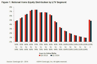 The second graph shows the distribution of home equity in Q1 compared to Q4 2013. Close to 5% of residential properties have 25% or more negative equity, down slightly from Q4.
In Q1 2013, there were 9.8 million properties with negative equity - now there are 6.3 million. A significant change.
Weekly Initial Unemployment Claims increase to 312,000
by Calculated Risk on 6/05/2014 08:30:00 AM
The DOL reports:
In the week ending May 31, the advance figure for seasonally adjusted initial claims was 312,000, an increase of 8,000 from the previous week's revised level. The previous week's level was revised up by 4,000 from 300,000 to 304,000. The 4-week moving average was 310,250, a decrease of 2,250 from the previous week's revised average. This is the lowest level for this average since June 2, 2007 when it was 307,500. The previous week's average was revised up by 1,000 from 311,500 to 312,500.The previous week was revised up from 300,000.
There were no special factors impacting this week's initial claims.
The following graph shows the 4-week moving average of weekly claims since January 1971.
 Click on graph for larger image.
The dashed line on the graph is the current 4-week average. The four-week average of weekly unemployment claims decreased to 310,250.
This was close to the consensus forecast of 310,000. The 4-week average is at the lowest level since June 2007 and is at normal levels for an expansion.
Wednesday, June 04, 2014
Thursday: ECB, Unemployment Claims, Flow of Funds
by Calculated Risk on 6/04/2014 07:05:00 PM
A few analyst views on the ECB decision tomorrow via the WSJ: The Market Says the ECB Will Act. What to Expect Next. As an example from Credit Agricole economists:
“We do not believe the ECB can afford to do nothing this week after having intentionally raised hopes of further monetary easing. While the maximum impact from an ECB rate cut would come with a negative deposit rate and liquidity-boosting measures, […] there is no guarantee that negative rates alone would boost bank lending. However, credit easing measures are becoming increasingly likely, either indirectly, via LTRO, or directly, via private quantitative easing. Communication will be an important part of the June ‘package’. We expect ECB President Mario Draghi to leave the door open to unconventional action in case inflation fails to pick up by year-end.”Should be interesting!
Wednesday:
• 7:45 AM ET (1:45 PM CET) the ECB meets in Frankfurt. From Nomura:
We expect the ECB to deliver a package of measures on 5 June to ease monetary policy. We expect a 10bp cut to all key interest rates, taking the refi rate down to 0.15%, the deposit rate negative for the first time to -0.10% and the marginal lending facility rate down to 0.65%. We also expect an extension of the forward guidance on liquidity provisions, with the fixed-rate full-allotment procedure extended by a further 12 months to at least the end of June 2016. We also expect the ECB to launch a targeted LTRO programme in June (60% probability), to address credit weakness and risks to the recovery from this channel.• Early: the Trulia Price Rent Monitors for May. This is the index from Trulia that uses asking house prices adjusted both for the mix of homes listed for sale and for seasonal factors.
• At 8:30 AM, the initial weekly unemployment claims report will be released. The consensus is for claims to increase to 310 thousand from 300 thousand.
• At 12:00 PM, the Q1 Flow of Funds Accounts of the United States from the Federal Reserve.


