by Calculated Risk on 6/06/2014 10:10:00 AM
Friday, June 06, 2014
Comment: U.S. Employment at All Time High
First, I promised the headline for this post last week!
Second, this means I'll be retiring the graph many called the "scariest jobs chart ever" (first graph in previous post).
Earlier: May Employment Report: 217,000 Jobs, 6.3% Unemployment Rate
Now some numbers: Through the first five months of 2014, the economy has added 1,068,000 payroll jobs - slightly better than during the same period in 2013 even with the severe weather early this year. (For comparison, there were 1,020,000 payroll jobs added during the first five months of 2013). My expectation at the beginning of the year was the economy would add between 2.4 and 2.7 million payroll jobs this year, and that still looks about right.
Here is a table of the annual change in total nonfarm and private sector payrolls jobs since 1999. The last three years have been near the best since 1999 (2005 was the best year for total nonfarm, and 2011 the best for private jobs).
It is possible that 2014 will be the best year since 1999 for both total nonfarm and private sector employment.
| Change in Payroll Jobs per Year (000s) | ||
|---|---|---|
| Total, Nonfarm | Private | |
| 1999 | 3,177 | 2,716 |
| 2000 | 1,946 | 1,682 |
| 2001 | -1,735 | -2,286 |
| 2002 | -508 | -741 |
| 2003 | 105 | 147 |
| 2004 | 2,033 | 1,886 |
| 2005 | 2,506 | 2,320 |
| 2006 | 2,085 | 1,876 |
| 2007 | 1,140 | 852 |
| 2008 | -3,576 | -3,756 |
| 2009 | -5,087 | -5,013 |
| 2010 | 1,058 | 1,277 |
| 2011 | 2,083 | 2,400 |
| 2012 | 2,236 | 2,294 |
| 2013 | 2,331 | 2,365 |
| 20141 | 2,563 | 2,527 |
| 1 2014 is current pace annualized (through May). | ||
Also employment has reached another milestone: total employment is now 98,000 above the previous peak, and and at a new all time high in May. Of course the labor force has continued to increase over the last 6+ years, and there are still millions of workers unemployed - so the economy still has a long way to go.
Note: Private payroll employment increased 216,000 in May and private employment is now 617,000 above the previous peak (the unprecedented large number of government layoffs has held back total employment).
Overall this was another solid employment report.
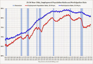
Employment-Population Ratio, 25 to 54 years old
 Since the overall participation rate declined recently due to cyclical (recession) and demographic (aging population, younger people staying in school) reasons, an important graph is the employment-population ratio for the key working age group: 25 to 54 years old.
In the earlier period the participation rate for this group was trending up as women joined the labor force. Since the early '90s, the participation rate has mostly moved sideways (with a downward drift started around '00) - and with ups and downs related to the business cycle.
The 25 to 54 participation rate was unchanged in May at 80.8%, and the 25 to 54 employment population ratio decreased to 76.4% from 76.5%. As the recovery continues, I expect the participation rate for this group to increase.
Percent Job Losses During Recessions

This graph shows the job losses from the start of the employment recession, in percentage terms - this time aligned at maximum job losses. Employment is now back above pre-recession levels and this graph will be retired until the next recession (Of course this doesn't include population growth).
In the earlier post, the graph showed the job losses aligned at the start of the employment recession.
Part Time for Economic Reasons
 From the BLS report:
The number of persons employed part time for economic reasons (sometimes referred to as involuntary part-time workers), at 7.3 million, changed little in May. These individuals were working part time because their hours had been cut back or because they were unable to find a full-time job.The number of persons working part time for economic reasons declined in May to 7.269 million from 7.465 million in April. This suggests significantly slack still in the labor market. These workers are included in the alternate measure of labor underutilization (U-6) that decreased to 12.2% in May from 12.3% in April. This is the lowest level for U-6 since October 2008.
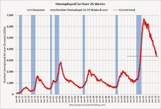
Unemployed over 26 Weeks
 This graph shows the number of workers unemployed for 27 weeks or more.
 According to the BLS, there are 3.374 million workers who have been unemployed for more than 26 weeks and still want a job. This was down from 3.452 in April. This is trending down, but is still very high. This is the lowest level for long term unemployed since March 2009.
Long term unemployment remains one of the key labor problems in the US.
State and Local Government
 This graph shows total state and government payroll employment since January 2007. State and local governments lost jobs for four straight years. (Note: Scale doesn't start at zero to better show the change.)
 In May 2014, state and local governments added 6,000 jobs. State and local government employment is now up 107,000 from the bottom, but still 637,000 below the peak.
It appears state and local employment employment is now increasing. Of course Federal government layoffs are ongoing (another 5,000 jobs lost in May).


