by Calculated Risk on 1/13/2014 09:21:00 AM
Monday, January 13, 2014
Lawler: Preliminary Table of Distressed Sales and Cash buyers for Selected Cities in December
Economist Tom Lawler sent me the preliminary table below of short sales, foreclosures and cash buyers for several selected cities in December.
From CR: This is just a few markets - more to come over the next week - but total "distressed" share is down significantly, mostly because of a decline in short sales.
And foreclosures are down in all of these areas too.
The All Cash Share (last two columns) is mostly declining year-over-year. As investors pull back in markets the share of all cash buyers will probably decline.
In general it appears the housing market is slowly moving back to normal.
| Short Sales Share | Foreclosure Sales Share | Total "Distressed" Share | All Cash Share | |||||
|---|---|---|---|---|---|---|---|---|
| Dec-13 | Dec-12 | Dec-13 | Dec-12 | Dec-13 | Dec-12 | Dec-13 | Dec-12 | |
| Las Vegas | 20.7% | 45.8% | 8.5% | 9.5% | 29.2% | 55.3% | 44.4% | 55.2% |
| Reno | 24.0% | 47.0% | 4.0% | 10.0% | 28.0% | 57.0% | ||
| Phoenix | 9.5% | 27.2% | 7.5% | 12.2% | 17.1% | 39.4% | ||
| Mid-Atlantic | 8.0% | 13.0% | 9.3% | 9.7% | 17.3% | 22.7% | 19.3% | 20.3% |
| Toledo | 36.5% | 41.6% | ||||||
| Tucson | 32.3% | 33.1% | ||||||
| Omaha | 23.9% | 20.6% | ||||||
| Memphis* | 21.0% | 25.6% | ||||||
| *share of existing home sales, based on property records | ||||||||
Sunday, January 12, 2014
Sunday Night Futures
by Calculated Risk on 1/12/2014 08:16:00 PM
From the WSJ: Why Business Investment Could Break Out
One gauge of business investment—new orders of nondefense capital goods, excluding aircraft—grew 4.1% in November, the biggest jump in nearly a year, after shrinking for two months. A broader measure of business spending that includes buildings and software grew at an annualized pace of 4.8% in the third quarter of 2013 and 4.7% in the second, after declining 4.6% in the first quarter.When demand picks up, companies invest ...
Economists now expect business spending to keep accelerating. ... Several things are pushing economists' forecasts for business spending higher. For one, businesses often follow consumers when it comes to spending, not the other way around. When the economy began growing again after the 2007-2009 recession, spending on equipment shot up—but then flagged when it became clear, by 2011, that the recovery had stalled. If the economic recovery now shifts into higher gear, businesses will expand capacity to meet demand.
Monday:
• At 2:00 PM ET, the Monthly Treasury Budget Statement for December. The CBO estimates that the Treasury ran a surplus of $44 billion in December.
Weekend:
• Schedule for Week of January 12th
• Update: When will payroll employment exceed the pre-recession peak?
From CNBC: Pre-Market Data and Bloomberg futures: the S&P futures and DOW futures are unchanged (fair value).
Oil prices are mostly unchanged with WTI futures at $92.80 per barrel and Brent at $107.49 per barrel.
Below is a graph from Gasbuddy.com for nationwide gasoline prices. Nationally prices are around $3.30 per gallon (about the same as a year ago). If you click on "show crude oil prices", the graph displays oil prices for WTI, not Brent; gasoline prices in most of the U.S. are impacted more by Brent prices.
| Orange County Historical Gas Price Charts Provided by GasBuddy.com |
More Employment Graphs: Duration of Unemployment, Unemployment by Education, Construction Employment and Diffusion Indexes
by Calculated Risk on 1/12/2014 11:51:00 AM
Friday on the employment report:
• December Employment Report: 74,000 Jobs, 6.7% Unemployment Rate
• Comments on the Disappointing Employment Report
A few more employment graphs by request ...
 This graph shows the duration of unemployment as a percent of the civilian labor force. The graph shows the number of unemployed in four categories: less than 5 week, 6 to 14 weeks, 15 to 26 weeks, and 27 weeks or more.
The general trend is down for all categories, and both the "less than 5 weeks" and 6 to 14 weeks" are close to normal levels.
The long term unemployed is at 2.5% of the labor force - the lowest since April 2009 - however the number (and percent) of long term unemployed remains a serious problem.
 This graph shows the unemployment rate by four levels of education (all groups are 25 years and older).
Unfortunately this data only goes back to 1992 and only includes one previous recession (the stock / tech bust in 2001). Clearly education matters with regards to the unemployment rate - and it appears all four groups are generally trending down.
Although education matters for the unemployment rate, it doesn't appear to matter as far as finding new employment.
Note: This says nothing about the quality of jobs - as an example, a college graduate working at minimum wage would be considered "employed".
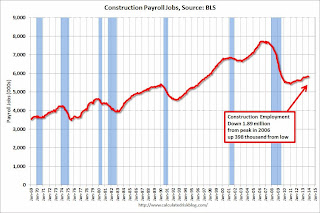 This graph shows total construction employment as reported by the BLS (not just residential).
Since construction employment bottomed in January 2011, construction payrolls have increased by 398 thousand.
According to the BLS, construction employment declined in December (probably due to weather). Historically there is a lag between an increase in activity and more hiring - and it appears hiring should pickup significant in 2014.
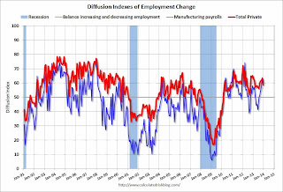 The BLS diffusion index for total private employment was at 58.8 in December, down from 63.2 in November.
For manufacturing, the diffusion index increased to 60.5, down from 63.6 in November.
Think of this as a measure of how widespread job gains are across industries. The further from 50 (above or below), the more widespread the job losses or gains reported by the BLS. From the BLS:
Figures are the percent of industries with employment increasing plus one-half of the industries with unchanged employment, where 50 percent indicates an equal balance between industries with increasing and decreasing employment.Job growth was still fairly widespread in December (a good sign even with fewer jobs added).
Saturday, January 11, 2014
Update: When will payroll employment exceed the pre-recession peak?
by Calculated Risk on 1/11/2014 05:13:00 PM
Just over two years ago I posted a graph with projections of when payroll employment would return to pre-recession levels (see: Sluggish Growth and Payroll Employment from November 2011).
In 2011, I argued we'd continue to see sluggish growth (back in 2011 many analysts were forecasting another US recession - those forecasts were wrong).
On the graph I posted two lines - one with payroll growth of 125,000 payroll jobs added per month (the pace in 2011), and another line with 200,000 payroll jobs per month. The following graph is an update with reported payroll growth through December 2013.
The dashed red line is 125,000 payroll jobs added per month. The dashed blue line is 200,000 payroll jobs per month. Both projections are from November 2011.
 Click on graph for larger image.
So far the economy has tracked just below the blue line (200,000 payroll jobs per month).
Right now it appears payrolls will exceed the pre-recession peak in mid-2014.
Currently there are about 1.18 million fewer payroll jobs than before the recession started, and at the expected pace of job growth in 2014 it will take about 6 months to reach the previous peak.
Of course this doesn't include population growth and new entrants into the workforce (the workforce has continued to grow). Also the annual benchmark revision will be released in February (with the January employment report), and the preliminary estimate is an upward revision of 345,000 jobs - HOWEVER the increase is due to a classification change, and the actual impact will probably be negative.
Note: There are 640 thousand fewer private sector payroll jobs than before the recession started. At the expected pace of private sector job growth, the private sector could be back at the pre-recession peak in March 2014.
Schedule for Week of January 12th
by Calculated Risk on 1/11/2014 11:18:00 AM
The key reports this week are retail sales and housing starts for December.
For manufacturing, Industrial Production for December, and the NY Fed (Empire State), and Philly Fed January surveys will be released this week.
For prices, CPI will be released on Thursday.
2:00 PM ET: the Monthly Treasury Budget Statement for December. The CBO estimates that the Treasury ran a surplus of $44 billion in December.
7:30 AM ET: NFIB Small Business Optimism Index for December.
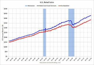 8:30 AM ET: Retail sales for December will be released.
This graph shows retail sales since 1992. This is monthly retail sales and food service, seasonally adjusted (total and ex-gasoline). On a monthly basis, retail sales increased 0.7% from October to November (seasonally adjusted), and sales were up 4.7% from November 2012.
The consensus is for retail sales to be unchanged in December, and to increase 0.4% ex-autos.
10:00 AM: Manufacturing and Trade: Inventories and Sales (business inventories) report for November. The consensus is for a 0.3% increase in inventories.
7:00 AM: The Mortgage Bankers Association (MBA) will release the results for the mortgage purchase applications index for the previous two weeks.
8:30 AM: Producer Price Index for December. The consensus is for a 0.4% increase in producer prices (and 0.1% increase in core PPI).
8:30 AM: NY Fed Empire Manufacturing Survey for January. The consensus is for a reading of 3.3, up from 1.0 in December (above zero is expansion).
2:00 PM: Federal Reserve Beige Book, an informal review by the Federal Reserve Banks of current economic conditions in their Districts.
8:30 AM: The initial weekly unemployment claims report will be released. The consensus is for claims to decline to 327 thousand from 330 thousand.
8:30 AM: Consumer Price Index for December. The consensus is for a 0.3% increase in CPI in December and for core CPI to increase 0.1%.
10:00 AM: the Philly Fed manufacturing survey for January. The consensus is for a reading of 8.7, up from 7.0 last month (above zero indicates expansion).
10:00 AM ET: The January NAHB homebuilder survey. The consensus is for a reading of 57.5, down from 58.0 in December. Any number above 50 indicates that more builders view sales conditions as good than poor.
 8:30 AM: Housing Starts for December.
 Total housing starts were at 1.09 million (SAAR) in November. Single family starts were at 727 thousand SAAR in November.
The consensus is for total housing starts to decrease to 985 thousand (SAAR) in December.
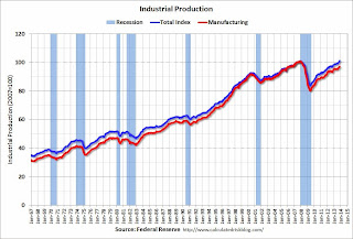 9:15 AM: The Fed will release Industrial Production and Capacity Utilization for December.
This graph shows industrial production since 1967.
The consensus is for a 0.3% increase in Industrial Production, and for Capacity Utilization to increase to 79.1%.
9:55 AM: Reuter's/University of Michigan's Consumer sentiment index (preliminary for January). The consensus is for a reading of 83.5, up from 82.5 in December.
 10:00 AM: Job Openings and Labor Turnover Survey for November from the BLS.
 This graph shows job openings (yellow line), hires (purple), Layoff, Discharges and other (red column), and Quits (light blue column) from the JOLTS.
Jobs openings increased in October to 3.925 million from 3.883 million in September. The number of job openings (yellow) is up 7.7% year-over-year compared to October 2012 and openings are at the highest level since early 2008.
Quits increase in October and are up about 14.7% year-over-year. These are voluntary separations. (see light blue columns at bottom of graph for trend for "quits"). This is the highest level for quits since 2008.
Friday, January 10, 2014
Unofficial Problem Bank list declines to 613 Institutions
by Calculated Risk on 1/10/2014 09:17:00 PM
This is an unofficial list of Problem Banks compiled only from public sources.
Here is the unofficial problem bank list for January 10, 2013.
Changes and comments from surferdude808:
A few removals this week and the strengthening of an enforcement action are the changes to the Unofficial Problem Bank List this week. In all, there were five removals that leave the list with 613 institutions with $203.0 billion of assets. A year ago, the list held 832 institutions with assets of $310.7 billion.
The OCC stepped up its enforcement action against Los Alamos National Bank, Los Alamos, NM ($1.5 billion) from a Formal Agreement to a Consent Order in December 2013. The bank has been operating under various corrective actions since 2010.
Actions were terminated against North Community Bank, Chicago, IL ($2.5 billion); Westbury Bank, West Bend, WI ($525 million); and Bank of Commerce, Chelsea, OK ($145 million). There are some official confirmations that Talmer Bancorp, Inc. has successfully acquired some banks controlled by Capitol Bancorp, Ltd. Based on these confirmations, we have removed Bank of Las Vegas, Henderson, NV ($224 million) and Sunrise Bank of Albuquerque, Albuquerque, NM ($42 million). Two banks controlled by Capitol Bancorp remain on the list as we wait for confirmation from the FDIC if there has been a change in ownership.
Next Friday, we anticipate the OCC will release its enforcement action activity through the middle of December 2013.
Lawler on Builder "supply-chain" Issues in 2013
by Calculated Risk on 1/10/2014 06:15:00 PM
From a piece on Meritage Homes by housing economist Tom Lawler:
Meritage over the last year has aggressively added to its land/lot positions over the last two years, and as of the end of September of 2013 Meritage owned or controlled 25,046 lots, up 40.4% from a year earlier and up about 56.5% from two years earlier. As was the case for many home builders last year, “supply-chain” issues increased lot-development timelines at Meritage in many areas of the country, resulting in slower-than-desired community openings and homes built (Supply issues, and not demand, was a major reason why SF housing starts last year fell short of consensus last year). Meritage (and many other builders) dealt with the increased demand and low supply by raising home prices in many areas sharply, resulting in the company’s highest margins since 2006.
Not surprisingly, the combination of increasing mortgage rates and sharply higher home prices led to a substantial slowdown in the pace of new home sales in second half of 2013, and as a result it appears as if builders have responded by “stabilizing” home prices.
As a group, large home builders are planning for a significant increase in housing production/home sales in 2014, and have increased significantly their land/lot positions in anticipation of higher sales/production. For example, lots owned or optioned by 13 large publicly-traded home builders near the end of last year (some as of 9/30, some as of 10/31, and some as of 11/30) were up 19.5% from a year earlier and up almost 30% from two years earlier. With margins as a whole very high and demand at current interest rate and price levels down, builders are unlikely to be able to raise prices much in 2014 after the “incredible” price hikes seen last year.
emphasis added
CR Note: At the beginning of last year, I wrote: "I've heard some builders might be land constrained in 2013 (not enough finished lots in the pipeline)." At Lawler notes, the builders have aggressively acquired land in 2013, and this "supply-chain" issue might be resolved. Less supply allowed the builders to raise prices aggressively in 2013, but that probably will not happen in 2014.
Public and Private Sector Payroll Jobs: Reagan, Bush, Clinton, Bush, Obama
by Calculated Risk on 1/10/2014 02:46:00 PM
First, from Fed Chairman Ben Bernanke, Jan 3, 2014:
[A]t the current point in the recovery from the 2001 recession, employment at all levels of government had increased by nearly 600,000 workers; in contrast, in the current recovery, government employment has declined by more than 700,000 jobs, a net difference of more than 1.3 million jobs.By request, here is an update on an earlier post through the November employment report.
In April, I posted two graphs comparing changes in public and private sector payrolls during the Bush and Obama presidencies. Several readers asked if I could add Presidents Reagan and Clinton (I've also added the single term of President George H.W. Bush). Below are updates through the September report.
Important: There are many differences between these periods. Overall employment was smaller in the '80s, so a different comparison might be to look at the percentage change. Of course the participation rate was increasing in the '80s (younger population and women joining the labor force), and the participation rate is declining now. But these graphs give an overview of employment changes.
The first graph shows the change in private sector payroll jobs from when each president took office until the end of their term(s). President George H.W. Bush only served one term, and President Obama is in the first year of his second term.
Mr. G.W. Bush (red) took office following the bursting of the stock market bubble, and left during the bursting of the housing bubble. Mr. Obama (blue) took office during the financial crisis and great recession. There was also a significant recession in the early '80s right after Mr. Reagan (yellow) took office.
There was a recession towards the end of President G.H.W. Bush (purple) term, and Mr Clinton (light blue) served for eight years without a recession.
 Click on graph for larger image.
The first graph is for private employment only.
The employment recovery during Mr. G.W. Bush's (red) first term was very sluggish, and private employment was down 946,000 jobs at the end of his first term. At the end of Mr. Bush's second term, private employment was collapsing, and there were net 665,000 private sector jobs lost during Mr. Bush's two terms.
Private sector employment increased slightly under President G.H.W. Bush (purple), with 1,490,000 private sector jobs added.
Private sector employment increased by 20,864,000 under President Clinton (light blue) and 14,688,000 under President Reagan (yellow).
There were only 1,933,000 more private sector jobs at the end of Mr. Obama's first term. Close to one year into Mr. Obama's second term, there are now 3,980,000 more private sector jobs than when he initially took office.
 A big difference between the presidencies has been public sector employment. Note the bumps in public sector employment due to the decennial Census in 1990, 2000, and 2010.
 The public sector grew during Mr. Reagan's terms (up 1,414,000), during Mr. G.H.W. Bush's term (up 1,127,000), during Mr. Clinton's terms (up 1,934,000), and during Mr. G.W. Bush's terms (up 1,748,000 jobs).
However the public sector has declined significantly since Mr. Obama took office (down 734,000 jobs). These job losses have mostly been at the state and local level, but more recently at the Federal level. This has been a significant drag on overall employment.
Looking forward, I expect the economy to continue to expand for the next few years, so I don't expect a sharp decline in employment as happened at the end of Mr. Bush's 2nd term (In 2005 and 2006 I was warning of a coming recession due to the bursting of the housing bubble).
A big question is when the public sector layoffs will end. It appears the cutbacks are mostly over at the state and local levels, but there are ongoing cutbacks at the Federal level - but overall - maybe public employment has bottomed.
Comments on the Disappointing Employment Report
by Calculated Risk on 1/10/2014 10:58:00 AM
This was a disappointing employment report, but 1) it was just one month, 2) November was revised up, 3) other data suggests stronger hiring, and 4) there was some weather related impact (as expected). This report doesn't change my outlook. On weather, the BLS reported:
Construction employment edged down in December (-16,000). However, in 2013, the industry added an average of 10,000 jobs per month. Employment in nonresidential specialty trade contractors declined by 13,000 in December, possibly reflecting unusually cold weather in parts of the country.There were probably other weather related impacts (unemployment claims spiked hire during the BLS reference week), but all the weakness can't be blamed on the weather (the report was still disappointing).
Overall job growth was about as expected in 2013 (see table below), and I expect employment growth to pick up in 2014.
| Change in Payroll Jobs per Year (000s) | ||
|---|---|---|
| Total, Nonfarm | Private | |
| 1999 | 3,170 | 2,709 |
| 2000 | 1,944 | 1,680 |
| 2001 | -1,757 | -2,308 |
| 2002 | -532 | -765 |
| 2003 | 62 | 104 |
| 2004 | 2,019 | 1,872 |
| 2005 | 2,484 | 2,298 |
| 2006 | 2,071 | 1,862 |
| 2007 | 1,115 | 827 |
| 2008 | -3,617 | -3,797 |
| 2009 | -5,052 | -4,976 |
| 2010 | 1,022 | 1,235 |
| 2011 | 2,103 | 2,420 |
| 2012 | 2,193 | 2,269 |
| 2013 | 2,186 | 2,211 |
Although construction was weak (weather related), seasonal retail hiring remained solid. See the first graph below - this is a good sign for the holiday season ("Watch what they do, not what they say")
Seasonal Retail Hiring
 Click on graph for larger image.
Typically retail companies start hiring for the holiday season in October, and really increase hiring in November. Here is a graph that shows the historical net retail jobs added for October, November and December by year.
This graph really shows the collapse in retail hiring in 2008. Since then seasonal hiring has increased back close to normal levels.
Retailers hired 176 thousand workers (NSA) net in December. This puts seasonal retail hiring at the highest level since 1999, and suggests holiday sales were decent. Note: this is NSA (Not Seasonally Adjusted).
Note: There is a decent correlation between seasonal retail hiring and holiday retail sales.
Employment-Population Ratio, 25 to 54 years old
 Since the participation rate declined recently due to cyclical (recession) and demographic (aging population) reasons, an important graph is the employment-population ratio for the key working age group: 25 to 54 years old.
In the earlier period the employment-population ratio for this group was trending up as women joined the labor force. The ratio has been mostly moving sideways since the early '90s, with ups and downs related to the business cycle.
The 25 to 54 participation rate declined in December to 80.7% from 80.9%, and the 25 to 54 employment population ratio increased to 76.1% from 76.0%. As the economy recoveries, I'd expect both to increase back towards pre-recession levels.
Percent Job Losses During Recessions

This graph shows the job losses from the start of the employment recession, in percentage terms - this time aligned at maximum job losses. At the recent pace of improvement, it appears employment will be back to pre-recession levels next year (Of course this doesn't include population growth).
In the earlier post, the graph showed the job losses aligned at the start of the employment recession.
This financial crisis recession was much deeper than other post WWII recessions, and the recovery has been slower (the recovery from the 2001 recession was slow too). However, if we compare to other financial crisis recoveries, this recovery has actually been better than most.
Part Time for Economic Reasons
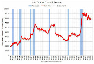 From the BLS report:
The number of persons employed part time for economic reasons (sometimes referred to as involuntary part-time workers) was essentially unchanged at 7.8 million in December. These individuals were working part time because their hours had been cut back or because they were unable to find full-time work.These workers are included in the alternate measure of labor underutilization (U-6) that was unchanged at 13.1% in December.
Unemployed over 26 Weeks
 This graph shows the number of workers unemployed for 27 weeks or more.
 According to the BLS, there are 3.878 million workers who have been unemployed for more than 26 weeks and still want a job. This was down from 4.044 million in November. This is trending down, but is still very high. Long term unemployment remains one of the key labor problems in the US.
State and Local Government
 This graph shows total state and government payroll employment since January 2007. State and local governments lost jobs for four straight years. (Note: Scale doesn't start at zero to better show the change.)
 In December 2013, state and local governments lost 11,000 jobs, however state and local employment was up 54 thousand in 2013.
It appears state and local employment employment has bottomed. Of course Federal government layoffs are ongoing.
Overall this was a disappointing employment report.
December Employment Report: 74,000 Jobs, 6.7% Unemployment Rate
by Calculated Risk on 1/10/2014 08:30:00 AM
From the BLS:
The unemployment rate declined from 7.0 percent to 6.7 percent in December, while total nonfarm payroll employment edged up (+74,000), the U.S. Bureau of Labor Statistics reported today.The headline number was well below expectations of 200,000 payroll jobs added.
...
The number of unemployed persons declined by 490,000 to 10.4 million in December, and the unemployment rate declined by 0.3 percentage point to 6.7 percent.
...
The change in total nonfarm payroll employment for October remained at +200,000, and the change for November was revised from +203,000 to +241,000. With these revisions, employment gains in October and November were 38,000 higher than previously reported.
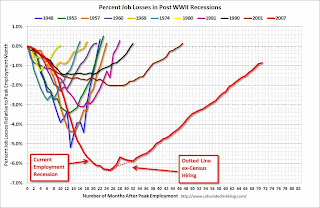 Click on graph for larger image.
This graph shows the job losses from the start of the employment recession, in percentage terms, compared to previous post WWII recessions. The dotted line is ex-Census hiring.
This shows the depth of the recent employment recession - worse than any other post-war recession - and the relatively slow recovery due to the lingering effects of the housing bust and financial crisis.
Employment is less than 1% below the pre-recession peak.

NOTE: The second graph is ex-Census meaning the impact of the decennial Census temporary hires and layoffs is removed to show the underlying payroll changes.
The third shows the unemployment rate.
The unemployment rate decreased in December to 6.7% from 7.0% in November.

The fourth graph shows the employment population ratio and the participation rate.
The Labor Force Participation Rate decreased in December to 62.8% from 63.0% in November. This is the percentage of the working age population in the labor force.
 The participation rate is well below the 66% to 67% rate that was normal over the last 20 years, although a significant portion of the recent decline is due to demographics.
The Employment-Population ratio was unchanged in December at 58.6% (black line).
I'll post the 25 to 54 age group employment-population ratio graph later.
This was a disappointing employment report. However this is just one month and other recent employment data was positive. As I noted yesterday, unemployment claims spiked higher during the BLS reference period in December (the reason I took the "under"), and that might have been weather related. I'll have much more later ...


