by Calculated Risk on 12/24/2008 01:01:00 PM
Wednesday, December 24, 2008
Conforming Mortgage Rates Fall, Jumbo Spread at Record
Freddie Mac reported Long-Term Rates Fall for Eight Consecutive Week Setting Another New Low
Freddie Mac today released the results of its Primary Mortgage Market Survey® (PMMS®) in which the 30-year fixed-rate mortgage (FRM) averaged 5.14 percent with an average 0.8 point for the week ending December 24, 2008, down from last week when it averaged 5.19 percent. Last year at this time, the 30-year FRM averaged 6.17 percent. The 30-year FRM has not been lower since Freddie Mac started the Primary Mortgage Market Survey in 1971.The MBA reported: Near Record Low Mortgage Rates Boost Mortgage Applications in Latest MBA Weekly Survey
The average contract interest rate for 30-year fixed-rate mortgages decreased to 5.04 percent from 5.18 percent, with points increasing to 1.17 from 1.13 (including the origination fee) for 80 percent loan-to-value (LTV) ratio loans. The contract rate for 30-year fixed-rate mortgages is the lowest recorded in the survey since the record low of 4.99 percent for the week ending June 13, 2003.Note the surge in refinance applications too!
However, Bloomberg reports: Jumbo Mortgage Shoppers Get Little Relief From Rates
Jumbo mortgage shoppers in the most expensive U.S. housing markets such as New York and San Francisco aren’t getting much relief from lower borrowing costs.It's jumbos rates that matter for most of California and other higher priced markets.
The average 30-year fixed rate for home loans of more than $729,750 remains almost 2 percentage points above conforming rates and the spread between them may set a record this month, according to financial data firm BanxQuote.
...
The difference between the two averaged 2.13 percentage points in December, 10 times the spread from 2000 to 2006 and above last month’s 1.95 percentage points that was the highest on record.
Savings Rate Starting to Recover
by Calculated Risk on 12/24/2008 11:33:00 AM
Here is a graph of the U.S. savings rate as a percent of disposable personal income. Click on graph for larger image in new window.
It looks like savings from lower gasoline prices is showing up as savings - as opposed to other consumption - and this process of increasing savings is a necessary step towards restoring healthy household balance sheets.
This is one of the areas some analysts really got wrong during the housing bubble. As an example, here is Larry Kudlow in 2006: Riding the Right Curve
Despite the grim picture the mainstream media continue to paint about just about everything ... there’s one thing they just can’t taint: This U.S. economy remains very healthy.By focusing on net wealth (inflated by the housing bubble and excessive stock prices), Mr. Kudlow completely missed the biggest story of our time. As I noted then, the savings rate (as calculated by the BEA), is the true savings rate. The savings rate was too low then - and the rate remains too low now - but it is starting to recover.
...
The latest chant is that ... a day of reckoning marked by a housing-price crash and an overwhelming debt burden is headed our way. This is utter nonsense.
...
Family net wealth, the nation’s true savings rate, advanced 8 percent in 2005 to a record level of $52 trillion.
Estimating PCE Growth for Q4 2008
by Calculated Risk on 12/24/2008 09:26:00 AM
Last quarter I was the first to note that PCE would probably be negative in the quarter based on the "two month estimate". That was the first decline in PCE since Q4 1991.
This quarter the two month estimate suggests PCE will be negative again. However most analysts might be a little too pessimistic for Q4 2008.
The BEA reports on Personal Income and Outlays:
Personal consumption expenditures (PCE) decreased $56.1 billion, or 0.6 percent.That may sound bad, but it is somewhat better than expected.
Maybe December will be especially weak, or maybe October and November will be revised downwards, but the two month estimate suggests real PCE will decline in Q4 by about 2.9% (annual rate).
Other components of GDP - especially invesment - will be very weak in Q4, but most estimates of negative 5% GDP change (annualized) included a decline of PCE in the negative 4% to 4.5% range.
As an example, here is the Northern Trust forecast (last page) of -5.0% GDP, and -4.0% PCE in Q4 2008. Since PCE accounts for about 71% of GDP, maybe these forecasts will be revised up slightly.
Weekly Unemployment Claims: 26 Year High
by Calculated Risk on 12/24/2008 09:10:00 AM
The DOL reports on weekly unemployment insurance claims:
In the week ending Dec. 20, the advance figure for seasonally adjusted initial claims was 586,000, an increase of 30,000 from the previous week's revised figure of 556,000. The 4-week moving average was 558,000, an increase of 13,750 from the previous week's revised average of 544,250.
...
The advance number for seasonally adjusted insured unemployment during the week ending Dec. 13 was 4,370,000, a decrease of 17,000 from the preceding week's revised level of 4,387,000.
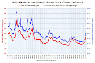
 Click on graph for larger image in new window.
The first graph shows weekly claims since 1968.
The four week moving average is at 558,000; the highest since December 1982.
Continued claims are now at 4.37 million.
 This graph shows the 4-week average of initial weekly unemployment claims (blue, right scale), and total insured unemployed (red, left scale), both as a percent of covered employment.
This normalizes the data for changes in insured employment.
By these measures, the current recession is already worse than the '01 recession, and close to the '90/'91 recession.
Hotels: Occupancy Rate Falling, Delinquencies Rising
by Calculated Risk on 12/24/2008 02:13:00 AM
From the Chicago Tribune: Chicago hotel occupancy falls 13% in November
Downtown Chicago hotels saw a 13.1 percent dive in the average occupancy rate, to 69 percent last month from a year earlier, according to Smith Travel Research. Nationwide, occupancy dropped 10.6 percent, to a 51.9 percent rate.A double digit RevPAR decline (revenue per available room) is stunning.
Pricing dropped as well, leading to double-digit declines in revenue per available room, a key measure of profitability. In downtown Chicago, the decline was 20.6 percent; nationally, it was 12.9 percent.
Also, Deutsche Bank reported in their Commercial Real Estate Outlook: Q4 2008 (no link), that "hotel loan deterioration now beginning to take-off" and that the 30-day delinquency rate has risen from 6bp to 55bp in just the last three months.
Falling hotel occupancy rates - leading to lower revenues and higher delinquency rates ... what a surprise!
Tuesday, December 23, 2008
Cerberus Limits Withdrawals
by Calculated Risk on 12/23/2008 08:15:00 PM
Video from CNBC.
From Bloomberg: Cerberus Caps Withdrawals From Hedge Fund After Loss
Cerberus Capital Management LLC, the $27 billion investment firm founded by billionaire Stephen Feinberg, limited investor withdrawals from one of its hedge funds after it lost 16 percent this year through November.As we all know, Cerberus is the three-headed dog who guards the gates of Hell. And at least one head is making sure investors' money doesn't escape from money hell.
Manhattan Office Vacancy Rate Rises to 10.9%
by Calculated Risk on 12/23/2008 07:12:00 PM
From Reuters: Manhattan office vacancy rate hits two-year high
The overall vacancy rate rose to 10.9 percent in the fourth quarter, the highest level in two years and more than three percentage points greater than a year ago, according to the report released by FirstService Williams.This fits with the report Mayor Bloomberg released on the NY City economy in November.
Space available directly from a landlord registered an 8.1 percent vacancy rate in the fourth quarter, while sublease space weighed in at 2.8 percent -- the highest rate in more than three years.
...
"With leasing activity languishing and tenant space choices growing exponentially, it is not surprising that the overall asking rent for Manhattan dropped by 4 percent from the previous quarter," Mark Jaccom, FirstService Williams chief executive, said in a statement.
 Click on graph for larger image in new window.
This graph shows the actual and projected (by the NYC OMB) rents and office vacancy rate for NYC Class A buildings (note: the Reuters story was all office space).
The Class A vacancy rate is expected to rise from about 7.5% to 13%, and rents are expect to decline by 20% or more from the peak.
Even More on Home Sales
by Calculated Risk on 12/23/2008 04:23:00 PM
Lots of housing news today ...
New Home Sales Lowest since 1982
Existing Home Sales Plunge
And here is an analysis of existing home turnover (not pretty), and NSA data showing the existing home sales plunge was worse than the headline number.
And now some more graphs ... Click on graph for larger image in new window.
This graph compares New and Existing home sales. Although sales tracked pretty well from 1994 through 2005, existing home sales have outperformed new home sales for the last few years.
One of the key reason for the difference is lender REO sales (foreclosure resales).
From the NY Times:
Lawrence Yun, chief economist of the National Association of Realtors, said that 45 percent of all home sales in November were so-called “distressed sales,” meaning that the sellers faced foreclosure, or they were forced to sell their home for less than the value of the mortgage.If we remove REOs, existing home sales have tracked much closer to new home sales. REO sales are real sales, but this shows as long as the REO volume is high, new home sales (and non-REO existing home sales) will be under severe pressure.
The following graph shows both annual new home sales (from the Census Bureau) and sales through November.
 In 2008, sales through November (before revisions) have totaled 461 thousand. This is slightly behind of the pace in 1991 (471 thousand sales through November).
 However sales slowed in the 2nd half of 2008, and it definitely appears that annual sales will be below the 509 thousand in 1991. This would mean sales would be the lowest since 1982 (412 thousand).
Of course the U.S. population and the number of households were much lower in 1982. In 1982 there were 54.2 million owner occupied units in the U.S., in 1991 there were 61.0 million, and there are approximately 76 million today.
If we use a ratio of owner occupied units to compare periods, the low in 1982 was 412 thousand X (76/54.2) = 578 thousand units (based on the number of owner occupied units today).
The calculation for 1991 gives 634 thousand units (to compare to today).
By this measure, 2008 is the worst year for new home sales since the Census Bureau started tracking new home sales (starting in 1963).
Philly Fed November State Coincident Indicators
by Calculated Risk on 12/23/2008 02:48:00 PM
Here is the Philadelphia Fed state coincident index release for September.
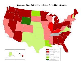
The Federal Reserve Bank of Philadelphia has released coincident indexes for all 50 states for November 2008. The indexes increased in eight states for the month, decreased in 37, and were unchanged in the remaining five (a one-month diffusion index of -58). For the past three months, the indexes increased in 11 states, decreased in 38, and remained unchanged only in Tennessee (a three-month diffusion index of -54).
 Click on map for larger image.
Here is a map of the three month change in the Philly Fed state coincident indicators. Most states are in recession, although a portion of the central U.S. is still growing (from Texas up to Wymong). This might change with falling oil prices.
This is what a recession looks like based on the Philly Fed states indexes.
 This is a graph of the monthly Philly Fed data of the number of states with one month increasing activity.
Note: the Philly Fed calls some states unchanged with minor changes.
Most of the U.S. was has been in recession since late last year based on this indicator.
More on Existing Home Sales
by Calculated Risk on 12/23/2008 12:00:00 PM
OK, this is a long one on turnover and NSA (not seasonally adjusted) data. The NSA data was much worse than the seasonally adjusted data.
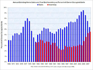
There have been 4.55 million existing home sales in 2008 through November. This puts 2008 on track for about 4.85+ million home sales, the fewest annual sales since 1997 (4.37 million). Click on graph for larger image in new window.
This graph shows annual existing home sales (since 1969) and year end inventory (since 1982). For this graph, sales for 2008 were estimated at 4.85 million and year end inventory at 4.2 million.
This shows sales are the lowest level since 1997, and inventory is at (or will be close) to a record at year end. I expect inventory to decline in December, so 2008 might be below December 2007.
However this has been an above normal year for transactions based on the turnover rate. Long term real estate agents have told me this has been a decent year for volume, although many of the sales are "one and done". Usually real estate sales are like a chain reaction - one family both sells and buys, and the seller then goes out and buys ... and on and on. But with so many REO (Lender "Real Estate Owned") sales by banks, agents have told me they frequently just have the one sale, and there is no move-up buyer - no chain reaction. The second graph shows sales and inventory as a percent of Owner Occupied Units (a measure of turnover).
By this measure sales are still above the normal range of about 6% per year. Inventory is well above the usual range too. I've been expecting turnover to decline to the 5% to 6% per year range, and stay there for an extended period. With 76 million owner occupied households, this suggested that existing home sales would decline to the 3.8 to 4.5 million range. Sales are finally in the predicted range with November sales at a 4.49 million annual rate.
The turnover rate was boosted in recent years by:
Although slowing, the turnover rate is still above the median for the last 40 years and substantially above previous troughs. Both types of speculative buying is now over. And the Baby Boomers have probably bought move up homes, and the next major move will be downsizing in retirement (still a number of years away). And although REO sales will continue to be significant in 2009, they will probably slow some as foreclosures move up the price range.
And finally - and probably a very important point - homeowners with negative equity, who manage to avoid foreclosure, will be stuck in their homes for years. This suggests the turnover rate - and existing home sales - will decline further.
Not Seasonally Adjusted (NSA) data
Here is another way to look at existing homes sales - monthly, Not Seasonally Adjusted (NSA):
 This graph shows NSA monthly existing home sales for 2005 through 2008. Sales (NSA) were about 17% lower in November 2008 than in November 2007 - this is a much larger decline than the reported seasonally adjusted decline.
Note: I've disagreed with the NAR method for seasonal adjustment before. The NAR uses a standard procedure to adjust for weekends and holidays in November. But since the sales were signed in September and October, I think they should adjust for holidays in those months instead. Using a different method, I think sales were closer to 4.2 million SAAR in November than the NAR reported 4.5 million - but it will all come out eventually. (note that NSA sales were 17% below Nov 2007, but SA sales were reported as 10.5% lower).
 The second graph shows inventory by month starting in 2002.
Inventory levels were flat for years (during the bubble), but started increasing at the end of 2005.
Inventory levels increased sharply in 2006 and 2007, but have only increased slightly in 2008. In fact inventory for the last four months was slightly below the levels of last year. This might indicate that inventory levels are close to the peak for this cycle (inventory has peaked for 2008), however there is probably a substantial shadow inventory – homeowners wanting to sell, but waiting for a better market - so existing home inventory levels will probably stay elevated for some time.


