 RSS Feed
 by Calculated Risk on 11/07/2010 08:30:00 AM
Showing posts with label Weekly Summary. Show all posts
Showing posts with label Weekly Summary. Show all posts
Sunday, November 07, 2010
Summary for Week ending Nov 6th
A summary of last week - mostly in graphs. NOTE: The graphs in this summary post link to a new Gallery graphics tool (Thanks Ken!). This Gallery is a collection of current graphs from the blog. There are tabs for several categories: Employment, New home Sales, etc. Enjoy!
Statement from the Federal Reserve's Federal Open Market Committee
Details from the NY Fed: Statement Regarding Purchases of Treasury Securities
Fed Chairman Ben Bernanke in the WaPo: What the Fed did and why: supporting the recovery and sustaining price stability
The combined REO (Real Estate Owned) inventory for Fannie, Freddie and the FHA increased by 24% at the end of Q3 2010 compared to Q2 2010. The REO inventory increased 92% compared to Q3 2009 (year-over-year comparison).
 Click on graph for larger image in new window.
This graph shows the REO inventory for Fannie, Freddie and FHA through Q3 2010.
The REO inventory for the "Fs" has increased sharply over the last year, from 153,007 at the end of Q3 2009 to a record 293,171 at the end of Q3 2010.
This is just a portion of the total REO inventory. Private label securities and banks and thrifts also hold a substantial number of REOs. The REO inventory will probably increase sharply in Q4 too.
From the BLS:
Nonfarm payroll employment increased by 151,000 in October, and the unemployment rate was unchanged at 9.6 percent, the U.S. Bureau of Labor Statistics reported today.Both August and September payroll employment were revised up.
 This graph shows the job losses from the start of the employment recession, in percentage terms aligned at the bottom of the recession (Both the 1991 and 2001 recessions were flat at the bottom, so the choice was a little arbitrary).
The dotted line shows payroll employment excluding temporary Census workers.
 This graph shows the employment-population ratio, and the partcipation and unemployment rates. The unemployment rate has been stuck at 9.6% for three straight months.
The Employment-Population ratio declined to 58.3% in October from 58.5% in September. This is disappointing news.
Note: the graph doesn't start at zero to better show the change.
The Labor Force Participation Rate also declined to 64.5% in October from 64.7% in September. This is the percentage of the working age population in the labor force. The participation rate is well below the 66% to 67% rate that was normal over the last 20 years.
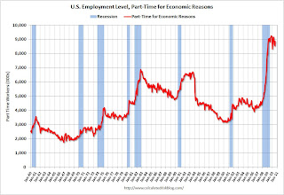
 The number of workers only able to find part time jobs (or have had their hours cut for economic reasons) declined to 9.154 million in October, from the record 9.472 million in September. This is still very high.
These workers are included in the alternate measure of labor underutilization (U-6) that decreased to 17.0% in October from 17.1% in September. The high for U-6 was 17.4% in October 2009. Still grim.
 This graph shows the number of workers unemployed for 27 weeks or more.
 According to the BLS, there are 6.206 million workers who have been unemployed for more than 26 weeks and still want a job. This was up from 6.123 million in September. It appears the number of long term unemployed has peaked ... although this may be because people are giving up.
The underlying details of the employment report were mixed. The positive included the 151,000 payroll jobs added, the upward revisions to August and September, a slight uptick in hours worked and average hourly earnings, and a slight decline in part time workers (and slight decline in U-6 unemployment).
The negatives include the declines in the employment-population ratio and the participation rate, the increase in workers unemployed for over 26 weeks, and the unemployment rate still flat at a very high level. This report was a clear improvement from the previous four months, but this was still a fairly soft report.
Based on an estimate from Autodata Corp, light vehicle sales were at a 12.26 million SAAR in October. That is up 17.9% from October 2009, and up 4.7% from the September 2010 sales rate.
 This graph shows the historical light vehicle sales (seasonally adjusted annual rate) from the BEA (blue) and an estimate for October (red, light vehicle sales of 12.26 million SAAR from Autodata Corp).
This is the highest sales rate since September 2008, excluding Cash-for-clunkers in August 2009.
This was above most forecasts of around 12.0 million SAAR.
 This graph shows the ISM non-manufacturing index (started in January 2008) and the ISM non-manufacturing employment diffusion index.
The October ISM Non-manufacturing index was at 54.3%, up from 53.2% in September - and above expectations of 54.0%. The employment index showed expansion in October at 50.9%, up from 50.2% in September. Note: Above 50 indicates expansion, below 50 contraction.
 The Census Bureau reported the homeownership and vacancy rates for Q3 2010 this week.
 The homeownership rate was at 66.9%, the same level as in Q2. This is at about the level of early 1999.
Note: graph starts at 60% to better show the change.
The homeowner vacancy rate was at 2.5% in Q3 2010. This is the same level as in Q2, and below the of 2.9% in 2008. The rental vacancy rate declined to 10.3% in Q3 2010 from 10.6% in Q2.
Best wishes to all.
Sunday, October 31, 2010
Summary for Week ending Oct 30th
by Calculated Risk on 10/31/2010 08:30:00 AM
A summary of last week - mostly in graphs. The key reports last week were the Q3 Advance GDP report, and several housing reports (New home sales, existing home sales, and house prices).
The the National Association of Realtors:
 Click on graph for larger image in new window.
This graph shows existing home sales, on a Seasonally Adjusted Annual Rate (SAAR) basis since 1993.
Sales in September 2010 (4.53 million SAAR) were 10% higher than last month, and were 19.1% lower than September 2009 (5.6 million SAAR).
The next graph shows the year-over-year (YoY) change in reported existing home inventory and months-of-supply. Inventory is not seasonally adjusted, so it really helps to look at the YoY change.
 Although inventory decreased slightly from August 2010 to September 2010, inventory increased 8.9% YoY in September. This is the largest YoY increase in inventory since early 2008.
The year-over-year increase in inventory is very bad news because the reported inventory is already historically very high (around 4 million), and the 10.7 months of supply in September is far above normal.
The bottom line: Sales were weak in September - almost exactly at the levels I expected - and will continue to be weak for some time. Inventory is very high - and the significant year-over-year increase in inventory is very concerning. The high level of inventory and months-of-supply will put downward pressure on house prices.
 The Census Bureau reported New Home Sales in September were at a seasonally adjusted annual rate (SAAR) of 307 thousand. This is slightly higher than in August (288 thousand SAAR).
This graph shows New Home Sales vs. recessions for the last 47 years. The dashed line is the current sales rate.
And another long term graph - this one for New Home Months of Supply.
 Months of supply decreased to 8.0 in September from 8.6 in August. The all time record was 12.4 months of supply in January 2009. This is still high (less than 6 months supply is normal).
The 307 thousand annual sales rate for September is just above the all time record low in May (282 thousand). This was the weakest September on record.
New home sales are important for the economy and jobs - and this indicated that residential investment would be a sharp drag on GDP in Q3 (subtracted 0.8 percentage points in Q3).
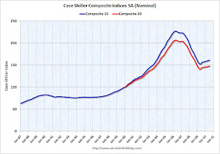
S&P/Case-Shiller released the monthly Home Price Indices for August (actually a 3 month average of June, July and August).
This includes prices for 20 individual cities, and two composite indices (10 cities and 20 cities).
 This graph shows the nominal seasonally adjusted Composite 10 and Composite 20 indices (the Composite 20 was started in January 2000).
The Composite 10 index is off 29.2% from the peak, and down 0.2% in August(SA).
The Composite 20 index is off 28.8% from the peak, and down 0.3% in August (SA).
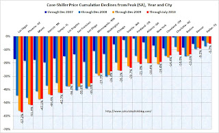
The next graph shows the price declines from the peak for each city included in S&P/Case-Shiller indices.
 Prices increased (SA) in only 1 of the 20 Case-Shiller cities in August seasonally adjusted. Only New York saw a price increase (SA) in August, and that was very small.
 Prices in Las Vegas are off 57.5% from the peak, and prices in Dallas only off 6.9% from the peak.
Prices are now falling - and falling just about everywhere. And it appears there are more price declines coming (based on inventory levels and anecdotal reports).
The CoreLogic HPI is a three month weighted average of June, July and August, and is not seasonally adjusted (NSA).
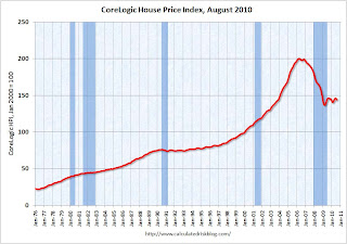 This graph shows the national CoreLogic HPI data since 1976. January 2000 = 100.
The index is down 1.5% over the last year, and off 28.2% from the peak.
The index is 5.4% above the low set in March 2009, and I expect to see a new post-bubble low for this index later this year or early in 2011. Prices are falling in most areas now (unusually for the summer months).
From the BEA:
Real gross domestic product -- the output of goods and services produced by labor and property located in the United States -- increased at an annual rate of 2.0 percent in the third quarter of 2010, (that is, from the second quarter to the third quarter), according to the "advance" estimate released by the Bureau of Economic Analysis.
 This graph shows the quarterly GDP growth (at an annual rate) for the last 30 years. The dashed line is the median growth rate of 3.05%. The current recovery is very weak as the 2nd half slowdown continues.
A key number:
Without the boost in inventories, GDP would have been barely positive in Q3.
Overall this was a weak report and will not derail QE2 next wednesday (further easing from the Fed).
The following graph compares the regional Fed surveys with the ISM manufacturing survey, including the Kansas City survey released this morning:
 For this graph I averaged the New York and Philly Fed surveys (dashed green, through October), and averaged five Fed surveys (blue) including New York, Philly, Richmond, Dallas and Kansas City.
 The Institute for Supply Management (ISM) PMI (red) is through September (right axis).
Although the internals were mixed in the regional Fed surveys, this graph suggests the ISM index will still show expansion in October. The ISM Manufacturing index will be released on Monday November 1st.
Best wishes to all.
Sunday, October 24, 2010
Summary for Week ending Oct 23rd
by Calculated Risk on 10/24/2010 09:00:00 AM
A summary of last week - mostly in graphs.
With all the Fed speeches last week it is clear that the countdown to QE2 continues (QE2: quantitative easing, 2nd round). Also "put-backs" of "soured" mortgages (repurchase demands) is picking up steam, see:
From the Fed: Industrial production and Capacity Utilization
Industrial production decreased 0.2 percent in September after having increased 0.2 percent in August. ... The capacity utilization rate for total industry edged down to 74.7 percent ...
 Click on graph for larger image in new window.
This graph shows Capacity Utilization. This series is up 9.5% from the record low set in June 2009 (the series starts in 1967).
Capacity utilization at 74.7% is still far below normal - and well below the pre-recession levels of 81.2% in November 2007.
 The second graph shows industrial production since 1967.
Industrial production declined slightly in September, and production is still 7.5% below the pre-recession levels at the end of 2007.
This is below consensus expectations of a 0.2% increase in Industrial Production, and an increase to 74.8% (from 74.7% before revision) for Capacity Utilization.
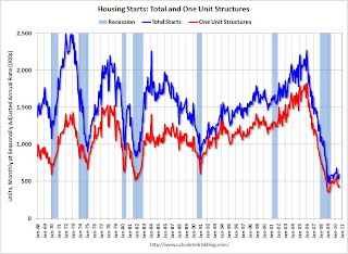
 Total housing starts were at 610 thousand (SAAR) in September, up 0.3% from the revised August rate of 608 thousand (revised up from 598 thousand), and up 28% from the all time record low in April 2009 of 477 thousand (the lowest level since the Census Bureau began tracking housing starts in 1959).
 There has been an increase in multi-family starts over the last two months, although single family starts are significantly below the levels of earlier this year.
Single-family starts increased 4.4% to 452 thousand in August. This is 25% above the record low in January 2009 (360 thousand).
This was above expectations of 580 thousand starts, mostly because of the volatile multi-family starts.
 The National Association of Home Builders (NAHB) reports the housing market index (HMI) was at 16 in October. This is a 3 point increase from 13 in September, and is the highest level since June. The record low was 8 set in January 2009, and 16 is still very low ...
Note: any number under 50 indicates that more builders view sales conditions as poor than good.
This graph compares the NAHB HMI (left scale) with single family housing starts (right scale). This includes the October release for the HMI and the August data for starts (posted before starts were released).
This shows that the HMI and single family starts mostly move in the same direction - although there is plenty of noise month-to-month.
 Moody's reported today that the Moody’s/REAL All Property Type Aggregate Index declined 3.3% in August. This is a repeat sales measure of commercial real estate prices.
Here is a comparison of the Moodys/REAL Commercial Property Price Index (CPPI) and the Case-Shiller composite 20 index.
CRE prices only go back to December 2000.
The Case-Shiller Composite 20 residential index is in blue (with Dec 2000 set to 1.0 to line up the indexes).
It is important to remember that the number of transactions is very low and there are a large percentage of distressed sales.
Note: This index is a leading indicator for new Commercial Real Estate (CRE) investment.
 Reuters reports that the American Institute of Architects’ Architecture Billings Index increased to 50.4 in September from 48.2 in August. Any reading above 50 indicates expansion.
This graph shows the Architecture Billings Index since 1996. This is the first time the index has been above 50 since Jan 2008.
Note: Nonresidential construction includes commercial and industrial facilities like hotels and office buildings, as well as schools, hospitals and other institutions.
According to the AIA, there is an "approximate nine to twelve month lag time between architecture billings and construction spending" on non-residential construction. So, if the index stays at 50 or above, this suggests there will probably be further declines in CRE investment for the next 9 to 12 months.
Here is the Philadelphia Fed Index: Business Outlook Survey
Results from the Business Outlook Survey suggest that regional manufacturing activity was steady in October. Although the broad survey measures showed marginal improvement this month, the new orders index continued to suggest weak demand for manufactured goods.
...
The survey’s broadest measure of manufacturing conditions, the diffusion index of current activity, increased from a reading of –0.7 in September to 1.0 in October.
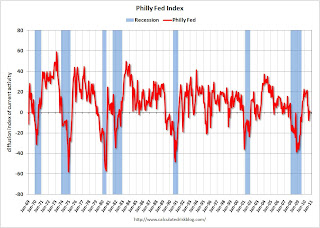 This graph shows the Philly index for the last 40 years.
This index turned down sharply in June and July and was negative in August and September (indicating contraction). The index was barely positive in October, and the internals (new orders, employment) are still weak.
These surveys are timely, but noisy. However this is further evidence of a slowdown in manufacturing. This was slightly worse than the consensus view of a reading of 1.8 (slight expansion).
Best wishes to all.
Sunday, October 03, 2010
Summary for Week ending Oct 2nd
by Calculated Risk on 10/03/2010 09:34:00 AM
Here is a summary of last week - mostly in graphs.
During the previous week, a number of Fed Presidents spoke about further easing (what is known as QE2: quantitative easing, round two). The majority seemed to favor taking additional action - probably purchasing longer term Treasury securities. Barring an upside surprise in the economic data, most analysts expect QE2 to arrive at 2:15 PM ET on November 3rd (when the next FOMC statement is released).
Another story was the "robo-signer" foreclosure mess that has led to GMAC, JPMorgan and BofA halting or reviewing foreclosure filings - and for some insurance companies to stop offering title insurance on related foreclosures.
There are links to other stories at the bottom of this post.
Based on an estimate from Autodata Corp, light vehicle sales were at a 11.76 million SAAR in Setpember. That is up 25.8% from September 2009 (the dip following cash-for-clunkers), and up 2.8% from the August 2010 sales rate.
 Click on graph for larger image in new window.
This graph shows the historical light vehicle sales (seasonally adjusted annual rate) from the BEA (blue) and an estimate for August (red, light vehicle sales of 11.76 million SAAR from Autodata Corp).
This is the high for the year - slightly higher than in March.
 The second graph shows light vehicle sales since the BEA started keeping data in 1967.
Note: dashed line is current month sales rate. The current sales rate is about at the bottom of the '90/'91 recession - when there were fewer registered drivers and a smaller population.
This was above most forecasts of around 11.6 million SAAR.
From S&P: Home Prices Remain Stable Around Recent Lows According to the S&P/Case-Shiller Home Price Indices
 This graph shows the nominal seasonally adjusted Composite 10 and Composite 20 indices (the Composite 20 was started in January 2000).
The Composite 10 index is off 29.0% from the peak, and flat in July (SA).
The Composite 20 index is off 28.6% from the peak, and down 0.1% in July (SA).
The next graph shows the price declines from the peak for each city included in S&P/Case-Shiller indices.
 Prices increased (SA) in only 4 of the 20 Case-Shiller cities in July seasonally adjusted.
Prices in Las Vegas are off 57.2% from the peak, and prices in Dallas only off 5.7% from the peak.
Prices probably declined just about everywhere in July, but this will not be evident in the Case-Shiller index until next month since the Case-Shiller index is an average of three months.
From the BEA: Personal Income and Outlays, August 2010
Personal income increased $59.3 billion, or 0.5 percent ... Personal consumption expenditures (PCE) increased $41.3 billion, or 0.4 percent.
...
Real PCE increased 0.2 percent, the same increase as in July.
...
Personal saving as a percentage of disposable personal income was
5.8 percent in August, compared with 5.7 percent in July.
 This graph shows monthly real PCE since Q4 2009. the dashed red lines are the quarterly PCE (note: left scale doesn't start at zero to show the change).
The key in this report is that real PCE growth in Q3 will probably be around 2.0% annualized - barring a significant change in September. This suggests sluggish, but positive GDP growth in Q3.
PMI at 54.4% in September down from 56.3% in August.
From the Institute for Supply Management: September 2010 Manufacturing ISM Report On Business®
 Here is a long term graph of the ISM manufacturing index.
In addition to the decrease in the PMI, the ISM's new orders index fell to 51.1 from 53.1 in August, and the production index declined to 56.5 from 59.9.
The employment index declined to 56.5 from 60.4 in August.
And the inventory index was up for the 3rd month in a row to 55.6 from 51.4.
With new order growth slowing, and inventory increasing - further declines in the ISM PMI are very likely. As ISM's Norbert Ore noted, these indexes are "sending strong negative signals of weakening performance in the [manufacturing] sector".
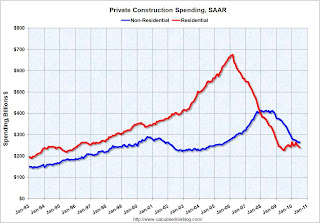
The Census Bureau reported overall construction spending increased slightly in August.
 This graph shows private residential and nonresidential construction spending since 1993. Note: nominal dollars, not inflation adjusted.
Both residential and non-residential private construction spending declined in August. Residential spending is 64.7% below the peak early 2006, and 4.7% above the recent low in 2009.
Non-residential spending is 37.3% from the peak in January 2008.
Residential spending has turned slightly negative after the tax credit expired - and this indicates residential investment (RI) will be a drag on Q3 GDP.
Best wishes to all.
Sunday, September 26, 2010
Summary for Week ending Sept 25th
by Calculated Risk on 9/26/2010 09:27:00 AM
A summary of last week - mostly in graphs.
There were a few key non-graphical stories this week: Fed Chairman Ben Bernanke expressed concern about the recovery, suggesting to many that QE2 will arrive in early November, Larry Summers is leaving the Obama Administration, the NBER announced the end date for the recent recession (June 2009), and the corporate credit union bailout was announced (coming for some time).
There are links for all of these stories and more at the bottom of this post.
The Census Bureau reported New Home Sales in August were at a seasonally adjusted annual rate (SAAR) of 288 thousand. This was unchanged from July.
 Click on graph for larger image in new window.
The first graph shows monthly new home sales (NSA - Not Seasonally Adjusted or annualized).
Note the Red columns for 2010. In August 2010, 25 thousand new homes were sold (NSA). This is a new record low for August.
The previous record low for the month of August was 34 thousand in 1981; the record high was 110 thousand in August 2005.
 The second graph shows New Home Sales vs. recessions for the last 47 years. The dashed line is the current sales rate.
 Sales of new single-family houses in August 2010 were at a seasonally adjusted annual rate of 288,000.
And another long term graph - this one for New Home Months of Supply.
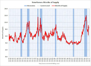 Months of supply decreased to 8.6 in August from 8.7 in July. The all time record was 12.4 months of supply in January 2009. This is still very high (less than 6 months supply is normal).
The 288 thousand annual sales rate for August is just above the all time record low in May (282 thousand). This was another very weak report. New home sales are important for the economy and jobs - and this indicates that residential investment will be a sharp drag on GDP in Q3.
The NAR reported: Existing-Home Sales Move Up in August
 This graph shows existing home sales, on a Seasonally Adjusted Annual Rate (SAAR) basis since 1993.
 Sales in August 2010 (4.13 million SAAR) were 7.6% higher than last month, and were 19.0% lower than August 2009 (5.1 million SAAR).
The next graph shows the year-over-year (YoY) change in reported existing home inventory and months-of-supply. Inventory is not seasonally adjusted, so it really helps to look at the YoY change.
 Although inventory decreased slightly from July 2010 to August 2010, inventory increased 1.5% YoY in August.
 Note: Usually July is the peak month for inventory.
The year-over-year increase in inventory is especially bad news because the reported inventory is already historically very high (around 4 million), and the 11.6 months of supply in August is far above normal.
The National Association of Home Builders (NAHB) reported the housing market index (HMI) was at 13 in September. This is the same low level as in August and below expectations. The record low was 8 set in January 2009, and 13 is very low ...
Note: any number under 50 indicates that more builders view sales conditions as poor than good.
 This graph compares the NAHB HMI (left scale) with single family housing starts (right scale). This includes the September release for the HMI and the July data for starts (August starts were released after this report).
This shows that the HMI and single family starts mostly move in the same direction - although there is plenty of noise month-to-month.
Press release from the NAHB: Builder Confidence Unchanged in September
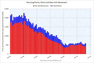 Total housing starts were at 598 thousand (SAAR) in August, up 10.5% from the revised July rate of 541 thousand (revised down from 546 thousand), and up 25% from the all time record low in April 2009 of 477 thousand (the lowest level since the Census Bureau began tracking housing starts in 1959).
 Single-family starts increased 4.3% to 438 thousand in August. This is 22% above the record low in January 2009 (360 thousand).
 The second graph shows total and single unit starts since 1968. This shows the huge collapse following the housing bubble, and that housing starts have mostly been moving sideways for over a year - with a slight up and down over the last several months due to the home buyer tax credit.
Here is the Census Bureau report on housing Permits, Starts and Completions.
This was above expectations of 550 thousand, mostly because of the volatile multi-family starts. This low level of starts is good news for the housing market longer term (there are too many housing units already), but bad news for the economy and employment short term.
Note: This index is a leading indicator for new Commercial Real Estate (CRE) investment.
Reuters reports that the American Institute of Architects’ Architecture Billings Index increased to 48.2 in August from 47.9 in July. Any reading below 50 indicates contraction.
 This graph shows the Architecture Billings Index since 1996. The index has remained below 50, indicating falling demand, since January 2008.
According to the AIA, there is an "approximate nine to twelve month lag time between architecture billings and construction spending" on non-residential construction. So there will probably be further declines in CRE investment into 2011.
Moody's reported today that the Moody’s/REAL All Property Type Aggregate Index declined 3.1% in July. This is a repeat sales measure of commercial real estate prices.
Below is a comparison of the Moodys/REAL Commercial Property Price Index (CPPI) and the Case-Shiller composite 20 index.
Notes: Beware of the "Real" in the title - this index is not inflation adjusted. Moody's CRE price index is a repeat sales index like Case-Shiller - but there are far fewer commercial sales - and that can impact prices.
 CRE prices only go back to December 2000.
The Case-Shiller Composite 20 residential index is in blue (with Dec 2000 set to 1.0 to line up the indexes).
It is important to remember that the number of transactions is very low and there are a large percentage of distressed sales.
The index is now down 43.2% from the peak in October 2007. And the index is only 0.9% above the October 2009 low.
Best wishes to all.
Sunday, September 19, 2010
Summary for week ending Sept 18th
by Calculated Risk on 9/19/2010 10:30:00 AM
A summary of last week - mostly in graphs:
From the Fed: Industrial production and Capacity Utilization
Industrial production rose 0.2 percent in August after a downwardly revised increase of 0.6 percent in July [revised down from 1.0 percent]. ... The capacity utilization rate for total industry rose to 74.7 percent, a rate 4.7 percentage points above the rate from a year earlier and 5.9 percentage points below its average from 1972 to 2009.
 Click on graph for larger image in new window.
This graph shows Capacity Utilization. This series is up 9.6% from the record low set in June 2009 (the series starts in 1967).
Capacity utilization at 74.7% is still far below normal - and well below the the pre-recession levels of 81.2% in November 2007. (Note: this is actual a decrease before the revision to July)
Note: y-axis doesn't start at zero to better show the change.
 The second graph shows industrial production since 1967.
This is the highest level for industrial production since Oct 2008, but production is still 7.2% below the pre-recession levels at the end of 2007.
The increase in August was about consensus, however the sharp downward revision to July puts this below consensus.
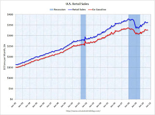 On a monthly basis, retail sales increased 0.4% from July to August (seasonally adjusted, after revisions), and sales were up 3.6% from August 2009. Retail sales increased 0.6% ex-autos.
 This graph shows retail sales since 1992. This is monthly retail sales, seasonally adjusted (total and ex-gasoline).
Retail sales are up 8.4% from the bottom, but still off 4.3% from the pre-recession peak.
Retail sales are still below the April level - and have mostly moved sideways for six months.
From CoreLogic: CoreLogic Home Price Index Remained Flat in July
 This graph shows the national CoreLogic HPI data since 1976. January 2000 = 100.
The index is flat over the last year, and off 28% from the peak.
The index is 6.1% above the low set in March 2009, and I expect to see a new post-bubble low for this index later this year or early in 2011.
 Press Release: August PCI Decline Signals Struggling Economy, but no Double-Dip
This graph shows the index since January 1999.
This is a new index, and doesn't have much of a track record in real time, although the data appears to suggest that the recovery has slowed - even stalled - over the last 4 months.
The Cleveland Fed has released the median CPI:
According to the Federal Reserve Bank of Cleveland, the median Consumer Price Index rose 0.1% (0.6% annualized rate) in August. The 16% trimmed-mean Consumer Price Index increased 0.1% (1.2% annualized rate) during the month.
...
Over the last 12 months, the median CPI rose 0.5%, the trimmed-mean CPI rose 0.9%, the CPI rose 1.1%, and the CPI less food and energy rose 0.9%.
 Click on graph for larger image in new window.
This graph shows three measure of inflation, Core CPI, Median CPI (from the Cleveland Fed), and 16% trimmed CPI (also from Cleveland Fed).
They all show that inflation has been falling, and that measured inflation is up less than 1% year-over-year. Core CPI was flat, and median CPI and the 16% trimmed mean CPI were up 0.1% in August.
Best wishes to all.
Sunday, September 05, 2010
Summary for Week ending Sept 4th
by Calculated Risk on 9/05/2010 11:45:00 AM
It was a busy week ...
The BLS reported:
1) Nonfarm payroll employment declined 54,000 in August.
2) however Decennial census employment declined 114,000.
3) so ex-Census, payrolls increased 60,000.
4) Private payrolls increased 67,000.
5) The unemployment rate increased to 9.6% from 9.5% in July.
6) Payrolls for June and July were revised up by 46,000 and 77,000 respectively.
A few graphs ...
 Click on graph for larger image.
This graph shows the job losses from the start of the employment recession, in percentage terms aligned at the bottom of the recession (Both the 1991 and 2001 recessions were flat at the bottom, so the choice was a little arbitrary).
The dotted line shows the impact of Census hiring. In August, there were only 82,000 temporary 2010 Census workers still on the payroll. The number of Census workers will continue to decline - and the remaining gap between the solid and dashed red lines will be gone soon.
Here is the graph showing the same data but aligned at the beginning of the recession.
The Employment-Population ratio increased to 58.5% in August from 58.4% in July.
 This graph shows the employment-population ratio; this is the ratio of employed Americans to the adult population.
Note: the graph doesn't start at zero to better show the change.
The Labor Force Participation Rate increased to 64.7% from 64.6% in July. This is the percentage of the working age population in the labor force. The Participation Rate is very low, and as the employment picture improves, people will return to the labor force, and that will put upward pressure on the unemployment rate.
The BLS reported that "The number of persons employed part time for economic reasons ... increased by 331,000 over the month to 8.9 million."
These workers are included in the alternate measure of labor underutilization (U-6) that increased to 16.7% in August from 16.5% in July.
 This graph shows the duration of unemployment as a percent of the civilian labor force. The graph shows the number of unemployed in four categories: less than 5 week, 6 to 14 weeks, 15 to 26 weeks, and 27 weeks or more.
In August 2010, the number of unemployed for 27 weeks or more declined significantly to 6.249 million (seasonally adjusted) from 6.752 million in July. It appears the number of long term unemployed has peaked, but it is still very difficult for these people to find a job - and this is a very serious employment issue.
The 5 to 14 week category increased sharply in August and is now at the highest level since October 2009.
The underlying details of the employment report were mixed. The positives: the upward revisions to the June and July reports, a slight increase in hours worked for manufacturing employees (flat for all employees), an increase in hourly wages, and the decrease in the long term unemployed. Other positives include the slight increase in the employment-population ratio and the participation rate.
The negatives include the hiring of only 60,000 ex-Census, the increase in the unemployment rate (including U-6), and the increase in part time workers for economic reasons.
Overall this was a weak report and is consistent with a sluggish recovery.
 Based on an estimate from Autodata Corp, light vehicle sales were at a 11.47 million SAAR in August. That is down 18.9% from August 2009 (cash-for-clunkers), and down 0.5% from the July sales rate.
This graph shows the historical light vehicle sales (seasonally adjusted annual rate) from the BEA (blue) and an estimate for August (red, light vehicle sales of 11.47 million SAAR from Autodata Corp).
The high for the year was in March, and sales have moved mostly sideways since then.
S&P/Case-Shiller released the monthly Home Price Indices for June (actually a 3 month average of April, May and June).
 This graph shows the nominal seasonally adjusted Composite 10 and Composite 20 indices (the Composite 20 was started in January 2000).
The Composite 10 index is off 29.0% from the peak, and up 0.3% in June (SA).
The Composite 20 index is off 28.4% from the peak, and up 0.3% in June (SA).
The next graph shows the price declines from the peak for each city included in S&P/Case-Shiller indices.
 Prices increased (SA) in 9 of the 20 Case-Shiller cities in June seasonally adjusted.
Prices in Las Vegas are off 56.5% from the peak, and prices in Dallas only off 4.8% from the peak.
Prices are probably falling right now (starting in July), but this will not show up in the Case-Shiller index for a few months since this an average of three months and reported with a significant lag (this was the June report).
Overall construction spending decreased in July.
 This graph shows private residential and nonresidential construction spending since 1993. Note: nominal dollars, not inflation adjusted.
From the Census Bureau: July 2010 Construction at $805.2 Billion Annual Rate
Private residential construction spending has turned down again - after the tax credit expired - and residential investment (RI) will be a drag on Q3 GDP. The "good" news is the overall drag from RI will be much smaller than during 2006, 2007 and 2008.
The Institute for Supply Management reported that the PMI increased to 56.3 in August from 55.5 in July.
 This graph shows the regional Fed manufacturing surveys and the ISM index through August.
The Fed surveys suggested that the ISM index would probably decline, but the relationship is noisy. Based on this graph I'd expect either the Fed surveys to bounce back in September - or the ISM to decline. The internals of the ISM report were soft - the new orders index declined in August to 53.1 from 53.5 in July (still expanding, but at a slower pace). And the inventory index was up for the 2nd month in a row to 51.4 - and I expect the PMI to decline in September.
 The August ISM Non-manufacturing index was at 51.5%, down from 54.3% in July. The employment index showed contraction in August at 48.2%. Note: Above 50 indicates expansion, below 50 contraction.
This graph shows the ISM non-manufacturing index (started in January 2008) and the ISM non-manufacturing employment diffusion index.
The overall ISM index, and the employment index, are both at the lowest level since January.
Best wishes to all.


