 RSS Feed
 by Calculated Risk on 5/31/2021 07:31:00 PM
Monday, May 31, 2021
Tuesday: ISM Manufacturing, Construction Spending, Vehicle Sales
Tuesday:
• At 8:00 AM ET, Corelogic House Price index for April.
• At 10:00 AM, ISM Manufacturing Index for May. The consensus is for the ISM to be at 61.0, up from 60.7 in April. The employment index was at 55.1% in April, and the new orders index was at 64.3%.
• Also at 10:00 AM, Construction Spending for April. The consensus is for a 0.6% increase in construction spending.
• At 10:30 AM, Dallas Fed Survey of Manufacturing Activity for May. This is the last of the regional surveys for May.
• All day, Light vehicle sales for May. The consensus is for light vehicle sales to be 18.0 million SAAR in May, down from 18.5 million in April (Seasonally Adjusted Annual Rate). Wards Auto is forecasting a decline in sales to 16.5 million SAAR.
Housing Inventory May 31st Update: Inventory Increased Week-over-week
by Calculated Risk on 5/31/2021 10:47:00 AM
One of the key questions for 2021 is: Will inventory increase as the pandemic subsides, or will inventory decrease further in 2021?
Tracking inventory will be very important this year.
 Click on graph for larger image in graph gallery.
This inventory graph is courtesy of Altos Research.
As of May 28th, inventory was at 327 thousand (7 day average), compared to 719 thousand the same week a year ago. That is a decline of 54.5%.
A week ago, inventory was at 324 thousand, and was down 55.3% YoY. Seasonally, inventory has bottomed.
Inventory was about 6.7% above the low in early April.
Mike Simonsen discusses this data regularly on Youtube.
Seven High Frequency Indicators for the Economy
by Calculated Risk on 5/31/2021 08:40:00 AM
These indicators are mostly for travel and entertainment. It will interesting to watch these sectors recover as the vaccine is distributed.
IMPORTANT: Be safe now - if all goes well, everyone could be vaccinated by July 4th.
----- Airlines: Transportation Security Administration -----
The TSA is providing daily travel numbers.
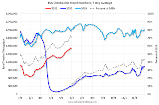 Click on graph for larger image.
This data shows the seven day average of daily total traveler throughput from the TSA for 2019 (Light Blue), 2020 (Blue) and 2021 (Red).
The dashed line is the percent of 2019 for the seven day average.
This data is as of May 30th.
The seven day average is down 29.8% from the same day in 2019 (70.2% of 2019). (Dashed line)
There was a slow increase from the bottom - and TSA data has picked up in 2021.
----- Restaurants: OpenTable -----
The second graph shows the 7 day average of the year-over-year change in diners as tabulated by OpenTable for the US and several selected cities.
----- Hotel Occupancy: STR -----
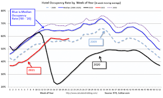 This graph shows the seasonal pattern for the hotel occupancy rate using the four week average.
The red line is for 2021, black is 2020, blue is the median, dashed purple is 2019, and dashed light blue is for 2009 (the worst year on record for hotels prior to 2020).
Occupancy is now slightly above the horrible 2009 levels.
This data is through May 22nd. Hotel occupancy is currently down 15% compared to same week in 2019). Note: Occupancy was up year-over-year, since occupancy declined sharply at the onset of the pandemic. However, occupancy is still down significantly from normal levels.
Notes: Y-axis doesn't start at zero to better show the seasonal change.
----- Gasoline Supplied: Energy Information Administration -----
 This graph, based on weekly data from the U.S. Energy Information Administration (EIA), shows gasoline supplied compared to the same week of 2019.
Blue is for 2020. Red is for 2021.
As of May 21st, gasoline supplied was up about 0.9% (about 100.9% of the same week in 2019).
This is the first week this year with gasoline supplied up compared to the same week in 2019.
----- Transit: Apple Mobility -----
This graph is from Apple mobility. From Apple: "This data is generated by counting the number of requests made to Apple Maps for directions in select countries/regions, sub-regions, and cities." This is just a general guide - people that regularly commute probably don't ask for directions.
There is also some great data on mobility from the Dallas Fed Mobility and Engagement Index. However the index is set "relative to its weekday-specific average over January–February", and is not seasonally adjusted, so we can't tell if an increase in mobility is due to recovery or just the normal increase in the Spring and Summer.
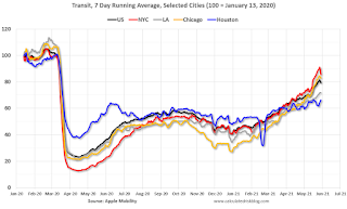 This data is through May 29th for the United States and several selected cities.
The graph is the running 7 day average to remove the impact of weekends.
IMPORTANT: All data is relative to January 13, 2020. This data is NOT Seasonally Adjusted. People walk and drive more when the weather is nice, so I'm just using the transit data.
According to the Apple data directions requests, public transit in the 7 day average for the US is at 79% of the January 2020 level and moving up.
----- New York City Subway Usage -----
Here is some interesting data on New York subway usage (HT BR).
 This graph is from Todd W Schneider. This is weekly data since 2015.
The TSA is providing daily travel numbers.
 Click on graph for larger image.
This data shows the seven day average of daily total traveler throughput from the TSA for 2019 (Light Blue), 2020 (Blue) and 2021 (Red).
The dashed line is the percent of 2019 for the seven day average.
This data is as of May 30th.
The seven day average is down 29.8% from the same day in 2019 (70.2% of 2019). (Dashed line)
There was a slow increase from the bottom - and TSA data has picked up in 2021.
The second graph shows the 7 day average of the year-over-year change in diners as tabulated by OpenTable for the US and several selected cities.
IMPORTANT: OpenTable notes: "we’ve updated the data including downloadable dataset from January 1, 2021 onward to compare seated diners from 2021 to 2019, as opposed to year over year." Thanks!
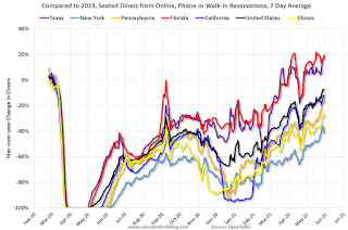 Thanks to OpenTable for providing this restaurant data:
This data is updated through May 29, 2021.
This data is "a sample of restaurants on the OpenTable network across all channels: online reservations, phone reservations, and walk-ins. For year-over-year comparisons by day, we compare to the same day of the week from the same week in the previous year."
Note that this data is for "only the restaurants that have chosen to reopen in a given market". Since some restaurants have not reopened, the actual year-over-year decline is worse than shown.
Dining picked up during the holidays, then slumped with the huge winter surge in cases. Dining is picking up again. Florida and Texas are above 2019 levels.
----- Movie Tickets: Box Office Mojo -----
 This data shows domestic box office for each week and the median for the years 2016 through 2019 (dashed light blue).
 Thanks to OpenTable for providing this restaurant data:
This data is updated through May 29, 2021.
This data is "a sample of restaurants on the OpenTable network across all channels: online reservations, phone reservations, and walk-ins. For year-over-year comparisons by day, we compare to the same day of the week from the same week in the previous year."
Note that this data is for "only the restaurants that have chosen to reopen in a given market". Since some restaurants have not reopened, the actual year-over-year decline is worse than shown.
Dining picked up during the holidays, then slumped with the huge winter surge in cases. Dining is picking up again. Florida and Texas are above 2019 levels.
 This data shows domestic box office for each week and the median for the years 2016 through 2019 (dashed light blue).
 Blue is 2020 and Red is 2021.
The data is from BoxOfficeMojo through May 27th.
Note that the data is usually noisy week-to-week and depends on when blockbusters are released.
Movie ticket sales were at $20 million last week, down about 92% from the median for the week.
Note that the data is usually noisy week-to-week and depends on when blockbusters are released.
Movie ticket sales were at $20 million last week, down about 92% from the median for the week.
 This graph shows the seasonal pattern for the hotel occupancy rate using the four week average.
 The red line is for 2021, black is 2020, blue is the median, dashed purple is 2019, and dashed light blue is for 2009 (the worst year on record for hotels prior to 2020).
Occupancy is now slightly above the horrible 2009 levels.
This data is through May 22nd. Hotel occupancy is currently down 15% compared to same week in 2019). Note: Occupancy was up year-over-year, since occupancy declined sharply at the onset of the pandemic. However, occupancy is still down significantly from normal levels.
Notes: Y-axis doesn't start at zero to better show the seasonal change.
 This graph, based on weekly data from the U.S. Energy Information Administration (EIA), shows gasoline supplied compared to the same week of 2019.
Blue is for 2020. Red is for 2021.
As of May 21st, gasoline supplied was up about 0.9% (about 100.9% of the same week in 2019).
This is the first week this year with gasoline supplied up compared to the same week in 2019.
This graph is from Apple mobility. From Apple: "This data is generated by counting the number of requests made to Apple Maps for directions in select countries/regions, sub-regions, and cities." This is just a general guide - people that regularly commute probably don't ask for directions.
There is also some great data on mobility from the Dallas Fed Mobility and Engagement Index. However the index is set "relative to its weekday-specific average over January–February", and is not seasonally adjusted, so we can't tell if an increase in mobility is due to recovery or just the normal increase in the Spring and Summer.
 This data is through May 29th for the United States and several selected cities.
The graph is the running 7 day average to remove the impact of weekends.
IMPORTANT: All data is relative to January 13, 2020. This data is NOT Seasonally Adjusted. People walk and drive more when the weather is nice, so I'm just using the transit data.
According to the Apple data directions requests, public transit in the 7 day average for the US is at 79% of the January 2020 level and moving up.
Here is some interesting data on New York subway usage (HT BR).
 This graph is from Todd W Schneider. This is weekly data since 2015.
 Most weeks are between 30 and 35 million entries, and currently there are almost 12 million subway turnstile entries per week - and increasing.
This data is through Friday, May 28th.
Schneider has graphs for each borough, and links to all the data sources.
He notes: "Data updates weekly from the MTA’s public turnstile data, usually on Saturday mornings".
This data is through Friday, May 28th.
Schneider has graphs for each borough, and links to all the data sources.
He notes: "Data updates weekly from the MTA’s public turnstile data, usually on Saturday mornings".
Sunday, May 30, 2021
May 30th COVID-19 New Cases, Vaccinations, Hospitalizations
by Calculated Risk on 5/30/2021 04:23:00 PM
Note: Many local areas will not report tomorrow due to the Memorial Holiday.
According to the CDC, on Vaccinations.
Total doses administered: 294,928,850, as of yesterday 293,705,050. Day: 1.22 million.
| COVID Metrics | |||
|---|---|---|---|
| Current | Yesterday | Goal | |
| Percent over 18, One Dose | 62.6% | 62.4% | ≥70.0%1,2 |
| Fully Vaccinated (millions) | 135.1 | 134.4 | ≥1601 |
| New Cases per Day3 | 18,913 | 20,277 | ≤5,0002 |
| Hospitalized3 | 20,780 | 21,571 | ≤3,0002 |
| Deaths per Day3 | 442 | 454 | ≤502 |
| 1 America's Goal by July 4th, 2my goals to stop daily posts, 37 day average for Cases, Hospitalized, and Deaths | |||
KUDOS to the residents of the ten states that have already achieved the 70% goal: Vermont and Hawaii are over 80%, plus Massachusetts, Connecticut, Maine, New Jersey, Rhode Island, New Mexico, Pennsylvania and New Hampshire all over 70%.
Next up are Maryland at 69.9%, California at 69.8%, Washington at 69.1%, D.C. at 68.2%, and New York at 67.7%, Minnesota at 67.4%, Illinois at 67.3%, and Virginia at 67.2%.
The Atlantic: "Why You Should Wait Out the Wild Housing Market"
by Calculated Risk on 5/30/2021 11:12:00 AM
I'm quoted several times in this article from Derek Thompson at the Atlantic: Why You Should Wait Out the Wild Housing Market
“In my time studying housing markets, I’ve seen bubbles and I’ve seen busts,” says Bill McBride, an economics writer who famously predicted the 2007 housing crash. “But I’ve never seen anything quite like this. It’s a perfect storm.”In the article, I suggested waiting ... but I'd like to add, if you do buy now, be careful about location (like near a busy street) because that can't be fixed. Also bad layouts are difficult and expensive to fix.
...
“It’s not clear at all to me that things are going to slow down significantly in the near future,” he said. “In 2005, I had a strong sense that the hot market would turn and that, when it turned, things would get very ugly. Today, I don’t have that sense at all, because all of the fundamentals are there. Demand will be high for a while, because Millennials need houses. Prices will keep rising for a while, because inventory is so low.”
Defective homes will make you unhappy, and they are also hard to sell in a normal market (you might have to wait for the next boom).
Hot markets are when the defective homes (bad location, bad layout, etc.) are sold. Don’t buy one of those!
Saturday, May 29, 2021
May 29th COVID-19 New Cases, Vaccinations, Hospitalizations
by Calculated Risk on 5/29/2021 05:10:00 PM
This data is from the CDC.
According to the CDC, on Vaccinations.
Total doses administered: 293,705,050, as of yesterday 292,099,778. Day: 1.61 million.
| COVID Metrics | |||
|---|---|---|---|
| Current | Yesterday | Goal | |
| Percent over 18, One Dose | 62.4% | 62.2% | 70.0%1,2 |
| Fully Vaccinated (millions) | 134.4 | 133.5 | 1601 |
| New Cases per Day3 | 20,277 | 20,901 | 5,0002 |
| Hospitalized3 | 21,571 | 21,928 | 3,0002 |
| Deaths per Day3 | 447 | 453 | 502 |
| 1 America's Goal by July 4th, 2my goals to stop daily posts, 37 day average for Cases, Hospitalized, and Deaths | |||
KUDOS to the ten states that have already achieved the 70% goal: Vermont and Hawaii over 80%, plus Massachusetts, Connecticut, Maine, New Jersey, Rhode Island, New Mexico, Pennsylvania and New Hampshire all over 70%.
Next up are Maryland at 69.9%, California at 69.6%, Washington at 68.8%, D.C. at 68.0%, and New York at 67.5%.
Schedule for Week of May 30, 2021
by Calculated Risk on 5/29/2021 08:11:00 AM
The key report scheduled for this week is the May employment report.
Other key reports include the May ISM Manufacturing and Service surveys, and May Vehicle Sales.
All US markets will be closed in observance of Memorial Day.
8:00 AM: Corelogic House Price index for April.
10:00 AM: ISM Manufacturing Index for May. The consensus is for the ISM to be at 61.0, up from 60.7 in April. The employment index was at 55.1% in April, and the new orders index was at 64.3%.
10:00 AM: Construction Spending for April. The consensus is for a 0.6% increase in construction spending.
10:30 AM: Dallas Fed Survey of Manufacturing Activity for May. This is the last of the regional surveys for May.
 All day: Light vehicle sales for May. The consensus is for light vehicle sales to be 18.0 million SAAR in May, down from 18.5 million in April (Seasonally Adjusted Annual Rate).
Wards Auto is forecasting a decline in sales to 16.5 million SAAR.
This graph shows light vehicle sales since the BEA started keeping data in 1967. The dashed line is the sales rate for last month.
----- Wednesday, June 2nd -----
7:00 AM ET: The Mortgage Bankers Association (MBA) will release the results for the mortgage purchase applications index.
2:00 PM: the Federal Reserve Beige Book, an informal review by the Federal Reserve Banks of current economic conditions in their Districts.
----- Thursday, June 3rd -----
8:15 AM: The ADP Employment Report for May. This report is for private payrolls only (no government). The consensus is for 650,000 payroll jobs added in May, down from 742,000 in April.
8:30 AM: The initial weekly unemployment claims report will be released. The consensus is for a decrease to 395 thousand from 406 thousand last week.
10:00 AM: the ISM Services Index for May. The consensus is for a reading of 63.0, up from 62.7.
----- Friday, June 4th -----
7:00 AM: Speech, Fed Chair Jerome Powell, Central banks and climate change, At the Green Swan 2021 Global Virtual Conference
 8:30 AM: Employment Report for May. The consensus is for 650,000 jobs added, and for the unemployment rate to decrease to 5.9%.
There were 266,000 jobs added in April, and the unemployment rate was at 6.1%.
This graph shows the job losses from the start of the employment recession, in percentage terms.
The current employment recession was by far the worst recession since WWII in percentage terms, but currently is not as severe as the worst of the "Great Recession".
This graph shows light vehicle sales since the BEA started keeping data in 1967. The dashed line is the sales rate for last month.
7:00 AM ET: The Mortgage Bankers Association (MBA) will release the results for the mortgage purchase applications index.
2:00 PM: the Federal Reserve Beige Book, an informal review by the Federal Reserve Banks of current economic conditions in their Districts.
8:15 AM: The ADP Employment Report for May. This report is for private payrolls only (no government). The consensus is for 650,000 payroll jobs added in May, down from 742,000 in April.
8:30 AM: The initial weekly unemployment claims report will be released. The consensus is for a decrease to 395 thousand from 406 thousand last week.
10:00 AM: the ISM Services Index for May. The consensus is for a reading of 63.0, up from 62.7.
7:00 AM: Speech, Fed Chair Jerome Powell, Central banks and climate change, At the Green Swan 2021 Global Virtual Conference
 8:30 AM: Employment Report for May. The consensus is for 650,000 jobs added, and for the unemployment rate to decrease to 5.9%.
There were 266,000 jobs added in April, and the unemployment rate was at 6.1%.
This graph shows the job losses from the start of the employment recession, in percentage terms.
The current employment recession was by far the worst recession since WWII in percentage terms, but currently is not as severe as the worst of the "Great Recession".
Friday, May 28, 2021
Real Personal Income less Transfer Payments Above Previous Peak
by Calculated Risk on 5/28/2021 03:48:00 PM
Government transfer payments decreased sharply in April compared to March, but were still almost $1.4 trillion (on SAAR basis) above the February 2020 level (pre-pandemic). Most of the increase in transfer payments - compared to the levels prior to the crisis - is from unemployment insurance and "other" (includes direct payments).
This table shows the amount of unemployment insurance and "Other" transfer payments since February 2020 (pre-crisis level). The increase in "Other" was mostly due to parts of the relief acts including direct payments.
There was a large increase in "Other" in March due to the American Rescue Plan Act.
Note: Not in the table below, but Social Security payments haven't increased significantly since the pre-recession levels (from $1,065 billion SAAR in Jan 2020 to $1,108 billion SAAR in Apr 2021).
A key measure of the health of the economy (Used by NBER in recession dating) is Real Personal Income less Transfer payments.
 Click on graph for larger image.
This graph shows real personal income less transfer payments since 1990.
This measure of economic activity increased 0.5% in April, compared to March, and was up 0.3% compared to February 2020 (previous peak).
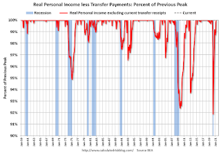 Another way to look at this data is as a percent of the previous peak.
Real personal income less transfer payments was off 8.1% in April 2020. That was a larger decline than the worst of the great recession.
Currently personal income less transfer payments are at a new peak.
This is the first of the key NBER measures - GDP, Employment, Industrial Production, Real Personal Income less Transfer Payments - that is above pre-recession levels. GDP will be above pre-recession levels in Q2.
| Selected Transfer Payments Billions of dollars, SAAR | ||
|---|---|---|
| Other | Unemployment Insurance | |
| Feb-20 | $506 | $28 |
| Mar-20 | $515 | $74 |
| Apr-20 | $3,379 | $493 |
| May-20 | $1,360 | $1,356 |
| Jun-20 | $758 | $1,405 |
| Jul-20 | $760 | $1,331 |
| Aug-20 | $692 | $636 |
| Sep-20 | $936 | $359 |
| Oct-20 | $732 | $304 |
| Nov-20 | $620 | $281 |
| Dec-20 | $654 | $304 |
| Jan-21 | $2,354 | $556 |
| Feb-21 | $777 | $535 |
| Mar-21 | $4,747 | $541 |
| Apr-21 | $1,400 | $495 |
A key measure of the health of the economy (Used by NBER in recession dating) is Real Personal Income less Transfer payments.
 Click on graph for larger image.
This graph shows real personal income less transfer payments since 1990.
This measure of economic activity increased 0.5% in April, compared to March, and was up 0.3% compared to February 2020 (previous peak).
 Another way to look at this data is as a percent of the previous peak.
Real personal income less transfer payments was off 8.1% in April 2020. That was a larger decline than the worst of the great recession.
Currently personal income less transfer payments are at a new peak.
This is the first of the key NBER measures - GDP, Employment, Industrial Production, Real Personal Income less Transfer Payments - that is above pre-recession levels. GDP will be above pre-recession levels in Q2.
May 28th COVID-19 New Cases, Vaccinations, Hospitalizations
by Calculated Risk on 5/28/2021 03:42:00 PM
This data is from the CDC.
According to the CDC, on Vaccinations.
Total doses administered: 292,099,778, as of yesterday 290,724,607. Day: 1.38 million.
| COVID Metrics | |||
|---|---|---|---|
| Current | Yesterday | Goal | |
| Percent over 18, One Dose | 62.2% | 62.0% | 70.0%1,2 |
| Fully Vaccinated (millions) | 133.5 | 132.8 | 1601 |
| New Cases per Day3 | 20,882 | 21,659 | 5,0002 |
| Hospitalized3 | 21,928 | 22,443 | 3,0002 |
| Deaths per Day3 | 453 | 437 | 502 |
| 1 America's Goal by July 4th, 2my goals to stop daily posts, 37 day average for Cases, Hospitalized, and Deaths | |||
KUDOS to the ten states that have already achieved the 70% goal: Vermont, Hawaii, Massachusetts, Connecticut, Maine, New Jersey, Rhode Island, New Mexico, Pennsylvania and New Hampshire.
Next up are Maryland at 69.6%, California at 69.3%, and Washington at 68.2%.
Fannie Mae: Mortgage Serious Delinquency Rate Decreased in April
by Calculated Risk on 5/28/2021 01:32:00 PM
Fannie Mae reported that the Single-Family Serious Delinquency decreased to 2.38% in April, from 2.58% in March. The serious delinquency rate is up from 0.70% in April 2020.
These are mortgage loans that are "three monthly payments or more past due or in foreclosure".
The Fannie Mae serious delinquency rate peaked in February 2010 at 5.59% following the housing bubble, and peaked at 3.32% in August 2020 during the pandemic.
 Click on graph for larger image
By vintage, for loans made in 2004 or earlier (2% of portfolio), 5.44% are seriously delinquent (down from 5.66% in March). For loans made in 2005 through 2008 (2% of portfolio), 9.33% are seriously delinquent (down from 9.65%), For recent loans, originated in 2009 through 2021 (96% of portfolio), 1.94% are seriously delinquent (down from 2.13%). So Fannie is still working through a few poor performing loans from the bubble years.
Mortgages in forbearance are counted as delinquent in this monthly report, but they will not be reported to the credit bureaus.
This is very different from the increase in delinquencies following the housing bubble. Lending standards have been fairly solid over the last decade, and most of these homeowners have equity in their homes - and they will be able to restructure their loans once they are employed.
Note: Freddie Mac reported earlier.
Q2 GDP Forecasts: Around 10%
by Calculated Risk on 5/28/2021 11:17:00 AM
From Merrill Lynch:
We continue to track 11% qoq saar after robust capex data this week [May 28 estimate]From Goldman Sachs:
emphasis added
We lowered our Q2 GDP tracking estimate by 0.5pp to +9.5% (qoq ar) to reflect the higher price deflator and the composition of the nominal spending revisions. [May 28 estimate]From the NY Fed Nowcasting Report
The New York Fed Staff Nowcast stands at 4.3% for 2021:Q2. [May 28 estimate]And from the Altanta Fed: GDPNow
The GDPNow model estimate for real GDP growth (seasonally adjusted annual rate) in the second quarter of 2021 is 9.3 percent on May 28, up from 9.1 percent on May 27. [May 28 estimate]
Black Knight: Number of Homeowners in COVID-19-Related Forbearance Plans Increased
by Calculated Risk on 5/28/2021 09:28:00 AM
Note: Both Black Knight and the MBA (Mortgage Bankers Association) are putting out weekly estimates of mortgages in forbearance.
This data is as of May 25th.
From Black Knight: Forbearance Volumes Increase Again, Moderate Opportunity for Additional Improvement in Early June
The country saw another week of forbearance increases this week, with volumes rising by another 16k (+0.73%). This marked the second consecutive week of increases after a sustained downward trend. Despite the raising volume, this is still only the third overall increase over the past 12 weeks. As of May 25, 2.2M (4.1% of) homeowners remain in COVID-19 related forbearance plans, including 2.4% of GSE, 7.3% of FHA/VA and 4.8% of portfolio/PLS loans.
Click on graph for larger image.
After seeing improvement accelerate as early forbearance entrants went through the 12-month review process in March and April, exit activity has since returned to more “normal” levels. Mid- to late-month increases in forbearance plan volumes like we’ve seen in the past two weeks have been very common during the recovery to-date.
Plan starts hit their highest level in nine weeks, primarily driven by elevated levels of restart activity. while new plans starts still remain low, they edged slightly upward, hitting their highest level in nine weeks as well.
...
Nearly 145k plans are still listed with May 2021 expirations, providing a moderate opportunity for additional improvements over the next two weeks and, more acutely, in early June. Another 780k plans are currently slated for review for extension/removal in June, the final quarterly review before early forbearance entrants begin to reach their 18-month plan expirations later this year.
June will mark the 15-month review point for many of the early forbearance entrants, so we will be watching exit velocity closely during that time.
emphasis added

Personal Income Decreased 13.1% in April, Spending increased 2.4%
by Calculated Risk on 5/28/2021 08:37:00 AM
The BEA released the Personal Income and Outlays report for April:
Personal income decreased $3.21 trillion (13.1 percent) in April according to estimates released today by the Bureau of Economic Analysis. Disposable personal income (DPI) decreased $3.22 trillion (14.6 percent) and personal consumption expenditures (PCE) increased $80.3 billion (0.5 percent).The April PCE price index increased 3.6 percent year-over-year and the April PCE price index, excluding food and energy, increased 3.1 percent year-over-year.
Real DPI decreased 15.1 percent in April and Real PCE decreased 0.1 percent; goods decreased 1.3 percent and services increased 0.6 percent. The PCE price index increased 0.6 percent. Excluding food and energy, the PCE price index increased 0.7 percent.
emphasis added
The following graph shows real Personal Consumption Expenditures (PCE) through April 2021 (2012 dollars). Note that the y-axis doesn't start at zero to better show the change.
 Click on graph for larger image.
The dashed red lines are the quarterly levels for real PCE.
Personal income was above expectations, and the increase in PCE was at expectations.
Thursday, May 27, 2021
Friday: Personal Income & Outlays
by Calculated Risk on 5/27/2021 09:03:00 PM
Friday:
• At 8:30 AM ET, Personal Income and Outlays, April 2021. The consensus is for a 14.8% decrease in personal income, and for a 0.5% increase in personal spending. And for the Core PCE price index to increase 0.6%.
• At 9:45 AM, Chicago Purchasing Managers Index for May.
• At 10:00 AM, University of Michigan's Consumer sentiment index (Final for May). The consensus is for a reading of 83.0.
Las Vegas Visitor Authority for April: No Convention Attendance, Visitor Traffic Down 27% Compared to 2019
by Calculated Risk on 5/27/2021 04:58:00 PM
From the Las Vegas Visitor Authority: April 2021 Las Vegas Visitor Statistics
Visitation continued to ramp up in April as the destination welcomed more than 2.5M visitors, up more than 15% MoM and down roughly ‐27% vs. pre‐COVID levels in Apr 2019.
Hotel occupancy increased to 65.6%, up 10.1 pts MoM, with Weekend occupancy improving to 83.5%, up 5.8 pts MoM and within 13 pts of Apr 2019 levels.
 Click on graph for larger image.
 The first graph shows visitor traffic for 2019 (blue), 2020 (orange) and 2021 (red).
Visitor traffic was down 27.3% compared to the same month in 2019.
Convention traffic was non-existent again in April, and was down 100% compared to April 2019.
There has been no convention traffic since March 2020.
I'll add a graph of convention traffic once conventions start to reopen.
Note: A convention is scheduled for early June (HT MS): "Informa Markets, organizers of the World of Concrete, has received approval from the Nevada Department of Business and Industry to move forward with its 2021 in-person edition. The event is scheduled to be held June 8-10, 2021 at the Las Vegas Convention Center."
May 27th COVID-19 New Cases, Vaccinations, Hospitalizations
by Calculated Risk on 5/27/2021 03:38:00 PM
I'm switching to a simple table to track progress.
| COVID Metrics (7 day average Cases, Hospitalized, Deaths) | |||
|---|---|---|---|
| Current | Yesterday | Goal | |
| Percent over 18, One Dose | 62.0% | 61.8% | 70.0%1,2 |
| Fully Vaccinated (millions) | 132.8 | 131.8 | 1601 |
| New Cases per Day | 21,627 | 22,139 | 5,0002 |
| Hospitalized | 22,443 | 22,810 | 3,0002 |
| Deaths per Day | 437 | 435 | 502 |
| 1 Biden Administration Goals, 2my goals | |||
This data is from the CDC.
Hotels: Occupancy Rate Down 15% Compared to Same Week in 2019
by Calculated Risk on 5/27/2021 11:39:00 AM
Note: The year-over-year occupancy comparisons are easy, since occupancy declined sharply at the onset of the pandemic. However, occupancy is still down significantly from normal levels.
The occupancy rate is down 15.1% compared to the same week in 2019.
U.S. weekly hotel occupancy reached the 60% mark for the first time since the start of the pandemic, according to STR‘s latest data through May 22.The following graph shows the seasonal pattern for the hotel occupancy rate using the four week average.
May 16-22, 2021 (percentage change from comparable week in 2019*):
• Occupancy: 60.3% (-15.1%)
• Average daily rate (ADR): US$115.57 (-13.6%)
• Revenue per available room (RevPAR): US$69.69 (-26.6%)
ADR also reached its highest point of the pandemic but was still US$18 less than the corresponding week in 2019. RevPAR also hit a high point when compared to 2019.
emphasis added
Click on graph for larger image.The red line is for 2021, black is 2020, blue is the median, dashed purple is 2019, and dashed light blue is for 2009 (the worst year on record for hotels prior to 2020).
Occupancy is now above the horrible 2009 levels.
Note: Y-axis doesn't start at zero to better show the seasonal change.
Note: Y-axis doesn't start at zero to better show the seasonal change.
NAR: Pending Home Sales Decreased 4.4% in April
by Calculated Risk on 5/27/2021 10:03:00 AM
From the NAR: Pending Home Sales Drop 4.4% in April
Pending home sales took a step backward in April, according to the National Association of Realtors®. All four U.S. regions recorded year-over-year increases, but only the Midwest witnessed month-over-month gains in terms of pending home sales contract transactions.This was well below expectations of a 1.2% increase for this index. Note: Contract signings usually lead sales by about 45 to 60 days, so this would usually be for closed sales in May and June.
The Pending Home Sales Index (PHSI), a forward-looking indicator of home sales based on contract signings, fell 4.4% to 106.2 in April. Year-over-year, signings jumped 51.7% as last year's pandemic-related shutdowns slumped sales to an all-time low. An index of 100 is equal to the level of contract activity in 2001.
...
The Northeast PHSI declined 12.9% to 85.3 in April, a 96.5% jump from a year ago. In the Midwest, the index increased 3.5% to 101.1 last month, up 39.4% from April 2020.
Pending home sales transactions in the South fell 6.1% to an index of 128.9 in April, up 45.3% from April 2020. The index in the West decreased 2.6% in April to 92.0, up 57.3% from a year prior.
emphasis added
Weekly Initial Unemployment Claims decrease to 406,000
by Calculated Risk on 5/27/2021 08:40:00 AM
The DOL reported:
In the week ending May 22, the advance figure for seasonally adjusted initial claims was 406,000, a decrease of 38,000 from the previous week's unrevised level of 444,000. This is the lowest level for initial claims since March 14, 2020 when it was 256,000. The 4-week moving average was 458,750, a decrease of 46,000 from the previous week's unrevised average of 504,750. This is the lowest level for this average since March 14, 2020 when it was 225,500.This does not include the 93,546 initial claims for Pandemic Unemployment Assistance (PUA) that was down from 95,142 the previous week.
emphasis added
The following graph shows the 4-week moving average of weekly claims since 1971.
 Click on graph for larger image.
The dashed line on the graph is the current 4-week average. The four-week average of weekly unemployment claims decreased to 458,750.
The previous week was unrevised.
Regular state continued claims decreased to 3,642,000 (SA) from 3,738,000 (SA) the previous week.
Note: There are an additional 6,515,657 receiving Pandemic Unemployment Assistance (PUA) that decreased from 6,606,198 the previous week (there are questions about these numbers). This is a special program for business owners, self-employed, independent contractors or gig workers not receiving other unemployment insurance. And an additional 5,191,642 receiving Pandemic Emergency Unemployment Compensation (PEUC) up from 5,142,370.
Weekly claims were lower than the consensus forecast.
Q1 GDP Growth Unchanged at 6.4% Annual Rate
by Calculated Risk on 5/27/2021 08:33:00 AM
From the BEA: Gross Domestic Product, 1st Quarter 2021 (Second Estimate); Corporate Profits, 1st Quarter 2021 (Preliminary Estimate)
Real gross domestic product (GDP) increased at an annual rate of 6.4 percent in the first quarter of 2021 , according to the "second" estimate released by the Bureau of Economic Analysis. In the fourth quarter of 2020, real GDP increased 4.3 percent.Here is a Comparison of Second and Advance Estimates. PCE growth was revised up from 10.7% to 11.3%. Residential investment was revised up from 10.8% to 12.7%. This was slightly below the consensus forecast.
The GDP estimate released today is based on more complete source data than were available for the "advance" estimate issued last month. In the advance estimate, the increase in real GDP was also 6.4 percent. Upward revisions to consumer spending and nonresidential fixed investment were offset by downward revisions to exports and private inventory investment. Imports, which are a subtraction in the calculation of GDP, were revised up
emphasis added
Wednesday, May 26, 2021
Thursday: GDP, Unemployment Claims, Durable Goods, Pending Home Sales
by Calculated Risk on 5/26/2021 09:00:00 PM
Thursday:
• At 8:30 AM ET, The initial weekly unemployment claims report will be released. The consensus is for a decrease to 420 thousand from 444 thousand last week.
• Also at 8:30 AM, Gross Domestic Product, 1st quarter 2021 (Second estimate). The consensus is that real GDP increased 6.5% annualized in Q1, up from the advance estimate of 6.4%.
• Also at 8:30 AM, Durable Goods Orders for April from the Census Bureau. The consensus is for a 0.8% increase in durable goods orders.
• At 10:00 AM, Pending Home Sales Index for April. The consensus is for a 1.2% increase in the index.
• At 11:00 AM, the Kansas City Fed manufacturing survey for May.
May 26th COVID-19 New Cases, Vaccinations, Hospitalizations
by Calculated Risk on 5/26/2021 04:09:00 PM
The economy will pick up speed as more and more people get vaccinated!
According to the CDC, on Vaccinations. Total administered: 289,212,304, as of yesterday 287,788,872. Day: 1.42 million. (U.S. Capacity is around 4 million per day)
1) 61.8% of the population over 18 has had at least one dose (70% is the goal by July 4th).
2) 131.8 million Americans are fully vaccinated (160 million goal by July 4th)
Note: I'll stop posting this daily once all four of these criteria are met:
1) 70% of the population over 18 has had at least one dose of vaccine, and
2) new cases are under 5,000 per day, and
3) hospitalizations are below 3,000, and
4) average daily deaths under 50 (currently 435 per day).
And check out COVID Act Now to see how each state is doing.
Almost 13,000 US deaths were reported so far in May due to COVID.
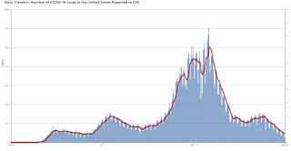
 Click on graph for larger image.
This graph shows the daily (columns) 7 day average (line) of positive tests reported.
This data is from the CDC.
 Click on graph for larger image.
This graph shows the daily (columns) 7 day average (line) of positive tests reported.
This data is from the CDC.
The 7-day average is 22,139, down from 23,220 yesterday. This is the lowest since June 9, 2020.
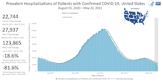
The second graph shows the number of people hospitalized.
 This data is also from the CDC.
The CDC cautions that due to reporting delays, the area in grey will probably increase.
The current 7-day average is 22,810, down from 23,183 reported yesterday, and below the post-summer surge low.
The second graph shows the number of people hospitalized.
 This data is also from the CDC.
The CDC cautions that due to reporting delays, the area in grey will probably increase.
The current 7-day average is 22,810, down from 23,183 reported yesterday, and below the post-summer surge low.
House Prices and Inventory
by Calculated Risk on 5/26/2021 01:37:00 PM
Watching existing home "for sale" inventory is very helpful. As an example, the increase in inventory in late 2005 helped me call the top for housing.
And the decrease in inventory eventually helped me correctly call the bottom for house prices in early 2012, see: The Housing Bottom is Here.
And in 2015, it appeared the inventory build in several markets was ending, and that boosted price increases.
In 2020, with the pandemic, inventory dropped to record lows, and prices really increased (record low mortgage rates and demographics were factors too).
I don't have a crystal ball, but watching inventory helps understand the housing market.
 Click on graph for larger image.
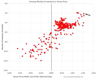
This graph below shows existing home months-of-supply (inverted, from the NAR) vs. the seasonally adjusted month-to-month price change in the Case-Shiller National Index (both since January 1999 through March 2021).
I don't have a crystal ball, but watching inventory helps understand the housing market.
 Click on graph for larger image.
This graph below shows existing home months-of-supply (inverted, from the NAR) vs. the seasonally adjusted month-to-month price change in the Case-Shiller National Index (both since January 1999 through March 2021).
There is a clear relationship, and this is no surprise (but interesting to graph). If months-of-supply is high, prices decline. If months-of-supply is very low (like now), prices rise quickly.
In March, the months-of-supply was at 2.1 months, and the Case-Shiller National Index (SA) increased 1.5% month-over-month (a month-over-month record). The black arrow points to the March dot.
In the April existing home sales report released last week, the NAR reported months-of-supply increased to 2.4 month in April. There is a seasonal pattern to inventory, but this is still very low - and prices are increasing sharply.
In the April existing home sales report released last week, the NAR reported months-of-supply increased to 2.4 month in April. There is a seasonal pattern to inventory, but this is still very low - and prices are increasing sharply.
Freddie Mac: Mortgage Serious Delinquency Rate decreased in April
by Calculated Risk on 5/26/2021 10:42:00 AM
Freddie Mac reported that the Single-Family serious delinquency rate in April was 2.15%, down from 2.34% in March. Freddie's rate is up year-over-year from 0.64% in April 2020.
Freddie's serious delinquency rate peaked in February 2010 at 4.20% following the housing bubble, and peaked at 3.17% in August 2020 during the pandemic.
These are mortgage loans that are "three monthly payments or more past due or in foreclosure".
 Click on graph for larger image
Mortgages in forbearance are being counted as delinquent in this monthly report, but they will not be reported to the credit bureaus.
This is very different from the increase in delinquencies following the housing bubble. Lending standards have been fairly solid over the last decade, and most of these homeowners have equity in their homes - and they will be able to restructure their loans once (if) they are employed.
Also - for multifamily - delinquencies were at 0.20%, up from 0.17% in March, and up more than double from 0.08% in April 2020.
New Home Prices
by Calculated Risk on 5/26/2021 10:21:00 AM
As part of the new home sales report released yesterday, the Census Bureau reported the number of homes sold by price and the average and median prices.
From the Census Bureau: "The median sales price of new houses sold in April 2021 was $372,400. The average sales price was $435,400."
The following graph shows the median and average new home prices.
 Click on graph for larger image.
During the housing bust, the builders had to build smaller and less expensive homes to compete with all the distressed sales. When housing started to recovery - with limited finished lots in recovering areas - builders moved to higher price points to maximize profits.
Then the average and median house prices mostly moved sideways since 2017 due to home builders offering more lower priced homes. Prices picked up during the pandemic, and really picked up recently.
The average price in April 2021 was $435,400, up 21% year-over-year. The median price was $372,400, up 20% year-over-year.
The second graph shows the percent of new homes sold by price.
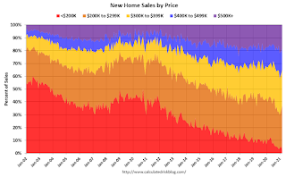 Very few new homes sold were under $200K in April 2021 (about 2.6% of all homes). This is down from 56% in 2002. In general, the under $200K bracket is going away.
The $400K and greater than $500K+ brackets increased significantly over the last decade. A majority of new homes (about 59% in April) in the U.S., are in the $200K to $400K range.
The average price in April 2021 was $435,400, up 21% year-over-year. The median price was $372,400, up 20% year-over-year.
The second graph shows the percent of new homes sold by price.
 Very few new homes sold were under $200K in April 2021 (about 2.6% of all homes). This is down from 56% in 2002. In general, the under $200K bracket is going away.
 The $400K and greater than $500K+ brackets increased significantly over the last decade. A majority of new homes (about 59% in April) in the U.S., are in the $200K to $400K range.
MBA: Mortgage Applications Decrease in Latest Weekly Survey
by Calculated Risk on 5/26/2021 07:00:00 AM
From the MBA: Mortgage Applications Decrease in Latest MBA Weekly Survey
Mortgage applications decreased 4.2 percent from one week earlier, according to data from the Mortgage Bankers Association’s (MBA) Weekly Mortgage Applications Survey for the week ending May 21, 2021.
... The Refinance Index decreased 7 percent from the previous week and was 9 percent lower than the same week one year ago. The seasonally adjusted Purchase Index increased 2 percent from one week earlier. The unadjusted Purchase Index increased 1 percent compared with the previous week and was 4 percent lower than the same week one year ago.
“Mortgage applications decreased last week as mortgage rates increased to 3.18 percent. Refinances dropped 7 percent as a result, driven by declines in both conventional and government refinance activity,” said Joel Kan, MBA’s Associate Vice President of Economic and Industry Forecasting. “Purchase applications increased for the second time in three weeks, rebounding after a rather weak April with mostly weekly declines. While purchase activity was around 4 percent lower than a year ago, the comparison is to last spring’s large upswing in activity as pandemic-related lockdowns lifted. Demand is robust throughout the country, but homebuyers continue to be held back by the lack of homes for sale and rapidly increasing home prices.”
...
The average contract interest rate for 30-year fixed-rate mortgages with conforming loan balances ($548,250 or less) increased to 3.18 percent from 3.15 percent, with points decreasing to 0.35 from 0.36 (including the origination fee) for 80 percent loan-to-value ratio (LTV) loans.
emphasis added
 Click on graph for larger image.
The first graph shows the refinance index since 1990.
With low rates, the index remains elevated, but below recent levels since mortgage rates have moved up from the record lows.
The second graph shows the MBA mortgage purchase index
 According to the MBA, purchase activity is down 4% year-over-year unadjusted.
Note: The year ago comparisons for the unadjusted purchase index are now more difficult since purchase activity picked up in late May 2020.
Note: Red is a four-week average (blue is weekly).
Tuesday, May 25, 2021
Zillow Case-Shiller House Price Forecast: "Not Slowing Any Time Soon", 14.3% YoY in April
by Calculated Risk on 5/25/2021 03:50:00 PM
The Case-Shiller house price indexes for March were released today. Zillow forecasts Case-Shiller a month early, and I like to check the Zillow forecasts since they have been pretty close.
From Matthew Speakman at Zillow: March 2021 Case-Shiller Results & Forecast: Not Slowing Any Time Soon
While signs are emerging that the consistent decline of for-sale inventory is beginning to slow and could be on the verge of reversing, the pressures that have pushed home prices upward at their fastest pace in years remain in place and prices continue to press higher.
...
Following sharp monthly declines in January and February, March saw a more modest retreat in inventory, suggesting that the historically tight inventory pressures may finally be starting to ease. But that anticipated relief has not yet materialized and the competition for the relatively few homes on the market remains red hot. Nationally, nearly half of all homes that go under contract are doing so in less than a week and nearly a third of homes are selling for above their initial list price – more than twice the share from a year ago. What’s more, mortgage rates have held near all-time lows and the gradual re-opening of the economy has encouraged many would-be buyers to enter the mix. All told, there is little, if any, indication that home prices will slow their appreciation anytime soon.
Monthly and annual growth in April as reported by Case-Shiller is expected to accelerate from March and April 2020 in all three main indices. S&P Dow Jones Indices is expected to release data for the April S&P CoreLogic Case-Shiller Indices on Tuesday, June 29.
emphasis added
 The Zillow forecast is for the year-over-year change for the Case-Shiller National index to be at 14.3% in April, up from 13.2% in March.
 The Zillow forecast is for the 20-City index to be up 14.3% YoY in April from 13.3% in March, and for the 10-City index to increase to be up 13.9% YoY compared to 12.8% YoY in March.
May 25th COVID-19 New Cases, Vaccinations, Hospitalizations; Less Than 1 Million Doses Administered
by Calculated Risk on 5/25/2021 03:37:00 PM
The economy will pick up speed as more and more people get vaccinated!
According to the CDC, on Vaccinations. Total administered: 287,788,872, as of yesterday 286,890,900. Day: 0.90 million. (U.S. Capacity is around 4 million per day)
1) 61.6% of the population over 18 has had at least one dose (70% is the goal by July 4th).
2) 131.1 million Americans are fully vaccinated (160 million goal by July 4th)
Note: I'll stop posting this daily once all four of these criteria are met:
1) 70% of the population over 18 has had at least one dose of vaccine, and
2) new cases are under 5,000 per day, and
3) hospitalizations are below 3,000, and
4) average daily deaths under 50 (currently 457 per day).
And check out COVID Act Now to see how each state is doing.
Almost 12,500 US deaths were reported so far in May due to COVID.
 Click on graph for larger image.
This graph shows the daily (columns) 7 day average (line) of positive tests reported.
This data is from the CDC.
 Click on graph for larger image.
This graph shows the daily (columns) 7 day average (line) of positive tests reported.
This data is from the CDC.
The 7-day average is 23,215, down from 23,509 yesterday, and down sharply from the recent peak of 69,881 on April 13, 2021. This is the lowest since June 14, 2020.
The second graph shows the number of people hospitalized.
 This data is also from the CDC.
The CDC cautions that due to reporting delays, the area in grey will probably increase.
The current 7-day average is 23,183, up from 22,744 reported yesterday, and close to the post-summer surge low of 23,000.
May Vehicle Sales Forecast: Supply Issues Pull Down Sales
by Calculated Risk on 5/25/2021 03:34:00 PM
From WardsAuto: U.S. Light Vehicle Sales & Inventory Forecast, May 2021 (pay content)
 Click on graph for larger image.
This graph shows actual sales from the BEA (Blue), and Wards forecast for May (Red).
The Wards forecast of 16.5 million SAAR, would be down 11% from last month, and up 36% from a year ago (sales collapsed at beginning of pandemic).
Real House Prices and Price-to-Rent Ratio in March
by Calculated Risk on 5/25/2021 01:25:00 PM
Here is the post earlier on Case-Shiller: Case-Shiller: National House Price Index increased 13.2% year-over-year in March
It has been fifteen years since the bubble peak. In the Case-Shiller release today, the seasonally adjusted National Index (SA), was reported as being 33% above the previous bubble peak. However, in real terms, the National index (SA) is about 4% above the bubble peak (and historically there has been an upward slope to real house prices). The composite 20, in real terms, is still 4% below the bubble peak.
The year-over-year growth in prices increased to 13.2% nationally.
Usually people graph nominal house prices, but it is also important to look at prices in real terms (inflation adjusted). Case-Shiller and others report nominal house prices. As an example, if a house price was $200,000 in January 2000, the price would be over $298,000 today adjusted for inflation (49%). That is why the second graph below is important - this shows "real" prices (adjusted for inflation).
Nominal House Prices
 The first graph shows the monthly Case-Shiller National Index SA, and the monthly Case-Shiller Composite 20 SA (through March) in nominal terms as reported.
In nominal terms, the Case-Shiller National index (SA) and the Case-Shiller Composite 20 Index (SA) are both at new all times highs (above the bubble peak).
Real House Prices
 The second graph shows the same two indexes in real terms (adjusted for inflation using CPI less Shelter). Note: some people use other inflation measures to adjust for real prices.
In real terms, the National index is 4% above the bubble peak, and the Composite 20 index is back to mid-2005.
In real terms, house prices are at 2005 levels.
Note that inflation was negative for a few months last year, and that also boosted real prices.
Price-to-Rent
In October 2004, Fed economist John Krainer and researcher Chishen Wei wrote a Fed letter on price to rent ratios: House Prices and Fundamental Value. Kainer and Wei presented a price-to-rent ratio using the OFHEO house price index and the Owners' Equivalent Rent (OER) from the BLS.
 Here is a similar graph using the Case-Shiller National and Composite 20 House Price Indexes.
This graph shows the price to rent ratio (January 2000 = 1.0). The price-to-rent ratio had been moving mostly sideways, but picked up recently.
On a price-to-rent basis, the Case-Shiller National index is back to March 2005 levels, and the Composite 20 index is back to August 2004 levels.
In real terms, prices are back to 2005 levels, and the price-to-rent ratio is back to late 2004, early 2005.
A few Comments on April New Home Sales
by Calculated Risk on 5/25/2021 12:16:00 PM
New home sales for April were reported at 863,000 on a seasonally adjusted annual rate basis (SAAR). Sales for the previous three months were revised down significantly, combined.
This was well below consensus expectations for April, but still the highest sales rate for April since 2007.
However, sales were in line with home builder comments about "limiting sales" in April and May mostly due to high material costs.
Still, sales have been strong for the last 11 months. Clearly low mortgages rates, low existing home supply, and favorable demographics have boosted sales. A surging stock market has probably helped new home sales too.
Earlier: New Home Sales Decrease to 863,000 Annual Rate in April.
 Click on graph for larger image.
This graph shows new home sales for 2020 and 2021 by month (Seasonally Adjusted Annual Rate).
The year-over-year comparisons are easy in the first half of 2021 - especially in March and April.
However, sales will likely be down year-over-year in August through October - since the selling season was delayed in 2020.
And on inventory: note that completed inventory (3rd graph in previous post) is near record lows, but inventory under construction is closer to normal.
 This graph shows the months of supply by stage of construction.
The inventory of completed homes for sale was at 36 thousand in April, just above the record low of 34 thousand in March 2021. That is about 0.5 months of completed supply (just above record low).
The inventory of new homes under construction, and not started, is at 3.9 months - close to normal.
New Home Sales Decrease to 863,000 Annual Rate in April
by Calculated Risk on 5/25/2021 10:16:00 AM
The Census Bureau reports New Home Sales in April were at a seasonally adjusted annual rate (SAAR) of 863 thousand.
The previous three months were revised down sharply, combined.
Sales of new single‐family houses in April 2021 were at a seasonally adjusted annual rate of 863,000, according to estimates released jointly today by the U.S. Census Bureau and the Department of Housing and Urban Development. This is 5.9 percent below the revised March rate of 917,000, but is 48.3 percent above the April 2020 estimate of 582,000.
emphasis added
 Click on graph for larger image.
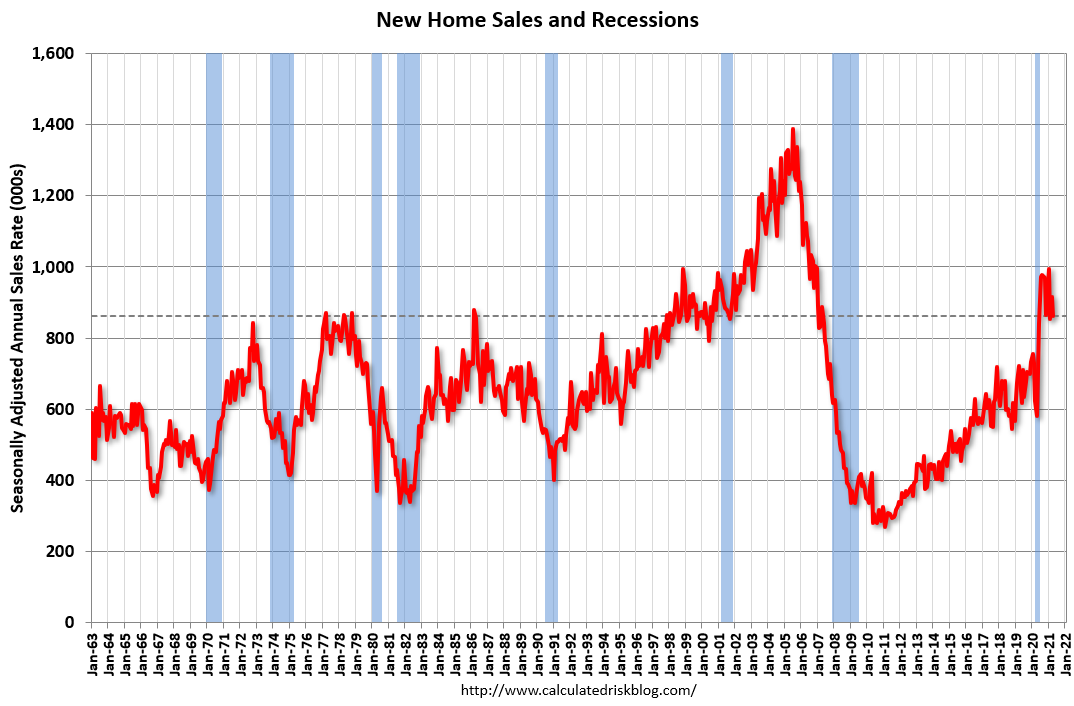
The first graph shows New Home Sales vs. recessions since 1963. The dashed line is the current sales rate.
This was the highest sales rate for April since 2007.
The second graph shows New Home Months of Supply.
 The months of supply increased in April to 4.4 months from 4.0 months in March.
 The all time record high was 12.1 months of supply in January 2009. The all time record low was 3.5 months, most recently in October 2020.
This is close to the low end of the normal range (about 4 to 6 months supply is normal).
"The seasonally‐adjusted estimate of new houses for sale at the end of April was 316,000. This represents a supply of 4.4 months at the current sales rate."
 On inventory, according to the Census Bureau:
 "A house is considered for sale when a permit to build has been issued in permit-issuing places or work has begun on the footings or foundation in nonpermit areas and a sales contract has not been signed nor a deposit accepted."Starting in 1973 the Census Bureau broke this down into three categories: Not Started, Under Construction, and Completed.
The third graph shows the three categories of inventory starting in 1973.
The inventory of completed homes for sale is just above the record low, and the combined total of completed and under construction is a little lower than normal.
 The last graph shows sales NSA (monthly sales, not seasonally adjusted annual rate).
In April 2021 (red column), 78 thousand new homes were sold (NSA). Last year, 52 thousand homes were sold in April.
The all time high for April was 116 thousand in 2005, and the all time low for April was 30 thousand in 2011.
This was well below expectations, and sales in the three previous months were revised down sharply, combined. I'll have more later today.
Case-Shiller: National House Price Index increased 13.2% year-over-year in March
by Calculated Risk on 5/25/2021 09:11:00 AM
S&P/Case-Shiller released the monthly Home Price Indices for March ("March" is a 3 month average of January, February and March prices).
This release includes prices for 20 individual cities, two composite indices (for 10 cities and 20 cities) and the monthly National index.
From S&P: S&P Corelogic Case-Shiller Index Shows Annual Home Price Gains Climbed to 13.2% in March
The S&P CoreLogic Case-Shiller U.S. National Home Price NSA Index, covering all nine U.S. census divisions, reported a 13.2% annual gain in March, up from 12.0% in the previous month. The 10-City Composite annual increase came in at 12.8%, up from 11.7% in the previous month. The 20-City Composite posted a 13.3% year-over-year gain, up from 12.0% in the previous month.
Phoenix, San Diego, and Seattle reported the highest year-over-year gains among the 20 cities in March. Phoenix led the way with a 20.0% year-over-year price increase, followed by San Diego with a 19.1% increase and Seattle with a 18.3% increase. All 20 cities reported higher price increases in the year ending March 2021 versus the year ending February 2021.
...
Before seasonal adjustment, the U.S. National Index posted a 2.0% month-over-month increase, while the 10-City and 20-City Composites both posted increases of 2.0% and 2.2% respectively in March.
After seasonal adjustment, the U.S. National Index posted a month-over-month increase of 1.5%, and the 10-City and 20-City Composites both posted increases of 1.4% and 1.6% respectively. In March, all 20 cities reported increases before and after seasonal adjustments.
“Housing prices continued to rise robustly in March 2021,” says Craig J. Lazzara, Managing Director and Global Head of Index Investment Strategy at S&P DJI. “The National Composite Index marked its tenth consecutive month of accelerating prices with a 13.2% gain from year-ago levels, up from 12.0% in February. This acceleration is also reflected in the 10- and 20-City Composites (up 12.8% and 13.3%, respectively). The market’s strength is broadly-based: all 20 cities rose, and all 20 gained more in the 12 months ended in March than they had gained in the 12 months ended in February.
“More than 30 years of S&P CoreLogic Case-Shiller data put these results into historical context. The National Composite’s 13.2% gain was last exceeded more than 15 years ago in December 2005, and lies very comfortably in the top decile of historical performance. The unusual strength is reflected across all 20 cities; March’s price gains in every city are above that city’s median level, and rank in the top quartile of all reports in 19 cities.
“These data are consistent with the hypothesis that COVID has encouraged potential buyers to move from urban apartments to suburban homes. This demand may represent buyers who accelerated purchases that would have happened anyway over the next several years. Alternatively, there may have been a secular change in preferences, leading to a permanent shift in the demand curve for housing. More time and data will be required to analyze this question
emphasis added
 Click on graph for larger image.
 The first graph shows the nominal seasonally adjusted Composite 10, Composite 20 and National indices (the Composite 20 was started in January 2000).
The Composite 10 index is up 1.4% in March (SA) from February.
The Composite 20 index is up 1.6% (SA) in March.
The National index is 33% above the bubble peak (SA), and up 1.5% (SA) in March. The National index is up 80% from the post-bubble low set in December 2011 (SA).
 The second graph shows the year-over-year change in all three indices.
The Composite 10 SA is up 12.8% compared to March 2020. The Composite 20 SA is up 13.3% year-over-year.
The National index SA is up 13.2% year-over-year.
Price increases were above expectations. I'll have more later.
Monday, May 24, 2021
Tuesday: Case-Shiller House Prices, New Home Sales
by Calculated Risk on 5/24/2021 09:00:00 PM
From Matthew Graham at Mortgage News Daily: MBS RECAP: Uneventful But Slightly Stronger Start
10yr yields hit the lowest levels in almost 2 weeks this morning ... The low yields were less than 2bps away from Friday's lows and we only traded about a 2bp range on the day. MBS prices picked up almost an eighth of a point early in the day and were perfectly flat from there on out. [30 year fixed 3.14%]Tuesday:
emphasis added
• At 9:00 AM ET, S&P/Case-Shiller House Price Index for March. The consensus is for a 12.3% year-over-year increase in the Comp 20 index for March.
• Also at 9:00 AM, FHFA House Price Index for March 2021. This was originally a GSE only repeat sales, however there is also an expanded index.
• At 10:00 AM, New Home Sales for April from the Census Bureau. The consensus is for 975 thousand SAAR, down from 1.021 million SAAR in March.
• Also at 10:00 AM, Richmond Fed Survey of Manufacturing Activity for May.
MBA Survey: "Share of Mortgage Loans in Forbearance Decreases to 4.19%"
by Calculated Risk on 5/24/2021 04:00:00 PM
Note: This is as of May 16th.
From the MBA: Share of Mortgage Loans in Forbearance Decreases to 4.19%
The Mortgage Bankers Association’s (MBA) latest Forbearance and Call Volume Survey revealed that the total number of loans now in forbearance decreased by 3 basis points from 4.22% of servicers’ portfolio volume in the prior week to 4.19% as of May 16, 2021. According to MBA’s estimate, 2.1 million homeowners are in forbearance plans.
The share of Fannie Mae and Freddie Mac loans in forbearance decreased 3 basis points to 2.21%. Ginnie Mae loans in forbearance decreased 2 basis points to 5.59%, while the forbearance share for portfolio loans and private-label securities (PLS) remained the same relative to the prior week at 8.26%. The percentage of loans in forbearance for independent mortgage bank (IMB) servicers decreased 4 basis points to 4.38%, and the percentage of loans in forbearance for depository servicers remained the same at 4.35%.
“The share of loans in forbearance declined for the 12 th straight week, dropping by 3 basis points. The decline was smaller than the prior week due to a slower pace of forbearance exits,” said Mike Fratantoni, MBA’s Senior Vice President and Chief Economist. “Although the overall share is declining, there was another increase in forbearance re-entries. Currently, 5.3 percent of loans in forbearance are homeowners who had cancelled forbearance but needed assistance again.”
Added Fratantoni, “The job market is recovering, but the pace of recovery thus far is slower than we had forecasted. Continued job growth is needed to help more struggling homeowners get back on their feet.”
emphasis added
 Click on graph for larger image.
This graph shows the percent of portfolio in forbearance by investor type over time. Most of the increase was in late March and early April, and has trended down since then.
The MBA notes: "Total weekly forbearance requests as a percent of servicing portfolio volume (#) increased relative to the prior week: from 0.04% to 0.05%. "
May 24th COVID-19 New Cases, Vaccinations; Hospitalizations Finally Below Post-Summer Surge Low
by Calculated Risk on 5/24/2021 03:53:00 PM
The economy will pick up speed as more and more people get vaccinated!
According to the CDC, on Vaccinations. Total administered: 286,890,900, as of yesterday 285,720,586. Day: 1.17 million. (U.S. Capacity is around 4 million per day)
1) 61.5% of the population over 18 has had at least one dose (70% is the goal by July 4th).
2) 130.6 million Americans are fully vaccinated (160 million goal by July 4th)
Note: I'll stop posting this daily once all four of these criteria are met:
1) 70% of the population over 18 has had at least one dose of vaccine, and
2) new cases are under 5,000 per day, and
3) hospitalizations are below 3,000, and
4) average daily deaths under 50 (currently 500 per day).
And check out COVID Act Now to see how each state is doing.
Over 12,000 US deaths were reported so far in May due to COVID.
 Click on graph for larger image.
This graph shows the daily (columns) 7 day average (line) of positive tests reported.
This data is from the CDC.
 Click on graph for larger image.
This graph shows the daily (columns) 7 day average (line) of positive tests reported.
This data is from the CDC.
The 7-day average is 22,877, down from 23,834 yesterday, and down sharply from the recent peak of 69,881 on April 13, 2021. This is the lowest since June 14, 2020.
The second graph shows the number of people hospitalized.
 This data is also from the CDC.
The CDC cautions that due to reporting delays, the area in grey will probably increase.
The current 7-day average is 22,744, down from 23,917 reported yesterday, and finally below the post-summer surge low of 23,000.
Housing Inventory May 24th Update: Inventory Increased Week-over-week
by Calculated Risk on 5/24/2021 01:10:00 PM
One of the key questions for 2021 is: Will inventory increase as the pandemic subsides, or will inventory decrease further in 2021?
Tracking inventory will be very important this year.
 Click on graph for larger image in graph gallery.
This inventory graph is courtesy of Altos Research.
As of May 21st, inventory was at 324 thousand (7 day average), compared to 725 thousand the same week a year ago. That is a decline of 55.3%.
A week ago, inventory was at 314 thousand, and was down 57.0% YoY. Seasonally, inventory has probably bottomed. Inventory was about 5.5% above the low in early April.
Mike Simonsen discusses this data regularly on Youtube.


