 RSS Feed
 by Calculated Risk on 2/25/2011 04:54:00 PM
Showing posts with label REO. Show all posts
Showing posts with label REO. Show all posts
Friday, February 25, 2011
Total REO: Private Label, Banks, and "Fs"
Yesterday I noted that the combined REO (Real Estate Owned) inventory for Fannie, Freddie and the FHA increased 71% compared to Q4 2009 (year-over-year comparison). As I noted, this is just a portion of the total REO inventory. Private label securities and banks and thrifts also hold a substantial number of REOs.
 Click on graph for larger image in graph gallery.
This graph from economist Tom Lawler shows an estimate of all the REO inventory. Lawler writes:
Based on the FDIC’s QBP report, as well as preliminary data on REO for private-label securities (using Barclay’s Capital data, as I don’t have data from my other source yet), REO inventory at “the F’s,” FDIC-insured institutions, and PLS would look as follows [see graph]From CR: REO inventory is still below the levels in 2008 - but not much - and that was when prices were falling quickly. I think the various lenders are a little more careful disposing of REOs now, but the level of REOs suggest downward house price pressure.
 The 2nd graph (repeated from yesterday) just shows the REO inventory for Fannie, Freddie and FHA through Q4 2010.
The REO inventory for the "Fs" has increased sharply over the last year, from 172,368 at the end of 2009 to a record 295,307 at the end of 2010. Although this slowed in Q4 - as the "Fs" slowed foreclosures - this will probably increase some more in 2011.
Thursday, February 24, 2011
Fannie, Freddie, FHA combined REO Inventory at Record Level
by Calculated Risk on 2/24/2011 06:37:00 PM
The combined REO (Real Estate Owned) inventory for Fannie, Freddie and the FHA increased to a record 295,307 units at the end of Q4, although REO inventory decreased slightly for both Fannie Mae and Freddie Mac in Q4 (compared to Q3). The REO inventory increased 71% compared to Q4 2009 (year-over-year comparison).
Click on graph for larger image in new window.
This graph shows the REO inventory for Fannie, Freddie and FHA through Q4 2010.
The REO inventory for the "Fs" has increased sharply over the last year, from 172,368 at the end of 2009 to a record 295,307 at the end of 2010.
From Fannie Mae: Fannie Mae Reports Fourth-Quarter and Full-Year 2010 Results
Given the large number of seriously delinquent loans in our single-family guaranty book of business and the large current and anticipated supply of single-family homes in the market, we expect it will take years before our REO inventory approaches pre-2008 levels.Also, this is just a portion of the total REO inventory. Private label securities and banks and thrifts also hold a substantial number of REOs.
Monday, February 14, 2011
Distressed House Sales: Highest since early 2009 using Sacramento data
by Calculated Risk on 2/14/2011 05:36:00 PM
I've been following the Sacramento market to see the change in mix (conventional, REOs, short sales) in a distressed area. The Sacramento Association of REALTORS® started breaking out REOs in May 2008, and short sales in June 2009. Here are the statistics.
 Click on graph for larger image in graph gallery.
This graph shows the percent of REO, short sales and conventional sales. There is a seasonal pattern for conventional sales (strong in the spring and summer), and distressed sales happen all year - so the percentage of distressed sales increases every winter. The tax credits might have also boosted conventional sales in 2009 and early 2010.
Note: Prior to June 2009, it is unclear if short sales were included as REO or as "conventional" - or some of both.
In January 2011, 73.1% of all resales (single family homes and condos) were distressed sales. This is the highest level of distressed sales since Sacramento started breaking out short sales, and might be the highest since February 2009.
And a high level of distressed sales suggests falling prices. And this isn't just happening in Sacramento. Housing economist Tom Lawler noted today:
"January is seasonally the weakest month for home sales (closings); distressed share of sales went up in many areas last month, suggesting that repeat transactions HPIs in early 2011 will show weakness."My guess is both the Case-Shiller and CoreLogic repeat sales indexes will fall to post-bubble lows once the January data is released.
Tuesday, November 09, 2010
Private Label Security REO
by Calculated Risk on 11/09/2010 04:56:00 PM
Last Friday I noted that the combined REO (Real Estate Owned) inventory for Fannie, Freddie and the FHA increased by 24% at the end of Q3 2010 compared to Q2 2010. However this is just a portion of the overall REO inventory.
 Click on graph for larger image in new window.
Here is the graph I posted last Friday showing the REO inventory for Fannie, Freddie and the FHA through Q3 2010.
The REO inventory for the "Fs" increased sharply over the last year, from 153,007 at the end of Q3 2009 to a record 293,171 at the end of Q3 2010.
As I noted, this is just a portion of the total REO inventory. Private label securities and banks and thrifts also hold a substantial number of REOs.
The following is from housing economist Tom Lawler:
While the SF REO inventory of “the F’s” – Fannie, Freddie, and FHA – surged last quarter, the SF REO inventory for private-label RMBS continued to decline (and the overall size of the RMBS market continued to shrink. Here is an updated chart showing the SF REO inventory (EOQ) for Fannie, Freddie, FHA, and private-label RMBS combined. I got the RMBS REO data from Moody’s economy.com. I don’t yet have enough data to estimate bank and thrift REO holdings, though the limited amount of “Q’s” I’ve read suggest that bank and thrift SF REO holdings probably increased last quarter, but by a smaller % than the “F’s.”

To give one of bit of perspective: according to Moody’s economy.com data, the SF REO of private-label RMBS hit a peak of over 409,000 properties in October 2008, and the number of loans backing PL RMBS was around 9.039 million (and about 10.9 million at its peak in May 2007). This September, the combined SF REO inventory of Fannie, Freddie, and FHA, who combined own or guarantee around 37 million SF mortgages, totaled 293,171. Don’t get me wrong – the runup in overall REO over the last few quarters is very disturbing and a clear negative for near-term home prices. But ... it’s occasionally important to take things into perspective!
The above was from housing economist Tom Lawler.
We still need to add in the bank and thrift REO - and those holdings probably increased significantly in Q3.
Friday, November 05, 2010
Fannie, Freddie, FHA REO Inventory Increases 24% in Q3 from Q2 2010
by Calculated Risk on 11/05/2010 05:20:00 PM
The combined REO (Real Estate Owned) inventory for Fannie, Freddie and the FHA increased by 24% at the end of Q3 2010 compared to Q2 2010. The REO inventory increased 92% compared to Q3 2009 (year-over-year comparison).
Click on graph for larger image in new window.
This graph shows the REO inventory for Fannie, Freddie and FHA through Q3 2010.
The REO inventory for the "Fs" has increased sharply over the last year, from 153,007 at the end of Q3 2009 to a record 293,171 at the end of Q3 2010.
There are new records for Fannie, Freddie, and FHA REO inventory individually too.
Remember this is just a portion of the total REO inventory. Private label securities and banks and thrifts also hold a substantial number of REOs.
The REO inventory will probably increase sharply in Q4. From Fannie Mae today:
Given the large number of seriously delinquent loans in our single-family guaranty book of business and the large current and anticipated supply of single-family homes in the market, we expect it will take a number of years before our REO inventory approaches pre-2008levels.
...
Our expectation that the foreclosure pause will likely result in higher serious delinquency rates, longer foreclosure timelines, higher foreclosed property expenses, higher credit losses, higher credit-related expenses, and an increase in the number of REO properties we are unable to market for sale.
Monday, August 09, 2010
REO Inventory including private-label RMBS
by Calculated Risk on 8/09/2010 09:24:00 PM
Earlier I posted a graph of Fannie, Freddie and FHA inventory (new record total in Q2).
Economist Tom Lawler has added private-label RMBS REO in the following graph.
Note: The private-label securities have one advantage - they essentially stopped making new loans in mid-2007! (see Figure 3 from San Francisco Fed Senior Economist John Krainer: Recent Developments in Mortgage Finance)
Update: The private-label securities are the ones securitized by Wall Street. This was the worst of the worst securities. Click on graph for larger image in new window.
From Tom Lawler:
As the chart indicates, the SF REO inventory of “the F’s” has increased sharply since the end of 2008, while the SF REO inventory held in private-label RMBS has fallen considerably. This chart, of course, does NOT include anything close to all REO, as SF REO properties owned by banks, thrifts, credit unions, VA, USDA, finance companies, and “other” mortgage lenders/investors are not included.
Fannie, Freddie, FHA REO Inventory Increases 13% in Q2 from Q1 2010
by Calculated Risk on 8/09/2010 11:25:00 AM
The combined REO (Real Estate Owned) inventory for Fannie, Freddie and the FHA increased by 13% in Q2 2010 from Q1 2010. The REO inventory (lender Real Estate Owned) increased 74% compared to Q2 2009 (year-over-year comparison). Click on graph for larger image in new window.
This graph shows the REO inventory for Fannie, Freddie and FHA through Q2 2010.
The REO inventory for the "Fs" has increased sharply over the last year, from 135,868 at the end of Q2 2009 to 236,338 at the end of Q2 2010.
This is a new record for Fannie and Freddie; the FHA's REO inventory decreased slightly in Q2 2010.
Remember this is just a portion of the total REO inventory. Private label securities and banks and thrifts also hold a substantial number of REOs.
Monday, July 12, 2010
Distressed Sales: Sacramento as an Example, June 2010
by Calculated Risk on 7/12/2010 04:08:00 PM
The Sacramento Association of REALTORS® has been breaking out short sales for over a year now. They report monthly resales by equity sales (conventional resales), and distressed sales (Short sales and REO sales), and I'm following this series as an example to see mix changes in a distressed area.  Click on graph for larger image in new window.
Here is the June data.
Total June sales were up from May, and up from June 2009. Of course June was the scheduled closing deadline to qualify for the Federal homebuyer tax credit (closing date since extended), and also the California tax credit played a role. Sales should collapse in July.
The year-over-year (YoY) increase in June sales break a 12 month streak of declining YoY sales. But that was because of the tax credit, and sales will be off YoY in July.
Short sales were up 66% YoY (Year of the Short Sale!), and REO sales were down by 30%.
Note: This data is not seasonally adjusted. The second graph shows the percent of REO, short sales and conventional sales. The percent of short sales is now at a high for this brief series.
In June, 62.4% of all resales (single family homes and condos) were distressed sales.
The percent of REOs has been generally declining (seasonally there are a larger percentage of REOs in the winter). Also there appears to be a higher percentage of conventional sales associated with the tax credit.
On financing, 54.6% percent were either all cash (21.3%) or FHA loans (33.3%), suggesting most of the activity in distressed former bubble areas like Sacramento is first time home buyers using government-insured FHA loans, and investors paying cash.
With the tax credit (mostly) over, I expect total sales to decline and the percent of distressed sales (Short and REO) to increase.
Sunday, July 04, 2010
Investors buying foreclosures in Phoenix
by Calculated Risk on 7/04/2010 05:22:00 PM
Here is an article from the AP about investors buying foreclosures in the Phoenix area: Finding gold in them thar foreclosures (ht Ian).
I can add a little to this story: I know of an individual investor (through a close friend) in the Phoenix area who has bought almost 100 homes over the last 18 months. The investor has shared with me his portfolio. He has only bought single family homes, no condos. His average purchase price was under $35,000 and most of the homes are 3 br / 2 ba.
He is renting the homes, many by the room. Yeah, they sound like flophouses! The investor is starting to have a vacancy problem that he attributes to the new Arizona immigration law that takes effect on July 29th.
I reviewed the public records of some of the homes this investor bought - as an example he bought a 3 br / 2 ba 1,200 sq ft home for about $35,000 a couple of months ago - and that is about the average for the homes he has been buying. Very basic, dirt yards ... not the best area.
He paid in the low $20,000s for a home he bought last summer that sold for over $180,000 in 2006! That is almost 90% off the peak price (the house sold for $62,000 in 2004, so I'm guessing fraud in 2006 - and maybe in 2004 too).
Note: all numbers changed a little - the investor wants to remain anonymous.
Monday, June 07, 2010
Distressed Sales: Sacramento as an Example, May 2010
by Calculated Risk on 6/07/2010 06:42:00 PM
The Sacramento Association of REALTORS® is breaking out monthly resales by equity sales (conventional resales), and distressed sales (Short sales and REO sales), and I'm following this series as an example to see mix changes in a distressed area. 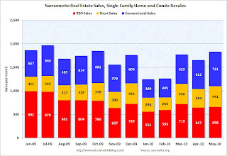 Click on graph for larger image in new window.
Here is the May data.
The Sacramento Association started breaking out REO sales in 2008, but they have only broken out short sales since June 2009 - so we now have one year of data.
In May, 60.1% of all resales (single family homes and condos) were distressed sales. This is the lowest level over the last year.
Note: This data is not seasonally adjusted.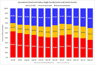 The second graph shows the percent of REO, short sales and conventional sales. The percent of short sales is near the high set in December and will probably continue to increase later this year (2010 is the year of the short sale!).
The percent of REOs has been generally declining (seasonally there are a larger percentage of REOs in the winter). Also there appears to be a higher percentage of conventional sales associated with the tax credit.
Also total sales in May were off 1.8% compared to May 2009; the 12th month in a row with declining YoY sales - even with the tax credit buying this year!
On financing, 57 percent were either all cash (23.3%) or FHA loans (33.6%), suggesting most of the activity in distressed former bubble areas like Sacramento is first time home buyers using government-insured FHA loans, and investors paying cash.
Starting in June we can do some year-over-year comparisons. It appears short sales will be up substantially YoY and REOs down, and it will be interesting to see the level of total distressed sales once the tax credit buying is behind us (July).
Tuesday, May 11, 2010
Distressed Sales: Sacramento as an Example, April Update
by Calculated Risk on 5/11/2010 05:17:00 PM
The Sacramento Association of REALTORS® is breaking out monthly resales by equity sales (conventional resales), and distressed sales (Short sales and REO sales), and I'm following this series as an example to see mix changes in a distressed area.  Click on graph for larger image in new window.
Here is the April data.
The Sacramento Association started breaking out REO sales in 2008, but they have only broken out short sales since June 2009 - so we almost have one year of data.
In April, 63% of all resales (single family homes and condos) were distressed sales.
Note: This data is not seasonally adjusted, although the decrease in sales in April is a little surprising because of the tax credit. The second graph shows the percent of REO, short sales and conventional sales. The percent of short sales is near the high set in December and will probably continue to increase later this year (2010 is the year of the short sale!).
The percent of REOs has been generally declining (seasonally there are a larger percentage of REOs in the winter).
Also total sales in April were off 9.1% compared to April 2009; the eleventh month in a row with declining YoY sales - even with the tax credit buying this year!
On financing, over 58 percent were either all cash (27.2%) or FHA loans (30.9%), suggesting most of the activity in distressed former bubble areas like Sacramento is first time home buyers using government-insured FHA loans, and investors paying cash.
Thursday, April 15, 2010
RealtyTrac: March Foreclosure Activity Highest on Record
by Calculated Risk on 4/15/2010 08:54:00 AM
From RealtyTrac: Foreclosure Activity Increases 7 Percent in First Quarter
RealtyTrac® ... today released its U.S. Foreclosure Market Report™ for Q1 2010, which shows that foreclosure filings — default notices, scheduled auctions and bank repossessions — were reported on 932,234 properties in the first quarter, a 7 percent increase from the previous quarter and a 16 percent increase from the first quarter of 2009. One in every 138 U.S. housing units received a foreclosure filing during the quarter.This is the highest monthly total - and highest quarterly total - since RealtyTrac started tracking foreclosures in 2005 (and that probably means this is the highest ever). Note that the initial stage filings (Notice of Default and Lis Pendens depending on the state) were flat with Q1 2009, but that later stage filings (of Trustee Sale and Notice of Foreclosure Sale and repossessions) surged:
Foreclosure filings were reported on 367,056 properties in March, an increase of nearly 19 percent from the previous month, an increase of nearly 8 percent from March 2009 and the highest monthly total since RealtyTrac began issuing its report in January 2005.
“Foreclosure activity in the first quarter of 2010 followed a very similar pattern to what we saw in the first quarter of 2009: a shallow trough in January and February followed by a substantial spike in March,” said James J. Saccacio, chief executive officer of RealtyTrac. “One difference, however, is that the increases were more tilted toward the final stage of foreclosure, with REOs increasing 9 percent on a quarterly basis in the first quarter of 2010 compared to a 13 percent quarterly decrease in REOs in the first quarter of 2009.
“This subtle shift in the numbers pushed REOs to the highest quarterly total we’ve ever seen in our report and may be further evidence that lenders are starting to make a dent in the backlog of distressed inventory that has built up over the last year as foreclosure prevention programs and processing delays slowed down the normal foreclosure timeline.”
Foreclosure auctions were scheduled for the first time on a total of 369,491 properties during the quarter, the highest quarterly total for scheduled auctions in the history of the report. Scheduled auctions increased 12 percent from the previous quarter and were up 21 percent from the first quarter of 2009.It appears that the banks are starting to clear out the foreclosure backlog.
Bank repossessions (REOs) also hit a record high for the report in the first quarter, with a total of 257,944 properties repossessed by the lender during the quarter — an increase of 9 percent from the previous quarter and an increase of 35 percent from the first quarter of 2009.
Wednesday, March 17, 2010
REO: Agencies vs. Private Label
by Calculated Risk on 3/17/2010 06:15:00 PM
CR Note: the following is from housing economist Tom Lawler (posted with permission):
Last month I showed data on trends in the REO inventories of Fannie, Freddie, and FHA, highlighting how while total REO inventory estimates appear to have fallen, REO at “the F’s” has increased notably over the last year. A few folks questioned how there could be reports of sharply lower REO inventories in many parts of the country if the F’s REO’s were up so much. Click on graph for larger image in new window.
Well, the answer mainly in REO inventories in the “non-agency” space, and especially REO inventories held by trusts for private-label mortgage-backed securities. Here is a chart (courtesy of Amherst) showing REO inventories for private-label securities tracked by LoanPerformance, which folks estimate accounts for about 85-90% of the private-label market.
As the above chart indicates, REO inventory from private-label MBS (where mortgage credit performance started to deteriorate sharply well before the ‘prime” market began to deteriorate in a big way) increased at a rapid clip from end of 2007 through the fall of 2008, peaking in October. It then began to decline as servicers accelerated the pace of REO sales last winter and early Spring, often by slashing prices – thus resulting in the “de-stickification” of home prices observed this cycle relative to past cycles.  Contrast that with REO inventories at Fannie, Freddie, and FHA.
Most areas where one hears that REO inventories have plunged over the last year are in areas that had a high share of “risky” mortgages and a disproportionately high share of loans that were packaged into private-label securities.
On the depository institution front, data on the book value of FDIC-insured institutions’ holdings of 1-4 family REO – in $’s, but not units – is shown below. Before discussing the chart, it should be noted that when a financial institution acquires the title to a property through foreclosure, the REO is supposed to be accounted for at fair value less costs to sell. This amount, of course, is often a boatload less than the mortgage balance at the time of foreclosure. Unfortunately, I don’t yet have any hard data on the average carrying cost of REO.
Second, over the last few years the % of mortgages held by banks and thrifts that are FDIC insured has increased. E.g., according to Fed data vs. FDIC data, the ratio of 1-4 family mortgages held by FDIC-insured institutions to 1-4 family mortgages held by all bank and savings institutions went from 89.3% at the end of 2007 to 92.9% at the end of 2009 – implying that the above chart for REO trends overstates a tad the increase in all banks and thrifts.
Having said that, it’s pretty clear that REO inventories at depositories grew at a decent clip (though much slower than REO at PLS) from the end of 2007 to the end of 2008, went down a “scooch” in the first half of 2009 (mainly, I believe, reflecting certain foreclosure moratoria), and then increased a bit in the second half of last year – though less rapidly than at the GSEs. Putting the Fannie, Freddie, FHA, and private-label data (with the latter “grossed up” assuming LP covers 85% of the market) together; making a crude assumption of units of REO at banks and thrifts (and grossing the total up to reflect non-FDIC institutions), here is a crude look at the path of REO inventories by quarter from the end of 2007 through the end of 2009. These estimates would NOT be the full market, of course, but the general pattern would probably reflect the overall market.
Note that this is still a “work in progress, and some of the assumptions I’ve made on depositories could be wrong. However, for those who wondered “how could REO have fallen so much if REO at ‘the F’s’ had gone up so much,” here is your answer. Once you factor in the private label market, it is not so “F’ing” hard to understand.
CR Note: The post was from economist Tom Lawler.
Tuesday, March 16, 2010
Distressed Sales: Sacramento as an Example, February Update
by Calculated Risk on 3/16/2010 06:49:00 PM
The Sacramento Association of REALTORS® is breaking out monthly resales by equity sales (conventional resales), and distressed sales (Short sales and REO sales), and I'm following this series as an example to see mix changes in a distressed area. It will be especially interesting to track this after the Home Affordable Foreclosure Alternatives (HAFA) starts on April 5th. Click on graph for larger image in new window.
Here is the February data.
The Sacramento Association started breaking out REO sales in 2008, but they have only broken out short sales since June 2009. Almost 68% of all resales (single family homes and condos) were distressed sales in February.
Note: This data is not seasonally adjusted, and the decline in sales from the end of last year is about normal. The second graph shows the percent of REO, short sales and conventional sales. The percent of REOs has been increasing again, and the percent of short sales has declined slightly over the last couple of months. The percent of conventional sales peaked last November, and has declined to 32% in February.
Now that many HAMP trial modifications have been cancelled, I expect REO sales to increase. Also, I expect the percentage of short sales to be higher in 2010 than in 2009 - but probably not as high as foreclosures (it will be interesting to watch).
Also total sales in February were off 24.3% compared to February 2009; the ninth month in a row with declining YoY sales.
On financing, over 60 percent were either all cash (30.7%) or FHA loans (30.2%), suggesting most of the activity in distressed former bubble areas like Sacramento is first time home buyers using government-insured FHA loans, and investors paying cash.
Tuesday, February 16, 2010
Distressed Sales: Sacramento as an Example
by Calculated Risk on 2/16/2010 02:43:00 PM
This will probably be the year of the "short sale", especially after the Home Affordable Foreclosure Alternatives starts (scheduled for April 5th).
The Sacramento Association of REALTORS® is breaking out monthly resales by equity sales (conventional resales), and distressed sales (Short sales and REO sales), and I'm following this series as an example to see mix changes in a distressed area.  Click on graph for larger image in new window.
Here is the January data.
The Sacramento Association started breaking out REO sales in 2008, but they have only broken out short sales since June 2009. Almost 69 percent of all resales (single family homes and condos) were distressed sales in January.
Note: This data is not seasonally adjusted, and the decline in sales from December to January was about normal. The second graph shows the percent of REO and short sales (and total distressed sales). The percent of REOs had been declining, and the percent of short sales had been steadily increasing. In January REOs were up to 45% - the highest percent since last September - and the percent short sales declined slightly to 23.6%.
Now that the trial modification period has ended, I expect the REO sales to increase. Also, I expect the percentage of short sales to be higher in 2010 than in 2009 - but probably not as high as foreclosures (it will be interesting to watch).
Also total sales in January were off 23.4% compared to January 2009; the eight month in a row with declining YoY sales.
On financing, over half the sales were either all cash (26.7%) or FHA loans (28.5%), suggesting most of the activity in distressed former bubble areas like Sacramento is first time home buyers using government-insured FHA loans, and investors paying cash.
Monday, January 11, 2010
Distressed Sales: Sacramento as an Example
by Calculated Risk on 1/11/2010 04:56:00 PM
NOTE: I expect the use of short sales to increase nationwide in 2010. Since the Sacramento Association of REALTORS® is breaking out monthly resales by equity sales (conventional resales), and distressed sales (Short sales and REO sales), I'm following this series as an example to see changes in the mix in a former bubble area.  Click on graph for larger image in new window.
Here is the December data.
They started breaking out REO sales in 2008, but they have only broken out short sales since June 2009. About 66 percent of all resales (single family homes and condos) were distressed sales in December. The second graph shows the percent of REO and short sales (and total distressed sales). The percent of REOs has been declining, but the percent of short sales has been steadily increasing, from 16.7% in June to 24.7% in December.
When the trial modification period ends, the REO sales will probably increase. Also, I expect short sales to be higher in 2010 than in 2009 (there is more emphasis on short sales and deed-in-lieu of foreclosure now).
Total sales in December were off 14.3% compared to December 2008; the seventh month in a row with declining YoY sales.
On financing, over half the sales were either all cash (24.6%) or FHA loans (27.5%), suggesting most of the activity in distressed former bubble areas like Sacramento is first time home buyers using government-insured FHA loans, and investors paying cash.
Saturday, December 12, 2009
Distressed Sales: Sacramento Market as an Example
by Calculated Risk on 12/12/2009 08:52:00 AM
Note: The Sacramento Association of REALTORS® is breaking out monthly resales by equity sales (conventional resales), and distressed sales (Short sales and REO sales). I'm following this series as an example to see changes in the mix in a former bubble area.  Click on graph for larger image in new window.
Here is the November data.
They started breaking out REO sales last year, but this is only the sixth monthly report with short sales. About 63 percent of all resales (single family homes and condos) were distressed sales in November. The second graph shows the mix for the last six months. It will be interesting to see if foreclosure resales pick up early next year when the early trial modifications period is over.
Total sales in November were off 16.1% compared to November 2008; the sixth month in a row with declining YoY sales.
On financing, over half the sales were either all cash (26.4%) or FHA loans (31.4%), suggesting most of the activity in distressed former bubble areas like Sacramento is first-time home buyers using government-insured FHA loans (and taking advantage of the tax credit), and investors paying cash.
This is a local market still in severe distress.
Sunday, November 08, 2009
First American CoreLogic Economist: Decline in Distressed Inventory a "Mirage"
by Calculated Risk on 11/08/2009 09:16:00 AM
Matt Padilla has an interesting chart on REOs and delinquent loans in Orange County, California: Banks hold few foreclosures.
The chart shows the number of REOs (bank owned real estate) has dropped sharply while 90+ day delinquencies continue to increase. Although this chart is for Orange County, we are seeing the same dynamics in many areas across the county (declining REOs, rising delinquency rates).
Sam Khater, senior economist with First American CoreLogic gave Matt his view of why this is happening:
The reason REOs have declined is that flow of distressed properties into REO has been artificially restricted due to local, state and GSE foreclosure moratoria, loan modifications and servicer backlogs. This has led to a drop in the supply of REO properties, while at the same time sales (including REO sales) increased due to the artificially low rates and first-time homebuyer tax credits, which further depleted the supply of REOs. This dynamic has led to the rapid improvement in home prices over the last six to eight months.We have to be careful with the 90+ day delinquency data because that includes loans in the trial modification process. If many of these trial modifications are successful - and become permanent - the delinquency rate could drop sharply without a large increase in foreclosures. We should know much more in Q1 when many of the trial modifications end.
However, the mortgage distress is high and rising as is evident by the 90+ day category, which means the pending supply is building up due to high levels of negative equity and rising unemployment. So we have a situation where at the back end (ie REOs) it appears as if it’s getting better, but it’s really a mirage as we know that the pending supply pipeline default (ie 90+ day DQs) is looming larger.
emphasis added
Saturday, September 12, 2009
Jim the Realtor: On the REO Trail
by Calculated Risk on 9/12/2009 11:49:00 AM
REO activity is starting to pickup again, and Jim breaks the news to a tenant:
Monday, August 31, 2009
CNBC: What Banks are doing with Foreclosures
by Calculated Risk on 8/31/2009 05:01:00 PM
Diana Olick at CNBC has some BofA info: What Banks Are Really Doing With Foreclosures
Bank of America:According to BofA, they are not sitting on REOs (Real Estate Owned) for longer than normal, but they are holding off foreclosing - pending modification attempts. That is basically what the data says too.Foreclosure sales have been abnormally low since we learned of the pending implementation of the administration’s Making Home Affordable program. From that point, we delayed the initiation of foreclosure proceedings and sales for customers that may eligible for a loan modification under MHA. As a result of this policy, our foreclosure sales in recent months have been as little as half the normal pace we experienced before.
...Now that Making Home Affordable programs are operational, we do project an increase in foreclosures as we exhaust every available option to qualify customers for modifications and other solutions.
...We do not hold foreclosed properties off the market.
The Q2 FDIC Quarterly Banking Profile showed the banks held $11.5 billion in 1-4 family residential REO at the end of Q2. That is the same level as the last several quarters.
But what has really changed is the surge in delinquencies - combined with the banks holding off foreclosing. As BofA notes, this will lead to a wave of foreclosures later this year and into 2010, however the size of the wave depends on the success of the modification programs (not looking great so far).


