by Calculated Risk on 4/30/2019 06:24:00 PM
Tuesday, April 30, 2019
Fannie Mae: Mortgage Serious Delinquency Rate Decreased in March
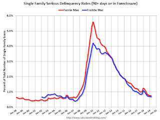
Fannie Mae reported that the Single-Family Serious Delinquency rate was decreased to 0.74% in March, from 0.76% in February. The serious delinquency rate is down from 1.16% in March 2018.
These are mortgage loans that are "three monthly payments or more past due or in foreclosure".
The Fannie Mae serious delinquency rate peaked in February 2010 at 5.59%.
This matches is the lowest serious delinquency rate for Fannie Mae since August 2007.

By vintage, for loans made in 2004 or earlier (3% of portfolio), 2.68% are seriously delinquent. For loans made in 2005 through 2008 (4% of portfolio), 4.50% are seriously delinquent, For recent loans, originated in 2009 through 2018 (93% of portfolio), only 0.33% are seriously delinquent. So Fannie is still working through poor performing loans from the bubble years.
The increase late last year in the delinquency rate was due to the hurricanes - there were no worries about the overall market.
I expect the serious delinquency rate will probably decline to 0.5 to 0.7 percent or so to a cycle bottom.
Note: Freddie Mac reported earlier.
Update: A few comments on the Seasonal Pattern for House Prices
by Calculated Risk on 4/30/2019 02:01:00 PM
CR Note: This is a repeat of earlier posts with updated graphs.
A few key points:
1) There is a clear seasonal pattern for house prices.
2) The surge in distressed sales during the housing bust distorted the seasonal pattern.
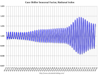
3) Even though distressed sales are down significantly, the seasonal factor is based on several years of data - and the factor is now overstating the seasonal change (second graph below).
4) Still the seasonal index is probably a better indicator of actual price movements than the Not Seasonally Adjusted (NSA) index.
For in depth description of these issues, see former Trulia chief economist Jed Kolko's article "Let’s Improve, Not Ignore, Seasonal Adjustment of Housing Data"
Note: I was one of several people to question the change in the seasonal factor (here is a post in 2009) - and this led to S&P Case-Shiller questioning the seasonal factor too (from April 2010). I still use the seasonal factor (I think it is better than using the NSA data).

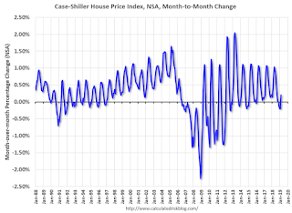
This graph shows the month-to-month change in the NSA Case-Shiller National index since 1987 (through February 2019). The seasonal pattern was smaller back in the '90s and early '00s, and increased once the bubble burst.
The seasonal swings have declined since the bubble.

The swings in the seasonal factors has started to decrease, and I expect that over the next several years - as recent history is included in the factors - the seasonal factors will move back towards more normal levels.
However, as Kolko noted, there will be a lag with the seasonal factor since it is based on several years of recent data.
Real House Prices and Price-to-Rent Ratio in February
by Calculated Risk on 4/30/2019 11:53:00 AM
Here is the earlier post on Case-Shiller: Case-Shiller: National House Price Index increased 4.0% year-over-year in February
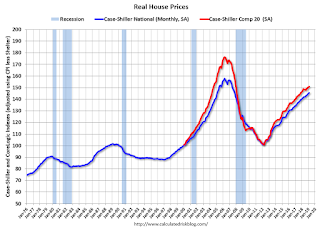
It has been over eleven years since the bubble peak. In the Case-Shiller release this morning, the seasonally adjusted National Index (SA), was reported as being 12.4% above the previous bubble peak. However, in real terms, the National index (SA) is still about 7.7% below the bubble peak (and historically there has been an upward slope to real house prices). The composite 20, in real terms, is still 14.5% below the bubble peak.
The year-over-year increase in prices has slowed to 4.0% nationally, and I expect price growth will slow some more.
Usually people graph nominal house prices, but it is also important to look at prices in real terms (inflation adjusted). Case-Shiller and others report nominal house prices. As an example, if a house price was $200,000 in January 2000, the price would be close to $286,000 today adjusted for inflation (43%). That is why the second graph below is important - this shows "real" prices (adjusted for inflation).
Nominal House Prices

In nominal terms, the Case-Shiller National index (SA)and the Case-Shiller Composite 20 Index (SA) are both at new all times highs (above the bubble peak).
Real House Prices

In real terms, the National index is back to February 2005 levels, and the Composite 20 index is back to July 2004.
In real terms, house prices are at 2004/2005 levels.
Price-to-Rent
In October 2004, Fed economist John Krainer and researcher Chishen Wei wrote a Fed letter on price to rent ratios: House Prices and Fundamental Value. Kainer and Wei presented a price-to-rent ratio using the OFHEO house price index and the Owners' Equivalent Rent (OER) from the BLS.

This graph shows the price to rent ratio (January 2000 = 1.0).
On a price-to-rent basis, the Case-Shiller National index is back to February 2004 levels, and the Composite 20 index is back to November 2003 levels.
In real terms, prices are back to late 2004 levels, and the price-to-rent ratio is back to late 2003, early 2004.
NAR: Pending Home Sales Index Increased 3.8% in March
by Calculated Risk on 4/30/2019 10:03:00 AM
From the NAR: Pending Home Sales Climb 3.8% in March
Pending home sales rose in March, reversing course from a month prior, according to the National Association of Realtors®. Three of the four major regions saw growth last month, as the Northeast reported a minor slip in contract activity.This was above expectations of a 0.6% increase for this index. Note: Contract signings usually lead sales by about 45 to 60 days, so this would usually be for closed sales in April and May.
The Pending Home Sales Index, a forward-looking indicator based on contract signings, increased 3.8% to 105.8 in March, up from 101.9 in February. Year-over-year contract signings declined 1.2%, making this the 15th straight month of annual decreases.
...
The PHSI in the Northeast declined 1.7% to 90.5 in March and is now 0.4% below a year ago. In the Midwest, the index grew 2.3% to 95.3 in March, 5.0% lower than March 2018.
Pending home sales in the South jumped up 4.4% to an index of 127.2 in March, which is 0.7% higher than last March. The index in the West ascended 8.7% in March to 95.1 and fell only 1.6% below a year ago.
emphasis added
Case-Shiller: National House Price Index increased 4.0% year-over-year in February
by Calculated Risk on 4/30/2019 09:10:00 AM
S&P/Case-Shiller released the monthly Home Price Indices for February ("February" is a 3 month average of December, January and February prices).
This release includes prices for 20 individual cities, two composite indices (for 10 cities and 20 cities) and the monthly National index.
Note: Case-Shiller reports Not Seasonally Adjusted (NSA), I use the SA data for the graphs.
From S&P: S&P CoreLogic Case-Shiller Index Shows Annual Gains Continue to Decline
The S&P CoreLogic Case-Shiller U.S. National Home Price NSA Index, covering all nine U.S. census divisions, reported a 4.0% annual gain in February, down from 4.2% in the previous month. The 10-City Composite annual increase came in at 2.6%, down from 3.1% in the previous month. The 20-City Composite posted a 3.0% year-over-year gain, down from 3.5% in the previous month.
Las Vegas, Phoenix and Tampa reported the highest year-over-year gains among the 20 cities. In February, Las Vegas led the way with a 9.7% year-over-year price increase, followed by Phoenix with a 6.7% increase, and Tampa with a 5.4% increase. Only one of the 20 cities reported greater price increases in the year ending February 2019 versus the year ending January 2019.
...
Before seasonal adjustment, the National Index posted a month-over-month increase of 0.2% in February. The 10-City and 20-City Composites both reported 0.2% increases for the month. After seasonal adjustment, the National Index recorded a 0.3% month-over-month increase in February. The 10-City and the 20-City Composites both posted 0.2% month-over-month increases. In February, 14 of 20 cities reported increases before seasonal adjustment, while 17 of 20 cities reported increases after seasonal adjustment.
“The pace of increases for home prices continues to slow,” says David M. Blitzer, Managing Director and Chairman of the Index Committee at S&P Dow Jones Indices. “Homes began their climb in 2012 and accelerated until late 2013 when annual increases reached double digits. Subsequently, increases slowed until now when the National Index is up 4% in the last 12 months. Sales of existing single family homes have recovered since 2010 and reached their peak one year ago in February 2018. Home sales drifted down over the last year except for a one-month pop in February 2019. Sales of new homes, housing starts, and residential investment had similar weak trajectories over the last year. Mortgage rates are down one-half to three-quarters of a percentage point since late 2018.
“The largest year-over-year price increase is 9.7% in Las Vegas; last year, the largest gain was 12.7% in Seattle. Regional patterns are shifting. The three California cities of Los Angeles, San Francisco and San Diego have the three slowest price increases over the last year. Chicago, New York and Cleveland saw only slightly larger prices increases than California. Prices generally rose faster in inland cities than on either the coasts or the Great Lakes. Aside from Las Vegas, Phoenix, and Tampa, which saw the fastest gains, Atlanta, Denver, and Minneapolis all saw prices rise more than 4% -- twice the rate of inflation.”
emphasis added
 Click on graph for larger image.
 The first graph shows the nominal seasonally adjusted Composite 10, Composite 20 and National indices (the Composite 20 was started in January 2000).
The Composite 10 index is up slightly from the bubble peak, and up 0.1% in February (SA).
The Composite 20 index is 4.0% above the bubble peak, and up 0.2% (SA) in February.
The National index is 12.4% above the bubble peak (SA), and up 0.3% (SA) in February. The National index is up 52.0% from the post-bubble low set in December 2011 (SA).
 The second graph shows the Year over year change in all three indices.
The Composite 10 SA is up 2.5% compared to February 2018. The Composite 20 SA is up 2.9% year-over-year.
The National index SA is up 4.0% year-over-year.
Note: According to the data, prices increased in 17 of 20 cities month-over-month seasonally adjusted.
I'll have more later.
Monday, April 29, 2019
Tuesday: Case-Shiller House Prices, Chicago PMI, Pending Home Sales
by Calculated Risk on 4/29/2019 07:05:00 PM
From Matthew Graham at Mortgage News Daily: Mortgage Rates Modestly Higher, But Volatility Could Increase
Mortgage rates moved up today, but at a fairly tame pace in the bigger picture. The rest of the week, however, may not be as tame. There are multiple economic reports on tap with a history of impacting the bond market (which dictates rates). The data gets most serious starting on Wednesday and finally culminates with ... the big jobs report. [30YR FIXED - 4.25-4.375%]Tuesday:
emphasis added
• At 9:00 AM, S&P/Case-Shiller House Price Index for February. The consensus is for a 3.2% year-over-year increase in the Comp 20 index for February.
• At 9:45 AM, Chicago Purchasing Managers Index for April.
• At 10:00 AM, Pending Home Sales Index for March. The consensus is for a 0.6% increase in the index.
Energy expenditures as a percentage of PCE
by Calculated Risk on 4/29/2019 04:05:00 PM
Note: Back in early 2016, I noted that energy expenditures as a percentage of PCE had hit an all time low. Here is an update through the March 2019 PCE report released this morning.
Below is a graph of expenditures on energy goods and services as a percent of total personal consumption expenditures through March 2019.
This is one of the measures that Professor Hamilton at Econbrowser looks at to evaluate any drag on GDP from energy prices.
Click on graph for larger image.
Data source: BEA Table 2.3.5U.
The huge spikes in energy prices during the oil crisis of 1973 and 1979 are obvious. As is the increase in energy prices during the 2001 through 2008 period.
In March 2019, energy expenditures as a percentage of PCE increased to 4.04% of PCE, up from the all time low three years ago of 3.6%.
Historically this is a low percentage of PCE for energy expenditures.
Q1 2019 GDP Details on Residential and Commercial Real Estate
by Calculated Risk on 4/29/2019 01:02:00 PM
The BEA has released the underlying details for the Q1 initial GDP report.
The BEA reported that investment in non-residential structures decreased at a 0.8% annual pace in Q1. Investment in petroleum and natural gas exploration was mostly unchanged in Q1 compared to Q4, but has increased substantially over the last two years.

The first graph shows investment in offices, malls and lodging as a percent of GDP.
Investment in offices increased in Q1, and is up 7% year-over-year.
Investment in multimerchandise shopping structures (malls) peaked in 2007 and was down about 22% year-over-year in Q1. The vacancy rate for malls is still very high, so investment will probably stay low for some time.
Lodging investment increased in Q1, and lodging investment is up 10% year-over-year.

Usually single family investment is the top category, although home improvement was the top category for five consecutive years following the housing bust. Then investment in single family structures was back on top for six years - but home improvement investment exceeded single family in Q1.
Even though investment in single family structures has increased from the bottom, single family investment is still very low, and still below the bottom for previous recessions as a percent of GDP. I expect some further increases.
Investment in single family structures was $264 billion (SAAR) (about 1.3% of GDP)..
Investment in multi-family structures increased in Q1.
Investment in home improvement was at a $274 billion Seasonally Adjusted Annual Rate (SAAR) in Q1 (about 1.3% of GDP). Home improvement spending has been solid.
Dallas Fed: "Growth in Texas Manufacturing Activity Picks Up Slightly"
by Calculated Risk on 4/29/2019 10:36:00 AM
From the Dallas Fed: Growth in Texas Manufacturing Activity Picks Up Slightly
Texas factory activity continued to expand in April, according to business executives responding to the Texas Manufacturing Outlook Survey. The production index, a key measure of state manufacturing conditions, ticked up two points to 12.4, indicating output growth accelerated slightly from March.This was the last of the regional Fed surveys for April.
Other measures of manufacturing activity also suggested slightly faster expansion in April. The survey’s demand indicators bounced back after dipping last month: The new orders index rose eight points to 9.8, and the growth rate of orders index rose from -2.0 to 5.2. The capacity utilization index pushed to a seven-month high of 15.6, while the shipments index held fairly steady at 6.3.
Perceptions of broader business conditions continued to improve in April. The general business activity index remained positive for a third month in a row but fell five points to 2.0. Meanwhile, the company outlook index climbed two points to 6.3.
Labor market measures suggested weaker employment growth but slightly stronger growth in workweek length in April. The employment index fell eight points to 4.6, its lowest reading since the end of 2016.
emphasis added
Here is a graph comparing the regional Fed surveys and the ISM manufacturing index:
 Click on graph for larger image.
The New York and Philly Fed surveys are averaged together (yellow, through April), and five Fed surveys are averaged (blue, through April) including New York, Philly, Richmond, Dallas and Kansas City. The Institute for Supply Management (ISM) PMI (red) is through March (right axis).
Based on these regional surveys, it seems likely the ISM manufacturing index will be at about the same level in April as in March, maybe slightly lower. The consensus forecast is for a reading of 55.0, down slightly from 55.3 in March (to be released on Wednesday, May 1st).
Personal Income increased 0.1% in March, Spending increased 0.9%
by Calculated Risk on 4/29/2019 08:36:00 AM
The BEA released the Personal Income and Outlays report for March:
Personal income increased $11.4 billion (0.1 percent) in March according to estimates released today by the Bureau of Economic Analysis. Disposable personal income (DPI) increased $0.6 billion, (less than 0.1 percent) and personal consumption expenditures (PCE) increased $123.5 billion (0.9 percent).The March PCE price index increased 1.5 percent year-over-year and the March PCE price index, excluding food and energy, increased 1.6 percent year-over-year.
Real DPI decreased 0.2 percent in March, and real PCE increased 0.7 percent. The PCE price index increased 0.2 percent. Excluding food and energy, the PCE price index increased less than 0.1 percent.
The following graph shows real Personal Consumption Expenditures (PCE) through September 2018 (2012 dollars). Note that the y-axis doesn't start at zero to better show the change.
 Click on graph for larger image.
The dashed red lines are the quarterly levels for real PCE.
The increase in personal income was below expectations, and the increase in PCE was above expectations.
PCE growth was weak in Q1, and inflation is below the Fed's target.


