by Calculated Risk on 7/31/2018 09:16:00 PM
Tuesday, July 31, 2018
Wednesday: FOMC Announcement., ISM Mfg, ADP Employment, Construction Spending, Vehicle Sales
Wednesday:
• At 7:00 AM ET, The Mortgage Bankers Association (MBA) will release the results for the mortgage purchase applications index.
• At 8:15 AM, The ADP Employment Report for July. This report is for private payrolls only (no government). The consensus is for 172,000 payroll jobs added in July, up from 177,000 added in June.
• At 10:00 AM, ISM Manufacturing Index for July. The consensus is for the ISM to be at 59.4, down from 60.2 in June.
• At 10:00 AM, Construction Spending for June. The consensus is for a 0.3% increase in construction spending.
• All day, Light vehicle sales for July. The consensus is for light vehicle sales to be 17.1 million SAAR in July, down from 17.5 million in June (Seasonally Adjusted Annual Rate).
• At 2:00 PM, FOMC Meeting Announcement. The FOMC is expected to announce no change to policy at this meeting.
Fannie Mae: Mortgage Serious Delinquency rate decreased in June
by Calculated Risk on 7/31/2018 04:15:00 PM
Fannie Mae reported that the Single-Family Serious Delinquency rate decreased to 0.97% in June, down from 1.03% in May. The serious delinquency rate is down from 1.01% in June 2017.
These are mortgage loans that are "three monthly payments or more past due or in foreclosure".
The Fannie Mae serious delinquency rate peaked in February 2010 at 5.59%.
This is the lowest serious delinquency for Fannie Mae since November 2007.

By vintage, for loans made in 2004 or earlier (3% of portfolio), 3.00% are seriously delinquent. For loans made in 2005 through 2008 (6% of portfolio), 5.54% are seriously delinquent, For recent loans, originated in 2009 through 2018 (91% of portfolio), only 0.41% are seriously delinquent. So Fannie is still working through poor performing loans from the bubble years.
The increase late last year in the delinquency rate was due to the hurricanes - no worries about the overall market (These are serious delinquencies, so it took three months late to be counted).
Following the hurricane bump, the rate will probably decline to 0.5 to 0.7 percent or so to a cycle bottom.
Note: Freddie Mac reported earlier.
Real House Prices and Price-to-Rent Ratio in May
by Calculated Risk on 7/31/2018 02:13:00 PM
Here is the earlier post on Case-Shiller: Case-Shiller: National House Price Index increased 6.4% year-over-year in May
It has been over eleven years since the bubble peak. In the Case-Shiller release this morning, the seasonally adjusted National Index (SA), was reported as being 9.5% above the previous bubble peak. However, in real terms, the National index (SA) is still about 9.9% below the bubble peak (and historically there has been an upward slope to real house prices). The composite 20, in real terms, is still 15.8% below the bubble peak.
The year-over-year increase in prices is mostly moving sideways now around 6%. In May, the index was up 6.4% YoY.
Usually people graph nominal house prices, but it is also important to look at prices in real terms (inflation adjusted). Case-Shiller and others report nominal house prices. As an example, if a house price was $200,000 in January 2000, the price would be close to $285,000 today adjusted for inflation (42%). That is why the second graph below is important - this shows "real" prices (adjusted for inflation).
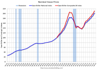
Nominal House Prices

In nominal terms, the Case-Shiller National index (SA)and the Case-Shiller Composite 20 Index (SA) are both at new all times highs (above the bubble peak).
Real House Prices

In real terms, the National index is back to December 2004 levels, and the Composite 20 index is back to June 2004.
In real terms, house prices are at 2004 levels.
Price-to-Rent
In October 2004, Fed economist John Krainer and researcher Chishen Wei wrote a Fed letter on price to rent ratios: House Prices and Fundamental Value. Kainer and Wei presented a price-to-rent ratio using the OFHEO house price index and the Owners' Equivalent Rent (OER) from the BLS.

This graph shows the price to rent ratio (January 2000 = 1.0).
On a price-to-rent basis, the Case-Shiller National index is back to February 2004 levels, and the Composite 20 index is back to November 2003 levels.
In real terms, prices are back to mid 2004 levels, and the price-to-rent ratio is back to late 2003, early 2004.
Update: A few comments on the Seasonal Pattern for House Prices
by Calculated Risk on 7/31/2018 11:33:00 AM
CR Note: This is a repeat of earlier posts with updated graphs.
A few key points:
1) There is a clear seasonal pattern for house prices.
2) The surge in distressed sales during the housing bust distorted the seasonal pattern.
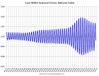
3) Even though distressed sales are down significantly, the seasonal factor is based on several years of data - and the factor is now overstating the seasonal change (second graph below).
4) Still the seasonal index is probably a better indicator of actual price movements than the Not Seasonally Adjusted (NSA) index.
For in depth description of these issues, see former Trulia chief economist Jed Kolko's article "Let’s Improve, Not Ignore, Seasonal Adjustment of Housing Data"
Note: I was one of several people to question the change in the seasonal factor (here is a post in 2009) - and this led to S&P Case-Shiller questioning the seasonal factor too (from April 2010). I still use the seasonal factor (I think it is better than using the NSA data).

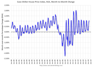
This graph shows the month-to-month change in the NSA Case-Shiller National index since 1987 (through May 2018). The seasonal pattern was smaller back in the '90s and early '00s, and increased once the bubble burst.
The seasonal swings have declined since the bubble.

The swings in the seasonal factors has started to decrease, and I expect that over the next several years - as recent history is included in the factors - the seasonal factors will move back towards more normal levels.
However, as Kolko noted, there will be a lag with the seasonal factor since it is based on several years of recent data.
Case-Shiller: National House Price Index increased 6.4% year-over-year in May
by Calculated Risk on 7/31/2018 09:23:00 AM
S&P/Case-Shiller released the monthly Home Price Indices for May ("May" is a 3 month average of March, April and May prices).
This release includes prices for 20 individual cities, two composite indices (for 10 cities and 20 cities) and the monthly National index.
Note: Case-Shiller reports Not Seasonally Adjusted (NSA), I use the SA data for the graphs.
From S&P: Rise in Home Prices Remains Steady at 6.4% According to S&P CoreLogic Case-Shiller Index
The S&P CoreLogic Case-Shiller U.S. National Home Price NSA Index, covering all nine U.S. census divisions, reported a 6.4% annual gain in May, remaining the same as in the previous month. The 10City Composite annual increase came in at 6.1%, down from 6.4% in the previous month. The 20-City Composite posted a 6.5% year-over-year gain, down from 6.7% in the previous month.
Seattle, Las Vegas, and San Francisco continued to report the highest year-over-year gains among the 20 cities. In May, Seattle led the way with a 13.6% year-over-year price increase, followed by Las Vegas with a 12.6% increase and San Francisco with a 10.9% increase. Seven of the 20 cities reported greater price increases in the year ending May 2018 versus the year ending April 2018.
...
Before seasonal adjustment, the National Index posted a month-over-month gain of 1.1% in May. The 10-City and 20-City Composites reported increases of 0.5% and 0.7%, respectively. After seasonal adjustment, the National Index recorded a 0.4% month-over-month increase in May. The 10-City and 20-City Composites posted 0.1% and 0.2% month-over-month increases, respectively. Nineteen of 20 cities reported increases in May before seasonal adjustment, while 16 of 20 cities reported increases after seasonal adjustment.
“Home prices continue to rack up gains two to three times greater than the inflation rate,” says David M. Blitzer, Managing Director & Chairman of the Index Committee at S&P Dow Jones Indices. “The year-over-year increases in the S&P CoreLogic Case-Shiller National Index have topped 5% every month since August 2016. Unlike the boom-bust period surrounding the financial crisis, price gains are consistent across the 20 cities tracked in the release; currently, the range of the largest to smallest price change is 10 percentage points compared to a 20 percentage point range since 2001, and a 25 percentage point range between 2006 and 2009. Not only are prices rising consistently, they are doing so across the country.
“Continuing price increases appear to be affecting other housing statistics. Sales of existing single family homes – the market covered by the S&P CoreLogic Case-Shiller Indices – peaked last November and have declined for three months in a row. The number of pending home sales is drifting lower as is the number of existing homes for sale. Sales of new homes are also down and housing starts are flattening. Affordability – a measure based on income, mortgage rates and home prices – has gotten consistently worse over the last 18 months. All these indicators suggest that the combination of rising home prices and rising mortgage rates are beginning to affect the housing market.”
emphasis added
 Click on graph for larger image.
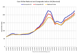
 The first graph shows the nominal seasonally adjusted Composite 10, Composite 20 and National indices (the Composite 20 was started in January 2000).
The Composite 10 index is off 1.0% from the peak, and up 0.1% in May (SA).
The Composite 20 index is 2.2% above the bubble peak, and up 0.2% (SA) in May.
The National index is 9.5% above the bubble peak (SA), and up 0.4% (SA) in May. The National index is up 48.1% from the post-bubble low set in December 2011 (SA).
 The second graph shows the Year over year change in all three indices.
The Composite 10 SA is up 6.2% compared to May 2017. The Composite 20 SA is up 6.5% year-over-year.
The National index SA is up 6.4% year-over-year.
Note: According to the data, prices increased in 18 of 20 cities month-over-month seasonally adjusted.
I'll have more later.
Personal Income increased 0.4% in June, Spending increased 0.4%
by Calculated Risk on 7/31/2018 08:39:00 AM
The BEA released the Personal Income and Outlays report for June:
Personal income increased $71.7 billion (0.4 percent) in June according to estimates released today by the Bureau of Economic Analysis. Disposable personal income (DPI) increased $65.3 billion (0.4 percent) and personal consumption expenditures (PCE) increased $57.1 billion (0.4 percent).The June PCE price index increased 2.2 percent year-over-year and the June PCE price index, excluding food and energy, increased 1.9 percent year-over-year.
Real PCE increased 0.3 percent. The PCE price index increased 0.1 percent. Excluding food and energy, the PCE price index increased 0.1 percent.
The following graph shows real Personal Consumption Expenditures (PCE) through June 2018 (2012 dollars). Note that the y-axis doesn't start at zero to better show the change.
 Click on graph for larger image.
The dashed red lines are the quarterly levels for real PCE.
The increase in personal income was at expectations, and the increase in PCE was close to expectations.
PCE growth was solid in Q2, and inflation is close to the Fed's target.
Monday, July 30, 2018
Tuesday: Personal Income and Outlays, Case-Shiller House Prices
by Calculated Risk on 7/30/2018 07:14:00 PM
From Matthew Graham at Mortgage News Daily: Mortgage Rates Edge to 2-Month Highs
Mortgage rates edged higher today, keeping alive a trend toward higher rates that began just over a week ago. While the overall amount of ground covered as a part of this move isn't necessarily alarming, it's significant because it brings us back to the highest levels since the end of May. [30YR FIXED - 4.625% - 4.75%]Tuesday:
emphasis added
• At 8:30 AM ET, Personal Income and Outlays for June. The consensus is for a 0.4% increase in personal income, and for a 0.4% increase in personal spending. And for the Core PCE price index to increase 0.2%.
• At 9:00 AM, S&P/Case-Shiller House Price Index for May. The consensus is for a 6.6% year-over-year increase in the Comp 20 index for May.
• At 9:45 AM, Chicago Purchasing Managers Index for July. The consensus is for a reading of 62.0, down from 64.1 in June.
Q2 2018 GDP Details on Residential and Commercial Real Estate
by Calculated Risk on 7/30/2018 03:15:00 PM
The BEA has released the underlying details for the Q2 advance GDP report.
The BEA reported that investment in non-residential structures increased at a 13.3% annual pace in Q2. Investment in petroleum and natural gas exploration increased substantially recently, from a $63 billion annual rate in Q4 2016 to a $140 billion annual rate in Q2 2018 - but is still down from a recent peak of $192 billion in Q4 2014.
Without the increase in petroleum and natural gas exploration, non-residential investment would only be up about 3% year-over-year.

The first graph shows investment in offices, malls and lodging as a percent of GDP.
Investment in offices increased in Q2, and is up 8% year-over-year.
Investment in multimerchandise shopping structures (malls) peaked in 2007 and was down about 2% year-over-year in Q2. The vacancy rate for malls is still very high, so investment will probably stay low for some time.
Lodging investment increased in Q2, and lodging investment is up 11% year-over-year.

Home improvement was the top category for five consecutive years following the housing bust ... but now investment in single family structures has been back on top for the last four years and will probably stay there for a long time.
However - even though investment in single family structures has increased from the bottom - single family investment is still very low, and still below the bottom for previous recessions as a percent of GDP. I expect further increases over the next few years.
Investment in single family structures was $289 billion (SAAR) (about 1.4% of GDP), and was up in Q2 compared to Q1.
Investment in multi-family structures increased in Q2.
Investment in home improvement was at a $256 billion Seasonally Adjusted Annual Rate (SAAR) in Q2 (about 1.25% of GDP). Home improvement spending has been solid.
Oil Rigs: " A local peak in rig counts"
by Calculated Risk on 7/30/2018 12:50:00 PM
A few comments from Steven Kopits of Princeton Energy Advisors LLC on July 27, 2018:
• A clear local peak in oil rig counts
• Total oil rigs rose, +3 to 861
• Horizontal oil rigs were flat at 762
...
• Horizontal oil rigs are showing a clear local peak, similar to last July. By the time the count bottomed in November, horizontal oil rigs had fallen by 32. The difference is that oil prices were $20 / barrel lower then.
• Our model sees falling horizontal oil rig counts through Labor Day.
 Click on graph for larger image.
CR note: This graph shows the US horizontal rig count by basin.
Graph and comments Courtesy of Steven Kopits of Princeton Energy Advisors LLC.
Dallas Fed: "Robust Expansion in Texas Manufacturing Continues; Uncertainty Picks Up"
by Calculated Risk on 7/30/2018 10:38:00 AM
From the Dallas Fed: Robust Expansion in Texas Manufacturing Continues; Uncertainty Picks Up
The robust expansion in Texas factory activity continued in July, according to business executives responding to the Texas Manufacturing Outlook Survey. The production index, a key measure of state manufacturing conditions, rose six points to 29.4, signaling an acceleration in output growth.This was the last of the regional Fed surveys for July.
Other indexes of manufacturing activity also indicated continued solid expansion in July. The survey’s demand measures—the new orders and growth rate of orders indexes—moved down but remained well above average at 23.3 and 17.0, respectively. The shipments index climbed five points to 30.8, and the capacity utilization index edged up to 25.0.
Perceptions of broader business conditions were a bit less positive this month versus June, and uncertainty increased. The general business activity index slipped four points to 32.3. The company outlook index dropped 13 points to 20.4, which is the second-lowest reading this year but still elevated relative to the average. A new question introduced to the survey in January 2018 asks, “How has uncertainty regarding your company’s outlook changed in the current month vs. prior month?” In July, a quarter of firms said uncertainty increased, while only 8 percent said it decreased—bringing the outlook uncertainty index* to 17.0, well above its June reading and the highest level to date.
Labor market measures suggested a pickup in net hiring and longer work hours in July. The employment index pushed up five points to 28.9, a 13-year high. Thirty-six percent of firms noted net hiring, compared with 7 percent noting net layoffs. The hours worked index ticked up to 22.2.
Price and wage pressures remained highly elevated this month. While still well above average, the raw materials prices index moved down five points to 48.6, and the finished goods prices index ticked down to 22.9. Compensation costs continued to rise at a faster clip than normal, with the wages and benefits index holding fairly steady at 32.4.
emphasis added
Here is a graph comparing the regional Fed surveys and the ISM manufacturing index:
 Click on graph for larger image.
The New York and Philly Fed surveys are averaged together (yellow, through July), and five Fed surveys are averaged (blue, through July) including New York, Philly, Richmond, Dallas and Kansas City. The Institute for Supply Management (ISM) PMI (red) is through June (right axis).
Based on these regional surveys, it is possible the ISM manufacturing index will be close to 60 in July (to be released on Wednesday, August 1st). The consensus is for the ISM to be at 59.4, down from 60.2 in June.


