by Calculated Risk on 6/04/2018 11:04:00 AM
Monday, June 04, 2018
U.S. Births decreased in 2017
From the National Center for Health Statistics: Births: Provisional Data for 2017. The NCHS reports:
The provisional number of births for the United States in 2017 was 3,853,472, down 2% from 2016 and the lowest number in 30 years. The general fertility rate was 60.2 births per 1,000 women aged 15–44, down 3% from 2016 and another record low for the United States. ...Here is a long term graph of annual U.S. births through 2017.
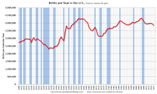 Click on graph for larger image.
Births have declined for three consecutive years following increases in 2013 and 2014.
With fewer births, and less net migration, demographics will not be as favorable as I was expecting a few years ago.
Black Knight Mortgage Monitor for April
by Calculated Risk on 6/04/2018 09:03:00 AM
Black Knight released their Mortgage Monitor report for April today. According to Black Knight, 3.67% of mortgages were delinquent in April, down from 4.08% in April 2017. Black Knight also reported that 0.61% of mortgages were in the foreclosure process, down from 0.85% a year ago.
This gives a total of 4.28% delinquent or in foreclosure.
Press Release: Black Knight’s April 2018 Mortgage Monitor
Today, the Data & Analytics division of Black Knight, Inc. released its latest Mortgage Monitor Report, based on data as of the end of April 2018. This month, leveraging both the Black Knight Home Price Index and Census Bureau income data, the company reports on how rising home prices and mortgage interest rates have affected housing affordability. While homes in much of the country are still more affordable than long-term norms, 19 states are either close to or past their long-term average affordability levels. As Ben Graboske, executive vice president of Black Knight’s Data & Analytics division explained, even the better-than-average income growth the U.S. has seen over the last few years has not been enough to keep up with rising home prices and interest rates.
“Last month, we reported that January and February 2018 saw faster rates of monthly home price appreciation (HPA) than the start of any year since 2005,” said Graboske. “While the pace of annual home price growth slowed a bit in March, HPA is still around 6.5 percent. We’ve also seen interest rates climb by nearly three-quarters of a percent so far this year. Together, those two factors have resulted in a $150 increase in the monthly payment on a 30-year mortgage used to purchase the median-priced U.S. home, about a 14 percent rise since the start of 2018. Stronger-than-average income growth in recent years still hasn’t been enough to keep up with rising HPA and interest rates. Seven states are now less affordable than their long-term norms and another 12 are close to hitting that point. Though much of the country remains more affordable than long-term norms, the current trajectory would change that sooner rather than later. We’ve modeled out multiple economic scenarios, some more conservative than others, and even with historically strong income growth, the current combination of home price and interest rate increases isn’t sustainable.
emphasis added
 Click on graph for larger image.
This graph from Black Knight shows the National Delinquency Rate since 2014, and the impact of the 2017 hurricanes.
From Black Knight:
• Of the 27K total reduction in national delinquencies, over 80% was attributed to hurricane recovery
• Hurricane-related delinquencies fell 19% (-22K) in April, with serious delinquencies attributed to the storms dropping by 15% (-16K)
• Storm-related delinquencies continue to have a strong upward pull on the national delinquency rate
• Without the hurricane effect, Black Knight estimates the national delinquency rate would be 3.48% (as opposed to the current 3.67%), 15% below April 2017 levels
• The upward pull is less than half the 45BPS seen last October, but it still remains strong
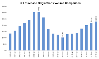
The second graph shows a comparison of Q1 mortgage purchase originations.
• We’ve now seen annual purchase origination growth in 26 of the past 27 quartersThere is much more in the mortgage monitor.
• The growth rate of purchase lending has moderated, from over 25% Y/Y in late 2015, to less than 10% in each of the past three quarters
• In fact, the 5% Y/Y increase in purchase lending was the lowest annual growth rate since early 2014, likely due to both normalization of growth as well as headwinds from tight housing inventory
• Average credit scores increased slightly in Q1 to 748 from 747 in the prior quarter, but have been hovering in the 747-748 range for the past four quarters
• Average loan-to-value ratios (LTVs) rose slightly in Q1 2018 from 81.7% to 82.2%
Sunday, June 03, 2018
Sunday Night Futures
by Calculated Risk on 6/03/2018 08:22:00 PM
Weekend:
• Schedule for Week of June 3, 2018
Monday:
• No major economic releases scheduled.
From CNBC: Pre-Market Data and Bloomberg futures: S&P 500 are unchanged, and DOW futures are up slightly (fair value).
Oil prices were down over the last week with WTI futures at $65.83 per barrel and Brent at $76.54 per barrel. A year ago, WTI was at $48, and Brent was at $48 - so oil prices are up about 50% year-over-year.
Here is a graph from Gasbuddy.com for nationwide gasoline prices. Nationally prices are at $2.95 per gallon. A year ago prices were at $2.37 per gallon - so gasoline prices are up 58 cents per gallon year-over-year.
Public and Private Sector Payroll Jobs During Presidential Terms
by Calculated Risk on 6/03/2018 08:14:00 AM
By request, here is another update of tracking employment during Presidential terms. We frequently use Presidential terms as time markers - we could use Speaker of the House, Fed Chair, or any other marker.
NOTE: Several readers have asked if I could add a lag to these graphs (obviously a new President has zero impact on employment for the month they are elected). But that would open a debate on the proper length of the lag, so I'll just stick to the beginning of each term.
Important: There are many differences between these periods. Overall employment was smaller in the '80s, however the participation rate was increasing in the '80s (younger population and women joining the labor force), and the participation rate is generally declining now. But these graphs give an overview of employment changes.
The first graph shows the change in private sector payroll jobs from when each president took office until the end of their term(s). Presidents Carter and George H.W. Bush only served one term.
Mr. G.W. Bush (red) took office following the bursting of the stock market bubble, and left during the bursting of the housing bubble. Mr. Obama (dark blue) took office during the financial crisis and great recession. There was also a significant recession in the early '80s right after Mr. Reagan (dark red) took office.
There was a recession towards the end of President G.H.W. Bush (light purple) term, and Mr Clinton (light blue) served for eight years without a recession.

The first graph is for private employment only.
Mr. Trump is in Orange (just 16 months).
The employment recovery during Mr. G.W. Bush's (red) first term was sluggish, and private employment was down 804,000 jobs at the end of his first term. At the end of Mr. Bush's second term, private employment was collapsing, and there were net 391,000 private sector jobs lost during Mr. Bush's two terms.
Private sector employment increased by 20,964,000 under President Clinton (light blue), by 14,717,000 under President Reagan (dark red), 9,041,000 under President Carter (dashed green), 1,509,000 under President G.H.W. Bush (light purple), and 11,907,000 under President Obama (dark blue).
During the first 16 months of Mr. Trump's term, the economy has added 2,953,000 private sector jobs.

The public sector grew during Mr. Carter's term (up 1,304,000), during Mr. Reagan's terms (up 1,414,000), during Mr. G.H.W. Bush's term (up 1,127,000), during Mr. Clinton's terms (up 1,934,000), and during Mr. G.W. Bush's terms (up 1,744,000 jobs). However the public sector declined significantly while Mr. Obama was in office (down 266,000 jobs).
During the first 16 months of Mr. Trump's term, the economy has added 13,000 public sector jobs.

After 16 months of Mr. Trump's presidency, the economy has added 2,966,000 jobs, about 367,000 behind the projection.
Saturday, June 02, 2018
Schedule for Week of June 3, 2018
by Calculated Risk on 6/02/2018 08:11:00 AM
The key economic report this week is the Trade Deficit on Wednesday.
No major economic releases scheduled.
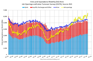 10:00 AM ET: Job Openings and Labor Turnover Survey for April from the BLS.
 This graph shows job openings (yellow line), hires (purple), Layoff, Discharges and other (red column), and Quits (light blue column) from the JOLTS.
Jobs openings increased in March to 6.550 million from 6.078 in February.
The number of job openings (yellow) were up 16.8% year-over-year, and Quits were up 6.3% year-over-year.
10:00 AM: the ISM non-Manufacturing Index for May. The consensus is for index to increase to 58.0 from 56.8 in April.
10:00 AM: Corelogic House Price index for April.
7:00 AM ET: The Mortgage Bankers Association (MBA) will release the results for the mortgage purchase applications index.
 8:30 AM: Trade Balance report for April from the Census Bureau.
 This graph shows the U.S. trade deficit, with and without petroleum, through March. The blue line is the total deficit, and the black line is the petroleum deficit, and the red line is the trade deficit ex-petroleum products.
The consensus is for the U.S. trade deficit to be at $49.0 billion in April unchanged from $49.0 billion in March.
8:30 AM ET: The initial weekly unemployment claims report will be released. The consensus is for 225 thousand initial claims, up from 221 thousand the previous week.
12:00 PM: Q1 Flow of Funds Accounts of the United States from the Federal Reserve.
3:00 PM: Consumer Credit from the Federal Reserve. The consensus is for consumer credit to increase $13.5 billion in April.
No major economic releases scheduled.
Friday, June 01, 2018
U.S. Light Vehicle Sales decrease to 16.9 million annual rate in May
by Calculated Risk on 6/01/2018 03:25:00 PM
Based on a preliminary estimate from AutoData, light vehicle sales were at a 16.9 million SAAR in May.
That is up 1% year-over-year from April 2017, and down 1% from last month.
Click on graph for larger image.
This graph shows the historical light vehicle sales from the BEA (blue) and an estimate for May (red, light vehicle sales of 16.9 million SAAR from AutoData).
This was below the consensus forecast for May.
Note that the increase in sales at the end of 2017 was due to buying following the hurricanes.
Sales will probably move sideways or decline in 2018 after setting new sales records in both 2015 and 2016.

Note: dashed line is current estimated sales rate.
This is the lowest sales rate since last August.
Comments on May Employment Report
by Calculated Risk on 6/01/2018 12:21:00 PM
The headline jobs number at 223,000 for May was above consensus expectations of 185 thousand, and the previously two months were revised up by a combined 15 thousand. Overall this was a strong report.
Earlier: May Employment Report: 223,000 Jobs Added, 3.8% Unemployment Rate
In May, the year-over-year employment change was 2.363 million jobs. This is solid year-over-year growth.
Average Hourly Earnings
Wage growth was about as expected in May. From the BLS:
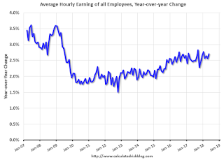
"In May, average hourly earnings for all employees on private nonfarm payrolls rose by 8 cents to $26.92. Over the year, average hourly earnings have increased by 71 cents, or 2.7 percent."
 Click on graph for larger image.
This graph is based on “Average Hourly Earnings” from the Current Employment Statistics (CES) (aka "Establishment") monthly employment report. Note: There are also two quarterly sources for earnings data: 1) “Hourly Compensation,” from the BLS’s Productivity and Costs; and 2) the Employment Cost Index which includes wage/salary and benefit compensation.
The graph shows the nominal year-over-year change in "Average Hourly Earnings" for all private employees. Nominal wage growth was at 2.7% YoY in May.
Wage growth had been trending up, although growth has been moving more sideways recently.
Prime (25 to 54 Years Old) Participation
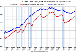 Since the overall participation rate has declined due to cyclical (recession) and demographic (aging population, younger people staying in school) reasons, here is the employment-population ratio for the key working age group: 25 to 54 years old.
In the earlier period the participation rate for this group was trending up as women joined the labor force. Since the early '90s, the participation rate moved more sideways, with a downward drift starting around '00 - and with ups and downs related to the business cycle.
The 25 to 54 participation rate decreased in May to 81.8%, and the 25 to 54 employment population ratio was unchanged at 79.2%.
The participation rate had been trending down for this group since the late '90s, however, with more younger workers (and fewer 50+ age workers), the prime participation rate might move up some more.
Part Time for Economic Reasons
 From the BLS report:
"The number of persons employed part time for economic reasons (sometimes referred to as involuntary part-time workers) was essentially unchanged at 4.9 million in May. These individuals, who would have preferred full-time employment, were working part time because their hours had been reduced or they were unable to find full-time jobs."The number of persons working part time for economic reasons has been generally trending down, and the number decreased in May. The number working part time for economic reasons suggests a little slack still in the labor market.
These workers are included in the alternate measure of labor underutilization (U-6) that decreased to 7.6% in May. This is the lowest level for U-6 since 2001.
Unemployed over 26 Weeks
 This graph shows the number of workers unemployed for 27 weeks or more.
 According to the BLS, there are 1.189 million workers who have been unemployed for more than 26 weeks and still want a job. This was down from 1.293 million in April.
This is the lowest level since June 2007.
The headline jobs number was solid and the previous two months were revised up slightly. The headline unemployment rate dropped further, to 3.8%, and U-6 is the lowest since 2007. For the first five months of 2018, job growth has been solid averaging just over 200 thousand per month.
Construction Spending increased 1.8% in April
by Calculated Risk on 6/01/2018 11:17:00 AM
Earlier today, the Census Bureau reported that overall construction spending decreased in April:
Construction spending during April 2018 was estimated at a seasonally adjusted annual rate of $1,310.4 billion, 1.8 percent above the revised March estimate of $1,286.8 billion. The April figure is 7.6 percent (±1.5 percent) above the April 2017 estimate of $1,217.7 billion.Private spending increased and public spending decreased:
Spending on private construction was at a seasonally adjusted annual rate of $1,014.3 billion, 2.8 percent above the revised March estimate of $986.6 billion. ...
In April, the estimated seasonally adjusted annual rate of public construction spending was $296.1 billion, 1.3 percent below the revised March estimate of $300.1 billion.
emphasis added
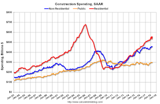 Click on graph for larger image.
This graph shows private residential and nonresidential construction spending, and public spending, since 1993. Note: nominal dollars, not inflation adjusted.
Private residential spending has been increasing, but is still 21% below the bubble peak.
Non-residential spending is 10% above the previous peak in January 2008 (nominal dollars).
Public construction spending is now 8% below the peak in March 2009, and 14% above the austerity low in February 2014.
 The second graph shows the year-over-year change in construction spending.
On a year-over-year basis, private residential construction spending is up 10%. Non-residential spending is up 5% year-over-year. Public spending is up 8% year-over-year.
This was below the consensus forecast of a 0.8% increase for April. And spending for the previous two months was revised up slightly.
ISM Manufacturing index increased to 58.7 in May
by Calculated Risk on 6/01/2018 10:03:00 AM
The ISM manufacturing index indicated expansion in May. The PMI was at 58.7% in May, up from 57.3% in April. The employment index was at 56.3%, up from 54.2% last month, and the new orders index was at 63.7%, up from 61.2%.
From the Institute for Supply Management: May 2018 Manufacturing ISM® Report On Business®
Economic activity in the manufacturing sector expanded in May, and the overall economy grew for the 109th consecutive month, say the nation’s supply executives in the latest Manufacturing ISM® Report On Business®.
The report was issued today by Timothy R. Fiore, CPSM, C.P.M., Chair of the Institute for Supply Management® (ISM®) Manufacturing Business Survey Committee: “The May PMI® registered 58.7 percent, an increase of 1.4 percentage points from the April reading of 57.3 percent. The New Orders Index registered 63.7 percent, an increase of 2.5 percentage points from the April reading of 61.2 percent. The Production Index registered 61.5 percent, a 4.3 percentage point increase compared to the April reading of 57.2 percent. The Employment Index registered 56.3 percent, an increase of 2.1 percentage points from the April reading of 54.2 percent. The Supplier Deliveries Index registered 62 percent, a 0.9 percentage point increase from the April reading of 61.1 percent. The Inventories Index registered 50.2 percent, a decrease of 2.7 percentage points from the April reading of 52.9 percent. The Prices Index registered 79.5 percent in May, a 0.2 percentage point increase from the April reading of 79.3 percent, indicating higher raw materials prices for the 27th consecutive month.
emphasis added
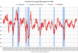 Click on graph for larger image.
Here is a long term graph of the ISM manufacturing index.
This was slightly above expectations of 58.4%, and suggests manufacturing expanded at a faster pace in May than in April.
A solid report.
May Employment Report: 223,000 Jobs Added, 3.8% Unemployment Rate
by Calculated Risk on 6/01/2018 08:42:00 AM
From the BLS:
Total nonfarm payroll employment increased by 223,000 in May, and the unemployment rate edged down to 3.8 percent, the U.S. Bureau of Labor Statistics reported today. Employment continued to trend up in several industries, including retail trade, health care, and construction.
...
The change in total nonfarm payroll employment for March was revised up from +135,000 to +155,000, and the change for April was revised down from +164,000 to +159,000. With these revisions, employment gains in March and April combined were 15,000 more than previously reported.
...
In May, average hourly earnings for all employees on private nonfarm payrolls rose by 8 cents to $26.92. Over the year, average hourly earnings have increased by 71 cents, or 2.7 percent.
emphasis added
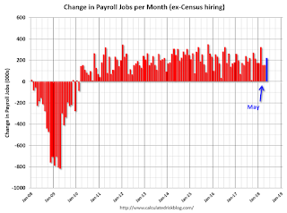 Click on graph for larger image.
The first graph shows the monthly change in payroll jobs, ex-Census (meaning the impact of the decennial Census temporary hires and layoffs is removed - mostly in 2010 - to show the underlying payroll changes).
Total payrolls increased by 223 thousand in May (private payrolls increased 218 thousand).
Payrolls for February and March were revised up by a combined 15 thousand.
 This graph shows the year-over-year change in total non-farm employment since 1968.
In May the year-over-year change was 2.363 million jobs.
The third graph shows the employment population ratio and the participation rate.
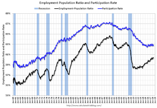 The Labor Force Participation Rate was decreased in May to 62.7%. This is the percentage of the working age population in the labor force. A large portion of the recent decline in the participation rate is due to demographics.
 The Employment-Population ratio increased to 60.4% (black line).
I'll post the 25 to 54 age group employment-population ratio graph later.
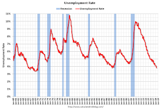 The fourth graph shows the unemployment rate.
 The unemployment rate declined in April to 3.8%.
This was above the consensus expectations of 185,000 jobs, and the previous two months combined were revised up by 15,000. A strong report.
I'll have much more later ...


