by Calculated Risk on 10/22/2013 02:07:00 PM
Tuesday, October 22, 2013
Employment Report Comments
Overall this was a weak employment report.
The decline in the unemployment rate to 7.2% in September, from 7.3% in August, was a little bit of good news, but the recent decline has been mostly due to declining participation.
If we look at the year-over-year change in employment - to minimize the monthly volatility - total nonfarm employment is up 2.225 million from September 2012, and private employment is up 2.290 million. That is essentially the same year-over-year gain as in August (2.215 million total, 2.282 million private year-over-year in August).
So the story mostly remains the same: slow and steady job growth.
Unfortunately the next employment report will be impacted by the government shutdown (both impacting employment and data gathering).
A few more graphs ...
Employment-Population Ratio, 25 to 54 years old
 Click on graph for larger image.
Since the participation rate declined recently due to cyclical (recession) and demographic (aging population) reasons, an important graph is the employment-population ratio for the key working age group: 25 to 54 years old.
In the earlier period the employment-population ratio for this group was trending up as women joined the labor force. The ratio has been mostly moving sideways since the early '90s, with ups and downs related to the business cycle.
The ratio was unchanged at 75.9% in September. This ratio should probably move close to 80% as the economy recovers, but that also requires an increase in the 25 to 54 participation rate.
The participation rate for this group declined to 80.9% in September. The decline in the participation rate for this age group is probably mostly due to economic weakness (as opposed to demographics) and this suggests the labor market is still very weak.
Percent Job Losses During Recessions
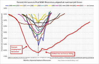
This graph shows the job losses from the start of the employment recession, in percentage terms - this time aligned at maximum job losses. At the recent pace of improvement, it appears employment will be back to pre-recession levels next year (Of course this doesn't include population growth).
In the earlier post, the graph showed the job losses aligned at the start of the employment recession.
This financial crisis recession was much deeper than other post WWII recessions, and the recovery has been slower (the recovery from the 2001 recession was slow too). However, if we compare to other financial crisis recoveries, this recovery has actually been better than most.
Part Time for Economic Reasons
 From the BLS report:
The number of persons employed part time for economic reasons (sometimes referred to as involuntary part-time workers) was unchanged at 7.9 million in September. These individuals were working part time because their hours had been cut back or because they were unable to find a full-time job.The number of part time workers increased slightly in September to 7.926 million.
These workers are included in the alternate measure of labor underutilization (U-6) that decreased to 13.6% in September from 13.7% in August. This is the lowest level for U-6 since December 2008.
Unemployed over 26 Weeks
 This graph shows the number of workers unemployed for 27 weeks or more.
 According to the BLS, there are 4.146 million workers who have been unemployed for more than 26 weeks and still want a job. This was down from 4.290 million in August. This is generally trending down, but is still very high. Long term unemployment remains one of the key labor problems in the US.
State and Local Government
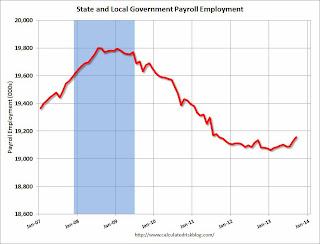 This graph shows total state and government payroll employment since January 2007. State and local governments lost jobs for four straight years. (Note: Scale doesn't start at zero to better show the change.)
 In September 2013, state and local governments added 28,000 jobs, and state and local employment is up 82 thousand so far in 2013.
I think most of the state and local government layoffs are over, and state and local employment has probably bottomed. Of course Federal government layoffs are ongoing - and with many more layoffs expected.
Overall the labor market is still weak and millions of people are unemployed or underemployed.
Chemical Activity Barometer for October Suggests Economic Activity Increasing
by Calculated Risk on 10/22/2013 12:32:00 PM
I'll have more on the employment report later, but this is a new indicator that I'm following that appears to be a leading indicator for the economy.
From the American Chemistry Council: Fourth Quarter to End Strong Shows Leading Economic Indicator
The partial shutdown of the federal government earlier this month didn’t take the steam out of the U.S. economy, according to the American Chemistry Council’s (ACC) monthly Chemical Activity Barometer (CAB), released today. The Chemical Activity Barometer is a leading economic indicator, shown to lead U.S. business cycles by an average of eight months at cycle peaks, and four months at cycle troughs. The barometer increased 0.3 percent over September on a three-month moving average (3MMA) basis, and remains up 3.1 percent over a year ago. It continues to be at its highest point since June 2008. Prior CAB readings for July through September were slightly revised.
“Despite the uncertainty being fueled by political gridlock in Washington, the fundamentals of our economy appear to be healthy,” said Dr. Kevin Swift, chief economist at the American Chemistry Council. This month’s Chemical Activity Barometer is up 0.3 percent and this follows upticks in August and September as well,” he said.
emphasis added
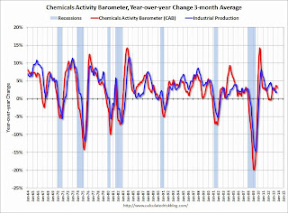 Click on graph for larger image.
This graph shows the year-over-year change in the 3-month moving average for the Chemical Activity Barometer compared to Industrial Production. It does appear that CAB (red) generally leads Industrial Production (blue).
And this suggests that economic activity is increasing.
Construction Spending increased in August
by Calculated Risk on 10/22/2013 10:00:00 AM
The Census Bureau reported that overall construction spending increased in August:
The U.S. Census Bureau of the Department of Commerce announced today that construction spending during August 2013 was estimated at a seasonally adjusted annual rate of $915.1 billion, 0.6 percent above the revised July estimate of $909.4 billion. The August figure is 7.1 percent above the August 2012 estimate of $854.0 billion.
...
Spending on private construction was at a seasonally adjusted annual rate of $640.5 billion, 0.7 percent above the revised July estimate of $636.1 billion. ...
In August, the estimated seasonally adjusted annual rate of public construction spending was $274.5 billion, 0.4 percent above the revised July estimate of $273.4 billion.
 Click on graph for larger image.
This graph shows private residential and nonresidential construction spending, and public spending, since 1993. Note: nominal dollars, not inflation adjusted.
Private residential spending is 50% below the peak in early 2006, and up 49% from the post-bubble low.
Non-residential spending is 27% below the peak in January 2008, and up about 34% from the recent low.
Public construction spending is now 16% below the peak in March 2009 and up about 4% from the recent low.
 The second graph shows the year-over-year change in construction spending.
On a year-over-year basis, private residential construction spending is now up 26%. Non-residential spending is up 4% year-over-year. Public spending is down 2% year-over-year.
To repeat a few key themes:
1) Private residential construction is usually the largest category for construction spending, and is now the largest category once again. Usually private residential construction leads the economy, so this is a good sign going forward.
2) Private non-residential construction spending usually lags the economy. There was some increase this time for a couple of years - mostly related to energy and power - but the key sectors of office, retail and hotels are still at very low levels. I expect private non-residential to start to increase.
3) Public construction spending increased in August and is now 4% above the low in April. It is possible that the drag from public construction spending is over. Public spending has declined to 2006 levels (not adjusted for inflation) and was a drag on the economy for 4 years. In real terms, public construction spending has declined to 2001 levels.
September Employment Report: 148,000 Jobs, 7.2% Unemployment Rate
by Calculated Risk on 10/22/2013 09:01:00 AM
From the BLS:
Total nonfarm payroll employment rose by 148,000 in September, and the unemployment rate was little changed at 7.2 percent, the U.S. Bureau of Labor Statistics reported today. ...The headline number was below expectations of 180,000 payroll jobs added.
...
The change in total nonfarm payroll employment for July was revised from +104,000 to +89,000, and the change for August was revised from +169,000 to +193,000. With these revisions, employment gains in July and August combined were 9,000 more than previously reported.
 Click on graph for larger image.
NOTE: This graph is ex-Census meaning the impact of the decennial Census temporary hires and layoffs is removed to show the underlying payroll changes.
The second graph shows the unemployment rate.
The unemployment rate declined in September to 7.2% from 7.3% in August.
 This is the lowest level for the unemployment rate since November 2008.
The unemployment rate is from the household report.
The third graph shows the employment population ratio and the participation rate.
The Labor Force Participation Rate was unchanged in September at 63.2%. This is the percentage of the working age population in the labor force.
 The participation rate is well below the 66% to 67% rate that was normal over the last 20 years, although a significant portion of the recent decline is due to demographics.
The Employment-Population ratio was unchanged in September at 58.6% from (black line).
I'll post the 25 to 54 age group employment-population ratio graph later.
 The fourth graph shows the job losses from the start of the employment recession, in percentage terms, compared to previous post WWII recessions. The dotted line is ex-Census hiring.
This shows the depth of the recent employment recession - worse than any other post-war recession - and the relatively slow recovery due to the lingering effects of the housing bust and financial crisis.
This was another weaker than expected employment report. I'll have much more later ...
Monday, October 21, 2013
Tuesday: Jobs, Jobs, Jobs
by Calculated Risk on 10/21/2013 09:22:00 PM
With the jobs report release, it is going to feel like Friday tomorrow!
Unfortunately many reports will really be delayed. The Census Bureau released their Revised Economic Indicator Calendar today. As an example, the New Home sales report for September will not be released until December 4th (originally scheduled this week). They will release both September and October at the same time..
The BEA also announced some update release dates today: 2013 News Release Schedule. The Q3 advance estimate for Gross Domestic Product (GDP) will now be released on November 7th (originally scheduled for October 30th).
Tuesday:
• At 8:30 AM ET, the Employment Report for September will be released. The consensus is for an increase of 178,000 non-farm payroll jobs in September; the economy added 169,000 non-farm payroll jobs in August. The consensus is for the unemployment rate to be unchanged at 7.3% in September.
• At 9:00 AM, the Chemical Activity Barometer (CAB) for October from the American Chemistry Council will be released. This appears to be a leading economic indicator.
• At 10:00 AM, the Richmond Fed Survey of Manufacturing Activity for October.
• Also at 10:00 AM, Construction Spending for August. The consensus is for a 0.4% increase in construction spending.
NMHC Survey: Apartment Market Conditions Loosen in Q3
by Calculated Risk on 10/21/2013 03:17:00 PM
From the National Multi Housing Council (NMHC): Apartment Markets Retreat in Third Quarter NMHC Survey
All four indexes of the National Multi Housing Council’s (NMHC) October Survey of Apartment Market Conditions dipped below 50 for the first time since July 2009. Market Tightness (46), Sales Volume (46), Equity Financing (39) and Debt Financing (41) all indicated declining conditions from the previous quarter.
“After four years of almost continuous improvement across all indicators, apartment markets have taken a small step back,” said Mark Obrinsky, NMHC’s Vice President of Research and Chief Economist.
...
Market Tightness Index fell to 46 from 55. Two-thirds of respondents (67 percent) saw no change in market tightness (higher rents and/or occupancy rates) compared with three months ago. One-fifth of respondents (up from 14 percent in July) felt that markets were looser than three months ago, while 13 percent saw tighter markets.
emphasis added

Click on graph for larger image.
This graph shows the quarterly Apartment Tightness Index. Any reading below 50 indicates loosening from the previous quarter. The quarterly decrease was small, but indicates looser market conditions.
As I've mentioned before, this index helped me call the bottom for effective rents (and the top for the vacancy rate) early in 2010. This survey now suggests vacancy rates are near a bottom, although apartment markets are still tight, so rents will probably continue to increase.
Comments on Existing Home Sales
by Calculated Risk on 10/21/2013 12:16:00 PM
As expected, existing home sales declined in September, and I expect further declines over the next several months. From the NAR:
NAR President Gary Thomas, broker-owner of Evergreen Realty in Villa Park, Calif., said there are far-ranging consequences from the repeating stalemates in Washington. “Just one impact of the recent government shutdown – delays in tax transcripts needed for approval of mortgage loans – put a monkey wrench in the transaction process and could negatively impact sales closings in next month’s report,” he said.But lower existing home sales, and slower price appreciation, doesn't mean the housing recovery is over. What matters for jobs and the economy are new home sales, not existing home sales. And I expect the housing recovery to continue.
emphasis added
The big story in the NAR release this morning was that inventory was now up 1.8% year-over-year in September. Inventory is still very low, but year-over-year inventory has now turned positive, and I expect inventory to continue to increase. With the low level of inventory, there is still upward pressure on prices - but as inventory starts to increase, buyer urgency will wane, and price increases will slow.
 Click on graph for larger image.
The NAR does not seasonally adjust inventory, even though there is a clear seasonal pattern. Trulia chief economist Jed Kolko sent me the seasonally adjusted inventory (see graph of NAR reported and seasonally adjusted).
This shows that inventory bottomed in January (on a seasonally adjusted basis), and is now up about 7.5% from the bottom. On a seasonally adjusted basis, inventory was up 2.3% in September, even though the NAR reported inventory was flat (usually inventory declines in September).
Important: The NAR reports active listings, and although there is some variability across the country in what is considered active, most "contingent short sales" are not included. "Contingent short sales" are strange listings since the listings were frequently NEVER on the market (they were listed as contingent), and they hang around for a long time - they are probably more closely related to shadow inventory than active inventory. However when we compare inventory to 2005, we need to remember there were no "short sale contingent" listings in 2005. In the areas I track, the number of "short sale contingent" listings is also down sharply year-over-year.
Another key point: The NAR reported total sales were up 10.7% from September 2012, but conventional sales are probably up close to 25% from September 2012, and distressed sales down. The NAR reported (from a survey):
Distressed homes – foreclosures and short sales – accounted for 14 percent of September sales, up from 12 percent in August, which was the lowest share since monthly tracking began in October 2008; they were 24 percent in September 2012.Although this survey isn't perfect, if total sales were up 10.7% from September 2012, and distressed sales declined to 14% of total sales (14% of 5.29 million) from 24% (24% of 4.78 million in September 2012), this suggests conventional sales were up sharply year-over-year - a good sign.
The following graph shows existing home sales Not Seasonally Adjusted (NSA).
 Click on graph for larger image.
Sales NSA in September (red column) are above the sales for 2007 through 2012, however sales are well below the bubble years of 2005 and 2006.
Earlier:
• Existing Home Sales in September: 5.29 million SAAR, Inventory up 1.8% Year-over-year
Existing Home Sales in September: 5.29 million SAAR, Inventory up 1.8% Year-over-year
by Calculated Risk on 10/21/2013 10:00:00 AM
The NAR reports: Existing-Home Sales Down in September but Prices Rise
Total existing-home sales, which are completed transactions that include single-family homes, townhomes, condominiums and co-ops, declined 1.9 percent to a seasonally adjusted annual rate of 5.29 million in September from a downwardly revised 5.39 million in August, but are 10.7 percent above the 4.78 million-unit pace in September 2012.
Total housing inventory at the end of September was unchanged at 2.21 million existing homes available for sale, which represents a 5.0-month supply at the current sales pace, compared with a 4.9-month supply in August. Unsold inventory is 1.8 percent above a year ago, when there was a 5.4-month supply
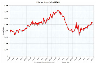 Click on graph for larger image.
This graph shows existing home sales, on a Seasonally Adjusted Annual Rate (SAAR) basis since 1993.
Sales in September 2013 (5.29 million SAAR) were 1.9% lower than last month, and were 10.7% above the September 2012 rate.
The second graph shows nationwide inventory for existing homes.
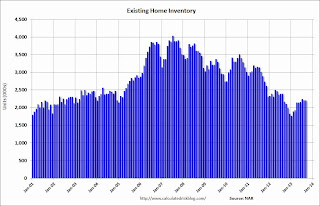 According to the NAR, inventory was unchanged at 2.21 million in September. Inventory is not seasonally adjusted, and inventory usually increases from the seasonal lows in December and January, and peaks in mid-to-late summer.
The third graph shows the year-over-year (YoY) change in reported existing home inventory and months-of-supply. Since inventory is not seasonally adjusted, it really helps to look at the YoY change. Note: Months-of-supply is based on the seasonally adjusted sales and not seasonally adjusted inventory.
 Inventory increased 1.8% year-over-year in September compared to September 2012. This is the first year-over-year increase since early 2011 and indicates inventory bottomed earlier this year.
Months of supply was at 5.0 months in September.
This was at expectations of sales of 5.30 million. For existing home sales, the key number is inventory - and inventory is still low, but up year-over-year. I'll have more later ...
Sunday, October 20, 2013
Monday: Existing Home Sales
by Calculated Risk on 10/20/2013 09:05:00 PM
Monday:
• At 8:30 AM ET, the Chicago Fed National Activity Index for September was scheduled for release. This is a composite index of other data and will probably be delayed.
• At 10:00 AM, Existing Home Sales for September from the National Association of Realtors (NAR). The consensus is for sales of 5.30 million on seasonally adjusted annual rate (SAAR) basis. Sales in August were at a 5.48 million SAAR. Economist Tom Lawler is estimating the NAR will report sales of 5.26 million SAAR for September. As always, the key will be inventory.
Weekend:
• Schedule for Week of October 20th
From CNBC: Pre-Market Data and Bloomberg futures: the S&P futures are down slightly and DOW futures are up slightly (fair value).
Oil prices are flat with WTI futures at $100.86 per barrel and Brent at $110.05 per barrel.
The Nikkei has opened up about 1% according to MarketWatch:
Japanese stocks rose in early Monday trading, with weaker-than-expected trade data pushing the yen lower, which in turn helped some export stocks. The Nikkei Stock Average added 1% to 14,704.36, with the broader Topix up 0.8%, also enjoying support from gains Friday in the U.S.
Builder Confidence and Single Family Starts
by Calculated Risk on 10/20/2013 07:04:00 PM
Last week the National Association of Home Builders (NAHB) reported the housing market index (HMI) declined in October to 55 from 57 in September.
Here is the press release from the NAHB: Builder Confidence Down in October; NAHB Estimates Sept. Housing Starts will Approach 900,000 Units
For some time I've been posting a graph with both builder confidence and single family starts (first graph below). This chart shows that confidence and single family starts generally move in the same direction, but it doesn't tell us anything about the expected level of single family starts.
 Click on graph for larger image.
This graph compares the NAHB HMI (left scale) with single family housing starts (right scale). This includes the October release for the HMI and the August data for starts.
Builder confidence is based on a survey by the NAHB, and is designed so that any number above 50 indicates that more builders view sales conditions as good than poor. Since sales have picked up, builders are now more confident - and the surviving builders view sales as "good" - even though single family starts are still historically very low.
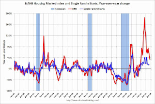 Probably a better comparison is to look at the year-over-year change in each series (Builder confidence and single family housing starts).
Once again the year-over-year change tends to move in the same direction, but builder confidence has larger swings (especially lately).
I expect single family starts to continue to increase over the next few years, but I don't think we should builder confidence to estimate the eventual level.


