by Calculated Risk on 4/30/2013 07:05:00 PM
Tuesday, April 30, 2013
Wednesday: FOMC Meeting, Auto Sales, ISM Mfg Index, Construction Spending, ADP Employment and more
A couple of releases earlier today:
From the Chicago ISM: (Ouch!)
The Chicago Purchasing Managers reported April's Chicago Business Barometer fell 3.4 to 49.0, a 3-1/2 year low. Except for a minor gain in New Orders, all Business Activity measures weakened in April with five of seven now in contraction. BUSINESS ACTIVITY: SUPPLIER DELIVERIES, PRICES PAID, and PRODUCTION: all lowest since 2009; ORDER BACKLOGS: ten months of contraction in the past 12 months; EMPLOYMENT: third month over month decline.And from the Conference Board: The Conference Board Consumer Confidence Index® Improves in April
The Conference Board Consumer Confidence Index®, which had declined in March, increased in April. The Index now stands at 68.1 (1985=100), up from 61.9 in March. The Present Situation Index increased to 60.4 from 59.2. The Expectations Index improved to 73.3 from 63.7 last month.Wednesday economic releases:
• At 7:00 AM ET, the Mortgage Bankers Association (MBA) will release the results for the mortgage purchase applications index.
• At 8:15 AM, the ADP Employment Report for April will be released. This report is for private payrolls only (no government). The consensus is for 155,000 payroll jobs added in April.
• At 9:00 AM, the Markit US PMI Manufacturing Index for April. The consensus is for a decrease to 52.0 from 54.6 in March.
• At 10:00 AM, the ISM Manufacturing Index for April. The consensus is for a decrease to 51.0 from 51.3 in March. Based on the regional surveys, a reading below 50 is possible.
• Also at 10:00 AM, Construction Spending for March. The consensus is for a 0.6% increase in construction spending.
• At 2:00 PM, FOMC Meeting Announcement will be released. No change to interest rates or QE purchases is expected at this meeting.
• All day: Light vehicle sales for April. The consensus is for light vehicle sales to be at 15.3 million SAAR in March (Seasonally Adjusted Annual Rate) unchanged from 15.3 SAAR in March.
Restaurant Index increased in March
by Calculated Risk on 4/30/2013 04:40:00 PM
From the National Restaurant Association: Positive same-store sales push RPI above 100 in March
Buoyed by positive sales results and a more optimistic outlook among restaurant operators, the National Restaurant Association’s Restaurant Performance Index (RPI) rose above 100 in March. The RPI stood at 100.6 in March, up 0.7 percent from February’s level of 99.9. March represented the second time in the last three months that the RPI stood above 100, which signifies expansion in the index of key industry indicators.
“The Restaurant Performance Index gain was driven by stronger same-store sales results in March, with comparisons aided by the Easter holiday occurring during the month,” said Hudson Riehle, senior vice president of the Research and Knowledge Group for the Association. “In addition, restaurant operators are somewhat more confident in the economy and a majority plan to make a capital expenditure in the next six months.”
...
The Current Situation Index stood at 99.8 in March – up 1.5 percent from February’s level. After reporting a same-store sales decline for the first time in 21 months, restaurant operators bounced back in March with a modest net gain. ... While overall sales were positive in March, restaurant operators reported a net decline in customer traffic for the fourth consecutive month. Despite the mixed sales and traffic results, restaurant operators reported an increase in capital spending activity.
 Click on graph for larger image.
The index increased to 100.6 in March, up from 99.9 in February. (above 100 indicates expansion).
Restaurant spending is discretionary, so even though this is "D-list" data, I like to check it every month. More evidence of a currently sluggish recovery ...
Earlier on House Prices:
• Case-Shiller: Comp 20 House Prices increased 9.3% year-over-year in February
• Real House Prices, Price-to-Rent Ratio, City Prices relative to 2000
HVS: Q1 2013 Homeownership and Vacancy Rates
by Calculated Risk on 4/30/2013 01:49:00 PM
The Census Bureau released the Housing Vacancies and Homeownership report for Q1 2013 this morning.
This report is frequently mentioned by analysts and the media to track the homeownership rate, and the homeowner and rental vacancy rates. However, there are serious questions about the accuracy of this survey.
This survey might show the trend, but I wouldn't rely on the absolute numbers. The Census Bureau is investigating the differences between the HVS, ACS and decennial Census, and analysts probably shouldn't use the HVS to estimate the excess vacant supply, or rely on the homeownership rate, except as a guide to the trend.
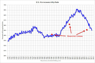 Click on graph for larger image.
The Red dots are the decennial Census homeownership rates for April 1st 1990, 2000 and 2010. The HVS homeownership rate decreased to 65.0%, down from 65.4% in Q4.
I'd put more weight on the decennial Census numbers and that suggests the actual homeownership rate is probably in the 64% to 65% range.
 The HVS homeowner vacancy rate was increased to 2.1% in Q1 from 1.9% in Q4.
The homeowner vacancy rate has peaked and is now generally declining, although it isn't really clear what this means. Are these homes becoming rentals? Anyway - once again - this probably shows that the trend is down, but I wouldn't rely on the absolute numbers.
 The rental vacancy rate declined in Q4 to 8.6%, from 8.7% in Q4.
I think the Reis quarterly survey (large apartment owners only in selected cities) is a much better measure of the overall trend in the rental vacancy rate - and Reis reported that the rental vacancy rate has fallen to the lowest level since 2001.
The quarterly HVS is the most timely survey on households, but there are many questions about the accuracy of this survey. Unfortunately many analysts still use this survey to estimate the excess vacant supply. However this does suggest that the housing vacancy rates have declined sharply.
Earlier on House Prices:
• Case-Shiller: Comp 20 House Prices increased 9.3% year-over-year in February
• Real House Prices, Price-to-Rent Ratio, City Prices relative to 2000
Real House Prices, Price-to-Rent Ratio, City Prices relative to 2000
by Calculated Risk on 4/30/2013 10:49:00 AM
Case-Shiller, CoreLogic and others report nominal house prices, and it is also useful to look at house prices in real terms (adjusted for inflation) and as a price-to-rent ratio.
As an example, if a house price was $200,000 in January 2000, the price would be close to $276,000 today adjusted for inflation. This is why economist also look at real house prices (inflation adjusted).
Nominal House Prices
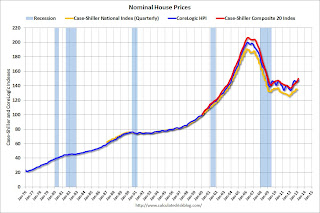 The first graph shows the quarterly Case-Shiller National Index SA (through Q4 2012), and the monthly Case-Shiller Composite 20 SA and CoreLogic House Price Indexes (through February) in nominal terms as reported.
In nominal terms, the Case-Shiller National index (SA) is back to Q2 2003 levels (and also back up to Q3 2010), and the Case-Shiller Composite 20 Index (SA) is back to November 2003 levels, and the CoreLogic index (NSA) is back to January 2004.
Real House Prices
 The second graph shows the same three indexes in real terms (adjusted for inflation using CPI less Shelter). Note: some people use other inflation measures to adjust for real prices.
In real terms, the National index is back to October 1999 levels, the Composite 20 index is back to January 2001, and the CoreLogic index back to February 2001.
In real terms, most of the appreciation in the last decade is gone.
Price-to-Rent
In October 2004, Fed economist John Krainer and researcher Chishen Wei wrote a Fed letter on price to rent ratios: House Prices and Fundamental Value. Kainer and Wei presented a price-to-rent ratio using the OFHEO house price index and the Owners' Equivalent Rent (OER) from the BLS.
 Here is a similar graph using the Case-Shiller National, Composite 20 and CoreLogic House Price Indexes.
This graph shows the price to rent ratio (January 1998 = 1.0).
On a price-to-rent basis, the Case-Shiller National index is back to Q4 1999 levels, the Composite 20 index is back to January 2001 levels, and the CoreLogic index is back to February 2001.
In real terms - and as a price-to-rent ratio - prices are mostly back to early 2000 levels.
Nominal Prices: Cities relative to Jan 2000
 The last graph shows the bubble peak, the post bubble minimum, and current nominal prices relative to January 2000 prices for all the Case-Shiller cities in nominal terms.
As an example, at the peak, prices in Phoenix were 127% above the January 2000 level. Then prices in Phoenix fell slightly below the January 2000 level, and are now up 29% above January 2000 (I'll look at this in real terms later). Some cities - like Denver - are close to the peak level. Other cities, like Atlanta and Detroit, are below the January 2000 level.
Case-Shiller: Comp 20 House Prices increased 9.3% year-over-year in February
by Calculated Risk on 4/30/2013 09:00:00 AM
S&P/Case-Shiller released the monthly Home Price Indices for February ("February" is a 3 month average of December, January and February).
This release includes prices for 20 individual cities, and two composite indices (for 10 cities and 20 cities).
Note: Case-Shiller reports Not Seasonally Adjusted (NSA), I use the SA data for the graphs.
From S&P: Home Prices Rise in February 2013 According to the S&P/Case-Shiller Home Price Indices
Data through February 2013, released today by S&P Dow Jones Indices for its S&P/Case-Shiller Home Price Indices ... showed average home prices increased 8.6% and 9.3% for the 10- and 20-City Composites in the 12 months ending in February 2013. The 10- and 20-City Composites rose 0.4% and 0.3% from January to February.
“Home prices continue to show solid increases across all 20 cities,” says David M. Blitzer, Chairman of the Index Committee at S&P Dow Jones Indices. “The 10- and 20-City Composites recorded their highest annual growth rates since May 2006; seasonally adjusted monthly data show all 20 cities saw higher prices for two months in a row – the last time that happened was in early 2005.
“Phoenix, San Francisco, Las Vegas and Atlanta were the four cities with the highest year-over-year price increases. Atlanta recovered from a wave of foreclosures in 2012 while the other three were among the hardest hit in the housing collapse. At the other end of the rankings, three older cities – New York, Boston and Chicago – saw the smallest year-over-year price improvements.
 Click on graph for larger image.
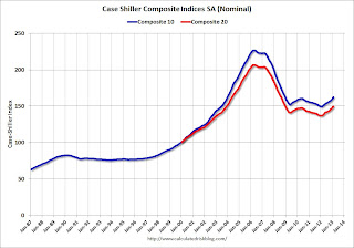
 The first graph shows the nominal seasonally adjusted Composite 10 and Composite 20 indices (the Composite 20 was started in January 2000).
The Composite 10 index is off 28.4% from the peak, and up 1.2% in February (SA). The Composite 10 is up 8.6% from the post bubble low set in Feb 2012 (SA).
The Composite 20 index is off 27.5% from the peak, and up 1.2% (SA) in February. The Composite 20 is up 9.4% from the post-bubble low set in Jan 2012 (SA).
 The second graph shows the Year over year change in both indices.
The Composite 10 SA is up 8.6% compared to February 2012.
The Composite 20 SA is up 9.3% compared to February 2012. This was the ninth consecutive month with a year-over-year gain and this was the largest year-over-year gain for the Composite 20 index since 2006.
Prices increased (SA) in 20 of the 20 Case-Shiller cities in February seasonally adjusted (prices increased in 12 of 20 cities NSA). Prices in Las Vegas are off 55.0% from the peak, and prices in Denver only off 1.0% from the peak.
This was just above the consensus forecast for a 9.0% YoY increase. I'll have more on prices later.
Monday, April 29, 2013
Tuesday: Case-Shiller House Prices, Chicago PMI, Consumer Confidence
by Calculated Risk on 4/29/2013 08:35:00 PM
Earlier today from LPS: U.S. Home Prices Up 1.0 Percent for the Month; Up 7.3 Percent Year-Over-Year. LPS reported their House Price Index increased to $210,000 in February, up from $208,000 or 1.0% from January - and up from $196,000 or 7.3% from February 2012. The LPS index is 20.6% below the peak in 2006.
Tuesday economic releases:
• At 9:00 AM ET, the S&P/Case-Shiller House Price Index for February will be released. Although this is the February report, it is really a 3 month average of December, January and February. The consensus is for a 9.0% year-over-year increase in the Composite 20 index (NSA) for February. The Zillow forecast is for the Composite 20 to increase 8.9% year-over-year, and for prices to increase 0.7% month-to-month seasonally adjusted.
• At 9:45 AM, the Chicago Purchasing Managers Index for April. The consensus is for the index to be unchanged at 52.4.
• At 10:00 AM, the Conference Board's consumer confidence index for April. The consensus is for the index to increase to 62.0 from 59.7.
• Also at 10:00 AM, the Census Bureau will release the Q1 Housing Vacancies and Homeownership report. This report is frequently mentioned by analysts and the media to report on the homeownership rate, and the homeowner and rental vacancy rates. However, this report doesn't track other measures (like the decennial Census and the ACS) and this survey probably shouldn't be used to estimate the excess vacant housing supply.
Q1 2013 GDP Details: Single Family investment increases, Commercial Investment very Low
by Calculated Risk on 4/29/2013 04:56:00 PM
The BEA released the underlying details for the Q1 advance GDP report today.
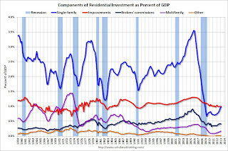
The first graph is for Residential investment (RI) components as a percent of GDP. According to the Bureau of Economic Analysis, RI includes new single family structures, multifamily structures, home improvement, broker's commissions, and a few minor categories (dormitories, manufactured homes).
A few key points:
1) Usually the most important components are investment in single family structures followed by home improvement. However home improvement has been the top category for eighteen consecutive quarters, but that is about to change. Investment in single family structures should be the top category again by Q2 or Q3.
2) Even though investment in single family structures has increased significantly from the bottom, single family investment is still very low - and still below the bottom for previous recessions. I expect further increases over the next few years.
3) Look at the contribution from Brokers' commissions. This is the category related to existing home sales (this is the contribution to GDP from existing home sales). If existing home sales are flat, or even decline due to fewer foreclosures, this will have little impact on residential investment.
 Click on graph for larger image.
Investment in home improvement was at a $161 billion Seasonally Adjusted Annual Rate (SAAR) in Q1 (about 1.0% of GDP), still above the level of investment in single family structures of (corrected) $157 billion (SAAR) (or 0.98% of GDP). Single family structure investment will probably overtake home improvement as the largest category of residential investment next quarter.
The second graph shows investment in offices, malls and lodging as a percent of GDP. Office, mall and lodging investment has increased slightly, but from a very low level.
Investment in offices is down about 54% from the recent peak (as a percent of GDP). With the high office vacancy rate, investment will probably not increase significantly (as a percent of GDP) for several years - even though there has been some increase in the Architecture Billings Index lately.
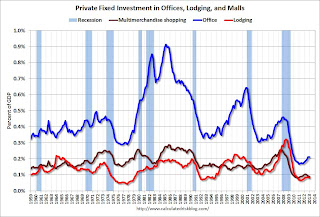 Investment in multimerchandise shopping structures (malls) peaked in 2007 and is down about 65% from the peak (note that investment includes remodels, so this will not fall to zero). The vacancy rate for malls is still very high, so investment will probably stay low for some time.
Lodging investment peaked at 0.32% of GDP in Q2 2008 and is down about 75%. With the hotel occupancy rate close to normal, it is possible that hotel investment will increase this year.
These graphs show there is currently very little investment in offices, malls and lodging. And residential investment is starting to pickup, but from a very low level.
Existing Home Inventory is up 12.1% year-to-date on April 29th
by Calculated Risk on 4/29/2013 01:05:00 PM
Weekly Update: One of key questions for 2013 is Will Housing inventory bottom this year?. Since this is a very important question, I'm tracking inventory weekly this year.
In normal times, there is a clear seasonal pattern for inventory, with the low point for inventory in late December or early January, and then peaking in mid-to-late summer.
The Realtor (NAR) data is monthly and released with a lag. However Ben at Housing Tracker (Department of Numbers) has provided me some weekly inventory data for the last several years. This is displayed on the graph below as a percentage change from the first week of the year (to normalize the data).
In 2010 (blue), inventory mostly followed the normal seasonal pattern, however in 2011 and 2012, there was only a small increase in inventory early in the year, followed by a sharp decline for the rest of the year.
 Click on graph for larger image.
Note: the data is a little weird for early 2011 (spikes down briefly).
In 2010, inventory was up 15% by the end of March, and close to 20% by the end of April.
For 2011 and 2012, inventory only increased about 5% at the peak and then declined for the remainder of the year.
So far in 2013, inventory is up 12.1%. This is well above the peak percentage increases for 2011 and 2012 and suggests to me that inventory is near the bottom. It is possible that inventory could bottom this year - especially if inventory is up 15% to 18% from the seasonal lows by mid-to-late summer.
It will probably be close. Inventory might have already bottomed in early 2013, or might bottom in early 2014. This will be important for price increases ... once inventory starts to increase (more than seasonal), buyer urgency will wane, and I expect price increases will slow.
Dallas Fed: Regional Manufacturing Activity "stalls" in April
by Calculated Risk on 4/29/2013 10:38:00 AM
This is the last of the regional manufacturing surveys for April. From the Dallas Fed: Growth in Texas Manufacturing Activity Stalls
Texas factory activity was flat in April, according to business executives responding to the Texas Manufacturing Outlook Survey. The production index, a key measure of state manufacturing conditions, fell from 9.9 to -0.5. The near-zero reading indicates output was little changed from March levels.Here is a graph comparing the regional Fed surveys and the ISM manufacturing index:
Ebbing growth in manufacturing activity was reflected in other survey measures as well. The capacity utilization index came in at 2.7, down from 5.5, and the shipments index fell to zero after rising to 10.6 in March. The new orders index fell nearly 14 points to -4.9, posting its first negative reading this year.
Perceptions of broader business conditions worsened in April. The general business activity index plummeted from 7.4 to -15.6, reaching its lowest level since July 2012.
Labor market indicators remained mixed. The employment index has been in positive territory so far in 2013 and moved up to 6.3 in April. ... The hours worked index pushed further negative, from -2.4 to -6.5.
emphasis added
 Click on graph for larger image.
The New York and Philly Fed surveys are averaged together (dashed green, through April), and five Fed surveys are averaged (blue, through April) including New York, Philly, Richmond, Dallas and Kansas City. The Institute for Supply Management (ISM) PMI (red) is through March (right axis).
The ISM index for April will be released Wednesday, May 1st, and these surveys suggest a lower reading, possibly even at or below 50 (contraction).
Pending Home Sales index increases in March
by Calculated Risk on 4/29/2013 10:00:00 AM
From the NAR: March Pending Home Sales Improve but Overall Pace Leveling
The Pending Home Sales Index, a forward-looking indicator based on contract signings, rose 1.5 percent to 105.7 in March from a downwardly revised 104.1 in February, and is 7.0 percent above March 2012 when it was 98.8. Pending sales have been above year-ago levels for the past 23 months; the data reflect contracts but not closings.Contract signings usually lead sales by about 45 to 60 days, so this would usually be for closed sales in April and May.
...
The PHSI in the Northeast was unchanged at 82.8 in March and is 6.3 percent higher than March 2012. In the Midwest the index increased 0.3 percent to 103.8 in March and is 13.7 percent above a year ago. Pending home sales in the South rose 2.7 percent to an index of 120.0 in March and are 10.4 percent higher than March 2012. In the West the index increased 1.5 percent in March to 102.9 but is 4.3 percent below a year ago.
As I've noted several times, with limited inventory at the low end and fewer foreclosures, we might see flat or even declining existing home sales. The key is that the number of conventional sales is increasing while foreclosures and short sales decline - and that is a sign of an improving market, even if total sales decline.


