by Calculated Risk on 8/26/2009 10:00:00 AM
Wednesday, August 26, 2009
New Home Sales Increase in July
The Census Bureau reports New Home Sales in July were at a seasonally adjusted annual rate (SAAR) of 433 thousand. This is an increase from the revised rate of 395 thousand in June. Click on graph for larger image in new window.
The first graph shows monthly new home sales (NSA - Not Seasonally Adjusted).
Note the Red columns for 2009. This is the 3rd lowest sales for July since the Census Bureau started tracking sales in 1963.
In July 2009, 39 thousand new homes were sold (NSA); the record low was 31 thousand in July 1982; the record high for July was 117 thousand in 2005.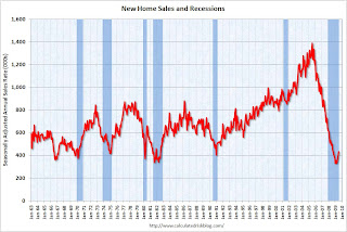 The second graph shows New Home Sales vs. recessions for the last 45 years. New Home sales fell off a cliff, but are now 32% above the low in January.
Sales of new one-family houses in July 2009 were at a seasonally adjusted annual rate of 433,000 ...And another long term graph - this one for New Home Months of Supply.
This is 9.6 percent (±13.4%) above the revised June rate of 395,000, but is 13.4 percent (±12.9%) below the July 2008 estimate of 500,000.
 There were 7.5 months of supply in July - significantly below the all time record of 12.4 months of supply set in January.
The seasonally adjusted estimate of new houses for sale at the end of July was 271,000. This represents a supply of 7.5months at the current sales rate..
 The final graph shows new home inventory.
 Note that new home inventory does not include many condos (especially high rise condos), and areas with significant condo construction will have much higher inventory levels.
Months-of-supply and inventory have both peaked for this cycle, and there is a good chance that sales of new homes has also bottomed for this cycle. However any further recovery in sales will likely be modest because of the huge overhang of existing homes for sale.
I'll have more later ...
MBA: Purchase Index Increases Slightly
by Calculated Risk on 8/26/2009 08:55:00 AM
The MBA reports:
The Market Composite Index, a measure of mortgage loan application volume, increased 7.5 percent on a seasonally adjusted basis from one week earlier.
...
The Refinance Index increased 12.7 percent from the previous week, the third increase in the last four weeks. The seasonally adjusted Purchase Index increased 1.0 percent from one week earlier ... This marks the fourth consecutive weekly gain – the first time this has happened since March, when fixed mortgage rates first dropped and stayed below 5 percent.
...
The average contract interest rate for 30-year fixed-rate mortgages increased to 5.24 percent from 5.15 percent ...
 Click on graph for larger image in new window.
This graph shows the MBA Purchase Index and four week moving average since 2002.
Note: The increase in 2007 was due to the method used to construct the index: a combination of lender failures, and borrowers filing multiple applications pushed up the index in 2007, even though activity was actually declining.
Even though sales of existing homes are up recently, the purchase index has only increased slightly. First-time home buyers using FHA loans would be included in the composite purchase index (the government index is up strongly over the last year), however this disconnect between sales and the MBA purchase index might be because of all the cash buyers at the low end - an example, from DataQuick on Las Vegas:
Of all buyers, those using cash to purchase their homes accounted for nearly 43 percent of all sales in July, based on an analysis of public property records. Specifically, these were transactions where there was no indication of a purchase mortgage recorded at the time of sale. ... All-cash deals have become popular in many Western markets where prices have dropped sharply and sellers favor the relative speed and certainty of all-cash buyers.
Tuesday, August 25, 2009
A comment on House Prices
by Calculated Risk on 8/25/2009 09:39:00 PM
I've seen story after story today suggesting the bottom is in for house prices.
This isn't like 2005 when it was almost certain that prices would fall, and fall sharply. Now we are much closer to the bottom than to the top in prices (for some metrics, see House Prices: Real Prices, Price-to-Rent, and Price-to-Income)
In some areas prices have probably already hit bottom - like some non-bubble areas, and some bubble areas with significant foreclosure activity.
But I think many areas, especially the mid-to-high priced bubble areas, there will be further price declines. I'm not as certain as I was in 2005, but I think these price declines will drag down the Case-Shiller indexes - and I don't think the price bottom is in.
I do not have a crystal ball, but ...
It seems there are many more foreclosures coming. Some of this depends on the success of the modification programs, but the Q2 MBA delinquency report shows a growing number of homeowners in the problem pipeline.
And the Fitch report yesterday suggests few of these delinquent homeowners will cure.
That seems to mean rising foreclosures, and more distressed inventory. The MBA Chief Economist Jay Brinkmann thinks foreclosures will peak at the end of 2010.
Historically prices bottom about the same time as foreclosure activity peaks. Maybe it will be different this time - maybe the modification programs will significantly reduce foreclosures - maybe prices will bottom before foreclosures peak ... but I'll go with the normal pattern.
And on the demand side, there has been a surge in first-time homebuyer activity. There was significant pent up demand from potential first-time buyers who were priced out of the market in 2004-2006, and then were afraid to buy as prices fell. But demand from these buyers will probably wane later this year, even if another tax credit is enacted.
Just like the "cash-for-clunkers" demand declined after the initial burst.
For mid-to-high priced homes, there are few move-up buyers (or so it would seem since so many low end homes were distress sales). Right now the months-of-supply in many of these areas is well into double figures, suggesting further price declines.
And on unemployment: most forecasts are for unemployment to rise into next year some time. Historically house prices do not bottom until after unemployment peaks. That seems especially likely now since so many homeowners are underwater. Once again I'll go with the normal pattern.
Also looking back at previous housing busts (like I did earlier today looking at the early '90s) there are usually some months during the bust with increasing prices. So no one should expect every month to be negative during the bust ... especially are prices get closer to the bottom.
I could be wrong - this isn't as certain as in 2005 - but I don't think house prices have bottomed. If I'm proven wrong, I'll be the first to admit it.
Best to all.
Will Mortgage Insurers Limit the Housing Market?
by Calculated Risk on 8/25/2009 06:46:00 PM
From Matt Padilla at the O.C. Register: Housing demand could snag on mortgage insurance
Matt quotes an article from the National Mortgage News:
The GSEs can purchase single-family mortgages with loan-to-value ratios higher than 80% only if the homebuyer gets mortgage insurance. The FHFA Mortgage Market Note issued a few days after Mr. Lockhart’s departure projects that the demand for such high LTV loans could hit $230 billion in 2009. The ability of the MIs to meet that level of demand is “remote,” FHFA report says. “The industry’s ability to build and maintain sufficient capital to meet the needs of the enterprises over the short term without some federal assistance or an infusion of private capital is unclear,” the report concludes.Another goverment program?
emphasis added
Misc: A possible 1991 House Price Headline, and Falling Rents in NYC
by Calculated Risk on 8/25/2009 04:05:00 PM
Imagine a headline in June 1991 (if Case-Shiller was around):
"House Prices increase at 11.6% annualized rate in June!"
The horrible price declines were over ... right? Nope. Real house prices declined for almost another 5 years. Just something to remember.
From Bloomberg: NYC Apartment Rents Fall as Tenants Gain Leverage
In buildings attended by doormen, rents on one-bedroom apartments dropped 10 percent from a year earlier to an average of $3,274 a month, according to a report by the Real Estate Group of New York. Studio prices fell 7 percent at those properties to $2,329 and two-bedrooms declined almost 6.9 percent to $5,161.Falling rents means a further decline in house prices to lower the price-to-rent ratio.
And a market graph from Doug Short. This matches up the market bottoms for four crashes (with an interim bottom for the Great Depression).
Note that the Great Depression crash is based on the DOW; the three others are for the S&P 500.
Case-Shiller House Prices and Stress Test Scenarios
by Calculated Risk on 8/25/2009 02:25:00 PM
This following graph compares the Case-Shiller Composite 10 SA index with the Stress Test scenarios from the Treasury (stress test data is estimated from quarterly forecasts).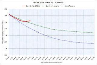 The Stress Test scenarios use the Composite 10 index and start in December. Here are the numbers:
Case-Shiller Composite 10 Index, June: 152.55
Stress Test Baseline Scenario, June: 148.82
Stress Test More Adverse Scenario, June: 140.71
Unlike with the unemployment rate (worse than both scenarios), house prices are performing better (from the perspective of the banks) than the the stress test scenarios. I believe there will be further price declines later this year, because I think the Case-Shiller seasonal adjustment is insufficient, and because I expect the first-time home buyer frenzy to slow just as more distressed supply comes on the market - even if an extension to the tax credit is passed.
Philly Fed State Coincident Indicators: Still a Widespread Recession in July
by Calculated Risk on 8/25/2009 11:30:00 AM
Click on map for larger image.
Here is a map of the three month change in the Philly Fed state coincident indicators. Forty six states are showing declining three month activity.
This is what a widespread recession looks like based on the Philly Fed states indexes.
On a one month basis, activity decreased in 35 states in June, and was unchanged in 8 states. Here is the Philadelphia Fed state coincident index release for July.
The Federal Reserve Bank of Philadelphia has released the coincident indexes for the 50 states for July 2009. In the past month, the indexes increased in seven states (Louisiana, Mississippi, North Dakota, South Carolina, South Dakota, Vermont, and Wisconsin), decreased in 35, and remained unchanged in eight (Hawaii, Indiana, Nebraska, New Jersey, Oklahoma, Rhode Island, Tennessee, and Virginia) for a one-month diffusion index of -56. Over the past three months, the indexes increased in three states (Mississippi, North Dakota, and Vermont), decreased in 46, and remained unchanged in one (South Carolina) for a three-month diffusion index of -86.
 The second graph is of the monthly Philly Fed data of the number of states with one month increasing activity. Most of the U.S. was has been in recession since December 2007 based on this indicator.
Note: this graph includes states with minor increases (the Philly Fed lists as unchanged).
A large percentage of states showed declining activity in July. Still a widespread recession in July by this indicator ...
House Prices: Real Prices, Price-to-Rent, and Price-to-Income
by Calculated Risk on 8/25/2009 10:01:00 AM
Here are three key measures of house prices: Price-to-Rent, Price-to-Income and real prices based on the Case-Shiller quarterly national home price index.
Price-to-Rent
In October 2004, Fed economist John Krainer and researcher Chishen Wei wrote a Fed letter on price to rent ratios: House Prices and Fundamental Value. Kainer and Wei presented a price-to-rent ratio using the OFHEO house price index and the Owners' Equivalent Rent (OER) from the BLS.
Here is a similar graph through Q2 2009 using the Case-Shiller National Home Price Index (SA): Click on image for larger graph in new window.
This graph shows the price to rent ratio (Q1 1997 = 1.0) for the Case-Shiller national Home Price Index. For rents, the national Owners' Equivalent Rent from the BLS is used.
Looking at the price-to-rent ratio based on the Case-Shiller index, the adjustment in the price-to-rent ratio is mostly behind us as of Q2 2009 on a national basis. However this ratio could easily decline another 10% or so.
It is important to note that rents are now falling and this has not shown up in the OER measure yet. The OER lags REIT rents, and I expect OER to declines later this year. And declining rents will impact the price-to-rent ratio.
Price-to-Income:
The second graph shows the price-to-income ratio: This graph is based off the Case-Shiller national index, and the Census Bureau's median income Historical Income Tables - Households (and an estimate of 2% increase in household median income for 2008 and flat for 2009).
Using national median income and house prices provides a gross overview of price-to-income (it would be better to do this analysis on a local area). However this does shows that the price-to-income is still too high, and that this ratio needs to fall another 10% or so. A further decline in this ratio could be a combination of falling house prices and/or rising nominal incomes.
Real Prices This graph shows the real and nominal house prices based on the Case-Shiller national index. (Q1 2000 = 100 for nominal index)
Nominal prices are adjusted using CPI less Shelter.
The Case-Shiller real prices are still significantly above prices in the '90s and perhaps real prices will decline another 10% to 20%.
Summary
These measures are useful, but somewhat flawed. These measures give a general idea about house prices, but there are other important factors like inventory levels and credit issues. All of this data is on a national basis and it would be better to use local area price-to-rent, price-to-income and real prices.
It appears that house prices - in general - are still too high. However prices depend on the local supply and demand factors. In many lower priced bubble areas supply has declined sharply (as banks are currently slow to foreclose), and demand is very strong (first-time home buyer frenzy, and cash flow investors). This is pushing up low end prices.
However in the mid-to-high end of the bubble areas - with significant supply and little demand - prices are probably still too high.
Case-Shiller House Price Index Increases in June
by Calculated Risk on 8/25/2009 09:00:00 AM
S&P/Case-Shiller released their monthly Home Price Indices for June this morning.
This monthly data includes prices for 20 individual cities, and two composite indices (10 cities and 20 cities). This is the Seasonally Adjusted data - others report the NSA data. Note: I have more on the quarterly national index soon.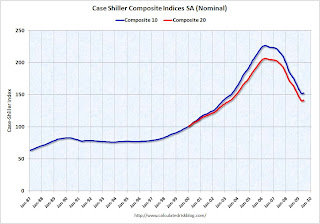 Click on graph for larger image in new window.
The first graph shows the nominal seasonally adjusted Composite 10 and Composite 20 indices (the Composite 20 was started in January 2000).
The Composite 10 index is off 32.6% from the peak, and up about 9% (annualized) in June.
The Composite 20 index is off 31.4% from the peak, and up in June.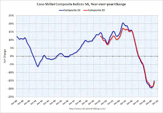 The second graph shows the Year over year change in both indices.
The Composite 10 is off 15.1% over the last year.
The Composite 20 is off 15.4% over the last year.
This is still a very strong YoY decline.
The third graph shows the price declines from the peak for each city included in S&P/Case-Shiller indices.
NOTE: updated 3rd graph. Two cities have price increases for 2009, and hopefully this graph shows the change better.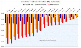 Prices increased (SA
 NSA) in 15 of the 20 Case-Shiller cities in June. In Las Vegas, house prices have declined 54.6% from the peak. At the other end of the spectrum, prices in Dallas are only off about 5.6% from the peak - and up in 2009. Prices have declined by double digits almost everywhere.
Let the debate begin - seasonal issues of mix (distressed sales vs. non-distressed sales), the impact of the first-time home buyer frenzy on prices, etc. - but this does show a price increase in June.
I'll compare house prices to the stress test scenarios soon.
FOIA: Court Orders Fed to Disclose Loan Program Details
by Calculated Risk on 8/25/2009 08:33:00 AM
From Bloomberg: Court Orders Federal Reserve to Disclose Emergency Loan Details
The Federal Reserve must for the first time identify the companies in its emergency lending programs after losing a Freedom of Information Act lawsuit.There is going to be some interesting information available soon.
...
The Fed has refused to name the financial firms it lent to or disclose the amounts or the assets put up as collateral under 11 programs, most put in place during the deepest financial crisis since the Great Depression, saying that doing so might set off a run by depositors and unsettle shareholders.
...
The judge said the central bank “improperly withheld agency records” ... She gave the Fed five days to turn over documents it told the reporters it located ...
The case is Bloomberg LP v. Board of Governors of the Federal Reserve System, 08-CV-9595, U.S. District Court, Southern District of New York (Manhattan).


