by Calculated Risk on 11/28/2012 11:49:00 AM
Wednesday, November 28, 2012
New Home Sales and Distressing Gap
New home sales in October were below expectations at a 368 thousand seasonally adjusted annual rate (SAAR). And sales for September were revised down from 389 thousand SAAR to 369 thousand.
This has led to some worrying about the housing recovery, as an example from Reuters: New Home Sales Drop 0.3%, Cast Shadow on Recovery
The data leaves the pace of new home sales just below the pace reported in May, suggesting little upward momentum the market for new homes.Yes, new home sales have been moving sideways for the last 6 months. However sales are still up significantly from 2011, and I expect sales to continue to increase over the next few years.
New home sales have averaged 361,000 on an annual rate basis through October. That means sales are on pace to increase 18% from last year. Most sectors would be pretty upbeat about an 18% increase in sales.
But even with the significant increase this year, 2012 will be the 3rd lowest year since the Census Bureau started tracking new home sales in 1963. This year will be above 2010 and 2011, but below the 375,000 sales in 2009. I expect sales to double from here within the next several years as distressed sales continue to decline.
 Click on graph for larger image.
I started posting this graph four years ago when the "distressing gap" first appeared.
The "distressing gap" graph shows existing home sales (left axis) and new home sales (right axis) through October. This graph starts in 1994, but the relationship has been fairly steady back to the '60s.
Following the housing bubble and bust, the "distressing gap" appeared mostly because of distressed sales. The flood of distressed sales kept existing home sales elevated, and depressed new home sales since builders weren't able to compete with the low prices of all the foreclosed properties.
I don't expect much of an increase in existing home sales (distressed sales will slowly decline and be offset by more conventional sales). But I do expect this gap to close - mostly from an increase in new home sales.
Note: Existing home sales are counted when transactions are closed, and new home sales are counted when contracts are signed. So the timing of sales is different.
Earlier:
• New Home Sales at 368,000 SAAR in October
• New Home Sales graphs
New Home Sales at 368,000 SAAR in October
by Calculated Risk on 11/28/2012 10:00:00 AM
The Census Bureau reports New Home Sales in October were at a seasonally adjusted annual rate (SAAR) of 368 thousand. This was down from a revised 369 thousand SAAR in August (revised down from 389 thousand).
The first graph shows New Home Sales vs. recessions since 1963. The dashed line is the current sales rate.
Sales of new single-family houses in October 2012 were at a seasonally adjusted annual rate of 368,000 ... This is 0.3 percent below the revised September rate of 369,000, but is 17.2 percent above the October 2011 estimate of 314,000.
 Click on graph for larger image in graph gallery.
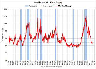
The second graph shows New Home Months of Supply.
The months of supply increased in October to 4.8 months. September was revised up to 4.7 months (from 4.5 months).
The all time record was 12.1 months of supply in January 2009.
 This is now in the normal range (less than 6 months supply is normal).
The seasonally adjusted estimate of new houses for sale at the end of October was 147,000. This represents a supply of 4.8 months at the current sales rate.On inventory, according to the Census Bureau:
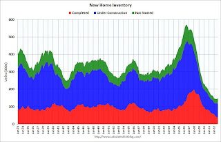
"A house is considered for sale when a permit to build has been issued in permit-issuing places or work has begun on the footings or foundation in nonpermit areas and a sales contract has not been signed nor a deposit accepted."Starting in 1973 the Census Bureau broke this down into three categories: Not Started, Under Construction, and Completed.
 This graph shows the three categories of inventory starting in 1973.
The inventory of completed homes for sale was just above the record low in October. The combined total of completed and under construction is also just above the record low since "under construction" is starting to increase.
The last graph shows sales NSA (monthly sales, not seasonally adjusted annual rate).
In October 2012 (red column), 29 thousand new homes were sold (NSA). Last year only 25 thousand homes were sold in October. This was the third weakest October since this data has been tracked (above 2011 and 2010). The high for October was 105 thousand in 2005.
 New home sales have averaged 361 thousand SAAR over the first 10 months of 2012, up sharply from the 307 thousand sales in 2011. Also sales are finally at the lows for previous recessions too.
This was below expectations of 387,000. I'll have more soon ...
MBA: Purchase Mortgage Applications increase, Refinance Applications decrease
by Calculated Risk on 11/28/2012 07:03:00 AM
From the MBA: Mortgage Applications Decrease in Latest MBA Weekly Survey
This week’s results include an adjustment for the Thanksgiving holiday. ...
The Refinance Index decreased 2 percent from the previous week. The seasonally adjusted Purchase Index increased 3 percent from one week earlier.
The average contract interest rate for 30-year fixed-rate mortgages with conforming loan balances ($417,500 or less) decreased to 3.53 percent from 3.54 percent, with points remaining constant at 0.40 (including the origination fee) for 80 percent loan-to-value ratio (LTV) loans.
 Click on graph for larger image.
This graph shows the MBA mortgage purchase index.
The purchase index has been mostly moving sideways over the last two years, however the purchase index has increased 8 of the last 10 weeks and is now near the high for the year.
Tuesday, November 27, 2012
Wednesday: New Home Sales, Beige Book
by Calculated Risk on 11/27/2012 09:01:00 PM
Earlier, a little good manufacturing news from the Richmond Fed: Manufacturing Activity Advanced in November; Optimism Increased
Manufacturing activity in the central Atlantic region advanced moderately in November following a slight pullback in October, according to the Richmond Fed's latest survey. ...And on consumer confidence from the Financial Times: US growth hopes lifted by housing data
In November, the seasonally adjusted composite index of manufacturing activity — our broadest measure of manufacturing — gained sixteen points to 9 from October's reading of −7. Among the index's components, shipments rose twenty points to 11, new orders moved up seventeen points to finish at 11, and the jobs index increased eight points to 3.
The figures suggest that consumers and companies are holding their nerve despite anxiety about the fiscal cliff ... The Conference Board, an industry group, said its index of consumer attitudes towards the economy rose to 73.7 in November, its highest since February 2008.Wednesday:
excerpt with permission
• At 7:00 AM, the Mortgage Bankers Association (MBA) will release the mortgage purchase applications index.
• At 10:00 AM, New Home Sales for October from the Census Bureau will be released. The consensus is for a decrease in sales to 387 thousand Seasonally Adjusted Annual Rate (SAAR) in October from 389 thousand in September.).
• At 2:00 PM, the Federal Reserve Beige Book will be released. This is an informal review by the Federal Reserve Banks of current economic conditions in their Districts. This might show some slight improvement. Some analysts will be looking for concerns about Europe or the "fiscal cliff".
Earlier on House Prices:
• Case-Shiller: Comp 20 House Prices increased 3.0% year-over-year in September
• Case-Shiller House Price Comments and Graphs
• Real House Prices, Price-to-Rent Ratio
• All Current House Price Graphs
Another question for the November economic prediction contest (Note: You can now use Facebook, Twitter, or OpenID to log in).
Update: The Recession Probability Chart
by Calculated Risk on 11/27/2012 05:36:00 PM
A few weeks ago, I mentioned a recession probability chart from the St Louis Fed that was making the rounds. (see below). This graph shouldn't be interpreted as indicating a new recession. Jeff Miller at a Dash of Insight discussed why: Debunking the 100% Recession Chart.
Now the author, University of Oregon Professor Jeremy Piger, posted some FAQs and data for the chart online. Professor Piger writes:
2. How should I interpret these probabilities as a recession signal?
Historically, three consecutive months of smoothed probabilities above 80% has been a reliable signal of the start of a new recession, while three consecutive months of smoothed probabilities below 20% has been a reliable signal of the start of a new expansion. For an analysis of the performance of the model for identifying new turning points in real time, see:
Chauvet, M. and J. Piger, “A Comparison of the Real-Time Performance of Business Cycle Dating Methods,” Journal of Business and Economic Statistics, 2008.
 Click on graph for larger image in new window.
Here is the chart from FRED at the St Louis Fed.
Obviously we haven't seen three consecutive months above 80%. Also I expect the recent data point to be revised down.
This is kind of a Woody Allen and Marshall McLuhan moment! Those arguing this chart indicated a 100% probability of a new recession knew nothing of Piger's work.
Earlier on House Prices:
• Case-Shiller: Comp 20 House Prices increased 3.0% year-over-year in September
• Case-Shiller House Price Comments and Graphs
• Real House Prices, Price-to-Rent Ratio
• All Current House Price Graphs


