 RSS Feed
 by Calculated Risk on 3/29/2011 03:56:00 PM
Tuesday, March 29, 2011
Proposed New Mortgage Lending Rules
Earlier, several regulators released proposed new mortgage lending rules. Here is the press release from the Federal Reserve.
And here is the 233 page document.
Alan Ziebel at the WSJ has an overview: Regulators Unveil Mortgage-Lending Rules
The proposal ... is designed to encourage safer lending practices by mandating that issuers of mortgage-backed securities either follow conservative principles, such as requiring 20% down payments for mortgages, or hold a portion of the loans on their books. Companies that package loans into securities would have to hold at least 5% of the credit risk, unless the loans meet an exemption for high-quality loans.I've noted before that a 10% down payment with mortgage insurance seems reasonable. These front end and back end debt-to-income (DTI) guidelines used to be pretty standard.
... The proposal requests public comment on an alternative approach that would allow for a 10% down payment and mortgage insurance.
It also recommends that homeowners spend only 28% of their pretax income on their primary mortgage and 36% on total debt ...
It is important to note that more risky loans can still be made - but the lender has to hold some of the credit risk (a "skin in the game" incentive to adequately underwrite the loans).
Lenders are arguing for a little more flexibility to meet the qualified residential mortgage (QRM) exemption, from the MBA:
"While factors like downpayment, debt to income (DTI) ratio and past payment history can be accurate predictors of loan performance, we do not believe that each ought to be considered independently.My reaction is the rule is fine (I'd go with the 10% down payment and mortgage insurance). For the riskier loans, the lender can hold on to some credit risk (a great incentive to properly underwrite the loan).
"Rather, the rule should allow for consideration of a borrowers entire credit profile before determining whether risk retention is necessary on a given loan. For example, we believe that a lower downpayment loan could be less risky if a borrower has a strong history of making payments on time and if the borrower's debt to income ratio is on the lower end of the scale. The rule should provide more flexibility in this regard."
Philly Fed February State Coincident Indexes
by Calculated Risk on 3/29/2011 02:48:00 PM
Earlier posts on Case-Shiller house prices:
• Case Shiller: Home Prices Off to a Dismal Start in 2011
• Real House Prices and Price-to-Rent
• House Price Graph Gallery
 Click on map for larger image.
The recovery may be sluggish, but it is fairly widespread geographically.
Here is a map of the three month change in the Philly Fed state coincident indicators. Forty six states are showing increasing three month activity. Four states are showing declining three month activity: Kansas, Delaware, New Jersey, and New Mexico.
Here is the Philadelphia Fed state coincident index release (pdf) for February 2011.
In the past month, the indexes increased in 44 states, decreased in three (Kansas, New Jersey, and Wyoming), and remained unchanged in three (Delaware, New Mexico, and South Dakota) for a one-month diffusion index of 82.
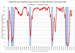 The second graph is of the monthly Philly Fed data for the number of states with one month increasing activity.
 The indexes increased in 44 states, decreased in 3, and remained unchanged in 4. Note: this graph includes states with minor increases (the Philly Fed lists as unchanged).
Several states fell back into declining activity in the 2nd of half of last year, but the situation has improved a little in early 2011.
Note: These are coincident indexes constructed from state employment data. From the Philly Fed:
The coincident indexes combine four state-level indicators to summarize current economic conditions in a single statistic. The four state-level variables in each coincident index are nonfarm payroll employment, average hours worked in manufacturing, the unemployment rate, and wage and salary disbursements deflated by the consumer price index (U.S. city average). The trend for each state’s index is set to the trend of its gross domestic product (GDP), so long-term growth in the state’s index matches long-term growth in its GDP.
Real House Prices and Price-to-Rent
by Calculated Risk on 3/29/2011 11:24:00 AM
The following graph shows the quarterly Case-Shiller National Index (through Q4 2010), and the monthly Case-Shiller Composite 20 and CoreLogic House Price Indexes through January 2011 in real terms (adjusted for inflation using CPI less shelter).
Note: some people use other inflation measures to adjust for real prices.
 Click on graph for larger image in graph gallery.
In real terms, the National index is back to Q1 2000 levels, the Composite 20 index is back to January 2001, and the CoreLogic index back to May 2000.
A few key points:
• The real price indexes are all at new post-bubble lows.
• I don't expect national real prices to fall to '98 levels. In many areas - if the population is increasing - house prices increase slightly faster than inflation over time, so there is an upward slope for real prices.
• Real prices are still too high, but they are much closer to the eventual bottom than the top in 2005. This isn't like in 2005 when prices were way out of the normal range.
• Nominal prices will probably fall some more and my forecast is for a decline of 5% to 10% from the October 2010 levels for the national price indexes.
Price-to-Rent
In October 2004, Fed economist John Krainer and researcher Chishen Wei wrote a Fed letter on price to rent ratios: House Prices and Fundamental Value. Kainer and Wei presented a price-to-rent ratio using the OFHEO house price index and the Owners' Equivalent Rent (OER) from the BLS.
 Here is a similar graph through January 2011 using the Case-Shiller Composite 20 and CoreLogic House Price Index.
This graph shows the price to rent ratio (January 1998 = 1.0).
An interesting point: the measure of Owners' Equivalent Rent (OER) is at about the same level as two years - so the price-to-rent ratio has mostly followed changes in nominal house prices since then. Rents are starting to increase again, and OER will probably increase in 2011 - lowering the price-to-rent ratio.
This ratio could decline another 10%, and possibly more if prices overshoot to the downside. The decline in the ratio will probably be a combination of falling house prices and increasing rents.
I know some people are forecasting nominal price declines of 20% to 30% from the current level. Those forecasts are based on more distressed supply hitting the market (almost 7 million loans are delinquent and 11.1 million borrowers have negative equity). However I think that forecast for house prices is too pessimistic.
One of the reasons that prices will probably not fall that far is all the cash buyers - especially at the low end. See from Bloomberg: Cash-Paying Vultures Pick Bones of U.S. Housing Market as Mortgages Dry Up (ht Mike In Long Island, db).
Earlier:
• Case Shiller: Home Prices Off to a Dismal Start in 2011
Case Shiller: Home Prices Off to a Dismal Start in 2011
by Calculated Risk on 3/29/2011 09:00:00 AM
S&P/Case-Shiller released the monthly Home Price Indices for January (actually a 3 month average of November, December and January).
This includes prices for 20 individual cities and and two composite indices (for 10 cities and 20 cities).
Note: Case-Shiller reports NSA, I use the SA data.
From S&P:Home Prices Off to a Dismal Start in 2011
ata through January 2011, released today by Standard & Poor’s for its S&P/Case-Shiller1 Home Price Indices ... show further deceleration in the annual growth rates in 13 of the 20 MSAs and the 10- and 20-City Composites compared to the December 2010 report. The 10-City Composite was down 2.0% and the 20-City Composite fell 3.1% from their January 2010 levels. San Diego and Washington D.C. were the only two markets to record positive year-over-year changes. However, San Diego was up a scant 0.1%, while Washington DC posted a healthier +3.6% annual growth rate. The same 11 cities that had posted recent index level lows in December 2010, posted new lows in January.
 Click on graph for larger image in graph gallery.
 The first graph shows the nominal seasonally adjusted Composite 10 and Composite 20 indices (the Composite 20 was started in January 2000).
The Composite 10 index is off 31.4% from the peak, and down 0.2% in January (SA). The Composite 10 is still 2.2% above the May 2009 post-bubble bottom.
The Composite 20 index is also off 31.3% from the peak, and down 0.2% in January (SA). The Composite 20 is only 0.7% above the May 2009 post-bubble bottom and will probably be at a new post-bubble low soon.
 The second graph shows the Year over year change in both indices.
The Composite 10 SA is down 2.0% compared to January 2010.
The Composite 20 SA is down 3.1% compared to January 2010.
The third graph shows the price declines from the peak for each city included in S&P/Case-Shiller indices.
 Prices increased (SA) in 8 of the 20 Case-Shiller cities in January seasonally adjusted. From S&P (NSA):
In January, the 10-City and 20-City Composites were down 0.9% and 1.0%, respectively, from their December 2010 levels. The monthly statistics show that 19 of the 20 MSAs and both the 10-City and 20-City Composite were down in January 2011 versus December 2010, the only exception being Washington D.C. which posted a month-over-month increase of 0.1%. Seventeen of the 20 MSAs and both Composites have posted more than three consecutive months of negative monthly returns. In January 2011, 12 of the 20 MSAs and the 20-City Composite are down by more than 1% compared to their levels in the previous month.Prices in Las Vegas are off 58% from the peak, and prices in Dallas only off 7.3% from the peak.
From S&P (NSA):
Continuing the trend set late last year, we witnessed 11 MSAs posting new index level lows in January 2011, from their 2006/2007 peaks. These cities are Atlanta, Charlotte, Chicago, Detroit, Las Vegas, Miami, New York, Phoenix, Portland (OR), Seattle and Tampa. These same 11 cities had posted lows with December’s report, as well.Both composite indices are still slightly above the post-bubble low (SA), but the indexes will probably be at new lows in early 2011.
Monday, March 28, 2011
Sports Stadium bonds in trouble?
by Calculated Risk on 3/28/2011 10:43:00 PM
Small and large ...
From Michelle McNiel at the Wenatchee World The debt dilemma (ht Ken)
Ask any public official and they’ll say default is simply not an option when it comes to the Town Toyota Center’s $42 million debt.And from Darrell Preston and Aaron Kuriloff at Bloomberg: Texans’ NFL Stadium Bonds Fall Amid Default Talk (ht Brian)
But the “D” word is creeping into conversations around the community, fueled by uncertainty over just how the massive debt is going to be paid on the 4,300-seat events center.
Harris County-Houston Sports Authority bonds that financed venues for the Houston Texans and two other sports teams have fallen as much as 34 percent amid speculation the agency may default on payments.
...
The authority financed the building of Minute Maid Park, home to the Houston Astros Major League Baseball team; Reliant Stadium, for the Texans; and Toyota Center, for the Houston Rockets National Basketball Association team.
...
the authority sold $509.7 million in bonds between 1998 and 2000 [for Reliant Stadium], along with $461.6 million the following year.


