 RSS Feed
 by Calculated Risk on 7/13/2010 03:20:00 PM
Tuesday, July 13, 2010
Rail Traffic softens further in June
From the Association of American Railroads: Rail Time Indicators. The AAR reports traffic in June 2010 was up 10.6% compared to June 2009 - but traffic was still 10.2% lower than in June 2008. Click on graph for larger image in new window.
This graph shows U.S. average weekly rail carloads. Traffic increased in 16 of 19 major commodity categories year-over-year.
From AAR:
• U.S. freight railroads originated 1,415,630 carloads in June 2010, an average of 283,126 carloads per week — up 10.6% from June 2009 (see chart) but down 10.2% from June 2008 on a non-seasonally adjusted basis.As the graph above shows, rail traffic collapsed in November 2008, and now, a year into the recovery, traffic has only recovered about half way. This is more evidence of a sluggish recovery ... also the declines in May and June are concerning although the declines were small.
• On a seasonally adjusted basis, U.S. rail carloads fell 1.3% in June 2010 from May 2010, following a 1.1% decline in May 2010 from April 2010. After bottoming out in May 2009, seasonally adjusted rail carloads trended upward, with some fits and starts along the way, through April 2010. They’ve now declined for two consecutive months.
• The declines in rail carloads over the past couple months have not been huge, and they certainly don’t prove that the wheels are coming off the economy’s bus.
• That said, an economy several months into a recovery from the worst recession in decades should be yielding rail traffic levels heading north, not south. (Remember, demand for rail service occurs as a result of demand elsewhere in the economy for the products that railroads haul.) Thus, rail traffic in June 2010 is consistent with an economy that is in far better shape than it was nine months or a year ago, but is, in the words of former Federal Reserve Chairman Alan Greenspan, “more than likely” undergoing a “pause.
excerpts with permission
CoreLogic: House Prices increase 0.9% in May
by Calculated Risk on 7/13/2010 01:10:00 PM
From CoreLogic (formerly First American LoanPerformance): CoreLogic® Home Price Index Shows Continued Increases in Home Prices for both Year-Over-Year and Month-Over-Month Figures In May
National home prices in the U.S. increased in May, the fourth-consecutive month showing a year-over-year increase. According to the CoreLogic HPI, national home prices, including distressed sales, increased by 2.9 percent in May 2010 compared to May 2009 and increased by 3.5 percent in April 2010 compared to April 2009. Excluding distressed sales, year-over-year prices only increased by 0.9 percent in May, and April’s non-distressed HPI increased by 0.4 percent.
On a month-over-month basis, May’s HPI was 0.9 percent higher than the April 2010 HPI, but the rate of increase was lower than the 1.3 percent gain from March 2010 to April 2010.
...
“Home price appreciation stabilized as homebuyer tax credit driven sales peaked in late spring,” said Mark Fleming, chief economist for CoreLogic. “But given that the labor market and income growth remain tepid we expect prices to moderate and possibly decline the rest of the year.”
 Click on graph for larger image in new window.
 This graph shows the national LoanPerformance data since 1976. January 2000 = 100.
The index is up 2.9% over the last year, and off 28.5% from the peak.
CoreLogic expects prices to "moderate and possibly decline". I expect that we will see lower prices on this index later this year.
 The second graph is an update on the price-to-rent ratio similar to the approach used by Fed economist John Krainer and researcher Chishen Wei in 2004: House Prices and Fundamental Value. Kainer and Wei presented a price-to-rent ratio using the OFHEO house price index and the Owners' Equivalent Rent (OER) from the BLS.
This graph shows the price to rent ratio using the CoreLogic data (January 2000 = 1.0).
This suggests that house prices are much closer to the bottom than the top, but that prices still have a ways to fall on a national basis.
I think this index will show a further price increase in June, as tax credit related existing home sales close. But I expect the index will show declines by the end of summer and into the fall.
BLS: Low Labor Turnover in May
by Calculated Risk on 7/13/2010 10:41:00 AM
From the BLS: Job Openings and Labor Turnover Summary
There were 3.2 million job openings on the last business day of May 2010, the U.S. Bureau of Labor Statistics reported today. The job openings rate was little changed over the month at 2.4 percent. TheNote: The difference between JOLTS hires and separations is similar to the CES (payroll survey) net jobs headline numbers. The CES (Current Employment Statistics, payroll survey) is for positions, the CPS (Current Population Survey, commonly called the household survey) is for people.
hires rate (3.4 percent) was little changed and the separations rate (3.1 percent) was unchanged.
...
[T]he number of job openings has risen by 868,000 (37 percent) since the most recent trough of 2.3 million in July 2009. Even with the gains since July 2009, the number of job openings in May 2010 remained below those in place at the start of the recession in every industry except government, and in each region except the Northeast.
The following graph shows job openings (purple), hires (blue), Total separations (include layoffs, discharges and quits) (red) and Layoff, Discharges and other (yellow) from the JOLTS.
Unfortunately this is a new series and only started in December 2000.
 Click on graph for larger image in new window.
Notice that hires (blue) and separations (red) are pretty close each month. In May, about 4.1 million people lost (or left) their jobs, and 4.5 million were hired (this is the labor turnover in the economy).
When the hires (blue line) is above total separations (as in May), the economy is adding net jobs, when the blue line is below total separations, the economy is losing net jobs.
The hires in May included the 411 thousand temporary Census 2010 hires. Without those hires, the JOLTS report shows only 8 thousand hires in May.
Layoffs and discharges have declined sharply since early 2009 - and are near a series low - and that is a good sign. And the number of job openings has moved up recently (although down slightly in May). But the overall turnover, especially after removing the impact of the Census hiring, is still low.
Trade Deficit increases in May
by Calculated Risk on 7/13/2010 08:56:00 AM
The Census Bureau reports:
[T]otal May exports of $152.3 billion and imports of $194.5 billion resulted in a goods and services deficit of $42.3 billion, up from $40.3 billion in April, revised. May exports were $3.5 billion more than April exports of $148.7 billion. [May] imports were $5.5 billion more than April imports of $189.0 billion.
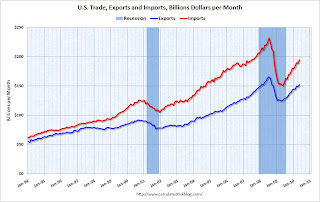 Click on graph for larger image.
The first graph shows the monthly U.S. exports and imports in dollars through May 2010.
Clearly imports are increasing much faster than exports. On a year-over-year basis, exports are up 21% and imports are up 29%. This is an easy comparison because of the collapse in trade at the end of 2008 and into early 2009.
The second graph shows the U.S. trade deficit, with and without petroleum, through May.
 The blue line is the total deficit, and the black line is the petroleum deficit, and the red line is the trade deficit ex-petroleum products.
Import oil prices decreased slightly to $76.93 in May - and are up 96% from the low of February 2009 (at $39.22). Oil import volumes were down in May.
With oil prices and volumes down, oil imports decreased sharply in May, however other imports - especially from China - increased significantly. Most of the increase in the trade deficit since last year has been related to oil, but now it appears the ex-oil deficit is increasing sharply again.
Ceridian-UCLA: Diesel Fuel index Falls Sharply in June
by Calculated Risk on 7/13/2010 08:20:00 AM
This is the new UCLA Anderson Forecast and Ceridian Corporation index using real-time diesel fuel consumption data: Pulse of Commerce IndexTM
Press Release: Amid Fears of Double-Dip Recession, PCI Falls Sharply in June
The Ceridian-UCLA Pulse of Commerce Index™ (PCI) by UCLA Anderson School of Management tumbled 1.9 percent in June after its impressive 3.1 percent gain in May.
...
“While June’s number is substantially down, erasing two-thirds of May’s great gain, the daily and weekly activity on which the monthly PCI is based does not suggest that the economy is heading over a cliff,” said [PCI Chief Economist Edward Leamer]. “Part of the apparent strength of May and weakness in June is the result of the Memorial Day holiday occurring on the last day of May, allowing the negative Memorial Day effect which is usually confined to May to leak into June. More importantly, the June weakness was confined to the first two weeks, and by the second half of June, we were seeing strong growth again.”
...
The PCI is based on an analysis of real-time diesel fuel consumption data ...
 Click on graph for larger image in new window.
This graph shows the index since January 1999.
The decline in June is just one month (partially offsetting the large increase in May), and the three month average is still increasing.
Note: This index appears to lead Industrial Production (IP), but there is a significant amount of monthly noise. This is a new index and is something to follow along with other transportation data.
Small Businesses a little more pessimistic
by Calculated Risk on 7/13/2010 07:47:00 AM
From the NFIB:
The National Federation of Independent Business Index of Small Business Optimism lost 3.2 points in June falling to 89.0 after posting modest gains for several months. The Index has been below 93 every month since January 2008 (30 months), and below 90 for 23 of those months, all readings typical of a weak or recession-mired economy.The key problems are a shortage of customers and also falling prices (via WSJ): “widespread price cutting continued to contribute to reports of lower nominal sales.”
...
Over the next three months, 8 percent plan to reduce employment (up one point), and 10 percent plan to create new jobs (down four points), yielding a seasonally adjusted net 1 percent of owners planning to create new jobs, unchanged from the May reading and positive for the second time in 20 months.
...
“Hiring and capital spending depend on expectations for growth in future sales, so the outlook for improved spending and hiring is not good,” said [William Dunkelberg, NFIB’s chief economist].
Small business owners continued to liquidate inventories and weak sales trends gave little reason to order new stock.
Updates: something to remember: "Small businesses" includes a large percentage of real estate related companies - so weak housing skews the results. The press release will be here, and the report here.
Monday, July 12, 2010
Condo Shadow Inventory
by Calculated Risk on 7/12/2010 11:30:00 PM
Another update on condos as shadow inventory ...
From Kelly Bennett at the Voice of San Diego: Vantage Pointe's Trouble Persists, but Downtown Thinks It's Found Bottom
Weighing in at 679 units, downtown's biggest condo building, Vantage Pointe, has met with outsize trouble since 2004 when buyers first got in fistfights for the privilege of securing a unit.This is another reminder that unless these condos are listed, they do not show up as either existing or new home inventory (the new home report doesn't include high rise condos).
The building's trouble continues. The developers haven't sold a single unit in the 14 months since returning deposits to the previous contracted buyers. About 40 buyers have signed contracts to buy there but can't close the deals. More than 150 other units are being rented.
But that's not enough to satisfy the project's lenders behind its $210 million loan, the largest construction loan on a single residential building in San Diego history. Those lenders filed a notice of default in April, pushing the developers to the first stage of foreclosure.
And 150 of these units have been rented and will probably be sold someday too. I spoke to a landlord in the downtown San Diego area yesterday, and she has had to cut rents significantly to compete with all the condo units being rented.
There are some areas - like Las Vegas and Miami - that have a huge number of vacant high rise condos. But there are also many smaller buildings that are mostly vacant in a number of cities (like in New York, Chicago, Raliegh, N.C. and Irvine, Ca). This is all part of the shadow inventory ...
Stress Tests: EU Concerned about "pockets of vulnerability”
by Calculated Risk on 7/12/2010 06:32:00 PM
From James Kanter at the NY Times: European Ministers Weigh Details of Stress Test
European Union finance ministers met Monday to start two days of discussions partly aimed at deciding how much information to reveal after they complete [stress] tests ...The results will be released on July 23rd.
“The European banking sector is, over all, resilient,” Olli Rehn, the European commissioner for economic and monetary affairs, said at a news conference. “At the same time when we publish the stress tests we will have to prepare for any pockets of vulnerability.”
And posted this morning from "some investor guy", part 3 in the series on sovereign default:
Earlier posts:
More coming later this week.
Distressed Sales: Sacramento as an Example, June 2010
by Calculated Risk on 7/12/2010 04:08:00 PM
The Sacramento Association of REALTORS® has been breaking out short sales for over a year now. They report monthly resales by equity sales (conventional resales), and distressed sales (Short sales and REO sales), and I'm following this series as an example to see mix changes in a distressed area.  Click on graph for larger image in new window.
Here is the June data.
Total June sales were up from May, and up from June 2009. Of course June was the scheduled closing deadline to qualify for the Federal homebuyer tax credit (closing date since extended), and also the California tax credit played a role. Sales should collapse in July.
The year-over-year (YoY) increase in June sales break a 12 month streak of declining YoY sales. But that was because of the tax credit, and sales will be off YoY in July.
Short sales were up 66% YoY (Year of the Short Sale!), and REO sales were down by 30%.
Note: This data is not seasonally adjusted. The second graph shows the percent of REO, short sales and conventional sales. The percent of short sales is now at a high for this brief series.
In June, 62.4% of all resales (single family homes and condos) were distressed sales.
The percent of REOs has been generally declining (seasonally there are a larger percentage of REOs in the winter). Also there appears to be a higher percentage of conventional sales associated with the tax credit.
On financing, 54.6% percent were either all cash (21.3%) or FHA loans (33.3%), suggesting most of the activity in distressed former bubble areas like Sacramento is first time home buyers using government-insured FHA loans, and investors paying cash.
With the tax credit (mostly) over, I expect total sales to decline and the percent of distressed sales (Short and REO) to increase.
FHFA attempting to recoup some losses of Fannie and Freddie
by Calculated Risk on 7/12/2010 02:15:00 PM
From the Federal Housing Finance Agency: FHFA Issues Subpoenas for PLS Documents
FHFA, as Conservator of Fannie Mae and Freddie Mac (the Enterprises), has issued 64 subpoenas to various entities, seeking documents related to private-label mortgage-backed securities (PLS) in which the two Enterprises invested. The documents will enable the FHFA to determine whether PLS issuers and others are liable to the Enterprises for certain losses they have suffered on PLS. If so, the Conservator expects to recoup funds, which would be used to offset payments made to the Enterprises by the U.S. Treasury.Many of the originators of the PLS mortgages are no longer in business (New Century, etc.), however most of the PLS issuers still exist.
...
Before and during conservatorship, the Enterprises sought to assess and enforce their rights as investors in PLS, in an effort to recoup losses suffered in connection with their portfolios. Specifically, the Enterprises have attempted to determine whether misrepresentations, breaches of warranties or other acts or omissions by PLS counterparties would require repurchase of loans underlying the PLS by the counterparties and whether other remedies might be appropriate. However, difficulty in obtaining the loan documents has presented a challenge to the Enterprises’ efforts. FHFA has therefore issued these subpoenas for various loan files and transaction documents pertaining to loans securing the PLS to trustees and servicers controlling or holding that documentation.
Bankruptcy and 2nd Liens
by Calculated Risk on 7/12/2010 11:12:00 AM
From Catherine Curan writing at the NY Post: Liening on banks
Underwater homeowners are jumping onto an unexpected financial life raft that lets them escape crippling second mortgage debts and keep their homes -- Chapter 13 bankruptcy.For many borrowers, this makes a Chapter 13 bankruptcy a better choice than a foreclosure. With a foreclosure, the borrower loses the house - and the 2nd lien holder might still pursue the borrower (unless they release the lien for some compensation, like under HAFA).
...
How it works is this: If the home is appraised at less than the value of the first mortgage, the owner can apply for permission in bankruptcy court to reclassify the second mortgage debt. That changes it from a secured debt, which must be repaid, into an unsecured debt, which does not have to be paid in full. The homeowner can then focus on paying off the first mortgage.
"This is the only time where you see such a huge percentage of houses worth less than the first loan, allowing us to basically get rid of the second loan," says [New York City bankruptcy attorney David Shaev of Shaev & Fleischman], who estimates that 20 percent of his Chapter 13 clients who own homes qualify for this type of workout. "We're at a unique place in history."
With a bankruptcy - under certain circumstances - the borrower keeps the house, and the 2nd lien is converted to unsecured debt and does not have to be paid in full. This is probably part of the reason for sharp increase in bankruptcy filings.
Part 3. What are the Market Estimates of the Probabilities of Default?
by Calculated Risk on 7/12/2010 08:50:00 AM
CR Note: This series is from reader "some investor guy".
There are a number of ways of looking at chances of default and/or expected losses, including: bond yields vs a low or no default bond in the same currency, credit default swap prices, bond ratings, and analysis of underlying financial factors.
Bond ratings move more slowly than bond yields or CDS prices. Ratings often are lowered only after a major problem has been realized and is already incorporated into yields or CDS prices. While bond prices can be useful, there are an assortment of problems of trying to extract default probabilities. One is the yield curve, and that for many sovereigns there aren’t all that many maturities outstanding. Trying to get a 5 year probability of default from a dataset including only a 2 year and 20 year maturity presents some analytic problems. Bond prices also have a surprising amount of differences due solely to liquidity. For example see Longstaff.
“We find a large liquidity premium in Treasury bonds, which can be more than fifteen percent of the value of some Treasury bonds. This liquidity premium is related to changes in consumer confidence, the amount of Treasury debt available to investors, and flows into equity and money market mutual funds. This suggests that the popularity of Treasury bonds directly affects their value.”
Yes, that’s 15 percent between different US Treasuries and a series of bonds explicitly guaranteed by the US govt, the 1990s Resolution Trust. Even on the run and off the run US treasuries have different yields due to liquidity.
Because it provides daily information for almost all large sovereigns, and calculates cumulative probabilities of default (CPD), we use data from CMAVision to estimate sovereign default probabilities.
 Click on graph for larger image in new window.
This chart shows outstanding debt with the (CPD) for each country. Despite it having a moderate 8.3% probability of default, Japan’s huge outstanding bond portfolio makes it the largest contributor to expected sovereign losses. However, it’s unlikely that any country would only have a default on a small group of bonds. If Japan defaulted, it is likely that most or all of its outstanding debt would be restructured (e.g., different interest rate, extended payment, a haircut on principal).
CPDs from 3/31/10 and 6/30/10 are shown in the next chart. The red bars are Q2, the orange bars are from Q1. Obviously, some credit default swap prices moved substantially in those three months, like Greece, Portugal, Spain and Belgium.
 As of June 30, 2010, the weighted average expected default rate is 7.4%. When weighted by value of debt outstanding, CDS pricing worldwide points to 7.4% of it defaulting within 5 years. If the outstanding sovereign debt was still $34 trillion as reported at 12/31/09, that’s $2.5 trillion of defaulted debt. If the trend of increased borrowing has continued to $36 trillion at 6/30/10, it’s about $2.7 trillion of defaulted debt.
Before you run out and start shorting sovereigns or panic over your retirement, remember that bondholders seldom lose all of their money on defaulted bonds. Sometimes recovery rates are quite good. Others, not so much.
CR Note: This is from "Some investor guy". Over the next week or so, some investor guy will address several questions: What are total estimated losses on sovereign bonds due to default? What happens if things go really badly and what are the indirect effects of default?
Later this week: Part 4. What are Total Estimated of Losses on Sovereign Bonds Due to Default?
Series:
• Part 1: How Large is the Outstanding Value of Sovereign Bonds?
• Part 2. How Often Have Sovereign Countries Defaulted in the Past?
• Part 2B: More on Historic Sovereign Default Research
• Part 3. What are the Market Estimates of the Probabilities of Default?
• Part 4. What are Total Estimated Losses on Sovereign Bonds Due to Default?
• Part 5A. What Happens If Things Go Really Badly? $15 Trillion of Sovereign Debt in Default
• Part 5B. Part 5B. What Happens If Things Go Really Badly? More Things Can Go Badly: Credit Default Swaps, Interest Swaps and Options, Foreign Exchange
• Part 5C. Some Policy Options, Good and Bad
• Part 5D. European Banks, What if Things Go Really Badly?
Sunday, July 11, 2010
Deflation and the Fed
by Calculated Risk on 7/11/2010 11:59:00 PM
From Paul Krugman: Trending Toward Deflation
Inflation has been falling, but how close are we to deflation? I found myself wondering that after observing John Makin’s combusting coiffure, his prediction that we might see deflation this year.And in the NY Times: The Feckless Fed
...
What I take from this is that deflation isn’t some distant possibility — it’s already here by some measures, not far off by others. And of course there isn’t some magic boundary effect when you cross zero; falling inflation is raising real interest rates and making debt problems worse as we speak.
Back in 2002, a professor turned Federal Reserve official by the name of Ben Bernanke gave a widely quoted speech titled “Deflation: Making Sure ‘It’ Doesn’t Happen Here.” Like other economists, myself included, Mr. Bernanke was deeply disturbed by Japan’s stubborn, seemingly incurable deflation, which in turn was “associated with years of painfully slow growth, rising joblessness, and apparently intractable financial problems.” This sort of thing wasn’t supposed to happen to an advanced nation with sophisticated policy makers. Could something similar happen to the United States?And an interesting point from Mike Bryan, vice president and senior economist at the Atlanta Fed: How close to deflation are we? Perhaps just a little closer than you thought
CPI will be released on Friday, and expectations are for another slight decline in the headline number. Persistent deflation (like in Japan) would be a serious problem. Perhaps if rents are increasing slightly, as recent reports suggests, the U.S. might avoid deflation without further Fed action (I'm not confident that rents have bottomed given the high vacancy and unemployment rate - especially if I'm correct about growth slowing in the 2nd half of 2010).
Note: Last week I asked "What might the Fed do?" and I excerpted from Bernanke's 2002 speech. If the trend towards deflation continues, I think the FOMC - based on Bernanke's speech - might set "explicit ceilings for yields on longer-maturity Treasury debt".
Trillions of Bank Debt coming due
by Calculated Risk on 7/11/2010 05:35:00 PM
Here is the Weekly Summary and a Look Ahead (it will be a busy week).
And some more on bank debt coming due (yesterday the WSJ has a brief article on this) ...
From Jack Ewing at the NY Times: Crisis Awaits World’s Banks as Trillions Come Due
Banks worldwide owe nearly $5 trillion to bondholders and other creditors that will come due through 2012, according to estimates by the Bank for International Settlements. About $2.6 trillion of the liabilities are in Europe.And an answer to some questions on sovereign default:
Last week:
Weekly Summary and a Look Ahead
by Calculated Risk on 7/11/2010 12:49:00 PM
First, more on sovereign debt issues this morning: Part 2B: More on Historic Sovereign Default Research
This will be a busy week. The key economic report this week will be June retail sales to be released on Wednesday.
On Monday, the June Ceridian-UCLA Pulse of Commerce Index (based on diesel fuel consumption) will be released. Also on Monday at 10 AM ET, Fed Chairman Ben Bernanke will open the Fed’s small business forum: Addressing the Financing Needs of Small Businesses.
On Tuesday, the National Association of Independent Business (NFIB) will release the small business optimism survey for June at 7:30 AM. The May Trade Balance report will be released at 8:30 AM by the Census Bureau. The consensus is for a slight decrease in the U.S. trade deficit to $39 billion (from $40.3 billion). Also on Tuesday the Job Openings and Labor Turnover Survey (JOLTS) for May will be released at 10 AM by the BLS. This report has been showing very little turnover in the labor market.
On Wednesday, the June Advance Monthly Retail Trade Report will be released by the Census Bureau at 8:30 AM. The consensus is for a 0.2% decline in retail sales (flat ex-autos). Also on Wednesday, the MBA will release the mortgage purchase applications index. This has been very weak after the expiration of the tax credit, although refinance activity has picked up significantly as mortgage rates have fallen.
Also on Wednesday, the May Manufacturing and Trade Inventories and Sales report from the Census Bureau will be released at 10 AM. This has been suggesting that the inventory adjustment is mostly over. At 2 PM the Fed will release the minutes of the June 23rd FOMC meeting.
On Thursday, the initial weekly unemployment claims will be released. Consensus is for a decline to 445K from 454K last week. The Producer Price index will be released at 8:30 AM. Consensus is for a slight increase in the PPI. The July Empire State manufacturing survey will also be released at 8:30 AM. The consensus is for a slight decrease from the June reading.
Also on Thursday the Federal Reserve will release the June Industrial Production and Capacity Utilization report at 9:15 AM. Expectations are for production to decrease slightly and capacity utilization to fall to 74.0% from 74.7% in May. If so, this will be the first decline since June 2009. The Philly Fed Business Outlook Survey for July will be released at 10 AM, and the consensus is for a slight increase.
On Friday, the June Consumer Price Index will be released at 8:30 AM. Expectations are for a slight decrease of 0.1% in the CPI. At 9:55 AM the July Reuters / University of Michigan's Consumer sentiment index will be released. The consensus is for a slight decrease in the index.
Also this week, the June rail traffic report from the Association of American Railroads (AAR) and June LA port traffic will probably be released and the FDIC will probably be busy ...
Three posts on Sovereign debt:
And a summary of last week:
 Click on graph for larger image in new window.
The June ISM Non-manufacturing index was at 53.8%, down from 55.4% in May - and below expectations of 55. The employment index showed contraction in June at 49.7%.
This graph shows the ISM non-manufacturing index (started in January 2008) and the ISM non-manufacturing employment diffusion index.
The employment index is showing contraction again after one month of expansion.
 This graph shows the 4-week moving average of weekly claims since January 2000.
The four-week average of weekly unemployment claims decreased this week by 1,250 to 466,000.
The dashed line on the graph is the current 4-week average.
Initial weekly claims have been at about the same level since December 2009.
 The MBA reports: The seasonally adjusted Purchase Index decreased 2.0 percent from one week earlier.
 "The Purchase Index has decreased eight of the last nine weeks."
This graph shows the MBA Purchase Index and four week moving average since 1990.
There has been a mini-refi boom because of the low mortgage rates, but the purchase index has fallen sharply to the levels of 1996.
Best wishes to all.
Part 2B: More on Historic Sovereign Default Research
by Calculated Risk on 7/11/2010 08:30:00 AM
CR Note: This series is from reader "some investor guy". Part 2B is in response to some questions in the comments.
A number of posters mentioned research which was originally part of later sections in the series. I’ve moved some of this research to this ubernerd post.
Some researchers, especially Reinhart and Rogoff, assert that “this time is not different”, and that rather similar things occur before and after defaults throughout the world and over a period of many centuries. Politicians might or might not know the history. However, one wonders to what extent bond traders and CDS market participants agree with the academics.
Within the bond market, CDS market, and the governments themselves, there is also a chance that someone knows important information regarding the chance of default that others do not. For example, an official misstating government revenues, reserves, or borrowing.
There is a very active effort in many countries to convince voters or investors that “everything will be fine” or “all debts will be paid on schedule”. Often, these claims are correct. If interest rates on government bonds and liquidity are set based on perception of risk, the spin might save a sovereign billions of dollars in reduced funding costs. If the spin loses all credibility, a particular government official might be regarded as “The Baghdad Bob of Bonds” (Term derived from the nickname for Saddam Hussseins’s Information Minister, “Baghdad Bob”).
The Research
Paolo Manasse and Nouriel Roubini studied sovereign default risk and concluded that many guidelines used for estimating when default was likely did not perform well when used in isolation, primarily because those guidelines looked at separate risks. For example, total government debt exceeding 200% of GDP is often used to indicate stress. However, some circumstances may make the problems much less severe, others might make it much worse (“Rules of Thumb” for Sovereign Debt Crises, Paolo Manasse and Nouriel Roubini):
“The analysis has one important, albeit simple, implication for sustainability analysis. It shows that unconditional thresholds, for example for debt-output ratios, are of little value per se for assessing the probability of default. One country may be heavily indebted but have a negligible probability of default, while a second may have moderate values of debt ratios while running a considerable default risk. Why? Because the joint effects of short maturity, political uncertainty, and relatively fixed exchange rates make a liquidity crisis in the latter much more likely than a solvency crisis in the former, particularly if the large external debt burden goes together with monetary stability, a large current account surplus, and sound public finances.”
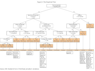 Click on graph for larger image in new window.
Chart source Predicting Sovereign Debt Crises, page 30. For specific countries, default probabilities from this model could be updated as often as the relevant economic data are updated.
In the earlier paper for the IMF, they found (Predicting Sovereign Debt Crises, Paolo Manasse, Nouriel Roubini, and Axel Schimmelpfennig):
“The empirical evidence suggests that a number of macroeconomic factors predict a debt crisis and the entry into a debt crisis. Measures of debt “solvency” matter: high levels of foreign debt (relative to a measure of the ability to pay, such as GDP) increase the probability of a default and entry into default. Measures of illiquidity, particularly short-term debt (relative to foreign reserves), and measures of debt servicing obligations also matter in predicting debt crises, consistent with the view that some recent crises had to do with illiquidity and/or the interaction of illiquidity and insolvency.Another line of research comes from Carmen Reinhart and Kenneth Rogoff. They have several relevant works, including This Time is Different: Eight Centuries of Financial Crises.
Other macroeconomic variables suggested from the analytical literature on debt sustainability also significantly matter for predicting debt crises: low GDP growth; current account imbalances; low trade openness; tight liquidity and monetary conditions in the Group of seven countries; monetary mismanagement (in the form of high inflation); policy uncertainty (in the form of high volatility of inflation); and political uncertainty leading to economic uncertainty (years of presidential elections).”
“We find that serial default is a nearly universal phenomenon as countries struggle to transform themselves from emerging markets to advanced economies. Major default episodes are typically spaced some years (or decades) apart, creating an illusion that “this time is different” among policymakers and investors. A recent example of the “this time is different” syndrome is the false belief that domestic debt is a novel feature of the modern financial landscape. We also confirm that crises frequently emanate from the financial centers with transmission through interest rate shocks and commodity price collapses.”Eight Centuries of Financial Crises also contains quite a bit of data on inflation, which the authors view as a second way to default (if the bonds are denominated in the issuer’s native currency), and exchange rate problems.
 Historically, we will see that the average percent of sovereigns in default or restructuring have sometimes been quite large (source: Eight Centuries of Financial Crises, page 4).
 Rogoff also has analysis of what happens with high debt levels when there is not default. Some readers will enjoy their paper from early 2008, “Is the 2007 U.S. Sub-Prime Financial Crisis So Different?”
We will revisit both sets of authors when looking at the indirect effects of default later in the series. Numerous posters have mentioned Rogoff research showing a possible dropoff in growth above a threshold of 90% debt to GDP (CR Note: this level is disputed).
CR Note: This is from "Some investor guy". Over the next week or so, some investor guy will address several questions: What are market estimates of the probabilities of default? What are total estimated losses on sovereign bonds due to default? What happens if things go really badly and what are the indirect effects of default?
Coming Monday: Part 3. What are the Market Estimates of the Probabilities of Default?
Series:
• Part 1: How Large is the Outstanding Value of Sovereign Bonds?
• Part 2. How Often Have Sovereign Countries Defaulted in the Past?
• Part 2B: More on Historic Sovereign Default Research
• Part 3. What are the Market Estimates of the Probabilities of Default?
• Part 4. What are Total Estimated Losses on Sovereign Bonds Due to Default?
• Part 5A. What Happens If Things Go Really Badly? $15 Trillion of Sovereign Debt in Default
• Part 5B. Part 5B. What Happens If Things Go Really Badly? More Things Can Go Badly: Credit Default Swaps, Interest Swaps and Options, Foreign Exchange
• Part 5C. Some Policy Options, Good and Bad
• Part 5D. European Banks, What if Things Go Really Badly?
Saturday, July 10, 2010
Euro and European Bond Spreads
by Calculated Risk on 7/10/2010 06:57:00 PM
Related to the earlier post on sovereign debt: Part 2. How Often Have Sovereign Countries Defaulted in the Past?
Here is a graph from the Atlanta Fed weekly Financial Highlights released today (graph as of July 7th): Click on graph for larger image in new window.
From the Atlanta Fed:
Most peripheral European bond spreads (over German bonds) have narrowed or stabilized over the past two weeks, though they remain elevated.Note: The Atlanta Fed data is a few days old. Nemo has links to the current data on the sidebar of his site.
After rising steadily through May and most of June, the 10-year Greece-to-German bond spread has narrowed 38 basis points (bps) (from 8.01% to 7.63%), through July 6. Most other European peripherals’ spreads have narrowed, too, with Portugal’s down 28 bps. However, Spain (up 18 bps) and Italy (8 bps higher) were the exceptions.
Here are the spread for the 10-year relative to the German bonds:
| Country | Spreads July 7th | Spreads June 16th | Spreads June 2nd |
|---|---|---|---|
| Greece | 7.64% | 6.40% | 5.03% |
| Portugal | 2.75% | 2.74% | 1.95% |
| Ireland | 2.62% | 2.83% | 2.19% |
| Spain | 2.06% | 2.09% | 1.62% |
 The second graphs shows the number of dollars per euro since Jan 1, 1999.
The euro has rebounded recently after dipping below 1.20 dollars per euro.
The dashed line is the current exchange rate. The euro is currently at 1.26 dollars.
WSJ: "$1.65 trillion Euro zone bank debt coming due in 2010 and 2011"
by Calculated Risk on 7/10/2010 01:50:00 PM
From Mark Whitehouse at the WSJ Real Time Economics: Number of the Week: Euro Zone Debt Is Coming Due (ht jb)
$1.65 trillion: Euro zone bank debt coming due in 2010 and 2011.The results of the stress tests will be released on July 23rd.
...
As investors fret about European banks’ exposures to Greece and other financially troubled countries, those banks’ borrowing costs are rising sharply. ... This year and next, some $1.7 trillion in euro-area bank debt will come due, far more than among banks in the U.S., the U.K. or elsewhere.
Part 2. How Often Have Sovereign Countries Defaulted in the Past?
by Calculated Risk on 7/10/2010 08:30:00 AM
CR Note: This is part 2 in a series on sovereign debt issues by reader "some investor guy". Here is Part 1: How Large is the Outstanding Value of Sovereign Bonds?
Sovereign bonds have been defaulting for almost as long as there have been sovereign bonds. The problems go back many centuries. A good overview created for the IMF is “The Costs of Sovereign Default” by Eduardo Borensztein and Ugo Panizza. Some countries are “serial defaulters”, with a long history of sovereign defaults. Many have defaulted on sovereign debt five times or more.
 Click on graph for larger image in new window.
Here is a chart showing the number of countries defaulting each year from 1824 to 2003. The raw data comes from S&P. Charts were created by the Some Investor Guy.
As you can see, there are some years with no defaults at all, and other years with many. Defaults tend to come in clusters, and the behavior of lenders often changes substantially after defaults. In the Volatility Machine, Michael Pettis asserts that sovereign default contagion follows predictable patterns, and that contagion is primarily due to investors in the first defaulting country also having investments in other countries which are vulnerable. This is especially the case with leveraged investors.
In the seemingly “quiet period” from 1945 to 1959, there was just one sovereign default. Interestingly, this was also a time with a number of very angry foreign investors. This time period was the peak of expropriation of foreign assets. There were at least 25 nationalizations and expropriations of foreign assets. Many were by new members of the Soviet Bloc, and by newly independent colonies (Source: Michael Tomz, Stanford, working paper).
For you ubernerds who want to see which countries defaulted each year, here they are. I’ve broken them down into three periods to make the charts more readable.
 |
| 1920 to 1980 |
 |
| 1981 to 2003 |
 |
1. Government revenues fall far below history or forecast;
2. Expenses aside from debt service rise far above history or forecast;
3. Interest rates rise substantially; due to inflation, credit spreads, illiquidity, or other causes
4. Demand for bonds suddenly drops or disappears (a sudden stop);
5. Exchange rates move, making payments on foreign denominated bonds much more expensive (currency risk), and,
6. A government simply decides not to pay, even though it has the capacity to pay (repudiation).
Paolo Manasse and Nouriel Roubini studied sovereign default risk and concluded that many guidelines used for estimating when default was likely did not perform well, primarily because those guidelines looked at separate risks. For example, total government debt exceeding 200% of GDP is often used to indicate stress. However, some other circumstances may make the problems much less severe (like having a growing economy and no foreign denominated debt). Other factors might make it much worse (like high inflation).
CR Note: This is from "Some investor guy". Over the next week or so, some investor guy will address several questions: What are market estimates of the probabilities of default? What are total estimated losses on sovereign bonds due to default? What happens if things go really badly and what are the indirect effects of default?
Next in the series, Part 3. What are the Market Estimates of the Probabilities of Default?
Series:
• Part 1: How Large is the Outstanding Value of Sovereign Bonds?
• Part 2. How Often Have Sovereign Countries Defaulted in the Past?
• Part 2B: More on Historic Sovereign Default Research
• Part 3. What are the Market Estimates of the Probabilities of Default?
• Part 4. What are Total Estimated Losses on Sovereign Bonds Due to Default?
• Part 5A. What Happens If Things Go Really Badly? $15 Trillion of Sovereign Debt in Default
• Part 5B. Part 5B. What Happens If Things Go Really Badly? More Things Can Go Badly: Credit Default Swaps, Interest Swaps and Options, Foreign Exchange
• Part 5C. Some Policy Options, Good and Bad
• Part 5D. European Banks, What if Things Go Really Badly?
Friday, July 09, 2010
Unofficial Problem Bank List at 796 Institutions
by Calculated Risk on 7/09/2010 10:18:00 PM
Note: this is an unofficial list of Problem Banks compiled only from public sources.
Here is the unofficial problem bank list for July 9, 2010.
Changes and comments from surferdude808:
Relatively quiet week for the Unofficial Problem Bank List.CR Note: The list will probably be over 800 next week, and is still on pace to hit 1,000 by the end of the year.
The four failures -- Home National Bank ($644. million), Bay National Bank ($282 million), USA Bank ($193 million), and Ideal Federal Savings Bank ($6.3 million) were removed.
There are two additions including Great Northern Bank, Saint Michael, MN ($70.8 million); and American Eagle Savings Bank, Boothwyn, PA ($21.9 million).
These changes leave the Unofficial Problem Bank List with 796 institutions with aggregate assets of $411.6 billion. Next week, we anticipate the OCC will release its actions for June 2010.


