by Calculated Risk on 3/11/2019 10:23:00 AM
Monday, March 11, 2019
BLS: Unemployment Rates Higher in 3 states in January; Lower in 3 States
From the BLS: Regional and State Employment and Unemployment Summary
Unemployment rates were lower in January in 3 states, higher in 3 states, and stable in 44 states and the District of Columbia, the U.S. Bureau of Labor Statistics reported today.
...
Iowa and New Hampshire had the lowest unemployment rates in January, 2.4 percent each. The rate in Vermont (2.5 percent) set a new series low. (All state series begin in 1976.) Alaska had the highest jobless rate, 6.5 percent.
emphasis added
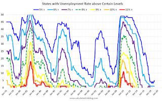 Click on graph for larger image.
This graph shows the number of states (and D.C.) with unemployment rates at or above certain levels since January 1976.
At the worst of the great recession, there were 11 states with an unemployment rate at or above 11% (red).
Currently only one state, Alaska, has an unemployment rate at or above 6% (dark blue). Four states and the D.C. have unemployment rates above 5%; Alaska, Arizona, New Mexico and West Virginia.
A total of seven states are at the series low.
Retail Sales increased 0.2% in January
by Calculated Risk on 3/11/2019 08:45:00 AM
On a monthly basis, retail sales increased 0.2 percent from December to January (seasonally adjusted), and sales were up 2.3 percent from January 2018.
From the Census Bureau report:
Advance estimates of U.S. retail and food services sales for January 2019, adjusted for seasonal variation and holiday and trading-day differences, but not for price changes, were $504.4 billion, an increase of 0.2 percent from the previous month, and 2.3 percent above January 2018. … The November 2018 to December 2018 percent change was revised from down 1.2 percent to down 1.6 percent.
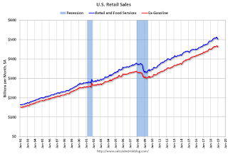 Click on graph for larger image.
This graph shows retail sales since 1992. This is monthly retail sales and food service, seasonally adjusted (total and ex-gasoline).
Retail sales ex-gasoline were up 0.4% in January.
The second graph shows the year-over-year change in retail sales and food service (ex-gasoline) since 1993.
 Retail and Food service sales, ex-gasoline, increased by 3.1% on a YoY basis.
The increase in January was slightly above expectations, however sales in November and December were revised down significantly.
Sunday, March 10, 2019
Sunday Night Futures
by Calculated Risk on 3/10/2019 07:54:00 PM
Weekend:
• Schedule for Week of March 10, 2019
Monday:
• 8:30 AM: Retail sales for January is scheduled to be released. The consensus is for no change in retail sales.
• 10:00 AM: State Employment and Unemployment (Monthly) for January 2019
From CNBC: Pre-Market Data and Bloomberg futures: S&P 500 and DOW futures are mostly unchanged (fair value).
Oil prices were up slightly over the last week with WTI futures at $56.18 per barrel and Brent at $65.81 per barrel. A year ago, WTI was at $62, and Brent was at $65 - so WTI oil prices are down about 10% year-over-year, and Brent is unchanged.
Here is a graph from Gasbuddy.com for nationwide gasoline prices. Nationally prices are at $2.48 per gallon. A year ago prices were at $2.52 per gallon, so gasoline prices are down 4 cents per gallon year-over-year.
Public and Private Sector Payroll Jobs During Presidential Terms
by Calculated Risk on 3/10/2019 01:17:00 PM
By request, here is another update of tracking employment during Presidential terms. We frequently use Presidential terms as time markers - we could use Speaker of the House, Fed Chair, or any other marker.
NOTE: Several readers have asked if I could add a lag to these graphs (obviously a new President has zero impact on employment for the month they are elected). But that would open a debate on the proper length of the lag, so I'll just stick to the beginning of each term.
Important: There are many differences between these periods. Overall employment was smaller in the '80s, however the participation rate was increasing in the '80s (younger population and women joining the labor force), and the participation rate is generally declining now. But these graphs give an overview of employment changes.
The first graph shows the change in private sector payroll jobs from when each president took office until the end of their term(s). Presidents Carter and George H.W. Bush only served one term.
Mr. G.W. Bush (red) took office following the bursting of the stock market bubble, and left during the bursting of the housing bubble. Mr. Obama (dark blue) took office during the financial crisis and great recession. There was also a significant recession in the early '80s right after Mr. Reagan (dark red) took office.
There was a recession towards the end of President G.H.W. Bush (light purple) term, and Mr Clinton (light blue) served for eight years without a recession.

The first graph is for private employment only.
Mr. Trump is in Orange (25 months).
The employment recovery during Mr. G.W. Bush's (red) first term was sluggish, and private employment was down 821,000 jobs at the end of his first term. At the end of Mr. Bush's second term, private employment was collapsing, and there were net 382,000 private sector jobs lost during Mr. Bush's two terms.
Private sector employment increased by 20,979,000 under President Clinton (light blue), by 14,714,000 under President Reagan (dark red), 9,039,000 under President Carter (dashed green), 1,511,000 under President G.H.W. Bush (light purple), and 11,890,000 under President Obama (dark blue).
During the first 25 months of Mr. Trump's term, the economy has added 4,738,000 private sector jobs.

The public sector grew during Mr. Carter's term (up 1,304,000), during Mr. Reagan's terms (up 1,414,000), during Mr. G.H.W. Bush's term (up 1,127,000), during Mr. Clinton's terms (up 1,934,000), and during Mr. G.W. Bush's terms (up 1,744,000 jobs). However the public sector declined significantly while Mr. Obama was in office (down 269,000 jobs).
During the first 25 months of Mr. Trump's term, the economy has added 173,000 public sector jobs.

After 25 months of Mr. Trump's presidency, the economy has added 4,911,000 jobs, about 297,000 behind the projection.
Saturday, March 09, 2019
Schedule for Week of March 10, 2019
by Calculated Risk on 3/09/2019 08:11:00 AM
The key reports this week are January New Home Sales, February CPI and January retail sales.
For manufacturing, the February Industrial Production report and the March NY Fed manufacturing survey will be released.
 8:30 AM: Retail sales for January is scheduled to be released. The consensus is for no change in retail sales.
This graph shows the year-over-year change in retail sales and food service (ex-gasoline) since 1993. Retail and Food service sales, ex-gasoline, increased by 2.9% on a YoY basis in December.
10:00 AM: State Employment and Unemployment (Monthly) for January 2019
6:00 AM ET: NFIB Small Business Optimism Index for February.
8:30 AM: The Consumer Price Index for February from the BLS. The consensus is for 0.2% increase in CPI, and a 0.2% increase in core CPI.
7:00 AM ET: The Mortgage Bankers Association (MBA) will release the results for the mortgage purchase applications index.
8:30 AM: Durable Goods Orders for February from the Census Bureau. The consensus is for a 0.8% decrease in durable goods orders.
8:30 AM: The Producer Price Index for February from the BLS. The consensus is for a 0.2% increase in PPI, and a 0.2% increase in core PPI.
10:00 AM: Construction Spending for January. The consensus is for a 0.3% increase in construction spending.
8:30 AM: The initial weekly unemployment claims report will be released. The consensus is for 225 thousand initial claims, up from 223 thousand the previous week.
 10:00 AM: New Home Sales for January from the Census Bureau.
 This graph shows New Home Sales since 1963. The dashed line is the sales rate for last month.
The consensus is for 620 thousand SAAR, down from 621 thousand in December.
8:30 AM: The New York Fed Empire State manufacturing survey for March. The consensus is for a reading of 10.0, up from 8.8.
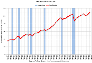 9:15 AM: The Fed will release Industrial Production and Capacity Utilization for February.
This graph shows industrial production since 1967.
The consensus is for a 0.4% increase in Industrial Production, and for Capacity Utilization to increase to 78.5%.
10:00 AM: University of Michigan's Consumer sentiment index (Preliminary for March).
 10:00 AM ET: Job Openings and Labor Turnover Survey for January from the BLS.
 This graph shows job openings (yellow line), hires (purple), Layoff, Discharges and other (red column), and Quits (light blue column) from the JOLTS.
Jobs openings increased in December to 7.335 million from 7.166 million in November.
The number of job openings (yellow) were up 29% year-over-year, and Quits were up 4% year-over-year.
Friday, March 08, 2019
Fed Chair Powell: Monetary Policy: Normalization and the Road Ahead
by Calculated Risk on 3/08/2019 10:02:00 PM
From Fed Chair Jerome Powell: Monetary Policy: Normalization and the Road Ahead
The Committee has long said that the size of the balance sheet will be considered normalized when the balance sheet is once again at the smallest level consistent with conducting monetary policy efficiently and effectively. Just how large that will be is uncertain, because we do not yet have a clear sense of the normal level of demand for our liabilities. Current estimates suggest, however, that something in the ballpark of the 2019:Q4 projected values may be the new normal. The normalized balance sheet may be smaller or larger than that estimate and will grow gradually over time as demand for currency rises with the economy. In all plausible cases, the balance sheet will be considerably larger than before the crisis.
emphasis added
AAR: February Rail Carloads down 2.7% YoY, Intermodal Down 0.9% YoY
by Calculated Risk on 3/08/2019 03:35:00 PM
From the Association of American Railroads (AAR) Rail Time Indicators. Graphs and excerpts reprinted with permission.
On the surface, rail traffic in February 2019 wasn’t very good. Total carloads were down 2.7% over February 2018, just the second monthly decline in the past year; 12 of the 20 carload categories were down, the most since January 2018; and intermodal was down 0.9%, its first decline in two years. But, like last month, weather likely played a significant but impossible-to-measure-precisely role in February — e.g., higher than normal rain and snow in California, with mudslides and track washouts thrown in for good measure; high winds, extreme cold, and record snowfalls in the Upper Great Plains; and so on. Winter always brings problems for railroads, but it seems this year was worse than last year in many areas.
emphasis added
 Click on graph for larger image.
This graph from the Rail Time Indicators report shows U.S. average weekly rail carloads (NSA). Red is 2019.
Rail carloads have been weak over the last decade due to the decline in coal shipments.
U.S. railroads originated 999,978 total carloads in February 2019, down 2.7%, or 28,238 carloads, from February 2018. Total carloads averaged 249,995 per week in February 2019. Since 1988, when our data begin, the only February with a lower weekly average was 2016. Total carloads were down in three of the four weeks in February.
 The second graph is for intermodal traffic (using intermodal or shipping containers):
U.S. railroads also originated 1.09 million intermodal containers and trailers in February 2019, down 0.9%, or 9,513 units, from February 2018. (Intermodal is not included in carloads.) It was the first yearover- year monthly decline for intermodal since January 2017. Like carloads, intermodal was surely affected by the weather, but non-weather factors might have played a role as well — e.g., imports that came ashore earlier to beat potential higher tariffs. Also, it’s not like intermodal fell off a cliff in February 2019: weekly average intermodal volume was 273,625 units, the second most ever for February (behind February 2018).Traffic will pick up in March, and there might be some bounce back from the poor weather.
Comments on January Housing Starts
by Calculated Risk on 3/08/2019 01:19:00 PM
Earlier: Housing Starts Increased to 1.230 Million Annual Rate in January
Total housing starts in January were well above expectations, however starts for November and December were revised down.
The housing starts report released this morning showed starts were up 18.6% in January compared to December, and starts were down 7.8% year-over-year compared to January 2018.
Single family starts were up 4.5% year-over-year, however multi-family starts were down 33.6%.
This first graph shows the month to month comparison for total starts between 2018 (blue) and 2019 (red).

Starts were down 7.8% in January compared to January 2018.
The weakness in January was in the multi-family sector that is volatile month-to-month.
All things considered, this is a decent start to 2019.
Below is an update to the graph comparing multi-family starts and completions. Since it usually takes over a year on average to complete a multi-family project, there is a lag between multi-family starts and completions. Completions are important because that is new supply added to the market, and starts are important because that is future new supply (units under construction is also important for employment).
These graphs use a 12 month rolling total for NSA starts and completions.

The rolling 12 month total for starts (blue line) increased steadily for several years following the great recession - but turned down, and has moved sideways recently. Completions (red line) had lagged behind - however completions and starts are at about the same level now (more deliveries).
As I've been noting for a few years, the significant growth in multi-family starts is behind us - multi-family starts peaked in June 2015 (at 510 thousand SAAR).
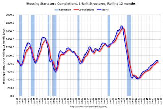
Note the relatively low level of single family starts and completions. The "wide bottom" was what I was forecasting following the recession, and now I expect some further increases in single family starts and completions.
Comments on February Employment Report
by Calculated Risk on 3/08/2019 09:22:00 AM
The headline jobs number at 20 thousand for February was well below consensus expectations of 178 thousand, however the previous two months were revised up 12 thousand, combined. The unemployment rate decreased to 3.8%, due to government employees on furlough being counted as employed in the February household survey. Overall this was a weak report, but it followed a strong January report, so there was probably some payback (the weather was good in January, and bad in February).
Earlier: February Employment Report: 20,000 Jobs Added, 3.8% Unemployment Rate
In February, the year-over-year employment change was 2.509 million jobs. That is solid year-over-year growth.
Average Hourly Earnings
Wage growth was at expectations in January. From the BLS:
"In February, average hourly earnings for all employees on private nonfarm payrolls rose by 11 cents to $27.66, following a 2-cent gain in January. Over the year, average hourly earnings have increased by 3.4 percent."
 This graph is based on “Average Hourly Earnings” from the Current Employment Statistics (CES) (aka "Establishment") monthly employment report. Note: There are also two quarterly sources for earnings data: 1) “Hourly Compensation,” from the BLS’s Productivity and Costs; and 2) the Employment Cost Index which includes wage/salary and benefit compensation.
The graph shows the nominal year-over-year change in "Average Hourly Earnings" for all private employees. Nominal wage growth was at 3.4% YoY in January.
Wage growth has generally been trending up.
Prime (25 to 54 Years Old) Participation
 Since the overall participation rate has declined due to cyclical (recession) and demographic (aging population, younger people staying in school) reasons, here is the employment-population ratio for the key working age group: 25 to 54 years old.
In the earlier period the participation rate for this group was trending up as women joined the labor force. Since the early '90s, the participation rate moved more sideways, with a downward drift starting around '00 - and with ups and downs related to the business cycle.
The 25 to 54 participation rate decreased in February to 82.5%, and the 25 to 54 employment population ratio was unchanged at 79.9%.
Part Time for Economic Reasons
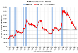 From the BLS report:
"The number of persons employed part time for economic reasons (sometimes referred to as involuntary part-time workers) decreased by 837,000 to 4.3 million in February. This decline follows a sharp increase in January that may have resulted from the partial federal government shutdown."The number of persons working part time for economic reasons has been generally trending down. The number increased sharply in January, probably as a result of the government shutdown, and decreased sharply in February - to the lowest level since 2007.
These workers are included in the alternate measure of labor underutilization (U-6) that decreased sharply to 7.3% in February.
Unemployed over 26 Weeks
 This graph shows the number of workers unemployed for 27 weeks or more.
 According to the BLS, there are 1.271 million workers who have been unemployed for more than 26 weeks and still want a job. This was up slightly from 1.252 million in January.
Summary:
The headline jobs number was well below expectations, however the previous two months were revised up slightly. The headline unemployment rate decreased to 3.8% due to unwinding from the government shutdown.
This was a weak jobs report - but it is probably mostly payback from the strong January report (and could be weather related). Some positives include the decline in the employment rate (expected following end of government shutdown), increase in wages, and decline in people working part time for economic reasons.
Housing Starts Increased to 1.230 Million Annual Rate in January
by Calculated Risk on 3/08/2019 08:52:00 AM
From the Census Bureau: Permits, Starts and Completions
Housing Starts:
Privately‐owned housing starts in January were at a seasonally adjusted annual rate of 1,230,000. This is 18.6 percent above the revised December estimate of 1,037,000, but is 7.8 percent below the January 2018 rate of 1,334,000. Single‐family housing starts in January were at a rate of 926,000; this is 25.1 percent above the revised December figure of 740,000. The January rate for units in buildings with five units or more was 289,000.
Building Permits:
Privately‐owned housing units authorized by building permits in January were at a seasonally adjusted annual rate of 1,345,000. This is 1.4 percent above the revised December rate of 1,326,000, but is 1.5 percent below the January 2018 rate of 1,366,000. Single‐family authorizations in January were at a rate of 812,000; this is 2.1 percent below the revised December figure of 829,000. Authorizations of units in buildings with five units or more were at a rate of 482,000 in January.
emphasis added
 Click on graph for larger image.
The first graph shows single and multi-family housing starts for the last several years.
Multi-family starts (red, 2+ units) decreased in January compared to December. Multi-family starts were down 32% year-over-year in January.
Multi-family is volatile month-to-month, and has been mostly moving sideways the last few years.
Single-family starts (blue) increased in January, and were up 5% year-over-year.
 The second graph shows total and single unit starts since 1968.
 The second graph shows the huge collapse following the housing bubble, and then eventual recovery (but still historically low).
Total housing starts in January were above expectations, however starts for November and December were revised down.
A solid report. I'll have more later …


