by Calculated Risk on 2/27/2019 12:30:00 PM
Wednesday, February 27, 2019
Zillow Case-Shiller Forecast: Smaller YoY House Price Gains in January
The Case-Shiller house price indexes for December were released yesterday. Zillow forecasts Case-Shiller a month early, and I like to check the Zillow forecasts since they have been pretty close.
From Aaron Terrazas at Zillow: December Case-Shiller Results and January Forecast: Slowing home price gains
For years, the housing market has been anything but “normal” or “balanced.” But as the start of the busy home shopping season looms, someone squinting at the market might be able to find signs of both normalcy and balance as the market continues to cool off after a years-long sizzle.The Zillow forecast is for the year-over-year change for the Case-Shiller National index to decline to 4.4% in January compared to 4.7% in December.
Annual home price growth, while still rapid in a handful of the most in-demand and/or affordable markets, has fallen to a pace not far off historic norms and feels largely sustainable for now at a national level of 4.7 percent year-over-year in December. That pace is down from 5.1 percent in November, according to the Case-Shiller home price index.
 The Zillow forecast is for the 20-City index to decline to 3.5% YoY in January, and for the 10-City index to decline to 3.2% YoY.
NAR: Pending Home Sales Index Increased 4.6% in January
by Calculated Risk on 2/27/2019 10:02:00 AM
From the NAR: Pending Home Sales Jump 4.6 Percent in January
Pending home sales rebounded strongly in January, according to the National Association of Realtors®. All four major regions saw growth last month, including the largest surge in the South.This was well above expectations of a 3% decrease for this index. Note: Contract signings usually lead sales by about 45 to 60 days, so this would usually be for closed sales in February and March.
The Pending Home Sales Index, a forward-looking indicator based on contract signings, increased 4.6 percent to 103.2 in January, up from 98.7 in December. Year-over-year contract signings, however, declined 2.3 percent, making this the thirteenth straight month of annual decreases.
...
The PHSI in the Northeast rose 1.6 percent to 94.0 in January, and is now 7.6 percent above a year ago. In the Midwest, the index rose 2.8 percent to 100.2 in January, 0.3 percent lower than January 2018.
Pending home sales in the South jumped 8.9 percent to an index of 119.8 in January, which is 3.1 percent lower than this time last year. The index in the West increased 0.3 percent in January to 87.3 and fell 10.1 percent below a year ago.
emphasis added
MBA: Mortgage Applications Increased in Latest Weekly Survey
by Calculated Risk on 2/27/2019 07:00:00 AM
From the MBA: Mortgage Applications Decrease in Latest MBA Weekly Survey
Mortgage applications increased 5.3 percent from one week earlier, according to data from the Mortgage Bankers Association’s (MBA) Weekly Mortgage Applications Survey for the week ending February 22, 2019. This week’s results include an adjustment for the Washington's Birthday (Presidents’ Day) holiday.
... The Refinance Index increased 5 percent from the previous week. The seasonally adjusted Purchase Index increased 6 percent from one week earlier. The unadjusted Purchase Index decreased 1 percent compared with the previous week and was 3 percent higher than the same week one year ago.
...
“Mortgage rates were little changed last week, but as we anticipated, homebuyers are responding favorably to this more stable rate environment,” said Mike Fratantoni, MBA Senior Vice President and Chief Economist. “Purchase applications for both conventional and government loans rose last week, with the government gain led by a 14 percent increase in applications for VA purchase loans.”
Added Fratantoni, “Refinance application volume increased as well, with the index reaching its highest level in a month. Borrowers with larger loans tend to be more responsive for a given drop in rates, and competition for these loans is fierce. Therefore, it was not surprising to see the average rate for a 30-year fixed jumbo loan drop to its lowest level since January 2018.”
...
The average contract interest rate for 30-year fixed-rate mortgages with conforming loan balances ($484,350 or less) decreased to 4.65 percent from 4.66 percent, with points remaining unchanged at 0.42 (including the origination fee) for 80 percent loan-to-value ratio (LTV) loans.
emphasis added
 Click on graph for larger image.
The first graph shows the refinance index since 1990.
Rates would have to fall further for a significant increase in refinance activity.
 The second graph shows the MBA mortgage purchase index
According to the MBA, purchase activity is up 3% year-over-year.
Tuesday, February 26, 2019
Wednesday: Pending Home Sales, Fed Chair Powell
by Calculated Risk on 2/26/2019 08:08:00 PM
Wednesday:
• At 7:00 AM ET: The Mortgage Bankers Association (MBA) will release the results for the mortgage purchase applications index.
• At 10:00 AM, Pending Home Sales Index for January. The consensus is for a 3.0% decrease in the index.
• Also at 10:00 AM, Testimony by Fed Chair Jerome Powell, Semiannual Monetary Policy Report to the Congress, Before the Committee on Financial Services, U.S. House of Representatives
Real House Prices and Price-to-Rent Ratio in December
by Calculated Risk on 2/26/2019 04:41:00 PM
Here is the earlier post on Case-Shiller: Case-Shiller: National House Price Index increased 4.7% year-over-year in December
It has been over eleven years since the bubble peak. In the Case-Shiller release this morning, the seasonally adjusted National Index (SA), was reported as being 11.9% above the previous bubble peak. However, in real terms, the National index (SA) is still about 8.2% below the bubble peak (and historically there has been an upward slope to real house prices). The composite 20, in real terms, is still 14.8% below the bubble peak.
The year-over-year increase in prices has slowed to 4.7% nationally, and will probably slow more as inventory picks up.
Usually people graph nominal house prices, but it is also important to look at prices in real terms (inflation adjusted). Case-Shiller and others report nominal house prices. As an example, if a house price was $200,000 in January 2000, the price would be close to $286,000 today adjusted for inflation (43%). That is why the second graph below is important - this shows "real" prices (adjusted for inflation).
Nominal House Prices

In nominal terms, the Case-Shiller National index (SA)and the Case-Shiller Composite 20 Index (SA) are both at new all times highs (above the bubble peak).
Real House Prices

In real terms, the National index is back to January 2005 levels, and the Composite 20 index is back to June 2004.
In real terms, house prices are at 2004/2005 levels.
Price-to-Rent
In October 2004, Fed economist John Krainer and researcher Chishen Wei wrote a Fed letter on price to rent ratios: House Prices and Fundamental Value. Kainer and Wei presented a price-to-rent ratio using the OFHEO house price index and the Owners' Equivalent Rent (OER) from the BLS.

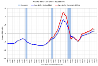
This graph shows the price to rent ratio (January 2000 = 1.0).
On a price-to-rent basis, the Case-Shiller National index is back to March 2004 levels, and the Composite 20 index is back to November 2003 levels.
In real terms, prices are back to late 2004 levels, and the price-to-rent ratio is back to late 2003, early 2004.
Update: A few comments on the Seasonal Pattern for House Prices
by Calculated Risk on 2/26/2019 02:33:00 PM
CR Note: This is a repeat of earlier posts with updated graphs.
A few key points:
1) There is a clear seasonal pattern for house prices.
2) The surge in distressed sales during the housing bust distorted the seasonal pattern.
3) Even though distressed sales are down significantly, the seasonal factor is based on several years of data - and the factor is now overstating the seasonal change (second graph below).
4) Still the seasonal index is probably a better indicator of actual price movements than the Not Seasonally Adjusted (NSA) index.
For in depth description of these issues, see former Trulia chief economist Jed Kolko's article "Let’s Improve, Not Ignore, Seasonal Adjustment of Housing Data"
Note: I was one of several people to question the change in the seasonal factor (here is a post in 2009) - and this led to S&P Case-Shiller questioning the seasonal factor too (from April 2010). I still use the seasonal factor (I think it is better than using the NSA data).

This graph shows the month-to-month change in the NSA Case-Shiller National index since 1987 (through December 2018). The seasonal pattern was smaller back in the '90s and early '00s, and increased once the bubble burst.
The seasonal swings have declined since the bubble.

The swings in the seasonal factors has started to decrease, and I expect that over the next several years - as recent history is included in the factors - the seasonal factors will move back towards more normal levels.
However, as Kolko noted, there will be a lag with the seasonal factor since it is based on several years of recent data.
Comments on December Housing Starts
by Calculated Risk on 2/26/2019 11:32:00 AM
Earlier: Housing Starts Decreased to 1.078 Million Annual Rate in December
Total housing starts in December were well below expectations, and starts for October and November were revised down.
The housing starts report released this morning showed starts were down 11.2% in December compared to November (November starts were revised down), and starts were down 10.9% year-over-year compared to December 2017.
Single family starts were down 10.5% year-over-year. This was the weakest month for single family starts since August 2016.
This first graph shows the month to month comparison for total starts between 2017 (blue) and 2018 (red).

Starts were down 10.9% in December compared to December 2017.
Even with the year end weakness, total starts were up 3.6% in 2018 compared to 2017. The weakness at the end of 2018 has been blamed on higher mortgage rates (that have since come down to around 4.5%), the stock market volatility (since stabilized), trade and immigration policies (impacting foreign buyers), and the partial government shutdown (started in December, but mostly in January).
My sense is starts will pick up in Q1 compared to Q4 2018.
Single family starts were up 2.8% in 2018 compared to 2017.
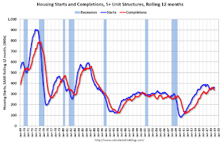
Below is an update to the graph comparing multi-family starts and completions. Since it usually takes over a year on average to complete a multi-family project, there is a lag between multi-family starts and completions. Completions are important because that is new supply added to the market, and starts are important because that is future new supply (units under construction is also important for employment).
These graphs use a 12 month rolling total for NSA starts and completions.

The rolling 12 month total for starts (blue line) increased steadily for several years following the great recession - but turned down, and has moved sideways recently. Completions (red line) had lagged behind - however completions and starts are at about the same level now (more deliveries).
As I've been noting for a few years, the significant growth in multi-family starts is behind us - multi-family starts peaked in June 2015 (at 510 thousand SAAR) - however multi-family has picked up a little recently.

Note the relatively low level of single family starts and completions. The "wide bottom" was what I was forecasting following the recession, and now I expect some further increases in single family starts and completions.
Fed Chair Powell: Semiannual Monetary Policy Report to the Congress
by Calculated Risk on 2/26/2019 10:02:00 AM
From Fed Chair Jerome Powell: Semiannual Monetary Policy Report to the Congress. Excerpts:
While we view current economic conditions as healthy and the economic outlook as favorable, over the past few months we have seen some crosscurrents and conflicting signals. Financial markets became more volatile toward year-end, and financial conditions are now less supportive of growth than they were earlier last year. Growth has slowed in some major foreign economies, particularly China and Europe. And uncertainty is elevated around several unresolved government policy issues, including Brexit and ongoing trade negotiations. We will carefully monitor these issues as they evolve.And on the balance sheet:
emphasis added
In light of the substantial progress we have made in reducing reserves, and after extensive deliberations, the Committee decided at our January meeting to continue over the longer run to implement policy with our current operating procedure. That is, we will continue to use our administered rates to control the policy rate, with an ample supply of reserves so that active management of reserves is not required. Having made this decision, the Committee can now evaluate the appropriate timing and approach for the end of balance sheet runoff. I would note that we are prepared to adjust any of the details for completing balance sheet normalization in light of economic and financial developments. In the longer run, the size of the balance sheet will be determined by the demand for Federal Reserve liabilities such as currency and bank reserves.
Case-Shiller: National House Price Index increased 4.7% year-over-year in December
by Calculated Risk on 2/26/2019 09:12:00 AM
S&P/Case-Shiller released the monthly Home Price Indices for December ("December" is a 3 month average of October, November and December prices).
This release includes prices for 20 individual cities, two composite indices (for 10 cities and 20 cities) and the monthly National index.
Note: Case-Shiller reports Not Seasonally Adjusted (NSA), I use the SA data for the graphs.
From S&P: Annual Gains Fall to 4.7% to End 2018 According to the S&P CoreLogic Case-Shiller Index
The S&P CoreLogic Case-Shiller U.S. National Home Price NSA Index, covering all nine U.S. census divisions, reported a 4.7% annual gain in December, down from 5.1% in the previous month. The 10City Composite annual increase came in at 3.8%, down from 4.2% in the previous month. The 20-City Composite posted a 4.2% year-over-year gain, down from 4.6% in the previous month.
Las Vegas, Phoenix and Atlanta reported the highest year-over-year gains among the 20 cities. In December, Las Vegas led the way with an 11.4% year-over-year price increase, followed by Phoenix with an 8.0% increase and Atlanta with a 5.9% increase. Three of the 20 cities reported greater price increases in the year ending December 2018 versus the year ending November 2018.
...
Before seasonal adjustment, the National Index posted a month-over-month decrease of 0.1% in December. The 10-City and 20-City Composites both reported 0.2% decreases for the month. After seasonal adjustment, the National Index recorded a 0.3% month-over-month increase in December. The 10-City Composite and the 20-City Composite both posted 0.2% month-over-month increases. In December, five of 20 cities reported increases before seasonal adjustment, while 14 of 20 cities reported increases after seasonal adjustment.
“The annual rate of price increases continues to fall,” says David M. Blitzer, Managing Director and Chairman of the Index Committee at S&P Dow Jones Indices. “Even at the reduced pace of 4.7% per year, home prices continue to outpace wage gains of 3.5% to 4% and inflation of about 2%. A decline in interest rates in the fourth quarter was not enough to offset the impact of rising prices on home sales. The monthly number of existing single family homes sold dropped throughout 2018, reaching an annual rate of 4.45 million in December. The 2018 full year sales pace was 4.74 million.
“Regional patterns continue to shift. Seattle and Portland, OR experienced the fastest price increases of any city from late 2016 to the spring of 2018; in December, they ranked 11th and 16th. Currently, the cities with the fastest price increases are Las Vegas and Phoenix. These are a reminder of how prices rose and collapsed in the financial crisis 12 years ago. Despite their recent gains, Las Vegas and Phoenix are the furthest below their 2006 peaks of any city followed in the S&P CoreLogic Case-Shiller Indices.
emphasis added
 Click on graph for larger image.
 The first graph shows the nominal seasonally adjusted Composite 10, Composite 20 and National indices (the Composite 20 was started in January 2000).
The Composite 10 index is up slightly from the bubble peak, and up 0.2% in December (SA).
The Composite 20 index is 3.8% above the bubble peak, and up 0.2% (SA) in December.
The National index is 11.9% above the bubble peak (SA), and up 0.3% (SA) in December. The National index is up 51.3% from the post-bubble low set in December 2011 (SA).
 The second graph shows the Year over year change in all three indices.
The Composite 10 SA is up 3.7% compared to December 2017. The Composite 20 SA is up 4.2% year-over-year.
The National index SA is up 4.7% year-over-year.
Note: According to the data, prices increased in 17 of 20 cities month-over-month seasonally adjusted.
I'll have more later.
Housing Starts Decreased to 1.078 Million Annual Rate in December
by Calculated Risk on 2/26/2019 08:40:00 AM
From the Census Bureau: Permits, Starts and Completions
Housing Starts:
Privately‐owned housing starts in December were at a seasonally adjusted annual rate of 1,078,000. This is 11.2 percent below the revised November estimate of 1,214,000 and is 10.9 percent below the December 2017 rate of 1,210,000. Single‐family housing starts in December were at a rate of 758,000; this is 6.7 percent below the revised November figure of 812,000. The December rate for units in buildings with five units or more was 302,000.
An estimated 1,246,600 housing units were started in 2018. This is 3.6 percent (±2.1%) above the 2017 figure of 1,203,000.
Building Permits:
Privately‐owned housing units authorized by building permits in December were at a seasonally adjusted annual rate of 1,326,000. This is 0.3 percent above the revised November rate of 1,322,000 and is 0.5 percent above the December 2017 rate of 1,320,000. Single‐family authorizations in December were at a rate of 829,000; this is 2.2 percent below the revised November figure of 848,000. Authorizations of units in buildings with five units or more were at a rate of 460,000 in December.
An estimated 1,310,700 housing units were authorized by building permits in 2018. This is 2.2 percent above the 2017 figure of 1,282,000.
emphasis added
 Click on graph for larger image.
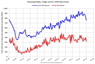
The first graph shows single and multi-family housing starts for the last several years.
Multi-family starts (red, 2+ units) decreased in December compared to November. Multi-family starts were down 12% year-over-year in December.
Multi-family is volatile month-to-month, and has been mostly moving sideways the last few years.
Single-family starts (blue) decreased in December, and were down 11% year-over-year.
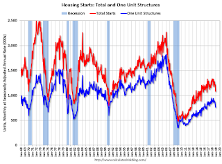
 The second graph shows total and single unit starts since 1968.
 The second graph shows the huge collapse following the housing bubble, and then eventual recovery (but still historically low).
Total housing starts in December were below expectations, and starts for October and November were revised down.
I'll have more later ...


