by Calculated Risk on 2/06/2017 04:06:00 PM
Monday, February 06, 2017
U.S. Courts: Bankruptcy Filings Drop 6 Percent in 2016, Lowest since 2006
From the U.S. Courts: Bankruptcy Filings Fall 5.9%, Reach Lowest Level Since 2006
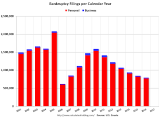
During the 12-month period ending December 31, 2016, 794,960 cases were filed in federal bankruptcy courts, down from the 844,495 bankruptcy cases filed in calendar year 2015—a 5.9 percent drop in filings.
This is the lowest number of bankruptcy filings for any calendar year since 2006, and the sixth consecutive calendar year that filings have fallen. However, it was the first calendar year since 2011 that the rate of annual decline was less than 10 percent.
 Click on graph for larger image.
This graph shows the business and non-business bankruptcy filings by calendar year since 2001.
The sharp decline in 2006 was due to the so-called "Bankruptcy Abuse Prevention and Consumer Protection Act of 2005". (a good example of Orwellian named legislation since this was more a "Lender Protection Act").
Other than 2006, this was the lowest level for filings since 1995. This is another indicator of an economy mostly recovered from the housing bust and financial crisis.
More Rain in California!
by Calculated Risk on 2/06/2017 01:01:00 PM
California has been enduring a five year drought, but it keeps raining in SoCal and snowing in the mountains this year. For much of the state, the drought is over.
Here are a few resources to track the rain and snow.
These tables show the snowpack in the North, Central and South Sierra. Currently the snowpack is about 145% of normal for this date in the North, 174% of normal in the Central Sierra, and 198% of normal in the Southern Sierra.
And here are some plots comparing the current and previous years to the average, a very dry year ('14-'15) and a wet year ('82-'83). This winter is already above the average and close to the record winter of '82-'83.
And for Los Angeles, here is a historical table of annual rainfall. After five years of significantly below average rainfall, this year is well above normal and the rain is still falling.
This is good news for the state and the state economy.

There were four very dry years in a row, and then last winter was a little better - but still below normal.
For the Tyndall Creek area, this is the fifth wettest year in the last 20 years - and it is still early February!
Black Knight: "7.4 million homes lost to foreclosure sale since 2007"
by Calculated Risk on 2/06/2017 10:01:00 AM
Black Knight Financial Services (BKFS) released their Mortgage Monitor report for December today. According to BKFS, 4.42% of mortgages were delinquent in December, down from 4.78% in December 2015. BKFS also reported that 0.95% of mortgages were in the foreclosure process, down from 1.37% a year ago.
This gives a total of 5.37% delinquent or in foreclosure.
Press Release: Black Knight’s Mortgage Monitor: Historical Data Suggests Up to 300,000 Delinquent Borrowers May Use Tax Refunds to Pay Mortgages Current; Affordability Suffers from Rate Increases
Today, the Data & Analytics division of Black Knight Financial Services, Inc. (NYSE: BKFS) released its latest Mortgage Monitor Report, based on data as of the end of December 2016. This month, Black Knight examined Internal Revenue Service (IRS) tax filing statistics in conjunction with mortgage performance data to quantify potential impacts of the upcoming tax season on the mortgage market. As Black Knight Data & Analytics Executive Vice President Ben Graboske explained, there has historically been a distinct correlation between income tax refund disbursements and delinquent mortgages curing to current status.
“Looking at IRS filing statistics, we see that nearly one in five Americans file their returns within the first two weeks of tax season, and over 40 percent had completed their taxes by the first week in March,” said Graboske. “Unsurprisingly, incentive played a big role in this timing; not only were Americans who filed early more likely to receive a refund than those filing later, but they also received larger refunds on average. Likewise, mortgage cures -- delinquent borrowers who bring themselves back to current status -- correspondingly spike in February and March as well, suggesting that some portion of Americans are using their tax refunds to make past-due payments on their mortgages. In recent years, this has meant nearly 300,000 borrowers on average paying their loans current in February and March alone, on top of normal cure volumes for the typical month. All things being equal, there’s no reason to expect this tax season to be any different.
“We see this increase in cures across the delinquency and foreclosure spectrum, but it is most pronounced in the early and moderate stages of delinquency. ...”
emphasis added
 Click on graph for larger image.
This graph from Black Knight shows the number of foreclosure starts (and repeat foreclosures) per year.
From Black Knight:
• Nearly 790K mortgages were referred to foreclosure in 2016; 57 percent of these were repeats (mortgages that had been referred to foreclosure at least once previously)
• 335K first time foreclosure starts is the lowest oneyear total since before the turn of the century, and was actually 20 percent below what we saw in 2015
• As of Q4 2016, over 13 million foreclosures had been initiated since 2007
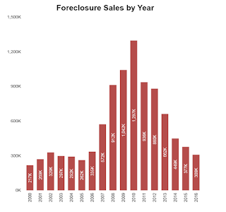 This graph from Black Knight shows foeclosure sales per year:
From Black Knight:
• There were 309K foreclosure sales in 2016, marking a 19 percent decline from 2015 and the lowest yearly total since 2005There is much more in the mortgage monitor.
• This is still slightly elevated from historical perspective; 2000-2005 averaged ~275k foreclosure sales/year
• Overall there have now been 7.4 million homes lost to foreclosure sale since 2007
Sunday Night Futures
by Calculated Risk on 2/06/2017 12:21:00 AM
Weekend:
• Schedule for Week of Feb 5, 2017
• Oil: "Another huge week" for total US oil rigs, Pressure on OPEC deal
• Goldman on the Trump Agenda
From CNBC: Pre-Market Data and Bloomberg futures: S&P futures are down 2, and DOW futures are down 10 (fair value).
Oil prices were up over the last week with WTI futures at $54.00 per barrel and Brent at $56.98 per barrel. A year ago, WTI was at $33, and Brent was at $33 - so oil prices are up sharply year-over-year.
Here is a graph from Gasbuddy.com for nationwide gasoline prices. Nationally prices are at $2.26 per gallon - a year ago prices were at $1.76 per gallon - so gasoline prices are up 50 cents a gallon year-over-year.
Sunday, February 05, 2017
Goldman on the Trump Agenda
by Calculated Risk on 2/05/2017 11:15:00 AM
On Thursday I wrote Some Random Concerns and Observations .... One of my observations was that after the election, many analysts thought the priorities of the new administration would be tax cuts, infrastructure spending, and deregulation. And the analysts thought that the negative economic policies on immigration and trade would be delayed until at least 2018. So far the new administration has delayed the policies with potential short term economic benefits - and pushed the negative policies.
From CNBC: US political, economic risks mounting against Trump's agenda, Goldman Sachs says
The policy halo effect that provided ballast to the stock market and fueled investor optimism is already being dimmed by political realities, according to Goldman Sachs, which may have negative implications for economic growth.Here are a few excepts from the Goldman Sachs note by economist Alex Phillips mentioned in the CNBC article:
In a note to clients on Friday, the investment bank noted President Donald Trump's agenda was already running into bipartisan political resistance, with doubts growing about potential tax reform and a repeal of the Affordable Care Act, among other marquee Trump administration initiatives.
• The Trump Agenda presents risks in both directions; tax cuts and infrastructure funding could boost growth but could be offset by the negative effects of restrictions on trade and immigration.
• Following the election, the positive shift in sentiment among investors, business, and consumers suggested that the probability of tax cuts and easier regulation was seen to be higher than the probability of meaningful restrictions to trade and immigration.
• One month into the year, the balance of risks is somewhat less positive in our view, for three reasons. First, the recent difficulty congressional Republicans have had in moving forward on Obamacare repeal does not bode well for reaching a quick agreement on tax reform or infrastructure funding, and reinforces our view that a fiscal boost, if it happens, is mostly a 2018 story.
• Second, while bipartisan cooperation looked possible on some issues following the election, the political environment appears to be as polarized as ever, suggesting that issues that require bipartisan support may be difficult to address.
• Third, some of the recent administrative actions by the Trump Administration serve as a reminder that the president is likely to follow through on campaign promises on trade and immigration, some of which could be disruptive for financial markets and the real economy.
Saturday, February 04, 2017
Oil: "Another huge week" for total US oil rigs, Pressure on OPEC deal
by Calculated Risk on 2/04/2017 09:19:00 PM
A few comments from Steven Kopits of Princeton Energy Advisors LLC on Feb 4, 2017:
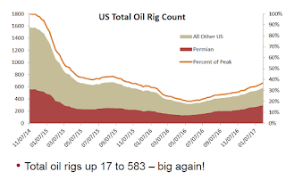
• Another huge week, total US oil rigs up 17 to 583
• Horizontal oil rig counts up +16 to 479
...
• The OPEC deal is looking at trouble ahead—three more weeks of this and the OPEC deal will fall apart
• Cana Woodford has moved distinctly into second place among US shale plays
 Click on graph for larger image.
Graph and comments Courtesy of Steven Kopits of Princeton Energy Advisors LLC.
Schedule for Week of Feb 5, 2017
by Calculated Risk on 2/04/2017 08:09:00 AM
This will be a light week for economic data.
The key economic report this week is December Trade Deficit.
10:00 AM ET: The Fed will release the monthly Labor Market Conditions Index (LMCI).
6:00 AM ET: NFIB Small Business Optimism Index for January.
 8:30 AM: Trade Balance report for December from the Census Bureau.
 This graph shows the U.S. trade deficit, with and without petroleum, through November. The blue line is the total deficit, and the black line is the petroleum deficit, and the red line is the trade deficit ex-petroleum products.
The consensus is for the U.S. trade deficit to be at $44.9 billion in December from $45.2 billion in November.
 10:00 AM: Job Openings and Labor Turnover Survey for December from the BLS.
 This graph shows job openings (yellow line), hires (purple), Layoff, Discharges and other (red column), and Quits (light blue column) from the JOLTS.
Jobs openings increased in November to 5.522 million from 5.451 million in October.
The number of job openings (yellow) were up 6% year-over-year, and Quits were up 7% year-over-year.
3:00 PM: Consumer credit from the Federal Reserve. The consensus is for a $20.0 billion increase in credit.
7:00 AM ET: The Mortgage Bankers Association (MBA) will release the results for the mortgage purchase applications index.
8:30 AM ET: The initial weekly unemployment claims report will be released. The consensus is for 250 thousand initial claims, up from 246 thousand the previous week.
10:00 AM: Monthly Wholesale Trade: Sales and Inventories for December. The consensus is for a 1.0% increase in inventories.
10:00 AM: University of Michigan's Consumer sentiment index (preliminary for February). The consensus is for a reading of 98.0, down from 98.5 in January.
Friday, February 03, 2017
Earlier: ISM Non-Manufacturing Index at 56.5% in January
by Calculated Risk on 2/03/2017 03:41:00 PM
The January ISM Non-manufacturing index was at 56.5%, down slightly from 56.6% in December. The employment index increased in January to 54.7%, from 52.7%. Note: Above 50 indicates expansion, below 50 contraction.
From the Institute for Supply Management:January 2017 Non-Manufacturing ISM Report On Business®
Economic activity in the non-manufacturing sector grew in January for the 85th consecutive month, say the nation's purchasing and supply executives in the latest Non-Manufacturing ISM® Report On Business®.
The report was issued today by Anthony Nieves, CPSM, C.P.M., CFPM, chair of the Institute for Supply Management® (ISM®) Non-Manufacturing Business Survey Committee: "The NMI® registered 56.5 percent which is 0.1 percentage point lower than the seasonally adjusted December reading of 56.6. This represents continued growth in the non-manufacturing sector at a slightly slower rate. The Non-Manufacturing Business Activity Index decreased to 60.3 percent, 0.6 percentage point lower than the seasonally adjusted December reading of 60.9 percent, reflecting growth for the 90th consecutive month, at a slightly slower rate in January. The New Orders Index registered 58.6 percent, 2.1 percentage points lower than the seasonally adjusted reading of 60.7 percent in December. The Employment Index increased 2 percentage points in January to 54.7 percent from the seasonally adjusted December reading of 52.7 percent. The Prices Index increased 2.9 percentage points from the seasonally adjusted December reading of 56.1 percent to 59 percent; indicating prices increased for the 10th consecutive month, at a faster rate in January. According to the NMI®, 12 non-manufacturing industries reported growth in January. The non-manufacturing sector begins 2017 with a cooling-off in the rate of growth month-over-month. The sector still reflects strong growth. Respondents' comments are mixed indicating both optimism and a degree of uncertainty in the business outlook as a result of the change in government administration."
emphasis added
 Click on graph for larger image.
This graph shows the ISM non-manufacturing index (started in January 2008) and the ISM non-manufacturing employment diffusion index.
This suggests about the same rate of expansion in January as in December. A solid report.
Public and Private Sector Payroll Jobs: Carter, Reagan, Bush, Clinton, Bush, Obama
by Calculated Risk on 2/03/2017 12:36:00 PM
By request, here is another update of an earlier post through the January 2017 employment report including all revisions. This is the final employment report for the Obama presidency (the reference week includes the 12th, and Obama was still President during that period).
And, yes, I will post these graphs during the next Presidential term.
NOTE: Several readers have asked if I could add a lag to these graphs (obviously a new President has zero impact on employment for the month they are elected). But that would open a debate on the proper length of the lag, so I'll just stick to the beginning of each term.
We frequently use Presidential terms as time markers - we could use Speaker of the House, or any other marker.
Important: There are many differences between these periods. Overall employment was smaller in the '80s, however the participation rate was increasing in the '80s (younger population and women joining the labor force), and the participation rate is generally declining now. But these graphs give an overview of employment changes.
First, here is a table for private sector jobs. The top two private sector terms were both under President Clinton.
The third best growth for the private sector was Obama's 2nd term.
Reagan's 2nd term saw about the same job growth as during Carter's term. Note: There was a severe recession at the beginning of Reagan's first term (when Volcker raised rates to slow inflation) and a recession near the end of Carter's term (gas prices increased sharply and there was an oil embargo).
| Term | Private Sector Jobs Added (000s) |
|---|---|
| Carter | 9,041 |
| Reagan 1 | 5,360 |
| Reagan 2 | 9,357 |
| GHW Bush | 1,509 |
| Clinton 1 | 10,883 |
| Clinton 2 | 10,085 |
| GW Bush 1 | -811 |
| GW Bush 2 | 414 |
| Obama 1 | 1,937 |
| Obama 2 | 9,867 |
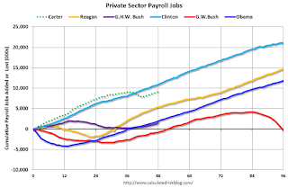
The first graph shows the change in private sector payroll jobs from when each president took office until the end of their term(s). Presidents Carter and George H.W. Bush only served one term, and President Obama is in the final months of his second term.
Mr. G.W. Bush (red) took office following the bursting of the stock market bubble, and left during the bursting of the housing bubble. Mr. Obama (blue) took office during the financial crisis and great recession. There was also a significant recession in the early '80s right after Mr. Reagan (yellow) took office.
There was a recession towards the end of President G.H.W. Bush (purple) term, and Mr Clinton (light blue) served for eight years without a recession.
 Click on graph for larger image.
The first graph is for private employment only.
The employment recovery during Mr. G.W. Bush's (red) first term was sluggish, and private employment was down 811,000 jobs at the end of his first term. At the end of Mr. Bush's second term, private employment was collapsing, and there were net 396,000 private sector jobs lost during Mr. Bush's two terms.
Private sector employment increased slightly under President G.H.W. Bush (purple), with 1,510,000 private sector jobs added.
Private sector employment increased by 20,966,000 under President Clinton (light blue), by 14,717,000 under President Reagan (yellow), and 9,041,000 under President Carter (dashed green).
There were only 1,937,000 more private sector jobs at the end of Mr. Obama's first term. At the end of his second term, there were 11,804,000 more private sector jobs than when Mr. Obama initially took office.
 A big difference between the presidencies has been public sector employment. Note the bumps in public sector employment due to the decennial Census in 1980, 1990, 2000, and 2010.
 The public sector grew during Mr. Carter's term (up 1,304,000), during Mr. Reagan's terms (up 1,414,000), during Mr. G.H.W. Bush's term (up 1,127,000), during Mr. Clinton's terms (up 1,934,000), and during Mr. G.W. Bush's terms (up 1,744,000 jobs).
However the public sector has declined significantly since Mr. Obama took office (down 303,000 jobs). This has been a significant drag on overall employment.
And a table for public sector jobs. Public sector jobs declined the most during Obama's first term, and increased the most during Reagan's 2nd term.
| Term | Public Sector Jobs Added (000s) |
|---|---|
| Carter | 1,304 |
| Reagan 1 | -24 |
| Reagan 2 | 1,438 |
| GHW Bush | 1,127 |
| Clinton 1 | 692 |
| Clinton 2 | 1,242 |
| GW Bush 1 | 900 |
| GW Bush 2 | 844 |
| Obama 1 | -708 |
| Obama 2 | 404 |
Below is a table of the top five presidential terms for total non-farm job creation.
Obama's 2nd term was the 3rd best ever for private job creation. However, with very few public sector jobs added, Obama's 2nd term was only the fifth best for total job creation.
| Top Employment Gains per Presidential Terms (000s) | ||||
|---|---|---|---|---|
| Rank | Term | Private | Public | Total Non-Farm |
| 1 | Clinton 1 | 10,883 | 692 | 11,575 |
| 2 | Clinton 2 | 10,085 | 1,242 | 11,317 |
| 3 | Reagan 2 | 9,357 | 1,438 | 10,795 |
| 4 | Carter | 9,041 | 1,304 | 10,345 |
| 5 | Obama 2 | 9,867 | 404 | 10,271 |
Comments: Another Solid Employment Report
by Calculated Risk on 2/03/2017 09:55:00 AM
The headline jobs number was above expectations, however there were combined downward revisions to the previous two months. Overall this was a solid report.
Earlier: January Employment Report: 227,000 Jobs, 4.8% Unemployment Rate
In January, the year-over-year change was 2.34 million jobs.
Average Hourly Earnings
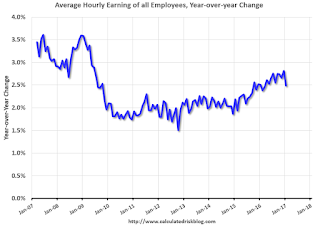
This graph is based on “Average Hourly Earnings” from the Current Employment Statistics (CES) (aka "Establishment") monthly employment report. Note: There are also two quarterly sources for earnings data: 1) “Hourly Compensation,” from the BLS’s Productivity and Costs; and 2) the Employment Cost Index which includes wage/salary and benefit compensation.
The graph shows the nominal year-over-year change in "Average Hourly Earnings" for all private employees. Nominal wage growth was at 2.5% YoY in January.
This is generally trending up, but this index is noisy and the pace of wage growth slowed in January.
Employment-Population Ratio, 25 to 54 years old

In the earlier period the participation rate for this group was trending up as women joined the labor force. Since the early '90s, the participation rate moved more sideways, with a downward drift starting around '00 - and with ups and downs related to the business cycle.
The 25 to 54 participation rate was unchanged in January at 81.5%, and the 25 to 54 employment population ratio was unchanged at 78.2%.
The participation rate has been trending down for this group since the late '90s, however, with more younger workers (and fewer older workers), the participation rate might move up some more.
Part Time for Economic Reasons

The number of persons employed part time for economic reasons (sometimes referred to as involuntary part-time workers) was little changed in January at 5.8 million. These individuals, who would have preferred full-time employment, were working part time because their hours had been cut back or because they were unable to find full-time jobs.The number of persons working part time for economic reasons increased in January. This level suggests slack still in the labor market.
These workers are included in the alternate measure of labor underutilization (U-6) that increased to 9.4% in January.
Unemployed over 26 Weeks
 This graph shows the number of workers unemployed for 27 weeks or more.
 According to the BLS, there are 1.85 million workers who have been unemployed for more than 26 weeks and still want a job. This was up from 1.83 million in December.
This is generally trending down, but still elevated.
Overall this was another solid report.


