by Calculated Risk on 7/24/2016 07:37:00 PM
Sunday, July 24, 2016
Sunday Night Futures
Weekend:
• Schedule for Week of July 24, 2016
• The Future is Still Bright!
Monday:
• At 10:30 AM ET: Dallas Fed Survey of Manufacturing Activity for July.
From CNBC: Pre-Market Data and Bloomberg futures: S&P and DOW futures are down slightly (fair value).
Oil prices were down over the last week with WTI futures at $44.26 per barrel and Brent at $45.69 per barrel. A year ago, WTI was at $48, and Brent was at $54 - so prices are down 10% to 15% year-over-year.
Here is a graph from Gasbuddy.com for nationwide gasoline prices. Nationally prices are at $2.16 per gallon (down over $0.50 per gallon from a year ago).
The Future is still Bright!
by Calculated Risk on 7/24/2016 10:12:00 AM
Three and a half years ago I wrote The Future's so Bright .... In that post I outlined why I was becoming more optimistic. It is time for another update!
For new readers: I was very bearish on the economy when I started this blog in 2005 - back then I wrote mostly about housing (see: LA Times article and more here for comments about the blog). I started looking for the sun in early 2009, and recently I've been more optimistic.
Here are some updates to the graphs I posted 3+ years ago. Several of these graphs have changed direction since that original post. As example, state and local government employment is now increasing, and household deleveraging is over (as predicted).

This graph shows total and single family housing starts. Even though starts are up about 150% from the bottom, starts are still below the average level of 1.5 million per year from 1959 through 2000.
Demographics and household formation suggests starts will increase to around 1.5 million over the next few years. That means starts will probably increase another 25% or so from the June 2016 level of 1.19 million starts (SAAR).
Residential investment and housing starts are usually the best leading indicator for the economy, so this suggests the economy will continue to grow.

Since January 2013, state and local employment has increased 259,000.
So, in the aggregate, state and local government layoffs are over - and the economic drag on the economy is over. However state and local government employment is still 464,000 below the pre-recession peak.

As we've been discussing, the US deficit as a percent of GDP declined significantly over the last few years, and will probably remain under 3% for several years.
Here are a couple of graph on household debt (and debt service):
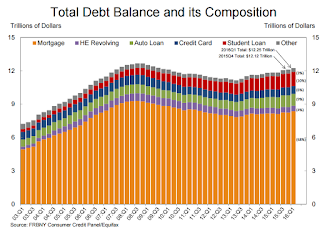
From the NY Fed: Household Debt Steps Up, Delinquencies Drop
Household indebtedness continued to advance during the first three months of 2016 according to the Federal Reserve Bank of New York’s Quarterly Report on Household Debt and Credit, ...There will be a little more deleveraging ahead for certain households (mostly from foreclosures and distressed sales), but in the aggregate, household deleveraging ended almost 3 years ago.
...
"Delinquency rates and the overall quality of outstanding debt continue to improve," said Wilbert van der Klaauw, senior vice president at the New York Fed. "The proportion of overall debt that becomes newly delinquent has been on a steady downward trend and is at its lowest level since our series began in 1999. This improvement is in large part driven by mortgages."
emphasis added
 This graph is from the Fed's Household Debt Service and Financial Obligations Ratios. These ratios show the percent of disposable personal income (DPI) dedicated to debt service (DSR) and financial obligations (FOR) for households.
The overall Debt Service Ratio has been moving sideways and is near the record low. Note: The financial obligation ratio (FOR) is also near a record low (not shown)
Also the DSR for mortgages (blue) are near the low for the last 30 years. This ratio increased rapidly during the housing bubble, and continued to increase until 2007. With falling interest rates, and less mortgage debt (mostly due to foreclosures), the mortgage ratio has declined significantly.
This data suggests household cash flow is in much better shape than several years ago.
 And for commercial real estate, here is the AIA Architecture Billings Index. This is usually a leading indicator for commercial real estate, and the readings over the last year suggest more increases in CRE investment at least through mid-2017 (except oil and power with the recent decline in oil prices).
Overall it appears the economy is poised for more growth.
And in the longer term I remain very optimistic.
In 2014, I posted some demographic data for the U.S., see: Census Bureau: Largest 5-year Population Cohort is now the "20 to 24" Age Group.
I pointed out that "even without the financial crisis we would have expected some slowdown in growth this decade (just based on demographics). The good news is that will change soon."
Changes in demographics are an important determinant of economic growth, and although most people focus on the aging of the "baby boomer" generation, the movement of younger cohorts into the prime working age is another key story in coming years. Here is a graph of the prime working age population (this is population, not the labor force) from 1948 through June 2016.
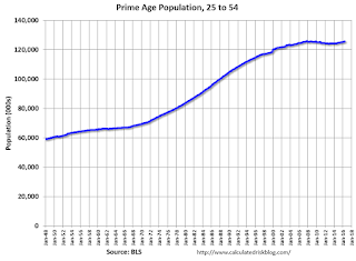 There was a huge surge in the prime working age population in the '70s, '80s and '90s. The prime working age population peaked in 2007, and bottomed at the end of 2012, and is almost back to the previous peak (this has nothing to do with the recession - just demographics).
The good news is the prime working age group has started to grow again, and should be growing solidly by 2020 - and this should boost economic activity in the years ahead.
These young workers are well educated and tech savvy. And they will have babies and buy homes soon. For more, see from Joe Weisenthal: The Analyst Who Nailed The Housing Crash Is Quietly Revealing The Next Big Thing
And a couple of graphs from The Projected Improvement in Life Expectancy
Instead of look at life expectancy, here is a graph of survivors out of 100,000 born alive, by age for three groups: those born in 1900-1902, born in 1949-1951 (baby boomers), and born in 2010.
 There was a dramatic change between those born in 1900 (blue) and those born mid-century (orange). The risk of infant and early childhood deaths dropped sharply, and the risk of death in the prime working years also declined significantly.
The CDC is projecting further improvement for childhood and prime working age for those born in 2010, but they are also projecting that people will live longer.
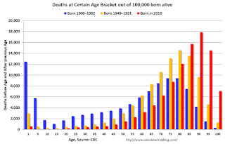 The second graph uses the same data but looks at the number of people who die before a certain age, but after the previous age. As an example, for those born in 1900 (blue), 12,448 of the 100,000 born alive died before age 1, and another 5,748 died between age 1 and age 5. That is 18.2% of those born in 1900 died before age 5.
In 1950, only 3.5% died before age 5. In 2010, it was 0.7%.
The peak age for deaths didn't change much for those born in 1900 and 1950 (between 76 and 80, but many more people born in 1950 will make it).
Now the CDC is projection the peak age for deaths - for those born in 2010 - will increase to 86 to 90!
Also the number of deaths for those younger than 20 will be very small (down to mostly accidents, guns, and drugs). Self-driving cars might reduce the accident components of young deaths.
In 1900, 25,2% died before age 20. And another 26.8% died before 55.
In 1950, 5.3% died before age 20. And another 18.7% died before 55. A dramatic decline in early deaths.
In 2010, 1.5% are projected to die before age 20. And only 9.7% before 55. A dramatic decline in prime working age deaths.
An amazing statistic: for those born in 1900, about 13 out of 100,000 made it to 100. For those born in 1950, 199 are projected to make to 100 - an significant increase. Now the CDC is projecting that 1,968 out of 100,000 born in 2010 will make it to 100. Stunning!
Some people look at this data and worry about supporting all the old people. To me, this is all great news - the vast majority of people can look forward to a long life - with fewer people dying in childhood or during their prime working years. Awesome!
Three and a half years ago I said that looking forward I was the most optimistic since the '90s. And things are only getting better. The future's so bright, I gotta wear shades.
Yes, the song was about nuclear holocaust ... but it was originally intended the way I'm using it.
Saturday, July 23, 2016
Schedule for Week of July 24, 2016
by Calculated Risk on 7/23/2016 08:11:00 AM
The key reports this week are the first estimate of Q2 GDP, June New Home sales, and the Case-Shiller House Price Index for May.
The FOMC is meeting on Tuesday and Wednesday, and no change in policy is expected this week.
For manufacturing, the July Dallas, Richmond and Kansas City manufacturing surveys will be released this week.
10:30 AM ET: Dallas Fed Survey of Manufacturing Activity for July.
 9:00 AM: S&P/Case-Shiller House Price Index for May. Although this is the May report, it is really a 3 month average of March, April and May prices.
This graph shows the nominal seasonally adjusted National Index, Composite 10 and Composite 20 indexes through the April 2016 report (the Composite 20 was started in January 2000).
The consensus is for a 5.6% year-over-year increase in the Comp 20 index for May. The Zillow forecast is for the National Index to increase 5.0% year-over-year in May.
 10:00 AM ET: New Home Sales for June from the Census Bureau.
 This graph shows New Home Sales since 1963. The dashed line is the May sales rate.
The consensus is for an increase in sales to 562 thousand Seasonally Adjusted Annual Rate (SAAR) in June from 551 thousand in May.
10:00 AM: Richmond Fed Survey of Manufacturing Activity for July. .
7:00 AM ET: The Mortgage Bankers Association (MBA) will release the results for the mortgage purchase applications index.
8:30 AM: Durable Goods Orders for May from the Census Bureau. The consensus is for a 1.3% decrease in durable goods orders.
10:00 AM: Pending Home Sales Index for June. The consensus is for a 1.3% increase in the index.
2:00 PM: FOMC Meeting Announcement. No change in policy is expected at this meeting.
8:30 AM ET: The initial weekly unemployment claims report will be released. The consensus is for 264 thousand initial claims, up from 253 thousand the previous week.
10:00 AM: the Q2 Housing Vacancies and Homeownership from the Census Bureau.
11:00 AM: Kansas City Fed Survey of Manufacturing Activity for July. This is the last of the regional Fed surveys for July.
8:30 AM ET: Gross Domestic Product, 2nd quarter 2016 (Advance estimate). The consensus is that real GDP increased 2.6% annualized in Q2. The annual revision will also be released.
9:45 AM: Chicago Purchasing Managers Index for July. The consensus is for a reading of 54.0, down from 56.8 in June.
10:00 AM: University of Michigan's Consumer sentiment index (final for July). The consensus is for a reading of 90.6, up from the preliminary reading 89.5, and down from 93.5 in June.
Friday, July 22, 2016
Vehicle Sales Forecast: Sales to be Over 17 Million SAAR in July
by Calculated Risk on 7/22/2016 03:41:00 PM
The automakers will report July vehicle sales on Tuesday, Aug 2nd.
Note: There were 26 selling days in July, the same as in July 2015.
From WardsAuto: Forecast: July Sales to Return to 17 Million SAAR Trend
A WardsAuto forecast calls for U.S. light-vehicle sales to reach a 17.6 million-unit seasonally adjusted annual rate in July, following June’s 16.6 million SAAR. July’s SAAR would be significantly higher than the 17.1 million recorded year-to-date through June, and would help bring 2016 sales in line with WardsAuto’s full-year forecast of 17.3 million units.Looks like a strong month for vehicle sales.
emphasis added
Hotels: Occupancy Rate on Track to be 2nd Best Year
by Calculated Risk on 7/22/2016 12:12:00 PM
From HotelNewsNow.com: STR: US hotel results for week ending 16 July
The U.S. hotel industry reported mixed results in the three key performance metrics during the week of 10-16 July 2016, according to data from STR.The following graph shows the seasonal pattern for the hotel occupancy rate using the four week average.
In year-over-year comparisons, the industry’s occupancy decreased 1.4% to 77.5%. However, average daily rate was up 3.4% to US$128.12, and revenue per available room increased 1.9% to US$99.33.
emphasis added
 The red line is for 2016, dashed orange is 2015, blue is the median, and black is for 2009 - the worst year since the Great Depression for hotels.
2015 was the best year on record for hotels.
So far 2016 is tracking just behind 2015, and well ahead of the median rate.
Also 2016 is tracking just ahead of 2000 (the previous 2nd best year).
The 4-week average occupancy rate should remain above 70% during the Summer travel period.
Data Source: Smith Travel Research, Courtesy of HotelNewsNow.com
BLS: Unemployment Rates stable in 43 states in June
by Calculated Risk on 7/22/2016 10:13:00 AM
From the BLS: Regional and State Employment and Unemployment Summary
Unemployment rates were significantly higher in June in 6 states, lower in 1 state, and stable in 43 states and the District of Columbia, the U.S. Bureau of Labor Statistics reported today.
...
South Dakota and New Hampshire had the lowest jobless rates in June, 2.7 percent and 2.8 percent, respectively. Alaska had the highest unemployment rate, 6.7 percent.
emphasis added
 Click on graph for larger image.
This graph shows the current unemployment rate for each state (red), and the max during the recession (blue). All states are well below the maximum unemployment rate for the recession.
The size of the blue bar indicates the amount of improvement. The yellow squares are the lowest unemployment rate per state since 1976.
The states are ranked by the highest current unemployment rate. Alaska, at 6.7%, had the highest state unemployment rate.
 The second graph shows the number of states (and D.C.) with unemployment rates at or above certain levels since January 2006. At the worst of the employment recession, there were 11 states with an unemployment rate at or above 11% (red).
Currently no state has an unemployment rate at or above 7% (light blue); Only seven states and D.C are at or above 6% (dark blue). The states at or above 6% are Alaska, Nevada, Illinois, Louisiana, New Mexico, Alabama and West Virginia.
Thursday, July 21, 2016
NMHC: Apartment Market Tightness Index remained negative in July Survey
by Calculated Risk on 7/21/2016 05:44:00 PM
From the National Multifamily Housing Council (NMHC): Apartment Markets Remain Mixed According to the Latest NMHC Quarterly Survey
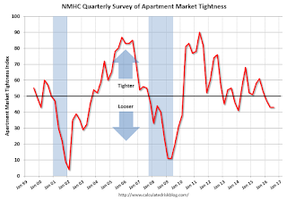
Apartment markets continued to show mixed conditions in the July 2016 National Multifamily Housing Council (NMHC) Quarterly Survey of Apartment Market Conditions. For the third quarter in a row, the Market Tightness (43) and Equity Financing (44) Indexes remained below the breakeven level of 50. Conversely, the Debt Financing Index came in at 62 and the Sales Volume Index landed right at 50.
“Apartment markets remain strong, but the surge of new apartment construction is starting to shift the supply-demand balance, particularly in the market for upscale apartments,” said Mark Obrinsky, NMHC’s Senior Vice President of Research and Chief Economist. “Given that most new supply is class A, we’re not seeing the same shift in class B and C apartments. In addition, some weakness in the Market Tightness Index may be just seasonality.”
For the third quarter in a row, the Market Tightness Index, which was unchanged at 43, showed supply a bit stronger than demand. Almost one-third of respondents (31 percent) reported looser conditions than three months ago. At the other end, 18 percent noted tighter conditions, while over half (51 percent) reported no change.
emphasis added
Click on graph for larger image.
This graph shows the quarterly Apartment Tightness Index. Any reading below 50 indicates looser conditions from the previous quarter. This indicates market conditions were looser over the last quarter.
As I've mentioned before, this index helped me call the bottom for effective rents (and the top for the vacancy rate) early in 2010.
This is the third consecutive quarterly survey indicating looser conditions - it appears supply has caught up with demand - and I expect rent growth to slow (the vacancy rate is generally rising too).
A Few Comments on June Existing Home Sales
by Calculated Risk on 7/21/2016 03:35:00 PM
Earlier: Existing Home Sales increased in June to 5.57 million SAAR
For existing homes, inventory is still key. I expected some increase in inventory last year, but that didn't happened. Inventory is still very low and falling year-over-year (down 5.8% year-over-year in June). More inventory would probably mean smaller price increases and slightly higher sales, and less inventory means lower sales and somewhat larger price increases.
Two of the key reasons inventory is low: 1) A large number of single family home and condos were converted to rental units. Last year, housing economist Tom Lawler estimated there were 17.5 million renter occupied single family homes in the U.S., up from 10.7 million in 2000. Many of these houses were purchased by investors, and rents have increased substantially, and the investors are not selling (even though prices have increased too). Most of these rental conversions were at the lower end, and that is limiting the supply for first time buyers. 2) Baby boomers are aging in place (people tend to downsize when they are 75 or 80, in another 10 to 20 years for the boomers). Instead we are seeing a surge in home improvement spending, and this is also limiting supply.
Of course low inventory keeps potential move-up buyers from selling too. If someone looks around for another home, and inventory is lean, they may decide to just stay and upgrade.
Also, the NAR reported total sales were up 3.0% from June 2015, however normal equity sales were up even more, and distressed sales down sharply. From the NAR (from a survey that is far from perfect):
Distressed sales — foreclosures and short sales — were 6 percent of sales in June, unchanged from May and down from 8 percent a year ago. Four percent of June sales were foreclosures (lowest since NAR began tracking in October 2008) and 2 percent were short sales.Last year in June the NAR reported that 8% of sales were distressed sales.
A rough estimate: Sales in June 2015 were reported at 5.41 million SAAR with 8% distressed. That gives 430 thousand distressed (annual rate), and 4.98 million equity / non-distressed. In June 2016, sales were 5.57 million SAAR, with 6% distressed. That gives 330 thousand distressed - a decline of about 23% from June 2015 - and 5.24 million equity. Although this survey isn't perfect, this suggests distressed sales were down sharply - and normal sales up around 5%.
The following graph shows existing home sales Not Seasonally Adjusted (NSA).
 Click on graph for larger image.
Sales NSA in June (red column) were the highest for June since 2006 (NSA).
This is a solid first half for 2016.
Earlier: Philly Fed Manufacturing Survey showed Contraction in July
by Calculated Risk on 7/21/2016 12:57:00 PM
From the Philly Fed: July 2016 Manufacturing Business Outlook Survey
Manufacturing activity in the region fell slightly in July, according to firms responding to this month’s Manufacturing Business Outlook Survey. Although the indicator for current general activity turned negative, indicators for new orders and shipments were positive. Employment was flat at the reporting firms this month.This was below the consensus forecast of a reading of 5.0 for July.
...
The survey’s broadest measure of manufacturing conditions, the diffusion index of current activity, fell from 4.7 in June to -2.9 this month. For nine of the past 11 months, this diffusion index has been negative ...
...
The survey’s broad indicator of future growth moved slightly higher this month: The diffusion index for future general activity increased 4 points to 33.7, which is close to its average of 35.9 during the past five years
emphasis added
 Click on graph for larger image.
Here is a graph comparing the regional Fed surveys and the ISM manufacturing index. The yellow line is an average of the NY Fed (Empire State) and Philly Fed surveys through July. The ISM and total Fed surveys are through June.
The average of the Empire State and Philly Fed surveys was slightly negative in July (yellow). This suggests the ISM survey will probably indicate slower expansion this month.
Existing Home Sales increased in June to 5.57 million SAAR
by Calculated Risk on 7/21/2016 10:11:00 AM
From the NAR: Existing-Home Sales Ascend Again in June, First-time Buyers Provide Spark
Total existing-home sales, which are completed transactions that include single-family homes, townhomes, condominiums and co-ops, climbed 1.1 percent to a seasonally adjusted annual rate of 5.57 million in June from a downwardly revised 5.51 million in May. After last month's gain, sales are now up 3.0 percent from June 2015 (5.41 million) and remain at their highest annual pace since February 2007 (5.79 million). ...
Total housing inventory at the end of June dipped 0.9 percent to 2.12 million existing homes available for sale, and is now 5.8 percent lower than a year ago (2.25 million). Unsold inventory is at a 4.6-month supply at the current sales pace, which is down from 4.7 months in May.
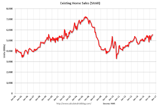 Click on graph for larger image.
This graph shows existing home sales, on a Seasonally Adjusted Annual Rate (SAAR) basis since 1993.
Sales in June (5.57 million SAAR) were 1.1% higher than last month, and were 3.0% above the June 2015 rate.
The second graph shows nationwide inventory for existing homes.
 According to the NAR, inventory decreased to 2.12 million in June from 2.14 million in May. Headline inventory is not seasonally adjusted, and inventory usually decreases to the seasonal lows in December and January, and peaks in mid-to-late summer.
The third graph shows the year-over-year (YoY) change in reported existing home inventory and months-of-supply. Since inventory is not seasonally adjusted, it really helps to look at the YoY change. Note: Months-of-supply is based on the seasonally adjusted sales and not seasonally adjusted inventory.
 Inventory decreased 5.8% year-over-year in June compared to June 2015.
 Months of supply was at 4.6 months in June.
This was above consensus expectations. For existing home sales, a key number is inventory - and inventory is still low. I'll have more later ...


