by Calculated Risk on 3/07/2014 01:19:00 PM
Friday, March 07, 2014
When will payroll employment exceed the pre-recession peak?
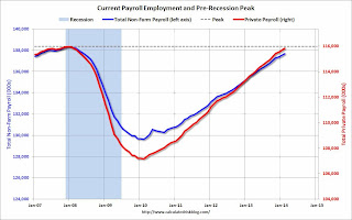
Payroll employment is getting very close to the pre-recession peak.
Of course this doesn't include population growth and new entrants into the workforce (the workforce has continued to grow), but reaching new highs in employment will be a significant milestone in the recovery.
The graph below shows both total non-farm payroll (blue, left axis) and private payroll (red, right axis) since January 2007. Both total non-farm and private payroll employment peaked in January 2008.
The dashed line is the pre-recession peak.
 Click on graph for larger image.
The pre-recession peak for total non-farm payroll employment was 138.365 million. Currently there are 137.699 million total non-farm payroll jobs, or 666 thousand fewer than the pre-recession peak.
At the recent annual pace (about 2.2 million jobs added per year), total non-farm payroll will be at a new high in June 2014.
The pre-recession peak for private payroll employment was 115.977 million. Currently there are 115.848 million total non-farm payroll jobs, or 129 thousand fewer than the pre-recession peak. It seems likely private sector employment that will be at a new high in March.
Trade Deficit increased in January to $39.1 Billion
by Calculated Risk on 3/07/2014 12:20:00 PM
The Department of Commerce reported this morning:
[T]otal January exports of $192.5 billion and imports of $231.6 billion resulted in a goods and services deficit of $39.1 billion, up from $39.0 billion in December, revised. January exports were $1.2 billion more than December exports of $191.3 billion. January imports were $1.3 billion more than December imports of $230.3 billion.The trade deficit was close to the consensus forecast of $39.0 billion.
The first graph shows the monthly U.S. exports and imports in dollars through January 2014.
 Click on graph for larger image.
Imports and exports increased in January.
Exports are 15% above the pre-recession peak and up 3% compared to January 2013; imports are at the pre-recession peak, and up about 1% compared to January 2013.
The second graph shows the U.S. trade deficit, with and without petroleum, through January.
 The blue line is the total deficit, and the black line is the petroleum deficit, and the red line is the trade deficit ex-petroleum products.
Oil averaged $90.21 in January, down from $91.34 in December, and down from $94.08 in January 2013. The petroleum deficit has generally been declining and is the major reason the overall deficit has declined since early 2012.
The trade deficit with China was mostly unchanged at $27.84 billion in January, from $27.79 billion in January 2013. A majority of the trade deficit is related to China.
Overall it appears trade is picking up a little.
Comments on Employment Report
by Calculated Risk on 3/07/2014 09:50:00 AM
First, a milestone for next month: Private payroll employment increased 162 thousand in February and private employment is now just 129 thousand below the previous peak (total employment is still 666 thousand below the peak in January 2008). It seems very likely that private employment will be at a new high in March.
Total non-farm employment will probably be at a new high this summer (all the government layoff have held back total employment).
This was a better employment report than the previous two months with 175,000 jobs added in February (and 25,000 in upward revisions to prior months). Hopefully job growth will be averaging over 200,000 jobs per month again soon (I expect stronger employment growth in 2014 than in 2013 even with the poor start to this year).
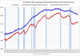
Employment-Population Ratio, 25 to 54 years old
 Since the participation rate declined recently due to cyclical (recession) and demographic (aging population) reasons, an important graph is the employment-population ratio for the key working age group: 25 to 54 years old.
In the earlier period the employment-population ratio for this group was trending up as women joined the labor force. The ratio has been mostly moving sideways since the early '90s, with ups and downs related to the business cycle.
The 25 to 54 participation rate increased in February to 81.2% from 81.1%, and the 25 to 54 employment population ratio was unchanged at 76.5%. As the recovery continues, I expect the participation rate for this group to increase.
Percent Job Losses During Recessions

This graph shows the job losses from the start of the employment recession, in percentage terms - this time aligned at maximum job losses. At the recent pace of improvement, it appears employment will be back to pre-recession levels mid-year (Of course this doesn't include population growth).
In the earlier post, the graph showed the job losses aligned at the start of the employment recession.
Part Time for Economic Reasons
 From the BLS report:
The number of persons employed part time for economic reasons (sometimes referred to as involuntary part-time workers) was little changed at 7.2 million in February. These individuals were working part time because their hours had been cut back or because they were unable to find full-time work.This is the lowest level for part time workers since October 2008.
These workers are included in the alternate measure of labor underutilization (U-6) that declined to 12.6% in February. This is the lowest level for U-6 since November 2008.
Unemployed over 26 Weeks
 This graph shows the number of workers unemployed for 27 weeks or more.
 According to the BLS, there are 3.849 million workers who have been unemployed for more than 26 weeks and still want a job. This was up from 3.646 in January. This is trending down, but is still very high. Long term unemployment remains one of the key labor problems in the US.
State and Local Government
 This graph shows total state and government payroll employment since January 2007. State and local governments lost jobs for four straight years. (Note: Scale doesn't start at zero to better show the change.)
 In February 2014, state and local governments added 19,000 jobs.
It appears state and local employment employment has bottomed. Of course Federal government layoffs are ongoing.
All things considered, this was a decent report. Hopefully the severe weather is behind us, and the pace of employment growth will pick up.
February Employment Report: 175,000 Jobs, 6.7% Unemployment Rate
by Calculated Risk on 3/07/2014 08:30:00 AM
From the BLS:
Total nonfarm payroll employment increased by 175,000 in February, and the unemployment rate was little changed at 6.7 percent, the U.S. Bureau of Labor Statistics reported today. ...
The change in total nonfarm payroll employment for December was revised from +75,000 to +84,000, and the change for January was revised from +113,000 to +129,000. With these revisions, employment gains in December and January were 25,000 higher than previously reported.
...
 Click on graph for larger image.
The headline number was above expectations of 150,000 payroll jobs added.
The first graph shows the job losses from the start of the employment recession, in percentage terms, compared to previous post WWII recessions. The dotted line is ex-Census hiring.
This shows the depth of the recent employment recession - worse than any other post-war recession - and the relatively slow recovery due to the lingering effects of the housing bust and financial crisis.

Employment is 0.5% below the pre-recession peak (666 thousand fewer total jobs).
NOTE: The second graph is the change in payroll jobs ex-Census - meaning the impact of the decennial Census temporary hires and layoffs is removed to show the underlying payroll changes.
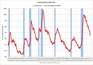
The third graph shows the unemployment rate.
The unemployment rate increased in February to 6.7% from 6.6% in January.

The fourth graph shows the employment population ratio and the participation rate.
The Labor Force Participation Rate was unchanged in February at 63.0%. This is the percentage of the working age population in the labor force.
 The participation rate is well below the 66% to 67% rate that was normal over the last 20 years, although a significant portion of the recent decline is due to demographics.
The Employment-Population ratio was unchanged in February at 58.8% (black line).
I'll post the 25 to 54 age group employment-population ratio graph later.
This was a decent employment report considering the recent harsh weather. I'll have much more later ...
Thursday, March 06, 2014
Friday: Employment Report, Trade Deficit
by Calculated Risk on 3/06/2014 08:09:00 PM
From Nelson Schwartz at the NY Times Economix: On February Jobs Data, It’s Anybody’s Guess. Here is my guess: Employment Preview for February: Another Weak Report
Another great piece from Tim Duy at Economist's View: Fed Watch: Tapering is Sooo 2013
Bottom Line: Barring the outlier outcomes of either recession or explosive growth, tapering is on autopilot. Rate guidance is now qualitative and actual policy is discretionary. Incoming data is interesting for what it says about the timing of the first rate hike. So far, though, it is not telling us much given the Fed's belief that weak data is largely weather related. The degree to which asset bubbles are a concern varies greatly accross Fed officials but the general consensus is that such concerns are of second or third order magnitude compared to missing on both sides of the dual mandate.Friday:
• At 8:30 AM ET, the Employment Report for February. The consensus is for an increase of 150,000 non-farm payroll jobs in February, up from the 113,000 non-farm payroll jobs added in January. The consensus is for the unemployment rate to be unchanged at 6.6% in February.
• At 8:30 AM, the Trade Balance report for January from the Census Bureau. The consensus is for the U.S. trade deficit to increase to $39.0 billion in January from $38.7 billion in December.
• At 3:00 PM, Consumer Credit for January from the Federal Reserve. The consensus is for credit to increase $14.5 billion in January.
Trulia: Asking House Prices up 10.4% year-over-year in February, Price increases "Slowdown"
by Calculated Risk on 3/06/2014 02:53:00 PM
From Trulia chief economist Jed Kolko: What The Home-Price Slowdown Really Looks Like
Nationally, asking home prices rose 10.4% year-over-year in February 2014, down slightly after peaking in November 2013. But the year-over-year change is an average of the past twelve months and therefore obscures the most recent trends in prices. Looking at quarter-over-quarter changes instead, it’s clear that price gains have been slowing for most of the last year: asking home prices rose just 1.9% in February – a rate similar to those recorded in January and December – compared with increases near 2.5% from July 2013 to November 2013 and over 3% from April 2013 to June 2013. The quarter-over-quarter change in asking prices topped out at 3.5% in April 2013 and now, at 1.9%, the increase is just over half of that peak.It appears the year-over-year asking price gains are slowing, but asking prices are still increasing.
...
The 10 U.S. metros with the biggest year-over-year price increases in February 2014 all experienced a severe housing bust after the bubble popped (by “severe,” we mean a price drop from peak to trough of at least 30%, according to the Federal Housing Finance Agency index). Why? After prices fell in these markets, homes looked like bargains to investors and other buyers. At the same time, price drops also spurred foreclosures, which forced many families to become renters. Price drops and stronger rental demand together create the ideal conditions for investors to buy and rent out single-family homes, which helped boost home prices.
In February, rents rose 3.4% year-over-year nationally. In 20 the 25 largest rental markets, February’s increase was larger than the year-over-year rent increase from three months earlier, in November. emphasis added
In November 2013, year-over-year asking prices were up 12.2%. In December, the year-over-year increase in asking home prices slowed slightly to 11.9%. In January, the year-over-year increase was 11.4%, and now, in February, the increase was 10.4%.
As Kolko notes, the slowdown has started - but prices are still increasing.
Note: These asking prices are SA (Seasonally Adjusted) - and adjusted for the mix of homes - and this suggests further house price increases, but at a slower rate, over the next few months on a seasonally adjusted basis.
Fed's Q4 Flow of Funds: Household Net Worth at Record High
by Calculated Risk on 3/06/2014 12:00:00 PM
The Federal Reserve released the Q4 2013 Flow of Funds report today: Flow of Funds.
According to the Fed, household net worth increased in Q4 compared to Q3, and is at a new record high. Net worth peaked at $68.8 trillion in Q2 2007, and then net worth fell to $55.6 trillion in Q1 2009 (a loss of $13.2 trillion). Household net worth was at $80.7 trillion in Q4 2013 (up $25.1 trillion from the trough in Q1 2009).
The Fed estimated that the value of household real estate increased to $19.4 trillion in Q4 2013. The value of household real estate is still $3.2 trillion below the peak in early 2006.
 Click on graph for larger image.
This is the Households and Nonprofit net worth as a percent of GDP. Although household net worth is at a record high, as a percent of GDP it is still below the peak in 2006 (housing bubble), but above the stock bubble peak.
This includes real estate and financial assets (stocks, bonds, pension reserves, deposits, etc) net of liabilities (mostly mortgages). Note that this does NOT include public debt obligations.
This ratio was increasing gradually since the mid-70s, and then we saw the stock market and housing bubbles. The ratio has been trending up and increased again in Q4 with both stock and real estate prices increasing.
 This graph shows homeowner percent equity since 1952.
Household percent equity (as measured by the Fed) collapsed when house prices fell sharply in 2007 and 2008.
In Q4 2013, household percent equity (of household real estate) was at 51.7% - up from Q3, and the highest since Q2 2007. This was because of both an increase in house prices in Q4 (the Fed uses CoreLogic) and a reduction in mortgage debt.
Note: about 30.3% of owner occupied households had no mortgage debt as of April 2010. So the approximately 52+ million households with mortgages have far less than 50.7% equity - and millions have negative equity.
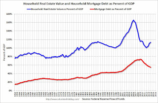
 The third graph shows household real estate assets and mortgage debt as a percent of GDP.
Mortgage debt decreased by $11 billion in Q4, after increasing slightly in Q3.
Mortgage debt has now declined by $1.32 trillion from the peak. Studies suggest most of the decline in debt has been because of foreclosures (or short sales), but some of the decline is from homeowners paying down debt (sometimes so they can refinance at better rates).
The value of real estate, as a percent of GDP, was up in Q4 (as house prices increased), but still close to the average of the last 30 years (excluding bubble). However household mortgage debt, as a percent of GDP, is still historically high, suggesting a little more deleveraging ahead for certain households.
CoreLogic: 4 Million Residential Properties Returned to Positive Equity in 2013
by Calculated Risk on 3/06/2014 09:51:00 AM
From CoreLogic: CoreLogic reports 4 Million Residential Properties Returned to Positive Equity in 2013
CoreLogic ... today released new analysis showing 4 million homes returned to positive equity in 2013, bringing the total number of mortgaged residential properties with equity to 42.7 million. The CoreLogic analysis indicates that nearly 6.5 million homes, or 13.3 percent of all residential properties with a mortgage, were still in negative equity at the end of 2013. Due to a small slowdown in the quarterly growth rate of the Home Price Index, the negative equity share was virtually unchanged from the end of the third quarter of 2013.
... Of the 42.7 million residential properties with positive equity, 10 million have less than 20-percent equity. Borrowers with less than 20-percent equity, referred to as “under-equitied,” may have a more difficult time obtaining new financing for their homes due to underwriting constraints. Under-equitied mortgages accounted for 21.1 percent of all residential properties with a mortgage nationwide in 2013, with more than 1.6 million residential properties at less than 5-percent equity, referred to as near-negative equity. Properties that are near-negative equity are considered at risk if home prices fall. ...
“The plight of the underwater borrower has improved dramatically since negative equity peaked in December 2009 when more than 12 million mortgaged homeowners were underwater,” said Mark Fleming, chief economist for CoreLogic. “Over the past four years, more than 5.5 million homeowners have regained equity, reducing their risk of foreclosure and unlocking pent-up supply in the housing market.”
emphasis added
 Click on graph for larger image.
This graph shows the break down of negative equity by state. Note: Data not available for some states. From CoreLogic:
"Nevada had the highest percentage of mortgaged properties in negative equity at 30.4 percent, followed by Florida (28.1 percent), Arizona (21.5 percent), Ohio (19.0 percent) and Illinois (18.7 percent). These top five states combined account for 36.9 percent of negative equity in the United States."
Note: The share of negative equity is still very high in Nevada and Florida, but down significantly from a year ago (Q4 2012) when the negative equity share in Nevada was at 52.4 percent, and at 40.2 percent in Florida.
 The second graph shows the distribution of home equity in Q4 compared to Q3. Close to 5% of residential properties have 25% or more negative equity, down slightly from Q3, and down from around 6% in Q2 and 8% in Q1.
In Q4 2012, there were 10.4 million properties with negative equity - now there are 6.5 million. A significant change.
Weekly Initial Unemployment Claims decline to 323,000
by Calculated Risk on 3/06/2014 08:35:00 AM
The DOL reports:
In the week ending March 1, the advance figure for seasonally adjusted initial claims was 323,000, a decrease of 26,000 from the previous week's revised figure of 349,000. The 4-week moving average was 336,500, a decrease of 2,000 from the previous week's revised average of 338,500.The previous week was revised up from 348,000.
The following graph shows the 4-week moving average of weekly claims since January 2000.
 Click on graph for larger image.
The dashed line on the graph is the current 4-week average. The four-week average of weekly unemployment claims declined to 336,500.
This was below the consensus forecast of 338,000. The 4-week average is mostly moving sideways ...
Wednesday, March 05, 2014
Thursday: Unemployment Claims, Q4 Flow of Funds
by Calculated Risk on 3/05/2014 08:04:00 PM
From Tim Duy Fed Watch: A Lackluster Start to the New Year
Incoming data has tended to disappoint. While weather impacts are taking part of the blame, I tend to think that part of the blame should fall on overly optimistic interpretations of data patterns at the end of 2013. ...CR Note: I think Duy is correct that tapering will continue "unless activity lurches sharply downward", but I remain fairly optimistic about 2014. We will see ...
Bottom Line: Data disappointment in part is driven by excessive optimism. In any event, data are not sufficiently disappointing to derail the Fed's tapering plans. Unless activity lurches sharply downward, I think the tapering process is pretty much on autopilot. It is now all about interest rates.
Thursday:
• Early, Trulia Price Rent Monitors for February. This is the index from Trulia that uses asking house prices adjusted both for the mix of homes listed for sale and for seasonal factors.
• At 8:30 AM ET, the initial weekly unemployment claims report will be released. The consensus is for claims to decrease to 338 thousand from 348 thousand.
• At 10:00 AM, the Manufacturers' Shipments, Inventories and Orders (Factory Orders) for January. The consensus is for a 0.5% decrease in January orders.
• At 12:00 PM, the Q4 Flow of Funds Accounts of the United States from the Federal Reserve.


