by Calculated Risk on 8/25/2013 09:11:00 PM
Sunday, August 25, 2013
Monday: Durable Goods, Mortgage Delinquencies, Dallas Fed Mfg Survey
Monday:
• 8:30 AM ET, Durable Goods Orders for July from the Census Bureau. The consensus is for a 4.0% decline in durable goods orders. The expected decline is from the volatile aircraft orders (and other transportation), and the consensus is for a 0.3% gain ex-transportation.
• At 10:30 AM, Dallas Fed Manufacturing Survey for August. The consensus is a reading of 4.5, up from 4.4 in July (above zero is expansion).
• During the Day: The LPS First Look at July's mortgage performance data.
Weekend:
• Schedule for Week of August 25th
• The Future is still Bright!
The Nikkei is up about 0.2%.
From CNBC: Pre-Market Data and Bloomberg futures: the S&P and DOW futures are flat (fair value).
Oil prices have increased with WTI futures at $107.04 per barrel and Brent at $111.30 per barrel. The spread between WTI and Brent is back (but still small).
Below is a graph from Gasbuddy.com for nationwide gasoline prices. Nationally prices are mostly moving sideways. If you click on "show crude oil prices", the graph displays oil prices for WTI, not Brent; gasoline prices in most of the U.S. are impacted more by Brent prices.
| Orange County Historical Gas Price Charts Provided by GasBuddy.com |
The Future is still Bright!
by Calculated Risk on 8/25/2013 04:46:00 PM
For new readers: I was very bearish on the economy when I started this blog in 2005 - back then I wrote mostly about housing (see: LA Times article and more here for comments about the blog). I started looking for the sun in early 2009, and now I'm even more optimistic looking out over the next few years.
Early this year I wrote The Future's so Bright .... In that post I outlined why I was becoming more optimistic, even though there might be too much deficit reduction in 2013. As I noted, "ex-austerity, we'd probably be looking at a decent year" in 2013. And of course - looking forward - Congress remains the key downside risk to the U.S. economy.
It still appears economic growth will pickup over the next few years. With a combination of growth in the key housing sector, a significant amount of household deleveraging behind us, the end of the drag from state and local government layoffs (four years of austerity mostly over), some loosening of household credit, and the Fed staying accommodative (even if the Fed starts to taper, the Fed will remain accommodative).
Here are some updates to the graphs I posted in January:
 Click on graph for larger image.
This graph shows total and single family housing starts. Even after the 28.1% in 2012, the 780 thousand housing starts in 2012 were the fourth lowest on an annual basis since the Census Bureau started tracking starts in 1959. Starts averaged 1.5 million per year from 1959 through 2000. Demographics and household formation suggests starts will return to close to that level over the next few years. That means starts will come close to doubling from the 2012 level.
Residential investment and housing starts are usually the best leading indicator for economy, so this suggests the economy will continue to grow over the next couple of years.
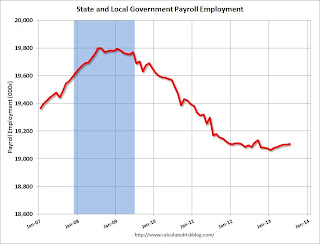
 The second graph shows total state and government payroll employment since January 2007. State and local governments lost 129,000 jobs in 2009, 262,000 in 2010, and 230,000 in 2011.
In 2012, state and local government employment declined by 26,000 jobs.
In 2013, state and local employment is up 31 thousand so far. So it appears that most of the state and local government layoffs are over and the drag on the economy is over.
 And here is a key graph on the US deficit. This graph, based on the CBO's May projections, shows the actual (purple) budget deficit each year as a percent of GDP, and an estimate for the next ten years based on estimates from the CBO.
As we've been discussing, the US deficit as a percent of GDP has been declining, and will probably decline to under 3% in 2015 before starting to increase again. Of course many people (and many politicians) have been surprised by the rapid decline in the deficit (it was obvious to those of us paying attention).
Note: With 7.4% unemployment, there is a strong argument for less deficit reduction in the short term, but that view doesn't seem to be gaining any traction.

This graph from the the NY Fed shows aggregate consumer debt decreased further in Q2 2013. This was mostly due to a decline in mortgage debt.
From the NY Fed: "In Q2 2013 total household indebtedness fell to $11.15 trillion; 0.7 percent lower than the previous quarter and 12 percent below the peak of $12.68 trillion in Q3 2008. Mortgages, the largest component of household debt, fell $91 billion from the first quarter."
There will probably more deleveraging ahead (mostly from foreclosures and distressed sales), but this suggests some improvement in household balance sheets.
 This graph is from the Fed's Household Debt Service and Financial Obligations Ratios. These ratios show the percent of disposable personal income (DPI) dedicated to debt service (DSR) and financial obligations (FOR) for households.
The graph shows the DSR for both renters and homeowners (red), and the homeowner financial obligations ratio for mortgages and consumer debt. The overall Debt Service Ratio increased slightly in Q1, and is just above the record low set in Q4 2012 thanks to very low interest rates. The homeowner's financial obligation ratio for consumer debt also increased slightly in Q1, and is back to levels last seen in early 1995.
The blue line is the homeowner's financial obligation ratio for mortgages (blue). This ratio increased rapidly during the housing bubble, and continued to increase until 2008. With falling interest rates, and less mortgage debt (mostly due to foreclosures), the mortgage ratio has declined to 1998 (and 1981) levels.
Overall it appears the economy is poised for more growth over the next few years.
And in the longer term, I remain very optimistic too. I mentioned a few long term risks in my January post, but I also mentioned that I wasn't as concerned as many others about the aging of the population. By 2020, eight of the top ten largest cohorts (five year age groups) will be under 40, and by 2030 the top 11 cohorts are the youngest 11 cohorts. The renewing of America was one of the key points I made when I posted the following animation of the U.S population by age, from 1900 through 2060. The population data and estimates are from the Census Bureau (actual through 2010 and projections through 2060).
Last year, I said that looking forward I was the most optimistic since the '90s. And things are only getting better. The future's so bright, I gotta wear shades.
Yes, the song was about nuclear holocaust ... but it was originally intended the way I'm using it.
New Home Prices
by Calculated Risk on 8/25/2013 11:29:00 AM
Here are two graphs I haven't updated for about a year.
As part of the new home sales report, the Census Bureau reported the number of homes sold by price and the average and median prices.
From the Census Bureau: "The median sales price of new houses sold in July 2013 was $257,200; the average sales price was $322,700."
The following graph shows the median and average new home prices.
 Click on graph for larger image.
During the bust, the builders had to build smaller and less expensive homes to compete with all the distressed sales. With fewer foreclosures now, it appears the builders are moving to slightly higher price points.
The second graph shows the percent of new home sales by price. At the peak of the housing bubble, almost 40% of new homes were sold for more than $300K - and over 20% were sold for over $400K.
 The percent of home over $300K declined to 20% in January 2009. Now it has rebounded to around 38%. And less than 12% were under $150K.
Earlier on New Home Sales:
• New Home Sales decline sharply to 394,000 Annual Rate in July
• Comments on New Home Sales
Saturday, August 24, 2013
Schedule for Week of August 25th
by Calculated Risk on 8/24/2013 01:11:00 PM
The key reports this week are Case-Shiller house prices for June on Tuesday, the second estimate of Q2 GDP on Thursday, and the July Personal Income and Outlays report on Friday.
For manufacturing, the Dallas and Richmond regional manufacturing surveys for August will be released this week.
8:30 AM: Durable Goods Orders for July from the Census Bureau. The consensus is for a 4.0% declined in durable goods orders.
10:30 AM: Dallas Fed Manufacturing Survey for August. The consensus is a reading of 4.5, up from 4.4 in July (above zero is expansion).
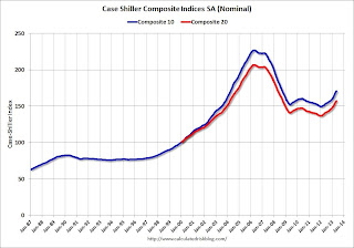
 9:00 AM: S&P/Case-Shiller House Price Index for June. Although this is the June report, it is really a 3 month average of April, May, and June.
 This graph shows the nominal seasonally adjusted Composite 10 and Composite 20 indexes through May 2012 (the Composite 20 was started in January 2000).
The consensus is for a 12.2% year-over-year increase in the Composite 20 index (NSA) for June. The Zillow forecast is for the Composite 20 to increase 12.1% year-over-year, and for prices to increase 1.1% month-to-month seasonally adjusted.
10:00 AM: Conference Board's consumer confidence index for August. The consensus is for the index to decrease to 78.0 from 80.3.
10:00 AM: Richmond Fed Survey of Manufacturing Activity for August. The consensus is for a reading of 0 for this survey, up from minus 11 in July (Above zero is expansion).
7:00 AM: The Mortgage Bankers Association (MBA) will release the results for the mortgage purchase applications index.
10:00 AM ET: Pending Home Sales Index for July. The consensus is for a 1.0% decrease in the index.
8:30 AM: The initial weekly unemployment claims report will be released. The consensus is for claims to decrease to 330 thousand from 336 thousand last week.
8:30 AM: Q2 GDP (second estimate). This is the second estimate of Q2 GDP from the BEA. The consensus is that real GDP increased 2.2% annualized in Q2, revised up from the advance estimate of 1.7% in Q2.
8:30 AM ET: Personal Income and Outlays for July. The consensus is for a 0.2% increase in personal income in June, and for a 0.3% increase in personal spending. And for the Core PCE price index to increase 0.2%.
9:45 AM: Chicago Purchasing Managers Index for August. The consensus is for an increase to 53.0, up from 52.3 in July.
9:55 AM: Reuter's/University of Michigan's Consumer sentiment index (final for July). The consensus is for a reading of 80.0.
Unofficial Problem Bank list declines to 714 Institutions
by Calculated Risk on 8/24/2013 08:40:00 AM
This is an unofficial list of Problem Banks compiled only from public sources.
Here is the unofficial problem bank list for August 23, 2013.
Changes and comments from surferdude808:
This week all we got was two bank closures from the FDIC as they did not release second quarter industry results or its enforcement actions through July. The closings and one other removal lower the count of the Unofficial Problem Bank List to 714 institutions with assets of $253.1 billion. A year ago, the list held 898 institutions with assets of $346.7 billion.CR Note: The first unofficial problem bank list was published in August 2009 with 389 institutions. The list peaked at 1,002 institutions on June 10, 2011, and is now down to 714.
The OCC terminated the action against Paragon National Bank, Memphis, TN ($260 million Ticker: PGNN). After being issued a Prompt Corrective Action order effective June 11, 2013, Community South Bank, Parsons, TN ($387 million) failed today.
The other closing was a bank controlled by Capitol Bancorp Ltd. (Ticker: CBCRQ), Sunrise Bank of Arizona, Phoenix, AZ ($202 million). This is the sixth bank controlled by Capitol Bancorp to fail. After controlling more than 50 banks at its peak, Capitol is down to an interest in seven banks. The failures have cost the FDIC insurance fund an estimated $48 million. On August 16, the FDIC in a bankruptcy court filing countered the company's allegations that it improperly denied issuing cross-guaranty waivers that could have prevented their sale to avoid failure. According to an SNL Securities report (FDIC continues to consider Capitol Bancorp cross-guaranty waivers as complexity mounts ), the FDIC argued that the company's desire to depose FDIC officials and obtain documents on four closures was "inappropriate" or "would accomplish nothing." With this closing and the mounting costs to the insurance fund, it probably becomes more difficult for the company to negotiate the sale of its remaining units before their failure or seizure under cross-guaranty.
Next week, we anticipate the FDIC will release its enforcement actions through July and the aggregate Official Problem Bank figures as of June.
Friday, August 23, 2013
Bank Failure #20: Sunrise Bank of Arizona, Phoenix, Arizona
by Calculated Risk on 8/23/2013 07:32:00 PM
As of June 30, 2013, Sunrise Bank of Arizona had approximately $202.2 million in total assets and $196.9 million in total deposits. ... The FDIC estimates that the cost to the Deposit Insurance Fund (DIF) will be $17.0 million. ... Sunrise Bank of Arizona is the 20th FDIC-insured institution to fail in the nation this year, and the third in Arizona.Sunset in the desert ... and two in one day ... a few years ago that would have been a slow Friday.
Bank Failure #19 in 2013: Community South Bank, Parsons, Tennessee
by Calculated Risk on 8/23/2013 06:38:00 PM
From the FDIC: CB&S Bank, Inc. Russellville, Alabama, Assumes All of the Deposits of Community South Bank, Parsons, Tennessee
As of June 30, 2013, Community South Bank had approximately $386.9 million in total assets and $377.7 million in total deposits. ... The FDIC estimates that the cost to the Deposit Insurance Fund (DIF) will be $72.5 million. ... Community South Bank is the 19th FDIC-insured institution to fail in the nation this year, and the second in Tennessee.The number of bank failures has really slowed down. It looks like there will be around 25 to 30 failures this year; the lowest since 2008 when there were 25 failures.
DOT: Vehicle Miles Driven decreased 0.4% in June
by Calculated Risk on 8/23/2013 04:46:00 PM
The Department of Transportation (DOT) reported:
Travel on all roads and streets changed by -0.4% (-0.9 billion vehicle miles) for June 2013 as compared with June 2012. Travel for the month is estimated to be 258.1 billion vehicle miles.
The following graph shows the rolling 12 month total vehicle miles driven.
The rolling 12 month total is still mostly moving sideways.
 Click on graph for larger image.
In the early '80s, miles driven (rolling 12 months) stayed below the previous peak for 39 months.
Currently miles driven has been below the previous peak for 67 months - over 5 1/2 years - and still counting.
The second graph shows the year-over-year change from the same month in the previous year.
 Gasoline prices were up in June compared to June 2012. In June 2013, gasoline averaged of $3.69 per gallon according to the EIA. In 2012, prices in June averaged $3.60 per gallon. Gasoline prices were up even more year-over-year in July, so I expect miles driven to be down more year-over-year in July. However prices were down year-over-year in August, so miles might be up.
As we've discussed, gasoline prices are just part of the story. The lack of growth in miles driven over the last 5+ years is probably also due to the lingering effects of the great recession (high unemployment rate and lack of wage growth), the aging of the overall population (over 55 drivers drive fewer miles) and changing driving habits of young drivers.
With all these factors, it might take several more years before we see a new peak in miles driven.
5% 30 Year Mortgage Rates?
by Calculated Risk on 8/23/2013 02:50:00 PM
It seems like yesterday that I wrote 4% 30 Year Mortgage Rates? (it was a few months ago in May).
Now there is some discussion of 5% 30 year mortgage rates. Here is what mortgage banker Lou Barnes wrote today:
Release of the Fed’s July 31 meeting minutes on Wednesday collapsed the last courage in the bond market, 10-year T-notes to 2.90% and low-down, low-fee mortgages to 5.00%. The minutes were incomprehensible, but their failure to pull back from taper of QE3 means that it is still a “go.”Barnes is talking about "low-down, low-fee" 30 year mortgages hitting 5%, but his comment made me wonder at what 10 year Treasury yield, mortgage rates in the Freddie Mac survey would probably rise to 5%?
This morning Treasury short-sellers so pleased with themselves got clobbered by word that new home sales had fainted 13.4% in July, and June was revised down by 8%. The 10-year briefly to 2.81%. New home sales are measured by new contracts written, thus these June-July results are the first since mortgage rates jumped 1% from May to June. Correlation is not cause ... some of the weakness is due to a shortage of inventory in turn caused by a shortage of credit to developers and builders.
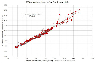
Here is an update to a graph that shows the relationship between the monthly 10 year Treasury Yield and 30 year mortgage rates from the Freddie Mac survey.
 Click on graph for larger image.
Currently the 10 year Treasury yield is 2.82% and 30 year mortgage rates are at 4.58% (according to Freddie Mac). Based on the relationship from the graph, the 30 year mortgage rate (Freddie Mac survey) would be around 5% when 10-year Treasury yields are around 3.33%.
Note: The yellow marker is the current (last week) relationship.
1 Long term readers will remember the quote about "neutron loans" from mortgage banker Lou Barnes in 2007:
“All of the old-timers knew that subprime mortgages were what we called neutron loans — they killed the people and left the houses,” said Louis S. Barnes, 58, a partner at Boulder West, a mortgage banking firm in Lafayette, Colo.
Comments on New Home Sales
by Calculated Risk on 8/23/2013 11:20:00 AM
Three key comments:
1. This is just one month of data (I note this whenever we see a weak or strong sales report). There is plenty of month-to-month noise for new home sales and frequent large revisions.
2. The downward revisions to previous months were expected (In the weekly schedule I wrote: "Based on the homebuilder reports, there will probably be some downward revisions to sales for previous months."). But these revisions do suggest the housing recovery was not as strong as previously thought.
3. Important: Any impact from rising mortgage rates would show up in the New Home sales report before the existing home sales report. New home sales are counted when contracts are signed, and existing home sales when the transactions are closed - so the timing is different. For existing home sales, I think there was a push to close before the mortgage interest rate lock expired - so closed existing home sales in July were strong - and I expect a decline in existing home sales in August.
For New Home sales, I expect some buyers were shocked by the increase in rates - and they held off signing a contract in July. But this doesn't mean the housing recovery is over - far from it. In fact I think the housing recovery (starts / new home sales) has just begun.
Earlier: New Home Sales decline sharply to 394,000 Annual Rate in July
Looking at the first seven months of 2013, there has been a significant increase in sales this year. The Census Bureau reported that there were 271 new homes sold in the first half of 2013, up 21.5% from the 223 thousand sold during the same period in 2012. This was the highest sales for the first seven months of the year since 2008.
And even though there has been a large increase in the sales rate, sales are just above the lows for previous recessions. This suggests significant upside over the next few years. Based on estimates of household formation and demographics, I expect sales to increase to 750 to 800 thousand over the next several years - substantially higher than the current sales rate.
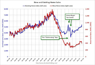
And here is another update to the "distressing gap" graph that I first started posting over four years ago to show the emerging gap caused by distressed sales. Now I'm looking for the gap to close over the next few years.
 Click on graph for larger image.
The "distressing gap" graph shows existing home sales (left axis) and new home sales (right axis) through June 2013. This graph starts in 1994, but the relationship has been fairly steady back to the '60s.
Following the housing bubble and bust, the "distressing gap" appeared mostly because of distressed sales. The flood of distressed sales kept existing home sales elevated, and depressed new home sales since builders weren't able to compete with the low prices of all the foreclosed properties.
I don't expect much of an increase in existing home sales (distressed sales will slowly decline and be offset by more conventional sales). But I do expect this gap to continue to close - mostly from an increase in new home sales.
Note: Existing home sales are counted when transactions are closed, and new home sales are counted when contracts are signed. So the timing of sales is different.


