by Calculated Risk on 2/07/2011 09:27:00 PM
Monday, February 07, 2011
Housing: Increase in Cash Buyers
From Mitra Kalita at the WSJ: Cash Buyers Lift Housing
Cash buyers represented more than half of all transactions in the Miami-Fort Lauderdale area last year ... In the fourth quarter of 2006, they represented just 13% of deals.This is a quite an increase in cash buyers. Most of the cash transactions are at the low end - and are frequently investors - although the article mentioned one buyer paying cash for $1+ million properties.
...
The percentage of buyers in Phoenix paying cash hit 42% in 2010—more than triple the rate in 2008 ... Nationally, 28% of sales were all-cash transactions last year, according to the National Association of Realtors. The rate was 14% in October 2008 ...
The good news is these buyers won't ever have negative equity!
Note: The MBA mortgage index is suggesting weak home sales over the next couple of months, but obviously that index doesn't capture this increase in cash buyers.
Daily Color: Years to Absorb Excess Housing Units
by Calculated Risk on 2/07/2011 06:10:00 PM
This morning I posted some data and analysis from economist Tom Lawler based on the 2010 Census: Lawler: Housing Vacancy Survey appears to massively overstate number of vacant housing units.
Lawler's key point was that when compared to the Census 2010 data, the Housing Vacancy Survey (that most analysts use) "massively overstates" the number of vacant housing units in these four states (and probably nationally).
Note: The Census bureau has released data for only four states so far, and will release data for all 50 states by April 1st.
Here is another question: At the current rate of population growth, how long will it take to lower the vacancy rate back to the Census 2000 level?
| Louisiana | Mississippi | New Jersey | Virginia | |
|---|---|---|---|---|
| Percent Excess Housing Units compared to Census 2000 | 1.7% | 2.6% | 2.1% | 2.1% |
| Excess Housing Units | 33,405 | 33,143 | 74,625 | 70,664 |
| Population Needed to Absorb at current people per household ratio | 87,618 | 88,140 | 204,113 | 185,004 |
| Years to absorb at current rate of population growth | 13.6 | 7.2 | 5.4 | 2.0 |
The above table provides the calculation. Note: This assumes that the people per household in each state will remain the same.
Of course Louisiana, and to some extent Mississippi, are special cases because of hurricane Katrina. The population in both states increased slowly over the last decade - and at that rate of population growth it will take many years to absorb the excess vacant units.
In New Jersey it will take 5.4 years to absorb the excess, and in Virginia (a fast growing state over the last decade) it will still take 2.0 years.
Of course the number of people per household could decline or the population could grow quicker over the next few years - but this suggests there is still a large excess inventory of vacant housing units in these states. This is one of the calculations I'll be looking at as the Census 2010 data is released.
Consumer Credit increases in December
by Calculated Risk on 2/07/2011 03:00:00 PM
The Federal Reserve reports:
Consumer credit increased at an annual rate of 2-1/2 percent in the fourth quarter. Revolving credit declined at an annual rate of 2-3/4 percent,
and nonrevolving credit increased at an annual rate of 5-1/2 percent. In December, consumer credit increased 3 percent at an annual rate.
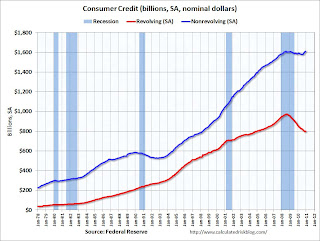 Click on graph for larger image in graph gallery.
This graph shows consumer credit since 1978. The amounts are nominal (not inflation adjusted).
Revolving credit (credit card debt) is off 17.8% from the peak. Non-revolving debt (auto, furniture, and other loans) is now slightly above the old peak. Note: Consumer credit does not include real estate debt.
Both revolving and non-revolving credit were up slightly in December. This was the first increase in revolving credit since August 2008 following 27 consecutive months of declines. This fits with the recent Senior Loan Officer survey that showed:
Banks again reported an increased willingness to make consumer installment loans, and a small net fraction of respondents reported easing standards for approving consumer credit card applications.
LPS: Overall mortgage delinquencies declined in 2010
by Calculated Risk on 2/07/2011 11:48:00 AM
LPS Applied Analytics released their December Mortgage Performance data. According to LPS:
• The average loan in foreclosure has been delinquent a record 507 days. This is up from 406 days at the end of 2009, and up from 499 days at the end of November.
• Overall, mortgage delinquencies dropped nearly 18% in 2010.
• On the other hand, foreclosure inventories were up almost 10% in 2010, and are now at nearly 8x historical averages
• “First-time” foreclosures are on the decline, with over 30% of new foreclosure starts having been in foreclosure before
 Click on graph for larger image in graph gallery.
This graph provided by LPS Applied Analytics shows the percent delinquent, percent in foreclosure, and total non-current mortgages.
The percent in the foreclosure process is trending up because of the foreclosure moratoriums.
According to LPS, 8.83% of mortgages are delinquent (down from 9.02% in November), and another 4.15% are in the foreclosure process (up from 4.08% in November) for a total of 12.98%. It breaks down as:
• 2.56 million loans less than 90 days delinquent.
• 2.12 million loans 90+ days delinquent.
• 2.2 million loans in foreclosure process.
For a total of 6.87 million loans delinquent or in foreclosure.
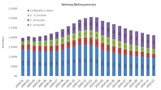 The second graph shows the break down of serious deliquencies.
LPS reported "the share of seriously delinquent loans that have not made payments in over a year continues to increase.".
Note: I've seen some people include these 7 million delinquent loans as "shadow inventory". This is not correct because 1) some of these loans will cure, and 2) some of these homes are already listed for sale (so they are included in the visible inventory).
Lawler: Housing Vacancy Survey appears to massively overstate number of vacant housing units
by Calculated Risk on 2/07/2011 08:30:00 AM
CR Note: Many analysts use the quarterly Housing Vacancies and Homeownership survey from the Census Bureau to estimate the number of vacant housing units in the United States. This survey probably overstates the number of vacant units.
From economist Tom Lawler ...
Early Look at a Few States’ Housing Stock Numbers from Census 2010 Suggests that Housing Vacancy Survey Massively Overstates Number of Vacant Housing Units
The Census Bureau has starting releasing Census 2010 data for selected states, with the first “batch” being Louisiana, Mississippi, New Jersey, and Virginia. On its website, the data shown include not just population counts, but housing counts as well – occupied as well as vacant. I don’t know if these are the “final, official” housing count totals, but here are the data shown on the website for these states. Also shown are the counts from Census 2000 (NOT adjusted for subsequent “overcounts/undercounts,” as well as the gross vacancy rates (total vacant units – including seasonal – divided by total housing units) for Census 2010, Census 2000, and the gross vacancy rates from the Housing Vacancy Survey HVS) and the ACS for 2009 (2010 data have not yet been released).
| Louisiana | Mississippi | New Jersey | Virginia | |
|---|---|---|---|---|
| Population | 4,533,372 | 2,967,297 | 8,791,894 | 8,001,024 |
| Housing Units | 1,964,981 | 1,274,719 | 3,553,562 | 3,364,939 |
| Occupied | 1,728,360 | 1,115,768 | 3,214,360 | 3,056,058 |
| Vacant | 236,621 | 158,951 | 339,202 | 308,881 |
| Population | 4,468,976 | 2,844,658 | 8,414,350 | 7,078,515 |
| Housing Units | 1,847,181 | 1,161,953 | 3,310,275 | 2,904,192 |
| Occupied | 1,656,053 | 1,046,434 | 3,064,645 | 2,699,173 |
| Vacant | 191,128 | 115,519 | 245,630 | 205,019 |
| Louisiana | Mississippi | New Jersey | Virginia | |
| Census 2010 | 12.00% | 12.50% | 9.50% | 9.20% |
| Census 2000 | 10.30% | 9.90% | 7.40% | 7.10% |
| HVS 2009 | 14.00% | 16.40% | 12.10% | 12.20% |
| ACS 2009 | 14.00% | 14.60% | 10.50% | 10.80% |
What is, of course, especially noteworthy is that the “gross” vacancy rates from the HVS for 2009 (which are yearly average estimates) are massively higher than the Census 2010 estimates for April 1, 2010, as well as being materially higher than those from the ACS for 2009. As I have noted numerous times, the HVS has for at least a decade “found” materially higher gross vacancy rates for most areas (Louisiana being an exception) than the ACS, and “found” materially higher gross vacancy rates for 2000 than was the case for Census 2000. I’ve talked to folks about this, but no one seems to know why.
What is also interesting is that the gross vacancy rate from Census 2010 for the above states is substantially lower than those shown in the ACS for 2009. While given the low level of housing production it would not be surprising that the gross vacancy rate on April 1, 2010 would be lower than the average for 2009, it’s hard to believe that the “actual” gross vacancy rate in these states declined by as much as that suggested by assuming that the ACS 2009 GVR and the Census 2010 GVR were both “correct.”
Not surprisingly, the gross vacancy rates in the above states from Census 2010 were all up significantly from Census 2000. However, it would appear as the GVRs did not increase by as much as suggested either in the HVS (state data are only available back to 2005) or the ACS, and it seems clear that the HVS’ estimates for TOTAL vacant housing units is a boatload higher than the “actuals.”
Next week the Census is scheduled to release Census 2010 data for Arkansas, Indiana, Iowa, Maryland, and Vermont, and the deadline for data releases for all states is, intriguingly, April Fools’ Day.
Sunday, February 06, 2011
Repeat: Color Commentary
by Calculated Risk on 2/06/2011 06:15:00 PM
I'm watching some sporting event with friends. I posted most of this list yesterday, and there were quite a few comments and emails - so while I'm distracted, here is a repeat for those who missed it - enjoy!
Earlier today:
• Summary for Week ending February 5th
• Schedule for Week of Feb 6th
Commentary this week:
• Monday: QE2 Speculation and Summary
• Tuesday: Economic Outlook and Daily Summary
• Wednesday: Daily Color: D-List Data
• Thursday: Employment Situation: A Lighter Shade of Gray
• Friday: Daily Color: Two Employment Surveys, Different Results
 Click on graph for larger image.
A repeat from Friday ...
This graph shows the job losses from the start of the employment recession, in percentage terms - aligned at maximum job losses.
In terms of lost payroll jobs, the 2007 recession is by far the worst since WWII, and the "recovery" for payroll jobs is one of the slowest.
Here are the employment posts from Friday (with graphs):
• January Employment Report: 36,000 Jobs, 9.0% Unemployment Rate
• Employment Summary and Part Time Workers, Unemployed over 26 Weeks
• Duration of Unemployment, Unemployment by Education, Diffusion Indexes
• Employment Graph Gallery
Recession Measures
by Calculated Risk on 2/06/2011 02:28:00 PM
According to the Bureau of Economic Analysis (BEA), real GDP is now slightly above the pre-recession peak. Real GDP (in 2005 dollars) was at $13,382.6 billion in Q4, just 0.14% above the $13,363.5 billion in Q4 2007.
Note: The following graphs are all constructed as a percent of the peak in each indicator. This shows when the indicator has bottomed - and when the indicator has returned to the level of the previous peak. If the indicator is at a new peak, the value is 100%.
 Click on graph for larger image in graph gallery.
This graph is for real GDP through Q4 2010. This shows real GDP is back to the pre-recession peak. However there are really two measures of GDP: 1) real GDP, and 2) real Gross Domestic Income (GDI). The BEA will release GDI with the 2nd GDP estimate, and I expect GDI will not be above the pre-recession peak until this quarter (Q1 2011).
And real GDP has performed better than other indicators ...
 This graph shows real personal income less transfer payments as a percent of the previous peak.
This has been slow to recover - and is still 4.3% below the previous peak.
Much of the growth in PCE over the last year has come from transfer payments - this includes people taking Social Security early, extended unemployment benefits, and other assistance programs - and it will be some time before this indicator returns to pre-recession levels.
And two more graphs to show two key monthly indicators:
 This graph is for industrial production through December.
Industrial production has been one of the stronger performing sectors because of inventory restocking and some growth in exports.
However industrial production is still 5.8% below the pre-recession peak, and it will probably be some time before industrial production returns to pre-recession levels.
 The final graph is for employment. This is similar to the graph I post every month comparing percent payroll jobs lost in several recessions.
Payroll employment is still 5.6% below the pre-recession peak. And even with slightly above trend GDP growth in 2011, payroll employment growth will probably only recover slowly.
Payroll employment is still 7.7 million below the pre-recession peak, and if the the U.S. adds 2.5 million payroll jobs per year over the next 3 years (my current forecast is 2.4 million private sector jobs this year), it would take 3+ years to return to the pre-recession peak. And that doesn't include population growth!
Earlier:
• Summary for Week ending February 5th
• Schedule for Week of Feb 6th
Summary for Week ending February 5th
by Calculated Risk on 2/06/2011 08:50:00 AM
Note: here is the economic schedule for the coming week.
Two ongoing stories ...
• Egypt: From the NY Times: Muslim Brotherhood Join Egypt Talks
As Western powers backed the Egyptian vice president’s [Omar Suleiman] attempt to defuse a popular uprising, the outlawed Muslim Brotherhood joined other groups meeting with him on Sunday in what seemed a significant departure in the nation’s uprising and political history.• Europe: From the WSJ: European Leaders Clash at Summit
Sharp disagreements opened up among European Union leaders at a summit here over a German-led plan to boost the competitiveness of weaker euro-zone economies, threatening to unsettle recently calm European financial markets.Below is a summary of the previous week, mostly in graphs.
• January Employment Report: 36,000 Jobs, 9.0% Unemployment Rate
The Employment Situation report contained mixed signals with a sharp drop in the unemployment, but few payroll jobs added. The BLS mentioned that severe weather impacted the payroll report. The following graph shows the employment population ratio, the participation rate, and the unemployment rate.
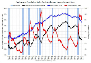 Click on graph for larger image in graph gallery.
The unemployment rate decreased to 9.0% (red line).
The Labor Force Participation Rate declined to 64.2% in January (blue line). This is the lowest level since the early '80s. (This is the percentage of the working age population in the labor force. The participation rate is well below the 66% to 67% rate that was normal over the last 20 years.)
The Employment-Population ratio increased to 58.4% in January (black line).
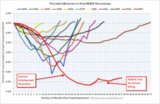 The second graph shows the job losses from the start of the employment recession, in percentage terms from the start of the recession. The dotted line is ex-Census hiring.
 For the current employment recession, the graph starts in December 2007, and this recession is by far the worst recession since WWII in percentage terms, and 2nd worst in terms of the unemployment rate (only the early '80s recession with a peak of 10.8 percent was worse).
 The number of workers only able to find part time jobs (or have had their hours cut for economic reasons) declined to 8.407 million in January.
 These workers are included in the alternate measure of labor underutilization (U-6) that declined sharply to 16.1% in January from 16.7% in December. Still very high, but improving.
 This graph shows the number of workers unemployed for 27 weeks or more.
 According to the BLS, there are 6.21 million workers who have been unemployed for more than 26 weeks and still want a job. This was down from 6.44 million in December. This is still very high.
Summary
This was a decent report with two obvious exceptions: the few payroll jobs added, and the slight decline in the average workweek - both potentially weather related.
The best news was the decline in the unemployment rate to 9.0% from 9.4% in December. However this was partially because the participation rate declined to 64.2% - a new cycle low, and the lowest level since the early '80s.
The 36,000 payroll jobs added was far below expectations of 150,000 jobs, however this was probably impacted by bad weather during the survey reference period. If so, there should be a strong bounce back in the February report.
• Q4 2010: Homeownership Rate Falls to 1998 Levels
The Census Bureau reported the homeownership and vacancy rates for Q4 2010 this week.
 The homeownership rate was at 66.5%, down from 66.9% in Q3. This is at about the level as 1998.
The homeownership rate increased in the '90s and early '00s because of changes in demographics and "innovations" in mortgage lending. Some of the increase due to demographics (older population) will probably stick, so I've been expecting the rate to decline to around 66%, and probably not all the way back to 64%.
 The homeowner vacancy rate increased to 2.7% in Q4 2010 from 2.5% in Q3 2010.
 This has been bouncing around in the 2.5% to 2.7% range for two years, and is slightly below the peak of 2.9% in 2008.
A normal rate for recent years appears to be about 1.7%.
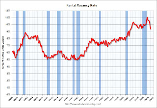 The rental vacancy rate declined sharply to 9.4% in Q4 2010, from 10.3% in Q3 2010.
This fits with the recent Reis data showing apartment vacancy rates fell in Q4 2010 to 6.6%, down from 7.1% in Q3 2010, and 8% in the Q4 2009.
This also fits with the NMHC apartment market tightness index that has indicated tighter market conditions for the last four quarters.
• ISM Manufacturing Index increased in January
 PMI at 60.8% in January, up from 58.5% in December. The consensus was for a reading of 57.9%. ISM's New Orders Index registered 67.8 percent in January, and ISM's Employment Index registered 61.7 percent. Here is a long term graph of the ISM manufacturing index.
This was a strong report and above expectations. The new orders and employment indexes were especially strong.
• Private Construction Spending decreased in December
 This graph shows private residential and nonresidential construction spending since 1993. Note: nominal dollars, not inflation adjusted.
Both private residential and non-residential construction spending decreased in December.
Residential spending is 66.5% below the peak in early 2006, and non-residential spending is 37% below the peak in January 2008.
Sometime this year (in 2011), residential construction spending will probably pass non-residential spending. Although I expect the recovery in residential spending to be sluggish, residential investment will probably make a positive contribution to GDP and employment growth in 2011 for the first time since 2005. And that is one of the reasons I think growth (both GDP and employment) will be better in 2011 than in 2010.
• U.S. Light Vehicle Sales increased in January to 12.62 million SAAR
 Based on an estimate from Autodata Corp, light vehicle sales were at a 12.62 million SAAR in January. That is up 17.5% from January 2010, and up 1.0% from the sales rate last month (Dec 2010). This is the highest sales rate since August 2008, excluding Cash-for-clunkers in August 2009. This was at the consensus estimate of 12.6 million SAAR.
This graph shows light vehicle sales since the BEA started keeping data in 1967.
Note: dashed line is current estimated sales rate. The current sales rate is still near the bottom of the '90/'91 recession - when there were fewer registered drivers and a smaller population.
• ISM Non-Manufacturing Index showed expansion in January
 The January ISM Non-manufacturing index was at 59.4%, up from 57.1% in December. The employment index showed faster expansion in December at 54.5%, up from 52.6% in December. Note: Above 50 indicates expansion, below 50 contraction.
This graph shows the ISM non-manufacturing index (started in January 2008) and the ISM non-manufacturing employment diffusion index.
• Other Economic Stories ...
• Chicago PMI Strong
• Fed: Little Change in Lending Standards in January Loan Officer Survey, Outlook "more upbeat"
• Personal Income and Outlays Report for December
• Restaurant Performance Index Shows Expansion in December
• ADP: Private Employment increased by 187,000 in January
• Fed Chairman Bernanke: The Economic Outlook and Macroeconomic Policies
• Unofficial Problem Bank list at 946 Institutions
Best wishes to all!
Saturday, February 05, 2011
Jim the Realtor is assigned a "premium" REO
by Calculated Risk on 2/05/2011 11:01:00 PM
Jim posted two videos on REOs tonight.
One video shows some mid-to-high end REOs hitting the market. I'm familiar with the REO at 4:13 in the linked video - I looked at this one (4,543' backs to golf course with slight ocean view). Sold at auction for $945,000 no takers - well below other recent sales in the area! Jim thinks there will be REOs coming on the market this year.
And the second video is pretty funny:
Schedule for Week of Feb 6th
by Calculated Risk on 2/05/2011 07:26:00 PM
The key report this week will be the December trade deficit on Friday. Also Fed Chairman Ben Bernanke will testify before the House Committee on the Budget on Wednesday.
3:00 PM: Consumer Credit for December. The consensus is a $2 billion increase in consumer credit.
7:30 AM: NFIB Small Business Optimism Index for January. This index has been showing small businesses have become a little less pessimistic recently, however the respondents continue to say that the major concern is the lack of customers.
8:45 AM: Richmond Fed President Jeffrey Lacker speaks on the economic outlook at the University of Delaware.
10:00 AM: Job Openings and Labor Turnover Survey for December from the BLS. This report has been showing a general increase in job openings, but very little turnover in the labor market.
Around 1:00 PM: Atlanta Fed President Dennis Lockhart speaks in Alabama, and Dallas Fed President Richard Fisher speaks in Dallas.
 7:00 AM: The Mortgage Bankers Association (MBA) will release the mortgage purchase applications index.
 Click on graph for larger image in graph gallery.
This graph shows the MBA Purchase Index and four week moving average since 1990.
The four-week moving average of the purchase index suggests weak existing home sales through the first few months of 2011.
Morning: CoStar Commercial Repeat-Sale Indices (CCRSI). This is a repeat sales index for commercial real estate.
10:00 AM: Fed Chairman Ben Bernanke, "The Economic Outlook and Monetary and Fiscal Policy" before the House Committee on the Budget, U.S. House of Representatives
5:45 PM: NY Fed Vice President Brian Sack speaks on "Implementing the Federal Reserve’s Asset Purchase Program" (aka QE2) at the Philadelphia Fed.
8:30 AM: The initial weekly unemployment claims report will be released. The number of initial claims had been trending down over the last few months. The consensus is for a decrease to 410,000 from 415,000 last week.
10:00 AM: Monthly Wholesale Trade: Sales and Inventories for December. The consensus is 0.8% increase in inventories.
8:30 AM: Trade Balance report for December from the Census Bureau.
 This graph shows the monthly U.S. exports and imports in dollars through November 2010.
Imports have been mostly flat since May, and exports have started increasing again after the mid-year slowdown.
The consensus is for the U.S. trade deficit to increase to $40 billion from $38.3 billion in November.
9:55 AM: Reuters/University of Mich Consumer Sentiment preliminary for February. The consensus is for a slight increase to 75.0 from 74.2 in January.
After 4:00 PM: The FDIC will probably have another busy Friday afternoon.
9:00 PM: Fed Governor Sarah Bloom Raskin, "Mortgage Servicing Issues" At the 2011 Midwinter Housing Finance Conference, Park City, Utah


