 RSS Feed
 by Calculated Risk on 9/07/2010 12:04:00 PM
Tuesday, September 07, 2010
Housing Completions will set new record low in 2010
One of the key questions for housing, jobs, and the economy is: When will the excess housing supply be absorbed?
The answers depends on:
1) The current number of excess housing units,
2) how many net units are added to the housing stock, and
3) how many net households are being formed.
There is no timely data for net household formation, and estimates of the excess housing supply vary widely. So the answer involves some guesses (I'll get back to these questions).
The best data is for completions of housing units - although the number of demolitions is unclear. So the limited purpose of this post to to provide an estimate of the net units added to the housing stock in 2010.
Housing units include single family homes (included as 1 to 4 units), apartments (5+ units), and mobile homes. Demolitions are subtracted from the stock.
NOTE: Table is based on Completions. Housing units added to stock:
| 2009 | 20101 | |
|---|---|---|
| 1 to 4 units | 534.7 | 480 |
| 5+ units | 259.8 | 135 |
| Mobile Homes | 52.2 | 55 |
| Sub-Total | 846.7 | 670.0 |
| Demolitions2 | 200 | 200 |
| Total | 646.7 | 470.0 |
1 Estimates for 2010 based on completions through July.
2 estimated.
Notice for 2010 that the estimate is for 5+ unit completions to collapse. This is already in the works as shown in the following diagram:
 Click on graph for larger image in new window.
The blue line is for multifamily starts and the red line is for multifamily completions. Probably all the multifamily units that will be delivered in 2010 have already been started since, according to the Census Bureau, it takes on average over 1 year to complete these projects.
Since multifamily starts collapsed in 2009, completions will collapse in 2010. This finally showed up in the data for July as completions fell to 8.1 thousand from 17.1 thousand in June. Completions averaged over 14 thousand per month during the first 6 months of 2010, and will average close to 8 thousand per month during the 2nd half of 2010.
Note: this decline in completions will impact construction employment in the 2nd half.
Similar logic applies to single family units, although these only take around 7 months to complete. Almost all of the single family units that will be completed this year have already been started. There were 249.2 thousand completions during the first 6 months of the year, and completions will probably slow in the 2nd half.
The manufactured homes data is from the Census Bureau (and demolitions are estimated).
This means a record low number of housing units will be added to the housing stock in 2010. But unfortunately household formation is probably very low too - so the excess inventory might not be reduced substantially (I'll get back to this).
UPDATE: To be clear - the record low completions is bad news in the short term, especially for employment, but overall it is GOOD news for the economy and housing since it helps reduce the excess supply.
Special thanks to housing economist Tom Lawler who shared with me some of his thoughts on completions.
European Bond Spreads
by Calculated Risk on 9/07/2010 09:03:00 AM
After the WSJ story last night on the European stress tests, here is an update on a few European bond spreads:
Monday, September 06, 2010
European Stress Tests and more
by Calculated Risk on 9/06/2010 09:30:00 PM
From the WSJ tonight: Europe's Bank Stress Tests Minimized Debt Risk
We've discussed this several times - as an example, in Part 5D of the sovereign debt series, "some investor guy" wrote:
Q1. Was there much sovereign stress in the European bank stress tests?Note: Here are links for the entire sovereign debt series.
NO. The most glaring oversight, in the opinion of the author and many other analysts, is assuming there would be no sovereign defaults, and thus not showing any losses on the bank’s long term holdings (in the banking category vs the “trading book”). According to the Committee of European Banking Supervisors, the sovereign stress scenario results in “39 billion euro associated with valuation losses of sovereign exposures in the trading book “.
“The haircuts are applied to the trading book portfolios only, as no default assumption was considered, which would be required to apply haircuts to the held to maturity sovereign debt in the banking book.”
Reconciling the Household and Payroll Surveys of Employment
by Calculated Risk on 9/06/2010 04:10:00 PM
Every month the BLS puts out a report that discusses the difference between the household and establishment surveys: Employment from the BLS household and payroll surveys: summary of recent trends
The Unemployment Rate comes from the Current Population Survey (CPS: commonly called the household survey), a monthly survey of about 60,000 households.
The jobs number comes from Current Employment Statistics (CES: payroll survey), a sample of approximately 390,000 business establishments nationwide.
These are very different surveys: the CPS gives the total number of employed (and unemployed including the alternative measures), and the CES gives the total number of positions (excluding some categories like the self-employed, and a person working two jobs counts as two positions).
The linked monthly report from the BLS discusses the differences, and adjusts the household survey to "an employment concept more similar to the payroll survey’s".  Click on graph for larger image in new window.
This graph from the BLS shows the household survey, the payroll survey and the adjusted household survey.
I was inspired to post this graph by Professor Nancy Folbre's post at Economix: Taking the ‘Un’ Out of Unemployment
A focus on employment, rather than unemployment, provides additional perspective. ...Little employment growth for a decade is quite a "hole".
The employment measure is unaffected by assumptions regarding the character, motives or incentives facing the unemployed.
And trends in this measure, as shown above, could discourage even the most optimistic among us, if they would just pay attention to it.
As Steven Hipple, a Bureau of Labor Statistics economist, puts it in a more detailed analysis of trends through the end of 2009, “Economic decision-makers might not understand the depth of the economic hole in the labor market.”
Note: Over the same decade, according to the Census Bureau, the U.S. population, has increased from around 285 million to 310 million.
Obama to Propose $50 Billion in Infrastructure Spending
by Calculated Risk on 9/06/2010 12:06:00 PM
From the NY Times: Obama to Call for $50 Billion Spending on Public Works
President Obama on Monday is to call for as much as $50 billion in government spending to start up a long-term public works plan emphasizing transportation projects – roads, rail and airport runways – over the next six years.Based on some media leaks, I'm not optimistic that the recovery package to be announced on Wednesday will help significantly with (un)employment. However this investment seems to make sense.
...
The spending is one part of a broader economic recovery package that Mr. Obama is to unveil during a speech in Cleveland on Wednesday.
...
While Mr. Obama’s plan would call for investment over six years, the White House says it would be front-loaded with an initial investment of $50 billion in taxpayer money, to help create jobs in the shorter term.
House Prices and Stress Tests
by Calculated Risk on 9/06/2010 09:15:00 AM
The following graph shows the two bank stress test scenarios compared to the Case-Shiller Composite 10 Index. Click on graph for larger image in new window.
The heavy government support for house prices has kept prices well above the baseline scenario. But is this good news?
With prices higher than projected, banks have taken fewer write downs than originally expected - and many homeowners have been able to refinance into Fannie and Freddie (or FHA insured) loans putting the future risk on the taxpayer. This is good news for the banks.
However, since prices are still too high in many areas, the market has not cleared and there is still too much inventory. Until the excess inventory is absorbed, there will be little new construction and few construction related jobs - and the recovery will remain sluggish.
Sunday, September 05, 2010
Streitfeld: Grim Housing Choice
by Calculated Risk on 9/05/2010 07:18:00 PM
From David Streitfeld at the NY Times: Grim Housing Choice: Help Today’s Owners or Future Ones (ht Paul)
Over the last 18 months, the administration has rolled out just about every program it could think of to prop up the ailing housing market ... The goal was to stabilize the market until a resurgent economy created new households that demanded places to live.I wouldn't quite phrase it as "let the housing market crash" - instead I'd argue to stop trying to support house prices and think jobs, jobs, jobs. More jobs mean more households - and more households will absorb the excess supply of housing.
As the economy again sputters and potential buyers flee... Some economists and analysts are now urging a dose of shock therapy that would greatly shift the benefits to future homeowners: Let the housing market crash.
More from Streitfeld:
A small decline in home prices might not make too much of a difference to a slack economy. But an unchecked drop of 10 percent or more might prove entirely discouraging to the millions of owners who are just hanging on, especially those who bought in the last few years under the impression that a turnaround had already begun.I think prices are near the bottom in many areas - although I think prices are still too high in many mid-to-high priced bubble areas. This probably means further price declines on the repeat sales indices of 5% to 10% (Case-Shiller and CoreLogic).
But I also think many of the recent FHA buyers will be underwater for a few years and they will have difficulty selling - unless they bring cash to escrow.
Earlier:
Schedule for Week of September 5th
by Calculated Risk on 9/05/2010 04:45:00 PM
This will be a light week for economic data. The trade deficit for July on Thursday is probably the key release.
Here is the Summary for the week ending Sept 4th (a busy week with plenty of graphs!)
Labor Day Holiday
No releases scheduled.
7:00 AM ET: The Mortgage Bankers Association (MBA) will release the mortgage purchase applications index. This index has been fairly flat over the last couple of months suggesting reported existing home sales in August and September will not be much stronger than in July.
10:00 AM: Job Openings and Labor Turnover Survey for July from the BLS. This report has been showing very little turnover in the labor market and few job openings.
2:00 PM: Fed's Beige Book for August.
3:00 PM: Consumer Credit for July from the Federal Reserve. The consensus is for a $3.5 billion decline in consumer credit.
8:30 AM: Trade Balance report from the Census Bureau. The consensus is for the U.S. trade deficit to decrease to $47 billion (from $49.9 billion in June).
8:30 AM: The initial weekly unemployment claims report will be released. Consensus is for a slight decrease to 470K from 472K last week. openings.
10:00 AM: Wholesale Inventories for July.
After 4:00 PM: The FDIC will probably get busy again ...
Possibly on Friday: Ceridian-UCLA Pulse of Commerce Index™ This is the diesel fuel index for August (a measure of transportation).
Summary for Week ending Sept 4th
by Calculated Risk on 9/05/2010 11:45:00 AM
It was a busy week ...
The BLS reported:
1) Nonfarm payroll employment declined 54,000 in August.
2) however Decennial census employment declined 114,000.
3) so ex-Census, payrolls increased 60,000.
4) Private payrolls increased 67,000.
5) The unemployment rate increased to 9.6% from 9.5% in July.
6) Payrolls for June and July were revised up by 46,000 and 77,000 respectively.
A few graphs ...
 Click on graph for larger image.
This graph shows the job losses from the start of the employment recession, in percentage terms aligned at the bottom of the recession (Both the 1991 and 2001 recessions were flat at the bottom, so the choice was a little arbitrary).
The dotted line shows the impact of Census hiring. In August, there were only 82,000 temporary 2010 Census workers still on the payroll. The number of Census workers will continue to decline - and the remaining gap between the solid and dashed red lines will be gone soon.
Here is the graph showing the same data but aligned at the beginning of the recession.
The Employment-Population ratio increased to 58.5% in August from 58.4% in July.
 This graph shows the employment-population ratio; this is the ratio of employed Americans to the adult population.
Note: the graph doesn't start at zero to better show the change.
The Labor Force Participation Rate increased to 64.7% from 64.6% in July. This is the percentage of the working age population in the labor force. The Participation Rate is very low, and as the employment picture improves, people will return to the labor force, and that will put upward pressure on the unemployment rate.
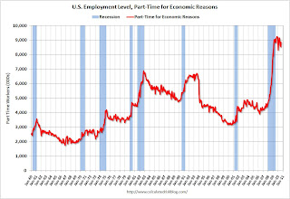
The BLS reported that "The number of persons employed part time for economic reasons ... increased by 331,000 over the month to 8.9 million."
These workers are included in the alternate measure of labor underutilization (U-6) that increased to 16.7% in August from 16.5% in July.
 This graph shows the duration of unemployment as a percent of the civilian labor force. The graph shows the number of unemployed in four categories: less than 5 week, 6 to 14 weeks, 15 to 26 weeks, and 27 weeks or more.
In August 2010, the number of unemployed for 27 weeks or more declined significantly to 6.249 million (seasonally adjusted) from 6.752 million in July. It appears the number of long term unemployed has peaked, but it is still very difficult for these people to find a job - and this is a very serious employment issue.
The 5 to 14 week category increased sharply in August and is now at the highest level since October 2009.
The underlying details of the employment report were mixed. The positives: the upward revisions to the June and July reports, a slight increase in hours worked for manufacturing employees (flat for all employees), an increase in hourly wages, and the decrease in the long term unemployed. Other positives include the slight increase in the employment-population ratio and the participation rate.
The negatives include the hiring of only 60,000 ex-Census, the increase in the unemployment rate (including U-6), and the increase in part time workers for economic reasons.
Overall this was a weak report and is consistent with a sluggish recovery.
 Based on an estimate from Autodata Corp, light vehicle sales were at a 11.47 million SAAR in August. That is down 18.9% from August 2009 (cash-for-clunkers), and down 0.5% from the July sales rate.
This graph shows the historical light vehicle sales (seasonally adjusted annual rate) from the BEA (blue) and an estimate for August (red, light vehicle sales of 11.47 million SAAR from Autodata Corp).
The high for the year was in March, and sales have moved mostly sideways since then.
S&P/Case-Shiller released the monthly Home Price Indices for June (actually a 3 month average of April, May and June).
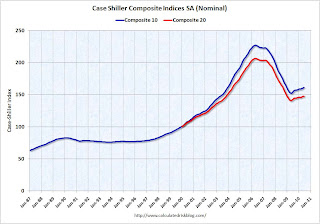 This graph shows the nominal seasonally adjusted Composite 10 and Composite 20 indices (the Composite 20 was started in January 2000).
The Composite 10 index is off 29.0% from the peak, and up 0.3% in June (SA).
The Composite 20 index is off 28.4% from the peak, and up 0.3% in June (SA).
The next graph shows the price declines from the peak for each city included in S&P/Case-Shiller indices.
 Prices increased (SA) in 9 of the 20 Case-Shiller cities in June seasonally adjusted.
Prices in Las Vegas are off 56.5% from the peak, and prices in Dallas only off 4.8% from the peak.
Prices are probably falling right now (starting in July), but this will not show up in the Case-Shiller index for a few months since this an average of three months and reported with a significant lag (this was the June report).
Overall construction spending decreased in July.
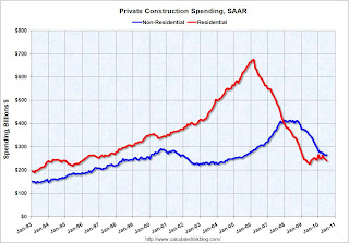 This graph shows private residential and nonresidential construction spending since 1993. Note: nominal dollars, not inflation adjusted.
From the Census Bureau: July 2010 Construction at $805.2 Billion Annual Rate
Private residential construction spending has turned down again - after the tax credit expired - and residential investment (RI) will be a drag on Q3 GDP. The "good" news is the overall drag from RI will be much smaller than during 2006, 2007 and 2008.
The Institute for Supply Management reported that the PMI increased to 56.3 in August from 55.5 in July.
 This graph shows the regional Fed manufacturing surveys and the ISM index through August.
The Fed surveys suggested that the ISM index would probably decline, but the relationship is noisy. Based on this graph I'd expect either the Fed surveys to bounce back in September - or the ISM to decline. The internals of the ISM report were soft - the new orders index declined in August to 53.1 from 53.5 in July (still expanding, but at a slower pace). And the inventory index was up for the 2nd month in a row to 51.4 - and I expect the PMI to decline in September.
 The August ISM Non-manufacturing index was at 51.5%, down from 54.3% in July. The employment index showed contraction in August at 48.2%. Note: Above 50 indicates expansion, below 50 contraction.
This graph shows the ISM non-manufacturing index (started in January 2008) and the ISM non-manufacturing employment diffusion index.
The overall ISM index, and the employment index, are both at the lowest level since January.
Best wishes to all.
More stories on the long term unemployed
by Calculated Risk on 9/05/2010 09:02:00 AM
From Alana Semuels at the LA Times: For many unemployed workers, jobs aren't coming back. A few excerpts:
The U.S. safety net wasn't designed to withstand such a strain. The extent and duration of unemployment benefits vary by state, but 26 weeks is typical. Several federal extensions have increased that to 99 weeks in California and other hard-hit states. Even so, an estimated 3.5 million Americans will have run out of benefits by the end of the year. About 180,000 Californians have already fallen off the rolls.This article has several stories about people struggling with long term unemployment.
There are few other places to turn. Applications for federal food stamps and state programs such as CalWorks, which provides temporary assistance to families with children, are up sharply in recent years.
...
Desperation is growing, said Ofer Sharone, an assistant professor at MIT's Sloan School of Management who has spent the last year interviewing dozens of long-term jobless workers.
"The U.S. is clearly not equipped to deal with this high level of unemployment," Sharone said. "People are running out of benefits, health insurance, retirement and pensions."
This brings up two key points:


