 RSS Feed
 by Calculated Risk on 7/15/2010 07:45:00 PM
Thursday, July 15, 2010
HUD announcement: FHA Seller concession to be cut in half
From HUD: HUD seeks Public Comment on Three Initiatives to Boost FHA Capital Reserves
For the next 30 days, HUD is seeking public comment on the following policy changes, each of which are designed to mitigate risk to the Mutual Mortgage Insurance Fund while promoting sustainable homeownership for FHA borrowers:This will become effective after the 30 day comment period - so around August 15th.1. Update the combination of credit and down payment requirements for new borrowers. New borrowers seeking FHA-insured financing will be required to have a minimum FICO score of 580 to qualify for FHA’s flagship 3.5 percent down payment program. New borrowers with credit scores of less than a 580 will be required to make a cash investment of at least 10 percent. Borrowers with credit scores of less than 500 will no longer qualify for an FHA-insured mortgage.
2. Reduce allowable seller concessions from six to three percent. Allowing sellers to contribute up to six percent of the home’s sales price to offset a buyer’s costs exposes the FHA to excess risk by potentially driving up the cost of the home beyond its appraised value. Reducing seller concessions to three percent will bring FHA into conformity with industry standards.
3. Tighten underwriting standards for manually underwritten loans. When using compensating factors in the underwriting process, lenders will be required to consider those factors which are the best predictive indicators of loan performance, such as the borrower’s credit history, loan-to-value (LTV) percentage, debt-to income ratio, and cash reserves.
Update: For more details, here is the public notice.
Reports: BP makes progress on Oil Gusher, SEC to make "significant announcement"
by Calculated Risk on 7/15/2010 03:58:00 PM
From the WSJ: Oil Stops Flowing as BP Tests Cap
From the SEC:
The SEC Enforcement Division is holding a news conference at 4:45 p.m. ET to make a significant announcement.There will be a webcast here. Rumors are about Goldman Sachs - but we will know in 45 minutes.
UPDATE: Goldman Sachs settles with SEC, agrees to pay $550 million.
News release
The Securities and Exchange Commission today announced that Goldman, Sachs & Co. will pay $550 million and reform its business practices to settle SEC charges that Goldman misled investors in a subprime mortgage product just as the U.S. housing market was starting to collapse.Goldman Consent
In agreeing to the SEC's largest-ever penalty paid by a Wall Street firm, Goldman also acknowledged that its marketing materials for the subprime product contained incomplete information.
Proposed judgment
Hotel Occupancy Rate increases compared to same week in 2009
by Calculated Risk on 7/15/2010 12:36:00 PM
Hotel occupancy is one of several industry specific indicators I follow ...
First, some comments from the Marriott conference call today:
After dropping for eight straight quarters occupancy rates bottomed in the Fourth Quarter of 2009. .. [W]e said we hope to increase room rates year-over-year, some time in 2010. As it turned out we were able to increase room rates much faster than we anticipated. In period five roughly equivalent to May, domestic Company operated room rates rose 1%. The first increase in nearly two years. In period six, roughly equivalent to June, domestic Company operated room rates rose 3%.And from HotelNewsNow.com: STR: US results for week ending 3 July 2010
...
Leisure demand in the Second Quarter ... was solid. On weekdays Marriott brand REVPAR rose an impressive 9% in the quarter but weekends held their own with REVPAR up 5%.
...
Business in Europe and the UK remains strong despite rumbling of economic concern. Our European hotels are benefiting from strong American tourism, attracted to fabulous destinations that are on sale due to the weaker currencies. In Asia, occupancy rates at Company operated hotels rose over 16 points as newer hotels continued to mature and the Shanghai world expo attracted strong demand.
Overall, in year-over-year measurements, the industry’s occupancy increased 3.9 percent to 62.5 percent, ADR rose 0.4 percent to US$94.69, and RevPAR was up 4.3 percent to US$59.17.The following graph shows the four week moving average for the occupancy rate by week for 2008, 2009 and 2010 (and a median for 2000 through 2007).
 Click on graph for larger image in new window.
Notes: the scale doesn't start at zero to better show the change.
On a 4-week basis, occupancy is up 6.5% compared to last year (the worst year since the Great Depression) and 5.3% below the median for 2000 through 2007.
A little more than half way back ...
Data Source: Smith Travel Research, Courtesy of HotelNewsNow.com
Philly Fed Index suggests "slowing" growth
by Calculated Risk on 7/15/2010 10:15:00 AM
Here is the Philadelphia Fed Index released today: Business Outlook Survey.
The survey’s broadest measure of manufacturing conditions, the diffusion index of current activity, decreased from a reading of 8 in June to 5.1 in July. The index, although still positive and suggesting growth, has fallen for two consecutive months. Indexes for new orders and shipments also suggest a slowing this month: The new orders index fell 13 points, to its first negative reading in 12 months, and the shipments index decreased 10 points but remained positive. Indicating weakness, indexes for both delivery times and unfilled orders fell and were in negative territory this month.
Firms indicated a slight increase in employment this month.
...
On balance, firms reported declines in prices for their own manufactured goods.
emphasis added
 Click on graph for larger image in new window.
This graph shows the Philly index for the last 40 years.
The index has been positive for eleven months now, but turned down sharply in June and July.
These surveys are timely, but noisy. However this is further evidence that the manufacturing sector is slowing.
Industrial Production, Capacity Utilization mostly flat in June
by Calculated Risk on 7/15/2010 09:30:00 AM
From the Fed: Industrial production and Capacity Utilization
Industrial production edged up 0.1 percent in June after having risen 1.3 percent in May. ... For the second quarter as a whole, total industrial production increased at an annual rate of 6.6 percent. Manufacturing output moved down 0.4 percent in June after three months of gains at or near 1 percent. The output of mines rose 0.4 percent. The output of utilities increased 2.7 percent, as temperatures moved further above seasonal norms. At 92.5 percent of its 2007 average, total industrial production in June was 8.2 percent above its year-earlier level. The capacity utilization rate for total industry remained unchanged in June at 74.1 percent, a rate 5.9 percentage points above the rate from a year earlier but 6.5 percentage points below its average from 1972 to 2009.
 Click on graph for larger image in new window.
This graph shows Capacity Utilization. This series is up 8.7% from the record low set in June 2009 (the series starts in 1967).
Capacity utilization at 74.1% is still far below normal - and well below the the pre-recession levels of 81.2% in November 2007.
Note: y-axis doesn't start at zero to better show the change.
 The second graph shows industrial production since 1967.
This is the highest level for industrial production since Nov 2008, but production is still 7.9% below the pre-recession levels at the end of 2007.
Still a long way to go.
NY Fed: Manufacturing Conditions improve, but pace "slowed substantially" in July
by Calculated Risk on 7/15/2010 08:51:00 AM
From the NY Fed: Empire State Manufacturing Survey
The Empire State Manufacturing Survey indicates that while conditions for New York manufacturers continued to improve in July, the pace of growth in business activity slowed substantially over the month.This came in well below expectations. This is more evidence that the inventory adjustment is over and that growth in the manufacturing sector has slowed. The average workweek declining is concerning.
...
The general business conditions index remained positive but fell from 19.6 to 5.1 in July, indicating that conditions had improved at a significantly slower pace than in June. The index has fallen a cumulative 27 points from the 2010 peak of 31.9 reached in April.
...
The new orders index dropped 7 points to 10.1, and the shipments index fell 13 points to 6.3. The unfilled orders index declined 15 points to -15.9, its lowest level since December.
...
The index for number of employees drifted downward for a second consecutive month, falling from 22.4 in May to 12.4 in June, and then to 7.9 in July. This pattern suggests that employment levels did increase over the month, but at a slower pace than in the previous two months. The average workweek index dropped 18 points and, at -9.5, entered negative territory for the first time this year.
Weekly Initial Unemployment Claims decline to 429,000
by Calculated Risk on 7/15/2010 08:30:00 AM
The DOL reports on weekly unemployment insurance claims:
In the week ending July 10, the advance figure for seasonally adjusted initial claims was 429,000, a decrease of 29,000 from the previous week's revised figure of 458,000. The 4-week moving average was 455,250, a decrease of 11,750 from the previous week's revised average of 467,000.
...
The advance number for seasonally adjusted insured unemployment during the week ending July 3 was 4,681,000, an increase of 247,000 from the preceding week's revised level of 4,434,000.
 Click on graph for larger image in new window.
This graph shows the 4-week moving average of weekly claims since January 2000.
The four-week average of weekly unemployment claims decreased this week by 11,750 to 455,250.
The dashed line on the graph is the current 4-week average.
This is an improvement, and this is the lowest level for initial weekly claims since July 2008. The 4-week average of initial weekly claims has been at about the same level since December 2009 and the 4-week average of 455,250 is still high historically, and suggests a weak labor market.
Wednesday, July 14, 2010
Part 4. What are Total Estimated Losses on Sovereign Bonds Due to Default?
by Calculated Risk on 7/14/2010 08:55:00 PM
CR Note: This series is from reader "some investor guy".
In Part 3, we showed that credit default swaps imply that 7.4% of sovereign debt will default over the next 5 years. However, the defaulted bonds probably would not lose all of their value.
In some cases, losses given default are quite small, a few percent. In some restructurings, only the durations are changed, and a technical default might not result in an actual loss. At the opposite end of the spectrum, losses on a particular bond could be 100%, especially if a sovereign had junior or subordinate debt.
To estimate losses, in addition to the Probability of Default, we need to estimate Recovery Rates Given Default.
Moody’s has studied sovereign default recoveries in the past several decades (Source: Sovereign Default and Recovery Rates, 1983-2008). Recovery rates have ranged from 18% (Russia, 1998) to 95% (Dominican Republic, 2005), when measured on all debt from a particular sovereign at the time of default. The average recovery rate was 50% when each country was weighted equally, but only 31% when weighted by the face value of all outstanding bonds from all defaulting issuers.
Applying those recovery rates leads to expected losses of $1.3 to 1.8 trillion, or about 3.7 - 5.1% of outstanding sovereign debt at 12/31/09, and about $100 billion more at 6/30/10. We now have our baseline estimate of worldwide sovereign default losses.
This might not sound too bad, unless you happen to live in one of the defaulted countries, or own a lot of that country’s bonds.
Even at the baseline $1.3 to $1.8 trillion, those losses would be about the size of all outstanding debt of China, Germany, or France. And, default losses aren’t the only losses which could be occurring in your bond portfolio. For example, if Greek bonds default, Irish interest rates might go up substantially, and Ireland might merely be in pain rather than in default. In that case, if you purchased Irish bonds before the crisis, their market value might drop substantially below what you paid. Hopefully you didn’t buy them using leverage. If the bonds aren’t denominated in your native currency, you could be experiencing large FX losses.
Ubernerd warning. This part of the post contains pictures, but is also pretty technical.
Some posters have asked, “why not use the CDS prices themselves, which contain information on both the default probabilities and expected recoveries?” Well, if the two are separated, you are able to do certain things in modeling that are impossible to calculate with them jumbled together. It is easier to compare to historic data which often tracks the occurrence of default, but not the recovery. It allows you to do frequency-severity simulations.
For you ubernerds, it also means that you can model and correlate frequency and severity separately. Would you change your estimate of severity of loss on Greek bonds if you thought Spain and Italy would also default? Do you think that the probability of default goes up each time debt needs to be rolled over, but the recoveries given default won’t move much? Then the common assumption of 40% recovery rate doesn’t work with your model.
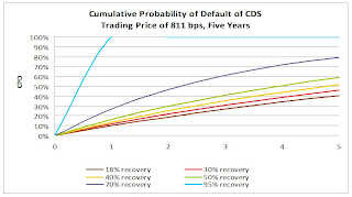 Click on graph for larger image in new window.
Here is a chart derived from a large bank’s presentation on sovereign CDS modeling which shows just how different your cumulative probability of default could be for a sovereign like Greece which closed at 811 basis points yesterday (July 13, 2010). The differences get pretty big, pretty fast. I’ve used the same historic range of 18% to 95% recovery rates to illustrate this. It’s pretty obvious that the CDS market doesn’t expect 95% recoveries from Greece. However, there are many combinations of probability of default and recovery rate which are consistent with current pricing.
For those of you who followed the subprime crisis closely, some common CDS modeling assumptions may sound familiar. My favorite misnomer is “discount cashflows at the risk-free rate”. There IS no truly riskfree rate. (CR note: by "riskfree", usually people mean essentially default risk free like U.S. treasuries. "Some investor guy" is pointing out there is still interest rate risk). There might be interest rates on a security incredibly unlikely to default. However, interest rates on that security will still move around, introducing plenty of risk which has nothing to do with default. Do you think that commonly used “riskfree” rates like 30 day LIBOR or 90 day US Treasuries might fluctuate and diverge in a crisis? Like they did in 2008 and 2009?
 There appears to be another market behavior which you might not expect unless you had seen it before: very strong correlations of securities which don’t appear to have the same underlying risks. Take a look at these charts on CDS prices for example. These may be artifacts of how people are funding, leveraging, or hedging their positions.
 The short term correlations are so strong that only events like Hungary’s “whoops, we didn’t really mean that” event stand out.
Source: CMA Sovereign Risk Report for Q2 2010
The strong correlations aren’t just in prices, those correlations also occur in trading volume. (see chart 4 below) It would not be surprising to find correlation desks at major traders generating lots of this volume. Who is trading, why, and how, are important in guessing what might happen if things go really badly.
Source: CMA CDS Liquidity Study
 Next in the series
The baseline losses from today’s article are certainly not the maximum possible number. For example, what would happen if Japan defaulted? That’s in Part 5, What if Things Go Really Badly?
In Part 6, we will talk about some of the indirect effects, which can cause distress through other mechanisms besides the original default(s).
CR Note: This is from "Some investor guy". Over the next week , some investor guy will address several questions: What are total estimated losses on sovereign bonds due to default? What happens if things go really badly and what are the indirect effects of default?
Coming this weekend: Part 5, What if Things Go Really Badly?
Series:
• Part 1: How Large is the Outstanding Value of Sovereign Bonds?
• Part 2. How Often Have Sovereign Countries Defaulted in the Past?
• Part 2B: More on Historic Sovereign Default Research
• Part 3. What are the Market Estimates of the Probabilities of Default?
• Part 4. What are Total Estimated Losses on Sovereign Bonds Due to Default?
• Part 5A. What Happens If Things Go Really Badly? $15 Trillion of Sovereign Debt in Default
• Part 5B. Part 5B. What Happens If Things Go Really Badly? More Things Can Go Badly: Credit Default Swaps, Interest Swaps and Options, Foreign Exchange
• Part 5C. Some Policy Options, Good and Bad
• Part 5D. European Banks, What if Things Go Really Badly?
Lawler: Update on the California Home Buyer Tax Credit
by Calculated Risk on 7/14/2010 05:48:00 PM
CR Note: This is from housing economist Thomas Lawler.
The State of California Franchise Tax Board reported that it estimates it has received first-time home buyer tax credit applications above the $100 million cap. However, it is still taking applications, as it believes it has received significant amounts of duplicate, revised, or invalid applications. Here are the stats the CFTB has reported on its estimates of applications for the first-time tax credit, as well as the paragraph highlighting that they are estimates only.
The figures shown below are only estimates, based on small samples. The numbers are overstated as there will be duplicate, revised, and invalid applications included as we have not verified any of the applications. These estimates are only provided to give a general idea of the number of applications received and the amount requested for the First-Time Buyer Credit. We are showing 57% of the estimated requested credit since the $100 million cap will only be reduced by 57% of the credit allocated to the buyer. The amounts do not reflect actual amounts which will be allocated. These estimates will be updated each Thursday until we are sure that we have received more than enough applications to allocate the full $100 million. Once we determine that we have received sufficient applications to allocate the full $100 million, we will stop accepting applications for the First-Time Buyer Credit. Estimates for the New Home Credit will be provided once our computer system is completed.
| Applications for First-Time Buyer Credit received as of 07/13/10 | ||
|---|---|---|
| As of | Estimated Total First-Time Buyer Applications Received | 57% of Estimated Requested Credit |
| 5/4/2010 | 430 | $2,351,000 |
| 5/11/2010 | 2,470 | $13,283,000 |
| 5/18/2010 | 4,830 | $25,473,000 |
| 5/25/2010 | 7,330 | $38,357,000 |
| 6/1/2010 | 9,760 | $50,948,000 |
| 6/8/2010 | 12,740 | $65,787,000 |
| 6/15/2010 | 15,220 | $78,108,000 |
| 6/22/2010 | 17,860 | $91,404,000 |
| 6/29/2010 | 20,760 | $105,898,000 |
| 7/6/2010 | 23,680 | |
| 7/9/2010 | 25,120 | |
| 7/12/2010 | 25,790 | |
| 7/13/2010 | 26,260 | |
Amazingly, the CFTB – which handled a similar tax credit last year, notes the following on its website:
“We have not processed any applications yet as our computer system is still being developed. Once our computer system is completed, we will provide weekly updates on the number of certificates that have been mailed and the amount of credits that have been allocated.”The CFTB notes that in order that it does not risk cutting off the program “too soon,” it “will wait for the computer system to be released before we determine when to stop accepting First-Time Buyer applications.” It also notes, however, that it “will only issue approved certificates of allocation until the $100 million is exhausted,” and the allocation is based on a first-come/first served basis. As such, there is some risk to home buyers that they may not get the credit they hoped for. And since applications must be faxed AFTER escrow closes, ...
According to the CFTB, “(w)e expect it to take 3-6 months to notify taxpayers after an application or reservation is received,” because “(w)e need to develop a computer system to capture, verify, reserve or allocate, issue letters, and track the credits.
The CFTB also provided some updated estimates for the new home tax credit, which also are “only estimates, based on small samples.” This credit is also capped at $100 million.
| As of | Estimated Reservation Requests Received | Estimated Applications Received | Estimated Total Reservation Requests and Applications Received | 70% of Estimated Total Requested Credit |
|---|---|---|---|---|
| 06/15/10 | 1,930 | 3,700 | 5,630 | $ 36,360,000 |
| 06/22/10 | 2,250 | 4,180 | 6,430 | $ 41,683,000 |
| 06/29/10 | 2,600 | 5,150 | 7,750 | $ 50,136,000 |
| 07/06/10 | 2,850 | 5,950 | 8,800 | $ 57,191,000 |
For those who forgot, each credit enables an eligible home buyer to get a state income tax credit of up to $10,000, taken in equal installments over three years. The credit cannot reduce a borrower’s tax to below zero, and last year’s experience was that many borrowers were not able to take advantage of the full $10,000 credit. So here is the rationale for the 57% and 70% “haircuts.”
“The total amount of allocated tax credit for all taxpayers may not exceed $100 million for the New Home Credit and $100 million for the First-Time Buyer Credit. However, since many taxpayers will not be able to utilize the entire tax credit, the legislation specifies that the $100 million cap for the New Home Credit will be reduced by 70 percent of the tax credit allocated to each buyer and the $100 million cap for the First-Time Buyer Credit will be reduced by 57 percent of the tax credit allocated to each buyer. For example, if a taxpayer is allocated $10,000 for the New Home Credit, the $100 million cap for the New Home Credit will only be reduced by $7,000. If a taxpayer is allocated $10,000 for the First-Time Buyer Credit, the $100 million cap for the First-Time Buyer Credit will only be reduced by $5,700. The 70 and 57 percent reductions do not impact the amount that can be claimed by the taxpayer.”This sure doesn’t seem like a well-run program!!!!!
CR Note: This is from housing economist Thomas Lawler.
LA Port Traffic: Imports Surge, Exports Decline
by Calculated Risk on 7/14/2010 03:38:00 PM
Notes: this data is not seasonally adjusted. There is a very distinct seasonal pattern for imports, but not for exports. LA area ports handle about 40% of the nation's container port traffic.
Sometimes port traffic gives us an early hint of changes in the trade deficit. The following graph shows the loaded inbound and outbound traffic at the ports of Los Angeles and Long Beach in TEUs (TEUs: 20-foot equivalent units or 20-foot-long cargo container). Although containers tell us nothing about value, container traffic does give us an idea of the volume of goods being exported and imported.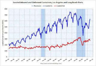 Click on graph for larger image in new window.
Loaded inbound traffic was up 30.0% compared to June 2009. Inbound traffic is now up 1% vs. two years ago (June '08).
Loaded outbound traffic was up 7.7% from June 2009. Exports were off almost 4% from May 2010. Unlike imports, exports are still off from 2 years ago (off 13%).
For imports there is usually a significant dip in either February or March, depending on the timing of the Chinese New Year, and then usually imports increase until late summer or early fall as retailers build inventory for the holiday season. So part of this increase in June imports is just the normal seasonal pattern.
Based on this data, it appears the trade deficit with Asia increased again in June. Not only have the pre-crisis global imbalances returned, but the decline in exports from May is concerning (there is no clear seasonal pattern for exports).


