by Calculated Risk on 8/31/2009 04:00:00 PM
Monday, August 31, 2009
August Economic Summary in Graphs
Here is a collection of real estate and economic graphs for data released in August ...
Note: Click on graphs for larger image in new window. For more info, click on link below graph to original post.
 New Home Sales in July (NSA)
The first graph shows monthly new home sales (NSA - Not Seasonally Adjusted).
Note the Red columns for 2009. This is the 3rd lowest sales for July since the Census Bureau started tracking sales in 1963.
In July 2009, 39 thousand new homes were sold (NSA); the record low was 31 thousand in July 1982; the record high for July was 117 thousand in 2005.
From: New Home Sales Increase in July
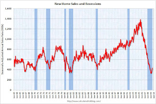 New Home Sales in July
This graph shows shows New Home Sales vs. recessions for the last 45 years.
"Sales of new one-family houses in July 2009 were at a seasonally adjusted annual rate of 433,000 ...
This is 9.6 percent (±13.4%) above the revised June rate of 395,000, but is 13.4 percent (±12.9%) below the July 2008 estimate of 500,000."
From: New Home Sales Increase in July
 New Home Months of Supply in July
There were 7.5 months of supply in July - significantly below the all time record of 12.4 months of supply set in January.
"The seasonally adjusted estimate of new houses for sale at the end of July was 271,000. This represents a supply of 7.5 months at the current sales rate."
From: New Home Sales Increase in July
 Existing Home Sales in July
 This graph shows existing home sales, on a Seasonally Adjusted Annual Rate (SAAR) basis since 1993.
Sales in July 2009 (5.24 million SAAR) were 7.2% higher than last month, and were 5.0% lower than July 2008 (4.99 million SAAR).
From: Existing Home Sales increase in July
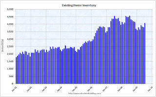 Existing Home Inventory July
This graph shows nationwide inventory for existing homes. According to the NAR, inventory increased to 4.09 million in July. The all time record was 4.57 million homes for sale in July 2008. This is not seasonally adjusted.
Also, many REOs (bank owned properties) are included in the inventory because they are listed - but not all. Recently there have been stories about a substantial number of unlisted REOs and other shadow inventory - so this inventory number is probably low.
From: Existing Home Sales increase in July
 Existing Home Inventory July, Year-over-Year Change
This graph shows the year-over-year change in existing home inventory.
If the trend of declining year-over-year inventory levels continues in 2009 that will be a positive for the housing market. Prices will probably continue to fall until the months of supply reaches more normal levels (closer to 6 months compared to the current 9.4 months), and that will take some time. Plus remember the shadow inventory!
From: More on Existing Home Inventory
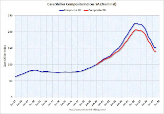 Case Shiller House Prices for June
This graph shows the nominal Composite 10 and Composite 20 indices (the Composite 20 was started in January 2000).
The Composite 10 index is off 32.6% from the peak, and up about 9% (annualized) in June.
The Composite 20 index is off 31.4% from the peak, and up in June.
From: Case-Shiller House Price Index Increases in June
 NAHB Builder Confidence Index in August
This graph shows the builder confidence index from the National Association of Home Builders (NAHB).
The housing market index (HMI) increased to 18 in August from 17 in July. The record low was 8 set in January.
This is still very low - and this is what I've expected - a long period of builder depression.
From: NAHB: Builder Confidence Slightly Higher in August
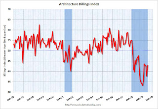 Architecture Billings Index for July
"The Architecture Billings Index rebounded more than 5 points last month to a reading of 43.1, reversing a similar decline in June, according to the American Institute of Architects.
The index has remained below 50, indicating contraction in demand for design services, since January 2008 ..."
From: AIA: Architecture Billings Index shows Contraction in July
 Housing Starts in July
Total housing starts were at 581 thousand (SAAR) in July, off slightly from June, but up sharply over the last three months from the all time record low in April of 479 thousand (the lowest level since the Census Bureau began tracking housing starts in 1959).
Single-family starts were at 490 thousand (SAAR) in July, up slightly from June; 37 percent above the record low in January and February (357 thousand).
From: Housing Starts Flat in July
 Construction Spending in June
The first graph shows private residential and nonresidential construction spending since 1993. Note: nominal dollars, not inflation adjusted.
Residential construction spending increased slightly in June, and nonresidential spending declined a little. From other data (new housing starts), it appears that residential spending has stabilized and might increase in Q3 - however private nonresidential construction will be falling off a cliff.
From: Construction Spending Increases Slightly in June
 July Employment Report
This graph shows the unemployment rate and the year over year change in employment vs. recessions.
Nonfarm payrolls decreased by 247,000 in July. The economy has lost almost 5.7 million jobs over the last year, and 6.66 million jobs during the 19 consecutive months of job losses.
The unemployment rate declined slightly to 9.4 percent.
Year over year employment is strongly negative.
From: Employment Report: 247K Jobs Lost, 9.4% Unemployment Rate
 July Employment Comparing Recessions
This graph shows the job losses from the start of the employment recession, in percentage terms (as opposed to the number of jobs lost).
For the current recession, employment peaked in December 2007, and this recession was a slow starter (in terms of job losses and declines in GDP).
However job losses have really picked up over the last year, and the current recession is now the 2nd worst recession since WWII in percentage terms (and the 1948 recession recovered very quickly) - and also in terms of the unemployment rate (only early '80s recession was worse).
From: Employment Report: 247K Jobs Lost, 9.4% Unemployment Rate
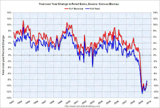 July Retail Sales
This graph shows the year-over-year change in nominal and real retail sales since 1993.
The Census Bureau reported retail sales decreased 0.1% from June to July (seasonally adjusted), and sales are off 8.3% from July 2008 (retail ex food services decreased 9.3%).
From: Retail Sales Decline Slightly in July
 LA Port Traffic in July
This graph shows the loaded inbound and outbound traffic at the port of Los Angeles in TEUs (TEUs: 20-foot equivalent units or 20-foot-long cargo container). Although containers tell us nothing about value, container traffic does give us an idea of the volume of goods being exported and imported.
Inbound traffic was 22.0% below July 2008.
Outbound traffic was 22.7% below July 2008.
There had been some recovery in U.S. exports earlier this year (the year-over-year comparison was off 30% from December through February). And this showed up in the in the Q1 and Q2 GDP reports as net exports of goods and services added 2.64% and 1.38% to GDP in Q1 and Q2, respectively.
From: LA Area Ports: Export Traffic Declines in July
 U.S. Imports and Exports Through June
This graph shows the monthly U.S. exports and imports in dollars through June 2009.
Imports were up in June, mostly because of a spike in oil prices. Exports also increased in June. On a year-over-year basis, exports are off 22% and imports are off 31%.
From: Trade Deficit Increases in June
 Capacity Utilization in July
 This graph shows Capacity Utilization. This series is slightly above the record low (the series starts in 1967).
"Industrial production increased 0.5 percent in July. Aside from a hurricane-related rebound in October 2008, the gain in July marked the first monthly increase since December 2007. ... At 96.0 percent of its 2002 average, total industrial production was 13.1 percent below its level of a year earlier. In July, the capacity utilization rate for total industry edged up to 68.5 percent, a level 12.4 percentage points below its 1972-2008 average."
From: Industrial Production, Capacity Utilization Increase in July
 Restaurant Performance Index for July
"The Association’s Restaurant Performance Index (RPI) – a monthly composite index that tracks the health of and outlook for the U.S. restaurant industry – stood at 98.1 in July, up 0.3 percent from its June level. However, the RPI still remained below 100 for the 21st consecutive month, which signifies contraction in the index of key industry indicators.
...
In addition to sales declines, restaurant operators reported negative customer traffic levels for the 23rd consecutive month in July."
From: Restaurants in July: 23rd Consecutive Month of Declining Traffic
Here is a map of the three month change in the Philly Fed state coincident indicators. Forty seven states are showing declining three month activity.
This is what a widespread recession looks like based on the Philly Fed states indexes.
On a one month basis, activity decreased in 35 states in June, and was unchanged in 8 states.
From: Philly Fed State Coincident Indicators: Still a Widespread Recession in July
 Light vehicle sales in July
This graph shows the historical light vehicle sales (seasonally adjusted annual rate) from the BEA (blue) and an estimate for July (red, light vehicle sales of 11.24 million SAAR from AutoData Corp).
This is the highest vehicle sales since September 2008 (12.5 million SAAR).
From: Light Vehicle Sales Over 11 Million (SAAR) in July
 Q2: Office, Mall and Lodging Investment
 This graph shows investment in offices, lodging and malls as a percent of GDP.
The recent boom in lodging investment has been stunning. Lodging investment peaked at 0.32% of GDP in Q2 2008 and has started to decline (0.27% in Q2 2009). There was a small increase in Q2 2009 that is probably related to projects being completed. I expect lodging investment to continue to decline through at least 2010, to perhaps one-third of the peak.
Investment in multimerchandise shopping structures (malls) peaked in 2007 and has fallen sharply.
Office investment as a percent of GDP peaked at 0.46% in Q3 2008 and has started to decline sharply. With the office vacancy rate rising sharply, office investment will also probably decline through at least 2010.
From: Q2: Office, Mall and Lodging Investment
 NMHC Quarterly Apartment Survey
This graph shows the quarterly Apartment Tightness Index.
A reading below 50 suggests vacancies are rising. Based on limited historical data, I think this index will lead reported apartment rents by 6 months to 1 year. Or stated another way, rents will probably fall for 6 months to 1 year after this index reaches 50. Right now I expect rents to continue to decline through most of 2010.
From: Q2 NMHC Quarterly Apartment Survey: Occupancy Continues to Decline, but Pace Slows
 U.S. Consumer Bankruptcy Filings in July
This graph shows the non-business bankruptcy filings by quarter.
Note: Quarterly data from Administrative Office of the U.S. Courts, 2009 based on monthly data from the American Bankruptcy Institute.
From the American Bankruptcy Institute: Consumer Bankruptcy Filings Reach Highest Monthly Total Since 2005 Bankruptcy Law Overhaul
U.S. consumer bankruptcy filings reached 126,434 in July, the highest monthly total since the Bankruptcy Abuse Prevention and Consumer Protection Act was implemented in October 2005, according to the American Bankruptcy Institute (ABI), relying on data from the National Bankruptcy Research Center (NBKRC).From: ABI: Personal Bankruptcy Filings up 34.3 Percent compared to July 2008
 Delinquency Rates in Q2 2009
 This graph shows the delinquency rates at the commercial banks for residential real estate, commercial real estate and consumer credit cards.
Commercial real estate delinquencies (7.91%) are rising rapidly, and are at the highest rate since the early '90s (as delinquency rates declined following the S&L crisis).
Residential real estate (8.84%) and consumer credit card (6.7%) delinquencies are at the highest levels since the Fed started tracking the data (since Q1 '91).
Although there is credit deterioration everywhere, the rise in these three categories is especially significant. There was also a significant increase in C&I delinquencies (commerical & industrial) and Agricultural loans.
From: Fed: Delinquency Rates Surged in Q2 2009
Fitch: Credit Card Default Chargeoffs decline Slightly in July
by Calculated Risk on 8/31/2009 01:35:00 PM
From Fitch: Consumer 'Signs of Life' Improve U.S. Credit Card Chargeoffs
U.S. consumer credit quality showed signs of life as credit card ABS chargeoffs declined last month, snapping a string of five consecutive record highs, according to the latest Credit Card Index results from Fitch Ratings.As a reminder, the bank stress tests assumed a cumulative two year credit card loss rate of 18% to 20% for the more adverse scenario (only 12% to 17% for the baseline scenario). Right now losses are worse than the more adverse scenario.
...
'We still need to see some measurable improvement in the delinquency and personal bankruptcy figures and the employment situation overall before chargeoffs revert to more historical norms,' said Managing Director Michael Dean. 'For now, we expect chargeoffs to moderate at these elevated levels in the coming months.'
Chargeoffs had risen 45% from February through July and they still remain 63% above year earlier levels. Late stage delinquencies, or receivables more than 60 days past due, have held relatively stable albeit near record highs during the same period following a rapid increase over the prior six months that forewarned the chargeoff run-up.
Fitch's Prime Credit Card Chargeoff Index declined 24 basis points (bps) to 10.55% for the July collection period. ...
Also credit card loss rates tend to the track unemployment - so, as the unemployment rate rises into 2010, the credit card chargeoffs might increase some more.
Restaurants in July: 23rd Consecutive Month of Declining Traffic
by Calculated Risk on 8/31/2009 10:03:00 AM
Note: Any reading below 100 shows contraction for this index.
From the National Restaurant Association (NRA): Restaurant Industry Outlook Remained Uncertain In June as Restaurant Performance Index Declined for Second Consecutive Month
The outlook for the restaurant industry improved somewhat in July, as the National Restaurant Association’s comprehensive index of restaurant activity registered its first gain in three months. The Association’s Restaurant Performance Index (RPI) – a monthly composite index that tracks the health of and outlook for the U.S. restaurant industry – stood at 98.1 in July, up 0.3 percent from its June level. However, the RPI still remained below 100 for the 21st consecutive month, which signifies contraction in the index of key industry indicators.
“Although restaurant operators continue to report soft same-store sales and customer traffic levels, they are more optimistic about improving conditions in the months ahead,” said Hudson Riehle, senior vice president of Research and Information Services for the Association. “Restaurant operators reported a positive six-month economic outlook, and the proportion expecting higher sales rose to its highest level in three months.”
...
In addition to sales declines, restaurant operators reported negative customer traffic levels for the 23rd consecutive month in July.
emphasis added
 Click on graph for larger image in new window.
Unfortunately the data for this index only goes back to 2002.
The restaurant business is still contracting, although not contracting as fast as late last year.
The cook must have put the green shoots in the soup.
Chicago: A Renters' Market
by Calculated Risk on 8/31/2009 09:05:00 AM
From the Chicago Tribune: Chicago's a renters' market, but vacancies, delinquencies on rise
More apartments are available in Chicago, and at prices that have slipped since the beginning of the year, creating a renter's market and allowing some consumers to trade up to better housing. ... according to a study scheduled to be released Monday by DePaul University's Institute for Housing Studies.
...
"If anything, I think [DePaul] is reporting less than what I see," said Jack Markowski, president of Community Investment Corp., a non-profit mortgage lender to multifamily buildings that started seeing increases in multifamily mortgage delinquencies 18 months ago. Multifamily buildings, he said, "are vulnerable right now."
...
Landlords, seeking to cover their costs, are lowering rents to attract tenants, and the study found that rents declined in all sizes of buildings and in all city neighborhoods except for the North Side.
...
The level of multifamily mortgages foreclosed on in Chicago during the year's second quarter, at 0.8 percent of the total supply, was twice as high as it was in the comparable year-ago period, said James Shilling, a DePaul professor and director of the institute.
"It only gets worse," Shilling said of the predicament the rental market finds itself in. "There's downward pressure on rents and upward pressure on vacancy rates. I think for the rest of 2009 and 2010 we'll see more defaults."
Sunday, August 30, 2009
Shanghai Cliff Diving
by Calculated Risk on 8/30/2009 11:14:00 PM
 Click on graph for larger image in new window.
This graph is the Shanghai SSE composite index. I used to post this graph with the subtitle "Cliff Diving"!
Now the Shanghai composite is off more than 20% from the recent peak, and off close to 5% tonight. I guess this is 'mini-me' Cliff Diving ...
The U.S. futures are also off tonight, but not significantly:
CBOT mini-sized Dow
Futures from barchart.com
CME Globex Flash Quotes
And the other Asian markets are mostly red too.
Best to all.
FDIC risks $80 Billion in Loss Share Agreements
by Calculated Risk on 8/30/2009 06:46:00 PM
Every Friday, in just about every bank failure press release, the FDIC mentions a loss share agreement with the acquiring bank. As an example, in the press release regarding Mutual Bank of Harvey, Illinois on July 31st:
As of July 16, 2009, Mutual Bank had total assets of $1.6 billion and total deposits of approximately $1.6 billion. In addition to assuming all of the deposits of the failed bank, United Central Bank agreed to purchase essentially all of the assets.For those interested in every detail, here are the Single Family Loss Share Agreement (page 54) and Commercial Loss Share Agreement {page 89) between the FDIC and United Central Bank (the acquirer).
The FDIC and United Central Bank entered into a loss-share transaction on approximately $1.3 billion of Mutual Bank's assets.
emphasis added
From the WSJ: FDIC Shoulders Big Losses on Loans
[T]he Federal Deposit Insurance Corp. has agreed to assume most of the risk on $80 billion in loans and other assets. The agency expects it will eventually have to cover $14 billion in future losses on deals cut so far. ...These agreements definitely make the deals more attractive to potential buyers because the limit the downside.
So far, the FDIC has paid out $300 million to a handful of banks under the loss-share agreements. ... The agency estimates the loss-share deals cut will cost it $11 billion less than if the agency seized the assets and sold them at fair-market value.
...
In most cases, the FDIC agrees to cover 80% of future losses on a big portion of the assets, and 95% on the rest. The FDIC says it doesn't anticipate facing the 95% loss-coverage scenario on any deal. ... Many of the loss-share deals will be in place for up to 10 years.
The article notes that the FDIC "had just $10.4 billion in its deposit-insurance fund at the end of June", but that includes reserves for future losses. And since the FDIC expects losses of $14 billion from these loss share agreements, they should have already reserved for those losses.
Still many of these agreements will be in place for 10 years, and there is the potential for much higher losses.
Econbrowser Shifts to Neutral
by Calculated Risk on 8/30/2009 03:16:00 PM
Professor Hamilton has changed the emoticon on his site to neutral. Hamilton has been generally negative since early 2007 ...
| Date | Status |
|---|---|
| Sep 13, 2006 | |
| Feb 21, 2007 | |
| Apr 25, 2007 | |
| Jun 27, 2007 | |
| Oct 5, 2007 | |
| Jan 4, 2008 | |
| Aug 30, 2009 |
If you've only been following Econbrowser since 2008, you may have thought that the crabby countenance in the upper-right corner of our main page was a permanent fixture, conveying our general grumpiness about the state of the economy or perhaps life in general. Despite having been stuck in the pessimistic mode for quite some time now, the emoticon was in fact always intended to be a dynamic feature, adjusted from time to time to provide readers with our overall impression of incoming data. The table on the left provides links to each occasion that our Little Econ Watcher's countenance has changed in the past.See Hamilton's post for the reasons for the change. I think we are a long way from a smiley face.
Last week's data persuaded me to move the Econbrowser Emoticon back into neutral, signifying that I now judge overall output to be growing slowly rather than declining. Here are details on the evidence that prompted this change in assessment, and what it signifies.
Bankruptcy Filings and Mortgage Delinquencies by State
by Calculated Risk on 8/30/2009 10:47:00 AM
Here is a graph of bankruptcy filings vs. mortgage delinquencies (including homes in foreclosure process) by state for Q2 2009.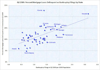 Click on graph for larger image in new window.
The bankruptcy filings data is from the American Bankruptcy Institute.
The mortgage delinquency data is from the Mortgage Bankers Association.
No surprise - there is a clear correlation, although each state has different bankruptcy laws that can impact the relationship (see Florida).
Here is a sortable table to find the data for each state (use scroll bar to see all data).
Saturday, August 29, 2009
Houses: Cash Buyer Percentages in Orlando, Tampa and Knoxville
by Calculated Risk on 8/29/2009 09:38:00 PM
Here is some data from the Atlanta Fed on cash buyers in the southeast. This is part of the economic and financial highlights the Atlanta Fed puts out weekly. Click on graph for larger image in new window.
From the Economic Highlight:
Orlando and Tampa Realtor data [earlier] showed an increase in the share of cash buyers, but in recent months that share has weakened somewhat.The percentages for Orlanda and Tampa are similar to the percentages in the lower priced areas of the California Bay Area: see the table in Carolyn Said's recent article in the San Francisco Chronicle 'Cash is king' in market for foreclosed homes
In the Knoxville market, where home sales and prices did not accelerate as much as in Orlando and Tampa, the share of cash buyers had peaked earlier in the year but has tapered off since March.
I suspect many of these cash buyers are investors buying for cash flow (not the speculators we saw during the boom). Frequently these investors are buying in the same areas as first-time home buyers (some motivated by the $8K tax credit) - and the competition is pushing up prices and reducing supply. Now if we just had better first-time home buyer data ...
Article: "The HAMP Mirage"
by Calculated Risk on 8/29/2009 05:40:00 PM
Andy Kroll at Mother Jones discusses problems with the Home Affordable Modification Program (HAMP): The Foreclosure Rescue Mirage
Industry experts are now questioning how many of the program’s estimated 235,000 modifications will actually benefit homeowners in the long term, and say that homeowners clamoring to participate in HAMP have created an industrywide logjam for mortgage servicers, resulting in substantial delays and backed-up customer service support. The Treasury’s first servicer performance report (PDF), covering March to July 2009, found that servicers had offered modifications to just 15 percent of eligible delinquent homeowners, and initiated them for just 9 percent of that group.I've heard from servicers who've said they are just overwhelmed and are staffing up to meet the demand. And it appears the administration is trying to make improvements:
Despite its flaws, HAMP is a good-faith effort by the government to address the foreclosure crisis, and there are signs of improvement. In June, HAMP officials began conducting much more rigorous reviews of servicers, and have started a "second look" program, in which servicers’ decisions to approve or deny HAMP modifications are scrutinized. Compliance officials are also analyzing samples of HAMP-modified loans to track error rates with servicers. And government officials have on several occasions tried to light a fire under HAMP servicers to speed up the modification process.Some believe HAMP will fall far short of the goals:
The Treasury has set a target of modifying 4 million mortgages by 2012, but Moody's estimates HAMP will in fact modify only 1.5 to 2 million.The Treasury disagrees:
More than 400,000 modification offers have been extended and more than 230,000 trial modifications have begun. This pace of modifications puts the program on track to offer assistance to up to 3 to 4 million homeowners over the next three years, our target on February 18.Actually the original press release stated the program "will help up to 3 to 4 million at-risk homeowners avoid foreclosure" and the new press release says "offer assistance to up to 3 to 4 million homeowners". A few word changes makes a significant difference.
The Treasury's current target is 500,000 cumulative trial modifications started by November 1st, up from the 235,000 cumulative at the end of July. At that pace (about 90 thousand trials started per month), the cumulative trial modifications started will be close to 3.0 million by early 2012 - however many of those borrowers will probably redefault. Anyone who redefaults will have been "offered assistance", but probably will not "avoid foreclosure".
The article has a few interesting anecdotes of the struggles of borrowers in dealing with their servicers. My best wishes to Kristina Page. Thanks for mentioning CR!


