 RSS Feed
 by Calculated Risk on 3/31/2021 09:00:00 PM
Wednesday, March 31, 2021
Thursday: Unemployment Claims, ISM Mfg, Construction Spending, Vehicle Sales
Thursday:
• At 8:30 AM ET, The initial weekly unemployment claims report will be released. The consensus is for a decrease to 650 thousand from 684 thousand last week.
• At 10:00 AM, ISM Manufacturing Index for March. The consensus is for the ISM to be at 61.2, up from 60.8 in February.
• Also at 10:00 AM, Construction Spending for February. The consensus is for a 0.9% decrease in construction spending.
• At All Day, Light vehicle sales for March. The consensus is for light vehicle sales to be 16.5 million SAAR in March, up from 15.7 million in February (Seasonally Adjusted Annual Rate).
Fannie Mae: Mortgage Serious Delinquency Rate Decreased in February
by Calculated Risk on 3/31/2021 04:10:00 PM
Fannie Mae reported that the Single-Family Serious Delinquency decreased to 2.76% in February, from 2.80% in January. The serious delinquency rate is up from 0.65% in February 2020.
These are mortgage loans that are "three monthly payments or more past due or in foreclosure".
The Fannie Mae serious delinquency rate peaked in February 2010 at 5.59% following the housing bubble, and peaked at 3.32% in August 2020 during the pandemic.
 Click on graph for larger image
By vintage, for loans made in 2004 or earlier (2% of portfolio), 5.90% are seriously delinquent (up from 5.87% in January). For loans made in 2005 through 2008 (2% of portfolio), 10.01% are seriously delinquent (up from 9.98%), For recent loans, originated in 2009 through 2021 (96% of portfolio), 2.29% are seriously delinquent (down from 2.32%). So Fannie is still working through a few poor performing loans from the bubble years.
Mortgages in forbearance are counted as delinquent in this monthly report, but they will not be reported to the credit bureaus.
This is very different from the increase in delinquencies following the housing bubble. Lending standards have been fairly solid over the last decade, and most of these homeowners have equity in their homes - and they will be able to restructure their loans once they are employed.
Note: Freddie Mac reported earlier.
March 31 COVID-19 Vaccinations, New Cases, Hospitalizations
by Calculated Risk on 3/31/2021 03:48:00 PM
Note: I've been posting this data daily for over a year. I'll stop once 70% of the population over 18 has had at least one dose of vaccine, new cases are under 5,000 per day, and hospitalizations below 3,000.
According to the CDC, 150.3 million doses have been administered. 21.1% of the population over 18 is fully vaccinated, and 37.7% of the population over 18 has had at least one dose (97.2 million people have had at least one dose).
And check out COVID Act Now to see how each state is doing.
Almost 35,000 US deaths have been reported in March due to COVID.
 Click on graph for larger image.
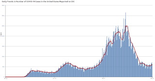
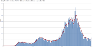
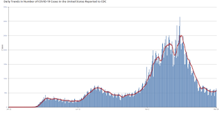
This graph shows the daily (columns) 7 day average (line) of positive tests reported.
This data is from the CDC.
 Click on graph for larger image.
This graph shows the daily (columns) 7 day average (line) of positive tests reported.
This data is from the CDC.
The 7-day average is 62,542, up from 61,998 yesterday, and close to the summer surge peak of 67,337 on July 23rd.
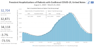
The second graph shows the number of people hospitalized.
 This data is also from the CDC.
The CDC cautions that due to reporting delays, the area in grey will probably increase.
The second graph shows the number of people hospitalized.
 This data is also from the CDC.
The CDC cautions that due to reporting delays, the area in grey will probably increase.
The current 7-day average is 33,376, up from 33,141 yesterday, and well above the post-summer surge low of 23,000.
CDC: "Age-adjusted death rate increased by 15.9% in 2020"; COVID Third Leading Cause of Death
by Calculated Risk on 3/31/2021 12:33:00 PM
The CDC released the Provisional Mortality Data — United States, 2020 today:
During January–December 2020, the estimated 2020 age-adjusted death rate increased for the first time since 2017, with an increase of 15.9% compared with 2019, from 715.2 to 828.7 deaths per 100,000 population. COVID-19 was the underlying or a contributing cause of 377,883 deaths (91.5 deaths per 100,000). COVID-19 death rates were highest among males, older adults, and AI/AN and Hispanic persons. The highest numbers of overall deaths and COVID-19 deaths occurred during April and December. COVID-19 was the third leading underlying cause of death in 2020, replacing suicide as one of the top 10 leading causes of deathThis is very close to economist Tom Lawler's estimates, see: Lawler: Update on the Dismal Demographics of 2020; "Smallest Population increase since 1918"
emphasis added
NAR: Pending Home Sales Decrease 10.6% in February
by Calculated Risk on 3/31/2021 10:02:00 AM
From the NAR: Pending Home Sales Slip 10.6% in February
Pending home sales dipped for a second straight month in February, according to the National Association of Realtors®. Each of the four major U.S. regions witnessed month-over-month declines in February, while results were mixed in the four regions year-over-year.This was well below expectations for this index. Note: Contract signings usually lead sales by about 45 to 60 days, so this would usually be for closed sales in March and April.
The Pending Home Sales Index (PHSI), a forward-looking indicator of home sales based on contract signings, dropped 10.6% to 110.3 in February. Year-over-year, contract signings fell 0.5%. An index of 100 is equal to the level of contract activity in 2001.
...
The Northeast PHSI fell 9.2% to 92.3 in February, a 3.9% dip from a year ago. In the Midwest, the index dropped 9.5% to 102.4 last month, down 6.1% from February 2020.
Pending home sales transactions in the South declined 13.0% to an index of 133.2 in February, up 2.9% from February 2020. The index in the West fell 7.4% in February to 96.9, up 1.9% from a year prior.
emphasis added
ADP: Private Employment increased 517,000 in March
by Calculated Risk on 3/31/2021 08:19:00 AM
Private sector employment increased by 517,000 jobs from February to March according to the March ADP® National Employment ReportTM. Broadly distributed to the public each month, free of charge, the ADP National Employment Report is produced by the ADP Research Institute® in collaboration with Moody’s Analytics. The report, which is derived from ADP’s actual payroll data, measures the change in total nonfarm private employment each month on a seasonally-adjusted basisThis was below the consensus forecast of 550,000 for this report.
“We saw marked improvement in March’s labor market data, reporting the strongest gain since September 2020,” said Nela Richardson, chief economist, ADP. “Job growth in the service sector significantly outpaced its recent monthly average, led with notable increase by the leisure and hospitality industry. This sector has the most opportunity to improve as the economy continues to gradually reopen and the vaccine is made more widely available. We are continuing to keep a close watch on the hardest hit sectors but the groundwork is being laid for a further boost in the monthly pace of hiring in the months ahead.”
emphasis added
The BLS report will be released Friday, and the consensus is for 565 thousand non-farm payroll jobs added in March. The ADP report has not been very useful in predicting the BLS report.
MBA: Mortgage Applications Decrease in Latest Weekly Survey
by Calculated Risk on 3/31/2021 07:00:00 AM
From the MBA: Mortgage Applications Decrease in Latest MBA Weekly Survey
Mortgage applications decreased 2.2 percent from one week earlier, according to data from the Mortgage Bankers Association’s (MBA) Weekly Mortgage Applications Survey for the week ending March 26, 2021.
... The Refinance Index decreased 3 percent from the previous week and was 32 percent lower than the same week one year ago. The seasonally adjusted Purchase Index decreased 2 percent from one week earlier. The unadjusted Purchase Index decreased 1 percent compared with the previous week and was 39 percent higher than the same week one year ago.
“After seven consecutive weeks of increasing mortgage rates, the 30-year fixed rate declined 3 basis points to 3.33 percent, which is still almost half a percentage point higher than the start of this year. Mortgage applications for refinances and home purchases both declined, but purchase activity was still convincingly higher than the pandemic-induced drop seen a year ago, as well as up 6 percent from the same week in March 2019,” said Joel Kan, MBA’s Associate Vice President of Economic and Industry Forecasting. “Many prospective homebuyers this spring are feeling the effects of higher rates and rapidly accelerating home prices. Record-low inventory is pushing home-price growth at double the rate from a year ago, and even above the 10 percent growth rates seen in 2005. The housing market is in desperate need of more inventory to cool price growth and preserve affordability.”
Added Kan, “Higher mortgage rates continue to shut down refinance activity, as the pool of borrowers who can benefit from a refinance further shrinks.”
...
The average contract interest rate for 30-year fixed-rate mortgages with conforming loan balances ($548,250 or less) decreased to 3.33 percent from 3.36 percent, with points decreasing to 0.39 from 0.42 (including the origination fee) for 80 percent loan-to-value ratio (LTV) loans.
emphasis added
 Click on graph for larger image.
The first graph shows the refinance index since 1990.
With low rates, the index remains elevated, but falling as rates rise.
The second graph shows the MBA mortgage purchase index
 According to the MBA, purchase activity is up 38% year-over-year unadjusted.
Note: Until the 2nd half of May, the MBA index will be up sharply year-over-year since purchase activity collapsed in late March 2020 in the early weeks of the pandemic.
Note: Red is a four-week average (blue is weekly).
Tuesday, March 30, 2021
Wednesday: ADP Employment, Pending Home Sales
by Calculated Risk on 3/30/2021 09:15:00 PM
Wednesday:
• At 7:00 AM ET, The Mortgage Bankers Association (MBA) will release the results for the mortgage purchase applications index.
• At 8:15 AM, The ADP Employment Report for March. This report is for private payrolls only (no government). The consensus is for 550,000 payroll jobs added in March, up from 117,000 added in February.
• At 9:45 AM, Chicago Purchasing Managers Index for March. The consensus is for a reading of 60.3, up from 59.5 in February.
• At 10:00 AM, Pending Home Sales Index for February. The consensus is for a 2.6% decrease in the index.
Zillow Case-Shiller House Price Forecast: "No End in Sight", 12.0% YoY in February
by Calculated Risk on 3/30/2021 06:13:00 PM
The Case-Shiller house price indexes for January were released today. Zillow forecasts Case-Shiller a month early, and I like to check the Zillow forecasts since they have been pretty close.
From Matthew Speakman at Zillow: January 2021 Case-Shiller Results & Forecast: No End in Sight
Home prices continued their surge higher as the new year began, maintaining a torrid pace that appears likely to persist for many more months.
...
As more signs of an improving economy continue to arrive, demand for housing remains elevated leading homes to fly off the shelves and red-hot competition for the relatively few homes available for sale. Homes in many areas went under contract in January — generally one of the slower times of the year — merely days after hitting the market and about a month faster than the same period a year ago. Seeing this, and unfazed by rising mortgage rates, a wave of eager buyers is being forced to act swiftly and face heightened competition for the few homes available. The combined dynamic is pushing prices upward at their strongest pace in years, and it doesn’t appear that there is an end in sight.
Monthly growth in January as reported by Case-Shiller is expected to slow slightly from December in all three main indices, while annual growth is expected to accelerate across the board. S&P Dow Jones Indices is expected to release data for the January S&P CoreLogic Case-Shiller Indices on Tuesday, April 27.
emphasis added
 The Zillow forecast is for the year-over-year change for the Case-Shiller National index to be at 12.0% in February, up from 11.2% in January.
 The Zillow forecast is for the 20-City index to be up 11.9% YoY in February from 11.1% in January, and for the 10-City index to increase to be up 11.6% YoY compared to 10.9% YoY in January.
March 30 COVID-19 Vaccinations, New Cases, Hospitalizations
by Calculated Risk on 3/30/2021 04:23:00 PM
Note: I've been posting this data daily for over a year. I'll stop once 70% of the population over 18 has had at least one dose of vaccine, new cases are under 5,000 per day, and hospitalizations below 3,000.
According to the CDC, 147.6 million doses have been administered. 20.7% of the population over 18 is fully vaccinated, and 37.1% of the population over 18 has had at least one dose (95.7 million people have had at least one dose).
And check out COVID Act Now to see how each state is doing.
Over 34,000 US deaths have been reported in March due to COVID.
 Click on graph for larger image.
This graph shows the daily (columns) 7 day average (line) of positive tests reported.
This data is from the CDC.
 Click on graph for larger image.
This graph shows the daily (columns) 7 day average (line) of positive tests reported.
This data is from the CDC.
The 7-day average is 61,741, up from 60,961 yesterday, and well above the low following the summer surge of 35,000.
The second graph shows the number of people hospitalized.
 This data is also from the CDC.
The CDC cautions that due to reporting delays, the area in grey will probably increase.
The second graph shows the number of people hospitalized.
 This data is also from the CDC.
The CDC cautions that due to reporting delays, the area in grey will probably increase.
The current 7-day average is 33,141, up from 31,850 yesterday, and well above the post-summer surge low of 23,000.
Update: A few comments on the Seasonal Pattern for House Prices
by Calculated Risk on 3/30/2021 02:15:00 PM
CR Note: This is a repeat of earlier posts with updated graphs.
A few key points:
1) There is a clear seasonal pattern for house prices.
2) The surge in distressed sales during the housing bust distorted the seasonal pattern.
3) Even though distressed sales are down significantly, the seasonal factor is based on several years of data - and the factor is now overstating the seasonal change (second graph below).
4) Still the seasonal index is probably a better indicator of actual price movements than the Not Seasonally Adjusted (NSA) index.
For in depth description of these issues, see Jed Kolko's article from 2014 (currently Chief Economist at Indeed) "Let’s Improve, Not Ignore, Seasonal Adjustment of Housing Data"
Note: I was one of several people to question the change in the seasonal factor (here is a post in 2009) - and this led to S&P Case-Shiller questioning the seasonal factor too (from April 2010). I still use the seasonal factor (I think it is better than using the NSA data).
 Click on graph for larger image.
This graph shows the month-to-month change in the NSA Case-Shiller National index since 1987 (through January 2021). The seasonal pattern was smaller back in the '90s and early '00s, and increased once the bubble burst.
The seasonal swings have declined since the bubble, although the recent price surge changed the month-over-month pattern.
 The second graph shows the seasonal factors for the Case-Shiller National index since 1987. The factors started to change near the peak of the bubble, and really increased during the bust.
The swings in the seasonal factors have started to decrease, and it seemed - as recent history is included in the factors - the seasonal factors had been moving back towards more normal levels.
The recent price surge might distort this a little.
Real House Prices and Price-to-Rent Ratio in January
by Calculated Risk on 3/30/2021 11:26:00 AM
Here is the post earlier on Case-Shiller: Case-Shiller: National House Price Index increased 11.2% year-over-year in January
It has been fifteen years since the bubble peak. In the Case-Shiller release today, the seasonally adjusted National Index (SA), was reported as being 29% above the previous bubble peak. However, in real terms, the National index (SA) is about 3% above the bubble peak (and historically there has been an upward slope to real house prices). The composite 20, in real terms, is still 5% below the bubble peak.
The year-over-year growth in prices increased to 11.2% nationally.
Usually people graph nominal house prices, but it is also important to look at prices in real terms (inflation adjusted). Case-Shiller and others report nominal house prices. As an example, if a house price was $200,000 in January 2000, the price would be close to $294,000 today adjusted for inflation (47%). That is why the second graph below is important - this shows "real" prices (adjusted for inflation).
Nominal House Prices
 The first graph shows the monthly Case-Shiller National Index SA, and the monthly Case-Shiller Composite 20 SA (through January) in nominal terms as reported.
In nominal terms, the Case-Shiller National index (SA) and the Case-Shiller Composite 20 Index (SA) are both at new all times highs (above the bubble peak).
Real House Prices
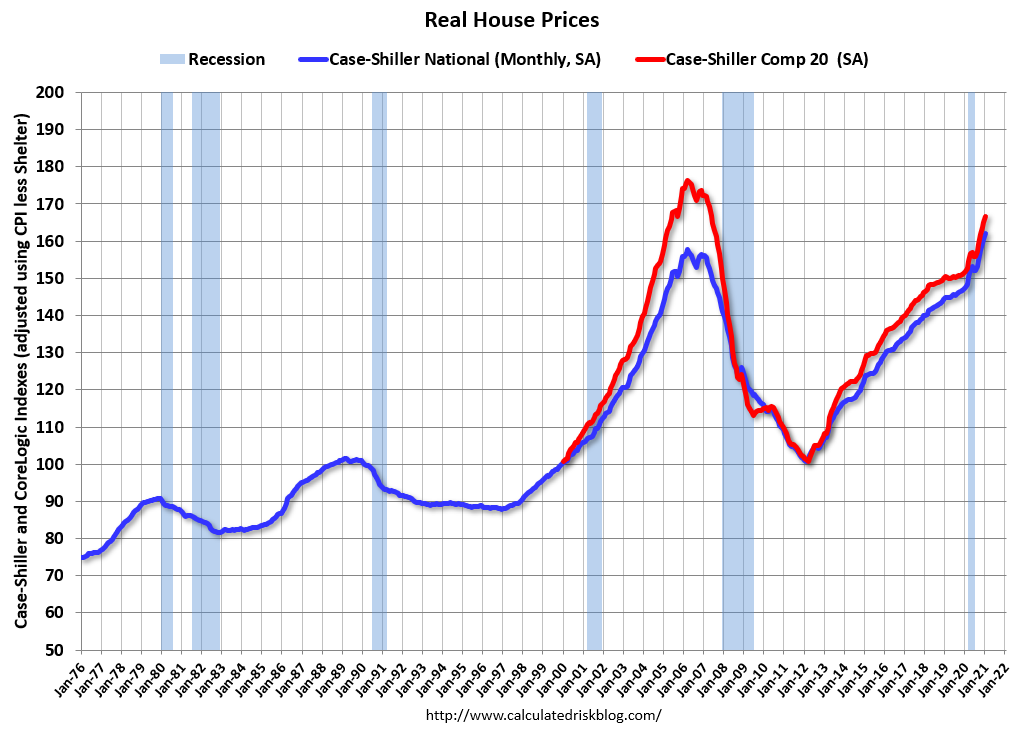 The second graph shows the same two indexes in real terms (adjusted for inflation using CPI less Shelter). Note: some people use other inflation measures to adjust for real prices.
In real terms, the National index is 3% above the bubble peak, and the Composite 20 index is back to early 2005.
In real terms, house prices are at 2005 levels.
Note that inflation was negative for a few months last year, and that also boosted real prices.
Price-to-Rent
In October 2004, Fed economist John Krainer and researcher Chishen Wei wrote a Fed letter on price to rent ratios: House Prices and Fundamental Value. Kainer and Wei presented a price-to-rent ratio using the OFHEO house price index and the Owners' Equivalent Rent (OER) from the BLS.
 Here is a similar graph using the Case-Shiller National and Composite 20 House Price Indexes.
This graph shows the price to rent ratio (January 2000 = 1.0). The price-to-rent ratio had been moving mostly sideways, but picked up recently.
On a price-to-rent basis, the Case-Shiller National index is back to December 2004 levels, and the Composite 20 index is back to June 2004 levels.
In real terms, prices are back to 2005 levels, and the price-to-rent ratio is back to 2004.
Case-Shiller: National House Price Index increased 11.2% year-over-year in January
by Calculated Risk on 3/30/2021 09:09:00 AM
S&P/Case-Shiller released the monthly Home Price Indices for January ("January" is a 3 month average of November, December and January prices).
This release includes prices for 20 individual cities, two composite indices (for 10 cities and 20 cities) and the monthly National index.
From S&P: S&P Corelogic Case-Shiller Index Reports 11.2% Annual Home Price Gain to Start 2021
The S&P CoreLogic Case-Shiller U.S. National Home Price NSA Index, covering all nine U.S. census divisions, reported an 11.2% annual gain in January, up from 10.4% in the previous month. The 10-City Composite annual increase came in at 10.9%, up from 9.9% in the previous month. The 20-City Composite posted an 11.1% year-over-year gain, up from 10.2% in the previous month.
Phoenix, Seattle, and San Diego continued to report the highest year-over-year gains among the 20 cities in January. Phoenix led the way with a 15.8% year-over-year price increase, followed by Seattle with a 14.3% increase and San Diego with a 14.2% increase. All 20 cities reported higher price increases in the year ending January 2021 versus the year ending December 2020.
...
Before seasonal adjustment, the U.S. National Index posted a 0.8% month-over-month increase, while the 10-City and 20-City Composites both posted increases of 0.8% and 0.9% respectively in January. After seasonal adjustment, the U.S. National Index posted a month-over-month increase of 1.2%, and the 10-City and 20-City Composites both posted increases of 1.2% as well. In January, 19 of 20 cities reported increases before seasonal adjustment, and all 20 cities reported increases after seasonal adjustment.
“The strong price gains that we observed in the last half of 2020 continued into the first month of the new year. In January 2021, the National Composite Index rose by 11.2% compared to its year-ago levels,” says Craig J. Lazzara, Managing Director and Global Head of Index Investment Strategy at S&P DJI. “The trend of accelerating prices that began in June 2020 has now reached its eighth month and is also reflected in the 10- and 20-City Composites (up 10.9% and 11.1%, respectively). The market’s strength is broadly-based: all 20 cities rose, and all 20 cities gained more in the 12 months ended in January 2021 than they had gained in the 12 months ended in December 2020.
emphasis added
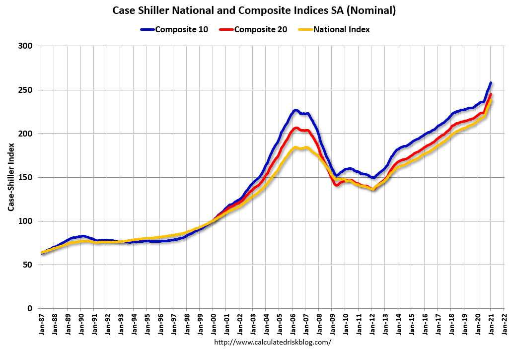 Click on graph for larger image.
 The first graph shows the nominal seasonally adjusted Composite 10, Composite 20 and National indices (the Composite 20 was started in January 2000).
The Composite 10 index is up 1.2% in January (SA) from December.
The Composite 20 index is up 1.2% (SA) in January.
The National index is 29% above the bubble peak (SA), and up 1.2% (SA) in January. The National index is up 75% from the post-bubble low set in December 2011 (SA).
 The second graph shows the year-over-year change in all three indices.
The Composite 10 SA is up 10.9% compared to January 2020. The Composite 20 SA is up 11.1% year-over-year.
The National index SA is up 11.2% year-over-year.
Note: According to the data, prices increased in 20 cities month-over-month seasonally adjusted.
Price increases were above expectations. I'll have more later.
Monday, March 29, 2021
Tuesday: Case-Shiller House Prices
by Calculated Risk on 3/29/2021 09:00:00 PM
From Matthew Graham at Mortgage News Daily: MBS RECAP: New Week, New Weakness
The new week wasted very little time in reinforcing the realities of 2021. This is a rising rate environment until further notice and any rapid correction toward lower rates will take some serious motivation. ... [30 year fixed 3.37%]Tuesday:
emphasis added
• At 9:00 AM ET, S&P/Case-Shiller House Price Index for January. The consensus is for a 10.7% year-over-year increase in the Comp 20 index.
• Also at 9:00 AM, FHFA House Price Index for January 2021. This was originally a GSE only repeat sales, however there is also an expanded index.
March 29 COVID-19 Vaccinations, New Cases, Hospitalizations
by Calculated Risk on 3/29/2021 08:20:00 PM
Note: I've been posting this data daily for over a year. I'll stop once 70% of the population over 18 has had at least one dose of vaccine, new cases are under 5,000 per day, and hospitalizations below 3,000.
According to the CDC, 145.8 million doses have been administered. 20.4% of the population over 18 is fully vaccinated, and 36.7% of the population over 18 has had at least one dose (94.7 million people have had at least one dose).
And check out COVID Act Now to see how each state is doing.
Almost 35,000 US deaths have been reported in March due to COVID.
 Click on graph for larger image.
This graph shows the daily (columns) 7 day average (line) of positive tests reported.
This data is from the CDC.
 Click on graph for larger image.
This graph shows the daily (columns) 7 day average (line) of positive tests reported.
This data is from the CDC.
The 7-day average is 61,632, up from 604,25 yesterday, and well above the low following the summer surge of 35,000.
The second graph shows the number of people hospitalized.
 This data is also from the CDC.
The CDC cautions that due to reporting delays, the area in grey will probably increase.
The second graph shows the number of people hospitalized.
 This data is also from the CDC.
The CDC cautions that due to reporting delays, the area in grey will probably increase.
The current 7-day average is 31,850, down from 32,857, yesterday, but well above the post-summer surge low of 23,000.
MBA Survey: "Share of Mortgage Loans in Forbearance Decreases to 4.96%"
by Calculated Risk on 3/29/2021 04:00:00 PM
Note: This is as of March 21st.
From the MBA: Share of Mortgage Loans in Forbearance Decreases to 4.96%
The Mortgage Bankers Association’s (MBA) latest Forbearance and Call Volume Survey revealed that the total number of loans now in forbearance decreased by 9 basis points from 5.05% of servicers’ portfolio volume in the prior week to 4.96% as of March 21, 2021. According to MBA’s estimate, 2.5 million homeowners are in forbearance plans.
...
“The share of loans in forbearance decreased for the fourth straight week, dropping below 5 percent for the first time in a year. New forbearance requests remained at their lowest level since last March, and the pace of exits increased,” said Mike Fratantoni, MBA’s Senior Vice President and Chief Economist. “More than 17 percent of borrowers in forbearance extensions have now exceeded the 12-month mark.”
Fratantoni added, “Many homeowners need this support, even as there are increasing signs that the pace of economic activity is picking up as the vaccine rollout continues. Those who have an ongoing hardship due to the pandemic and want to extend their forbearance beyond the 12-month point need to contact their servicer. Servicers cannot automatically extend forbearance terms without the borrower’s consent.”
emphasis added
 Click on graph for larger image.
This graph shows the percent of portfolio in forbearance by investor type over time. Most of the increase was in late March and early April, and has trended down since then.
The MBA notes: "Total weekly forbearance requests as a percent of servicing portfolio volume (#) remained flat relative to the prior week at 0.05%, the lowest level since the week ending March 15, 2020."
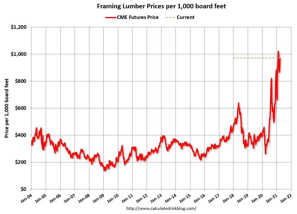
Update: Framing Lumber Prices Up Sharply Year-over-year
by Calculated Risk on 3/29/2021 01:36:00 PM
Here is another monthly update on framing lumber prices.
This graph shows CME framing futures through Mar 29th.
 Click on graph for larger image in graph gallery.
This is up sharply year-over-year (lumber prices slumped at the beginning of the pandemic).
There is a seasonal pattern for lumber prices, and usually prices will increase in the Spring, and peak around May, and then bottom around October or November - although there is quite a bit of seasonal variability.
Clearly there is another surge in demand for lumber.
Housing Inventory March 29th Update: At Record Lows
by Calculated Risk on 3/29/2021 10:49:00 AM
One of the key questions for 2021 is: Will inventory increase as the pandemic subsides, or will inventory decrease further in 2021?
Tracking inventory will be very important this year.
 Click on graph for larger image in graph gallery.
This inventory graph is courtesy of Altos Research.
As of March 26th, inventory was at 313 thousand (7 day average), compared to 747 thousand the same week a year ago. That is a decline of 58%.
A week ago, inventory was at 316 thousand, and was down 57% YoY. Seasonally, inventory should bottom soon.
Mike Simonsen discusses this data regularly on Youtube.
Mike Simonsen discusses this data regularly on Youtube.
Dallas Fed: "Texas Manufacturing Activity Accelerates Sharply" in March
by Calculated Risk on 3/29/2021 10:43:00 AM
From the Dallas Fed: Texas Manufacturing Activity Accelerates Sharply
Texas factory activity expanded at a markedly faster pace in March, according to business executives responding to the Texas Manufacturing Outlook Survey. The production index, a key measure of state manufacturing conditions, surged 28 points to 48.0, its highest reading in the survey’s 17-year history.This was the last of the regional Fed surveys for March.
Other measures of manufacturing activity also pointed to sharply faster growth this month. The new orders index rose 18 points to 30.5, and the growth rate of orders index rose 11 points to 22.7. The capacity utilization index rocketed from 16.5 to 46.1, an all-time high. The shipments index rose 17 points to 33.1.
Perceptions of broader business conditions improved markedly in March. The general business activity index posted another double-digit increase, rising 12 points to 28.9. The company outlook index shot up 15 points to 25.8, its highest reading since mid-2018. The outlook uncertainty index edged down to 5.5.
Labor market measures indicated robust growth in employment and work hours. The employment index came in at 18.8, up from 12.7 and well above average.
emphasis added
Here is a graph comparing the regional Fed surveys and the ISM manufacturing index:
 Click on graph for larger image.
The New York and Philly Fed surveys are averaged together (yellow, through March), and five Fed surveys are averaged (blue, through March) including New York, Philly, Richmond, Dallas and Kansas City. The Institute for Supply Management (ISM) PMI (red) is through February (right axis).
The ISM manufacturing index for March will be released on Thursday, April 1st. Based on these regional surveys, the ISM manufacturing index will likely increase from the February level (the consensus is for an increase to 61.2 from 60.8 in February).
Seven High Frequency Indicators for the Economy
by Calculated Risk on 3/29/2021 08:26:00 AM
These indicators are mostly for travel and entertainment. It will interesting to watch these sectors recover as the vaccine is distributed.
IMPORTANT: Be safe now - if all goes well, we could all be vaccinated by Q2 2021.
----- Airlines: Transportation Security Administration -----
The TSA is providing daily travel numbers.
 Click on graph for larger image.
This data shows the seven day average of daily total traveler throughput from the TSA for 2019 (Light Blue), 2020 (Blue) and 2021 (Red).
The dashed line is the percent of 2019 for the seven day average.
This data is as of March 28th.
The seven day average is down 42.6% from the same week in 2019 (57.4% of last year). (Dashed line)
There was a slow increase from the bottom, with ups and downs due to the holidays - and TSA data has moved up in 2021.
----- Restaurants: OpenTable -----
The second graph shows the 7 day average of the year-over-year change in diners as tabulated by OpenTable for the US and several selected cities.
----- Hotel Occupancy: STR -----
 This graph shows the seasonal pattern for the hotel occupancy rate using the four week average.
The red line is for 2021, black is 2020, blue is the median, and dashed light blue is for 2009 (the worst year since the Great Depression for hotels - before 2020).
Even when occupancy increases to 2009 levels, hotels will still be hurting.
This data is through March 20th. Hotel occupancy is currently down 15.4% compared to same week in 2019). Note: Occupancy was up year-over-year, since occupancy declined sharply at the onset of the pandemic. However, occupancy is still be down significantly from normal levels.
Notes: Y-axis doesn't start at zero to better show the seasonal change.
----- Gasoline Supplied: Energy Information Administration -----
 This graph, based on weekly data from the U.S. Energy Information Administration (EIA), shows gasoline supplied compared to the same week of 2019.
Blue is for 2020. Red is for 2021.
As of March 19th, gasoline supplied was off about 5.6% (about 94.4% of the same week in 2019).
Gasoline supplied was up year-over-year, since at one point, gasoline supplied was off almost 50% YoY in 2020.
----- Transit: Apple Mobility -----
This graph is from Apple mobility. From Apple: "This data is generated by counting the number of requests made to Apple Maps for directions in select countries/regions, sub-regions, and cities." This is just a general guide - people that regularly commute probably don't ask for directions.
There is also some great data on mobility from the Dallas Fed Mobility and Engagement Index. However the index is set "relative to its weekday-specific average over January–February", and is not seasonally adjusted, so we can't tell if an increase in mobility is due to recovery or just the normal increase in the Spring and Summer.
 This data is through March 27th for the United States and several selected cities.
The graph is the running 7 day average to remove the impact of weekends.
IMPORTANT: All data is relative to January 13, 2020. This data is NOT Seasonally Adjusted. People walk and drive more when the weather is nice, so I'm just using the transit data.
According to the Apple data directions requests, public transit in the 7 day average for the US is at 62% of the January 2020 level. It is at 55% in Chicago, and 61% in Houston (the Houston dip was a weather related decline) - and moving up recently.
----- New York City Subway Usage -----
Here is some interesting data on New York subway usage (HT BR).
 This graph is from Todd W Schneider. This is weekly data since 2015.
The TSA is providing daily travel numbers.
 Click on graph for larger image.
This data shows the seven day average of daily total traveler throughput from the TSA for 2019 (Light Blue), 2020 (Blue) and 2021 (Red).
The dashed line is the percent of 2019 for the seven day average.
This data is as of March 28th.
The seven day average is down 42.6% from the same week in 2019 (57.4% of last year). (Dashed line)
There was a slow increase from the bottom, with ups and downs due to the holidays - and TSA data has moved up in 2021.
The second graph shows the 7 day average of the year-over-year change in diners as tabulated by OpenTable for the US and several selected cities.
IMPORTANT: OpenTable notes: "we’ve updated the data including downloadable dataset from January 1, 2021 onward to compare seated diners from 2021 to 2019, as opposed to year over year." Thanks!
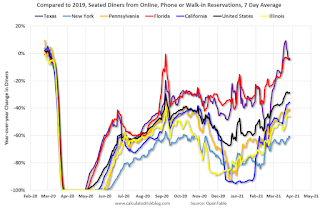 Thanks to OpenTable for providing this restaurant data:
This data is updated through March 27, 2021.
This data is "a sample of restaurants on the OpenTable network across all channels: online reservations, phone reservations, and walk-ins. For year-over-year comparisons by day, we compare to the same day of the week from the same week in the previous year."
Note that this data is for "only the restaurants that have chosen to reopen in a given market". Since some restaurants have not reopened, the actual year-over-year decline is worse than shown.
Dining picked up during the holidays, then slumped with the huge winter surge in cases. Dining is picking up again - and is close to 2019 in Texas and Florida.
----- Movie Tickets: Box Office Mojo -----
 This data shows domestic box office for each week and the median for the years 2016 through 2019 (dashed light blue).
 Thanks to OpenTable for providing this restaurant data:
This data is updated through March 27, 2021.
This data is "a sample of restaurants on the OpenTable network across all channels: online reservations, phone reservations, and walk-ins. For year-over-year comparisons by day, we compare to the same day of the week from the same week in the previous year."
Note that this data is for "only the restaurants that have chosen to reopen in a given market". Since some restaurants have not reopened, the actual year-over-year decline is worse than shown.
Dining picked up during the holidays, then slumped with the huge winter surge in cases. Dining is picking up again - and is close to 2019 in Texas and Florida.
 This data shows domestic box office for each week and the median for the years 2016 through 2019 (dashed light blue).
 Blue is 2020 and Red is 2021.
The data is from BoxOfficeMojo through Mar 25th.
Note that the data is usually noisy week-to-week and depends on when blockbusters are released.
Movie ticket sales were at $22 million last week, down about 88% from the median for the week.
Note that the data is usually noisy week-to-week and depends on when blockbusters are released.
Movie ticket sales were at $22 million last week, down about 88% from the median for the week.
 This graph shows the seasonal pattern for the hotel occupancy rate using the four week average.
 The red line is for 2021, black is 2020, blue is the median, and dashed light blue is for 2009 (the worst year since the Great Depression for hotels - before 2020).
Even when occupancy increases to 2009 levels, hotels will still be hurting.
This data is through March 20th. Hotel occupancy is currently down 15.4% compared to same week in 2019). Note: Occupancy was up year-over-year, since occupancy declined sharply at the onset of the pandemic. However, occupancy is still be down significantly from normal levels.
Notes: Y-axis doesn't start at zero to better show the seasonal change.
 This graph, based on weekly data from the U.S. Energy Information Administration (EIA), shows gasoline supplied compared to the same week of 2019.
Blue is for 2020. Red is for 2021.
As of March 19th, gasoline supplied was off about 5.6% (about 94.4% of the same week in 2019).
Gasoline supplied was up year-over-year, since at one point, gasoline supplied was off almost 50% YoY in 2020.
This graph is from Apple mobility. From Apple: "This data is generated by counting the number of requests made to Apple Maps for directions in select countries/regions, sub-regions, and cities." This is just a general guide - people that regularly commute probably don't ask for directions.
There is also some great data on mobility from the Dallas Fed Mobility and Engagement Index. However the index is set "relative to its weekday-specific average over January–February", and is not seasonally adjusted, so we can't tell if an increase in mobility is due to recovery or just the normal increase in the Spring and Summer.
 This data is through March 27th for the United States and several selected cities.
The graph is the running 7 day average to remove the impact of weekends.
IMPORTANT: All data is relative to January 13, 2020. This data is NOT Seasonally Adjusted. People walk and drive more when the weather is nice, so I'm just using the transit data.
According to the Apple data directions requests, public transit in the 7 day average for the US is at 62% of the January 2020 level. It is at 55% in Chicago, and 61% in Houston (the Houston dip was a weather related decline) - and moving up recently.
Here is some interesting data on New York subway usage (HT BR).
 This graph is from Todd W Schneider. This is weekly data since 2015.
 Most weeks are between 30 and 35 million entries, and currently there close to 10 million subway turnstile entries per week.
This data is through Friday, March 26th.
Schneider has graphs for each borough, and links to all the data sources.
He notes: "Data updates weekly from the MTA’s public turnstile data, usually on Saturday mornings".
This data is through Friday, March 26th.
Schneider has graphs for each borough, and links to all the data sources.
He notes: "Data updates weekly from the MTA’s public turnstile data, usually on Saturday mornings".
Sunday, March 28, 2021
Sunday Night Futures
by Calculated Risk on 3/28/2021 07:50:00 PM
Weekend:
• Schedule for Week of March 28, 2021
Monday:
• At 10:30 AM ET, Dallas Fed Survey of Manufacturing Activity for March. This is the last of the regional surveys for March.
From CNBC: Pre-Market Data and Bloomberg futures S&P 500 futures are down 11 and DOW futures are down 57 (fair value).
Oil prices were mostly unchanged over the last week with WTI futures at $60.73 per barrel and Brent at $64.38 per barrel. A year ago, WTI was at $15, and Brent was at $22 - so WTI oil prices are UP sharply year-over-year (oil prices collapsed at the beginning of the pandemic).
Here is a graph from Gasbuddy.com for nationwide gasoline prices. Nationally prices are at $2.85 per gallon. A year ago prices were at $1.97 per gallon, so gasoline prices are up $0.88 per gallon year-over-year.
March 28 COVID-19 Vaccinations, New Cases, Hospitalizations
by Calculated Risk on 3/28/2021 05:36:00 PM
Note: I've been posting this data daily for over a year. I'll stop once 70% of the population over 18 has had at least one dose of vaccine, new cases are under 5,000 per day, and hospitalizations below 3,000.
According to the CDC, 143.5 million doses have been administered. 20.0% of the population over 18 is fully vaccinated, and 36.2% of the population over 18 has had at least one dose (93.3 million people have had at least one dose).
And check out COVID Act Now to see how each state is doing.
Over 34,000 US deaths have been reported in March due to COVID.
 Click on graph for larger image.
This graph shows the daily (columns) 7 day average (line) of positive tests reported.
This data is from the CDC.
 Click on graph for larger image.
This graph shows the daily (columns) 7 day average (line) of positive tests reported.
This data is from the CDC.
The 7-day average is 60,425, up from 60,176 yesterday, and well above the low following the summer surge of 35,000.
The second graph shows the number of people hospitalized.
 This data is also from the CDC.
The CDC cautions that due to reporting delays, the area in grey will probably increase.
The second graph shows the number of people hospitalized.
 This data is also from the CDC.
The CDC cautions that due to reporting delays, the area in grey will probably increase.
The current 7-day average is 32,817, down slightly from 32,849, yesterday, but well above the post-summer surge low of 23,000.
Q1 2021 Update: Unofficial Problem Bank list Increased to 67 Institutions
by Calculated Risk on 3/28/2021 08:11:00 AM
The FDIC's official problem bank list is comprised of banks with a CAMELS rating of 4 or 5, and the list is not made public (just the number of banks and assets every quarter). Note: Bank CAMELS ratings are also not made public.
CAMELS is the FDIC rating system, and stands for Capital adequacy, Asset quality, Management, Earnings, Liquidity and Sensitivity to market risk. The scale is from 1 to 5, with 1 being the strongest.
As a substitute for the CAMELS ratings, surferdude808 is using publicly announced formal enforcement actions, and also media reports and company announcements that suggest to us an enforcement action is likely, to compile a list of possible problem banks in the public interest.
DISCLAIMER: This is an unofficial list, the information is from public sources only, and while deemed to be reliable is not guaranteed. No warranty or representation, expressed or implied, is made as to the accuracy of the information contained herein and same is subject to errors and omissions. This is not intended as investment advice. Please contact CR with any errors.
Here is the unofficial problem bank list for Q1 2021.
Here are the quarterly changes and a few comments from surferdude808:
Update on the Unofficial Problem Bank List through March 26, 2020. Since the last update at the end of December 2020, the list increased by two to 67 institutions after five additions and three removals. Assets increased by $800 million to $59 billion, with the change including a $1.1 billion decrease from updated asset figures through December 31, 2020. A year ago, the list held 65 institutions with assets of $48.6 billion.
Additions this month included Bank of the Orient, San Francisco, CA ($927 million); Southwestern National Bank, Houston, TX ($776 million); Lincoln 1st Bank, Lincoln Park, NJ ($314 million); Community First Bank, Maywood, NE ($127 million); and Spectra Bank, Fort Worth, TX ($92 million). Removals included Citizens Savings Bank and Trust Company, Nashville, TN ($112 million); The Morris County National Bank of Naples, Naples, TX ($94 million); and The First National Bank of Fleming, Fleming, CO ($25 million). Another change since year-end was the OCC issuing a Prompt Corrective Action order against The First National Bank and Trust Company of Vinita, Vinita, OK ($285 million).
On February 23, 2021, the FDIC released third quarter results and an update on the Official Problem Bank List. In that release, the FDIC said there were 56 institutions with assets of $56 billion on the official list, compared with 56 institutions with assets of $53.9 billion at the third quarter of 2020.
With the conclusion of the first quarter, we bring an updated transition matrix to detail how banks are transitioning off the Unofficial Problem Bank List. Since we first published the Unofficial Problem Bank List on August 7, 2009 with 389 institutions, 1,773 institutions have appeared on a weekly or monthly list since then. Only 3.8 percent of the banks that have appeared on a list remain today as 1,706 institutions have transitioned through the list. Departure methods include 1,005 action terminations, 411 failures, 271 mergers, and 19 voluntary liquidations. Of the 389 institutions on the first published list, only 3 or less than 1.0 percent, still have a troubled designation more than ten years later. The 411 failures represent 23.2 percent of the 1,773 institutions that have made an appearance on the list. This failure rate is well above the 10-12 percent rate frequently cited in media reports on the failure rate of banks on the FDIC's official list.
Saturday, March 27, 2021
March 27 COVID-19 Vaccinations, New Cases, Hospitalizations
by Calculated Risk on 3/27/2021 03:55:00 PM
Note1: There is growing concern about the UK, South African, and Brazilian variants. The UK and South African variants are causing a surge in cases in Michigan, New Jersey and New York.
Notes: I've been posting this data daily for over a year. I'll stop once 70% of the population over 18 has had at least one dose of vaccine, new cases are under 5,000 per day, and hospitalizations below 3,000.
According to the CDC, 140.2 million doses have been administered. 19.4% of the population over 18 is fully vaccinated, and 35.4% of the population over 18 has had at least one dose.
And check out COVID Act Now to see how each state is doing.
Over 33,000 US deaths have been reported in March due to COVID.
 Click on graph for larger image.
This graph shows the daily (columns) 7 day average (line) of positive tests reported.
This data is from the CDC.
 Click on graph for larger image.
This graph shows the daily (columns) 7 day average (line) of positive tests reported.
This data is from the CDC.
The 7-day average is 60,176, up from 58,790 yesterday, and well above the low following the summer surge of 35,000.
The second graph shows the number of people hospitalized.
 This data is also from the CDC.
The CDC cautions that due to reporting delays, the area in grey will probably increase.
The second graph shows the number of people hospitalized.
 This data is also from the CDC.
The CDC cautions that due to reporting delays, the area in grey will probably increase.
The current 7-day average is 32,849, up slightly from 32,843 yesterday, but well above the post-summer surge low of 23,000.
Schedule for Week of March 28, 2021
by Calculated Risk on 3/27/2021 08:11:00 AM
The key report scheduled for this week is the March employment report on Friday.
Other key reports include January Case-Shiller house prices and March Auto Sales.
For manufacturing, the March Dallas Fed survey and the ISM Manufacturing survey will be released.
10:30 AM: Dallas Fed Survey of Manufacturing Activity for March. This is the last of the regional surveys for March.
 9:00 AM: S&P/Case-Shiller House Price Index for January.
This graph shows the year-over-year change for the Case-Shiller National, Composite 10 and Composite 20 indexes, through the most recent report (the Composite 20 was started in January 2000).
The consensus is for a 10.7% year-over-year increase in the Comp 20 index.
9:00 AM: FHFA House Price Index for January 2021. This was originally a GSE only repeat sales, however there is also an expanded index.
7:00 AM ET: The Mortgage Bankers Association (MBA) will release the results for the mortgage purchase applications index.
8:15 AM: The ADP Employment Report for March. This report is for private payrolls only (no government). The consensus is for 550,000 payroll jobs added in March, up from 117,000 added in February.
9:45 AM: Chicago Purchasing Managers Index for March. The consensus is for a reading of 60.3, up from 59.5 in February.
10:00 AM: Pending Home Sales Index for February. The consensus is for a 2.6% decrease in the index.
8:30 AM: The initial weekly unemployment claims report will be released. The consensus is for a decrease to 650 thousand from 684 thousand last week.
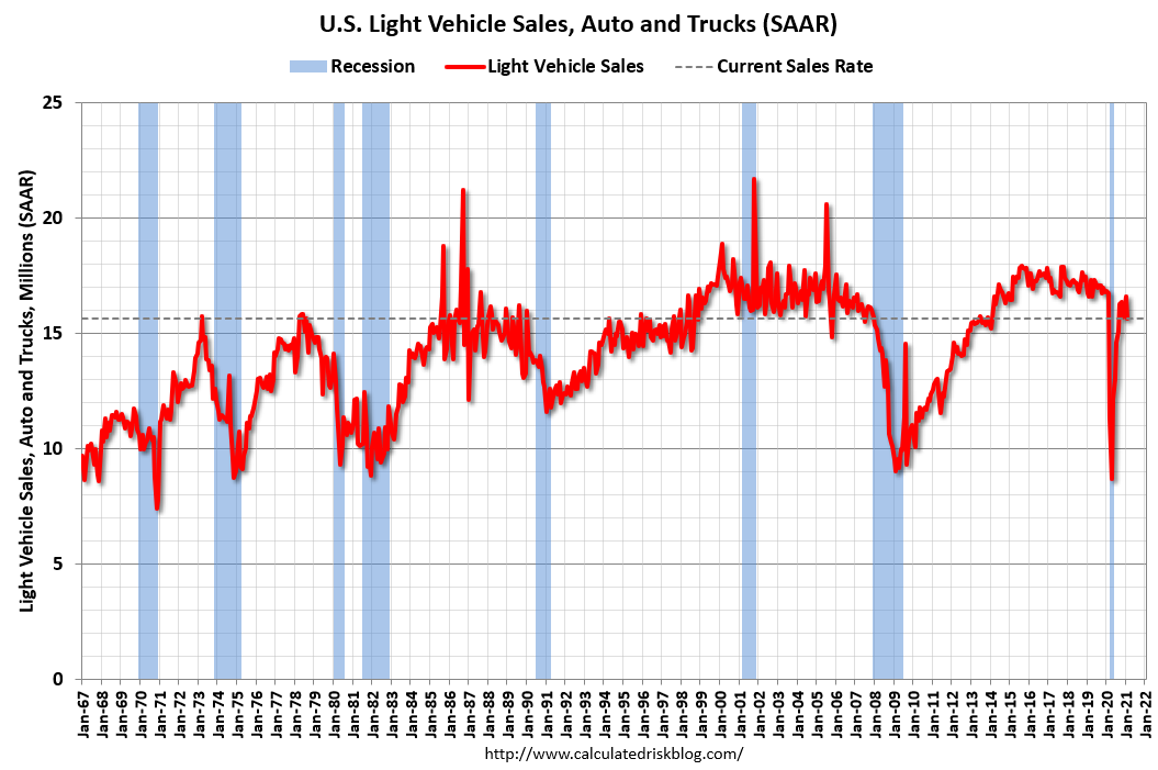 All Day: Light vehicle sales for March. The consensus is for light vehicle sales to be 16.5 million SAAR in March, up from 15.7 million in February (Seasonally Adjusted Annual Rate).
This graph shows light vehicle sales since the BEA started keeping data in 1967. The dashed line is the February sales rate.
10:00 AM: ISM Manufacturing Index for March. The consensus is for the ISM to be at 61.2, up from 60.8 in February.
10:00 AM: Construction Spending for February. The consensus is for a 0.9% decrease in construction spending.
 8:30 AM: Employment Report for February. The consensus is for 565,000 jobs added, and for the unemployment rate to decrease to 6.0%.
There were 379,000 jobs added in February, and the unemployment rate was at 6.2%.
This graph shows the job losses from the start of the employment recession, in percentage terms.
The current employment recession was by far the worst recession since WWII in percentage terms, and is still at the worst of the "Great Recession".
Friday, March 26, 2021
Real Personal Income less Transfer Payments
by Calculated Risk on 3/26/2021 10:23:00 PM
Government transfer payments decreased sharply in February compared to January, but were still $1 trillion (on SAAR basis) above the February 2020 level. Most of the increase in transfer payments - compared to the level prior to the crisis - is from unemployment insurance and "other" (includes direct payments).
This table shows the amount of unemployment insurance and "Other" transfer payments since February 2020 (pre-crisis level). The increase in "Other" was mostly due to other parts of the relief acts (including direct payments).
There will be another large increase in "Other" in March.
A key measure of the health of the economy (Used by NBER in recession dating) is Real Personal Income less Transfer payments.
 Click on graph for larger image.
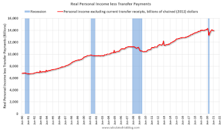
This graph shows real personal income less transfer payments since 1990.
This measure of economic activity increased 0.2% in February, compared to January, and was down 2.5% compared to February 2020 (previous peak).
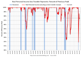 Another way to look at this data is as a percent of the previous peak.
Real personal income less transfer payments was off 8.1% in April. This was a larger decline than the worst of the great recession.
Currently personal income less transfer payments are still off 2.5% (dashed line).
| Selected Transfer Payments Billions of dollars, SAAR | ||
|---|---|---|
| Other | Unemployment Insurance | |
| Feb-20 | $506 | $28 |
| Mar-20 | $515 | $74 |
| Apr-20 | $3,379 | $493 |
| May-20 | $1,360 | $1,356 |
| Jun-20 | $758 | $1,405 |
| Jul-20 | $760 | $1,331 |
| Aug-20 | $692 | $636 |
| Sep-20 | $936 | $359 |
| Oct-20 | $732 | $304 |
| Nov-20 | $620 | $281 |
| Dec-20 | $654 | $304 |
| Jan-21 | $2,357 | $556 |
| Feb-21 | $781 | $537 |
A key measure of the health of the economy (Used by NBER in recession dating) is Real Personal Income less Transfer payments.
 Click on graph for larger image.
This graph shows real personal income less transfer payments since 1990.
This measure of economic activity increased 0.2% in February, compared to January, and was down 2.5% compared to February 2020 (previous peak).
 Another way to look at this data is as a percent of the previous peak.
Real personal income less transfer payments was off 8.1% in April. This was a larger decline than the worst of the great recession.
Currently personal income less transfer payments are still off 2.5% (dashed line).
March 26 COVID-19 Vaccinations, New Cases, Hospitalizations
by Calculated Risk on 3/26/2021 04:02:00 PM
According to the CDC, 136.7 million doses have been administered. 18.8% of the population over 18 is fully vaccinated, and 34.6% of the population over 18 has had at least one dose.
And check out COVID Act Now to see how each state is doing.
Almost 32,000 US deaths have been reported in March due to COVID.
 Click on graph for larger image.
This graph shows the daily (columns) 7 day average (line) of positive tests reported.
This data is from the CDC.
 Click on graph for larger image.
This graph shows the daily (columns) 7 day average (line) of positive tests reported.
This data is from the CDC.
The 7-day average is 58,598, up from 57,249 yesterday, and well above the low following the summer surge of 35,000.
The second graph shows the number of people hospitalized.
 This data is also from the CDC.
The CDC cautions that due to reporting delays, the area in grey will probably increase.
The second graph shows the number of people hospitalized.
 This data is also from the CDC.
The CDC cautions that due to reporting delays, the area in grey will probably increase.
The current 7-day average is 32,843, down slightly from 32,871 yesterday, but well above the post-summer surge low of 23,000.
Las Vegas Visitor Authority: No Convention Attendance, Visitor Traffic Down 54% YoY in February
by Calculated Risk on 3/26/2021 01:35:00 PM
From the Las Vegas Visitor Authority: February 2021 Las Vegas Visitor Statistics
Although less than half of prior year levels, February's visitor tally of approx. 1.54M visitors reflected a welcome MoM increase of 18.9% over Jan 2021 as the vaccine rollout & continued protocols helped control the COVID spikes that emerged in Dec and Jan.
Total occupancy for Feb improved to 42.0%, 10.4 percentage points over Jan 2021, but was down from 86.8% in Feb 2020. Weekend occupancy (62.8%) and Midweek occupancy (32.1%) saw MoM gains over Jan of 14.5 pts and 9.6 pts, respectively.
Average daily rates reached $98 (up 8.1% MoM, down -25.8% YoY) while RevPAR came in at approx. $41.17, down -64.1% vs. Feb 2020.
 Click on graph for larger image.
 The first graph shows visitor traffic for 2019 (blue), 2020 (orange) and 2021 (red).
Visitor traffic was down 53.8% year-over-year.
Convention traffic was non-existent again in February, and was down 100% compared to February 2020.
There has been no convention traffic since March 2020.
I'll add a graph of convention traffic once conventions start to reopen.
Note: A convention is scheduled for early June (HT MS): "Informa Markets, organizers of the World of Concrete, has received approval from the Nevada Department of Business and Industry to move forward with its 2021 in-person edition. The event is scheduled to be held June 8-10, 2021 at the Las Vegas Convention Center."
Q1 GDP Forecasts
by Calculated Risk on 3/26/2021 11:21:00 AM
Note that the forecasts of the automated systems (based on released data) are declining, whereas the forecasts of economists have been increasing anticipating strong growth in economic activity in March due to the American Rescue Plan Act of 2021. From BofA yesterday:
"Total card spending, as measured by BAC aggregated card data, increased 45% 1-yr and 23% 2-yr for the 7-days ending Mar 20. The strong gain owes to the latest stimulus: total card spending for stimulus recipients is running 40% above the Feb avg."From Merrill Lynch:
1Q GDP tracking stands at 7.0% qoq saar. [Mar 26 estimate]From Goldman Sachs:
emphasis added
We left our Q1 GDP tracking estimate unchanged at +7.5% (qoq ar). [Mar 26 estimate]From the NY Fed Nowcasting Report
The New York Fed Staff Nowcast stands at 6.1% for 2021:Q1 and 0.7% for 2021:Q2. [Mar 26 estimate]And from the Atlanta Fed: GDPNow
The GDPNow model estimate for real GDP growth (seasonally adjusted annual rate) in the first quarter of 2021 is 4.7 percent on March 26, down from 5.4 percent on March 24. [Mar 26 estimate]
Black Knight: Number of Homeowners in COVID-19-Related Forbearance Plans Decreased
by Calculated Risk on 3/26/2021 10:52:00 AM
Note: Both Black Knight and the MBA (Mortgage Bankers Association) are putting out weekly estimates of mortgages in forbearance.
This data is as of March 23rd.
From Black Knight: Another Week of Improvement in Forbearance Numbers
Active forbearance plans fell again this week, dropping by another 19,000 (-0.7%) from last Tuesday. In total, this puts the number of active plans down by 134,000 over the last month – a 5% reduction. This monthly decline represents the strongest rate of improvement since late November 2020 and is a direct result of servicers working through the 1.2 million plans that entered this month with scheduled March month-end expirations for extension and/or removal.The number of loans in forbearance has slowly declined over the last few months.
Of particular note when taking a look at this week’s numbers: even with such strong monthly improvement, there are still more than 460,000 active plans with March month-end expirations, which provides the potential for additional improvement in the coming weeks.
...
Click on graph for larger image.
Early extension activity suggests that mortgage servicers continue to approach forbearance plans in three-month increments, with the bulk of would-be March expirations being extended out through June. Plan extensions have accounted for 75% of all extension/removal activity in recent weeks, but removals are up simply as a result of the volume of expirations that were scheduled for this month.
Finally, the McDash Flash Payment Tracker shows that 90.7% of observed borrowers had made their payment through March 22, up from 89.8% at the same time in February suggesting that the recent improvement in outstanding mortgage delinquencies may resume in March after taking a step back last month. We’ll keep watching to see if this upward trend continues, and will post another weekly update on this blog next Friday, April 2.
emphasis added

BLS: February Unemployment rates down in 23 States
by Calculated Risk on 3/26/2021 10:28:00 AM
From the BLS: Regional and State Employment and Unemployment Summary
Unemployment rates were lower in February in 23 states and the District of Columbia, higher in 4 states, and stable in 23 states, the U.S. Bureau of Labor Statistics reported today. Forty-five states and the District had jobless rate increases from a year earlier and five states had little or no change. The national unemployment rate, 6.2 percent, was little changed over the month, but was 2.7 percentage points higher than in February 2020.Hawaii is being impacted by the lack of tourism.
Nonfarm payroll employment increased in 11 states, decreased in 3 states, and was essentially unchanged in 36 states and the District of Columbia in February 2021. Over the year, nonfarm payroll employment decreased in 48 states and the District and was essentially unchanged in 2 states.
...
Hawaii and New York had the highest unemployment rates in February, 9.2 percent and 8.9 percent, respectively, while South Dakota, 2.9 percent, and Utah, 3.0 percent, had the lowest rates.
Personal Income decreased 7.1% in February, Spending decreased 1.0%
by Calculated Risk on 3/26/2021 08:42:00 AM
The BEA released the Personal Income and Outlays report for February:
Personal income income decreased $1,516.6 billion (7.1 percent) in February according to estimates released today by the Bureau of Economic Analysis. Disposable personal income (DPI) decreased $1,532.3 billion (8.0 percent) and personal consumption expenditures (PCE) decreased $149.0 billion (1.0 percent).The February PCE price index increased 1.6 percent year-over-year and the February PCE price index, excluding food and energy, increased 1.4 percent year-over-year.
Real DPI decreased 8.2 percent in February and Real PCE decreased 1.2 percent; goods decreased 3.3 percent and services decreased 0.1 percent. The PCE price index increased 0.2 percent. Excluding food and energy, the PCE price index increased 0.1 percent.
emphasis added
The following graph shows real Personal Consumption Expenditures (PCE) through February 2021 (2012 dollars). Note that the y-axis doesn't start at zero to better show the change.
 Click on graph for larger image.
The dashed red lines are the quarterly levels for real PCE.
Personal income was at expectations, and the decrease in PCE was slightly below expectations.
Using the two-month method to estimate Q1 PCE growth, PCE was increasing at a 6.3% annual rate in Q1 2021. (using the mid-month method, PCE was increasing at 3.3%). However, these methods are understating growth in Q1, due to the American Rescue Plan Act of 2021. Both income and spending increased sharply in March, from BofA yesterday:
"Total card spending, as measured by BAC aggregated card data, increased 45% 1-yr and 23% 2-yr for the 7-days ending Mar 20.
The strong gain owes to the latest stimulus: total card spending for stimulus recipients is running 40% above the Feb avg."
Thursday, March 25, 2021
Friday: February Personal Income and Outlays
by Calculated Risk on 3/25/2021 09:00:00 PM
Friday:
• At 8:30 AM ET, Personal Income and Outlays, February. The consensus is for a 7.0% decrease in personal income, and for a 0.6% decrease in personal spending. And for the Core PCE price index to increase 0.1%.
• At 10:00 AM, University of Michigan's Consumer sentiment index (Final for March). The consensus is for a reading of 83.5.
• Also at 10:00 AM, State Employment and Unemployment (Monthly), February 2021
Freddie Mac: Mortgage Serious Delinquency Rate decreased in February
by Calculated Risk on 3/25/2021 04:40:00 PM
Freddie Mac reported that the Single-Family serious delinquency rate in February was 2.52%, down from 2.56% in January. Freddie's rate is up from 0.60% in February 2020.
Freddie's serious delinquency rate peaked in February 2010 at 4.20% following the housing bubble, and peaked at 3.17% in August 2020 during the pandemic.
These are mortgage loans that are "three monthly payments or more past due or in foreclosure".
 Click on graph for larger image
Mortgages in forbearance are being counted as delinquent in this monthly report, but they will not be reported to the credit bureaus.
This is very different from the increase in delinquencies following the housing bubble. Lending standards have been fairly solid over the last decade, and most of these homeowners have equity in their homes - and they will be able to restructure their loans once (if) they are employed.
Also - for multifamily - delinquencies were at 0.14%, down from 0.16% in January, and up almost double from 0.08% in February 2020.
March 25 COVID-19 Vaccinations, New Cases, Hospitalizations
by Calculated Risk on 3/25/2021 04:28:00 PM
According to the CDC, 133.5 million doses have been administered. 18.3% of the population over 18 is fully vaccinated, and 33.7% of the population over 18 has had at least one dose.
And check out COVID Act Now to see how each state is doing. (updated link to new site)
Almost 31,000 US deaths have been reported in March due to COVID.
 Click on graph for larger image.
This graph shows the daily (columns) 7 day average (line) of positive tests reported.
This data is from the CDC.
 Click on graph for larger image.
This graph shows the daily (columns) 7 day average (line) of positive tests reported.
This data is from the CDC.
The 7-day average is 57,249, up from 56,272 yesterday, and well above the low following the summer surge of 35,000.
The second graph shows the number of people hospitalized.
 This data is also from the CDC.
The CDC cautions that due to reporting delays, the area in grey will probably increase.
The second graph shows the number of people hospitalized.
 This data is also from the CDC.
The CDC cautions that due to reporting delays, the area in grey will probably increase.
The current 7-day average is 32,871, down from 33,001 yesterday, but well above the post-summer surge low of 23,000.
Kansas City Fed: Tenth District Manufacturing Activity "Grew Solidly" in March
by Calculated Risk on 3/25/2021 02:10:00 PM
From the Kansas City Fed: Tenth District Manufacturing Activity Grew Solidly
The Federal Reserve Bank of Kansas City released the March Manufacturing Survey today. According to Chad Wilkerson, vice president and economist at the Federal Reserve Bank of Kansas City, the survey revealed that Tenth District manufacturing activity grew solidly compared to a month ago and a year ago with positive expectations for future activity.These regional surveys have been strong in March.
“Regional factories continued to report solid growth in March,” said Wilkerson. “Materials prices remain extremely high for most firms. However, many manufacturers have been able to pass through at least a portion of the price increases on to customers.”
...
The month-over-month composite index was 26 in March, higher than 24 in February and 17 in January. The composite index is an average of the production, new orders, employment, supplier delivery time, and raw materials inventory indexes. The growth in district manufacturing activity was driven more by durable goods plants for primary metals, machinery, transportation equipment, furniture, and miscellaneous manufacturing. Month-over-month indexes for shipments, new orders, and order backlog expanded at a faster pace in March and supplier delivery time was very high as well. Growth in production and employment remained positive, but slightly slower than in recent months. Materials inventories were positive while finished goods inventories dipped further from a month ago. Year-over-year factory indexes rose in March, and business conditions are now comparable to levels at the start of the pandemic last year. The year-over-year composite index increased from 8 to 16, but new orders for exports and finished goods inventories continued to lag year-ago levels. The future composite index expanded slightly from 34 to 35 with an uptick in employment expectations.
emphasis added
Hotels: Occupancy Rate Highest in a Year; Down 15% Compared to Same Week in 2019
by Calculated Risk on 3/25/2021 12:57:00 PM
Note: Starting this week, the year-over-year comparisons are easy - since occupancy declined sharply at the onset of the pandemic - but occupancy is still down significantly from normal levels.
The occupancy rate is down 15.4% compared to the same week in 2019.
U.S. weekly hotel occupancy jumped almost seven points from the previous week to the highest level in the country since early March 2020, according to STR‘s latest data through March 20, 2021.The following graph shows the seasonal pattern for the hotel occupancy rate using the four week average.
March 14-20, 2021:
• Occupancy: 58.9%
• verage daily rate (ADR): US$108.07
• Revenue per available room (RevPAR): US$63.62
The 58.9% absolute occupancy was a 93.9% increase from the comparable, pandemic-affected week last year, but more importantly, represented almost 85% of occupancy regained from the 2019 benchmark. There was also more improvement in ADR, which reached 81% of the comparable 2019 level.
emphasis added
Click on graph for larger image.The red line is for 2021, black is 2020, blue is the median, and dashed light blue is for 2009 (the worst year since the Great Depression for hotels prior to 2020).
Even when occupancy increases to 2009 levels, hotels will still be hurting.
Note: Y-axis doesn't start at zero to better show the seasonal change.
Note: Y-axis doesn't start at zero to better show the seasonal change.


