by Calculated Risk on 5/30/2009 05:33:00 PM
Saturday, May 30, 2009
May Economic Summary in Graphs
Here is a collection of real estate and economic graphs for data released in May ...
Note: Click on graphs for larger image in new window. For more info, click on link below graph to original post.
 New Home Sales in April (NSA)
The first graph shows monthly new home sales (NSA - Not Seasonally Adjusted).
Note the Red columns for 2009. This is the second lowest sales for April since the Census Bureau started tracking sales in 1963. (NSA, 33 thousand new homes were sold in March 2009; the record low was 32 thousand in April 1982).
From: New Home Sales Flat in April
 New Home Sales in April
This graph shows shows New Home Sales vs. recessions for the last 45 years. New Home sales have fallen off a cliff.
"Sales of new one-family houses in April 2009 were at a seasonally adjusted annual rate of 352,000, according to estimates released jointly today by the U.S. Census Bureau and the Department of Housing and Urban Development.
This is 0.3 percent (±14.5%)* above the revised March rate of 351,000, but is 34.0 percent (±11.0%) below the April 2008 estimate of 533,000."
From: New Home Sales Flat in April
 New Home Months of Supply in April
There were 10.1 months of supply in April - significantly below the all time record of 12.4 months of supply set in January.
"The seasonally adjusted estimate of new houses for sale at the end of April was 297,000. This represents a supply of 10.1months at the current sales rate.
From: New Home Sales Flat in April
 Existing Home Sales in April
 This graph shows existing home sales, on a Seasonally Adjusted Annual Rate (SAAR) basis since 1993.
Sales in April 2009 (4.68 million SAAR) were 2.9% higher than last month, and were 3.5% lower than April 2008 (4.85 million SAAR).
It's important to note that close to half of these sales were foreclosure resales or short sales. Although these are real transactions, this means activity (ex-distressed sales) is under 3 million units SAAR.
From: Existing Home Sales in April
 Existing Home Inventory April
This graph shows nationwide inventory for existing homes. According to the NAR, inventory increased to 3.97 million in April. The all time record was 4.57 million homes for sale in July 2008. This is not seasonally adjusted.
Typically inventory increases in April, and then really increases over the next few months of the year until peaking in the summer. This increase in inventory was probably seasonal, and the next few months will be key for inventory.
Also, many REOs (bank owned properties) are included in the inventory because they are listed - but not all. Recently there have been stories about a substantial number of unlisted REOs - this is possible.
From: Existing Home Sales in April
 Existing Home Inventory April, Year-over-Year Change
This graph shows the year-over-year change in existing home inventory.
If the trend of declining year-over-year inventory levels continues in 2009 that will be a positive for the housing market. Prices will probably continue to fall until the months of supply reaches more normal levels (in the 6 to 8 month range comparted to the current 10.2 months), and that will take some time.
From: More on Existing Home Sales and Inventory
 Case Shiller House Prices for March
This graph shows the nominal Composite 10 and Composite 20 indices (the Composite 20 was started in January 2000).
The Composite 10 index is off 32.4% from the peak, and off 2.0% in March.
The Composite 20 index is off 31.4% from the peak, and off 2.2% in March.
From: Case-Shiller: Prices Fall Sharply in March
 NAHB Builder Confidence Index in May
This graph shows the builder confidence index from the National Association of Home Builders (NAHB).
The housing market index (HMI) increased to 16 in May from 14 in April from. The record low was 8 set in January.
The increase in April and May followed five consecutive months at either 8 or 9.
From: NAHB: Builder Confidence Increases in May
 Architecture Billings Index for April
"After an eight-point jump in March, the Architecture Billings Index (ABI) fell less than a full point in April. As a leading economic indicator of construction activity, the ABI reflects the approximate nine to twelve month lag time between architecture billings and construction spending. The American Institute of Architects (AIA) reported the April ABI rating was 42.8, down from the 43.7 mark in March. This was the first time since August and September 2008 that the index was above 40 for consecutive months, but the score still indicates an overall decline in demand for design services (any score above 50 indicates an increase in billings)...."
From: Architecture Billings Index Steady in April
 Housing Starts in April
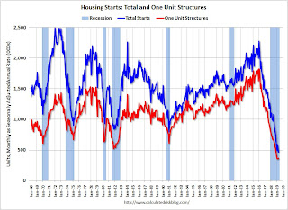
Total housing starts were at 458 thousand (SAAR) in April, the all time record low. The previous record low was 488 thousand in January (the lowest level since the Census Bureau began tracking housing starts in 1959).
Single-family starts were at 368 thousand (SAAR) in April; just above the revised record low in January (357 thousand).
From: Housing Starts at Record Low in April
 Construction Spending in March
This graph shows private residential and nonresidential construction spending since 1993. Note: nominal dollars, not inflation adjusted.
Private residential construction spending is 61.8% below the peak of early 2006.
Private non-residential construction spending is 5.7% below the peak of last September.
From: Private Construction Spending Declines Slightly in March
 April Employment Report
This graph shows the unemployment rate and the year over year change in employment vs. recessions.
Nonfarm payrolls decreased by 539,000 in April. March job losses were revised to
699,000. The economy has lost almost 4 million jobs over the last 6 months, and over 5.7 million jobs during the 16 consecutive months of job losses.
The unemployment rate rose to 8.9 percent; the highest level since 1983.
Year over year employment is strongly negative (there were 5.2 million fewer Americans employed in Apr 2009 than in Apr 2008).
From: Employment Report: 539K Jobs Lost, 8.9% Unemployment Rate
 April Retail Sales
This graph shows the year-over-year change in nominal and real retail sales since 1993.
On a monthly basis, retail sales decreased 0.4% from March to April (seasonally adjusted), and sales are off 11.4% from April 2008 (retail and food services decreased 10.1%).
From: Retail Sales Decline in April
 LA Port Traffic in April
This graph shows the loaded inbound and outbound traffic at the port of Los Angeles in TEUs (TEUs: 20-foot equivalent units or 20-foot-long cargo container). Although containers tell us nothing about value, container traffic does give us an idea of the volume of goods being exported and imported.
Inbound traffic was 21.5% below April 2008.
Outbound traffic was 18.3% below April 2008.
There has been some slight recovery in exports the last two months (the year-over-year comparison was off 30% from December through February). But this is the 2nd worst YoY comparison for imports - only February was worse, and that might have been related to the Chinese New Year. So imports from Asia appear especially weak.
From: LA Area Port Traffic
 U.S. Imports and Exports Through March
This graph shows the monthly U.S. exports and imports in dollars through March 2009.
Both imports and exports declined in March, although it appears the cliff diving in trade might be over.
On a year-over-year basis, exports are off 17.4% and imports are off 27%!
From: U.S. March Trade Deficit: $27.6 billion
 April Capacity Utilization
This graph shows Capacity Utilization. This series is at another record low (the series starts in 1967).
The Federal Reserve reported that "Industrial production decreased 0.5 percent in April after having fallen 1.7 percent in March. Production in manufacturing declined 0.3 percent in April and was 16.0 percent below its recent peak in December 2007. The decreases in manufacturing in April remained broadly based across industries."
From: Industrial Production Declines, now 16% Below Peak
 Vehicle Miles driven in March
The first graph shows the annual change in the rolling 12 month average of U.S. vehicles miles driven. Note: the rolling 12 month average is used to remove noise and seasonality.
By this measure, vehicle miles driven are off 3.3% Year-over-year (YoY); the decline in miles driven was worse than during the early '70s and 1979-1980 oil crisis. However miles driven - compared to the same month of 2008 - has only been off about 1% for the last couple months.
From: D.O.T.: U.S. Vehicle Miles off 1.2% YoY in March
 Unemployment Claims
This graph shows weekly claims and continued claims since 1971.
Continued claims are now at 6.79 million - an all time record. This is 5.1% of covered employment.
Note: continued claims peaked at 5.4% of covered employment in 1982 and 7.0% in 1975. So this isn't a record as a percent of covered employment.
From: Unemployment Claims: Continued Claims at Record 6.79 Million
 Restaurant Performance Index for April
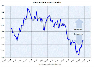
"The outlook for the restaurant industry grew more optimistic in April, as the National Restaurant Association’s comprehensive index of restaurant activity registered its fourth consecutive monthly gain. The Association’s Restaurant Performance Index (RPI) – a monthly composite index that tracks the health of and outlook for the U.S. restaurant industry – stood at 98.6 in April, up 0.8 percent from March, its highest level in 11 months."
From: Restaurant Performance Index Improves in April
 Philly Fed State Conincident Indicators for April
Here is a map of the three month change in the Philly Fed state coincident indicators. All 50 states are showing declining three month activity.
This is the new definition of "Red states" and this is what a widespread recession looks like based on the Philly Fed states indexes.
"Over the past three months, the indexes decreased in all 50 states, for a three-month diffusion index of -100."
From: Philly Fed State Coincident Indexes


