by Calculated Risk on 2/29/2016 08:58:00 PM
Monday, February 29, 2016
Tuesday: ISM Mfg, Vehicle Sales, Construction Spending
From Matthew Graham at Mortgage News Daily: Mortgage Rates Sideways Again; Anxiety Builds
For now, the most prevalently-quoted conventional 30yr fixed rate remains 3.625% on top tier scenarios. Some of the less aggressive lenders are back up to 3.75%, but that was the case as of late last week as well.Tuesday:
• At 10:00 AM ET, ISM Manufacturing Index for February. The consensus is for the ISM to be at 48.5, up from 48.2 in January. The employment index was at 45.9%, and the new orders index was at 51.5%.
• Also at 10:00 AM, Construction Spending for January. The consensus is for a 0.5% increase in construction spending.
• All day, Light vehicle sales for February. The consensus is for light vehicle sales to increase to 17.6 million SAAR in February from 17.5 million in January (Seasonally Adjusted Annual Rate).
Fannie Mae: Mortgage Serious Delinquency rate unchanged in January
by Calculated Risk on 2/29/2016 04:24:00 PM
Fannie Mae reported today that the Single-Family Serious Delinquency rate was unchanged in January at 1.55%. The serious delinquency rate is down from 1.86% in January 2015.
The Fannie Mae serious delinquency rate peaked in February 2010 at 5.59%.
Note: These are mortgage loans that are "three monthly payments or more past due or in foreclosure".
Note: Freddie Mac reported last week that their Single-Family serious delinquency rate declined in January to 1.33%, up from 1.32% in December.
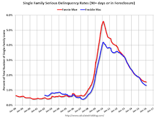
The Fannie Mae serious delinquency rate has only fallen 0.31 percentage points over the last year - the pace of improvement has slowed - and at that pace the serious delinquency rate will not be below 1% until 2017.
The "normal" serious delinquency rate is under 1%, so maybe Fannie Mae serious delinquencies will be close to normal some time in 2017. This elevated delinquency rate is mostly related to older loans - the lenders are still working through the backlog.
Restaurant Performance Index indicates expansion in January
by Calculated Risk on 2/29/2016 02:27:00 PM
Here is a minor indicator I follow from the National Restaurant Association: Restaurant Performance Index Bounced Back Above 100 in January
Although same-store sales and customer traffic indicators remained mixed, the National Restaurant Association’s Restaurant Performance Index (RPI) bounced back above 100 in January. The RPI stood at 100.6 in January, up 0.8 percent from December’s level of 99.7. The January gain pushed the RPI above the 100 level, which signifies expansion in the index of key industry indicators.
...
“Despite an uptick in the RPI in the first month of the year, restaurant operators still report mixed results about their business environment,” said Hudson Riehle, senior vice president of research for the National Restaurant Association. “Except for the capital expenditures arena, the current situation indicators remain dampened. However, operators are somewhat more optimistic regarding higher sales in six months.”
emphasis added
 Click on graph for larger image.
The index increased to 100.6 in January, up from 99.7 in December. (above 100 indicates expansion).
Restaurant spending is discretionary, so even though this is "D-list" data, I like to check it every month.
Dallas Fed: "Texas Manufacturing Activity Contracts Again" in February
by Calculated Risk on 2/29/2016 10:35:00 AM
From the Dallas Fed: Texas Manufacturing Activity Contracts Again
Texas factory activity contracted again in February, according to business executives responding to the Texas Manufacturing Outlook Survey. The production index, a key measure of state manufacturing conditions, remained negative but edged up from -10.2 to -8.5, suggesting output declined but at a slightly softer pace than in January.This was the last of the regional Fed surveys for February. All five of the regional surveys indicated contraction in Febuary, especially in the Dallas region (oil prices).
Most other indexes of current manufacturing activity also indicated further contraction in February. The new orders index fell 8 points to -17.6, reaching its lowest level since May 2009, when Texas was in recession. The growth rate of orders index remained strongly negative at -17.4. The capacity utilization index was largely unchanged at -8.2. Meanwhile, the shipments index rose 10 points to -1.1 after plunging last month.
Perceptions of broader business conditions remained strongly negative in February. The general business activity index has been negative for more than a year and came in at -31.8, up slightly from the January reading. ...
Labor market indicators reflected further decline in February. The employment index dropped 7 points to -11.1, hitting its lowest reading since November 2009.
emphasis added
Here is a graph comparing the regional Fed surveys and the ISM manufacturing index:
 Click on graph for larger image.
The New York and Philly Fed surveys are averaged together (yellow, through February), and five Fed surveys are averaged (blue, through February) including New York, Philly, Richmond, Dallas and Kansas City. The Institute for Supply Management (ISM) PMI (red) is through January (right axis).
It seems likely the ISM index will be weak in February, and will probably show contraction again. The consensus is the ISM index will increase to 48.5% from 48.2% in January (below 50 is contraction).
NAR: Pending Home Sales Index decreased 2.5% in January, up 1.4% year-over-year
by Calculated Risk on 2/29/2016 10:01:00 AM
From the NAR: Pending Home Sales Cool Down in January
The Pending Home Sales Index, a forward-looking indicator based on contract signings, declined 2.5 percent to 106.0 in January from an upwardly revised 108.7 in December but is still 1.4 percent above January 2015 (104.5). Although the index has increased year-over-year for 17 consecutive months, last month’s annual gain was the second smallest (September 2014 at 1.2 percent) during the timeframe.This was below expectations of a 0.5% increase for this index. Note: Contract signings usually lead sales by about 45 to 60 days, so this would usually be for closed sales in February and March.
...
The PHSI in the Northeast declined 3.2 percent to 94.5 in January, but is still 10.9 percent above a year ago. In the Midwest the index fell 4.9 percent to 101.1 in January, but is still 1.4 percent above January 2015.
Pending home sales in the South inched up 0.3 percent to an index of 121.1 in January but remain 1.3 percent lower than last January. The index in the West decreased 4.5 percent in January to 96.5, but is still 0.4 percent above a year ago.
emphasis added
Chicago PMI declines to 47.6
by Calculated Risk on 2/29/2016 09:50:00 AM
Chicago PMI: Feb Chicago Business Barometer Down 8.0 pts to 47.6
The Chicago Business Barometer recoiled 8.0 points to 47.6 in February following a sharp increase to 55.6 in the previous month, led by significant declines in Production and New OrdersThis was well below the consensus forecast of 52.9.
...
The Barometer’s decline was led by an 18.5 drop in Production, which completely reversed January’s near 16 point gain, pushing it back into contraction. New Orders also fell sharply and Order Backlogs slipped further into contraction, a situation that has persisted for a year. Employment also declined significantly, leaving it at the lowest since November 2009 and the fifth consecutive month below 50.
...
Chief Economist of MNI Indicators Philip Uglow said, “If one looks beyond the gyrations seen over the past three months then trend activity has been running a little below the 50 neutral mark, highlighting continued sluggish activity levels, with manufacturers under particular pressure. Still, given the weakness in Q4, it looks like activity should pick up during Q1.”
emphasis added
Black Knight: House Price Index up 0.1% in December, Up 5.5% year-over-year
by Calculated Risk on 2/29/2016 08:11:00 AM
Note: I follow several house price indexes (Case-Shiller, CoreLogic, Black Knight, Zillow, FHFA, FNC and more). Note: Black Knight uses the current month closings only (not a three month average like Case-Shiller or a weighted average like CoreLogic), excludes short sales and REOs, and is not seasonally adjusted.
From Black Knight: Black Knight Home Price Index Report: December Transactions U.S. Home Prices Up 0.1 Percent for the Month; Up 5.5 Percent Year-Over-Year
• U.S. home prices were up 0.1 percent for the month, and have gained 5.5 percent from one year agoThe year-over-year increase in the index has been about the same for the last year.
• At $253K, the national level HPI remains 5.3 percent off its June 2006 peak of $268K, and up 27 percent from the market’s bottom in January 2012
• Among the 20 largest states tracked by Black Knight, New York and Texas both hit new peaks in December
• Of the nation’s 40 largest metros, 8 hit new peaks – Austin, TX; Dallas, TX; Denver, CO; Houston, TX; Nashville, TN; Portland OR, San Antonio, TX and San Francisco, CA
Sunday, February 28, 2016
Sunday Night Futures
by Calculated Risk on 2/28/2016 08:21:00 PM
Last week the FDIC released its “Quarterly Banking Profile” for Q4 2015.
Declines in expenses for litigation at a few large banks combined with moderate revenue growth to lift fourth-quarter net income at FDIC-insured institutions to $40.8 billion, an increase of $4.4 billion (11.9 percent) compared with fourth quarter 2014. The improving trend in earnings was widespread.
...
The number of insured institutions on the FDIC’s “Problem List” declined from 203 to 183 during the quarter, and total assets of problem institutions fell from $51.1 billion to $46.8 billion. For all of 2015, there were 305 mergers of insured institutions, one new charter was added, and eight banks failed.
 Click on graph for larger image.
On the REO front, the report showed that the carrying value of one-to-four family REO properties at FDIC institutions declined to $4.66 billion at the end of December, down from $4.91 billion at then end of September and $5.98 billion at the end of 2014.
REO is down from $14.6 billion in 2010.
Weekend:
• Schedule for Week of February 21, 2016
• February 2016: Unofficial Problem Bank list declines to 228 Institutions
Monday:
• At 9:45 AM ET, Chicago Purchasing Managers Index for February. The consensus is for a reading of 52.9, down from 55.6 in January.
• At 10:00 AM, Pending Home Sales Index for January. The consensus is for a 0.5% increase in the index.
• At 10:30 AM, Dallas Fed Manufacturing Survey for February.
From CNBC: Pre-Market Data and Bloomberg futures: currently S&P futures and DOW futures are mostly unchanged (fair value).
Oil prices were up over the last week with WTI futures at $32.69 per barrel and Brent at $35.00 per barrel. A year ago, WTI was at $50, and Brent was at $61 - so prices are down about 40% year-over-year.
Here is a graph from Gasbuddy.com for nationwide gasoline prices. Nationally prices are at $1.75 per gallon (down about $0.65 per gallon from a year ago).
Hotel Occupancy in 2016: Tracking Record Year
by Calculated Risk on 2/28/2016 11:19:00 AM
Here is an update on hotel occupancy from HotelNewsNow.com: STR: US results for week ending 20 February
The U.S. hotel industry reported positive results in the three key performance metrics during the week of 14-20 February 2016, according to data from STR, Inc.The following graph shows the seasonal pattern for the hotel occupancy rate using the four week average. The occupancy rate should continue to increase into the Spring, and then increased further during the Summer travel period.
In year-over-year measurements, the industry’s occupancy increased 0.6% to 64.3%. Average daily rate for the week was up 2.1% to US$120.04. Revenue per available room rose 2.7% to US$77.17.
emphasis added
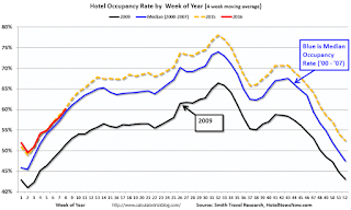 The red line is for 2016, dashed orange is 2015, blue is the median, and black is for 2009 - the worst year since the Great Depression for hotels.
2015 was the best year on record for hotels.
So far 2016 is tracking 2015. A solid start to the year.
Data Source: Smith Travel Research, Courtesy of HotelNewsNow.com
Saturday, February 27, 2016
February 2016: Unofficial Problem Bank list declines to 228 Institutions
by Calculated Risk on 2/27/2016 02:56:00 PM
This is an unofficial list of Problem Banks compiled only from public sources.
Here is the unofficial problem bank list for February 2016.
Changes and comments from surferdude808:
Update on the Unofficial Problem Bank List for February 2016. During the month, the list fell from 238 institutions to 228 after 11 removals and two additions. Assets dropped by $3.5 billion to an aggregate $66.0 billion. The asset total was updated to reflect fourth quarter figures, which resulted in a small increase of $728 million. A year ago, the list held 357 institutions with assets of $109.2 billion. This past week, the FDIC released fourth quarter industry results and an update on the Official Problem Bank List. FDIC said the official list held 183 problem banks, a decline of 20 during the quarter. Over the same horizon, the unofficial list declined by 27 banks.
Actions have been terminated against Centrue Bank, Streator, IL ($942 million Ticker: TRUE); Four Oaks Bank & Trust Company, Four Oaks, NC ($690 million); OneUnited Bank, Boston, MA ($649 million); New Peoples Bank, Inc., Honaker, VA ($634 million; Highlands Union Bank, Abingdon, VA ($618 million Ticker: HBKA); Arthur State Bank, Union, SC ($459 million); The First National Bank of Russell Springs, Russell Springs, KY ($206 million); The First National Bank of Absecon, Absecon, NJ ($147 million Ticker: ASCN); Asian Bank, Philadelphia, PA ($130 million); F&M Bank and Trust Company, Hannibal, MO ($114 million); and Ruby Valley National Bank, Twin Bridges, MT ($91 million).
Gateway Bank, FSB, Oakland, CA ($142 million) found a merger partner in order to get off the list. [UPDATE: This was an error, Gateway did not merge.]
Additions this month were Dieterich Bank, N.A., Dieterich, IL ($574 million) and Louisa Community Bank, Louisa, KY ($32 million).
Schedule for Week of February 28, 2016
by Calculated Risk on 2/27/2016 08:09:00 AM
The key report this week is the February employment report on Friday.
Other key indicators include February vehicle sales, the February ISM manufacturing and non-manufacturing indexes, and the January trade deficit.
9:45 AM: Chicago Purchasing Managers Index for February. The consensus is for a reading of 52.9, down from 55.6 in January.
10:00 AM: Pending Home Sales Index for January. The consensus is for a 0.5% increase in the index.
10:30 AM: Dallas Fed Manufacturing Survey for February.
 10:00 AM: ISM Manufacturing Index for February. The consensus is for the ISM to be at 48.5, up from 48.2 in January.
Here is a long term graph of the ISM manufacturing index.
The ISM manufacturing index indicated contraction at 48.2% in January. The employment index was at 45.9%, and the new orders index was at 51.5%.
10:00 AM: Construction Spending for January. The consensus is for a 0.5% increase in construction spending.
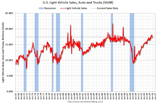 All day: Light vehicle sales for February. The consensus is for light vehicle sales to increase to 17.6 million SAAR in February from 17.5 million in January (Seasonally Adjusted Annual Rate).
This graph shows light vehicle sales since the BEA started keeping data in 1967. The dashed line is the January sales rate.
7:00 AM ET: The Mortgage Bankers Association (MBA) will release the results for the mortgage purchase applications index.
8:15 AM: The ADP Employment Report for February. This report is for private payrolls only (no government). The consensus is for 185,000 payroll jobs added in February, down from 206,000 in January.
2:00 PM: the Federal Reserve Beige Book, an informal review by the Federal Reserve Banks of current economic conditions in their Districts.
8:30 AM: The initial weekly unemployment claims report will be released. The consensus is for 270 thousand initial claims, down from 272 thousand the previous week.
10:00 AM: Manufacturers' Shipments, Inventories and Orders (Factory Orders) for January. The consensus is a 2.0% increase in orders.
10:00 AM: the ISM non-Manufacturing Index for February. The consensus is for index to decrease to 53.1 in February from 53.5 in January.
8:30 AM: Employment Report for February. The consensus is for an increase of 190,000 non-farm payroll jobs added in February, up from the 151,000 non-farm payroll jobs added in January.
The consensus is for the unemployment rate to be unchanged at 4.9%.
 This graph shows the year-over-year change in total non-farm employment since 1968.
In December, the year-over-year change was 2.67 million jobs.
A key will be the change in real wages.
 8:30 AM: Trade Balance report for January from the Census Bureau.
 This graph shows the U.S. trade deficit, with and without petroleum, through December. The blue line is the total deficit, and the black line is the petroleum deficit, and the red line is the trade deficit ex-petroleum products.
The consensus is for the trade deficit to be at $43.9 billion from $43.4 billion in December.
Friday, February 26, 2016
Freddie Mac: Mortgage Serious Delinquency rate increased slightly in January
by Calculated Risk on 2/26/2016 02:30:00 PM
Freddie Mac reported that the Single-Family serious delinquency rate increased in January to 1.33% from 1.32% in December. Freddie's rate is down from 1.86% in January 2015.
Freddie's serious delinquency rate peaked in February 2010 at 4.20%.
These are mortgage loans that are "three monthly payments or more past due or in foreclosure".
Note: Fannie Mae is expected to report early next week.

Although the rate is generally declining, the "normal" serious delinquency rate is under 1%.
The serious delinquency rate has fallen 0.53 percentage points over the last year, and at that rate of improvement, the serious delinquency rate will not be below 1% until the second half of this year.
I expect an above normal level of Fannie and Freddie distressed sales through 2016 (mostly in judicial foreclosure states).
Earlier: February Consumer Sentiment at 91.7
by Calculated Risk on 2/26/2016 12:29:00 PM
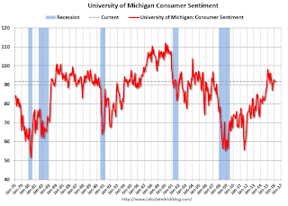
The University of Michigan consumer sentiment index for February was at 91.7, up from the preliminary reading of 90.7, and down from 92.0 in January:
"Consumer confidence nearly recovered the entire small loss it recorded at mid month, with the Sentiment Index finishing February just 0.3 Index-points below January. Although consumers are not as optimistic as at the start of last year, the Sentiment Index is just 6.5% below the cyclical peak of 98.1 set in January 2015. Such a small decline is hardly consistent with the onset of a downturn in consumer spending. ...This was above the consensus forecast of 91.0.
...
Most of the decline from last year’s peak has been in how consumers view year-ahead prospects for the economy, while the outlook for their personal financial situation has improved to its best level in ten years."
emphasis added
Click on graph for larger image.
Personal Income increased 0.5% in January, Spending increased 0.5%
by Calculated Risk on 2/26/2016 08:45:00 AM
The BEA released the Personal Income and Outlays report for January:
Personal income increased $79.6 billion, or 0.5 percent ... in January, according to the Bureau of Economic Analysis. Personal consumption expenditures (PCE) increased $63.0 billion, or 0.5 percent.The following graph shows real Personal Consumption Expenditures (PCE) through January 2016 (2009 dollars). Note that the y-axis doesn't start at zero to better show the change.
...
Real PCE -- PCE adjusted to remove price changes -- increased 0.4 percent in January, compared with an increase of 0.2 percent in December. ... The price index for PCE increased 0.1 percent in January, in contrast to a decrease of 0.1 percent in December. The PCE price index, excluding food and energy, increased 0.3 percent, compared with an increase of 0.1 percent.
The January PCE price index increased 1.3 percent from January a year ago. The January PCE price index, excluding food and energy, increased 1.7 percent from January a year ago.
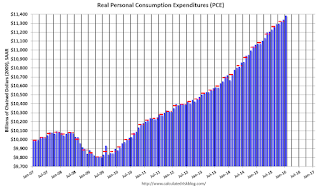 Click on graph for larger image.
The dashed red lines are the quarterly levels for real PCE.
The increase in personal income was above consensus expectations. And the increase in PCE was also above the consensus. A solid start for 2016.
On inflation: The PCE price index increased 1.3 percent year-over-year due to the sharp decline in oil prices. The core PCE price index (excluding food and energy) increased 1.7 percent year-over-year in January.
Q4 GDP Revised Up to 1.0% Annual Rate
by Calculated Risk on 2/26/2016 08:33:00 AM
From the BEA: Gross Domestic Product: Fourth Quarter 2015 (Second Estimate)
Real gross domestic product -- the value of the goods and services produced by the nation’s economy less the value of the goods and services used up in production, adjusted for price changes -- increased at an annual rate of 1.0 percent in the fourth quarter of 2015, according to the "second" estimate released by the Bureau of Economic Analysis. In the third quarter, real GDP increased 2.0 percent.Here is a Comparison of Second and Advance Estimates. PCE growth was revised down from 2.2% to 2.0%. Residential investment was revised down from 8.1% to 8.0%. This was above the consensus forecast.
The GDP estimate released today is based on more complete source data than were available for the "advance" estimate issued last month. In the advance estimate, the increase in real GDP was 0.7 percent. With this second estimate for the fourth quarter, the general picture of economic growth remains the same; private inventory investment decreased less than previously estimated ...
emphasis added
Thursday, February 25, 2016
Friday: GDP, Personal Income and Outlays, Consumer Sentiment
by Calculated Risk on 2/25/2016 06:58:00 PM
Some interesting analysis from Romer and Romer:
According to an analysis by Gerald Friedman, Senator Sanders’s proposed policies would result in average annual output growth of 5.3% over the next decade, and average monthly job creation of close to 300,000.1 As a result, output in 2026 would be 37% higher than it would have been without the policies, and employment would be 16% higher.Friday:
Although we share many of Senator Sanders’s values and enthusiastically support some of his goals, such as greater public investment in infrastructure and education, we also believe it is vitally important to be realistic about the impact of policies on the performance of the overall economy. For this reason, it is worth examining Friedman’s analysis carefully. Moreover, Friedman has made available an extensive report describing his methodology and assumptions, allowing others to examine the specifics of his analysis.
Unfortunately, careful examination of Friedman’s work confirms the old adage, “if something seems too good to be true, it probably is.” We identify three fundamental problems in Friedman’s analysis. ...
• At 8:30 AM ET, Gross Domestic Product, 4th quarter 2015 (Second estimate). The consensus is that real GDP increased 0.4% annualized in Q4, revised down from 0.7%.
• At 10:00 AM, Personal Income and Outlays for January. The consensus is for a 0.4% increase in personal income, and for a 0.3% increase in personal spending. And for the Core PCE price index to increase 0.2%.
• Also at 10:00 AM,University of Michigan's Consumer sentiment index (final for February). The consensus is for a reading of 91.0, up from the preliminary reading 90.7.
Lawler on Existing Home Sales, Table of Distressed Sales for Selected Cities in January
by Calculated Risk on 2/25/2016 03:34:00 PM
From housing economist Tom Lawler:
Yesterday the National Association of Realtors estimated that US existing home sales ran at a seasonally adjusted annual rate of 5.47 million in January, up 0.4% from December’s downwardly-revised (to 5.45 million from 5.46 million pace, and up 11.0% from January’s upwardly-revised (to 4.93 million from 4.82 million) seasonally adjusted base. The NAR’s unadjusted sales estimate for January was up 7.5% from a year ago. The January release incorporated annual seasonal adjustment revisions, which, as shown in the table below, worked to increase adjusted sales in the early part of the year (especially January and February), and decrease adjusted sales from late Spring through earl Fall.
| Seasonally Adjusted Existing Home Sales in 2015, Old vs. New Seasonal Factors (Annual Rate, 000's) | |||
|---|---|---|---|
| Old Seasonal Factors | New Seasonal Factors | % Change | |
| Jan | 4,820 | 4,930 | 2.3% |
| Feb | 4,890 | 4,970 | 1.6% |
| Mar | 5,210 | 5,250 | 0.8% |
| Apr | 5,090 | 5,140 | 1.0% |
| May | 5,320 | 5,290 | -0.6% |
| Jun | 5,480 | 5,410 | -1.3% |
| Jul | 5,580 | 5,480 | -1.8% |
| Aug | 5,300 | 5,290 | -0.2% |
| Sept | 5,550 | 5,440 | -2.0% |
| Oct | 5,320 | 5,290 | -0.6% |
| Nov | 4,760 | 4,860 | 2.1% |
| Dec* | 5,440 | 5,450 | 0.2% |
| *Note: December’s preliminary sales pace using old seasonal factors was 5.46 million. However, the NAR revised unadjusted sales in December down to 436,000 from 438,000. The number in the table above uses the old seasonal factor but the revised unadjusted sales number. | |||
The NAR’s seasonally-adjusted sales estimate for January was above consensus and slightly higher than my projection, but that was solely attributable to the larger-than-expected downward revision in January seasonal factors.
The NAR also estimated that the inventory of existing homes for sale at the end of January was 1.820 million, up 3.4% from December’s downwardly-revised (to 1.76 million from 1.79 million) level and down 2.2% from last January. The NAR’s estimate was somewhat higher than my projection based on local realtor/MLS reports available about a week ago, though reports released suggest that the NAR’s estimate is “reasonable.” Finally, the NAR estimated that the median existing SF home sales price last month was $215,000, up 8.2% from last January. This YOY increase was slightly higher than my projection.
CR Note: Tom Lawler also sent me the table below of short sales, foreclosures and all cash sales for a several selected cities in January.
On distressed: Total "distressed" share is down in all of these markets.
The All Cash Share (last two columns) is mostly declining year-over-year. As investors pull back, the share of all cash buyers will probably continue to decline.
| Short Sales Share | Foreclosure Sales Share | Total "Distressed" Share | All Cash Share | |||||
|---|---|---|---|---|---|---|---|---|
| Jan- 2015 | Jan- 2014 | Jan- 2015 | Jan- 2014 | Jan- 2015 | Jan- 2014 | Jan- 2015 | Jan- 2014 | |
| Las Vegas | 7.0% | 9.7% | 7.9% | 9.4% | 14.9% | 19.1% | 31.1% | 36.0% |
| Reno** | 4.0% | 10.0% | 6.0% | 6.0% | 10.0% | 16.0% | ||
| Phoenix | 2.3% | 6.3% | 3.9% | 6.8% | 6.2% | 13.1% | 27.4% | 32.0% |
| Sacramento | 4.8% | 6.9% | 4.2% | 9.5% | 9.0% | 16.4% | 19.8% | 22.7% |
| Minneapolis | 2.9% | 4.3% | 11.0% | 16.0% | 13.9% | 20.3% | ||
| Mid-Atlantic | 4.3% | 5.8% | 13.9% | 15.2% | 18.2% | 21.0% | 19.5% | 21.4% |
| Riverside | 3.1% | 3.3% | 4.2% | 5.8% | 7.3% | 9.1% | 18.2% | 19.9% |
| San Bernardino | 1.9% | 4.3% | 4.5% | 6.1% | 6.4% | 10.4% | 19.2% | 21.9% |
| Bay Area CA* | 2.5% | 4.2% | 2.5% | 4.2% | 5.0% | 8.4% | 20.5% | 24.3% |
| So. California* | 3.5% | 5.7% | 4.5% | 5.7% | 8.0% | 11.4% | 22.4% | 26.7% |
| Florida SF | 3.5% | 5.3% | 15.3% | 25.7% | 18.7% | 31.0% | 36.8% | 43.4% |
| Florida C/TH | 2.2% | 3.2% | 12.1% | 20.6% | 14.4% | 23.9% | 61.9% | 69.5% |
| Miami MSA SF | 5.7% | 8.9% | 16.8% | 23.2% | 22.5% | 32.1% | 36.3% | 42.4% |
| Miami MSA C/TH | 2.7% | 3.7% | 14.7% | 23.5% | 17.4% | 27.2% | 65.6% | 70.9% |
| Chicago (city) | 22.8% | 24.1% | ||||||
| Rhode Island | 11.8% | 16.1% | ||||||
| Northeast Florida | 24.8% | 38.1% | ||||||
| Spokane | 15.6% | 24.2% | ||||||
| Spokane | 15.6% | 24.2% | ||||||
| Toledo | 34.7% | 37.6% | ||||||
| Tucson | 29.7% | 34.8% | ||||||
| Knoxville | 26.3% | 28.5% | ||||||
| Peoria | 22.3% | 24.6% | ||||||
| Georgia*** | 24.8% | 31.3% | ||||||
| Omaha | 19.5% | 22.2% | ||||||
| Pensacola | 32.9% | 38.3% | ||||||
| Richmond VA | 13.5% | 18.3% | 21.9% | 22.8% | ||||
| Memphis | 15.6% | 14.8% | ||||||
| Springfield IL** | 16.8% | 16.6% | ||||||
| *share of existing home sales, based on property records **Single Family Only ***GAMLS | ||||||||
A comment on the Labor Force Participation Rate
by Calculated Risk on 2/25/2016 12:38:00 PM
Update on August 16, 2018: A recent article by Ryan Cooper referenced this post. Unfortunately he misunderstood what I wrote. I argued that most of the decline in the overall participation rate since the great recession was due to demographics and long term trends - and was not cyclical, and I've suggested using the prime working age ("25 to 54" years old) participation rate to track the economy (not perfect, but better than the overall rate). Strangely Mr. Cooper used the "25 to 54" years old rate to argue I was wrong. Time has proven me correct, and Mr. Cooper should correct his mistake.
Please see this post (with a spreadsheet) for an explanation.
Original post:
Yesterday I was a guest on Bloomberg's What'd You Miss? talking about housing. One of the earlier guests was Professor J.W. Mason discussing the labor force participation rate (LFPR).
Professor Mason argued that most of the decline in the LFPR is cyclical.
I've written extensively about the LFPR, and I've argued that most of the decline is due to ongoing trends and demographics.
Dr. Mason said that if you looked at each age group by sex, you could construct an "adjusted" LFPR. He presented the following graph:

NOTE: I believe this approach is incorrect.
This graph from Bloomberg shows the BLS reported LFPR and an "adjusted" LFPR using the 1999 LFPR for each age group and gender - and the current population for each group.
As an example, if we look at men in the 40 to 44 age group (these are my calculations using Dr. Mason's method):
• 1999 Labor Force Participation Rate, Men, 40-44: 92.2%
• Jan 2016 LFPR: 90.4%
• Current Population 40-44 Men: 9,572,000
• Current Participation: 8,652,000
• Adjusted Participation (using 1999 LFPR): 8,829,000
• "Missing" Male workers in the 40-44 age group: 177,000
This is the approach that Dr. Mason used to construct the above graph - and this is incomplete and I believe his conclusion is incorrect.
Here is a look at the trend for 40 to 44 year old men (BLS data, only available Not Seasonally Adjusted since 1976).

This graph shows the 40 to 44 year old men participation rate since 1976 (note the scale doesn't start at zero to better show the change).
There is a clear downward trend, and a researcher looking at this trend in the year 2000 might have predicted the 40 to 44 year old men participation rate would be about the level as today (see trend line).
Clearly there are other factors than "economic weakness" causing this downward trend. I listed some reasons a couple of years ago, and newer research from Pew Research suggests stay-at-home dads is one of the reasons: Growing Number of Dads Home with the Kids
Just looking at this graph, I don't think there are many 40 to 44 year old men that will be returning to the labor force - and a careful analysis of each age group by sex shows few "missing workers".
If Dr. Mason had used this trend line for 40 to 44 year old men - instead of the 1999 participation rate - the number of missing workers would be close to zero.
The bottom line is most of the decline in the Labor Force Participation rate is due to ongoing trends (as above) and demographics - and is not cyclical.
Kansas City Fed: Regional Manufacturing Activity "declined further" in February
by Calculated Risk on 2/25/2016 11:00:00 AM
From the Kansas City Fed: Tenth District Manufacturing Activity Declined Further
The Federal Reserve Bank of Kansas City released the February Manufacturing Survey today. According to Chad Wilkerson, vice president and economist at the Federal Reserve Bank of Kansas City, the survey revealed that Tenth District manufacturing activity declined further.The Kansas City region continues to be hit hard by lower oil prices and the stronger dollar.
“Factories reported a slightly larger decline in February than in previous months,” said Wilkerson. “Energy-related firms generally had a negative outlook, but firms overall remained slightly optimistic about future factory activity.”
...
Tenth District manufacturing activity declined further in February, while producers’ expectations for future activity remained slightly positive. Price indexes were mixed, but most remained in negative territory.
The month-over-month composite index was -12 in February, its lowest level since 2009, down from -9 in January and December. ... The employment index dropped from -15 to -26, its lowest level in nearly six years. The new orders for exports index fell from -4 to -13, while the capital expenditures index remained stable but weak.
emphasis added
Weekly Initial Unemployment Claims increase to 272,000
by Calculated Risk on 2/25/2016 08:34:00 AM
The DOL reported:
In the week ending February 20, the advance figure for seasonally adjusted initial claims was 272,000, an increase of 10,000 from the previous week's unrevised level of 262,000. The 4-week moving average was 272,000, a decrease of 1,250 from the previous week's unrevised average of 273,250.The previous week was unrevised.
There were no special factors impacting this week's initial claims.
The following graph shows the 4-week moving average of weekly claims since 1971.
 Click on graph for larger image.
The dashed line on the graph is the current 4-week average. The four-week average of weekly unemployment claims decreased to 272,000.
This was close to the consensus forecast of 270,000. The low level of the 4-week average suggests few layoffs.
Wednesday, February 24, 2016
Thursday: Unemployment Claims, Durable Goods
by Calculated Risk on 2/24/2016 09:06:00 PM
Thursday:
• At 8:30 AM ET, The initial weekly unemployment claims report will be released. The consensus is for 270 thousand initial claims, up from 262 thousand the previous week.
• Also at 8:30 AM, Durable Goods Orders for January from the Census Bureau. The consensus is for a 2.0% increase in durable goods orders.
• At 9:00 AM, FHFA House Price Index for December 2015. This was originally a GSE only repeat sales, however there is also an expanded index. The consensus is for a 0.5% month-to-month increase for this index.
• At 11:00 AM, the Kansas City Fed manufacturing survey for February.
Vehicle Sales Forecast: Sales to Reach 15-Year High for a February
by Calculated Risk on 2/24/2016 03:55:00 PM
The automakers will report February vehicle sales on Tuesday, March 1st.
Note: There were 24 selling days in February, unchanged from 24 in February 2015.
From WardsAuto: Forecast: February Sales Set to Reach 15-Year High
A WardsAuto forecast calls for U.S. automakers to deliver 1.34 million light vehicles in February, a 15-year high for the month. The forecasted daily sales rate of 55,868 over 24 days represents a 7.1% improvement from like-2015 (also 24 days).And from J.D. Power: New-Vehicle Sales in February Expected to Increase 8.1%
The report puts the seasonally adjusted annual rate of sales for the month at 17.50 million units, compared with year-ago’s 16.32 million and January’s 17.45 million mark.
emphasis added
New-vehicle sales in February 2016 are expected to increase 8.1% from a year ago, according to a monthly sales forecast developed jointly by J.D. Power and LMC Automotive.Looks like another strong month for car sales.
New-vehicle retail sales in February are projected to reach 1,046,700 units from 968,316 in February 2015, with the same number of selling days (24 days).
...
The SAAR for total sales is projected to reach 17.7 million units in February 2016, up 1.4 million units from 16.4 million a year ago and the highest rate since 2000 (18.9 million).
Comments on January New Home Sales
by Calculated Risk on 2/24/2016 01:48:00 PM
The new home sales report for January was below expectations at 494,000 on a seasonally adjusted annual rate basis (SAAR), however combined sales for October, November and December were revised up.
Sales were down 5.2% year-over-year (YoY) compared to January 2015. However, we have to remember January 2015 was a pretty strong month at 521,000 SAAR. Sales for all of 2015 were 501,000 (up 14.5% from 2014) - and since January (and February) were especially strong months last year, the YoY comparison is difficult.
Earlier: New Home Sales decreased to 494,000 Annual Rate in January.

This graph shows new home sales for 2015 and 2016 by month (Seasonally Adjusted Annual Rate).
The comparisons in early 2016 are difficult. And I also expect lower growth this year.
Houston (and other oil producing areas) will have a problem this year. Inventory of existing homes is increasing quickly and prices will probably decline in those areas. And that means new home construction will slow in those areas too.
And here is another update to the "distressing gap" graph that I first started posting a number of years ago to show the emerging gap caused by distressed sales. Now I'm looking for the gap to close over the next few years.
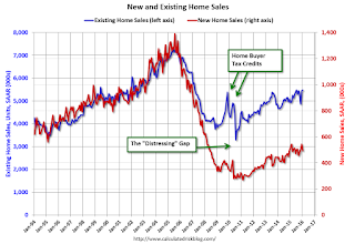
Following the housing bubble and bust, the "distressing gap" appeared mostly because of distressed sales.
I expect existing home sales to move more sideways, and I expect this gap to slowly close, mostly from an increase in new home sales.
However, this assumes that the builders will offer some smaller, less expensive homes.
Note: Existing home sales are counted when transactions are closed, and new home sales are counted when contracts are signed. So the timing of sales is different.
New Home Sales decreased to 494,000 Annual Rate in January
by Calculated Risk on 2/24/2016 10:13:00 AM
The Census Bureau reports New Home Sales in January were at a seasonally adjusted annual rate (SAAR) of 494 thousand.
The previous three months were revised up by a total of 28 thousand (SAAR).
"Sales of new single-family houses in January 2016 were at a seasonally adjusted annual rate of 494,000, according to estimates released jointly today by the U.S. Census Bureau and the Department of Housing and Urban Development. This is 9.2 percent below the revised December rate of 544,000 and is 5.2 percent below the January 2015 estimate of 521,000."
emphasis added
 Click on graph for larger image.
The first graph shows New Home Sales vs. recessions since 1963. The dashed line is the current sales rate.
Even with the increase in sales since the bottom, new home sales are still fairly low historically.
The second graph shows New Home Months of Supply.
 The months of supply increased in January to 5.8 months.
 The all time record was 12.1 months of supply in January 2009.
This is now in the normal range (less than 6 months supply is normal).
"The seasonally adjusted estimate of new houses for sale at the end of January was 238,000. This represents a supply of 5.8 months at the current sales rate."
 On inventory, according to the Census Bureau:
 "A house is considered for sale when a permit to build has been issued in permit-issuing places or work has begun on the footings or foundation in nonpermit areas and a sales contract has not been signed nor a deposit accepted."Starting in 1973 the Census Bureau broke this down into three categories: Not Started, Under Construction, and Completed.
The third graph shows the three categories of inventory starting in 1973.
The inventory of completed homes for sale is still low, and the combined total of completed and under construction is also low.
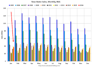 The last graph shows sales NSA (monthly sales, not seasonally adjusted annual rate).
In January 2016 (red column), 37 thousand new homes were sold (NSA). Last year 39 thousand homes were sold in January.
The all time high for January was 92 thousand in 2005, and the all time low for January was 21 thousand in 2011.
This was below expectations of 520,000 sales SAAR in January, however prior months were revised up slightly - although sales were down year-over-year. Still a decent report. I'll have more later today.
MBA: Mortgage Applications Decreased in Latest Weekly Survey, Purchase Applications up 27% YoY
by Calculated Risk on 2/24/2016 07:00:00 AM
From the MBA: Mortgage Applications Decrease in Latest MBA Weekly Survey
Mortgage applications decreased 4.3 percent from one week earlier, according to data from the Mortgage Bankers Association’s (MBA) Weekly Mortgage Applications Survey for the week ending February 19, 2016. This week’s results include an adjustment to account for the President’s Day holiday.
...
The Refinance Index decreased 8 percent from the previous week. The seasonally adjusted Purchase Index increased 2 percent from one week earlier. The unadjusted Purchase Index decreased 4 percent compared with the previous week and was 27 percent higher than the same week one year ago.
...
The average contract interest rate for 30-year fixed-rate mortgages with conforming loan balances ($417,000 or less) increased to 3.85 percent from 3.83 percent, with points increasing to 0.42 from 0.36 (including the origination fee) for 80 percent loan-to-value ratio (LTV) loans.
emphasis added
 Click on graph for larger image.
The first graph shows the refinance index since 1990.
Refinance activity was higher in 2015 than in 2014, but it was still the third lowest year since 2000.
Refinance activity has picked up recently as rates have declined.
 The second graph shows the MBA mortgage purchase index.
 According to the MBA, the unadjusted purchase index is 27% higher than a year ago.
Tuesday, February 23, 2016
Real Prices and Price-to-Rent Ratio in December
by Calculated Risk on 2/23/2016 06:39:00 PM
Here is the earlier post on Case-Shiller: Case-Shiller: National House Price Index increased 5.4% year-over-year in December
The year-over-year increase in prices is mostly moving sideways now around 5%. In December 2015, the index was up 5.4% YoY.
In the earlier post, I graphed nominal house prices, but it is also important to look at prices in real terms (inflation adjusted). Case-Shiller, CoreLogic and others report nominal house prices. As an example, if a house price was $200,000 in January 2000, the price would be close to $274,000 today adjusted for inflation (37%). That is why the second graph below is important - this shows "real" prices (adjusted for inflation).
It has been almost ten years since the bubble peak. In the Case-Shiller release this morning, the National Index was reported as being 3.7% below the bubble peak. However, in real terms, the National index is still about 18% below the bubble peak.
Nominal House Prices

In nominal terms, the Case-Shiller National index (SA) is back to October 2005 levels, and the Case-Shiller Composite 20 Index (SA) is back to April 2005 levels, and the CoreLogic index (NSA) is back to June 2005.
Real House Prices

In real terms, the National index is back to December 2003 levels, the Composite 20 index is back to September 2003, and the CoreLogic index back to December 2004.
In real terms, house prices are back to 2003 levels.
Note: CPI less Shelter is down 0.6% year-over-year, so this has been pushing up real prices recently.
Price-to-Rent
In October 2004, Fed economist John Krainer and researcher Chishen Wei wrote a Fed letter on price to rent ratios: House Prices and Fundamental Value. Kainer and Wei presented a price-to-rent ratio using the OFHEO house price index and the Owners' Equivalent Rent (OER) from the BLS.
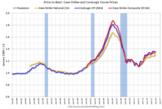
This graph shows the price to rent ratio (January 1998 = 1.0).
On a price-to-rent basis, the Case-Shiller National index is back to August 2003 levels, the Composite 20 index is back to April 2003 levels, and the CoreLogic index is back to July 2003.
In real terms, and as a price-to-rent ratio, prices are back to 2003 levels - and the price-to-rent ratio maybe moving a little sideways now.
A Few Comments on January Existing Home Sales
by Calculated Risk on 2/23/2016 03:56:00 PM
The January existing home sales report was stronger than expected, and even slightly stronger than the December report (that included a rebound from the decline in November related to the new TILA-RESPA Integrated Disclosure (TRID)). Note: TILA: Truth in Lending Act, and RESPA: the Real Estate Settlement Procedures Act of 1974.
Going forward, there are some economic reasons for some softness in existing home sales in certain areas. Low inventory is probably holding down sales in many areas, and there will be weakness in some oil producing areas (see: Houston has a problem).
Earlier: Existing Home Sales increased in January to 5.47 million SAAR
I expected some increase in inventory last year, but that didn't happened. Inventory is still very low and falling year-over-year (down 2.2% year-over-year in January). More inventory would probably mean smaller price increases and slightly higher sales, and less inventory means lower sales and somewhat larger price increases.
The following graph shows existing home sales Not Seasonally Adjusted (NSA).

Sales NSA in January (red column) were the highest since January 2007 (NSA).
This is a solid start to 2016.
Chemical Activity Barometer "Slips" in February
by Calculated Risk on 2/23/2016 12:42:00 PM
Here is an indicator that I'm following that appears to be a leading indicator for industrial production.
From the American Chemistry Council: Chemical Activity Barometer Slips in February
The Chemical Activity Barometer (CAB), a leading economic indicator created by the American Chemistry Council (ACC), slipped 0.1 percent in February following flat performance in January and two months of revised gains in November and December 2015. All data is measured on a three-month moving average (3MMA). Accounting for adjustments, the CAB remains up 1.5 percent over this time last year, a decline of fifty-percent from activity of one year ago when the barometer logged a 3.0 percent year-over-year gain from February 2014. On an unadjusted basis the CAB rose 0.1 percent following two consecutive monthly declines.
...
Applying the CAB back to 1919, it has been shown to provide a lead of two to 14 months, with an average lead of eight months at cycle peaks as determined by the National Bureau of Economic Research. The median lead was also eight months. At business cycle troughs, the CAB leads by one to seven months, with an average lead of four months. The median lead was three months. The CAB is rebased to the average lead (in months) of an average 100 in the base year (the year 2012 was used) of a reference time series. The latter is the Federal Reserve’s Industrial Production Index.
emphasis added
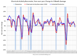 Click on graph for larger image.
This graph shows the year-over-year change in the 3-month moving average for the Chemical Activity Barometer compared to Industrial Production. It does appear that CAB (red) generally leads Industrial Production (blue).
Currently CAB is up slightly year-over-year, and this suggests a slight increase in Industrial Production over the next year is possible.
Existing Home Sales increased in January to 5.47 million SAAR
by Calculated Risk on 2/23/2016 10:10:00 AM
From the NAR: Existing-Home Sales Inch Forward in January, Price Growth Accelerates
Total existing-home sales, which are completed transactions that include single-family homes, townhomes, condominiums and co-ops, inched 0.4 percent to a seasonally adjusted annual rate of 5.47 million in January from a downwardly revised 5.45 million in December. Sales are now 11.0 percent higher than a year ago – the largest year-over-year gain since July 2013 (16.3 percent)....
Total housing inventory at the end of January increased 3.4 percent to 1.82 million existing homes available for sale, but is still 2.2 percent lower than a year ago (1.86 million). Unsold inventory is at a 4.0-month supply at the current sales pace, up slightly from 3.9 months in December 2015.
 Click on graph for larger image.
This graph shows existing home sales, on a Seasonally Adjusted Annual Rate (SAAR) basis since 1993.
Sales in January (5.47 million SAAR) were 0.4% hgiher than last month, and were 11.0% above the January 2015 rate.
The second graph shows nationwide inventory for existing homes.
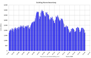 According to the NAR, inventory increased to 1.82 million in January from 1.76 million in December. Headline inventory is not seasonally adjusted, and inventory usually decreases to the seasonal lows in December and January, and peaks in mid-to-late summer.
The third graph shows the year-over-year (YoY) change in reported existing home inventory and months-of-supply. Since inventory is not seasonally adjusted, it really helps to look at the YoY change. Note: Months-of-supply is based on the seasonally adjusted sales and not seasonally adjusted inventory.
 Inventory decreased 2.2% year-over-year in January compared to January 2015.
 Months of supply was at 4.0 months in January.
This was above consensus expectations of sales of 5.32 million. For existing home sales, a key number is inventory - and inventory is still low. I'll have more later ...
Case-Shiller: National House Price Index increased 5.4% year-over-year in December
by Calculated Risk on 2/23/2016 09:21:00 AM
S&P/Case-Shiller released the monthly Home Price Indices for December ("December" is a 3 month average of October, November and December prices).
This release includes prices for 20 individual cities, two composite indices (for 10 cities and 20 cities) and the monthly National index.
Note: Case-Shiller reports Not Seasonally Adjusted (NSA), I use the SA data for the graphs.
From S&P: Home Prices Marginally Increased in December According to the S&P/Case-Shiller Home Price Indices
The S&P/Case-Shiller U.S. National Home Price Index, covering all nine U.S. census divisions, recorded a slightly higher year-over-year gain with a 5.4% annual increase in December 2015 versus a 5.2% increase in November 2015. The 10-City Composite increased 5.1% in the year to December compared to 5.2% previously. The 20-City Composite’s year-over-year gain was 5.7%, the same as November.
...
Before seasonal adjustment, the National Index posted a gain of 0.1% month-over-month in December. The 10- City Composite decreased by 0.1% and the 20-City Composite remained unchanged in December. After seasonal adjustment, the National and 20-City Composites Index both recorded a monthly increase of 0.8%. The 10-City Composite increased 0.7% month-over-month in December. Ten of 20 cities reported increases in December before seasonal adjustment; after seasonal adjustment, all 19 cities increased for the month.
emphasis added
 Click on graph for larger image.
 The first graph shows the nominal seasonally adjusted Composite 10, Composite 20 and National indices (the Composite 20 was started in January 2000).
The Composite 10 index is off 12.4% from the peak, and up 0.7% in December (SA).
The Composite 20 index is off 10.8% from the peak, and up 0.8% (SA) in December.
The National index is off 3.7% from the peak, and up 0.8% (SA) in December. The National index is up 30.1% from the post-bubble low set in December 2011 (SA).
 The second graph shows the Year over year change in all three indices.
The Composite 10 SA is up 5.1% compared to December 2014.
The Composite 20 SA is up 5.7% year-over-year..
The National index SA is up 5.4% year-over-year.
Prices increased (SA) in 19 of the 20 Case-Shiller cities in December seasonally adjusted. (Prices increased in 10 of the 20 cities NSA) Prices in Las Vegas are off 38.2% from the peak.
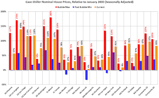 The last graph shows the bubble peak, the post bubble minimum, and current nominal prices relative to January 2000 prices for all the Case-Shiller cities in nominal terms.
As an example, at the peak, prices in Phoenix were 127% above the January 2000 level. Then prices in Phoenix fell slightly below the January 2000 level, and are now up 57% above January 2000 (57% nominal gain in almost 16 years).
These are nominal prices, and real prices (adjusted for inflation) are up about 40% since January 2000 - so the increase in Phoenix from January 2000 until now is about 17% above the change in overall prices due to inflation.
Six cities - Charlotte, Boston, Dallas, Denver, Portland and San Francisco - are above the bubble highs (Seattle is close). Detroit prices are barely above the January 2000 level.
I'll have more on house prices later.
Monday, February 22, 2016
Tuesday: Existing Home Sales, Case-Shiller House Prices, Richmond Fed Mfg Survey
by Calculated Risk on 2/22/2016 07:15:00 PM
From Matthew Graham at Mortgage News Daily: Mortgage Rates Sideways Again; Anxiety Builds
For now, the most prevalently-quoted conventional 30yr fixed rate remains 3.625% on top tier scenarios. Some of the less aggressive lenders are back up to 3.75%, but that was the case as of late last week as well.Tuesday:
• At 9:00 AM ET, S&P/Case-Shiller House Price Index for December. Although this is the December report, it is really a 3 month average of October, November and December prices. The consensus is for a 5.9% year-over-year increase in the Comp 20 index for November. The Zillow forecast is for the National Index to increase 5.3% year-over-year in November.
• At 10:00 AM, Existing Home Sales for January from the National Association of Realtors (NAR). The consensus is for 5.32 million SAAR, down from 5.46 million in December. Economist Tom Lawler expects the NAR to report sales of 5.36 million SAAR for January.
• At 10:00 AM, Richmond Fed Survey of Manufacturing Activity for February.
A comment on the January Black Knight Mortgage Delinquency Data
by Calculated Risk on 2/22/2016 04:43:00 PM
This morning I posted some mortgage delinquency data from Black Knight (formerly LPS). The data showed an increase in delinquencies in January to 5.09%. Several people asked me if this is a leading indicator of a potential problem. The answer is no.
Here is what I wrote in 2012 when the delinquency rate was at 8%:
At the current rate of decline, the number of delinquent lonas will be back to "normal" in about three years (around 4.5% to 5% of loans are delinquent even in good times). However the number of loans in the foreclosure process hasn't change year-over-year - although that will probably change soon with the mortgage servicer settlement (around 0.5% of loans in foreclosure is "normal").The percent of loans in delinquency is now close to the normal range, although there are still an excessive number of seriously delinquent loans. As the delinquency rate approaches normal, it will not be unusual for the rate to increase in some months - no worries.
Note that the number of loans in the foreclosure process is still way above normal at 1.30% in January 2016; the lenders are still working through the backlog.
DOT: Vehicle Miles Driven increased 4.2% year-over-year in December
by Calculated Risk on 2/22/2016 12:51:00 PM
With lower gasoline prices, driving has really picked up!
The Department of Transportation (DOT) reported today:
Travel on all roads and streets changed by 4.2% (10.6 billion vehicle miles) for December 2015 as compared with December 2014.The following graph shows the rolling 12 month total vehicle miles driven to remove the seasonal factors.
Travel for the month is estimated to be 264.2 billion vehicle miles.
The seasonally adjusted vehicle miles traveled for December 2015 is 268.5 billion miles, a 4.0% (10.4 billion vehicle miles) increase over December 2014. It also represents a 1.4% change (3.7 billion vehicle miles) compared with November 2015.
The rolling 12 month total is moving up - mostly due to lower gasoline prices - after moving sideways for several years.
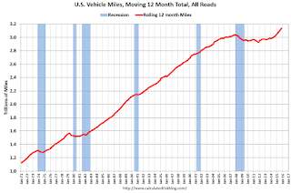 Click on graph for larger image.
In the early '80s, miles driven (rolling 12 months) stayed below the previous peak for 39 months.
Miles driven (rolling 12) had been below the previous peak for 85 months - an all time record - before reaching a new high for miles driven in January.
The second graph shows the year-over-year change from the same month in the previous year.
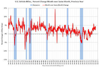 In December 2015, gasoline averaged $2.14 per gallon according to the EIA. That was down significantly from December 2014 when prices averaged $2.63 per gallon. Gasoline prices have continued to decline, and vehicle miles will probably up sharply year-over-year in January.
Gasoline prices aren't the only factor - demographics are also important. However, with lower gasoline prices, miles driven on a rolling 12 month basis, is setting new highs each month.
Black Knight's First Look at January Mortgage Data
by Calculated Risk on 2/22/2016 09:01:00 AM
From Black Knight: Black Knight Financial Services’ First Look at January Mortgage Data: Delinquencies Up Sharply; Prepayment Rate Drops
- Delinquency rate up 6.6 percent in January; back above 5 percent nationally for the first time in 11 monthsAccording to Black Knight's First Look report for January, the percent of loans delinquent increased 6.6% in January compared to December, and declined 7.1% year-over-year.
- Prepayment rate (historically a good indicator of refinance activity) dropped 29 percent to its lowest level since February 2014
- Foreclosure sales (completions) up nearly 16 percent following holiday moratoriums
- Active foreclosure inventory continues to decline; down 26 percent from last year
The percent of loans in the foreclosure process declined 4.5% in December and were down 25.7% over the last year.
Black Knight reported the U.S. mortgage delinquency rate (loans 30 or more days past due, but not in foreclosure) was 5.09% in January, down from 4.79% in December.
The percent of loans in the foreclosure process declined in January to 1.30%.
The number of delinquent properties, but not in foreclosure, is down 229,000 properties year-over-year, and the number of properties in the foreclosure process is down 226,000 properties year-over-year.
Black Knight will release the complete mortgage monitor for January in early March.
| Black Knight: Percent Loans Delinquent and in Foreclosure Process | ||||
|---|---|---|---|---|
| Jan 2016 | Dec 2015 | Jan 2015 | Jan 2014 | |
| Delinquent | 5.09% | 4.78% | 5.48% | 6.25% |
| In Foreclosure | 1.30% | 1.37% | 1.76% | 2.41% |
| Number of properties: | ||||
| Number of properties that are delinquent, but not in foreclosure: | 2,575,000 | 2,408,000 | 2,764,000 | 3,150,000 |
| Number of properties in foreclosure pre-sale inventory: | 659,000 | 689,000 | 885,000 | 1,213,000 |
| Total Properties | 3,234,000 | 3,097,000 | 3,649,000 | 4,363,000 |
Chicago Fed: "Index shows economic growth picked up in January"
by Calculated Risk on 2/22/2016 08:35:00 AM
The Chicago Fed released the national activity index (a composite index of other indicators): Index shows economic growth picked up in January
Led by improvements in production-related indicators, the Chicago Fed National Activity Index (CFNAI) rose to +0.28 in January from –0.34 in December. Two of the four broad categories of indicators that make up the index increased from December, and two of the four categories made positive contributions to the index in January.This graph shows the Chicago Fed National Activity Index (three month moving average) since 1967.
The index’s three-month moving average, CFNAI-MA3, increased to –0.15 in January from –0.30 in December. January’s CFNAI-MA3 suggests that growth in national economic activity was somewhat below its historical trend. The economic growth reflected in this level of the CFNAI-MA3 suggests subdued inflationary pressure from economic activity over the coming year.
emphasis added
 Click on graph for larger image.
This suggests economic activity was somewhat below the historical trend in January (using the three-month average).
According to the Chicago Fed:
What is the National Activity Index? The index is a weighted average of 85 indicators of national economic activity drawn from four broad categories of data: 1) production and income; 2) employment, unemployment, and hours; 3) personal consumption and housing; and 4) sales, orders, and inventories.
A zero value for the index indicates that the national economy is expanding at its historical trend rate of growth; negative values indicate below-average growth; and positive values indicate above-average growth.


