by Calculated Risk on 8/31/2009 04:00:00 PM
Monday, August 31, 2009
August Economic Summary in Graphs
Here is a collection of real estate and economic graphs for data released in August ...
Note: Click on graphs for larger image in new window. For more info, click on link below graph to original post.
 New Home Sales in July (NSA)
The first graph shows monthly new home sales (NSA - Not Seasonally Adjusted).
Note the Red columns for 2009. This is the 3rd lowest sales for July since the Census Bureau started tracking sales in 1963.
In July 2009, 39 thousand new homes were sold (NSA); the record low was 31 thousand in July 1982; the record high for July was 117 thousand in 2005.
From: New Home Sales Increase in July
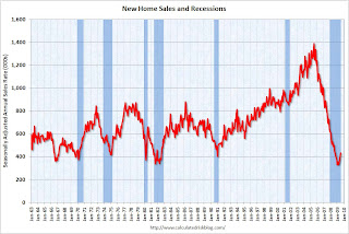 New Home Sales in July
This graph shows shows New Home Sales vs. recessions for the last 45 years.
"Sales of new one-family houses in July 2009 were at a seasonally adjusted annual rate of 433,000 ...
This is 9.6 percent (±13.4%) above the revised June rate of 395,000, but is 13.4 percent (±12.9%) below the July 2008 estimate of 500,000."
From: New Home Sales Increase in July
 New Home Months of Supply in July
There were 7.5 months of supply in July - significantly below the all time record of 12.4 months of supply set in January.
"The seasonally adjusted estimate of new houses for sale at the end of July was 271,000. This represents a supply of 7.5 months at the current sales rate."
From: New Home Sales Increase in July
 Existing Home Sales in July
 This graph shows existing home sales, on a Seasonally Adjusted Annual Rate (SAAR) basis since 1993.
Sales in July 2009 (5.24 million SAAR) were 7.2% higher than last month, and were 5.0% lower than July 2008 (4.99 million SAAR).
From: Existing Home Sales increase in July
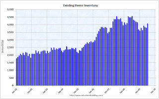 Existing Home Inventory July
This graph shows nationwide inventory for existing homes. According to the NAR, inventory increased to 4.09 million in July. The all time record was 4.57 million homes for sale in July 2008. This is not seasonally adjusted.
Also, many REOs (bank owned properties) are included in the inventory because they are listed - but not all. Recently there have been stories about a substantial number of unlisted REOs and other shadow inventory - so this inventory number is probably low.
From: Existing Home Sales increase in July
 Existing Home Inventory July, Year-over-Year Change
This graph shows the year-over-year change in existing home inventory.
If the trend of declining year-over-year inventory levels continues in 2009 that will be a positive for the housing market. Prices will probably continue to fall until the months of supply reaches more normal levels (closer to 6 months compared to the current 9.4 months), and that will take some time. Plus remember the shadow inventory!
From: More on Existing Home Inventory
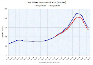 Case Shiller House Prices for June
This graph shows the nominal Composite 10 and Composite 20 indices (the Composite 20 was started in January 2000).
The Composite 10 index is off 32.6% from the peak, and up about 9% (annualized) in June.
The Composite 20 index is off 31.4% from the peak, and up in June.
From: Case-Shiller House Price Index Increases in June
 NAHB Builder Confidence Index in August
This graph shows the builder confidence index from the National Association of Home Builders (NAHB).
The housing market index (HMI) increased to 18 in August from 17 in July. The record low was 8 set in January.
This is still very low - and this is what I've expected - a long period of builder depression.
From: NAHB: Builder Confidence Slightly Higher in August
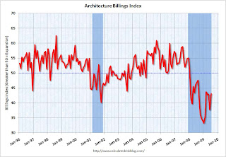 Architecture Billings Index for July
"The Architecture Billings Index rebounded more than 5 points last month to a reading of 43.1, reversing a similar decline in June, according to the American Institute of Architects.
The index has remained below 50, indicating contraction in demand for design services, since January 2008 ..."
From: AIA: Architecture Billings Index shows Contraction in July
 Housing Starts in July
Total housing starts were at 581 thousand (SAAR) in July, off slightly from June, but up sharply over the last three months from the all time record low in April of 479 thousand (the lowest level since the Census Bureau began tracking housing starts in 1959).
Single-family starts were at 490 thousand (SAAR) in July, up slightly from June; 37 percent above the record low in January and February (357 thousand).
From: Housing Starts Flat in July
 Construction Spending in June
The first graph shows private residential and nonresidential construction spending since 1993. Note: nominal dollars, not inflation adjusted.
Residential construction spending increased slightly in June, and nonresidential spending declined a little. From other data (new housing starts), it appears that residential spending has stabilized and might increase in Q3 - however private nonresidential construction will be falling off a cliff.
From: Construction Spending Increases Slightly in June
 July Employment Report
This graph shows the unemployment rate and the year over year change in employment vs. recessions.
Nonfarm payrolls decreased by 247,000 in July. The economy has lost almost 5.7 million jobs over the last year, and 6.66 million jobs during the 19 consecutive months of job losses.
The unemployment rate declined slightly to 9.4 percent.
Year over year employment is strongly negative.
From: Employment Report: 247K Jobs Lost, 9.4% Unemployment Rate
 July Employment Comparing Recessions
This graph shows the job losses from the start of the employment recession, in percentage terms (as opposed to the number of jobs lost).
For the current recession, employment peaked in December 2007, and this recession was a slow starter (in terms of job losses and declines in GDP).
However job losses have really picked up over the last year, and the current recession is now the 2nd worst recession since WWII in percentage terms (and the 1948 recession recovered very quickly) - and also in terms of the unemployment rate (only early '80s recession was worse).
From: Employment Report: 247K Jobs Lost, 9.4% Unemployment Rate
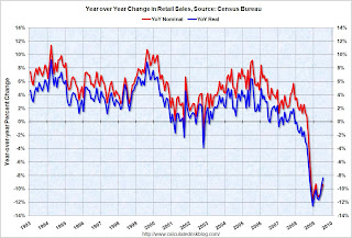 July Retail Sales
This graph shows the year-over-year change in nominal and real retail sales since 1993.
The Census Bureau reported retail sales decreased 0.1% from June to July (seasonally adjusted), and sales are off 8.3% from July 2008 (retail ex food services decreased 9.3%).
From: Retail Sales Decline Slightly in July
 LA Port Traffic in July
This graph shows the loaded inbound and outbound traffic at the port of Los Angeles in TEUs (TEUs: 20-foot equivalent units or 20-foot-long cargo container). Although containers tell us nothing about value, container traffic does give us an idea of the volume of goods being exported and imported.
Inbound traffic was 22.0% below July 2008.
Outbound traffic was 22.7% below July 2008.
There had been some recovery in U.S. exports earlier this year (the year-over-year comparison was off 30% from December through February). And this showed up in the in the Q1 and Q2 GDP reports as net exports of goods and services added 2.64% and 1.38% to GDP in Q1 and Q2, respectively.
From: LA Area Ports: Export Traffic Declines in July
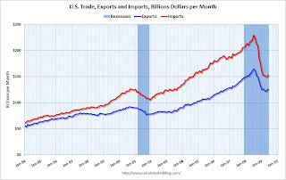 U.S. Imports and Exports Through June
This graph shows the monthly U.S. exports and imports in dollars through June 2009.
Imports were up in June, mostly because of a spike in oil prices. Exports also increased in June. On a year-over-year basis, exports are off 22% and imports are off 31%.
From: Trade Deficit Increases in June
 Capacity Utilization in July
 This graph shows Capacity Utilization. This series is slightly above the record low (the series starts in 1967).
"Industrial production increased 0.5 percent in July. Aside from a hurricane-related rebound in October 2008, the gain in July marked the first monthly increase since December 2007. ... At 96.0 percent of its 2002 average, total industrial production was 13.1 percent below its level of a year earlier. In July, the capacity utilization rate for total industry edged up to 68.5 percent, a level 12.4 percentage points below its 1972-2008 average."
From: Industrial Production, Capacity Utilization Increase in July
 Restaurant Performance Index for July
"The Association’s Restaurant Performance Index (RPI) – a monthly composite index that tracks the health of and outlook for the U.S. restaurant industry – stood at 98.1 in July, up 0.3 percent from its June level. However, the RPI still remained below 100 for the 21st consecutive month, which signifies contraction in the index of key industry indicators.
...
In addition to sales declines, restaurant operators reported negative customer traffic levels for the 23rd consecutive month in July."
From: Restaurants in July: 23rd Consecutive Month of Declining Traffic
Here is a map of the three month change in the Philly Fed state coincident indicators. Forty seven states are showing declining three month activity.
This is what a widespread recession looks like based on the Philly Fed states indexes.
On a one month basis, activity decreased in 35 states in June, and was unchanged in 8 states.
From: Philly Fed State Coincident Indicators: Still a Widespread Recession in July
 Light vehicle sales in July
This graph shows the historical light vehicle sales (seasonally adjusted annual rate) from the BEA (blue) and an estimate for July (red, light vehicle sales of 11.24 million SAAR from AutoData Corp).
This is the highest vehicle sales since September 2008 (12.5 million SAAR).
From: Light Vehicle Sales Over 11 Million (SAAR) in July
 Q2: Office, Mall and Lodging Investment
 This graph shows investment in offices, lodging and malls as a percent of GDP.
The recent boom in lodging investment has been stunning. Lodging investment peaked at 0.32% of GDP in Q2 2008 and has started to decline (0.27% in Q2 2009). There was a small increase in Q2 2009 that is probably related to projects being completed. I expect lodging investment to continue to decline through at least 2010, to perhaps one-third of the peak.
Investment in multimerchandise shopping structures (malls) peaked in 2007 and has fallen sharply.
Office investment as a percent of GDP peaked at 0.46% in Q3 2008 and has started to decline sharply. With the office vacancy rate rising sharply, office investment will also probably decline through at least 2010.
From: Q2: Office, Mall and Lodging Investment
 NMHC Quarterly Apartment Survey
This graph shows the quarterly Apartment Tightness Index.
A reading below 50 suggests vacancies are rising. Based on limited historical data, I think this index will lead reported apartment rents by 6 months to 1 year. Or stated another way, rents will probably fall for 6 months to 1 year after this index reaches 50. Right now I expect rents to continue to decline through most of 2010.
From: Q2 NMHC Quarterly Apartment Survey: Occupancy Continues to Decline, but Pace Slows
 U.S. Consumer Bankruptcy Filings in July
This graph shows the non-business bankruptcy filings by quarter.
Note: Quarterly data from Administrative Office of the U.S. Courts, 2009 based on monthly data from the American Bankruptcy Institute.
From the American Bankruptcy Institute: Consumer Bankruptcy Filings Reach Highest Monthly Total Since 2005 Bankruptcy Law Overhaul
U.S. consumer bankruptcy filings reached 126,434 in July, the highest monthly total since the Bankruptcy Abuse Prevention and Consumer Protection Act was implemented in October 2005, according to the American Bankruptcy Institute (ABI), relying on data from the National Bankruptcy Research Center (NBKRC).From: ABI: Personal Bankruptcy Filings up 34.3 Percent compared to July 2008
 Delinquency Rates in Q2 2009
 This graph shows the delinquency rates at the commercial banks for residential real estate, commercial real estate and consumer credit cards.
Commercial real estate delinquencies (7.91%) are rising rapidly, and are at the highest rate since the early '90s (as delinquency rates declined following the S&L crisis).
Residential real estate (8.84%) and consumer credit card (6.7%) delinquencies are at the highest levels since the Fed started tracking the data (since Q1 '91).
Although there is credit deterioration everywhere, the rise in these three categories is especially significant. There was also a significant increase in C&I delinquencies (commerical & industrial) and Agricultural loans.
From: Fed: Delinquency Rates Surged in Q2 2009


